Commons:Featured picture candidates/File:HahnEcho GWM.gif
Jump to navigation
Jump to search

File:HahnEcho GWM.gif, not featured[edit]
Voting period is over. Please don't add any new votes.Voting period ends on 11 Jun 2011 at 15:41:38 (UTC)
Visit the nomination page to add or modify image notes.

 Info created by GavinMorley - uploaded by GavinMorley - nominated by GavinMorley -- GavinMorley (talk) 15:41, 2 June 2011 (UTC)
 Support -- GavinMorley (talk) 15:41, 2 June 2011 (UTC)
 Comment I'm not saying this to be rude, but is there a way to have this image represented by a still image somehow? I keep swinging by the FPC page and then my browser will hang for 30 seconds while the gif is trying to load, and I keep forgetting it's here. If this isn't possible, then ignore me : ) – Kerαunoςcopia◁galaxies 06:37, 3 June 2011 (UTC)
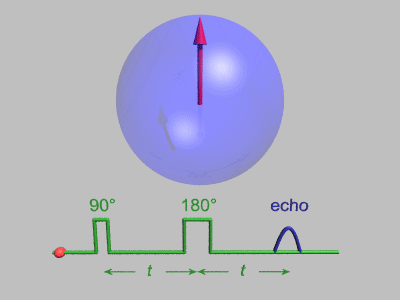
 Question 1) What is the meaning of the green arrows at the bottom? 2) If I understand correctly, the pi/2 (90) and pi (180) pulses are something that you apply to the system, while the echo is something that you measure. In this sense, having both in one "graph" is a bit counterintuitive and possibly confusing. Also don't see the reason for having the "graph" in 3D. bamse (talk) 11:28, 3 June 2011 (UTC)
- 1) The green arrows at the bottom show that the time "t" between the 90 and 180 pulses is the same as the time "t" between the 180 pulse and the echo. 2) As you say there is a difference between the applied pulses and the echo. They are the same in the sense that they are all pulses of electromagnetic radiation with the same frequency (generally RF for NMR and microwave for EPR). I like to have them together to show that the two times "t" are the same. Many experiments produce data with the pulses and the echo together such as figure 3a from my recent Phys Rev Lett paper here: http://arxiv.org/ftp/arxiv/papers/0806/0806.3431.pdf . I did the green graph in 3D because I thought it looked nicer. GavinMorley (talk) 13:35, 3 June 2011 (UTC)
- Thanks for the reply and congratulations to the PRL. 1) So the arrows are pointing at the centers of the respective peak/plateaus (hard to see in 3D in my opinion)? I am not sure that these green arrows are the best way to illustrate that it is the same time interval. Initially I thought it was somehow related to the direction of the spins (which are also represented by arrows. Unfortunately I don't have a good idea of how to improve it: maybe some kind of bar instead of the arrows or adding a label "T" or something. 2) OK as for plotting them together. A problem of the 3D graph is that the p/2 pulse does not appear to be half as wide as the pi pulse due to the projection. Can you remind me what determines the shape (width and height) of the echo peak? Well done and very useful illustration btw! bamse (talk) 14:04, 3 June 2011 (UTC)
- 1) yes. 2) The echo height depends on things like how many spins are in the sample, the relaxation times, the spin polarization etc. The echo width depends on the width of the pulses, the relaxation times, the inhomogeneities in the experiment etc. If people want I could render the animation with all of the green stuff rotated so that you are looking at it head-on. GavinMorley (talk) 14:52, 3 June 2011 (UTC)
- Thanks for the explanation. I would support it with a rotated green stuff. bamse (talk) 20:20, 3 June 2011 (UTC)
- 1) yes. 2) The echo height depends on things like how many spins are in the sample, the relaxation times, the spin polarization etc. The echo width depends on the width of the pulses, the relaxation times, the inhomogeneities in the experiment etc. If people want I could render the animation with all of the green stuff rotated so that you are looking at it head-on. GavinMorley (talk) 14:52, 3 June 2011 (UTC)
- Thanks for the reply and congratulations to the PRL. 1) So the arrows are pointing at the centers of the respective peak/plateaus (hard to see in 3D in my opinion)? I am not sure that these green arrows are the best way to illustrate that it is the same time interval. Initially I thought it was somehow related to the direction of the spins (which are also represented by arrows. Unfortunately I don't have a good idea of how to improve it: maybe some kind of bar instead of the arrows or adding a label "T" or something. 2) OK as for plotting them together. A problem of the 3D graph is that the p/2 pulse does not appear to be half as wide as the pi pulse due to the projection. Can you remind me what determines the shape (width and height) of the echo peak? Well done and very useful illustration btw! bamse (talk) 14:04, 3 June 2011 (UTC)
- 1) The green arrows at the bottom show that the time "t" between the 90 and 180 pulses is the same as the time "t" between the 180 pulse and the echo. 2) As you say there is a difference between the applied pulses and the echo. They are the same in the sense that they are all pulses of electromagnetic radiation with the same frequency (generally RF for NMR and microwave for EPR). I like to have them together to show that the two times "t" are the same. Many experiments produce data with the pulses and the echo together such as figure 3a from my recent Phys Rev Lett paper here: http://arxiv.org/ftp/arxiv/papers/0806/0806.3431.pdf . I did the green graph in 3D because I thought it looked nicer. GavinMorley (talk) 13:35, 3 June 2011 (UTC)
- Comment I always support animations, because they are best to describe things, that hard to be explained in words. But this animation is need additional explanation in words, so I can't support it. Technically: a) animation does not show, what we "did" and what we "get"; and b) the green arrow of time looks like it is assigned to X axis. -- ☭Acodered (talk) 11:51, 4 June 2011 (UTC)
- Comment I uploaded a new version of the animation to solve the concerns raised above. GavinMorley (talk) 14:47, 4 June 2011 (UTC)
 Oppose Why does it need to be so dark and to have such strong colors? After all it looks a bit after "I didn't know how how to make it better". I would suggest to use a 2D-Graph and a brighter illustration of the angles/vectors on top of it. -- /人◕ ‿‿ ◕人\ 苦情処理係 10:22, 5 June 2011 (UTC)
- I chose the black background because I thought it looked best but I can change it if people want other colours. Last week I put up this version http://commons.wikimedia.org/wiki/File:GWM_HahnEcho_GreyBgd.gif which has a grey background. Why would it be better with a 2D graph? What do you mean by "a brighter illustration"? Red arrows on a blue background seems very bright and I thought that your complaint about "strong colours" meant you wanted less bright colours (closer to pastel shades) rather than the current primary colours. GavinMorley (talk) 13:25, 5 June 2011 (UTC)
- Im currently rendering an alternative. I like the idea very much, but i changed some details. I will upload it as an animation, if it is done, and that PC is slow, very slow. ;-)
- I uploaded an animation here with less bright colours and a grey background: http://commons.wikimedia.org/wiki/File:SpinEcho_GWM3.gif. Please suggest alternative colours if you would like me to change these. GavinMorley (talk) 15:00, 5 June 2011 (UTC)
- Just uploaded an alternative to this versions. I hope you also like it. -- /人◕ ‿‿ ◕人\ 苦情処理係 15:26, 5 June 2011 (UTC)
- I uploaded an animation here with less bright colours and a grey background: http://commons.wikimedia.org/wiki/File:SpinEcho_GWM3.gif. Please suggest alternative colours if you would like me to change these. GavinMorley (talk) 15:00, 5 June 2011 (UTC)
- Im currently rendering an alternative. I like the idea very much, but i changed some details. I will upload it as an animation, if it is done, and that PC is slow, very slow. ;-)
- I chose the black background because I thought it looked best but I can change it if people want other colours. Last week I put up this version http://commons.wikimedia.org/wiki/File:GWM_HahnEcho_GreyBgd.gif which has a grey background. Why would it be better with a 2D graph? What do you mean by "a brighter illustration"? Red arrows on a blue background seems very bright and I thought that your complaint about "strong colours" meant you wanted less bright colours (closer to pastel shades) rather than the current primary colours. GavinMorley (talk) 13:25, 5 June 2011 (UTC)
Alternative[edit]

- Click the image to see the animation. Another example for not working GIF thumbnails. ;-) -- /人◕ ‿‿ ◕人\ 苦情処理係 15:26, 5 June 2011 (UTC)
- Thanks, but I much prefer the strong colours of the original. Also there are a couple of inaccuracies in your physics: the echo shape is not smooth enough and the accelarating and decelarating precession in the xy plane would require a changing magnetic field. These experiments are conducted with constant external magnetic field.
- How smooth should the echo shape be? "the accelarating and decelarating precession" Currently it is non linear in this animation. Should i change it to linear instead? -- /人◕ ‿‿ ◕人\ 苦情処理係 16:34, 5 June 2011 (UTC)
- The echo looks pointy at the top. The precession speed should be constant. GavinMorley (talk) 17:01, 5 June 2011 (UTC)
- How smooth should the echo shape be? "the accelarating and decelarating precession" Currently it is non linear in this animation. Should i change it to linear instead? -- /人◕ ‿‿ ◕人\ 苦情処理係 16:34, 5 June 2011 (UTC)
- Very good, as usual. And for not working GIF -- at 540x540 resolution it should be 42 frames length to fit 12.5 MP limit. ~ ☭Acodered (talk) 05:15, 6 June 2011 (UTC)
- Then you will hardly get something usable (42 frames, 250 frames at 222x222...). The filesize itself is 1,3 MB. Compared to other images this is small. I can only assume that the limit is way too low. -- /人◕ ‿‿ ◕人\ 苦情処理係 08:54, 6 June 2011 (UTC)
- Thanks, but I much prefer the strong colours of the original. Also there are a couple of inaccuracies in your physics: the echo shape is not smooth enough and the accelarating and decelarating precession in the xy plane would require a changing magnetic field. These experiments are conducted with constant external magnetic field.
- Support I prefer this one. The other one is too dark. Yann (talk) 17:56, 6 June 2011 (UTC)
- Question Is it possible to remove dithering noise at background? ~ ☭Acodered (talk) 05:30, 7 June 2011 (UTC)
- Support this version ☭Acodered (talk) 18:37, 9 June 2011 (UTC)
Alternative[edit]

Here is a version without the dark background. GavinMorley (talk) 22:05, 6 June 2011 (UTC)
- Support Very good with the arrows' shadows. Yann (talk) 22:05, 8 June 2011 (UTC)
- Support I'm not even completely sure what it is but these are so demonstrative it's easy to figure out what it's attempting to teach about echoes/reflections. I like the reflections shown here. -- One, please. ( Thank you.) 15:41, 10 June 2011 (UTC)
Confirmed results:
Result: 2 support, 0 oppose, 0 neutral → not featured. /George Chernilevsky talk 16:50, 11 June 2011 (UTC)