Commons:Graphic Lab
Graphics community: Graphic Lab · Graphics Village Pump · Picture Requests · Photography Critiques · Photography terms
 Graphic Lab
| Illustration Workshop | Map Workshop | Photography Workshop | Video and Sound Workshop |

The Graphic Lab helps improve all graphical content used by Wikimedia projects stored on the Wikimedia Commons by picture retouching.
They work to improve the quality and clarity of images that are proposed to them by the community. This work most often involves extracting key elements from photos, removing distracting elements, and improving the general appearance of images. Creation and editing of drawings, diagrams and maps are also within the scope of this project if the requests are clear and the work is feasible.
The Graphic Lab and the Graphics village pump aim to transform Commons from an uploaders' community to a true working graphist community, based on the four graphic skills and interests categories.
Feel free to request image improvements. Active contributors are also really needed to lead the project too. We need all this to start!
Types of work done
-
 Whitening or cleaning the background
 -
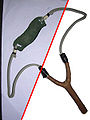
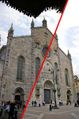 Removal of objects and colour improvement
 -
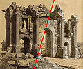 Image restoration
 -
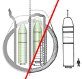 Vector graphics


For a better view of the capabilities of the Graphics Workshop, see examples of prior work.
Instructions
Requests for image improvement are placed on one of the available workshops. Once on that page, you may click the "request" link located besides the workshop link. Fill in the template and save the page. This will add the request to the chosen workshop. You may also visit the workshop page and follow the manual procedures. A Wikigraphist will sign up for the work, perform the requested actions, and, after approval, replace the original image with the improved one.
All help is welcome!
Requesting work
When requesting work to be done, please do so in the right place:
 Illustration workshop: Creation and editing of drawings, diagrams, and vector images.
 Map workshop: For creation and editing of maps and cartography work (translations, coloration from data, etc.)
 Photography workshop: For improvement of photographs, including restorations of historic material.
 Video and sound workshop: For converting and improving sound and video quality on Commons.
Wikigraphists
Graphists who volunteer to improve images (add your name):
- Often active: Alex:D (talk · contribs), Amada44 (talk · contribs), Orionist (talk · contribs), PawełMM (talk · contribs), Quibik (talk · contribs), Yjenith (talk · contribs), Grunpfnul (talk · contribs), Berkaysnklf (talk · contribs), CharlieTheCabbie (talk · contribs), Ananth subray (talk · contribs), Rickterto (talk · contribs), Marajozkee (talk · contribs), KCVelaga (talk · contribs), Tris T7 (talk · contribs), , Sushant Savla (talk · contribs), 大诺史 (talk · contribs), Path slopu (talk · contribs), Vulphere (talk · contribs), Bop34 (talk · contribs), nancystodd (talk · contribs), Turtle-bienhoa (talk · contribs), DigitalDasein (talk · contribs)
- Less active: Craigjwjr (talk · contribs), mikehadd12 (talk · contribs), Mycotic (talk · contribs), Alex T. (talk · contribs), Chech Explorer (talk · contribs), Editor at Large (talk · contribs), Greyskull (talk · contribs), Ivan Akira (talk · contribs), Jackl (talk · contribs), Jak (talk · contribs), JK+ontic (talk · contribs), Mmxx (talk · contribs), Morgan_Phoenix (talk · contribs), Officialwikiwriter (talk · contribs), Rohith goura (talk · contribs), Vanderdecken (talk · contribs), Nareign (talk · contribs), Gauravjuvekar (talk · contribs), Liriodendron777 (talk · contribs), Dimitri Hon (talk · contribs), philg88 (talk · contribs), Eitan96 (talk · contribs), Ivi104 (talk · contribs), Kwameghana (talk · contribs), Xerxes2k (talk · contribs), Tim D. Williamson (talk · contribs), Blue Sonic (talk · contribs), Lệ Xuân (talk · contribs) Sriveenkat (talk · contribs), Listz3 (talk · contribs), galejandro2007 (talk · contribs)
See also the list of Active Wikigraphists
Advice
- Wikigraphists :
Encouraged formats : PNG, GIF (animations only), SVG, Ogg Vorbis (.ogg), WebM VP8 (.WebM)
Transparent backgrounds;
Cleaned up images: upload over the original
Derivative works: should be uploaded to a new name.
- Wikiphotographers:
Photograph your objects on monochromatic backgrounds;
Share your pictures on Commons;
Propose important images to improve.
- Software (advice):
The GIMP, for JPG-GIF-PNG images;
The GIMP, for animations GIF;
Inkscape, for PNG-SVG images;
- Commons help, resources:
Software
These free software products have been labeled by the Wikigraphists of the Graphic Lab the "five stars" of editing and creation of images, illustrations, maps, photograph and animations:
| Logo | Name | Features | Operating System | Download | Example |
|---|---|---|---|---|---|
| Inkscape | Creator of SVG vector images. It can also be used to export PNG. | Linux; Windows; Mac OS X | inkscape.org |  | |
| GIMP | Similar to Photoshop, suite for image manipulation and creation of raster graphics, PNG, JPG, GIF, XCF). Can also be used to create animations when the GIMP Animation Package (GAP) is installed. | Linux; BSD; Solaris; Windows; Mac OS X | gimp.org | 
| |
| hugin | Stitch panorama images and correct perspective | Windows; Linux; BSD; Mac OS X; Other Unix Systems | hugin.sourceforge.net | ||
| Blender | Creation and editing of 3D images. | Windows; Linux x86/PPC; Solaris; Irix ; BSD; Mac OS X | blender.org | 
| |
| Dia | Create and edit diagrams and graphics that only require basic shapes. Supports exporting to vector (SVG) and various raster file formats. | Windows; Linux; Mac OS X | dia-installer.de | 
|
Links
 (ar): ورشة الصُور
 (bn): অঙ্কন ঘর
 (de): Grafikwerkstatt
 (en): Graphic Lab
 (es): Taller gráfico
 (fr): Atelier graphique
 (he): סדנה לגרפיקה
 (it): Laboratorio grafico
 (lb): Billeratelier
 (ru): Графическая мастерская
 (tr): Grafik Laboratuvarı
Templates used
- {{User Wikigraphist}} – userbox for Wikigraphists;
- {{Graphic Lab}} – promotion-box for requested images (configurable for local projects);
- You can see a complete list of all cleanup templates at Commons: Templates #Maintenance.
- {{Commons:Graphic Lab/Ad}} - Graphic Lab ad template.
On Wikipedia
- Wikimedia Commons: Upload page, place to share your images with Wikipedia (need to be logged in).
Communities of users with Graphics Abilities on Commons: