Commons:Quality images candidates/Archives August 2008
-

-

- Nomination Bulding of Opera in Oslo by night --Pudelek 22:01, 28 August 2008 (UTC)
- Promotion good --Mbdortmund 22:27, 28 August 2008 (UTC)
-

- Nomination Emerald Damselfly (Lestes sponsa) --LC-de 21:52, 28 August 2008 (UTC)
- Promotion Superb. TimVickers 04:22, 29 August 2008 (UTC)
-
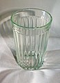
- Nomination Traditional russian (soviet) glass. #!George Shuklin 21:10, 28 August 2008 (UTC)
- Decline Most of the glass is out of focus. --Eusebius 21:18, 28 August 2008 (UTC)
-

- Nomination Macaroni with Cheese --Pedroserafin 20:02, 28 August 2008 (UTC)
- Decline Interesting, but image is below QI size requirement. TimVickers 20:19, 28 August 2008 (UTC)
-

- Nomination Chinon CP 9 AF, the last single-lens reflex camera of Chinon --Berthold Werner 16:04, 28 August 2008 (UTC)
- Promotion Passes requirements. TimVickers 20:52, 28 August 2008 (UTC)
-
-
-

-

-
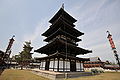
- Nomination pagoda in Kofukuji --Jn1 13:45, 28 August 2008 (UTC)
- Decline Overexposed. --Kosiarz-PL 18:46, 28 August 2008 (UTC)
-

- Nomination Common Hawker (Aeshna juncea) --LC-de 06:54, 28 August 2008 (UTC)
- Promotion Crisp, superb detail, nice composition. TimVickers 17:14, 28 August 2008 (UTC)
-

-

- Nomination Macro shot of a typical smartphone qwerty keyboard --Marcosleal 02:14, 28 August 2008 (UTC)
- Decline Too shallow DOF. #!George Shuklin 21:10, 28 August 2008 (UTC)
-
- Nomination Lake Sterzh (evening/sunset) --Ilya Voyager 20:55, 27 August 2008 (UTC)
- Decline Colors are fantastic, but very noisy. Stephanemartin 22:21, 28 August 2008 (UTC)
-

-

- Nomination Erodium ciconium Sardinia, Italy -- Lycaon 17:08, 27 August 2008 (UTC)
- Promotion Excellent detail, could do with a bit more DOF, but a quality image. TimVickers 16:36, 28 August 2008 (UTC)
-

- Nomination Revueflex 1000 S, propably manufactured by Chinon --Berthold Werner 15:17, 26 August 2008 (UTC)
- Promotion Passes requirements. TimVickers 20:50, 28 August 2008 (UTC)
-
- Nomination Meerkat on guard duty in a bush --VVHeavyVv 02:20, 25 August 2008 (UTC)
- Decline Very dark, subject a small part of the photo. TimVickers 20:48, 28 August 2008 (UTC)
-

- Nomination Ruins of a medieval church in front of Malin Beg in County Donegal, Ireland --AFBorchert 08:15, 24 August 2008 (UTC)
- Decline Overexposed, washed out highlights. Crapload 03:33, 29 August 2008 (UTC)
-

- Nomination Trinity Bridge, Saint Petersburg. #!George Shuklin 22:32, 23 August 2008 (UTC)
- Promotion Sharp with good framing of the reflections. Lights on the left are blown out, but I think that's unavoidable. TimVickers 20:47, 28 August 2008 (UTC)
-

- Nomination Office of the Governor of Illinois. --Dschwen 17:53, 22 August 2008 (UTC)
- Decline Too much flare from windows. TimVickers 16:38, 28 August 2008 (UTC)
-

- Nomination Hanomag 4/23 by Berthold Werner Mbdortmund
- Promotion Passes criteria. TimVickers 19:14, 28 August 2008 (UTC)
-
-

- Nomination Baveno, ship to the booromäen islands --Mbdortmund 23:05, 21 August 2008 (UTC)
- Promotion Nice composition, just a bit overexposed, but I think it passes the requirements. TimVickers 20:44, 28 August 2008 (UTC)
-

- Nomination dusk at river Niers --Tobi 87 20:39, 21 August 2008 (UTC)
- Decline To blurry, but the image is really cool, maybe you can nominate it to Featured Picture? --Leo Johannes 17:47, 28 August 2008 (UTC)
-

- Nomination Common Chuckwalla (Sauromalus ater) --TimVickers 17:33, 27 August 2008 (UTC)
- Decline Tail is cut-off, also the eyes are not center of focus. Sorry --Ianare 21:06, 27 August 2008 (UTC)
-

-

- Nomination A landmark of Hellabrunn Zoo in Munich: The old elephant house --High Contrast 14:51, 27 August 2008 (UTC)
- Decline Noticeable tilt, but I guess it can be corrected. -Eusebius 15:06, 27 August 2008 (UTC)
-

- Nomination Pastoriza, Arteixo, Arteixo, Provincia da Coruña, Galiza --Lmbuga 18:05, 26 August 2008 (UTC)
- Promotion It's ok. --Berthold Werner 15:26, 27 August 2008 (UTC)
-
- Nomination Chapelle Saint-Bruno, Chartreuse, France --Eusebius 06:22, 26 August 2008 (UTC)
- Promotion Nice composition, shows precisely why this church is unusual. TimVickers 17:37, 27 August 2008 (UTC)
-

- Nomination Stone wall Körnerbrötchen 20:26, 25 August 2008 (UTC)
- Promotion Passes quality requirements, for me an uninspiring subject, but I suppose it's encyclopedic. TimVickers 20:19, 27 August 2008 (UTC)
-

- Nomination Ffestiniog Railway locomotive Merddin Emrys in the rain. Mattbuck 22:00, 23 August 2008 (UTC)
 Comment I realise this is Wales, and thus a bit foggy :) but the photo still looks under-exposed to me. TimVickers 17:42, 27 August 2008 (UTC)
 - Decline Only ~1.3M pixels and that is too bad; the foggy day and the atmosphere are good and the presence of people in the image tells me that you did not use my dads method of getting a perfect photograph of a train which should be good. Sorry about the size. -- carol 19:50, 27 August 2008 (UTC)
- Nomination Ffestiniog Railway locomotive Merddin Emrys in the rain. Mattbuck 22:00, 23 August 2008 (UTC)
-

-

-
- Nomination ♀ flowers of Chamaerops humilis near el Perelló, Catalonia, Spain. — Lycaon 07:25, 21 August 2008 (UTC)
- Decline Leaf in the foreground blocks view of the flowers. TimVickers 22:50, 27 August 2008 (UTC)
-

- Nomination Mende (Lozere, France), the "Cathédrale Saint Privat" Stef48 19:52, 26 August 2008 (UTC)
- Decline bad perspective --Pudelek 11:06, 27 August 2008 (UTC)
-

- Nomination A Painted Lady butterfly collecting nectar from a Lantana camara flower -- Alvesgaspar 16:36, 26 August 2008 (UTC)
- Promotion Excellent sharpness for a macro shot, a bit of motion blur on one antenna, but it looks like a quality image to me. User:TimVickers 22:40, 26 August 2008 (UTC)
-
- Nomination Harbour in Hovedøya island, Oslo -Pudelek 11:41, 26 August 2008 (UTC)
- Promotion hypsch --Mbdortmund 12:36, 26 August 2008 (UTC)
-

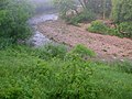
- Nomination Polluted creek --Specious 00:44, 25 August 2008 (UTC)
- Decline The composition makes it very hard to tell what the subject is. TimVickers 23:02, 26 August 2008 (UTC)
-

- Nomination A juvenile seagull -- Alvesgaspar 18:15, 24 August 2008 (UTC)
- Promotion Good focus, nice composition. A bit of a tight crop at the bottom, but still OK for me. TimVickers 16:42, 26 August 2008 (UTC)
-
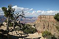
- Nomination Grand Canyon, as seen from Moran Pt at the south rim --AFBorchert 10:01, 24 August 2008 (UTC)
- Promotion Perhaps sharpness of the tree could be better but the light is very good. QI! --Berthold Werner 15:38, 26 August 2008 (UTC)
-

- Nomination A diesel locomotive at the Teifi Valley Railway. Mattbuck 21:57, 23 August 2008 (UTC)
- Decline Nice composition. However, this image has less than 2 megapixel which is one of the requirements. Besides, the red of the locomotive is somewhat noisy and I would expect an identification of the Diesel locomotive in the image's description if it is the main motive. --AFBorchert 20:01, 26 August 2008 (UTC)
-

- Nomination Kajakfahrer :-) --Böhringer 20:31, 23 August 2008 (UTC)
- Promotion It is a wellmade sequence even if it is somewhat spoiled because the kayaker had noted the photographer and sticked out his tongue ;) --AFBorchert 20:09, 26 August 2008 (UTC)
-

- Nomination Tunnel at S. Martinho do Porto, Portugal -- Alvesgaspar 16:08, 23 August 2008 (UTC)
- Decline Despite the nice composition, sharpness is just too far below the bar. Thegreenj 00:55, 27 August 2008 (UTC)
-

- Nomination Germany, Trier, Liebfrauen (Our lady, Notre Dame) --Berthold Werner 15:02, 23 August 2008 (UTC)
- Decline Tree blocks view of the church. TimVickers 23:05, 26 August 2008 (UTC)
-

- Nomination Phaseolus coccineus (flowers). --Kosiarz-PL 21:49, 22 August 2008 (UTC)
- Decline Sorry but the flowers are not well to be seen against the background, not sharp, and the image is quite noisy. --AFBorchert 20:22, 26 August 2008 (UTC)
-

- Nomination: Fallen leaves of Coccoloba uvifera, Seagrape at Le Gosier, Guadeloupe. — Lycaon 08:04, 21 August 2008 (UTC) CommentI Thought the picture was for the oomycete ? --B.navez 10:30, 21 August 2008 (UTC)
- Review needed
- Nomination: Fallen leaves of Coccoloba uvifera, Seagrape at Le Gosier, Guadeloupe. — Lycaon 08:04, 21 August 2008 (UTC)
-

- Nomination: school in Baveno, italy --Mbdortmund 00:09, 21 August 2008 (UTC)
- Review needed
-

-

- Nomination Reflections on the side of Ffestiniog Railway Double Fairlie Merddin Emrys. Mattbuck 16:11, 20 August 2008 (UTC)
- Promotion Good job, well shined. --B.navez 15:48, 26 August 2008 (UTC)
-

- Nomination Male Mouse Spider (Missulena occatoria) --Peripitus 04:43, 20 August 2008 (UTC)
- Decline A nice spider, nice to see in thumb size. But DOF is just not good enough, a larger F number could (and should) have been be used -- Alvesgaspar 08:06, 26 August 2008 (UTC)
I wish I could have - 200/sec with a 300mm lens handheld was the limit I could get to with no camera shake - tried flash but it looked poor.....must get a good tripod - Peripitus 05:33, 27 August 2008 (UTC)
-

-

-

-
- Nomination Notre Dame, in Clisson, France Stephanemartin 21:30, 25 August 2008 (UTC)
- Promotion rotated 1.03 degrees to the left, I hope, it is OK now, good picture --Mbdortmund 04:38, 26 August 2008 (UTC)
-

- Nomination A barge transporting scrap-steel on the Meuse at Maastricht (the Netherlands). -- MJJR 20:19, 25 August 2008 (UTC)
- Promotion good --Mbdortmund 21:35, 25 August 2008 (UTC)
-

- Nomination Silver-spotted Skipper. Ram-Man 23:39, 24 August 2008 (UTC)
- Promotion good --Mbdortmund 04:33, 26 August 2008 (UTC)
-
- Nomination street in Mergozzo, italy --Mbdortmund 20:14, 24 August 2008 (UTC)
- Promotion Beautiful composition and colours (maybe a bit oversaturated?). I'm willing to forgive the blown sky if the geometric distortion is corrected (the lines at right should be vertical)-- Alvesgaspar 23:11, 24 August 2008 (UTC)
better now? light was really difficult in the streets of Mergozzo) --Mbdortmund 21:43, 25 August 2008 (UTC) -- Better now, the composition really compesantes for the flaws. With a better exposure choice a larger DOF could also be achieved... -- Alvesgaspar 22:24, 25 August 2008 (UTC)
-

- Nomination Boletus edulis --Kosiarz-PL 19:14, 24 August 2008 (UTC)
- Decline For me too dark, some noise, too much elements out of DOF. --Lestath 20:35, 25 August 2008 (UTC)
-
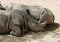
- Nomination Composition in grey: two White Rhinoceros sleeping -- Alvesgaspar 18:15, 24 August 2008 (UTC)
- Promotion Good one. --Lestath 20:36, 25 August 2008 (UTC)
-

- Nomination Germany, Trier, Porta Nigra, roman town gate, town side --Berthold Werner 15:16, 24 August 2008 (UTC)
- Promotion Good lighting with the sun coming from the south-west. But why was this shot at f/6.7? It could have been slightly more crisp. --AFBorchert 16:14, 24 August 2008 (UTC)
Yes. ;-) --Berthold Werner 17:15, 24 August 2008 (UTC) -- Nevertheless: good enough for QI. -- MJJR 20:26, 25 August 2008 (UTC)
-

- Nomination Baunachmarketplace by 12345678 Mbdortmund
- Decline Cropping : top of the pole is missing. BTW could you have asked their owners to move their cars ? --B.navez 19:07, 25 August 2008 (UTC)
-

-

-
- Nomination Morning mist on the Whitewater River in Minnesota. Jonathunder 17:21, 19 August 2008 (UTC)
- Decline Odd composition, most of subject (the mist and the river) only in top half of photo. --TimVickers 19:54, 25 August 2008 (UTC)
-

- Nomination Dortmund, germany, Propsteikirche, anteroom, door handle on glas door --Mbdortmund 15:13, 19 August 2008 (UTC)
- Promotion Good rendering of difficult balance between light and dark; nice composition. -- MJJR 20:36, 25 August 2008 (UTC)
-

- Nomination Formal photograph of a zebra -- Alvesgaspar 18:15, 24 August 2008 (UTC)
- Promotion good --Mbdortmund 23:04, 24 August 2008 (UTC)
But the poor thing has only three legs ;-). Lycaon 23:09, 24 August 2008 (UTC)
-

- Nomination Ischnura senegalensis (female) --Laitche 14:44, 24 August 2008 (UTC)
- Promotion nice --Mbdortmund 19:20, 24 August 2008 (UTC)
-

- Nomination The tomb of Vasco da Gama. Jerónimos Monastery, Lisbon -- Alvesgaspar 16:12, 23 August 2008 (UTC)
- Promotion professionell traveller? *g* --Mbdortmund 20:00, 23 August 2008 (UTC) -- Vasco da Gama or I?... Well, Lisboa is my home town! -- Alvesgaspar 18:25, 24 August 2008 (UTC)
-

-

- Nomination Stealth bomber flyover at American football game (First ever nom.). --Conman33 21:02, 18 August 2008 (UTC)
- Decline This is a cool photograph! You must have had the camera already out and almost ready for this image? It fails every single QI requirement but I am not going to decline it so it can stay on this page for a while. If there were a cool photograph review thing like this QI one, it should be one of the best.... -- carol 01:52, 19 August 2008 (UTC)
Flare, overexposure, main topic too small. Lycaon 15:08, 22 August 2008 (UTC)
It only passes the QI size requirements, but this is one of the few honestly cool images we see here. And difficult to get! Probably rarer than a lightning photograph. -- carol 08:22, 25 August 2008 (UTC)
-

- Nomination Late afternoon shadows --ShakataGaNai 04:28, 18 August 2008 (UTC)
- Promotion Good Q. Crapload 01:08, 25 August 2008 (UTC)
-
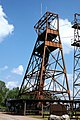
- Nomination Head frame from an Iron Ore mine --ShakataGaNai 01:15, 17 August 2008 (UTC)
- Decline I find the second tower on the right quite disturbing in the composition. --Eusebius 12:47, 24 August 2008 (UTC)
-

- Nomination Joe Biden's first speech after the announcement of his vice presidential candidacy. --Dschwen 22:59, 23 August 2008 (UTC)
- Promotion good quality, useful --Mbdortmund 01:09, 24 August 2008 (UTC)
-

- Nomination The two running mates. Freshly taken this morning. Stood in the sun for almost 6h and got the worst sunburn in a long time. --Dschwen 22:59, 23 August 2008 (UTC)
- Promotion good quality, useful --Mbdortmund 01:09, 24 August 2008 (UTC)
-

- Nomination The Eiffel Tower, view from below -- Alvesgaspar 16:32, 23 August 2008 (UTC)
- Promotion nice --Mbdortmund 19:58, 23 August 2008 (UTC)
-
-

- Nomination Germany, Dortmund, architecture of the 50ies, Gesundheitsamt --Mbdortmund 20:20, 19 August 2008 (UTC)
- Promotion Good composition and good lighting. --AFBorchert 09:36, 24 August 2008 (UTC)
-

- Nomination The former railway station of Westrozebeke (West Flanders, Belgium). -- MJJR 20:10, 18 August 2008 (UTC)
- Promotion Good composition. --AFBorchert 09:22, 24 August 2008 (UTC)
-

- Nomination Architecture in Amsterdam --Massimo Catarinella 00:27, 18 August 2008 (UTC)
- Decline Not good composition because of ground/stree out of frame and harder perspective distortion. -unsigned
-

- Nomination Dortmund, Liebfrauenkirche, doves on the church door --Mbdortmund 00:05, 17 August 2008 (UTC)
- Decline Not the best image quality. I can't exactly put my finger on it, it looks like the quality of a cheaper point-and-shoot, yet it comes from a D80. Don't know what happened here. Lycaon 18:21, 23 August 2008 (UTC)
-

- Nomination Ok, this might be getting ridiculous, but why downsample when the sharpness is so good. Here it is: a 117 Megapixel panoramic image of the Chicago skyline. (P.S.: I finally cleaned my sensor!) --Dschwen 22:52, 22 August 2008 (UTC)
- Promotion So, you went back to Chicago, maybe the best place in the world for shooting buildings! Remember when, a long time ago, I used to oppose your panos for some milimetric stitching errors? Well, i guess i became soft with age... BTW, how did you clean your sensor? -- Alvesgaspar 23:44, 22 August 2008 (UTC), Hm, I spent quite some time on this baby (needed to make extensive use of vertical guides), but I haven found any glitches so far. For cleaning the sensor I use the lint free kimwipes and methyl alcohol (don't use any other kind, it'll leave stains!), I wrapped the kimwipe around a piece of teflon, that is soft enough not to scratch the sensor and makes a nice handle to clean the sensor with one broad swipe. --Dschwen 00:14, 23 August 2008 (UTC)
Nothing ridiculous about this picture. Thanks for uploading this kind of quality images. Would you mind adding some info on how the image was constructed to the image's page? Lycaon 09:15, 23 August 2008 (UTC)
The neck strap must be taking the place of a tripod. Could it please be larger? -- carol 09:20, 24 August 2008 (UTC), The neck strap is aleady pretty large (it's one of the red cannon ones), or are you talking about my neck? Workout isn't doing it for me. --Dschwen 13:00, 25 August 2008 (UTC)
No, the image. Heh. Lets see how long to keep this beauty here, eh? -- carol 14:48, 25 August 2008 (UTC)
-

- Nomination Church in Swepsonville, NC --Specious 05:27, 23 August 2008 (UTC)
- Decline distorion -Pudelek 09:18, 23 August 2008 (UTC)
-

- Nomination Lincoln Herndon law offices in Springfield, Illinois. --Dschwen 17:53, 22 August 2008 (UTC)
- Promotion nice Mbdortmund
-

- Nomination High res shot of the Illinois state capitol. --Dschwen 17:53, 22 August 2008 (UTC)
- Promotion Excellent on all counts! -- MJJR 20:23, 22 August 2008 (UTC)
Nothing wrong with the image itself, but would you mind providing exif info, or otherwise some camera/stitching info? Lycaon 09:15, 23 August 2008 (UTC)
-
-

-

- Nomination Ffestiniog Railway Double Fairlie Earl of Merioneth. Mattbuck 00:03, 20 August 2008 (UTC)
- Decline It's a compositional mistake that the right side of the locomotive is cut off. Another mistake is tat the mountains in the background align with the roof. --Ikiwaner 10:36, 23 August 2008 (UTC)
-

- Nomination Ffestiniog Railway Double Fairlie Earl of Merioneth. Mattbuck 00:03, 20 August 2008 (UTC)
- Promotion Just some hair missing. Other qualities fulfilled. --B.navez 15:03, 22 August 2008 (UTC)
-

- Nomination Vitra Design Museum by Advaitk --Mbdortmund 23:07, 19 August 2008 (UTC)
- Decline Comment Perspective correction — are the walls tilted in fact? --Sfu 12:38, 22 August 2008 (UTC)
 Oppose A great building and careful composition. Colour aberrations visible at thumbnail size spoil the image. --Ikiwaner 10:43, 23 August 2008 (UTC)
-

- Nomination The Cabel Car at Teide by Skistar --Mbdortmund 23:07, 19 August 2008 (UTC)
- Promotion Good enough. Lycaon 15:07, 22 August 2008 (UTC)
-

- Nomination Ffestiniog Railway Double Fairlie David Lloyd George. Mattbuck 22:15, 19 August 2008 (UTC)
- Decline Steam locomotives are hard to photograph. But here the locomotive is underexposed so that we miss the details of the main subject. --Ikiwaner 10:43, 23 August 2008 (UTC)
-

- Nomination A Superleague Formula car on display. Mattbuck 17:17, 17 August 2008 (UTC)
- Decline Crop spoils it, Sorry. Lycaon 15:09, 22 August 2008 (UTC)
-

-

-

-

-

-

- Nomination Chevrolet Fleetline from 1948 --Berthold Werner 17:47, 21 August 2008 (UTC)
- Promotion Looks like it was alive. --B.navez 03:02, 22 August 2008 (UTC)
-

- Nomination Strap on musketeer, France, 1640 --Thesupermat 19:41, 20 August 2008 (UTC)
- Decline it's cut-off --Ianare 00:59, 22 August 2008 (UTC)
-

- Nomination Wien, «Schönbrunner Palmenhaus» by böhringer friedrich --Mbdortmund 20:59, 15 August 2008 (UTC)
- Decline I really like this image, but what are these strange artifacts around all edges (best visible at the border between the trees and the sky). Compression or sharpening artifacts? --Chmehl 22:36, 16 August 2008 (UTC)
Sorry, cannot support this with that many artifacts. Leider zu viele störende Artefakte im Bild sichtbar. Chmehl 18:37, 21 August 2008 (UTC)
-

- Nomination Portrait of a zebra -- Alvesgaspar 19:42, 15 August 2008 (UTC)
- Promotion Good portrait.--B.navez 02:35, 22 August 2008 (UTC)
-
-

-

-

-

-
- Nomination Male mallard photographed in one of Saint-Petersburg's parks. --ViseMoD 18:40, 20 August 2008 (UTC)
- Promotion Wonderful image. I really love the colours of this picture. Compliments to the author.--Alessandro Zangrilli 11:57, 21 August 2008 (UTC)
-

- Nomination Eagle by sporadic contributor Pixelk. Nom by Lycaon 17:48, 20 August 2008 (UTC)
- Promotion nice portrait --Mbdortmund 18:21, 20 August 2008 (UTC)
-

- Nomination Two raspberries --Sfu 15:35, 20 August 2008 (UTC)
- Promotion Lovely image. Nice use of depth of field to highlight the ripe and unripe berries for comparison. --Jonathunder 17:07, 20 August 2008 (UTC)
-

- Nomination Ffestiniog Railway Double Fairlie David Lloyd George. Mattbuck 22:23, 19 August 2008 (UTC)
- Promotion Nice composition and sharp. --Sfu 09:30, 20 August 2008 (UTC)
Comment Unfortunatlly the valve gear is hidden by a garden fence --Berthold Werner 07:31, 21 August 2008 (UTC)
-
-

- Nomination Johann Strauß (son) memorial by Edmund Hellmer, 1921, Wien by böhringer friedrich --Mbdortmund 22:17, 15 August 2008 (UTC)
- Promotion Good enough. Crapload 03:23, 21 August 2008 (UTC)
-

- Nomination A portrait of a seagull taken at the Island of Pessegueiro, Porto Covo, Portugal -- Alvesgaspar 17:04, 15 August 2008 (UTC)
- Decline Why this akward cropping ? this one of yours was far much better (for me a FP) --B.navez 16:56, 20 August 2008 (UTC)
-

- Nomination View from the Island of Pessegueiro, Porto Covo, Portugal -- Alvesgaspar 17:04, 15 August 2008 (UTC)
- Promotion Nice composition, atmosphere & light, but two dust spots at the upper right corner. -- MJJR 20:10, 16 August 2008 (UTC) *
 Done Thank you, fixed -- Alvesgaspar 22:32, 16 August 2008 (UTC) -- O.K. for promotion now. -- MJJR 18:33, 20 August 2008 (UTC)
-

- Nomination Another picture of mine of a plane in flight, this time a Piper Grasshopper. Airwolf 13:08, 15 August 2008 (UTC)
- Promotion Technically is good. To obtain better composition in a frame next time put more free space in front of motion direction (in this one it should be more sky on the right side).--Kosiarz-PL 18:28, 20 August 2008 (UTC)
-

- Nomination Sternbergia clusiana, Negev, Israel. Gidip 12:36, 15 August 2008 (UTC)
- Promotion Lovely light. Arria Belli 18:53, 20 August 2008 (UTC)
-
-

-
-

- Nomination green wine grape by Martin Kozák --Mbdortmund 23:07, 19 August 2008 (UTC)
- Promotion Good quality. Barabas 00:09, 20 August 2008 (UTC)
-

- Nomination Germany, Trier, Church Sankt Paulin, ceiling fresko, crucifixion (new photographed version) --Berthold Werner 19:27, 19 August 2008 (UTC)
- Promotion good details --Mbdortmund 20:21, 19 August 2008 (UTC)
-

-

- Nomination Drill scheme. --Kosiarz-PL 18:36, 19 August 2008 (UTC)
- Promotion good job! Ianare 00:27, 20 August 2008 (UTC)
-
- Nomination Dortmund, germany, Propsteikirche, door handle on glas door --Mbdortmund 15:13, 19 August 2008 (UTC)
- Promotion Nicely done. A little more sharpness on the left would have meant perfection. QI as it is. Lycaon 22:25, 19 August 2008 (UTC)
-

- Nomination Heliopsis helianthoides in Poland. --Kosiarz-PL 18:00, 18 August 2008 (UTC)
- Decline Unsharp. --Lestath 17:35, 19 August 2008 (UTC)
-

- Nomination View at Gulf of Finland from Krestovskiy Island, Saint-Petersburg. -- Lvova 15:51, 18 August 2008 (UTC)
- Decline Over- and underexposed. --Lestath 17:36, 19 August 2008 (UTC)
-

- Nomination Picture taken of the "Natural Arch" on the northeast coast of Newfoundland. --NeonFire 15:08, 18 August 2008 (UTC)
- Decline Out of focus --Massimo Catarinella 12:44, 19 August 2008 (UTC)
-

- Nomination Office building in Dortmund --Mbdortmund 21:07, 17 August 2008 (UTC)
- Promotion Nice pic. --Sfu 12:56, 19 August 2008 (UTC)
-

- Nomination Waves breaking at Porto Covo, west coast of Portugal -- Alvesgaspar 18:46, 17 August 2008 (UTC)
- Promotion good quality --Mbdortmund 20:22, 19 August 2008 (UTC)
-

- Nomination Germany, Dortmund, Liebfrauenkirche, church door --Mbdortmund 11:37, 17 August 2008 (UTC)
- Promotion Good quality and interesting object. --Lestath 17:38, 19 August 2008 (UTC)
-

- Nomination Germany, Trier, St. Paulin, crypt --Berthold Werner 06:43, 17 August 2008 (UTC)
- Decline head of the main figure lacking contrast and sharpnes --Mbdortmund 20:24, 19 August 2008 (UTC)
-

-

- Nomination diagram of the giardia parasit life cycle- -LadyofHats 20:16, 15 August 2008 (UTC)
- Promotion Fine work --Berthold Werner 10:05, 20 August 2008 (UTC)
-

- Nomination Straightening a Fender --Specious 04:15, 15 August 2008 (UTC)
- Decline Poor composition. --Kosiarz-PL 10:21, 20 August 2008 (UTC)
-

- Nomination Astronomy sculpture in Ogród Saski, Warsaw, Poland. --Sfu 20:28, 14 August 2008 (UTC)
- Promotion OK. --Berthold Werner 09:12, 20 August 2008 (UTC)
-

- Nomination: Canada goose (Branta canadensis). Thegreenj 01:55, 14 August 2008 (UTC)
- Review needed
-

- Nomination: Canada goose (Branta canadensis). Thegreenj 01:55, 14 August 2008 (UTC)
- Review needed
-

- Nomination: Shrine in Ciechomin, Lublin Voivodeship, Poland. --Sfu 18:20, 13 August 2008 (UTC))
- Review needed
-

-
-

- Nomination Kodak DX 6490 --Berthold Werner 14:03, 11 August 2008 (UTC)
- Promotion Technically very well done. Barabas 23:11, 19 August 2008 (UTC)
-

-

-

- Nomination Neogothic stained glass window in Meaux Cathedral Vassil 21:40, 17 August 2008 (UTC)
- Promotion Very good --Berthold Werner 15:05, 18 August 2008 (UTC)
-

- Nomination Neogothic stained glass window in Meaux Cathedral. Vassil 21:25, 17 August 2008 (UTC)
- Promotion Very good --Berthold Werner 15:05, 18 August 2008 (UTC)
-

- Nomination: Jotunheimen moutains, Norway --Pudelek 11:37, 13 August 2008 (UTC)
- Review needed
-

- Nomination: Tourist in Jotunheimen mountain, Norway --Pudelek 11:37, 13 August 2008 (UTC)
- Review needed
-

- Nomination: A Leica M3 with Summicron 50mm lense -- Rama 08:04, 13 August 2008 (UTC)
- Review needed
-

- Nomination Gary Sinise on stage. --Dschwen 03:24, 18 August 2008 (UTC)
- Promotion Good quality --Massimo Catarinella 10:54, 18 August 2008 (UTC)
-

- Nomination Aggressive Hippos --Peripitus 02:37, 18 August 2008 (UTC)
- Promotion süß --Mbdortmund 12:07, 18 August 2008 (UTC)
-

- Nomination Portrait of a giraffe -- Alvesgaspar 19:42, 15 August 2008 (UTC)
- Promotion A little underexposed, but solid quality otherwise. Thegreenj 16:54, 17 August 2008 (UTC)
-

-

-

-

- Nomination male Broad-bodied Chaser. --Merops 21:29, 16 August 2008 (UTC)
- Decline Good composition but terrible quality. What is the cause of all these artifacts? -- Alvesgaspar 21:56, 16 August 2008 (UTC)
-

- Nomination A woman taking a photograph of Elliott Bay, Seattle Washington. --Rootology 15:59, 16 August 2008 (UTC)
- Decline Very poor image quality, with disturbing noise. Also, this photo is hardly an example of a large depth of field, as stated in the pic file -- Alvesgaspar 22:00, 16 August 2008 (UTC)
-

-

-

- Nomination Two pigs resting -- Alvesgaspar 19:42, 15 August 2008 (UTC)
- Promotion Sweet --Sfu 18:16, 16 August 2008 (UTC)
-

-

- Nomination Libelloides macaronius), Istrien by Sebaho --Mbdortmund 22:28, 15 August 2008 (UTC)
- Promotion Gorgeous creature! Good enough for QI despite the hand being a bit distracting -- Alvesgaspar 22:53, 15 August 2008 (UTC)
-

- Nomination Ile Louët, Chateau du Taureau by Thesupermat --Mbdortmund 23:12, 15 August 2008 (UTC)
- Promotion Superb composition. The wave draws into Ile Louët, while the château in the backgound balances the picture nicely. Thegreenj 01:05, 16 August 2008 (UTC)
-

- Nomination Münnerstadt, Marktplatz 2, by Andreas Praefcke --Mbdortmund 21:12, 15 August 2008 (UTC)
- Decline Good light and illustrative image. From a photographical point I don't like the roof of the building on the right leaning into the image. That pillar on the right corner is suboptimal too (watch the corners!). From an architectural point of view it's a pity they put this plastic Lusso flag and sign in such a beautiful house. --Ikiwaner 05:54, 16 August 2008 (UTC)
-

- Nomination diagram made for the Greenspun illustration project- -LadyofHats 20:16, 15 August 2008 (UTC)
- Promotion Highly useful, I learned some things just from this wonderful diagram--now how about one with US Spellings ;-) Bastique 01:50, 16 August 2008 (UTC)
-
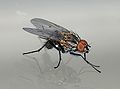
- Nomination A male fly of the Anthomyiidae family at my window (cf. Anthomyiia sp.) -- Alvesgaspar 15:15, 15 August 2008 (UTC)
- Promotion good --Mbdortmund 00:06, 16 August 2008 (UTC)
-

-

- Nomination A male Sympetrum striolatum (thanks to review ;-))-- Pierre.loustau 04:20, 15 August 2008 (UTC)
- Decline Lack of detail, marginal focus, too much noise -- Alvesgaspar 14:41, 15 August 2008 (UTC)
-

-

- Nomination Portrait of a small Jumping Spider (Salticidae family) -- Alvesgaspar 23:27, 12 August 2008 (UTC)
- Decline Could be very nice. But I think DOF is too shallow here. Eyes are not sharp. --Sfu 17:47, 15 August 2008 (UTC)
-

- Nomination Lake Piaseczno (Wda Landscape Park) --Kosiarz-PL 13:04, 12 August 2008 (UTC)
- Decline Blury left side. --Lestath 22:56, 15 August 2008 (UTC)
-

-

- Nomination: Sympetrum striolatum, De Haan, Belgium. -- Lycaon 21:29, 9 August 2008 (UTC)
- Review needed
-

- Nomination: Germany, Bamberg, Madonna at the Hotel Brudermühle --Berthold Werner 13:09, 9 August 2008 (UTC)
- Review needed
-

- Nomination: evening in Baveno near Stresa at the Lago Maggiore --Mbdortmund 12:40, 9 August 2008 (UTC)
- Review needed
-

- Nomination Seweryn Goszczyński tomb on Lyczakowski necropolis in Lviv. --Lestath 19:07, 8 August 2008 (UTC)
- Decline overexposed, tic nosy and very few color aberrations-LadyofHats 22:19, 15 August 2008 (UTC)
-

- Nomination Young snake in water --J-Luc 09:15, 8 August 2008 (UTC)
- Promotion *weak
 Support- much of the image is out of focus, and it is a bit noisy but the composition is really interesting so i would like a second opinion on this one-LadyofHats 22:19, 15 August 2008 (UTC) See it just like you and thought about promoting it. Should be good enough. --Mbdortmund 00:20, 16 August 2008 (UTC)
-

- Nomination Organ of St. Paulin, Trier, Germany (New photographed) --Berthold Werner 18:26, 14 August 2008 (UTC)
- Promotion Most of the time, photographing organs is not easy at all. Or they stand on dark places, or tey are in a contre-jour situation, as is the case here. This explains why some of the windows are blown white (which is almost inevitable). But the light on the main subject is well balanced, and sharpness and composition are O.K. So, for me this is a QI. -- MJJR 18:59, 14 August 2008 (UTC)
-

-
- Nomination pier in Baveno, Lago Maggiore --Mbdortmund 15:26, 14 August 2008 (UTC)
- Promotion very good composition: The portal leads into the image and titles it. Inside the portal I find that village. Good job! --Ikiwaner 19:51, 14 August 2008 (UTC)
-

- Nomination Two cinnamon rolls. --Martin NH 12:40, 14 August 2008 (UTC)
- Decline How good you took a white background to isolate the subject! However the lighting is bad. We see two harsh shadows and reflections of the flash on the rolls. A polystyrene plate on the side as a diffusor would have helped here. I recommend to read a tutorial like this one --Ikiwaner 19:59, 14 August 2008 (UTC) OpposeI do not agree with DOF here. Barabas 23:30, 14 August 2008 (UTC)
-
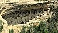
- Nomination Cliff Palace, Mesa Verde NP, Colorado --Tobi 87 09:34, 14 August 2008 (UTC)
- Promotion nice --Mbdortmund 15:31, 14 August 2008 (UTC)
-

- Nomination dusk at Riederalp, Switzerland --Tobi 87 09:34, 14 August 2008 (UTC)
- Promotion nice postcard --Mbdortmund 15:30, 14 August 2008 (UTC)
-

- Nomination Adult seagull in flight (Larus michaellis) -- Alvesgaspar 23:13, 13 August 2008 (UTC)
- Decline Same detail problem here. Thegreenj 01:24, 15 August 2008 (UTC)
-

- Nomination A male Flesh-fly (Sarcophaga sp.) -- Alvesgaspar 23:13, 13 August 2008 (UTC)
- Promotion good details, sharp --Mbdortmund 16:50, 14 August 2008 (UTC)
-

- Nomination Wall detail of Pisa Cathedral, Italy --Lucarelli 23:08, 13 August 2008 (UTC)
- Promotion Would you like to try to make it a little darker and invest a little more econtrast? I like the idea, but I think it looks a little bit faded. --Mbdortmund 16:49, 14 August 2008 (UTC)I hope it's better now --Lucarelli 20:06, 14 August 2008 (UTC)
yes --Mbdortmund 20:57, 14 August 2008 (UTC)
-

- Nomination A Sand Wasp or Digger Wasp (Bembix rostrata) -- Alvesgaspar 23:27, 12 August 2008 (UTC)
- Promotion Nice photo. Meets QI requirements! Bidgee 00:23, 15 August 2008 (UTC)
-

- Nomination Blaenau Ffestiniog railway station in Wales. Mattbuck 16:52, 12 August 2008 (UTC)
- Promotion There's a bit too much sky and a bit too little station, but other than that, good quality. Thegreenj 01:25, 15 August 2008 (UTC)
-

- Nomination ET22-857 electric locomotive. Sir Iwan 11:01, 11 August 2008 (UTC)
- Decline Blue snow and chromatic aberration. --Kosiarz-PL 14:01, 14 August 2008 (UTC)
-

-

- Nomination Heliopsis helianthoides in Poland. --Kosiarz-PL 09:29, 10 August 2008 (UTC)
- Decline Has potential, but the center is sadly out of focus. –Dilaudid 22:17, 14 August 2008 (UTC)
-

-
- Nomination: Street in Bergen city, Norway --Pudelek 09:52, 9 August 2008 (UTC)
- Review needed
-

-

-

- Nomination Chicken Kebabs --ShakataGaNai 18:39, 7 August 2008 (UTC)
- Decline unclear composition, shallow DOF --LC-de 18:13, 14 August 2008 (UTC)
-

-

- Nomination Bombus hortorum by Bartiebert --Adamantios 13:28, 7 August 2008 (UTC)
- Promotion Nice!!! -- Barabas 23:38, 14 August 2008 (UTC)
-

- Nomination Panorama of the Valley of the Kings. Nikola Smolenski 15:20, 3 August 2008 (UTC)
What's that in the upper right corner? Looks like a rectangle with a different brightness as the sky. Also a small black vertical line is visible at the border of this rectangle. --Chmehl 08:17, 10 August 2008 (UTC)
An artifact of the merging process, apparently caused by my incompetence. I culd remove it if the image is otherwise OK. Nikola Smolenski 18:44, 11 August 2008 (UTC) - Decline Good try, but seems to be overexposed on the left. -- Barabas 23:34, 14 August 2008 (UTC)
- Nomination Panorama of the Valley of the Kings. Nikola Smolenski 15:20, 3 August 2008 (UTC)
-
- Nomination Portrait of a gull (Larus michaellis) -- Alvesgaspar 23:13, 13 August 2008 (UTC)
- Decline Absolutely gorgeous composition, but absolutely no detail. Thegreenj 01:49, 14 August 2008 (UTC)
-

- Nomination Immaculate Conception in Santiago, Chile. Jorgebarrios 21:58, 13 August 2008 (UTC)
- Decline Not the best perspective. --Lestath 23:18, 13 August 2008 (UTC)
-

- Nomination Turku Science Park main building (renomination, left unassessed). –Dilaudid 07:19, 4 August 2008 (UTC)
- Promotion Suffient quality --Massimo Catarinella 10:35, 14 August 2008 (UTC)
-

- Nomination Lake Maggiore (Italy), Stresa, roses, evening --Mbdortmund 19:28, 13 August 2008 (UTC)
- Decline Underexposed, mostly unsharp --Massimo Catarinella 10:36, 14 August 2008 (UTC)
-
- Nomination valley of the Rhone, Switzerland --Tobi 87 18:54, 13 August 2008 (UTC)
- Promotion nice --Mbdortmund 19:29, 13 August 2008 (UTC)
-

- Nomination Reflections in the water of Bristol Harbour. Mattbuck 15:50, 13 August 2008 (UTC)
- Decline Underexposed, mostly unsharp and too much noise --Massimo Catarinella 10:39, 14 August 2008 (UTC)
-

- Nomination A Leica M3 with Summicron 50mm lense -- Rama 08:04, 13 August 2008 (UTC)
- Promotion for me the best one --Mbdortmund 14:34, 13 August 2008 (UTC)
-

- Nomination A Garden Spider (Araneus diadamatus) -- Alvesgaspar 23:27, 12 August 2008 (UTC)
- Promotion nice --Mbdortmund 14:35, 13 August 2008 (UTC)
-

-

- Nomination EU07-081 electric locomotive. Sir Iwan 11:01, 11 August 2008 (UTC)
- Promotion clipping could be a little bit lower, but interesting object, technically OK --Mbdortmund 19:17, 13 August 2008 (UTC)
-

- Nomination Church of the Santuario della Madonna delle Grazie, Livorno, Italy --Lucarelli 23:23, 10 August 2008 (UTC)
- Decline Unsharp and nasty lens flares --Massimo Catarinella 10:42, 14 August 2008 (UTC)
-

- Nomination Smilax aspera, El Perelló, Spain. -- Lycaon 18:40, 10 August 2008 (UTC)
- Promotion Technically there is nothing wrong with it. --Massimo Catarinella 10:43, 14 August 2008 (UTC)
-

- Nomination WD VelociRaptor Hard drive. --ShakataGaNai 06:48, 10 August 2008 (UTC)
- Promotion Nice image. Leo Johannes 15:12, 13 August 2008 (UTC)
-

- Nomination Jeszywa Talmud Tora in Vilnius. --Lestath 19:07, 8 August 2008 (UTC)
- Decline Tilted and the foreground is very distracting --Massimo Catarinella 10:49, 14 August 2008 (UTC)
-
-

- Nomination Trier Cathedral --Berthold Werner 14:04, 7 August 2008 (UTC)
- Decline Out of focus, people in the lower right corner are very present --Massimo Catarinella 10:45, 14 August 2008 (UTC)
-

- Nomination Germany, Mainbernheim, Unteres Tor by Dr. Volkmar Rudolf --Berthold Werner 13:00, 5 August 2008 (UTC)
- Decline The building is obviously tilted. Barabas 18:23, 13 August 2008 (UTC)
-
- Nomination A Garden Spider (Araneus diadamatus) -- Alvesgaspar 23:27, 12 August 2008 (UTC)
- Promotion super --Pudelek 10:44, 13 August 2008 (UTC)
-
-
- Nomination Sculpture: "Man, condemn War" (1932) by Fritz Wotruba --Tsui 09:05, 12 August 2008 (UTC)
- Decline cropped, poor compisition -Pudelek 09:17, 12 August 2008 (UTC) )
I do not think those are good enough reasons for rejection here. I do not like that the contrast is too high here, though. Barabas 21:03, 12 August 2008 (UTC)
-

-
- Nomination Säntis view from a small village --Ikiwaner 05:48, 8 August 2008 (UTC)
- Promotion good composition --Mbdortmund 22:02, 12 August 2008 (UTC)
-
-

-

-

-

-

-

- Nomination coats of arm of Schwerte, germany, on a panel of Schwertes partners in the former «Hanse» --Mbdortmund 11:42, 10 August 2008 (UTC)
- Promotion That's a precise capture of this COA specially for contrast and crop. --Ikiwaner 20:02, 11 August 2008 (UTC)
-

- Nomination Ensis ensis, Baix Ebre, Spain. -- Lycaon 21:29, 9 August 2008 (UTC)
- Promotion sharp, good details --Mbdortmund 22:53, 11 August 2008 (UTC)
-

- Nomination Equus quagga burchellii, Etosha, Namibia. -- Lycaon 21:29, 9 August 2008 (UTC)
- Promotion nice --Mbdortmund 21:41, 11 August 2008 (UTC)
-

-

-

- Nomination: Salt crystals. Mschel 02:03, 6 August 2008 (UTC)
Comment:I understand how hard to make such zoom, but those cristals most out of focus. If your equipment could not make enough DOF, may be better to change composition (put them in row)? #!George Shuklin 05:11, 6 August 2008 (UTC) - Review needed
- Nomination: Salt crystals. Mschel 02:03, 6 August 2008 (UTC)
-

-
-

- Nomination Italy, Lago di Mergozzo, rowing boats, motorboats forbidden --Mbdortmund 18:46, 6 August 2008 (UTC)
- Promotion nice composition --Pudelek 21:15, 10 August 2008 (UTC)
-
-

- Nomination Monarch butterfly wing closeup. Ram-Man 01:57, 10 August 2008 (UTC)
- Promotion I don't really like the way you have cropped the image but it's still interesting --Mbdortmund 12:09, 10 August 2008 (UTC)
-

-

-
-

- Nomination Lake Maggiore (Italy), Stresa, villa in the hills above the lake, evening --Mbdortmund 23:17, 7 August 2008 (UTC)
- Promotion very nice -Pudelek 12:33, 9 August 2008 (UTC)
-

- Nomination Monte Mottarone between Lago Maggiore and Ortasee, near Stresa --Mbdortmund 00:23, 7 August 2008 (UTC)
- Decline Overexposed shirt. –Dilaudid 22:57, 9 August 2008 (UTC)
I accept your judgement, but if you take a second look, you may see, that a darker version would turn the white shirt into a grey one, isn't it? --Mbdortmund 11:47, 10 August 2008 (UTC)
-

- Nomination House gecko (Hemidactylus mabouia). Dominica, W.I. -- Lycaon 11:56, 4 August 2008 (UTC)
- Promotion I would recommend cropping, perhaps to 6:4 --Bdesham 16:37, 4 August 2008 (UTC) Comment I wouldn't, but I'd like to see the vignette weakened. –Dilaudid 19:39, 4 August 2008 (UTC) Done. Lycaon 13:33, 6 August 2008 (UTC)
A decent shot. --Bdesham 14:33, 9 August 2008 (UTC)
-

- Nomination: Podarcis muralis. Bergerac, France. -- Lycaon 11:54, 4 August 2008 (UTC)
- Review needed
-
- Nomination: Turku Science Park main building. –Dilaudid 07:19, 4 August 2008 (UTC)
- Review needed
-

-
-

-

- Nomination: Stalks and ears of maize (corn) --Jonathunder 16:12, 3 August 2008 (UTC)
- Review needed
-

- Nomination Schloss Burgk near Dresden. --Kolossos 20:57, 30 July 2008 (UTC)
- Promotion Comment The sky looks too red to me. –Dilaudid 06:06, 4 August 2008 (UTC)
We had Sahara dust these days in Germany, so I belive this is the reason. I could remove it but the light was so. --Kolossos 15:22, 4 August 2008 (UTC) Fascinating! Perhaps this could be mentioned in the description as it isn't obvious from just looking at the image and adds value? –Dilaudid 19:43, 4 August 2008 (UTC)
done --Mbdortmund 12:36, 9 August 2008 (UTC)
-

-

-

-

-

-

- Nomination Coenagrion puella by User:Merops, Körnerbrötchen 17:51, 7 August 2008 (UTC)
- Decline Sorry, but the background has a lot of chromatic noise and the subject has been excessively sharpened. --Bdesham 19:52, 7 August 2008 (UTC), Yes, you're right. Strange, I didn't see that. Körnerbrötchen 19:55, 7 August 2008 (UTC)
-

-

-

- Nomination Old fashioned signpost in Ogden, Illinois. --Dschwen 00:47, 4 August 2008 (UTC)
- Promotion Comment The sky looks overly dark? –Dilaudid 19:29, 4 August 2008 (UTC) I like the composition and DOF play. The sky is dark because it was shot with a polarizer I guess. --Ikiwaner 17:45, 7 August 2008 (UTC)
-

-

- Nomination Facade minimalism --Ikiwaner 06:01, 6 August 2008 (UTC)
- Promotion interesting --Mbdortmund 22:44, 6 August 2008 (UTC)
-

- Nomination Coronation of the Virgin by Giorgio Vasari, Altarpiece in the Church Santa Caterina, Livorno, Italy --Lucarelli 23:55, 5 August 2008 (UTC)
- Promotion technically good --Mbdortmund 11:58, 7 August 2008 (UTC)
-

-

- Nomination Greater Dodder (Cuscuta europaea) a parasite, close to Visp, Wallis, Switzerland. -- Lycaon 11:32, 2 August 2008 (UTC)
- Promotion QI, probably they all are. One at a time into the QI Gallery though.... -- carol 08:53, 7 August 2008 (UTC)
-

-
- Nomination: Mengusovská dolina, High Tatras, Slovakia --Sfu 13:48, 31 July 2008 (UTC)
- Review needed
-

-

- Nomination Banded Demoiselle (Calopteryx splendens), Female --LC-de 21:56, 5 August 2008 (UTC)
- Promotion nice one --Mbdortmund 00:20, 6 August 2008 (UTC)
-

- Nomination Anton and Wanda Gag House in New Ulm, Minnesota. Jonathunder 01:38, 5 August 2008 (UTC)
- Promotion I like it. --Kolossos 11:13, 6 August 2008 (UTC)
-

-

-

- Nomination Nephila clavipes versus Apis mellifera --Ianare 05:01, 4 August 2008 (UTC)
- Promotion impressing --Mbdortmund 00:23, 6 August 2008 (UTC)
-
- Nomination Grain elevators and watertower. Perspective corrected with hugin. --Dschwen 01:21, 4 August 2008 (UTC)
- Promotion Then why is everything leaning to the right? Lycaon 06:59, 4 August 2008 (UTC), Maybe because you have a kink in your pupil? ;-) Seriously, the perspective is slightly undercorrected (100% looks too artificial IMO). Everything in th right half of the frame is slightly leaning left. --Dschwen 18:33, 4 August 2008 (UTC)Good exposure and composition. The perspective correction is very good because the total amount is not too high (I guess below 18°) and not overcorrected (leave 1-2°) --Ikiwaner 06:04, 6 August 2008 (UTC)
-

- Nomination: Lemur catta at Skansen. --Leo Johannes 11:20, 31 July 2008 (UTC)
- Review needed
-

- Nomination: Angarnsjöängen at night, spring 2008. --Leo Johannes 11:20, 31 July 2008 (UTC)
- Review needed
-

- Nomination Centaurea jacea (brown knapweed). –Dilaudid 12:37, 30 July 2008 (UTC)
- Promotion good composition, nice colours --Mbdortmund 13:43, 5 August 2008 (UTC)
-

- Nomination: Kapellbrücke, Luzern, CH --Thisisbossi 11:24, 29 July 2008 (UTC)
- Review Nice light, but the tower looks slightly tilted. --Dschwen 13:09, 29 July 2008 (UTC)
Agreed, but when I rotated it a degree & then tried another degree, it really didn't look right... the water is level in this version. In looking at other images, I think the tower itself is tilted -- a lesson learned from building towers in the middle of a river, I suppose? --Thisisbossi 01:58, 30 July 2008 (UTC) No It's not. The image is leaned 0.6° to the left and has a perspective distortion of 6°. How to measure? Open the image in Hugin and set many vertical control points. Then optimize and you get the angles. Is the tower specially tilted? No, not measurable. The control points on the tower have about the same error as the others. --Ikiwaner 18:56, 30 July 2008 (UTC)
It's like you're speaking a different language! I tried figuring out Hugin, but I couldn't even figure out what to download from the website. :P --Thisisbossi 22:45, 30 July 2008 (UTC)
-

- Nomination A small building at Brinkhall Manor, Turku. –Dilaudid 19:14, 4 August 2008 (UTC)
- Promotion good --Mbdortmund 23:06, 4 August 2008 (UTC)
-

- Nomination Echinops sphaerocephalus with bumblebee. --Adamantios 16:38, 4 August 2008 (UTC)
- Promotion Sufficient DOF, and the noise doesn't ruin it. –Dilaudid 19:33, 4 August 2008 (UTC)
-

- Nomination Fountain. Jardin Darcy, Dijon. Arria Belli 14:03, 4 August 2008 (UTC)
- Decline The fountain is cut off at the right side of the image. --Bdesham 16:37, 4 August 2008 (UTC)
-

- Nomination Tea steeping. Lipton's, as I recall. Arria Belli 14:03, 4 August 2008 (UTC)
- Decline Not of a commoner. Körnerbrötchen 16:09, 4 August 2008 (UTC)
The user is a Commons user. Unfortunately, the image is extremely noisy and offers little visual context. --Bdesham 16:31, 4 August 2008 (UTC)
-

- Nomination Young man at the corniche. Alexandria, Egypt. Arria Belli 14:03, 4 August 2008 (UTC)
- Decline Composition, sharpness, haloing, etc. -- carol 18:51, 4 August 2008 (UTC)
-

- Nomination Great St. Bernard Pass at the Italy - Switzerland border. -- Lycaon 11:34, 4 August 2008 (UTC)
- Withdrawn Great picture. But ist tilt in my opinion. The houses are falling to the right. Can you correct that? --Simonizer 12:19, 4 August 2008 (UTC)
Poor tilted people having to live in tilted houses ;-)). Lycaon 13:20, 4 August 2008 (UTC)
Are you planning to renominate this? It's a very nice image. --Bdesham 16:44, 4 August 2008 (UTC)
Yep, sometime soon.Just need the time to restitch it. Thanks. Lycaon 05:02, 5 August 2008 (UTC)
-

-
-
-

- Nomination The wall motif of Royal Belgian Institute of Natural Sciences. –Dilaudid 19:18, 3 August 2008 (UTC)
- Promotion Intriguing subject and a very well executed photo. --Bdesham 17:52, 4 August 2008 (UTC)
-

-

-

-

- Nomination Wawel castle in Crakow, Poland, by User:Jakubhal -- Klaus with K 14:13, 30 July 2008 (UTC)
- Decline Colours & contrast: the shadows are too light and too blue, overall the photo looks washed out. –Dilaudid 19:24, 4 August 2008 (UTC)
-
- Nomination The Biblioteca Alexandrina at dusk by User:Bastique. --ShakataGaNai 04:46, 29 July 2008 (UTC)
- Decline It`s very noisy, and needs perspective correction. --Sfu 06:05, 29 July 2008 (UTC), Does it need perspective correction? Demanding this shouldn't become an automatism, otherwise we might as well have the bot review the images. The perspective seems fine to me. --Dschwen 15:06, 29 July 2008 (UTC) Comment I'd go for corrected perspective too in order to remove grid noise. The top crop seems too tight to me. –Dilaudid 12:44, 30 July 2008 (UTC)
It doesn`t look natural here. The statue on the left is titted to the right. The lamp is tilted to the right. But nice composition anyway. --Sfu 20:17, 30 July 2008 (UTC)
Uploaded a corrected version. I think that, when concerning modern buildings, perspective should be always corrected. Only people who saw the buildings themselvs can be shure wich walls are straight, wich not. Maby not really shure, but they know this better, in a way. --Sfu 07:59, 4 August 2008 (UTC) After some thinking and despite the beautiful light I will have to Oppose this due to the overly tight crop. –Dilaudid 19:19, 4 August 2008 (UTC)
-

- Nomination: View from Rigi, CH --Thisisbossi 04:32, 28 July 2008 (UTC)
- Review Are these taken with same exposure and white balance? --Berthold Werner 08:54, 28 July 2008 (UTC)
I believe they are, though Autostitch had a bit of difficulty at one part. --Thisisbossi 00:22, 29 July 2008 (UTC), Then I suggest investing some time to get to know Hugin. It handles varying exposure and WB very well. --Dschwen 15:00, 29 July 2008 (UTC)
-

- Nomination The Apollo 11 Saturn V rocket --Admrboltz 09:00, 4 August 2008 (UTC)
- Decline According to our image guidelines, Quality Images “must have been created by a ‘Commoner’ (i.e. someone with a login account on commons. wikimedia.org).” –Dilaudid 10:06, 4 August 2008 (UTC)
-

-

-

-

- Nomination A mosaic in the streets of Alexandria. I believe it's a nice use of perspective. Nikola Smolenski 15:20, 3 August 2008 (UTC)
- Decline I agree, but the crop is too tight. –Dilaudid 17:55, 3 August 2008 (UTC)
-

- Nomination Oh, what a coincidence. A farm road in Illinois. Taken yesterday from a rail overpass. (the spots is a flock of birds) --Dschwen 14:12, 3 August 2008 (UTC)
- Promotion Technically fine, compositionally nice. QI. Lycaon 17:50, 3 August 2008 (UTC)
One faint spot, Verbascum, Asclepias, Daucus and Asparagus also. Discuss? -- carol 06:08, 4 August 2008 (UTC)
-

- Nomination A country road near Groveland, New York. --Bdesham 04:15, 3 August 2008 (UTC)
- Decline Very much noise and blurry. Körnerbrötchen 11:07, 4 August 2008 (UTC)
-

- Nomination Phlox paniculata in Poland. --Kosiarz-PL 21:13, 2 August 2008 (UTC)
- Decline Too soft. Lycaon 17:51, 3 August 2008 (UTC)
-

- Nomination CZE, Frýdek-Místek, St. John and Paul Church --Daniel Baránek 19:23, 2 August 2008 (UTC)
- Decline It`s blurry and noisy. Sorry. --Sfu 08:55, 4 August 2008 (UTC)
-

- Nomination Germany, Rothenburg o.d.T., Sacred-Blood-Altar in the St. Jakobs church --Berthold Werner 13:44, 2 August 2008 (UTC)
- Decline blurry --Ianare 04:52, 4 August 2008 (UTC)
-
-
- Nomination Upper Newport Bay, looking south. Basar 02:45, 1 August 2008 (UTC)
- Decline bad light Körnerbrötchen 09:26, 4 August 2008 (UTC)
-

- Nomination Hippo sunbathing, HDR. Adamantios 21:08, 31 July 2008 (UTC)
- Decline Insufficient quality. CA, artefacts and noise. Lycaon 17:54, 3 August 2008 (UTC)
-

-

-

-

-

- Nomination Interior of Friedrichswerdersche Kirche in Berlin --PetrusSilesius 15:58, 30 July 2008 (UTC)
- Decline You catched a nice mood in a beautiful church. Unfortunately the overexposure is a bit too high and there is visible barrel distortion. --Ikiwaner 20:11, 3 August 2008 (UTC)
-

- Nomination: Moses Mosaic in the Cathedral Basilica of Saint Louis. - TheWB 18:26, 28 July 2008 (UTC)
- Review needed
-
-

- Nomination Motorboats in Oslofjord --Pudelek 17:54, 28 July 2008 (UTC)
- Decline unsharp/noisy. building site/cranes in the background. Körnerbrötchen 09:37, 4 August 2008 (UTC)
-

- Nomination Monument Valley after a snow storm. --Chmehl 20:08, 1 August 2008 (UTC)
- Promotion There is 1 big stain in the sky. Right next to the bush. Otherwise very beautiful picture! --Simonizer 22:25, 1 August 2008 (UTC)
Wow, I didn't see the stain before. Seems that it is on all of my pictures from there. I removed the stain and uploaded a new version.--Chmehl 06:52, 2 August 2008 (UTC)
Changed state to discussion. --Chmehl 12:19, 2 August 2008 (UTC)
ok now --Simonizer 13:43, 2 August 2008 (UTC)
-

-

- Nomination Incoming metro in Farsta Strand, Stockholm, Sweden. --Leo Johannes 11:20, 31 July 2008 (UTC)
- Decline Bad lightning. #!George Shuklin 12:23, 2 August 2008 (UTC)
-

- Nomination Ågestasjön, Stockholm, Sweden, spring 2008. --Leo Johannes 11:20, 31 July 2008 (UTC)
- Decline -- Nice image, interesting subject, good light & colors, although some noise in the sky. Unfortunately, I cannot support because the left part of the picture is really too unsharp. I regret! -- MJJR 21:35, 2 August 2008 (UTC)
-

- Nomination Snowy landscape around Egenhausen. --Simonizer 00:43, 31 July 2008 (UTC)
- Withdrawn Its unsharp. So i withdraw my QI nomination --Simonizer 13:50, 2 August 2008 (UTC)
-

- Nomination: Own photo, painting of Van Gogh in the Wallraf-Richartz Museum, Cologne--Szilas 06:38, 27 July 2008 (UTC)
- Review CommentHm, does this qualify? --Dschwen 15:00, 27 July 2008 (UTC) CommentIt is a derivative work of Copyright expired work (1888) I guess the PD-old might be more more valid as permission & Does this qualify? The photo is of a wikimedian but the original work is not. --Nevit 20:03, 27 July 2008 (UTC) CommentWe had this discussion already a couple of times. There are several photos about paintings already among the the QI-s. Some colleagues don't like two-dimensional subjects, but this is really a very plastic image.--Szilas 07:38, 28 July 2008 (UTC)
-
-

- Nomination Cirsium palustre. –Dilaudid 19:13, 1 August 2008 (UTC)
- Promotion Good quality, sufficient sharpness for the given resolution. --Chmehl 20:09, 1 August 2008 (UTC)
-

-

-
-
-

- Nomination Brighton Beach boardwalk. --Dschwen 15:00, 29 July 2008 (UTC)
- Promotion Gute Stimmung, ausgewogenes Verhältnis von Licht und Schatten (wohl auch etwas aufgehellt, aber gut). --Ikiwaner 18:45, 30 July 2008 (UTC), This was taken with a gradient ND filter on the lens. --Dschwen 12:57, 31 July 2008 (UTC) I have to get one of these too :-) --Ikiwaner 11:25, 2 August 2008 (UTC)
-

- Nomination Triftbrücke / Triftsee / Triftgletscher, Gadmertal, CH --Thisisbossi 11:24, 29 July 2008 (UTC)
- Decline Great picture, great size, good composition and atmosphere. But sadly there are some halos around the snow fields. Clouds and snow are a little overexposed as well --Simonizer 19:20, 1 August 2008 (UTC)
-

- Nomination Lantana camara, Thun, CH --Thisisbossi 11:24, 29 July 2008 (UTC)
- Promotion Good picture --Simonizer 19:21, 1 August 2008 (UTC)
-

- Nomination Church of Peace in Świdnica, Poland. --Wisnia6522 20:36, 28 July 2008 (UTC)
- Promotion Comment - is tilted--Pudelek 20:50, 28 July 2008 (UTC)
Now is OK. --Wisnia6522 14:46, 29 July 2008 (UTC)
yep --Simonizer 19:31, 1 August 2008 (UTC)
-

- Nomination Cathedral in Świdnica, Poland. --Wisnia6522 20:15, 28 July 2008 (UTC)
- Promotion Well done --Simonizer 19:12, 1 August 2008 (UTC)
-

-

- Nomination Own photo, Pylon and western ramp of Brooklyn Bridge NYC --Arnoldius 17:39, 27 July 2008 (UTC)
- Promotion Very nice, but currently the chromatic aberration is too strong to promote this. The noise could be reduced, and I think it would be better without the taxi, too. –Dilaudid 06:33, 29 July 2008 (UTC) - Tanks for review. New version: -cromatic aberr. corr.; -persp. corr.; -rotated --Arnoldius 21:20, 30 July 2008 (UTC) Support Thanks for the improvements! Some CA remains but not enough for me to oppose. –Dilaudid 15:07, 1 August 2008 (UTC)
-

- Nomination Euphorbia pulcherrima in Laurel, MD, USA --Thisisbossi 01:41, 26 July 2008 (UTC)
- Promotion a different crop would make it a exciting picture. But quality is ok --Simonizer 18:04, 1 August 2008 (UTC)
-
- Nomination Berkeley Springs State Park in Bath (Berkeley Springs), WV, USA --Thisisbossi 01:41, 26 July 2008 (UTC)
- Decline I think there was a green colour cast - corrected --Ikiwaner 17:05, 29 July 2008 (UTC)
Barrel distortion --Simonizer 19:29, 1 August 2008 (UTC)
-
- Nomination Dortmund; Germany, cemetery «Ostenfriedhof», sculpture on the grave of Wilhelmine Reinders, detail --Mbdortmund 13:21, 25 July 2008 (UTC)
- Decline DOF to low in my opinion --Simonizer 19:01, 1 August 2008 (UTC)
-

-

-

-

-

- Nomination Vienna International Centre, seen from the less urban backside --Tsui 15:17, 24 July 2008 (UTC))
- Promotion Not very exciting but its ok --Simonizer 17:55, 1 August 2008 (UTC)
-

-

- Nomination Spiš region as seen from nearby of Skalnaté pleso lake, Slovakia --Sfu 13:48, 31 July 2008 (UTC)
- Decline The image is unfortunatley very noisy. However, I like the composition. --Leo Johannes 08:53, 1 August 2008 (UTC)
-

-
-

- Nomination Hope the translation is correct. --Ikiwaner 19:15, 30 July 2008 (UTC)
- Promotion Good composition, and quite sharp. Leo Johannes 08:55, 1 August 2008 (UTC)
-
- Nomination Górnośląska Avenue in Katowice. --Lestath 11:21, 30 July 2008 (UTC)
- Decline Sorry, but blurry and unsharp. --Leo Johannes 08:55, 1 August 2008 (UTC)
-
-

- Nomination Pinus sylvestris in Enskededalen, Stockholm --Leo Johannes 20:29, 27 July 2008 (UTC)
- Decline Sometimes flare is good but not this time. I am sorry, I was kind of expecting that when viewed at full resolution it would be one of the good times (if not great) but it wasn't. -- carol 14:06, 31 July 2008 (UTC)
-

- Nomination Détail des tours surplombant la rue de Tolbiac --Romanceor 11:53, 30 July 2008 (UTC)
- Promotion Very nice! The slightly slanting vertical lines remind of three-dimensionality in this graphic shot. –Dilaudid 12:40, 30 July 2008 (UTC), Yes, nicely seen. Great shot. --Dschwen 18:44, 30 July 2008 (UTC)
-

-

-

-

-

- Nomination: Wrecked car --Specious 09:24, 24 July 2008 (UTC)
- Review needed
-

- Nomination Plan of the village Casalvasco, actually in Vila Bela da Santíssima Trindade, Mato Grosso, Brazil.--Mateus Hidalgo 23:54, 23 July 2008 (UTC)
- Decline I am sorry, but the text at the lower left corner is unsharp and smaller font is simply unreadable. -- Barabas 00:42, 30 July 2008 (UTC)
-

- Nomination Historical Museum of Mato Grosso, in Cuiabá, Brazil--Mateus Hidalgo 23:07, 23 July 2008 (UTC)
- Promotion Well done -- Barabas 23:25, 29 July 2008 (UTC)
-

- Nomination Shevah Weiss by User:Cezary p --Sfu 20:14, 23 July 2008 (UTC)
- Promotion I like that portrait a lot. It's direct and shows the man waiting to give the next signature. Technically it could benefit from some deflashing (blueish cast in the face). --Ikiwaner 19:16, 29 July 2008 (UTC)
-

-


.jpg)
.jpg)


.jpg)
.jpg)


.jpg)


.jpg)


.jpg)


.jpg)
.jpg)


.jpg)


.jpg)
.jpg)


.jpg)


.jpg)
.jpg)


.jpg)


.jpg)


.jpg)


.jpg)
.jpg)
.jpg)
Consensual review[edit]
File:Motorboat in Oslo harbour.jpg[edit]

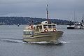
- Nomination Motorboat in Oslo harbour --Pudelek 00:13, 22 July 2008 (UTC)
- Decline
- Support Well done. Barabas 01:12, 22 July 2008 (UTC)
- OpposeNoise in water, nothing is sharp. -- carol 05:34, 22 July 2008 (UTC)
Comment I see that all is sharp. noise in water? where?? -Pudelek 08:29, 22 July 2008 (UTC)
- The fact that I had to ask is perhaps a problem here. -- carol 16:56, 24 July 2008 (UTC)
- Oppose unsharp and dull --Simonizer 09:22, 29 July 2008 (UTC)
- Oppose, there is nothing special about the photo. --Kjetil r 13:20, 30 July 2008 (UTC)
- Quality images does not need to be special, featured pictures need to. Leo Johannes 19:24, 31 July 2008 (UTC)
File:Monument Valley Morning Snow MC.jpg[edit]

- Nomination Monument Valley after a snow storm. --Chmehl 20:08, 1 August 2008 (UTC)
- Promotion
- Comment There are 2 big stains in the sky. Otherwise very beautiful picture! --Simonizer 22:25, 1 August 2008 (UTC)
- Comment I thought to discuss this because I can only see one stain and in the discussion, maybe the other can be circled? -- carol 04:09, 2 August 2008 (UTC)
- Comment I removed the stain that is also visible in the other version and updated this image. I also cannot see another stain. Could you point me to it so I can remove it? Thanks. --Chmehl 06:52, 2 August 2008 (UTC)
- Support I cant see it anymore too ;-) Maybe it was on my display. I cleaned it today. So I promote now! --Simonizer 13:47, 2 August 2008 (UTC)
File:Wunstorf_Abtei.jpg[edit]

- Nomination Abbey in Wunstorf, Germany. (and yes, thumbnailing is currently broken on commons!) --Dschwen 20:36, 23 July 2008 (UTC)
- Decline *
 Info removed a dust spot right of the roof. -- Klaus with K 12:52, 24 July 2008 (UTC)
 - Oppose low-saturated blacks, oversaturated greens --Simonizer 00:16, 29 July 2008 (UTC). Hm, I processed this from raw to capture the entire dynamic range. Didn't go so well, did it? I might give the original another go with enfuse this time. --Dschwen 15:03, 29 July 2008 (UTC), P.S.: what are low-saturated blacks btw.? I have yet to see a saturated black ;-) --Dschwen 15:04, 29 July 2008 (UTC) he he, ich meinte damit, dass die schwarzen Balken an dem Fachwerkhaus nicht schwarz sind obwohl sie in die Richtung gehen müßten. --Simonizer 22:23, 29 July 2008 (UTC) Die gehen eher ins grünliche --Simonizer 13:04, 30 July 2008 (UTC)
- Support Fine image. -- Barabas 23:36, 29 July 2008 (UTC)
- Oppose Ich stimme Simon zu. Ursprung der etwas unnatürlichen Wirkung im Baum und im Schwarz des Fachwerks ist wohl ein missglückter Versuch zur Reduzierung des Kontrastes resp. der Aufhellung der Schatten. Für ein wirklich hochkarätiges Bild spielte das Wetter hier nicht mit. Liebe Grüsse --Ikiwaner 18:42, 30 July 2008 (UTC)
Laufende Summe 1 Unterstützen (mit Ausnahme der nominator), 1 gegen -> (stimmen) -- karola (sprechen) 14:24, 31 Juli 2008 (UTC)
- Comment Sehr witzig, Karola! --> Very funny, carol! Sorry for using german but it was easier for me in that moment and Dschwen understands it --Simonizer 19:49, 31 July 2008 (UTC)
- Heh, by the looks of it it is me and the google translator who should be making the apology! :) carol 22:08, 31 July 2008 (UTC)
By the way this would be the right translation:
Aktueller Stand: 1 dafür(mit Ausnahme des Ernenners), 2 dagegen -> (mehr Stimmen?) --Simonizer 19:59, 31 July 2008 (UTC)
File:Vermilion_River_Kickapoo.jpg[edit]

- Nomination Vermilion River Kickapoo SP, East Central Illinois. --Dschwen 14:17, 31 July 2008 (UTC)
- Decline
- Support Nice! (Please remove the dust spots near the upper right corner). -- MJJR 21:02, 31 July 2008 (UTC)
- Comment Heh. I counted 4 or 5 other spots also.... -- carol 02:22, 1 August 2008 (UTC)
- Oppose Please remove the spots before promoting this. Also the vignette should be weakened and CA fringes removed. –Dilaudid 09:20, 1 August 2008 (UTC)
- Oppose per Dilaudid. Lycaon (talk) 14:23, 2 August 2008 (UTC)
File:Björn_Kjellman_reading_Harry_Potter_7-15.JPG[edit]

- Nomination Björn Kjellman reading Harry Potter 7 at its' release in Sweden. --Leo Johannes 11:20, 31 July 2008 (UTC)
- Decline
- Oppose Strong CA fringing and white glow. –Dilaudid 09:26, 1 August 2008 (UTC)
- Comment Would corpping make it better? --Leo Johannes 09:47, 1 August 2008 (UTC)
- Comment Cropping out the hand and the book where the CA is strongest would sort of ruin the whole idea of the picture, wouldn't it? :) (Though cropping out a bit of the left-hand side could make the composition more interesting.) I gave it a shot at weakening the CA, but couldn't save it because the fringing is so strong and varied. –Dilaudid 09:01, 5 August 2008 (UTC)
NYC Brighton_Beach 2[edit]

- Nomination Brighton Beach boardwalk. --Dschwen 15:00, 29 July 2008 (UTC)
- Decline
- Oppose Variante 1 erzeugt deutlich mehr Spannung, wahrschinlich liegt's am Vordergrund, du bist näher dran. --Ikiwaner 18:45, 30 July 2008 (UTC),
- Comment Ok, but does the comparison with version 1 vindicate a decline? Afterall we are not tagging the one very best quality image. --Dschwen 12:57, 31 July 2008 (UTC)
- Comment What to do about on again off again users here who may or may not know about VI? -- carol 14:49, 31 July 2008 (UTC)
File:Santa Ana River Mouth2.jpg[edit]

- Nomination Santa Ana River Mouth with the Pacific Coast Highway crossing. Basar 00:20, 23 July 2008 (UTC)
- Decline
- Oppose I don't see what makes this one outstanding. The composition is standard 50% sky 50% earth. The bridge is not that special. And I have the feeling that this cut bus on the right is just there by accident. --Ikiwaner 19:16, 29 July 2008 (UTC)
- Support Quality images do not have to be "outstanding". As far as composition is concerned it is sufficient if it is not terribly wrong. In this case I would say it is about average. Some would say it is above the average, some would say it is below. But in my view in no way the composition is such so that it would disqualify the image as far as quality image status is concerned. Barabas 23:32, 29 July 2008 (UTC)
- Support It seems to be about 66% blue which is interesting for a photograph which is "50% earth". -- carol (talk) 14:16, 31 July 2008 (UTC)
- Aye. Given that earth is 70.8% blue, you'd think the picture would be 85.4% blue. Thegreenj 18:52, 31 July 2008 (UTC)
- Oppose Quality substandard (not sharp). Lycaon 14:14, 2 August 2008 (UTC)
- Oppose not very sharp and the waves are overexposed and some stones too --Simonizer 09:27, 3 August 2008 (UTC)
File:Sankt Paulin BW 3.JPG[edit]

- Nomination Germany, Trier, Sankt Paulin, inside --Berthold Werner 14:22, 26 July 2008 (UTC)
- Decline
- Support Fantasic image, the light is beautiful ARBAY 19:45, 27 July 2008 (UTC)
- Oppose it is a few notches away from sharp. -- carol 06:55, 28 July 2008 (UTC)
- Oppose Beautiful subject, but very underexposed. I adjusted levels here. -- Barabas 19:11, 29 July 2008 (UTC)
- Support It makes an illustrative and well done full screen image. When viewed at larger sizes it's rather unsharp. --Ikiwaner 19:07, 29 July 2008 (UTC)
- Oppose too dark --Simonizer 22:26, 29 July 2008 (UTC)
- Support high res --Beyond silence 23:55, 29 July 2008 (UTC)
- Oppose Really too dark, and chromatic noise to boot. Lycaon 14:11, 2 August 2008 (UTC)
File:Passerelle Simone de Beauvoir de nuit.jpg[edit]
File:Passerelle Simone de Beauvoir de nuit.jpg
- Nomination Passerelle Simone de Beauvoir (Paris XIII) by night --Romanceor 11:27, 30 July 2008 (UTC)
- Promotion
- Support Looks interesting. Quality is certainly good. --Dschwen 18:44, 30 July 2008 (UTC)
- Comment Deletion request pending. Lycaon 11:51, 2 August 2008 (UTC)
- Guess it doesn't really matter: if it gets deleted, it will be gone, QI-seal and all. If it stays, it passed QIC anyway. QI-stamp should however not become an argument for the deletion request. Lycaon 13:02, 5 August 2008 (UTC)
File:Paronychia argentea (flowers).jpg[edit]
.jpg)
-weird.jpg)
-cloned.jpg)
- Nomination Paronychia argentea close up. Sardinia, Italy. -- Lycaon 12:05, 4 August 2008 (UTC)
- Withdrawn
- Support Very good, the unusual DOF, colours and composition all serve a purpose. –Dilaudid 19:35, 4 August 2008 (UTC)
- Oppose A very weird line in it that is unexplainable based on my experiences with digital manipulation of images. -- carol 10:40, 6 August 2008 (UTC)
.jpg)
- Can you point me to that line. The only manipulation done was a crop to bring it to 4:3 format and cut some OOF stuff (original out-of-camera-res: 4288 × 2856, now: 3413×2560; or from 11.7 to 8.3 Mpx). Lycaon (talk) 13:31, 6 August 2008 (UTC)
- Due to a previous experience, I downloaded the flawed image before marking it for discussion and a screen grab of the file time can confirm that. Do I need to reupload the problem image so that the outlined image that I just made makes sense? -- carol (talk) 18:36, 6 August 2008 (UTC)
- Also, if I needed to come up with a guess about what caused the problem, my guess would be that the battery was just beginning to need recharging when the image was taken. -- carol (talk) 18:38, 6 August 2008 (UTC)
- ???? The file hasn't changed since 11:31, 23 May 2008, when it was uploaded Lycaon 18:40, 6 August 2008 (UTC)
- I downloaded a different image than the one that is here. -- carol (talk) 18:46, 6 August 2008 (UTC)
- Where from? Lycaon 18:47, 6 August 2008 (UTC)
- I downloaded a different image than the one that is here. -- carol (talk) 18:46, 6 August 2008 (UTC)
- ???? The file hasn't changed since 11:31, 23 May 2008, when it was uploaded Lycaon 18:40, 6 August 2008 (UTC)
- Also, if I needed to come up with a guess about what caused the problem, my guess would be that the battery was just beginning to need recharging when the image was taken. -- carol (talk) 18:38, 6 August 2008 (UTC)
- Too early in my day and the room is too bright, perhaps. The line is still there. Please accept my apology for the accusatory reaction I had to not being able to see the same thing! -- carol (talk) 18:55, 6 August 2008 (UTC)
- I don't feel accused, I only would like to see the 'line'. BTW, I took 55 more pictures that day and probably many more the next day (I don't often need recharging). Lycaon 18:56, 6 August 2008 (UTC)
- Weird. It is there indeed. Back to the original. Lycaon 18:58, 6 August 2008 (UTC)
- I don't feel accused, I only would like to see the 'line'. BTW, I took 55 more pictures that day and probably many more the next day (I don't often need recharging). Lycaon 18:56, 6 August 2008 (UTC)
- The original was without the line. Something must have gone wrong during saving or uploading. I made a new crop from the original. Thanks for noticing. Lycaon 19:10, 6 August 2008 (UTC)
- The new crop was a disappointment compared to the original. I tried my hand with the clone tool by the light of day
and uploaded it into the namespace with the outlined flaw.Please consider using that one instead! -- carol (talk) 19:40, 6 August 2008 (UTC) reverted that -- carol (talk) 19:57, 6 August 2008 (UTC)- I am unable to change my opposition to the image, the first "crop" was that much superior to the new one. -- carol (talk) 20:02, 6 August 2008 (UTC)
- The new crop was a disappointment compared to the original. I tried my hand with the clone tool by the light of day
File:Corn_fields_near_Royal,_Illinois.jpg[edit]
![]()
- Nomination Corn fields in the American Midwest. 21MP. --Dschwen 00:40, 4 August 2008 (UTC)
- Promotion *Faint spot, seam error. -- carol 06:13, 4 August 2008 (UTC)
- Where? Just post the coordinates you obtain from GIMP, no need to upload a marked version. --Dschwen 16:50, 4 August 2008 (UTC)
- Support The fact that it's possible to see a stich given an infinite amout of time is no reason to oppose for me. Else we could upload 3MP images and everything would be fine. The photographic quality (composition, colours, contrast) is strong. --Ikiwaner 16:56, 4 August 2008 (UTC)
 Question Huh? -- carol (talk) 04:57, 5 August 2008 (UTC)
File:2008-07-23 Lucky Strike chimney in Durham.jpg[edit]

- Nomination Lucky Strike smokestack --Specious 03:02, 28 July 2008 (UTC)
- Promotion copyright issue IMO, the logo is not accidental on the picture. It is the main subject! --Simonizer 18:23, 1 August 2008 (UTC) I asked on Commons talk:Licensing and it's not a copyright violation. Could you please review this picture based on technical merit? --Specious 14:59, 3 August 2008 (UTC)
ok changed status back to Nomination --Simonizer 16:20, 3 August 2008 (UTC)
Two spots. -- carol 06:26, 4 August 2008 (UTC)
Cloned the spots out. --Specious 14:53, 4 August 2008 (UTC) - Support Excellent composition! You have a really good photographic eye! The sharpness and noise level is not overhelming but acceptable. --Ikiwaner 16:45, 4 August 2008 (UTC)
File:2008-07-23 Lucky Strike tower in Durham.jpg[edit]

- Nomination Lucky Strike tower --Specious 03:02, 28 July 2008 (UTC)
- Promotion
- Comment copyright issue IMO, the logo is not accidental on the picture. It is the main subject! --Simonizer 18:23, 1 August 2008 (UTC)
- Comment ok changed status back to Nomination --Simonizer 16:20, 3 August 2008 (UTC)
- Support There used to be between 25 and 35 spots in the sky in this image. -- carol 06:21, 4 August 2008 (UTC) -- carol (talk) 07:50, 5 August 2008 (UTC)
- Comment Cloned out between 25 and 35 dust spots. Thanks, Carol! I really need to clean my sensor. --Specious 14:55, 4 August 2008 (UTC)
Robert Maiilart bridge[edit]

- Nomination old Ferroconcrete bridge --Ikiwaner 08:41, 27 July 2008 (UTC)
- Promotion
- Support Great sharpness and size. Good composition as well. Unfortunately left side is bit dark --Simonizer 19:11, 1 August 2008 (UTC)
- Oppose Obvious stitching errors both in the water and on the bridge. Lycaon 13:59, 2 August 2008 (UTC)
- Comment What are you referring to? After having a very close look I managed to find some small errors on the bridge. I corrected them. But in the water I can't see obvious stitching errors. That barrier where colour suddenly changes certainly isn't one. --Ikiwaner 14:00, 3 August 2008 (UTC)
- Support Much better. The slight downsampling has also improved the noise level and made the fault in the water all but invisible (it is still there but no more disturbing). Well done. Lycaon 16:23, 3 August 2008 (UTC)
Orange child[edit]

- Nomination Freisteller --Böhringer 20:33, 1 August 2008 (UTC)
- Decline
- Oppose Digitally altered image without notification, no photo subject (yes, image can be impressive and have no value for Wikipedia). #!George Shuklin 12:21, 2 August 2008 (UTC)
- Support I don't agree with the assessment. Lycaon 13:55, 2 August 2008 (UTC)
- Support I dont agree as well. We are not at wikipedia --Simonizer 14:09, 2 August 2008 (UTC)
- Oppose I don't see how the digital alteration adds to the quality (IMO it detracts). Dori 18:07, 3 August 2008 (UTC)
- Oppose I think it's great at thumb size but at full resolution is noisy and has obvious editing traces --Ianare 05:11, 4 August 2008 (UTC)
File:Bowl of Strawberries.jpg[edit]

- Nomination A bowl of strawberries on a counter --ShakataGaNai 21:23, 1 August 2008 (UTC)
- Promotion
- Oppose Counter not in frame. -- carol 02:47, 2 August 2008 (UTC)
- Support Strawberries are. Lycaon 11:34, 2 August 2008 (UTC)
- Support Yes they are indeed. -- Klaus with K 15:14, 2 August 2008 (UTC)
- Support sharp and nice colours. --Ikiwaner 18:41, 2 August 2008 (UTC)
- Support Gorgeous and delicious looking too Bastique 22:51, 4 August 2008 (UTC)
[edit]

- Nomination Landscape shot from Hedmark, Norway. Kjetil r 13:04, 30 July 2008 (UTC)
- Decline
- Support Very nice landscape. I wish the trees on the horizon weren't there, though. -- TheWB 14:21, 30 July 2008 (UTC)
- Oppose All blurred. Lycaon 11:51, 2 August 2008 (UTC)
- Oppose yup, blurry. Ianare 05:12, 4 August 2008 (UTC)
File:Trier Sankt Matthias BW 2.JPG[edit]

- Nomination Germany, Trier, Tower of St. Matthias --Berthold Werner 08:44, 1 August 2008 (UTC)
- Promotion
- Support Sharp, and nice composition. Leo Johannes 08:50, 1 August 2008 (UTC)
- Support
It seems tilted. -- carol 09:49, 1 August 2008 (UTC)I got that completely wrong!!! -- carol 07:29, 4 August 2008 (UTC)Which direction and how much? --Berthold Werner 05:30, 4 August 2008 (UTC)
File:Kosciol pokoju w swidnicy wisnia6522.jpg[edit]

- Nomination Church of Peace in Świdnica, Poland. --Wisnia6522 16:04, 28 July 2008 (UTC)
- Decline
- Oppose Visible CA & strong perspective correction. --Lestath 22:20, 30 July 2008 (UTC)
- Oppose After some thinking, the perspective correction is too strong making the building look unnatural. –Dilaudid 08:40, 4 August 2008 (UTC)
- Support It is fine. -- Barabas 18:48, 4 August 2008 (UTC)
File:Rothenburg BW 5.JPG[edit]

- Nomination Germany, Rothenburg o.d.T., Historiengewölbe --Berthold Werner 08:54, 28 July 2008 (UTC)
- Decline
- OpposeMotion blur due to long exposure time, CA fringing. –Dilaudid 19:18, 4 August 2008 (UTC)
- Blur may be, but are you sure it's from long exposure? The Shake Reduction of the K10D should avoid this at 1/30 s. Perhaps the autofocus took the wrong part of the picture and DoF is also not so good. --Berthold Werner 15:39, 5 August 2008 (UTC)
- It looks like it's at least partially motion blur. Remember that Shake Reduction only goes so far; the numbers it is supposed to compensate for assume quite a steady hand. Thegreenj 21:45, 8 August 2008 (UTC)
- Blur may be, but are you sure it's from long exposure? The Shake Reduction of the K10D should avoid this at 1/30 s. Perhaps the autofocus took the wrong part of the picture and DoF is also not so good. --Berthold Werner 15:39, 5 August 2008 (UTC)
- Oppose Heavy CA at the bows --Simonizer 15:13, 11 August 2008 (UTC)
- Support To me the picture is sharp enough and CA affects only a tiny portion of the picture, so I support it. Barabas 18:14, 13 August 2008 (UTC)
File:Reflections of Earth 8.jpg[edit]

- Nomination: The Reflections of Earth fireworks at Epcot. --Bdesham 13:53, 26 July 2008 (UTC)
- Review
- Support looks good to me Ianare 05:14, 4 August 2008 (UTC)
- Oppose Difficult picture, but too much CA for QI. Lycaon 08:59, 6 August 2008 (UTC)
Running total: 1 support (excluding the nominator), 1 oppose -> draw after voting period --LC-de 20:49, 14 August 2008 (UTC)
File:Black-legged-Kittiwake.jpg[edit]

- Nomination Rissa tridactyla at Helgoland. Körnerbrötchen 09:17, 4 August 2008 (UTC)
- Promotion
- Comment background looks not good on my monitor, only my problem? --Mbdortmund 23:10, 4 August 2008 (UTC)
- It looks odd to me as well. The bird seems fine, though. --Bdesham 14:45, 5 August 2008 (UTC)
- Support Looks good to me. --Bdesham 20:33, 5 August 2008 (UTC)
File:Peeling paint 2.jpg[edit]

- Nomination I swear I see Jesus in there... --Dschwen 16:47, 24 July 2008 (UTC)
- Decline
- Comment Then surely you must geolocate this then!! -- carol 17:54, 24 July 2008 (UTC)
- Comment Put it on ebay and I'll bid thirty pieces of silver! Thegreenj 19:13, 25 July 2008 (UTC)
- Weak Oppose Nice colors and mood, but the sharpness is not that great. --Bdesham 21:12, 2 August 2008 (UTC)
- Oppose usually positive for minimalistic images but this one does not convince me photographically. I have the feeling that a more interesting crop had been possible. --Ikiwaner 16:51, 4 August 2008 (UTC)
- Oppose I have to agree with Ikiwaner here. For a texture image, the composition just isn't enough for me. Thegreenj 16:59, 4 August 2008 (UTC)
- Support Quality is fine. Barabas 00:11, 7 August 2008 (UTC)
Cygnets Portrait[edit]

- Nomination Cygnets Portrait --Böhringer 19:50, 27 July 2008 (UTC)
- Promotion
- Comment The background could benefit from noise reduction. –Dilaudid 06:28, 29 July 2008 (UTC)
- Oppose Agree with Dilaudid and there is a big, bright stain right next to the beak. Otherwise great picture --Simonizer 19:06, 1 August 2008 (UTC)
- Support Very nice. Background is not noisy for me. Where are noise and stain? _Fukutaro 02:39, 3 August 2008 (UTC)
- Support Do not see that point. Just glimmers of the whater. Körnerbrötchen 17:34, 4 August 2008 (UTC)
- Oppose glimmers should not be round. Those are spots, they can be repaired. -- carol (talk) 05:41, 5 August 2008 (UTC)
- Support It is pretty good. Barabas 18:47, 5 August 2008 (UTC)
- Comment The stains should be removed. --Mbdortmund 22:47, 6 August 2008 (UTC)
File:Schloss Obernzenn SK 0003.jpg[edit]

- Nomination Castle Obernzenn --Simonizer 12:54, 26 July 2008 (UTC)
- Decline
- Comment Yes that would be right. But I could only made a picture from the gate, the rest of the fence is covered by bushes. And to go into the park you need an authorization --Simonizer 22:09, 1 August 2008 (UTC)
- Comment But who opposed? --Simonizer 21:08, 2 August 2008 (UTC)
- Oppose Building looks tilted. Lycaon 05:54, 5 August 2008 (UTC)
- Support It is fine. Barabas 18:12, 13 August 2008 (UTC)
File:Paldiski Lighthouse.jpg[edit]

- Nomination The red lighthouse of Paldiski, Estonia. –Dilaudid 06:22, 29 July 2008 (UTC)
- Decline
- Support The grass is rather blurred, but the main subject - i.e. the lighthouse - is O.K.; nice light. -- MJJR 20:44, 30 July 2008 (UTC)
- Oppose Too noisy and unsharp for me. Lycaon 09:16, 1 August 2008 (UTC)
- Oppose noise, tilt --Ianare 05:06, 4 August 2008 (UTC)
- Support Awesome and typical image of a minah bird and a hyena playing pinball! (And the photograph is also definitely QI) -- carol 07:45, 5 August 2008 (UTC)
- Support It is fine. Barabas 18:50, 5 August 2008 (UTC)
Other version had no opposes. Lycaon 11:59, 15 August 2008 (UTC)
File:Paldiski Lighthouse edit.jpg[edit]

- Nomination The red lighthouse of Paldiski, Estonia. –Dilaudid 06:22, 29 July 2008 (UTC)
- Promotion
- Info There's now a tilt corrected, colour adjusted, denoised new version available. –Dilaudid 21:53, 5 August 2008 (UTC)
- Support better now Ianare 03:15, 6 August 2008 (UTC)
- Support Slight improvement. Makes the cut. Lycaon 06:02, 8 August 2008 (UTC)
File:Slavkovský štít–panorama.jpg[edit]
![]()
- Nomination Panoramic view from Slavkovský štít, High Tatras, Slovakia --Sfu 10:34, 6 August 2008 (UTC)
- Decline
- Support Definitely above the bar. -- Barabas 00:28, 7 August 2008 (UTC)
- Oppose I don't like the crop. The foreground confuses the background or visa versa. Lycaon 13:44, 7 August 2008 (UTC)
I don`t understand how does it work. Could you tell something more? --Sfu 09:16, 8 August 2008 (UTC)
- The crop is too tight vertically, the people on the foreground disturb and there is no depth in the image because of the narrow window. Lycaon 19:21, 8 August 2008 (UTC)
- It's clear now. --Sfu 12:55, 9 August 2008 (UTC)
- Oppose You tried to catch a nice mood. However I think the panoramic has an inappropriate aspect ratio. It's almost impossible to view the image without scrolling. Then there are technical errors: The blue lady is half a ghost and one image is significantly brighter than the others. --Ikiwaner 18:57, 8 August 2008 (UTC)
- Oppose ac Ikiwaner + different sky colours (too visible). --Lestath 23:23, 13 August 2008 (UTC)
Life Belt Ionian Sky-tilt adjusted[edit]

- Nomination A life preserver on the boat Ionian Sky. Original by AlMare, "tilt" adjusted by carol. -- carol 22:20, 5 August 2008 (UTC)
- Decline
- Support It seems ok.--Kolossos 14:23, 6 August 2008 (UTC)
- Oppose Either the background will be tilted or the foreground will. The quality is decent otherwise, but this photo can't help but "look wrong." --Bdesham 13:36, 7 August 2008 (UTC)
- Oppose Tilt / distortion. Dilaudid 16:21, 7 August 2008 (UTC)
- I was going to request that the word "composition" be included in the reason to support this image before the bot deposited it in the QI galleries.... -- carol 19:33, 7 August 2008 (UTC)
- Comment The photograph was taken from a ship, so I believe the tilt is normal. A false horizon would be a greater problem. I like the colors and the Idea of the composition. But ok. --Kolossos (talk) 20:30, 11 August 2008 (UTC)
File:Alexandria street mosaic.jpg[edit]

- Nomination A mosaic in the streets of Alexandria. I believe it's a nice use of perspective. Nikola Smolenski 15:20, 3 August 2008 (UTC)
- Decline
- Oppose I agree, but the crop is too tight. –Dilaudid 17:55, 3 August 2008 (UTC)
- I'd like to get a second opinion. I don't think that the tight cropping detracts from the quality of the image, and I don't see what would it gain by a wider cropping. Nikola Smolenski 05:47, 7 August 2008 (UTC)
- See our guidelines for assessing quality images. Composition and cropping are related and largely technical matters that affect eg. how the image can be used. In this picture part of the subject is cut off, which I see as a serious fault – I don't see what the picture would lose from a more generous crop. :) –Dilaudid 16:30, 7 August 2008 (UTC)
- Larger part of the street and the white fence would be visible, which would detract from the subject (the mosaic). Nikola Smolenski 06:28, 9 August 2008 (UTC)
- See our guidelines for assessing quality images. Composition and cropping are related and largely technical matters that affect eg. how the image can be used. In this picture part of the subject is cut off, which I see as a serious fault – I don't see what the picture would lose from a more generous crop. :) –Dilaudid 16:30, 7 August 2008 (UTC)
- Oppose I agree that the crop is uncomfortably tight. Coupled with the awkward perspective, I don't think this is a QI. --Bdesham 19:45, 7 August 2008 (UTC)
- Support It is pretty good. Barabas 19:23, 12 August 2008 (UTC)
File:Nyctea-scandiaca-snowy-owl-0a.jpg[edit]

- Nomination Snowy owl. Adamantios 21:08, 31 July 2008 (UTC)
- Decline
- Support good --Mbdortmund 13:41, 5 August 2008 (UTC)
- Oppose Feathers bordered with green CA. Lycaon 14:06, 5 August 2008 (UTC)
- Support It is fine. Barabas 00:15, 7 August 2008 (UTC)
- Oppose per Lycaon, and the whole is a bit noisy. _Fukutaro 05:34, 10 August 2008 (UTC)
- Oppose CA --Simonizer 18:27, 10 August 2008 (UTC)
- Support--Beyond silence 22:22, 11 August 2008 (UTC)
- Oppose noise is unfortunate Ianare 04:59, 12 August 2008 (UTC)
Cygnus olor Family[edit]

- Nomination Cygnus olor Family --Böhringer 19:51, 27 July 2008 (UTC)
- Decline
- Support Its ok! --Simonizer 19:03, 1 August 2008 (UTC)
- Oppose The right and center birds are overexposed, and not much sharpness. _Fukutaro 02:39, 3 August 2008 (UTC)
- Oppose Overexposure on the right hand side bird. –Dilaudid 06:09, 4 August 2008 (UTC)
- Support The question should be: Is that little piece of overexposure distracting? Is this an excellent composition? I'd say no to the first and yes to the second question. Photography is more than counting overexposed pixels. --Ikiwaner 19:40, 4 August 2008 (UTC)
- Support like Ikiwaner --Mbdortmund 11:52, 6 August 2008 (UTC)
- Oppose To me the overexposed spot is very distracting. Barabas 00:08, 7 August 2008 (UTC)
- Oppose As Fukutaro --Sfu 18:58, 13 August 2008 (UTC)
File:Místek, Kostel svatého Jakuba, zákoutí.jpg[edit]

- Nomination CZE, Frýdek-Místek, enter to the St. James Church --Daniel Baránek 21:32, 7 August 2008 (UTC)
- Decline
- Support good composition --Mbdortmund 22:43, 7 August 2008 (UTC)
- Oppose but lots of chromatic noise. Lycaon 06:00, 8 August 2008 (UTC)
- Comment I tried to reduce the noise. Is it better now? --Daniel Baránek 07:10, 8 August 2008 (UTC)
- Comment It's overcorrected now and looks plastic. The composition is very strong no doubt a QI. What disturbs me is that it's leaning to the left. --Ikiwaner 18:51, 8 August 2008 (UTC)
- Comment As Ikiwaner I find the composition very good, but mitigation is an FP concept, and here on QI technical quality is very important. Noise may have reduced but sharpness id still not acceptable, sorry, my oppose stands. Lycaon 19:19, 8 August 2008 (UTC)
- Comment I tried one more edit from original (milder reduction of noise and rotation). If still not OK, I don't know how to do. Never mind, thanks for your time :) --Daniel Baránek 19:51, 8 August 2008 (UTC)
- Oppose Plastic appearance. Barabas 19:27, 12 August 2008 (UTC)
- Opposenoisy -LadyofHats 20:20, 15 August 2008 (UTC)
File:Sv. Cyril a Metoděj.jpg[edit]

- Nomination Cross with sculpture on the Radhošť Mountain commemorating Saints Cyril and Methodius with Chapel of Saints Cyril and Methodius in the back (Moravian-Silesian Region, Czech Republic) --Ondřej Žváček 19:01, 4 August 2008 (UTC)
- Decline Strange colours: too much yellow. Also very noisy. –Dilaudid 19:31, 4 August 2008 (UTC) Comment Uploaded new version with less noise and milder colours.--Ondřej Žváček 16:04, 5 August 2008 (UTC)
- Oppose Interesting subject, but the picture is way oversharpened. Barabas 00:17, 7 August 2008 (UTC)
- Comment Thanks, uploaded new softened version.--Ondřej Žváček 15:07, 8 August 2008 (UTC)
- Oppose Software sharpening is not a way. Try again with better light. It's not sharp enough now. Interesting photo otherwise. --Sfu 08:04, 15 August 2008 (UTC)
File:Trier Frankenturm BW 1.JPG[edit]


- Nomination Germany, Trier, Frankenturm --Berthold Werner 06:58, 29 July 2008 (UTC)
- Promotion
- Oppose Too strong perspective, building looks unnatural. –Dilaudid 19:21, 4 August 2008 (UTC)
- Yes. But you cannot get a picture of this building from a greater distance (or you pull down another building). For buildings QI mean to get the best of a situation. In this case: to wait for the right time and weather, searching the best point to photograph and then try to adjust perspective. --Berthold Werner 08:15, 5 August 2008 (UTC)
- Support to keep the balance. Although I would prefer slanting lines instead of architectural projection, just because one has to point the camera upwards for this kind of shot. -- Klaus with K 20:00, 5 August 2008 (UTC)
- Support It is fine. Barabas 00:12, 7 August 2008 (UTC)
- Oppose per Dilaudid. Lycaon 13:36, 7 August 2008 (UTC)
- Support I think, it meets QI requirements --Mbdortmund 11:57, 11 August 2008 (UTC)
- Question Which one? Lycaon 14:14, 11 August 2008 (UTC)
- the left one --Mbdortmund 21:19, 11 August 2008 (UTC)
- Comment The perspective has gone from one extreme to the other, neither is an accurate representation of what the eye sees. Somewhere in between would look much less awkward. --Calibas 01:07, 16 August 2008 (UTC)
- Question Wich image is the one we are voting on? --LC-de 22:46, 16 August 2008 (UTC)
- The left one. --Berthold Werner 06:40, 17 August 2008 (UTC)
File:Bytom - Ul. Józefa Kwietniewskiego 01.jpg[edit]

- Nomination Tenement house on the Józefa Kwietniewskiego Street in Bytom. --Lestath 19:07, 8 August 2008 (UTC)
- Decline
- weak Oppose this one is the best from all the images subitted but it is still overexposed. so i would like to have a second opinion on this one -LadyofHats 10:31, 16 August 2008 (UTC)
- Comment No, it is not overexposed, I checked the histogram to be sure. It is blurred though and suffers heavily from JPEG-compression (JPEG-artifacts visible). --Massimo Catarinella 00:19, 18 August 2008 (UTC)
File:Katowice - Ul. Słowackiego 33.jpg[edit]

- Nomination Tenement house on the Słowackiego Street 33 in Katowice. --Lestath 19:07, 8 August 2008 (UTC)
- Decline
- Oppose overexposed and color aberrations (specially at the side of the white and yellow color fields)-LadyofHats 10:31, 16 August 2008 (UTC)
- Comment Another deline of my photo by LadyofHats. Please for another, obiective opinion. --Lestath 12:08, 16 August 2008 (UTC)
- Comment composition is OK, but in the full solution it is not really sharp, maybe a Problem of the camera/objective, not of your work. Sometimes it helps to take the picture a little bit darker and to work out the highlights later. --Mbdortmund 10:59, 17 August 2008 (UTC)
File:Katowice - Kasztanowiec - Kwiaty 01.JPG[edit]

- Nomination Aesculus flowers. --Lestath 19:07, 8 August 2008 (UTC)
- Decline
- Oppose overexposed, oversaturated and blury in full view. still an interesting plant :P-LadyofHats 10:31, 16 August 2008 (UTC)
- Comment I don't agree with Ladyof Hats decision. Please for another, obiective opinion. --Lestath 12:03, 16 August 2008 (UTC)
- Comment The whites are blown. The "oversaturation" is possibly due to the same harsh lighting which made the whites too white which was in reality a bright and pretty day there and then. If you could get the same photograph on a not so clear day it all of the problems would probably go away. -- carol (talk) 00:53, 17 August 2008 (UTC)
- Comment Date of picture is in the future ?! Lycaon 13:39, 17 August 2008 (UTC)
- Sorry. My mistake - I changed it. --Lestath 16:37, 17 August 2008 (UTC)
- Oppose Chromatic aberration on the left and right side of photo --Kosiarz-PL 08:50, 20 August 2008 (UTC)
File:Seusslitz-Luisenburg.jpg[edit]

- Nomination Seusslitz near Dresden. --Kolossos 19:21, 11 August 2008 (UTC)
- Promotion Needs perspective correction. –Dilaudid 05:50, 14 August 2008 (UTC)
I do it and upload it as new version. --Kolossos 18:21, 13 August 2008 Comment Thanks! But it still experiences quite strong barrel distortion. Otherwise it seems fine so once this is fixed I can support. –Dilaudid 22:15, 14 August 2008 (UTC)
- I upload a new image with barrel correction and a little bit darker. --Kolossos 08:51, 16 August 2008 (UTC)
- Support- tic overexposed, still good enough-LadyofHats 22:04, 15 August 2008 (UTC)
- Support for the new version --Mbdortmund 00:12, 17 August 2008 (UTC)
File:Visa river near Spiterstulen1.jpg[edit]

- Nomination Visa river near Spiterstulen, Jotunheimen mountains, Norway --Pudelek 17:03, 10 August 2008 (UTC)
- Decline
- Oppose Unclear composition. Whats the main subject? The river hidden behind the rocks or the mountains wich were cut in an unfavourable way? --LC-de 18:04, 14 August 2008 (UTC)
- Comment the main subject is a Visa river and the mountain are the background for her --Pudelek 22:23, 14 August 2008 (UTC)
- Oppose- even when it has better contrast as the other two it is blury and partially noisy -LadyofHats 22:02, 15 August 2008 (UTC)
File:Visa river near Spiterstulen.JPG[edit]

- Nomination Visa river near Spiterstulen, Jotunheimen mountains, Norway --Pudelek 17:03, 10 August 2008 (UTC)
- Decline
- Comment I'm tempted to decline this same reason as File:Visa river near Spiterstulen1.jpg: unclear composition. But I think these pics are discutable. --LC-de 18:08, 14 August 2008 (UTC)
- Oppose - misses contrast -LadyofHats 21:25, 15 August 2008 (UTC)
File:Motorcycle of Police in Bergen.JPG[edit]

- Nomination Motorcycle of Police in Bergen, Norway --Pudelek 12:42, 8 August 2008 (UTC)
- Decline
- Support meets QI requirements --Mbdortmund 22:00, 12 August 2008 (UTC)
- Oppose Too much CA fringing. Lycaon 11:34, 15 August 2008 (UTC)
- Oppose plain composition and ligthing -LadyofHats 21:19, 15 August 2008 (UTC)
File:Sugar cubes-closeup.jpg[edit]

- Nomination Sugar cubes which were "lifted" from a nice restaurant. -- carol 07:38, 8 August 2008 (UTC)
- Decline
- Oppose Irregular lighting. --Kosiarz-PL 18:34, 14 August 2008 (UTC)
- Comment Technically speaking, that could also be expressed as "interesting lighting" or "unusual lighting". QI is about technical merit. -- carol 00:14, 15 August 2008 (UTC)
- weak Oppose - i think the irregular ( as in, not coming from the same direction) lighting comes from the form of the white plate that refects the light. wich as result removes a bit of the "volume" feeling on the sugar cubes wich then again oposes to the defined volume and light reflections on the plate. another reason to oppose is the amount of background (plate) without any real information to the main subject (sugar).the composition is interesting. ( as in unusual, and nothing to do with technical merit but still worth mentioning it ;) )-LadyofHats 21:17, 15 August 2008 (UTC)
- weak Comment Technically if the lighting were not so unusual, the ratio of the image would be technically wrong -- half and half or less, not into three. Technical is how images are judged here, so if you can find even a weak link that explains your problem in more technical terms, it would assist not only your reputation for reviewing but also educate others in the technical aspects of photography. -- carol (talk) 09:11, 16 August 2008 (UTC)
Gamle Bergen - houses[edit]

- Nomination Houses in Gamle Bergen (Old Bergen) - open air museum in Bergen, Norway --Pudelek 15:21, 4 August 2008 (UTC)
- Decline
- Support It is ok. Barabas 20:58, 12 August 2008 (UTC)
- Oppose noisy. JPG artifacts is there. _Fukutaro 08:45, 15 August 2008 (UTC)
- Opposeas per Futukaro-LadyofHats 21:07, 15 August 2008 (UTC)
Cuscuta europaea (plants)[edit]
.jpg)
- Nomination Greater Dodder (Cuscuta europaea) a parasite, close to Visp, Wallis, Switzerland. -- Lycaon 11:32, 2 August 2008 (UTC)
- Promotion
- Please review. Lycaon 09:02, 10 August 2008 (UTC)
- Oppose Very nice and beatiful, but details are washed out in highlights. Barabas 20:55, 12 August 2008 (UTC)
- Support In my eyes (resp. on my monitor) the flowers shows enough detail even in highlight areas. DOF is shallow but acceptable. --LC-de 13:20, 14 August 2008 (UTC)
- Comment It's cute flower, but very distractive composition:(. The body of this flower is vine? or stalk? And some of leaves that were seen on the whole are other kinds? _Fukutaro (talk) 09:15, 15 August 2008 (UTC)
- Comment It is a holoparasite, so no green leaves, only the reddish vine and the flowers. Always a very chaotic plant if you want to 'catch' more than the flowers alone. It often starts of on Urtica dioica (nettle) or the larger Fabaceae but tends to spread out and engulf several different species in the process. Other species are quite host-specific. Lycaon 11:15, 15 August 2008 (UTC)
- Comment If show the ecology in the large text, may even this enough. But it need such explanation as you said, I think. _Fukutaro 13:23, 17 August 2008 (UTC)
- Oppose- exposure problems, both DOF and composition are better in the other image this subject -LadyofHats 21:06, 15 August 2008 (UTC)
- Support Nothing too wrong with this photograph. Perhaps an identification of the bug that is there also? -- carol (talk) 00:58, 17 August 2008 (UTC)
- Support a very good illustration of Cuscuta which is an odd plant and not any photgraphic problem in my opinion --B.navez 03:41, 17 August 2008 (UTC)
Cuscuta europaea (plant)[edit]
.jpg)
- Nomination Greater Dodder (Cuscuta europaea) a parasite, close to Visp, Wallis, Switzerland. -- Lycaon 11:32, 2 August 2008 (UTC)
- Promotion
- Please review. Lycaon 09:02, 10 August 2008 (UTC)
- Oppose Very nice and beatiful, but details are washed out in highlights. Barabas 20:55, 12 August 2008 (UTC)
- Support In my eyes (resp. on my monitor) the flowers shows enough detail even in highlight areas. DOF is shallow but acceptable. --LC-de 13:20, 14 August 2008 (UTC)
- weak Support- there is much detail in the image, but there are many parts (including in the main subject) that are out of focus. -LadyofHats 21:03, 15 August 2008 (UTC)~
- Support Both pictures are valuable, the above one showing chaos made by the plant, this one showing details of the individual flowers --B.navez 03:44, 17 August 2008 (UTC)
File:2008-08-11 University Tower from Petty Rd.jpg[edit]

- Nomination University Tower in Durham, NC --Specious 04:46, 12 August 2008 (UTC)
- Promotion
- Support Good perspective, balanced composition, no tourists around --Ikiwaner 19:09, 12 August 2008 (UTC)
- Oppose Composition: the electric lines are too prominent; they, not the university building, seem to be the main topic. –Dilaudid 05:49, 14 August 2008 (UTC)
- What a lucky coincidence that the electric lines frame the building without crossing it. The lines form two axis giving the otherwise static composition a dynamic touch. In addition to that they add perspective to the image because the lines go closer together. --Ikiwaner 16:26, 14 August 2008 (UTC)
- Support good diagonal... --Mbdortmund 20:59, 14 August 2008 (UTC)
- Support the cables give it a dinamic feeling to a otherwise rather plain composition -LadyofHats 20:59, 15 August 2008 (UTC)
- Support --Lestath 17:48, 19 August 2008 (UTC)
File:Lago-Maggiore 1327.JPG[edit]

- Nomination Baveno, church SS Gervasio e Protasio, baptistery --Mbdortmund 00:27, 7 August 2008 (UTC)
- Promotion
- CommentI think the black thing on the right side should be removed, then it's ok. --Berthold Werner 12:11, 13 August 2008 (UTC)
done --Mbdortmund 14:43, 13 August 2008 (UTC) - Support OK. --Berthold Werner 15:15, 13 August 2008 (UTC)
- Support good quality. --Lucarelli 23:17, 13 August 2008 (UTC)
- Support-LadyofHats 20:55, 15 August 2008 (UTC)
Presidential Palace, Vilnius[edit]

- Nomination Presidentail Palace, Vilnius, Lithuania --Sfu 09:11, 10 August 2008 (UTC)
- Promotion
- Oppose The point of view is well chosen and the stitching good. However I think because of the tree the image would perform better in winter. And the group of senior citizens could be avoided in a panoramic --Ikiwaner 20:05, 11 August 2008 (UTC)
- Comment Are these really such a problems? Tourist are a part of this place. Should I go to them and say: go away, I want to make a picture!. It's not VI – here image must be technicly good, it don't have to show the whole subject. Why didn't you write this words: composition is bad? It's because there is no point to say this. --Sfu 08:32, 12 August 2008 (UTC)
- Just wave a machete around yelling obscenities, that usually gets them moving. Ianare 15:52, 12 August 2008 (UTC)
- Support Colors and composition are OK. Good QI. --Kosiarz-PL 09:19, 12 August 2008 (UTC)
- Support-i dont think the tourists or the tree afects the composition to that point-LadyofHats 20:54, 15 August 2008 (UTC)
File:Campanula glomerata 08.jpg[edit]

- Nomination Campanula glomerata - Wda Landscape Park, Poland. --Kosiarz-PL 13:05, 11 August 2008 (UTC)
- Decline
- Oppose it's unsharp --Pudelek 13:48, 11 August 2008 (UTC)
- Comment Sharpness was set on the centre and two nearer flowers. Only parts of the flower afar off are unsharp. I think this composition is OK. -- Kosiarz-PL 17:23, 11 August 2008 (UTC)
- Support-LadyofHats 20:52, 15 August 2008 (UTC)
- Oppose most of subject is out of focus. -- carol (talk) 00:59, 17 August 2008 (UTC)
File:Trier Sankt Paulin BW 3a.jpg[edit]

- Nomination Germany, Trier, St. Paulin,(New version, previous nomination was declined as too dark) --Berthold Werner 10:01, 10 August 2008 (UTC)
- Promotion just a question: Isn't the point of sharpnes some meters in front of the main object? --Mbdortmund 11:53, 10 August 2008 (UTC)
Hm. Take a close look at statues over the gate (in reality they are a few meters behind it) --Berthold Werner 13:26, 10 August 2008 (UTC) Support DOF is short, but good composition and light must be difficult --Mbdortmund 15:34, 14 August 2008 (UTC) - weak Supportbecouse the image has a ton lots of elements one kind of mises how noisy it actually is. also even when the composition is really nice it forces to either all small and undefined or big and noisy. and still I think it can be QI ...-LadyofHats 20:24, 15 August 2008 (UTC)
File:Picea-abies-norway-spruce-resin-n-bark-hdr.jpg[edit]

- Nomination Picea abies --Adamantios 13:04, 16 August 2008 (UTC)
- Decline Oversaturated. --Lestath 14:50, 16 August 2008 (UTC) Comment That's a common effect of exposure blending (HDR), isn't it? Adamantios 16:53, 16 August 2008 (UTC)
Not if it's done properly. Many HDR tone-mapping programs oversautrate the image to compensate for the lack of contrast caused when the HDR goes to low-DR in order to be saved as a jpeg. BTW, if this is indeed an exposure-blended image, it would be nice to indicate so on the image page. Thegreenj 19:29, 16 August 2008 (UTC)
Thanks for the insightful reply. I mostly use a GIMP script, sometimes I try to do it manually (complicated). All my HDR photos are tagged as such in the filename. Isn't that sufficient? Adamantios 21:07, 16 August 2008 (UTC)
- Files may be renamed for whatever reason (unlikely here, but still), so it is better to indicate 'special treatment' on the image page. Lycaon 13:43, 17 August 2008 (UTC)
- Oppose Apart the fact this picture is not very representative to show spruce resin (botanical garden with bamboos (or Peking Willow ?) in the background, bad pruning, orange color of the resin) the chromatic aberrations are clearly too strong (green fringes under bark scales)--B.navez 14:31, 17 August 2008 (UTC)
File:Praslin von Anse Sévère.jpg[edit]

- Nomination Praslin, Seychelles --Tobi 87 09:13, 15 August 2008 (UTC)
- Decline
- Oppose Did you try to cut of the sand in the front , which is overexposured? --Mbdortmund 11:21, 16 August 2008 (UTC)
- Support Sand is really so white and here not overexposed (footsteps are well printed). A good general view of Praslin. --B.navez 03:55, 18 August 2008 (UTC)
- Oppose The causeles shadows in the foreground are irritating --Berthold Werner 15:00, 18 August 2008 (UTC)
- ????--Berthold Werner 14:03, 19 August 2008 (UTC)
- Ouch that was only a zero ;-) Lycaon 22:32, 19 August 2008 (UTC)
File:Katowice - Ul. Korfantego 01.jpg[edit]

- Nomination Korfantego Street in Katowice. --Lestath 19:07, 8 August 2008 (UTC)
- Decline
- Oppose same as the other the image is too long exposed so that many details are burn out and the colors apear oversaturated -LadyofHats 10:31, 16 August 2008 (UTC)
- Comment Another deline of my photo by LadyofHats. Please for another, obiective opinion. --Lestath 12:19, 16 August 2008 (UTC)
- Oppose Very overexposed. To prevent this in the future, try working with histograms (if your camera shows it). --Massimo Catarinella 00:14, 18 August 2008 (UTC)
- Oppose That's the only pic, where I can follow LadyofHats argumentation. It shows some significant exposure/saturation problems. --LC-de 08:52, 19 August 2008 (UTC)
File:Bytom - Róg ul. Piłsudskiego i ul. Drzymały 01.jpg[edit]

- Nomination Tenement houses on the Józefa Piłsudskiego Street in Bytom. --Lestath 19:07, 8 August 2008 (UTC)
- Decline
- Oppose overexposed and tic blury-LadyofHats 22:19, 15 August 2008 (UTC)
- Comment Another deline of my photo by LadyofHats. Please for another, obiective opinion. --Lestath 12:08, 16 August 2008 (UTC)
- Oppose Per LadyofHats --Massimo Catarinella 00:14, 18 August 2008 (UTC)
- Comment As the other pictures, it don't seem overexposed to me. It's blurry and certainly need some retouching. --LC-de 07:47, 19 August 2008 (UTC)
File:Lago-Maggiore 0971.JPG[edit]

- Nomination pier in Baveno, Lago Maggiore --Mbdortmund 15:26, 14 August 2008 (UTC)
- Promotion
- Comment The other version is much better in terms of composition --Ikiwaner 16:36, 14 August 2008 (UTC)
- Comment so I nominate it *g* --Mbdortmund 16:45, 14 August 2008 (UTC)
- Oppose mediocre composition --Ikiwaner 19:51, 14 August 2008 (UTC)
- Support If this image is technically fine, it does not matter that there is another one of the same subject that is better composed. -- Barabas 23:27, 14 August 2008 (UTC)
- Support-agree composition is not that interesting but it is still good enough-LadyofHats 22:06, 15 August 2008 (UTC)
- Comment It makes absolutely no sense to me to promote all images in a group of very similar. Let's just take the best. -Ikiwaner (talk) 05:48, 16 August 2008 (UTC)
- on the oposite, commons is aiming to be a depository of images for all posible uses, for that reason it can not be satisfied with just an image of each subject or just an image of each user. Becouse we dont know what future use the images may have, we dont know wichone of the image in a set would be better right?. since what we do know and do is qualify the quality of each and every image, i believe is only fair to do so independently of there are similar images from the same user. or even nominated at the same time. The only reason i tend to mention other images when qualifying them is to give guideness in what is better than what. so that users can improve their images ( the actual objective of QI, i believe). ofcourse the only exception to this would be two really identical images -LadyofHats 10:44, 16 August 2008 (UTC)
- I would say that the QI-sign simply shows that the quality is OK. It should not create a list of the best pictures like our featured pictures. --Mbdortmund 11:26, 16 August 2008 (UTC)
- on the oposite, commons is aiming to be a depository of images for all posible uses, for that reason it can not be satisfied with just an image of each subject or just an image of each user. Becouse we dont know what future use the images may have, we dont know wichone of the image in a set would be better right?. since what we do know and do is qualify the quality of each and every image, i believe is only fair to do so independently of there are similar images from the same user. or even nominated at the same time. The only reason i tend to mention other images when qualifying them is to give guideness in what is better than what. so that users can improve their images ( the actual objective of QI, i believe). ofcourse the only exception to this would be two really identical images -LadyofHats 10:44, 16 August 2008 (UTC)
- Support QI is about the quality of a picture. This image has a good quality so it is a QI. It doesnt matter wether there are similar pictures --Simonizer 10:15, 17 August 2008 (UTC)
- Support QI is about the image quality here, now, today, whether an image tomorrow is better isnt relevant as part of QI's future potential value will come with it being able to have 2, 10, 20.. images of the same place over a time period all considered technically proficient for their time to compare. Where as FP is a dynamic process thats always looking for the best available today, if something better comes along tomorrow then the old is removed. Gnangarra 13:01, 18 August 2008 (UTC)
File:L'Ametlla.jpg[edit]

- Nomination L'Ametlla de Mar, Spain. -- Lycaon 21:29, 9 August 2008 (UTC)
- Promotion
- Oppose Sorry but its tilt. The picture is leaning to the right --Simonizer 18:25, 10 August 2008 (UTC)
- Comment Removed tilt. Lycaon 11:46, 11 August 2008 (UTC)
- Comment But i have still the impression the boats and the water are leaning to the right. The boats must be on a horizontal line IMO --Simonizer 12:31, 11 August 2008 (UTC)
- Comment Port wall is receding, verticals on crates on land look straight. Lycaon 12:40, 11 August 2008 (UTC)
- Oppose That cloned dust spot in the sky could be removed. But that big wall across the image makes me think that the most beautiful part of this image is hidden behind concrete. --Ikiwaner 20:23, 11 August 2008 (UTC)
- Comment This is the port wall, outside is just sea. The pituresque part are the fishing boats. Where is the dust spot btw? Lycaon 11:28, 15 August 2008 (UTC)
- Support Nice and quality image. Barabas 20:49, 12 August 2008 (UTC)
- weak Support a wonderfull place and a very interesting angle. but seen close by the image has exposure problems in the boats. -LadyofHats 20:35, 15 August 2008 (UTC)
- Support Nice angle and precision. (Can't see the dust spot !) Stephanemartin 10:29, 19 August 2008 (UTC)
File:Place settings on a table.jpg[edit]

- Nomination Fine silverware on a table --ShakataGaNai 07:34, 14 August 2008 (UTC)
- Decline
- Oppose idea is good, but DOF to short --Mbdortmund 10:54, 17 August 2008 (UTC)
- Comment But that is the point. The spoon in knife are in focus, nothing else is. --ShakataGaNai 04:30, 18 August 2008 (UTC)
- Oppose Yes maybe, but what about the fork? Wouldn't it better to have a complete set in focus then? There are also some blown highlights and maybe the table (viz. napkins) should be horizontal. Lycaon 12:24, 19 August 2008 (UTC)
- Support I think that was the idea. DOF works for me really well here. Barabas 23:08, 19 August 2008 (UTC)
- Oppose I'm willing to forgive DOF and blown headlights given the difficulty of lighting something like this evenly, but composition is poor. Why is the spoon (and most of the other silverware) cut off to the left when there's so much room to the right? It's very distracting to me. Thegreenj 00:38, 20 August 2008 (UTC)
File:Saint_Remy_Les_Antiques_R01.jpg[edit]

- Nomination Roman mausoleum and gate at Les Antiques, near Saint-Rémy-de-Provence (France). -- MJJR 14:26, 16 August 2008 (UTC)
- Promotion
- Oppose All the leafs are very disturbing. --Lestath 14:50, 16 August 2008 (UTC)
- Support Foreground IMHO acceptable --Mbdortmund 10:51, 17 August 2008 (UTC)
- Comment I agree to Mbdortmund, but it seems to be tilted clockwise to me --Berthold Werner 14:55, 18 August 2008 (UTC)
- Comment I tried to correct the tilt, but those antique monuments aren't very straight anyway, so there will always be some tilted lines... -- MJJR 20:11, 19 August 2008 (UTC)
- Support Works for me. Barabas 23:03, 19 August 2008 (UTC)
- Support Good enough for QI, and the leaves add a welcome sense of depth Ianare 00:45, 20 August 2008 (UTC)
File:Cat mg 3738.jpg[edit]

- Nomination A cat stretching on the ground -- Rama 15:54, 8 August 2008 (UTC)
- Decline
- Comment Noise reduction. Thegreenj 20:43, 10 August 2008 (UTC)-
- weak Oppose- much of the image out of focus, the paw is cropped, yet very interesting composition, would like a second opinion on this one-LadyofHats 22:19, 15 August 2008 (UTC)
- Oppose Needs noise reduction and has strongly blown highlights (nose, nape and paws are partly purely white: RGB(255,255,255)). Lycaon 13:25, 19 August 2008 (UTC)
File:Bytom - Róg ul. Piłsudskiego i ul. Drzymały 01edit.jpg[edit]

- Nomination Tenement houses on the Józefa Piłsudskiego Street in Bytom. --Lestath 19:07, 8 August 2008 (UTC)
- Promotion
- I've uploaded an edit. --LC-de 08:46, 19 August 2008 (UTC)
- Support edited version --Pudelek 13:25, 19 August 2008 (UTC)
File:Jotunheimen mountains - view from Spiterstulen.JPG[edit]

- Nomination Jotunheimen mountains - view from Spiterstulen --Pudelek 17:03, 10 August 2008 (UTC)
- Promotion
- Comment I'm tempted to decline this same reason as File:Visa river near Spiterstulen1.jpg: unclear composition. But I think these pics are disputable. --LC-de 18:11, 14 August 2008 (UTC)
- Comment on this picture the main subject are mountains. Visa river is an addition --Pudelek 22:23, 14 August 2008 (UTC)
- Oppose plain straight forward composition misses a lot of contrast -LadyofHats 21:22, 15 August 2008 (UTC)
- Support --Lestath 13:29, 16 August 2008 (UTC)
![]() Support Fine picture. I do not share LadyofHats concerns. There is white and there is dark on the picture - how is it low contrast? The composition is not delicious, true, but there is no such requirement for QI. Barabas 22:53, 19 August 2008 (UTC)
Support Fine picture. I do not share LadyofHats concerns. There is white and there is dark on the picture - how is it low contrast? The composition is not delicious, true, but there is no such requirement for QI. Barabas 22:53, 19 August 2008 (UTC)
File:ChapelleStMichel.jpg[edit]

- Nomination View from the summit of Bréhat island (Chapelle St-Michel), with Benh doing the same panorama --Sanchezn 19:31, 6 August 2008 (UTC)
- Decline
- Support That's a fun composition! Good lighting/contrast despite of difficult conditions. --Ikiwaner 13:25, 10 August 2008 (UTC)
- Comment in my opinion this photo is a little tilt --Pudelek 21:15, 10 August 2008 (UTC)
- I'm sorry but this picture is not tilted. First, you don't see the horizon line because of the mountains. Second, the mountains are not the same high everywhere and are not at the same distance from me (the photographer), so you can't use it. The only part of the horizon that is usable (horizon with only the sea) is on the right of the photo, and there there's no problem, it's perfectly horizontal. I think the clouds are responsible of an optical effect while they are mostly on the left of the picture. Sanchezn 12:25, 11 August 2008 (UTC)
- Oppose I know it is a difficult scene to capture because of its high contrast. Unfortunately it was not done well. It is too dark. Barabas 20:50, 12 August 2008 (UTC)
- weak Support the image colors are really oversaturated and it is a vit overexposed (wich creates areas in the complete darkness). but still i find both composition and format interesting enough -LadyofHats 20:28, 15 August 2008 (UTC)
- Oppose as Barabas. --LC-de 16:11, 17 August 2008 (UTC)
- Oppose I haven't authorized Nicolas to diffuse a picture of me :D Kidding, but I told him several times that it seems tilted (although we can't tell for sure) and that it's very saturated - Benh 22:06, 22 August 2008 (UTC)
File:Haslen Kirche.jpg[edit]

- Nomination Church with fog in Appenzell --Ikiwaner 22:35, 8 August 2008 (UTC)
- Promotion
- Support sharp, good composition --Mbdortmund 10:00, 9 August 2008 (UTC)
- Oppose Lacking details. Lycaon 12:00, 11 August 2008 (UTC)
- Support good enough --Manco Capac 08:45, 12 August 2008 (UTC)
- Oppose color is better for encyclopedic images Ianare 15:46, 12 August 2008 (UTC)
- Do you mean contemporary b&w images are out of the project scope? --Ikiwaner 19:36, 12 August 2008 (UTC)
- this is not a contemporary B&W photograph, it is a de-saturated digital color image, and as such is less valuable than the original version. Ianare (talk) 04:11, 14 August 2008 (UTC)
- You seem not to have understood a few things. There is no original version because I shoot raw. And I did not use the desaturation method but the channel mixer to choose those colours which should appear brighter or darker in the image. This adds to the image. Why do you wish colour in this image? The sky is very grey already and the church as the main subject is basically grey too. What remains coloured is the grass which looks dull because of the heavy clouds. This image as a colour photograph would sure not be a QI in my eyes. Photography often is about reducing your means to the minimum you need. That's why I shoot b&w unless colour really adds to the image. Maybe in a few years and some hundred images on Commons you'll understand that. --Ikiwaner 17:56, 14 August 2008 (UTC)
- Support Great composition, enough details for QI, and Wikimedia commons project is not concerned about "encyclopedic value". Barabas 20:45, 12 August 2008 (UTC)
- didn't you read the guidelines ? "Our main goal is to encourage quality images being contributed to Wikicommons, valuable for Wikimedia projects." --Ianare 04:06, 14 August 2008 (UTC)
- I do not recall reading any promise that Wikimedia projects are strictly limited to Wikipedia. Barabas 22:48, 19 August 2008 (UTC)
- Support -- MJJR 21:04, 12 August 2008 (UTC)
- Support --Lestath 23:19, 13 August 2008 (UTC)
- Support-LadyofHats 20:30, 15 August 2008 (UTC)
- Support --Kosiarz-PL 11:36, 18 August 2008 (UTC)
- Support Technically good, nice B&W conversion. The composition could be better, because I don't like the bushes in the lower right corner. But that's my opinion. --Massimo Catarinella 11:42, 20 August 2008 (UTC)
Charadrius hiaticula 2 breeding.jpg[edit]

- Nomination Charadrius hiaticula (Sandregenpfeifer) breeding. --Arnoldius 20:54, 8 August 2008 (UTC)
- Promotion
- SupportVery good DOF. –Dilaudid 22:52, 9 August 2008 (UTC)
- Oppose what about that whole 'unethical nest photography' thing ?? Ianare 06:01, 12 August 2008 (UTC)
- Support I agree there should be ethic principles, but unless it is made a writen rule or it afects the quality of the image it wouldnt be ethical to use it against a nomination IMO-LadyofHats 20:49, 15 August 2008 (UTC)
- Oppose -- carol (talk) 12:26, 16 August 2008 (UTC)
- Oppose unless the picture has been taken by the female.--B.navez 17:57, 16 August 2008 (UTC)
- Support as LadyofHats. Very good quality. --LC-de 16:13, 17 August 2008 (UTC)
- Support Nice image. --Kosiarz-PL 13:13, 20 August 2008 (UTC)
- Oppose as B.navez. Lycaon 05:38, 21 August 2008 (UTC)
- Support --Pudelek 07:44, 22 August 2008 (UTC)
- Support photographer was certainly very close, but it's still a nice quality picture, and I don't feel like subject was harm that much (I'm certainly wrong though) -- Benh 22:12, 22 August 2008 (UTC)
- Support Good quality photograph. I would have opposed the nest photograph on quality, looking at the link. I like this one quite a bit. Maybe someone can link me to an essay on nest photography ethics so I can understand the dispute against it better. Bastique 00:01, 23 August 2008 (UTC)
File:Cuscuta europaea (flowers).jpg[edit]
.jpg)
- Nomination Greater Dodder (Cuscuta europaea) a parasite, close to Visp, Wallis, Switzerland. -- Lycaon 11:32, 2 August 2008 (UTC)
- Withdrawn
- Oppose Very nice and beatiful, but details are washed out in highlights. Barabas 20:55, 12 August 2008 (UTC)
- Request second opinion. Lycaon 11:30, 15 August 2008 (UTC)
- Support- white flowers (specially this size) are hard enough to take. i dont see much detail lost and has a good composition -LadyofHats 21:08, 15 August 2008 (UTC)
- Oppose the highlights are blown and half of the flower is lost in the blur. -- carol (talk) 05:29, 22 August 2008 (UTC)
.jpg)
.jpg)
- Oppose It's very nice, but DOF is too shallow to me. Benh 22:16, 22 August 2008 (UTC)
File:Le Zebre C5 BW 1.JPG[edit]

- Nomination Le Zebre C5 from 1913 --Berthold Werner 17:47, 21 August 2008 (UTC)
- Decline Oppose Bad choice of focal length --B.navez 03:02, 22 August 2008 (UTC)
26 mm at the K10D is equivalent to 40 mm at a 35 mm camera. I don't think this is bad. --Berthold Werner 08:34, 22 August 2008 (UTC)
File:Lago-Maggiore 1275.JPG[edit]

- Nomination Lake Maggiore (Italy), Baveno, beach--Mbdortmund 19:28, 13 August 2008 (UTC)
- Decline
![]() Oppose Not sharp enough for a static picture and needs better categorization (Conglomerate?). Lycaon 08:17, 20 August 2008 (UTC)
Oppose Not sharp enough for a static picture and needs better categorization (Conglomerate?). Lycaon 08:17, 20 August 2008 (UTC)
Discuss! -- carol 05:58, 22 August 2008 (UTC)
- Support It is as sharp (or more) than the flower being discussed right now. -- carol (talk) 12:29, 22 August 2008 (UTC)
- Oppose What's the subject of the picture ? unclear composition and harsh lighting. Benh 22:32, 22 August 2008 (UTC)
- Oppose - What on earth IS it? The sand gives me a headache. Mattbuck 01:52, 23 August 2008 (UTC)
File:Petrogale xanthopus - Monarto 2.JPG[edit]

- Nomination Yellow-footed rock wallaby --Peripitus 04:43, 20 August 2008 (UTC)
- Decline
- Support Wonderful image. Part of the tail is cut off, the image is a little underexposed, but great composition and interesting subject. A quality image, no doubt about it. Alessandro Zangrilli 09:50, 20 August 2008 (UTC)
- Oppose All of the positives here are negatives for QI. -- carol 10:13, 21 August 2008 (UTC)
- Oppose idem --Ianare 00:57, 22 August 2008 (UTC)
- The cut off tail was a compositional decision to keep the main subject filling enough of the frame. I might try selectively adjusting the exposure of just the main subject and shadows tonight - Peripitus 01:55, 22 August 2008 (UTC)
File:Fly June 2008-10.jpg[edit]

- Nomination A fly of the Anthomyiidae family (cf. Anthomyiia sp.) -- Alvesgaspar 16:13, 15 August 2008 (UTC)
- Promotion
- Support Good quality image with focus well placed. I think your D80s sensor has a dust problem though - Peripitus 11:59, 19 August 2008 (UTC)
- Oppose Background shows compression. Crapload 03:23, 21 August 2008 (UTC)
- Info - No compression at all, I always work with the maximum jpeg quality. Only some noise and posterization due to low light and slight contrast enhancement -- Alvesgaspar 18:55, 21 August 2008 (UTC)
- Question Can we get an idea of the fly's size? --Ianare 00:56, 22 August 2008 (UTC)
- Info - This is smaller than a housefly, about 6mm in length -- Alvesgaspar 08:46, 22 August 2008 (UTC)
- Support Ianare 15:19, 22 August 2008 (UTC)~
File:Cockburn pana.jpg[edit]
![]()
![]()
- Nomination Panoramic view of construction of Port Coogee Gnangarra 13:51, 15 August 2008 (UTC)
- Decline
- Oppose Underexposed and low contrast. Barabas 00:37, 21 August 2008 (UTC)
- Comment this is potentially fixable, I'll up load an alternative with adjusted levels Gnangarra 10:12, 21 August 2008 (UTC)
- CommentFile:Port coogee pana gnangarra.jpg new image with levels adjusted Gnangarra 10:43, 21 August 2008 (UTC)
- Oppose original as stated by Barabas, edit as overprocessed & noisy (you can only compensate for so much). You could try downsampling & noise reduction. --Ianare 00:53, 22 August 2008 (UTC)
File:Spider July 2008-7.jpg[edit]

- Nomination A spider and its web (Steatoda nobilis) - Alvesgaspar 23:16, 13 August 2008 (UTC)
- Decline
- Comment This photograph is 50% QI and 50% wow and at least deserving of discussion. -- carol 10:22, 21 August 2008 (UTC)
- Comment I agree, but maybe neither of the components is worth a promotion in its category (QI and FP)... Alvesgaspar 11:39, 21 August 2008 (UTC)
- Oppose focus is not on spider's head. Ianare 00:49, 22 August 2008 (UTC)
- Oppose First, wow ! but... I miss DOF, and, can hardly see what I believe to be the head. I'm also not too keen on the flash lighting... - Benh (talk) 22:28, 22 August 2008 (UTC)
File:Fly August 2008-1.jpg[edit]

- Nomination A fly of the Tachinidae family (Trichopoda pennipes) -- Alvesgaspar 23:13, 13 August 2008 (UTC)
- Promotion
- Question Could you indicate size? Lycaon 08:18, 20 August 2008 (UTC) Info - About 10mm long -- Alvesgaspar 08:53, 20 August 2008 (UTC)
- Oppose Motion blur. –Dilaudid 21:22, 20 August 2008 (UTC)
- Support I think it is sharp enough for a QI. Barabas 00:29, 21 August 2008 (UTC)
- Support No problem with motion. Fine. --B.navez 19:09, 21 August 2008 (UTC)
File:Flintlock diagramme.svg[edit]

- Nomination Diagramme of a w:Flintlock --Bastique 00:13, 12 August 2008 (UTC)
- Promotion
- Question is the wood texture also vectors? or is it rasterized?-LadyofHats 14:29, 19 August 2008 (UTC)
- Comment Wood texture is vectors. Bastique 03:06, 20 August 2008 (UTC)
- Support I like this diagramm, but I#m no expert. If it's correct, we should promote it. --Mbdortmund 22:27, 19 August 2008 (UTC)
- Support A decisive ditto of what Mbdortmund said. -- carol 03:46, 20 August 2008 (UTC)
- Comment Flintlock image is good, but letter type and arrows are not really fitting the image (letters to bold face and arrows to yellow and to elaborate). Still QI. Lycaon 08:23, 20 August 2008 (UTC)
- Oppose I find the graphics childish, and in a QI the arrows and typography have to be fitting. –Dilaudid 21:24, 20 August 2008 (UTC)
- Comment The typography can be changed, and I will do so. Comments like "I find the graphics childish" are wholely inappropriate in this instance. Read the purpose of QI, which is about promotion of images with regard to improving them. Insults are completely uncalled for, here. Bastique 22:48, 20 August 2008 (UTC)
- Support Lycaon 12:20, 21 August 2008 (UTC)
- Support. a clear illustration. The wood texture isn't really necessary (and it doesn't show in my browser anyways). --Dschwen 17:59, 22 August 2008 (UTC)
Volcanic craters[edit]

- Nomination Adventive craters of Piton de la Fournaise volcano --B.navez 17:40, 16 August 2008 (UTC)
- Promotion
- Comment I fixed it better --B.navez 18:04, 20 August 2008 (UTC) New opinions ? --B.navez 02:22, 21 August 2008 (UTC)
- Support Looks better now. There are still some hallos around the peak, but that's minor issue. Sharpness is good enuogh as for a given resolution. --Sfu 05:14, 21 August 2008 (UTC)
- Question It could make it on rarity and coolness if those were "Qualities". How did you get access to this location? -- carol (talk) 05:50, 22 August 2008 (UTC)
- I have added geolocation. Access to this place is free and not very difficult, just one hour and half of easy walking after the road terminus. Just be cautious and sure you've got the right equipment : water and eventually some food, good walking shoes and long trousers (scorias are very sharp), protection against sun exposure, coldness and rain (weather may change very quickly). Since the main crater has collapsed in april 2007 and its access has been forbidden, visitors have been invited to go to this other place instead. Of course general access is denied when there is an imminent eruption hazard. You're welcome. --B.navez 08:56, 22 August 2008 (UTC)
- Support
Only to keep it around a little while longer :) -- carol (talk) 05:51, 22 August 2008 (UTC)Since my plan was foiled!!! (and thank you!) -- carol (talk) 12:26, 22 August 2008 (UTC) - Support --Kosiarz-PL 08:46, 22 August 2008 (UTC)
File:Numbat cons gnangarra.JPG[edit]

- Nomination trap set for research into Numbats Gnangarra 01:05, 15 August 2008 (UTC)
- Promotion
- Support Technically OK, good illustration. I like this very special forest atmosphere. --B.navez 03:52, 18 August 2008 (UTC)
- Comment I'm not so shure: the sky is overexposed, not very sharp. --Sfu 09:01, 20 August 2008 (UTC)
- can you explain, it was a cloudy day so the sky wasnt blue, what part of the sky isnt sharp? Gnangarra 15:03, 20 August 2008 (UTC)
- I ment that image as whole is not very sharp. Cloudy weather happens, but it not always end with overexposed sky. I'm not opposing. I just want a second person to review this image. --Sfu 15:38, 20 August 2008 (UTC)
- I don't think that a bat trap in a well lit location would be believable or function as that. So, of course the sky is a little too light (what little there is) compared to the dark of the woods/forest. The brightness of the sky could be dimmed without touching the subject parts of the image if this were that much of a concern. -- carol (talk) 05:42, 22 August 2008 (UTC)
- I ment that image as whole is not very sharp. Cloudy weather happens, but it not always end with overexposed sky. I'm not opposing. I just want a second person to review this image. --Sfu 15:38, 20 August 2008 (UTC)
- can you explain, it was a cloudy day so the sky wasnt blue, what part of the sky isnt sharp? Gnangarra 15:03, 20 August 2008 (UTC)
File:Marseille_notre_dame_de_la_garde.jpg[edit]

- Nomination Notre-Dame de la Garde in Marseille --Stephanemartin 12:51, 12 August 2008 (UTC)
- Decline
- Oppose the main subject is not in focus. dommage, c'était bien vu... Ianare 15:59, 12 August 2008 (UTC)
- Support The image is on the softer side, but well within acceptable range in my opinion. The remote building on the hill might be affected by the haze a bit. That is not the photographer's mistake, just the existing conditions. Barabas 21:08, 12 August 2008 (UTC)
- There is little haze on the Côte d'Azur. The air is typically very dry (even next to the sea), and wind takes care of any lingering pollution... To me it looks like the image was simply taken without a tripod, which at that focal length & timing is necessary. Furthermore, the building directly in the foreground is in better focus (though still soft), clearly an error on the photographer's part. This is a shame since the composition is very attractive. However, I don't think that church will be going anywhere soon, so a re-take should be easy. -- Ianare 23:09, 13 August 2008 (UTC)
- Then there is no choice but suicide myself with shame for lacking focus. But you're right and wrong : that day was humid, there was some haze, but I also had no tripod. Stephanemartin (talk) 15:34, 14 August 2008 (UTC)
- There is little haze on the Côte d'Azur. The air is typically very dry (even next to the sea), and wind takes care of any lingering pollution... To me it looks like the image was simply taken without a tripod, which at that focal length & timing is necessary. Furthermore, the building directly in the foreground is in better focus (though still soft), clearly an error on the photographer's part. This is a shame since the composition is very attractive. However, I don't think that church will be going anywhere soon, so a re-take should be easy. -- Ianare 23:09, 13 August 2008 (UTC)
- weak Oppose- find the focus a bit funny, but also the composition, since the buildings of the foreground and the main subject are both on the right side wich afects a lot the balance of the picture-LadyofHats 20:58, 15 August 2008 (UTC)
- Support Mediocre sharpness, but just enough given the 2MP QI requirement. I like the depth that the foreground buildings provide, though I agree with LadyofHats that it does upset balance somwhat; it would be better if the basilica were in the left third. Thegreenj 19:36, 16 August 2008 (UTC)
- Oppose Sharpness insufficient and a slight CW tilt. Lycaon 12:17, 24 August 2008 (UTC)
File:Norbert Gstrein O-Töne2008a.jpg[edit]

- Nomination Austrian author Norbert Gstrein reading from his latest book. --Tsui 02:09, 23 August 2008 (UTC)
- Promotion
- Oppose Too dark for no good reason. Crapload 02:37, 23 August 2008 (UTC)
- Comment Four reasons: it was evening and outdoors without much ambient light, there was only one lamp at the table, a flash would have been very disturbing (to the writer, to the audience) and the contrast (the silhouette of the profile, the highlight on the book) is what creates the appeal of this image to me (more at the talk page), Tsui 04:41, 23 August 2008
- Comment mood is always a good reason for dark images, as is the actual environment. The question is whether its well executed and meets QI requirements. Gnangarra 06:44, 23 August 2008 (UTC)
weakcropped, thank you. Lycaon 16:48, 23 August 2008 (UTC) Oppose White right bottom needs cropping. Lycaon 16:06, 23 August 2008 (UTC)- strong Support I cropped the white corner. It is an excellent composition with Low-key_lighting. I like the lamp highlighting the contour of his face. --Ikiwaner 16:41, 23 August 2008 (UTC)
- Support I like! --Specious 04:54, 24 August 2008 (UTC)
- Support This is definitely a QI! In these circumstances many other photographers would have failed. It is technically perfect and furthermore it is very full of atmosphere. -- Ukuthenga 21:02, 24 August 2008 (UTC)
File:Pomnik Sienkiewicza w Okrzei.jpg[edit]

- Nomination H. Sienkiewicz monument, Okrzeja, Lublin Voivodeship, Poland. --Sfu 10:29, 22 August 2008 (UTC)
- Promotion
- Oppose the monument looks a bit overexposured and oversharpened, composition is very good. Can you present a version without these problems? Mbdortmund
- I have no other version. I can make some procesing if really needed. --Sfu 14:43, 23 August 2008 (UTC)
- Support Can't discern overexposure. Lycaon 15:05, 22 August 2008 (UTC)
- Support - lighting is ok --Pudelek 08:56, 25 August 2008 (UTC)
File:Campanula thyrsoides (flower spike).jpg[edit]
.jpg)
- Nomination Campanula thyrsoides - flowers, Swiss-Italian border. — Lycaon 07:08, 21 August 2008 (UTC)
- Promotion
- Oppose
 Neutral Don't like the cropping. --B.navez 10:30, 21 August 2008 (UTC)
- It is a detail picture which may have its use. Any other problems? Lycaon 22:18, 22 August 2008 (UTC)
- No other problems and my opposition is very light. Just find this version doesn't bring more than the two others (plain & closer). IMO the cropping is a bit confusing beacuse it gives the sensation of the spike but no idea of its importance. Find just one supporter and I withdraw my half-oppose (as half doesn't count) --B.navez 14:57, 23 August 2008 (UTC)
- Support good enough. -- carol (talk) 09:32, 25 August 2008 (UTC)
- Support very nice detail. _Fukutaro (talk) 16:39, 25 August 2008 (UTC)
File:Orgel im St. Stephansdom-Passau.jpg[edit]

- Nomination church pipe organ, Passau, Germany --Tobi 87 09:34, 14 August 2008 (UTC)
- Decline
- Support good composition, quality good for a compact camera --Mbdortmund 20:27, 19 August 2008 (UTC)
- Comment Tilted. Can be easily corrected. --Sfu 06:36, 20 August 2008 (UTC)
- Info I rotated the image 0.6 degress clockwise. I think it's straight now. --Tobi 87 10:08, 20 August 2008 (UTC)
- Comment Not sure about noise, but ok. --Sfu 11:14, 20 August 2008 (UTC)
- Oppose Composition and light very good but unfortunately lack on sharpness especially on the right side. --Berthold Werner 16:41, 20 August 2008 (UTC)
- Oppose Wonderful majestic view, as that as sadly to what whole of noises. _Fukutaro (talk) 16:39, 25 August 2008 (UTC)
KLM Boeing B744 PH-BFR[edit]

- Nomination KLM Boeing 747-400 -- Phil13 13:17, 27 August 2008 (UTC)
- Withdrawn
- Neutral it's sharp, composition is good, but noise --Pudelek 17:14, 27 August 2008 (UTC)
- Oppose noise, not that sharp --Ianare 21:15, 27 August 2008 (UTC)
 Phil13 13:59, 28 August 2008 (UTC)
Thank you for your comments. I understand I have noise problems with that tiny weeny Powershot sensor. I'll start saving my money... Phil13 13:59, 28 August 2008 (UTC)
File:Cathédrale d'Amiens, portail central de nuit.jpg[edit]

- Nomination Amiens cathedral central portal by night --Eusebius 09:19, 24 August 2008 (UTC)
- Withdrawn
- Support This is an image with some wow-factor even if some parts are slightly overlit but this is hard to avoid under these circumstances. --AFBorchert 09:46, 24 August 2008 (UTC)
- Oppose But it is also noisy and not sharp. And this is QI, not FP. Lycaon 12:35, 26 August 2008 (UTC)
- Oppose Details are missing even on lighted parts --B.navez 15:52, 26 August 2008 (UTC)
- Oppose noisy, blurry --Ianare 20:26, 27 August 2008 (UTC)
File:Churche in Kvam.jpg[edit]

- Nomination Wooden church in Kvam, Norway --Pudelek 23:28, 24 August 2008 (UTC)
- Promotion OpposeWires really spoil + jpeg artefacts at the top of the spire. --B.navez 19:18, 25 August 2008 (UTC) Comment Wires are unfortunate but this is not FP. Small artefacts have been fixed. Lycaon 08:41, 26 August 2008 (UTC)
- Support Good image. --Kosiarz-PL 11:09, 26 August 2008 (UTC)
- Support I like it, too. --AFBorchert 13:14, 26 August 2008 (UTC)
- Support Very good? --Foroa 13:00, 27 August 2008 (UTC)
- Support meets QI requirements --Ianare 20:29, 27 August 2008 (UTC)
File:Brussels.Cinquantenaire.Museum 2878.JPG[edit]

- Nomination Jubelpark - Cinquantenaire at Brussels by sporadic contributor Guywets. Nom by --Foroa 06:48, 21 August 2008 (UTC)
- Decline Description is missing Mbdortmund- Description updated Foroa
Nice shot but I would appreciate the image to be slightly cropped to get rid of the somewhat dark and out-of-focus parts at the bottom of the image. --AFBorchert 13:55, 24 August 2008 (UTC) - Oppose Interesting view and light, but a bit blurry and noisy and very akward crop at the foreground. --B.navez 19:31, 25 August 2008 (UTC)
- Comment This is are how cities are alike: beautiful spots rising above and trying to hide miserable parts. Nothing to say about the crop, composition could possibly be better. --Foroa 13:03, 27 August 2008 (UTC)
File:Katowice - Silesian Museum 01.jpg[edit]

- Nomination Silesian Museum. --Lestath 19:12, 19 August 2008 (UTC)
- Decline
- Support Good enough -- MJJR 20:36, 25 August 2008 (UTC)
- Oppose I think it is oversaturated. Barabas 22:51, 25 August 2008 (UTC)
- Oppose I think it is oversaturated too. --Base64 12:36, 26 August 2008 (UTC)
File:Temple of Zeus in Athens.jpg[edit]

- Nomination Temple of Zeus in Athens by Andreas Trepte Mbdortmund
- Decline
- Support looks fine :) -Pudelek 17:50, 22 August 2008 (UTC)
- Oppose Halos, posterization, was there some "oily" manipulation?, etc.... -- carol 08:51, 24 August 2008 (UTC)
- Oppose A pity for this well composed image. The inappropriate manipulation (too much noise reduction with heavy sharpening?) spills it. --Ikiwaner 16:30, 24 August 2008 (UTC)
Wine grape diagram[edit]

- Nomination diagram made for the Greenspun illustration project- -LadyofHats 20:16, 15 August 2008 (UTC)
- Promotion
- Comment Gorgeous, useful and accurate. But Is the grape in back suffering from a bit of a transparency issue? Bastique 23:47, 15 August 2008 (UTC)
- Info i aded a white background, hadnt noticed that it disapeared after the mark of the crop area-LadyofHats 13:43, 17 August 2008
- Oppose No, it's highly inaccurate, and I pointed out some small number of inaccuracies before this was put up here for Quality Image. The skin of this fruit, for example, has a peripheral vascular network that is not connected with the plant's vascular system. Highly unusual, botanically speaking. --Blechnic 14:16, 18 August 2008 (UTC)(UTC)
- Comment Information not entirely checked nor corrected (see on discussion page)--B.navez 16:42, 20 August 2008 (UTC)
- Comment I've searched through the remarks on the talk page and am having difficulty understanding exactly what Blechnic finds inaccurate and specifically what this user expects to be fixed. For instance, the concerns about the peripheral vascular network on the grape skin being "disconnected" seem irrelevant to me, a non-botanist, but perhaps I'm just assuming they're connected somewhere I'm not seeing. Not sure how important that is to the diagram to see that, but I'm sure it can be fixed if it's absolutely critical. It doesn't make the diagram "incorrect" however, merely less comprehensive as it could be. I don't think anything is going to satisfy Blechnic, judging by this user's comments here on Commons, on Meta, and on the Greenspan email list. Bastique 18:54, 20 August 2008 (UTC)
- Support its reflective/accurate based on what is in the 7 sources quoted, the illustration is clear and meets the requirements of QI. I dont see any alternative sourcing quoted in the discussion to that shows there is any flaws ro problems with the image. two thing that would be nice but dont affect QI one is a small area of transparance at the bottom of the image, and the other is to number the areas so that multilingual keys could be use rather then just an english language image. Gnangarra 05:50, 21 August 2008 (UTC)
- Question So this striken support is actually a support then? -- carol (talk) 09:46, 25 August 2008 (UTC)
- Oppose Neutral Skin vessels is a minor issue but main vessels are not connected to the brush corrected. This brown color is unreal and there should be some transparency in grapes (to be shown at least in the skin). Scars are missing :
scars of the stamens around the pedicelnot always visible and scar of the stigma at the tip. “Locule” instead of “locular cavity” would be simpler Done. I am not sure there is endosperm anymore in mature seeds.yes there is --B.navez 10:52, 21 August 2008 (UTC) signature for the corrections : --B.navez 13:14, 27 August 2008 (UTC) - Support The reality of the color is largely irrelevant, as this is a diagram, and accurately depicts what it is intended. It is useful and gorgeous, and I am comfortable that it meets the criteria for QI. Bastique 23:12, 22 August 2008 (UTC)
- I've added some comments on the article talk page about what needs to be changed for information not to be wrong and thus the diagram really useful. --B.navez 11:34, 24 August 2008 (UTC)
- Support Wow. TimVickers 18:26, 27 August 2008 (UTC)
File:KeizersgrachtReguliersgrachtAmsterdam.jpg[edit]
.jpg)

- Nomination Keizersgracht, Amsterdam --Massimo Catarinella 18:34, 13 August 2008 (UTC)
- Promotion
- Support While less jpeg compression and some perspective compensation would be nice, everything else is quite good. Thegreenj 23:20, 18 August 2008 (UTC)
- Comment The picture was shot in RAW, so there is hardly any JPEG compression and the perspective is as correct as it can be.--Massimo Catarinella 10:42, 19 August 2008 (UTC)
- Comment I can see jpeg artifacts; something like this (8MP) should probably be 2-3MB with a good algorithm. As to perspective, there are programs that can make the perspective more "correct" than this, for example DxO. I'm not familiar with any of them, though. Thegreenj 20:15, 19 August 2008 (UTC)
- Oppose Though some of these houses are leaning IRL, the perspective is not correct. Lycaon 08:12, 20 August 2008 (UTC)
- Info That is because is does not need perspective correction. I even went back to the same place to check it myself, because I was not sure either. If you look at the light poles in the lower right corner you can notice that they do not lean to the right. If you're still not convinced, I would like to see a perspective correction from your hand. --Massimo Catarinella 11:35, 20 August 2008 (UTC)
- Info The image to the right is perspective corrected. That doesn't mean that the houses are no longer leaning, it improves reflection axes (all lights should be perpendicular to their reflections). Lycaon 12:54, 26 August 2008 (UTC)
- Support I am a great friend of perspective correction, but I don't see here why it should be necessary. Also I found no JPEG artefacts (that can appear when you convert RAW to JPEG) --Berthold Werner 12:43, 22 August 2008 (UTC)
- Support good quality, good subject, attractive photograph. Illustrates the subject well. Bastique 00:03, 23 August 2008 (UTC)
- Support As Bastique writes - this is why I originally nominated it as a quality image -- Ukuthenga 20:45, 24 August 2008 (UTC)
- Question Didn't this same or almost the same image go through here recently? -- carol (talk) 09:42, 25 August 2008 (UTC)
- IMHO there was another picture of then same place. --Berthold Werner 10:54, 25 August 2008 (UTC)
- Oppose Clearly distorted even if some historical buildings do lean. Look at the axis of symetry of the sky perspective and its reflection in the canal : this axis should be vertical and it is tilted. --B.navez 16:59, 25 August 2008 (UTC)
File:Chateau du Taureau 7.JPG[edit]

- Nomination Ile Louët by Thesupermat --Mbdortmund 23:12, 15 August 2008 (UTC)
- Decline
- Oppose CCW tilt. Lycaon 15:10, 22 August 2008 (UTC)
- Comment Sorry, but I fail to see a tilt in this image. --AFBorchert 09:14, 24 August 2008 (UTC)
- Comment No need to be sorry, just check the horizon left and right of the island. Lycaon 19:07, 24 August 2008 (UTC)
- Comment I tried to find a clear point in the water, to measure the hight of the horizon, but there is no clear line, because what you see are other islands, not the horizon. So I tried the lines of the buildings, which are OK, but they are in the middle and give no clear indication. I think, the picture is OK and should not be rotated. Perhaps somebody finds a better way to solve this question. --Mbdortmund 12:50, 26 August 2008 (UTC) You nominated, didn't you? Lycaon 20:01, 27 August 2008 (UTC)
- It needs to be rotated 0.5degrees clockwise. TimVickers 16:36, 26 August 2008 (UTC)
- How did you find this value? --Mbdortmund 17:00, 26 August 2008 (UTC)
- I added white dots at the sea level on each side of the island, enabled gridlines on Photoshop and experimented to find what would put the dots at precisely the same level. TimVickers 18:27, 26 August 2008 (UTC)
- Sorry, I forgot the nomination --Mbdortmund 12:08, 30 August 2008 (UTC)
- Oppose because of overexposed highlights. Crapload 03:09, 29 August 2008 (UTC)
File:Réunion RouteDesTamarins Chantier 2.JPG[edit]

- Nomination New motorway allmost achieved - Réunion --B.navez 15:13, 21 August 2008 (UTC)
- Decline
- Rotated -0,4° , new opinions ? --B.navez 11:47, 23 August 2008 (UTC)
- Oppose Washed out highlights, a bit of blur and low on details, possibly because of the blur. Crapload 03:13, 29 August 2008 (UTC)
Rose with Mantis[edit]

- Nomination A European mantis (Mantis religiosa) on a shrub rose. Huwmanbeing 16:49, 16 August 2008 (UTC)
- Promotion
*![]() Neutral The composition is amazing, a wonderful shot. Unfortunately, it's a bit soft. Other opinions? --Ianare 00:38, 20 August 2008 (UTC)
Neutral The composition is amazing, a wonderful shot. Unfortunately, it's a bit soft. Other opinions? --Ianare 00:38, 20 August 2008 (UTC)
- Oppose Support I agree with composition
but too unsharp.--B.navez 09:20, 20 August 2008 (UTC) OK now --B.navez 15:29, 22 August 2008 (UTC) - Support Perhaps a crop to make the critter to be more definitely the subject of the photograph -- but it seems sharp to me. -- carol (talk) 05:37, 22 August 2008 (UTC)
- Comment I've applied a very mild (33%) unsharpening mask to the image; fine details are now a bit crisper. Huwmanbeing 11:53, 22 August 2008 (UTC)
- Original
- Edit
- Comment perhaps my support should change to an oppose since the problems I saw were not repaired and the image is different now? Or a list of people to only oppose and not bother with a real review? -- carol (talk) 09:40, 25 August 2008 (UTC)
- I was only aware of the unsharp problem, which I addressed. What other unrepaired problems are you referring to? I see earlier you supported the current composition, so I'm a bit confused. Huwmanbeing ☀★ 11:17, 26 August 2008 (UTC)
- Support edit Ianare 15:18, 22 August 2008 (UTC)
- Oppose over saturated red channel. _Fukutaro (talk) 16:39, 25 August 2008 (UTC)
- Support --B.navez 16:50, 25 August 2008 (UTC)
- Oppose crop -- carol (talk) 05:16, 26 August 2008 (UTC)
- Support Meets technical requirements (just). Lycaon 12:37, 26 August 2008 (UTC)
- Support Looks OK to me. TimVickers 00:38, 29 August 2008 (UTC)
Campanula glomerata (flowers)[edit]
.jpg)
- Nomination Campanula glomerata close to Visp, Wallis, Switzerland. -- Lycaon 13:56, 11 August 2008 (UTC)
- Promotion
- Oppose Back petals not sharp. -- carol 10:45, 19 August 2008 (UTC)
- Should they be? This is a large image after all... Lycaon 12:20, 19 August 2008 (UTC)
- Even scaled down with my magical mystery scale-tool, they are still kind of fuzzy. Resizing is no replacement for good focus and field depth. -- carol 20:12, 19 August 2008 (UTC)
- Support DOF could be better but good enough for QI --Ianare 00:42, 20 August 2008 (UTC)
- The standard I use here was set for QI by this photographer -- a standard that I like, btw. It is not like the QI galleries or categories are in need of images so the technical bar can stay as high as the photographer himself put it. I even suggest that the photographer withdraw the nomination as a show of approving his own standards. -- carol (talk) 03:43, 20 August 2008 (UTC)
- I see your point but given the resolution and magnification I feel DOF is within guidelines. Compared to other images in the species' category it is the best 'extreme' closeup of the flower. --Ianare 03:41, 21 August 2008 (UTC)
- This is how reviews are for VI, where the best image is chosen. QI is about the technical aspects of the image. VI is not where the images which fail QI go, it is where the image which is the best that is available on the commons for its subject is chosen. -- carol (talk) 04:23, 21 August 2008 (UTC)
- I'm sorry to bring this here, since it's irrelevant, but if that's the case for VI then why was this Commons:Valued image candidates/Macropus-parma-parma-wallaby.jpg declined? It's still the only picture on commons of this creature. Adamantios 09:12, 21 August 2008 (UTC)
- I assume the user who opposed that image did it based on VI-criterion 3. It looks to me that all other criteria were fulfilled. VI hasn't got the number of reviewers yet as QI or FP, so discussions are still rare and images are often assessed based on the opinion of a single users (I know, cause I fought a 'battle' there recently). But you're right this is irrelevant here ;-). Lycaon 09:33, 21 August 2008 (UTC)
- The standard I use here was set for QI by this photographer -- a standard that I like, btw. It is not like the QI galleries or categories are in need of images so the technical bar can stay as high as the photographer himself put it. I even suggest that the photographer withdraw the nomination as a show of approving his own standards. -- carol (talk) 03:43, 20 August 2008 (UTC)
- Oppose The background shows compression.
Also, I guess the flower may be overexposed.Crapload 03:35, 21 August 2008 (UTC)
- Comment I can live with critiques like Carol's, but this is absolute nonsense. Lycaon 08:13, 21 August 2008 (UTC)
- Comment I am of the opinion that it is quite possible to live with nonsense reviews; even suffering through them alone! I have done this for about one third of my nominations here and I assure you that I am very much still alive. Is it actually possible to live with a positive critique??? -- carol (talk) 10:10, 21 August 2008 (UTC)
- No compression artefacts. Processed from RAW and then saved with a maximal jpg size. Lycaon 09:50, 22 August 2008 (UTC)
- Support Enough for QI. --Kosiarz-PL 10:11, 22 August 2008 (UTC)
- Support Indeed I like the short DOF. I think it underlines the flower's curves. Stephanemartin 22:13, 28 August 2008 (UTC)