File:Regression confidence band.svg
Jump to navigation
Jump to search

Size of this PNG preview of this SVG file: 720 × 540 pixels. Other resolutions: 320 × 240 pixels | 640 × 480 pixels | 1,024 × 768 pixels | 1,280 × 960 pixels | 2,560 × 1,920 pixels.
Original file (SVG file, nominally 720 × 540 pixels, file size: 47 KB)
Captions
Captions
Add a one-line explanation of what this file represents
Summary[edit]
| Description |
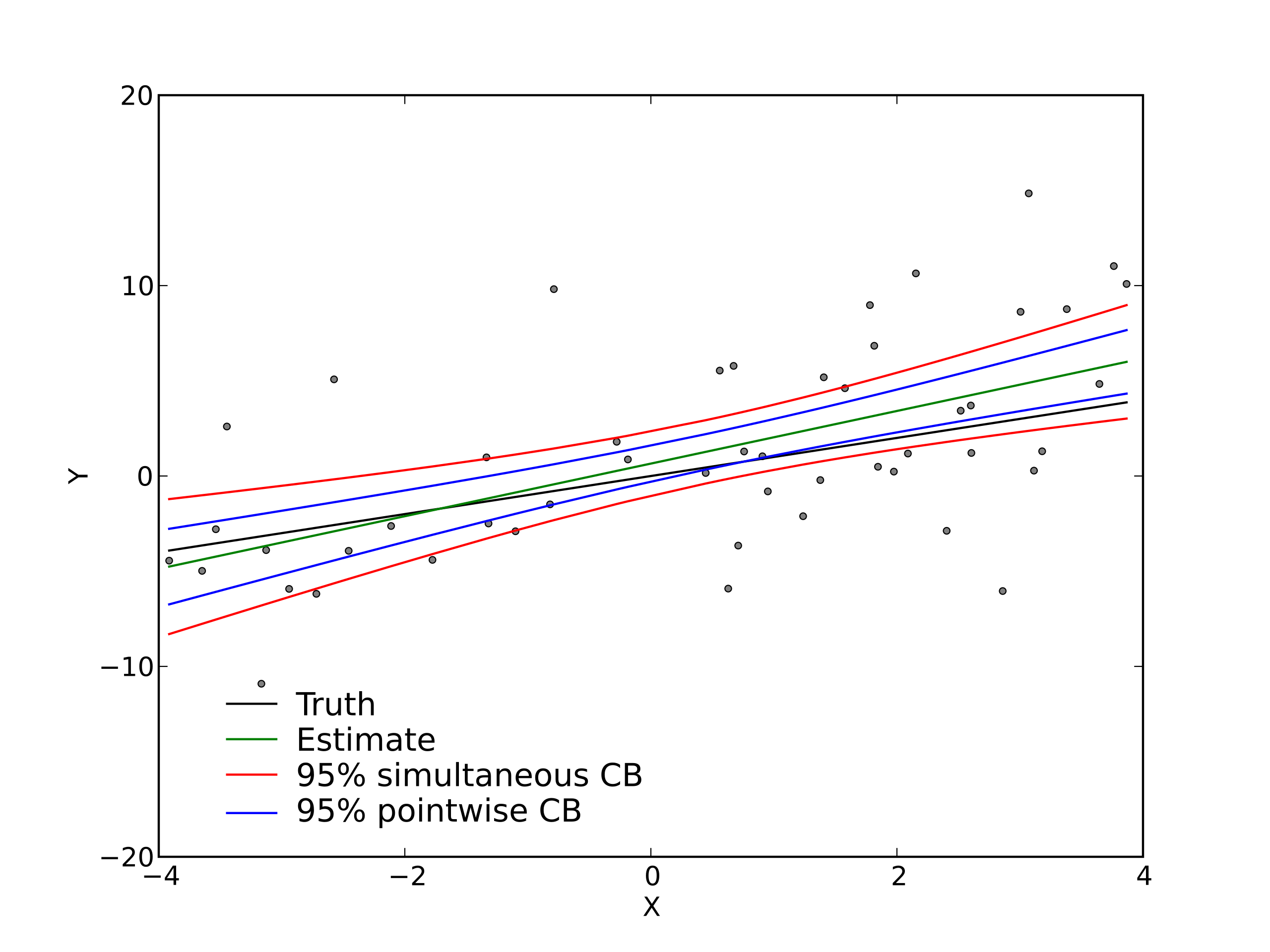
English: Plot showing a regression fit to a simulated data set, along with 95% point-wise and simultaneous confidence bands. |
| Date | |
| Source | Own work |
| Author | Skbkekas |
| Other versions |
[]
|
| SVG development | This plot was created with Matplotlib. |
| Source code | Python codeimport numpy as np
import matplotlib.pyplot as plt
import scipy.special as sp
## Sample size.
n = 50
## Predictor values.
XV = np.random.uniform(low=-4, high=4, size=n)
XV.sort()
## Design matrix.
X = np.ones((n,2))
X[:,1] = XV
## True coefficients.
beta = np.array([0, 1.], dtype=np.float64)
## True response values.
EY = np.dot(X, beta)
## Observed response values.
Y = EY + np.random.normal(size=n)*np.sqrt(20)
## Get the coefficient estimates.
u,s,vt = np.linalg.svd(X,0)
v = np.transpose(vt)
bhat = np.dot(v, np.dot(np.transpose(u), Y)/s)
## The fitted values.
Yhat = np.dot(X, bhat)
## The MSE and RMSE.
MSE = ((Y-EY)**2).sum()/(n-X.shape[1])
s = np.sqrt(MSE)
## These multipliers are used in constructing the intervals.
XtX = np.dot(np.transpose(X), X)
V = [np.dot(X[i,:], np.linalg.solve(XtX, X[i,:])) for i in range(n)]
V = np.array(V)
## The F quantile used in constructing the Scheffe interval.
QF = sp.fdtri(X.shape[1], n-X.shape[1], 0.95)
## The lower and upper bounds of the Scheffe band.
D = s*np.sqrt(X.shape[1]*QF*V)
LB,UB = Yhat-D,Yhat+D
## The lower and upper bounds of the pointwise band.
D = s*np.sqrt(2*V)
LBP,UBP = Yhat-D,Yhat+D
## Make the plot.
plt.clf()
plt.plot(XV, Y, 'o', ms=3, color='grey')
plt.hold(True)
a = plt.plot(XV, EY, '-', color='black')
b = plt.plot(XV, LB, '-', color='red')
plt.plot(XV, UB, '-', color='red')
c = plt.plot(XV, LBP, '-', color='blue')
plt.plot(XV, UBP, '-', color='blue')
d = plt.plot(XV, Yhat, '-', color='green')
B = plt.legend( (a,d,b,c), ("Truth", "Estimate", "95% simultaneous CB",\
"95% pointwise CB"), 'lower left')
B.draw_frame(False)
plt.ylim([-20,15])
plt.gca().set_yticks([-20,-10,0,10,20])
plt.xlim([-4,4])
plt.gca().set_xticks([-4,-2,0,2,4])
plt.xlabel("X")
plt.ylabel("Y")
plt.savefig("regression_confidence_band.png")
plt.savefig("regression_confidence_band.svg")
|


Licensing[edit]
I, the copyright holder of this work, hereby publish it under the following license:
This file is licensed under the Creative Commons Attribution 3.0 Unported license.
- You are free:
- to share – to copy, distribute and transmit the work
- to remix – to adapt the work
- Under the following conditions:
- attribution – You must give appropriate credit, provide a link to the license, and indicate if changes were made. You may do so in any reasonable manner, but not in any way that suggests the licensor endorses you or your use.
File history
Click on a date/time to view the file as it appeared at that time.
| Date/Time | Thumbnail | Dimensions | User | Comment | |
|---|---|---|---|---|---|
| current | 04:37, 11 April 2009 | | 720 × 540 (47 KB) | Skbkekas (talk | contribs) | {{Information |Description={{en|1=Plot showing a regression fit to a simulated data set, along with 95% point-wise and simultaneous confidence bands.}} |Source=Own work by uploader |Author=Skbkekas |Date=2009-04-11 |Permission= |other_ve |
You cannot overwrite this file.
File usage on Commons
The following 3 pages use this file:
File usage on other wikis
The following other wikis use this file:
- Usage on en.wikipedia.org
- Usage on www.wikidata.org