Commons:Featured picture candidates/File:Global Temperature Anomaly.gif
File:Global Temperature Anomaly.gif, featured[edit]
Voting period is over. Please don't add any new votes.Voting period ends on 21 Oct 2018 at 07:36:48 (UTC)
Visit the nomination page to add or modify image notes.

- Category: Commons:Featured pictures/Animated
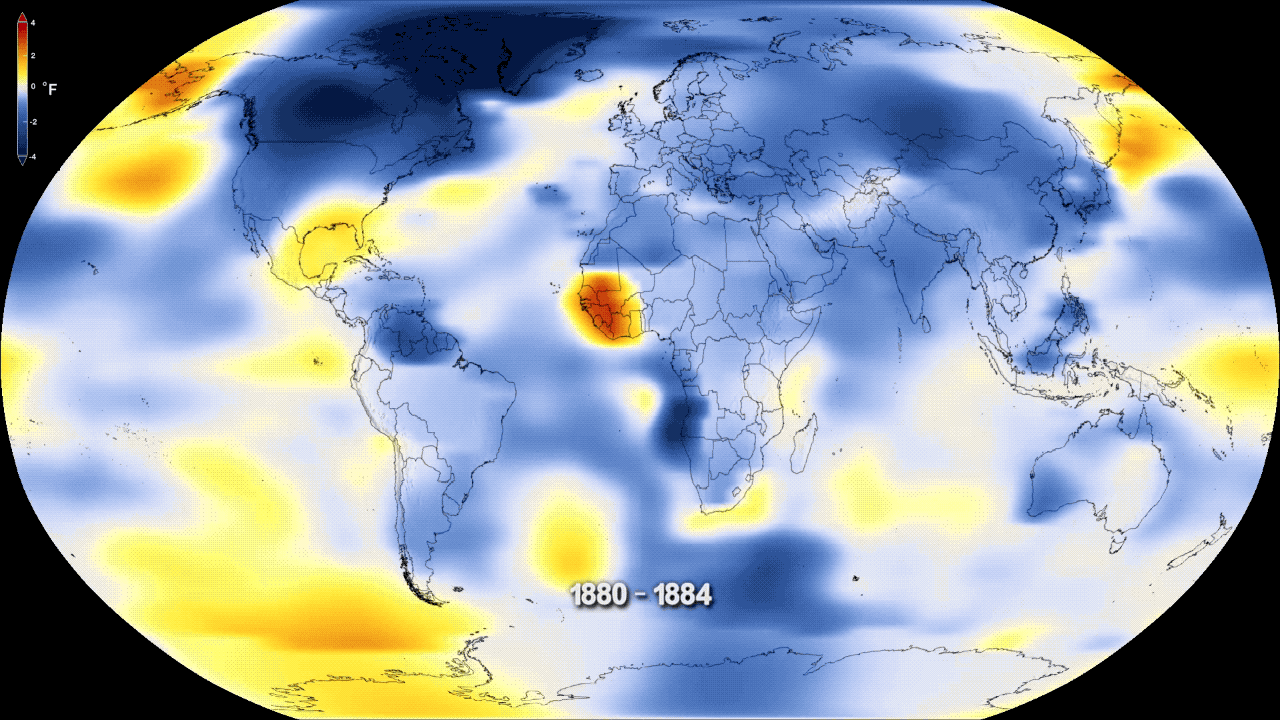
 Info created by NASA's Goddard Space Flight Center - uploaded by Habitator terrae - nominated by Habitator terrae -- Habitator terrae (talk) 07:36, 12 October 2018 (UTC)
 Support -- Habitator terrae (talk) 07:36, 12 October 2018 (UTC)
* Scary... And for those who still wonder about size for gifs, this image consists of 79 frames so the real file size is 79 x 1,280 × 720 pixels = 72.8 Mpx which is very large for a complex gif. It's about as large as the system can take. --Cart (talk) 08:22, 12 October 2018 (UTC)
![]() Support
Support
- Move to support the video. --Cart (talk) 10:48, 13 October 2018 (UTC)
- Support, and should also be a VI. -- Ikan Kekek (talk) 09:30, 12 October 2018 (UTC)
- Support This should run endlessly on the TVs Donald Trump uses to stare at ... --Granada (talk) 09:37, 12 October 2018 (UTC)
 Comment - That would be Fox "News". Fat chance! -- Ikan Kekek (talk) 11:13, 12 October 2018 (UTC)
 Neutral The animation runs too fast, making the file less useful.--Peulle (talk) 10:05, 12 October 2018 (UTC)
- Peulle, just what I thought. This is set to a 0.1 sek change rate. If you look at the file's page (Other versions) you can see that I have made a version that runs at only 0.5 sek speed. If need be I can make other versions that run even slower so that it is possible to examine the map at any speed you like. I think the 'fast' original gives you a good quick idea of what's going on, after that you can get nerdy and examine the map more closely. It's even possible to extract the individual images from this gif and make a still series of it. --Cart (talk) 10:31, 12 October 2018 (UTC)
- Yes, the slower one works better. I'm still considering opposing, though, since I also think it should be bigger; the ideal use of this file (IMO) is on a powerpoint presentation on a big screen in front of a crowd, and for big projector screens, the current size is not ideal. Btw.: having the individual images available for separate viewing, as in an album, would be useful, so there could be a link to that in the files.--Peulle (talk) 10:39, 12 October 2018 (UTC)
- Since it is a gif you always have to factor in the number of images when it comes to size. This consists of 79 images and that is about as big as the system can handle, so a bigger image is not possible. See above for how to calculate the size of a gif. This is the equivalent of a 72.8 Mpx image. Btw, the image reaches a bigger audience via people's phones than powerpoint, so IMO that is the ideal use. --Cart (talk) 10:44, 12 October 2018 (UTC)
- At my computer the fast version is not so good, too, because my internet is to slow. But after you wait the gif has run one time, you see the gif with the true speed. You also could see on a smaller version, than the original version (with the descripted problem). In my view. The fast version, because, you see the weather changes (5 years) and see also the climate changes (>30 years), where the focus is on. So it shows very good, that weather isn't climate. The slow version doesn't discribe this so good, I think. Habitator terrae (talk) 11:26, 12 October 2018 (UTC)
- Comment too fast for me. Can the speed be changed? Charles (talk) 10:53, 12 October 2018 (UTC)
- Charles, yes, see the discussion above. --Cart (talk) 11:03, 12 October 2018 (UTC)
 Oppose Illustrates well why this 30-year-old image format should not be used in this millennium. We can now stream video, adapt the quality to the bandwidth, speed it up or slow it down in real time, pause it, and whizz forward and backward at will. This is eye-candy, visually intrusive, CPU hogging, bloated and I get the point on the very first pass so why loop? I can't see how anyone would enjoy reading and pay attention to an article on this serious topic with this flickering away in the corner of your screen. Also, what's with the filename? An "anomaly" is a [singular] deviation from standard, not a trend upwards. -- Colin (talk) 11:22, 12 October 2018 (UTC)
- Even so, the format is not prohibited and sometimes more reliable/easier to play than video files. Why else would there be need for the constant "Problems playing the file?" on video files. Last year a gif ended up on third place in POTY. --Cart (talk) 12:12, 12 October 2018 (UTC)
- The heart isn't quite so distracting with colour flicker as this. But even so, a video format would have been better. If WMF have problems with playing videos then they should invest in making a better player. I don't have any problems playing youtube videos. And with modern video editing suites it would be trivial to produce a 4K, HD, SD, etc version. --Colin (talk) 13:08, 12 October 2018 (UTC)
- Cart, thinking about the heart gif, I think the old talking frog joke explains it. -- Colin (talk) 17:49, 12 October 2018 (UTC)
- Oppose The endless loop is horribly distracting when you'r trying to read the page it's embedded in, even in the slower version. GIF is stone age, and so is using Fahrenheit for scientific results (from a global perspective). --El Grafo (talk) 12:10, 12 October 2018 (UTC)
- @El Grafo and Charlesjsharp: Yes, I know Fahrenheit isn't in the SI, but here we see only the anomaly. And there is a°F-b=a°C-b=c°K-b. So this is irrelevant. Habitator terrae (talk) 12:55, 12 October 2018 (UTC)
- I agree it is less problematic than with absolute values. I strongly disagree with the term irrelevant though. --El Grafo (talk) 13:04, 12 October 2018 (UTC) and BTW: there is no "°K"
- It isn't just about SI but the fact the majority of the world won't have a feel for what +/- 4°F means, and knowing what this temperature change means is kind of the point. -- Colin (talk) 13:08, 12 October 2018 (UTC)
- I'm so stupid (I didn't know so much about Fahrenheit, I thinked, that there are the same rules than Celcius): It's more relevant then I thinked: 0,56a°F-b=a°C-b=c°K-b
 . I work on a K version. Habitator terrae (talk) 14:21, 12 October 2018 (UTC)
- I'm so stupid (I didn't know so much about Fahrenheit, I thinked, that there are the same rules than Celcius): It's more relevant then I thinked: 0,56a°F-b=a°C-b=c°K-b
- @El Grafo and Charlesjsharp: Yes, I know Fahrenheit isn't in the SI, but here we see only the anomaly. And there is a°F-b=a°C-b=c°K-b. So this is irrelevant. Habitator terrae (talk) 12:55, 12 October 2018 (UTC)
- Oppose I agree. Fahrenheit? 12:31, 12 October 2018 (UTC) — Preceding unsigned comment added by Charlesjsharp (talk • contribs) 12:31, 12 October 201 (UTC)
- See above. Habitator terrae (talk) 12:55, 12 October 2018 (UTC)
- Info At least a converter is added to the decription: "The scale shows a temperature change of ±4 F° or ±2.2 C°." --Cart (talk) 13:32, 12 October 2018 (UTC)
- Oppose per Colin, who has made this point before but never as forcefully as he does here. .GIFs were always just a stopgap, a format that was developed so people on CompuServe (remember that?) could share images (".GIF! .GIF! .GIF!" ... ah, those were the days). IMO .PNG has superseded .GIF as a better lossless image format for stills, and as noted now that we have better video capabilities here we can leave the animated ones to memes. Daniel Case (talk) 16:47, 12 October 2018 (UTC)
- Oppose The video is much better. --Yann (talk) 16:40, 13 October 2018 (UTC)
Alternative[edit]

- Info Here is the Kelvin-Version --Habitator terrae (talk) 15:19, 12 October 2018 (UTC)
* Works too. --Cart (talk) 15:32, 12 October 2018 (UTC)
![]() Support
Support
- Move to support the video. --Cart (talk) 10:48, 13 October 2018 (UTC)
- Support --Habitator terrae (talk) 15:36, 12 October 2018 (UTC)
- Ikan Kekek, this is only how many degrees up or down the temperature has fluctuated, not the actual temperature. K and C have the same steps unlike F. So whether it is written as 1K up or 1C, doesn't matter, it's the same. --Cart (talk) 16:06, 12 October 2018 (UTC)
- and K is in the SI. Habitator terrae (talk) 16:12, 12 October 2018 (UTC)
- I know that degrees Kelvin and Celsius are the same size, but in the English description of the Fahrenheit version, it states: "The scale shows a temperature change of ±4 F° or ±2.2 C°." This makes things clear, should be in German, too, and should be included in the description for this version, too (though it can be restricted to mentioning variation of degrees Kelvin). I'll provisionally Support, but I think everyone can see how I was confused. -- Ikan Kekek (talk) 19:10, 12 October 2018 (UTC)
- I've added the temp clarification to this Alt's description. For clarity and correct language, someone who speaks German should add the translation to the files. --Cart (talk) 19:34, 12 October 2018 (UTC)
- I know that degrees Kelvin and Celsius are the same size, but in the English description of the Fahrenheit version, it states: "The scale shows a temperature change of ±4 F° or ±2.2 C°." This makes things clear, should be in German, too, and should be included in the description for this version, too (though it can be restricted to mentioning variation of degrees Kelvin). I'll provisionally
![]() Comment @Charlesjsharp: What do you say to this animation? Habitator terrae (talk) 08:48, 13 October 2018 (UTC)
Comment @Charlesjsharp: What do you say to this animation? Habitator terrae (talk) 08:48, 13 October 2018 (UTC)
- Comment It's still too fast and you cannot easily see the temperature scale (should be Celsius) Charles (talk) 12:28, 13 October 2018 (UTC)
- Oppose The video is much better. --Yann (talk) 16:40, 13 October 2018 (UTC)
Slow video alternative[edit]
![]() Info @W.carter, Ikan Kekek, Granada, Peulle, Charlesjsharp, Colin, El Grafo, and Daniel Case: Here a compromise version, that I found on another page of the NASA. All critical things are solved: It is slow, it is a video, it is in °C and the title is Global temperature changes
Info @W.carter, Ikan Kekek, Granada, Peulle, Charlesjsharp, Colin, El Grafo, and Daniel Case: Here a compromise version, that I found on another page of the NASA. All critical things are solved: It is slow, it is a video, it is in °C and the title is Global temperature changes ![]() . What do you thing of this? Habitator terrae (talk) 10:39, 13 October 2018 (UTC)
. What do you thing of this? Habitator terrae (talk) 10:39, 13 October 2018 (UTC)
- Support --Habitator terrae (talk) 10:40, 13 October 2018 (UTC)
- Support Nice, you have taken to heart all the comments here. Also 'pinging' Colin, Daniel Case, El Grafo, Granada. --Cart (talk) 10:48, 13 October 2018 (UTC)
- Comment Better, but why not just have one year increasing top right? And make the temperature scale legible. Charles (talk) 12:30, 13 October 2018 (UTC)
- The original was made by NASA and they made the individual frames in four-years-segments. The uploader can't add information that NASA didn't provide. --Cart (talk) 12:48, 13 October 2018 (UTC)
- I surf on the NASA-Website, and I think I will find something. Please wait a bit. Habitator terrae (talk) 12:52, 13 October 2018 (UTC)
- I found a high resolution scale. But I didn't found an one year Video, and I think, this video is better. Info Now the video has a 3.840 × 2.160 px per frame (that are 8.3 mp). Habitator terrae (talk) 13:22, 13 October 2018 (UTC)
- Ok, while your enthusiasm for your image is commendable, please know that with each change and alternative, voter's interest in the nomination will fade. Most voters don't revisit a nom once they have cast their vote. You are new on this forum and on a bit of a learning curve, but ideally, this should not be a media lab and nominations should be as ready as they can be when posted here. Think about that in the future. --Cart (talk) 13:39, 13 October 2018 (UTC)
- Sorry, I didn't think, that they would be so critical with my nomination. Habitator terrae (talk) 14:17, 13 October 2018 (UTC)
- And didn't know about the other animations. After it seems to be, that the file has non chance, I reasearch on the Website for better images. Habitator terrae (talk) 14:19, 13 October 2018 (UTC)
- Don't worry, you will learn how to do this.
 It is a very demanding and tough forum and voters here will complain about the smallest thing to select "the best of the best" images on Commons. I think you have done well for a first-timer, you survived and delivered. --Cart (talk) 14:29, 13 October 2018 (UTC)
- Maybe there is a little confusion with Charles taking your "you have taken to heart all the comments here" literally as though Habitator terrae was the author and could therefore tweak it. Obviously, with third-party sources, there is much less we can or should do. -- Colin (talk) 16:00, 13 October 2018 (UTC)
- Don't worry, you will learn how to do this.
- I found a high resolution scale. But I didn't found an one year Video, and I think, this video is better.
- Support Wonderful. I can look at this in 4K and it is smooth like a lava lamp and inevitably moves towards hot. This is something that could easily be incorporated into a TV documentary or current affairs programme, and the individual frames are good enough to be used in a magazine. Exactly what FP should aim for. -- Colin (talk) 16:00, 13 October 2018 (UTC)
- Habitator terrae, I still think (after the nomination closes) the filename(s) should be changed. NASA's title is "Global Temperature Anomalies from 1880 to 2017" which would be a much better title, though their claim that the baseline of "1951 to 1980" is "normal" and so the red, yellow and blue represent "anomalies" is strange language -- they are deviations from an arbitrary baseline but hardly unexpected or irregular. Still, picking NASA's title is better than this one. -- Colin (talk) 12:16, 14 October 2018 (UTC)
- @Colin and Habitator terrae: "temperature anomaly relative to $reference_period" is exactly how climatologists call this kind of thing. So yes, that's how the file should be named, imho. The reference period doesn't really matter, as temperature during the reference period just serves as a baseline; this is never meant to imply that the average temperature from 1951 to 1980 would be somehow normal or natural, it's just one way of looking at things. --El Grafo (talk) 07:47, 15 October 2018 (UTC)
- El Grafo, the thing is it isn't an "anomaly" but "Global Temperature Anomalies from 1880 to 2017", which should be the filename. It is quite misleading to use the singular (and echo's Trump's recent claim that "it'll change back" as though this is all just a blip). As for "normal", see the NASA article, which repeatedly (and IMO incorrectly) keeps referring to "Higher than normal" and "Lower than normal", rather than the correct neutral term "baseline". At least the Commons file description doesn't make that mistake. -- Colin (talk) 10:46, 15 October 2018 (UTC)
- @Colin and Habitator terrae: "temperature anomaly relative to $reference_period" is exactly how climatologists call this kind of thing. So yes, that's how the file should be named, imho. The reference period doesn't really matter, as temperature during the reference period just serves as a baseline; this is never meant to imply that the average temperature from 1951 to 1980 would be somehow normal or natural, it's just one way of looking at things. --El Grafo (talk) 07:47, 15 October 2018 (UTC)
- Habitator terrae, I still think (after the nomination closes) the filename(s) should be changed. NASA's title is "Global Temperature Anomalies from 1880 to 2017" which would be a much better title, though their claim that the baseline of "1951 to 1980" is "normal" and so the red, yellow and blue represent "anomalies" is strange language -- they are deviations from an arbitrary baseline but hardly unexpected or irregular. Still, picking NASA's title is better than this one. -- Colin (talk) 12:16, 14 October 2018 (UTC)
- Support Good. --Yann (talk) 16:40, 13 October 2018 (UTC)
- Support - I liked the other versions, too, but this is a big improvement. -- Ikan Kekek (talk) 21:17, 13 October 2018 (UTC)
- Support --MZaplotnik(talk) 10:40, 14 October 2018 (UTC)
- Support --S. DÉNIEL (talk) 15:37, 14 October 2018 (UTC)
- weak support There are still some things I dislike about the cartography, but let'S not get lost in details … --El Grafo (talk) 07:22, 15 October 2018 (UTC)
- Support High educative value -- Basile Morin (talk) 02:42, 17 October 2018 (UTC)
- Support --Karelj (talk) 21:26, 17 October 2018 (UTC)
- Support --GeXeS (talk) 11:31, 18 October 2018 (UTC)