Commons:Featured picture candidates/File:Плоская Башня Псковского Кремля.jpg
Jump to navigation
Jump to search

File:Плоская Башня Псковского Кремля.jpg, featured[edit]
Voting period is over. Please don't add any new votes.Voting period ends on 9 Dec 2016 at 18:29:26 (UTC)
Visit the nomination page to add or modify image notes.

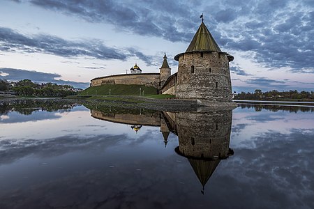
- Category: Commons:Featured pictures/Places/Architecture/Towers
 Info created by Sachkv - uploaded by Sachkv - nominated by JukoFF -- JukoFF (talk) 18:29, 30 November 2016 (UTC)
 Support -- JukoFF (talk) 18:29, 30 November 2016 (UTC)
 Comment - Beautiful, but I think it needs perspective correction. Everything to the left of the turret seems to lean left, and some of the leaning is very pronounced. -- Ikan Kekek (talk) 21:54, 30 November 2016 (UTC)
- Info My attempt to fix perspective distortion. Please revert, if it's not ok. --Ivar (talk) 11:22, 1 December 2016 (UTC)
- I Support this version. A little unsharpness on the left side in no way cancels out the beauty of the photo. -- Ikan Kekek (talk) 11:30, 1 December 2016 (UTC)
- I
- Support --Ivar (talk) 13:48, 1 December 2016 (UTC)
- Comment Will have to oppose if distortion cannot be corrected. Charles (talk) 12:20, 1 December 2016 (UTC)
- Support Daniel Case (talk) 16:49, 1 December 2016 (UTC)
- Support Think distortion is gone, but i wouldnt compare is to this old tower, maybe to white church inside, where windows seem fine. Some strange stuff is inside the lake.--Mile (talk) 19:20, 1 December 2016 (UTC)
- Support --Agnes Monkelbaan (talk) 19:24, 1 December 2016 (UTC)
- Support lNeverCry 19:57, 1 December 2016 (UTC)
- Support --Martin Falbisoner (talk) 07:04, 2 December 2016 (UTC)
- Support -- Johann Jaritz (talk) 08:27, 2 December 2016 (UTC)
- Comment It looks like oversharpened. There are halos from sharpening around the building. --XRay talk 11:42, 2 December 2016 (UTC)
- Saw similar, but more on 200 %. Problem: again not in sRGB color - Sachkv, JukoFF !? --Mile (talk) 15:14, 3 December 2016 (UTC)
- I am not the author of photos. According to this answer to your comments I can not. JukoFF (talk) 16:29, 3 December 2016 (UTC)
 Oppose Overdone is several aspects IMO (distortion, contrast, sharpness, colors). A typical candidate for a prize in WLM, but not for FP, as stated in our guidelines.--Jebulon (talk) 23:27, 3 December 2016 (UTC)
- Oppose Too much distortion. --Yann (talk) 10:26, 4 December 2016 (UTC)
- Support At first sight, the tower looks tilted, but I may be wrong, as the perspective is otherwise OK, particularly at the edges. The sharpening is somewhat overdone, but on the other hand, the noise is extremely well managed, which is really not self-evident. The composition is fine. There is no reason to me to refuse FP star for this image. The quality is still very decent and I'm glad Russian WLM has now quite a high bar on quality (this was not always the case, as you may guess). --A.Savin 23:03, 5 December 2016 (UTC)
Confirmed results:
Result: 10 support, 2 oppose, 0 neutral → featured. /lNeverCry 23:19, 9 December 2016 (UTC)
This image will be added to the FP gallery: Places/Architecture/Towers