Commons:Quality images candidates/Archives October 2008
Jump to navigation
Jump to search

-

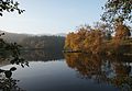
- Nomination Sunset over the Vercors mountains, France --Eusebius 16:15, 28 October 2008 (UTC)
- Promotion Good quality, great atmosphere. I like it. MathKnight 17:39, 28 October 2008 (UTC)
-

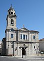
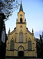
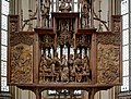
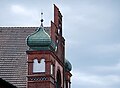
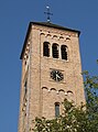
- Nomination Bamberg Cathedral --Berthold Werner 12:14, 28 October 2008 (UTC)
- Promotion Definitely QI. - Till.niermann 16:02, 28 October 2008 (UTC)
-
-
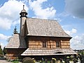
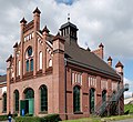
- Nomination Wooden church in Woźniki, Poland -- Przykuta 16:19, 27 October 2008 (UTC)
- Promotion OK. --Berthold Werner 12:24, 28 October 2008 (UTC)
-

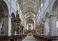
- Nomination Choir and rood screen (Albi cathedral, France) --Pom² 20:16, 27 October 2008 (UTC)
- Promotion Fascinant. Techniquement bon. Albertus teolog 21:46, 28 October 2008 (UTC)
-

-

-

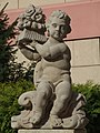
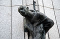
- Nomination Monument of polish scouts in Katowice (Kattowitz), Upper Silesia --Pudelek 12:45, 23 October 2008 (UTC)
- Promotion how about a description in English? --Mbdortmund 15:58, 23 October 2008 (UTC)
 Info - done --Pudelek 16:44, 23 October 2008 (UTC) picture is good --Mbdortmund 10:48, 29 October 2008 (UTC)
-

-
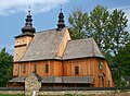
- Nomination church from Łosina Dolna, open air museum in Nowy Sącz, Poland --Przykuta 16:00, 27 October 2008 (UTC)
- Decline This one needs perspective correction. In my opinion. --Berthold Werner 12:24, 28 October 2008 (UTC)
-

-
-

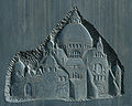
- Nomination Coats of arms of Proskowski family (left) and Lobkowitz family in Opole (Oppeln) --Pudelek 21:14, 19 October 2008 (UTC) Probably too dark. --Lestath 08:21, 25 October 2008 (UTC
- Decline a few dark. and not sharp detail for sculpture. _Fukutaro 16:19, 27 October 2008 (UTC)) Too dark, the upper motif looks like it should be nearly white, not grey. --PieCam 14:15, 29 October 2008 (UTC)
-

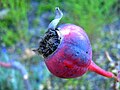
- Nomination Lycoperdon perlatum --Yarl 15:44, 27 October 2008 (UTC)
- Decline I like the image, but I cannot support it. The mushroom's cap is overexposed on the left hand side. Another problem I have is that the grass is crossing the main subject of the photo and is a bit distracting. J.smith 00:15, 28 October 2008 (UTC)
-

-

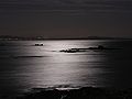
- Nomination On a full moon night --Kprateek88 10:06, 26 October 2008 (UTC)
- Promotion The moon is a very difficult subject to capture... I think this image does a great job and fits in well with the holidays. :) --J.smith 00:24, 28 October 2008 (UTC)~
-

- Nomination Pollution, Ribeira, Galicia--Lmbuga 02:19, 26 October 2008 (UTC)
- Decline Distracting tilt. - Till.niermann 06:22, 28 October 2008 (UTC)
-

-
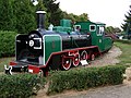
- Nomination Steam locomotive -- Albertus teolog 08:08, 22 October 2008 (UTC)
- Decline In my opinion sky is overexposed --Pudelek 18:44, 27 October 2008 (UTC)
 Comment Color temperature of pure sky is around 10000K (white) Albertus teolog 19:19, 27 October 2008 (UTC)
-
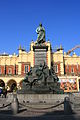
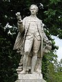
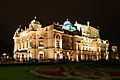
- Nomination: Adam Mickiewicz Monument in Kraków. --Lestath 22:18, 21 October 2008 (UTC)
- Review needed
-

- Nomination: Monument of Svantevit. --Lestath 22:13, 21 October 2008 (UTC)
- Review needed
-

- Nomination: The market square in Bytom. --Lestath 22:13, 21 October 2008 (UTC)
- Review needed
-

- Nomination Loreto near Starý Hrozňatov (Cheb, Karlovy Vary Region, Czech Republic)--Ondřej Žváček 21:38, 20 October 2008 (UTC)
- Decline color is unnatural chroma. _Fukutaro 16:17, 27 October 2008 (UTC)
-

-

- Nomination Tympanum -- Albertus teolog 13:16, 19 October 2008 (UTC)
- Decline Too tight crop. _Fukutaro 16:19, 27 October 2008 (UTC)
-

-

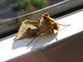
- Nomination Argynnis paphia --Bartiebert 11:24, 26 October 2008 (UTC)
- Promotion Good shot. Wings are nice and sharp. Elucidate 09:18, 27 October 2008 (UTC)
-

- Nomination The tomb of Christopher Columbus --Pom² 22:28, 25 October 2008 (UTC)
- Promotion Certainly QI --Massimo Catarinella 16:22, 26 October 2008 (UTC)
-

-

-
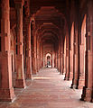
![* Nomination Abbey church in Neuzelle --PetrusSilesius 21:25, 23 October 2008 (UTC) * Decline Minus: contrast too strong, we can barely see any detail in the altar and the vault, while the columns on both sides are washed out; please try to improve the situation with a software such as Photoshop. Plus: nice perspective of this seemingly beautiful church.--Tango7174 00:32, 27 October 2008 (UTC) In situations like this I use a tripod, the exposure bracketing function of my camera and tufuse [1] to mix the photographs. --Berthold Werner 07:16, 27 October 2008 (UTC)](https://upload.wikimedia.org/wikipedia/commons/thumb/b/b4/Neuzelle_Klosterkirche_Mittelschiff.jpg/76px-Neuzelle_Klosterkirche_Mittelschiff.jpg)
- Nomination Abbey church in Neuzelle --PetrusSilesius 21:25, 23 October 2008 (UTC)
- Decline Minus: contrast too strong, we can barely see any detail in the altar and the vault, while the columns on both sides are washed out; please try to improve the situation with a software such as Photoshop. Plus: nice perspective of this seemingly beautiful church.--Tango7174 00:32, 27 October 2008 (UTC)
In situations like this I use a tripod, the exposure bracketing function of my camera and tufuse [1] to mix the photographs. --Berthold Werner 07:16, 27 October 2008 (UTC)
-

- Nomination Fireworks, Santiago de Compostela, Galicia, Spain--Lmbuga 00:53, 26 October 2008 (UTC)
- Promotion good --Mbdortmund 12:09, 26 October 2008 (UTC)
-

- Nomination Fireworks, Santiago de Compostela, Galicia, Spain--Lmbuga 00:13, 26 October 2008 (UTC)
- Promotion good --Mbdortmund 12:09, 26 October 2008 (UTC)
-
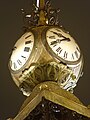
- Nomination Note the second hands. --Kprateek88 19:12, 25 October 2008 (UTC)
- Decline Too much noise--Lmbuga 02:30, 26 October 2008 (UTC)
-

- Nomination Entombment of Christ in Joinville Church. Vassil 12:21, 25 October 2008 (UTC)
- Promotion Excellent -- Albertus teolog 10:31, 26 October 2008 (UTC)
-

-

- Nomination Palace in Nakło Śląskie. --Lestath 18:56, 24 October 2008 (UTC)
- Promotion Ok. --Berthold Werner 18:10, 25 October 2008 (UTC)
-

- Nomination Mid-autumn festival at the Botanical Garden in Montreal. --Tango7174 12:38, 24 October 2008 (UTC)
- Promotion Seems to be noisy but I think it's acceptable. --Berthold Werner 18:10, 25 October 2008 (UTC)
-

- Nomination Notre-Dame Basilica in Montreal. --Tango7174 12:38, 24 October 2008 (UTC)
- Promotion Ok. --Berthold Werner 18:10, 25 October 2008 (UTC)
-
- Nomination Remains of a mill in the fields in Weerde, Belgium, Author:David Edgar. --Mmxx 23:56, 24 October 2008 (UTC)
- Promotion Nice. Ok for QI. --Berthold Werner 18:10, 25 October 2008 (UTC)
-
- Nomination Alternate to
 --Mrmariokartguy 01:40, 24 October 2008 (UTC)
 - Decline Lower half is underexposed. - Till.niermann 11:25, 26 October 2008 (UTC)
- Nomination Alternate to
-
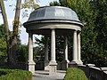
- Nomination: Garden pavilion in Rogów Opolski (Rogau), Upper Silesia --Pudelek 21:14, 19 October 2008 (UTC)
- Review needed
-

- Nomination Couto de Ximonde, Ulla river, Vedra, (Galicia--Lmbuga 18:33, 17 October 2008 (UTC)
- Promotion Quiet. --B.navez 13:46, 25 October 2008 (UTC)
-

-

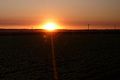
- Nomination A beautiful sunset near a farm close to Salinas CA. --Mrmariokartguy 01:38, 24 October 2008 (UTC)
- Decline Disturbing wire. --Eusebius 12:22, 24 October 2008 (UTC)
-

- Nomination Abbey church in Neuzelle --PetrusSilesius 21:25, 23 October 2008 (UTC)
- Promotion Perspective overcorrected. --Lestath 22:42, 23 October 2008 (UTC) It's more natural now -- PetrusSilesius 17:48, 24 October 2008 (UTC) Now it's OK. --Lestath 08:18, 25 October 2008 (UTC)
-

- Nomination Abbey church in Neuzelle --PetrusSilesius 21:25, 23 October 2008 (UTC)
- Decline Perspective overcorrected. --Lestath 22:42, 23 October 2008 (UTC) It's more natural now -- PetrusSilesius 17:48, 24 October 2008 (UTC)
-

-

-

- Nomination: Dar es Salaam Skyline --Muhammad Mahdi Karim 17:00, 18 October 2008 (UTC)
- Review needed
-

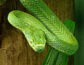
- Nomination: Grass snake, Natrix natrix. --Bartiebert 12:34, 18 October 2008 (UTC)
- Review needed
-

-

- Nomination Neuzelle abbey --PetrusSilesius 21:25, 23 October 2008 (UTC)
- Promotion It's OK, very good sharpness. --Lestath 22:40, 23 October 2008 (UTC)
-

- Nomination Abbey church in Neuzelle --PetrusSilesius 21:25, 23 October 2008 (UTC)
- Promotion QI. Good colours and perspective. --Lestath 22:41, 23 October 2008 (UTC)
-
- Nomination Abbey church in Neuzelle: Baptism of Christ --PetrusSilesius 21:25, 23 October 2008 (UTC)
- Decline Overexposed parts. --Lestath 22:41, 23 October 2008 (UTC)
-

- Nomination Mount Fuji, as seen from Hakone, Japan.--Σ64 15:13, 23 October 2008 (UTC)
- Decline Crop/composition, blue haze. - Till.niermann 05:27, 24 October 2008 (UTC)
-
- Nomination Struthio camelus --MathKnight 20:51, 22 October 2008 (UTC))
- Promotion Distracting dark part at lower left. - Till.niermann 05:44, 23 October 2008 (UTC)
I cropped the image. Please reconsider. MathKnight 17:24, 23 October 2008 (UTC)
I think now it's OK, although the image would be better without the shadow at the lower left. But - you can't pin down the critters... - Till.niermann 18:16, 23 October 2008 (UTC)
-

- Nomination Cathédrale Saint-Pierre de Nantes, France --Eusebius 16:37, 22 October 2008 (UTC)
- Promotion Good image --Twdragon 17:39, 22 October 2008 (UTC)
It is certainly a good picture of the facade but it is too small for large reprints and the asymmetry between the white part and the grey part is disturbing. --MathKnight 20:40, 22 October 2008 (UTC)
About size: it is over QI requirements, no pb. About asymmetry: it is intrinsic to the building (due to different restoration dates) and any correction of it would be deceiving (and thus incompatible with QI guidelines) --Eusebius 09:40, 23 October 2008 (UTC)
-

-
- Nomination: Xirimbao, (concello de Teo, provicia da Coruña, Galicia)--Lmbuga 20:51, 17 October 2008 (UTC)
- Review needed
-
- Nomination: Beach of Barraña (concello de Boiro, provicia da Coruña, Galicia), Ria of Arousa--Lmbuga 20:44, 17 October 2008 (UTC)
- Review needed
-
- Nomination: Beach of Barraña (concello de Boiro, provicia da Coruña, Galicia), Ria of Arousa--Lmbuga 20:36, 17 October 2008 (UTC)
- Review needed
-

- Nomination: Beach of Carnota (concello de Carnota, provicia da Coruña, Galicia), Ria of Arousa--Lmbuga 20:11, 17 October 2008 (UTC)
- Review needed
-
- Nomination: Port ofCastiñeiras (concello de Ribeira, provicia da Coruña, Galicia), Ria of Arousa--Lmbuga 19:29, 17 October 2008 (UTC)
- Review needed
-

- Nomination: The singer of Phazm. Vassil 18:59, 17 October 2008 (UTC)
- Review needed
-
- Nomination Church of Vilanova de Arousa, Galicia, Spain--Lmbuga 14:05, 22 October 2008 (UTC)
- Promotion The tower is slightly distorted, but acceptable for QI. -- MJJR 20:12, 22 October 2008 (UTC)
-
- Nomination: Thysanoplusia orichalcea, Barraña, Boiro, (Galicia)--Lmbuga 18:38, 17 October 2008 (UTC)
- Review needed
-

- Nomination Coat of arms of France (Louis XIV) in the castle of Nantes --Eusebius 05:43, 21 October 2008 (UTC)
- Promotion Info It is impossible to have the whole shadow in the frame (bottom centre), there is a window right below the crop line. --Eusebius 13:16, 21 October 2008 (UTC) good details --Mbdortmund 16:00, 21 October 2008 (UTC)
-
-
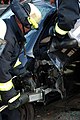
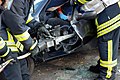
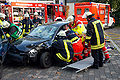
- Nomination: Firefighters opening a car --Mbdortmund 19:54, 15 October 2008 (UTC)
- Review needed
-

- Nomination: Firefighters opening a car --Mbdortmund 19:54, 15 October 2008 (UTC)
- Review needed
-
- Nomination: Firefighters opening a car --Mbdortmund 19:54, 15 October 2008 (UTC)
- Review needed
-
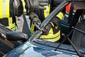
- Nomination: Firefighters removing the door --Mbdortmund 19:54, 15 October 2008 (UTC)
- Review needed
-
- Nomination: Cutting off the roof of a car --Mbdortmund 19:54, 15 October 2008 (UTC)
- Review needed
-

- Nomination: A train near Echten, by User:Silver Spoon. --SterkeBak 18:55, 15 October 2008 (UTC)
- Review needed
-

- Nomination: Sculpture "Żyrafa" in Silesian Central Park. --Lestath 14:14, 15 October 2008 (UTC)
- Review needed
-
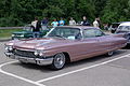
- Nomination: Cadillac Coupe deVille 1960 --Berthold Werner 13:27, 15 October 2008 (UTC)
- Review needed
-

- Nomination Andean avocet, Northern Chile. -- Till.niermann 20:49, 13 October 2008 (UTC)
- Promotion Nice image -- Albertus teolog 19:33, 21 October 2008 (UTC)
-

-

- Nomination La Force Guerrière, allegoric statue in the cathedral Saint-Pierre in Nantes, France --Eusebius 20:18, 20 October 2008 (UTC)
- Promotion QI --Massimo Catarinella 21:12, 20 October 2008 (UTC)
-

- Nomination La Porte de l'enfer -- Albertus teolog 12:48, 20 October 2008 (UTC)
- Decline Very pixelated --Massimo Catarinella 21:13, 20 October 2008 (UTC)
-
- Nomination Statue in Opole (Oppeln), Upper Silesia --Pudelek 21:14, 19 October 2008 (UTC)
- Promotion Great sharpness --Massimo Catarinella 21:17, 20 October 2008 (UTC)
-
- Nomination Obelisk of Corunna --Drow male 19:52, 19 October 2008 (UTC)
- Decline Tilted, purple fringing (note green lines on numbers clock) and overall quality could be better --Massimo Catarinella 21:16, 20 October 2008 (UTC)
-

- Nomination Oryx leucoryx --MathKnight 16:30, 17 October 2008 (UTC)
- Decline Too much artefacts. Lycaon 22:39, 20 October 2008 (UTC)
-
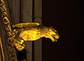
- Nomination: A gargoyle of Amiens cathedral. --Eusebius 11:23, 15 October 2008 (UTC)
- Review needed
-
- Nomination: Sunset after a storm over the Vercors mountains. --Eusebius 10:55, 15 October 2008 (UTC)
- Review needed
-

- Nomination: Rose window -- Albertus teolog 06:12, 15 October 2008 (UTC)
- Review needed
-
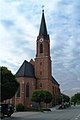
- Nomination St. Joseph's Catholic Church in Bavaria.--High Contrast 08:56, 14 October 2008 (UTC)
- Decline Unfortunate lighting — motif is underexposed. - Till.niermann 19:27, 20 October 2008 (UTC)
-

- Nomination Leopard Tortoise --Muhammad Mahdi Karim 19:59, 17 October 2008 (UTC)
- Promotion Sharp,good exposure --Lmbuga 17:17, 18 October 2008 (UTC)
-

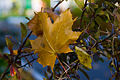
- Nomination Brown leaf, Santiago de Compostela, Galicia, Spain--Lmbuga 18:28, 17 October 2008 (UTC)
- Decline Harsh shadows Muhammad Mahdi Karim 17:14, 18 October 2008 (UTC)
-
- Nomination The church of Neerijnen --SterkeBak 17:11, 17 October 2008 (UTC)
- Decline Tilted Muhammad Mahdi Karim 17:14, 18 October 2008 (UTC)
-

- Nomination: Tenement house on the Warszawska Street in Katowice. --Lestath 11:51, 13 October 2008 (UTC)
- Review needed
-
- Nomination: The market square in Bytom. --Lestath 11:51, 13 October 2008 (UTC)
- Review needed
-

- Nomination: A sculpture made by Emmanuel Frémiet in Świerklaniec. --Lestath 11:51, 13 October 2008 (UTC)
- Review needed
-
- Nomination: Contemporary monument of Svantevit near Wawel Hill in Kraków. --Lestath 11:51, 13 October 2008 (UTC)
- Review needed
-
-
-

- Nomination: The face of the New Bullards Bar Dam. --J.smith 01:47, 13 October 2008 (UTC)
- Review needed
-

- Nomination 360 Degree Panorama of Dar es Salaam --Muhammad Mahdi Karim 17:00, 18 October 2008 (UTC)
- Promotion Great panorama. - Till.niermann 10:46, 20 October 2008 (UTC)
-

-

-

- Nomination Aguiño (concello de Ribeira, provicia da Coruña, Galicia)--Lmbuga 20:51, 17 October 2008 (UTC)
- Promotion Good quality, very nice -- Alvesgaspar 07:46, 20 October 2008 (UTC)
-
- Nomination Castiñeiras (concello de Ribeira, provicia da Coruña, Galicia), Ria of Arousa--Lmbuga 19:40, 17 October 2008 (UTC)
- Promotion Very good moonlight picture. --B.navez 12:28, 19 October 2008 (UTC)
-

- Nomination Ria of Arousa, Castiñeiras - Ribeira - Galicia--Lmbuga 19:16, 17 October 2008 (UTC)
- Decline Long exposure makes the moon look like a dying star. --B.navez 12:28, 19 October 2008 (UTC)
-

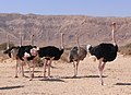
- Nomination Struthio camelus --MathKnight 16:22, 17 October 2008 (UTC)
- Decline For this kind of picture, full animal is needed. By the way, where are the missing feathers ? --B.navez 12:20, 19 October 2008 (UTC)
-
- Nomination Arico, Teneriffe, Canary Islands --Berthold Werner 11:56, 14 October 2008 (UTC)
- Promotion Subject is not very special. Some slightly disturbing elements (the broom-sticks!). But good composition and nice atmosphere. Technically certainly good enough for QI. -- MJJR 19:30, 19 October 2008 (UTC)
-
- Nomination: Holy Cross Church in Kraków. --Lestath 21:25, 13 October 2008 (UTC)
- Review needed
-

- Nomination: Tenement house in Katowice. --Lestath 21:25, 13 October 2008 (UTC)
- Review needed
-
- Nomination: Gate to Collegium Iuridicum in Kraków. --Lestath 21:25, 13 October 2008 (UTC)
- Review needed
-
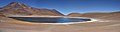
- Nomination Lago Chungará, Northern Chile, panorama. -- Till.niermann 20:37, 13 October 2008 (UTC)
- Promotion HQI ! (High quality image) --B.navez 17:55, 19 October 2008 (UTC)
-

- Nomination: Seminary portal in Bad Mergentheim --PetrusSilesius 19:23, 13 October 2008 (UTC)
- Review needed
-

- Nomination Market square in Bad Mergentheim --PetrusSilesius 19:23, 13 October 2008 (UTC)
- Promotion perspective should be corrected --Mbdortmund 16:06, 17 October 2008 (UTC)It's corrected now... --PetrusSilesius 17:49, 19 October 2008 -- Definitely QI! -- MJJR 19:22, 19 October 2008 (UTC)
-
- Nomination: Detail of St. John's church tower --PetrusSilesius 19:23, 13 October 2008 (UTC)
- Review needed
-

- Nomination Madrid: Royal Botanical Gardens -- MJJR 20:04, 5 October 2008 (UTC)
- Decline The part where you see the sky is not so good. --Berthold Werner 17:36, 13 October 2008 (UTC)
-

- Nomination Madrid, Plaza de Cibeles: Palacio de Comunicaciones -- MJJR 20:04, 5 October 2008 (UTC)
- Decline Looks noisy. Therefore no promotion. --Berthold Werner 17:36, 13 October 2008 (UTC)
-

- Nomination Port of Vilagarcía de Arousa, Galicia, Spain--Lmbuga 19:05, 17 October 2008 (UTC)
- Promotion nice --Mbdortmund 19:51, 17 October 2008 (UTC)
-

-
-
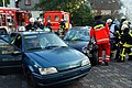
- Nomination Firefighters in action --Mbdortmund 19:54, 15 October 2008 (UTC)
- Promotion Looks fine. Lycaon 13:29, 17 October 2008 (UTC)
-

- Nomination Oudezijds Kolk, Amsterdam. --Massimo Catarinella 17:15, 15 October 2008 (UTC)
- Promotion Good for QI. Lycaon 12:42, 17 October 2008 (UTC)
-
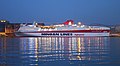
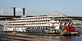
- Nomination Cruise ship "Festos Palace". --Wisnia6522 10:29, 15 October 2008 (UTC)
- Promotion Good picture and very interesting light reflections game --B.navez 18:36, 17 October 2008 (UTC)
-

-

- Nomination Architectural sculpture Albertus teolog 22:19, 13 October 2008 (UTC)
- Promotion good detail, good image of the material --Mbdortmund 16:05, 17 October 2008 (UTC)
-

- Nomination A photo depicting the damage from the hydraulic mining operations at Malakoff Diggins. --J.smith 01:47, 13 October 2008 (UTC)
- Decline Info I did a slight bit of color balancing. J.smith 20:13, 14 October 2008 (UTC)
It is not sharp enough (too little detail) and probably also tilted CW, unless all the trees are leaning? Lycaon 12:46, 17 October 2008 (UTC)
-

- Nomination La Porte de l'enfer -- Albertus teolog 21:01, 12 October 2008 (UTC)
- Decline Good composition, but noisy in the shadows. Vassil 12:10, 17 October 2008 (UTC)
-

- Nomination: Detail on old railway station in Katowice (Kattowitz) --Pudelek 10:20, 11 October 2008 (UTC)
- Review needed
-

-
- Nomination Statue of Virgin Mary, 1672, in Arc-en-Barrois (France).Vassil 19:37, 16 October 2008 (UTC)
- Promotion good --Mbdortmund 20:09, 16 October 2008 (UTC)
-
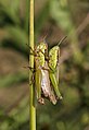
- Nomination Oxya yezoensis which copulates--池田正樹 15:20,16 October 2008 (UTC)
- Promotion Good enough to earn the title QI --Massimo Catarinella 14:55, 16 October 2008 (UTC)
-

- Nomination Orsay -- Albertus teolog 08:14, 16 October 2008 (UTC)
- Decline A lot of CA, compression and the sharpness lacks --Massimo Catarinella 14:55, 16 October 2008 (UTC)
-
- Nomination Rose hip of unknown rose variety-- Elucidate 13:48, 16 October 2008 (UTC)
- Decline The colors are very off and the picture is very pixelated --Massimo Catarinella 14:55, 16 October 2008 (UTC)
-

- Nomination Santa Cruz Mounatins in the January of 07-08 (This is a very rare shot, it snows there approximately every 10 years) Mrmariokartguy 12:53, 15 October 2008 (UTC)
- Decline I'm missing something hinting at the location. Like this, it seems like an arbitrary shot of trees with snow. The composition could be better as well. - Till.niermann 16:56, 16 October 2008 (UTC) Do you even know where this is? Mrmariokartguy 23:12, 16 October 2008 (UTC)
-

-

- Nomination: Tympanum
- Review Albertus teolog 07:28, 11 October 2008 (UTC)
-
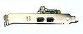
- Nomination: Firewire PCI Expansion Card --Digon3 18:50, 10 October 2008 (UTC)
- Review needed
-
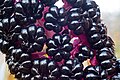
- Nomination Phytolacca berries --Twdragon 10:29, 10 October 2008 (UTC)
- Decline There is a lot of noise in the image and it is overexposed in parts. I would like to see more picture of this plant, it is very interesting and we don't have very many pictures of this in the Commons. I think the picture could be sharper with a lower F Number, but its good enough for QI. --Digon3 14:57, 16 October 2008 (UTC)
-

-

- Nomination Changing of the Guard Evzones in Athens. --Wisnia6522 12:19, 15 October 2008 (UTC)
- Promotion good composition --Mbdortmund 19:46, 15 October 2008 (UTC)
-
- Nomination Close-up of the dorsal fin of the reticulated dragonet. -- Lycaon 06:06, 15 October 2008 (UTC)
- Promotion nice --Mbdortmund 20:06, 15 October 2008 (UTC)
-
- Nomination Fisherman's mascot at the fishing port of L'Ametlla de Mar, Spain. -- Lycaon 06:06, 15 October 2008 (UTC)
- Promotion Of course --Massimo Catarinella 17:30, 15 October 2008 (UTC)
-

- Nomination: Memorial for German restistants and foreign workers in Dortmund -- Mbdortmund 19:17, 9 October 2008 (UTC)
- Review needed
-
- Nomination: Memorial for German restistants and foreign workers in Dortmund -- Mbdortmund 19:17, 9 October 2008 (UTC)
- Review needed
-

- Nomination: Observation tower on Altvater moutain (Praděd) - second nomination (first in June) --Pudelek 18:51, 9 October 2008 (UTC)
- Review needed
-

- Nomination Neomarica gracilis --B.navez 15:37, 14 October 2008 (UTC)
- Promotion Very good exposition of flowers Albertus teolog 18:49, 14 October 2008 (UTC)
-

-
-

- Nomination Meteora, Greece. --Wisnia6522 14:54, 14 October 2008 (UTC)
- Promotion Very nice panorama. (How was it done? → Category?} - Till.niermann 18:24, 14 October 2008 (UTC)
-

-

-

- Nomination Crimp tool. Adamantios 09:53, 14 October 2008 (UTC)
- Promotion Looks perfect to me. - Till.niermann 05:42, 15 October 2008 (UTC)
-
- Nomination École Militaire
- Decline Albertus teolog 07:44, 14 October 2008 (UTC)
I don't like the composition. It looks like the Eiffeltower is part of the building. --Berthold Werner 11:59, 14 October 2008 (UTC) InfoIs the whole charm :-) Albertus teolog 12:30, 14 October 2008 (UTC)
-
-

-

-

-

-

- Nomination Acer platanoides in autumn colors, Poland. --Kosiarz-PL 07:13, 11 October 2008 (UTC)
- Promotion Very good lighting for the subject. Vassil 23:25, 14 October 2008 (UTC)
-
-
-

-

- Nomination Memorial for German restistants and foreign workers in Dortmund -- Mbdortmund 19:17, 9 October 2008 (UTC)
- Promotion Short DOF, but well used. Vassil 06:57, 15 October 2008 (UTC)
-
- Nomination Memorial for German restistants and foreign workers in Dortmund -- Mbdortmund 19:17, 9 October 2008 (UTC)
- Decline I think this one is not sharp enough. Vassil 07:05, 15 October 2008 (UTC)
-

- Nomination Angarnsjöängen at night, spring 2008. --Calandrella 19:34, 30 September 2008 (UTC)
- WARNING: third template parameter added – please remove.
-

- Nomination Panorama of Chuquicamata copper mine, Chile. -- Till.niermann 21:31, 13 October 2008 (UTC)
- Decline Not cropped. --Lestath 22:31, 13 October 2008 (UTC)
-
- Nomination Laguna Miñiques, Northern Chile, panorama. -- Till.niermann 20:26, 13 October 2008 (UTC)
- Promotion I love this panorama. No flaws that I could find and the view is stunning. --J.smith 21:41, 13 October 2008 (UTC)
-

-

- Nomination Running -- Albertus teolog 07:57, 13 October 2008 (UTC)
- Decline The resolution of this image is way too low(1.2mp). Otherwise, it's quite interesting. J.smith 18:02, 13 October 2008 (UTC)
 Albertus teolog
-
- Nomination Side-striped palm-pitviper Bothriechis lateralis -- TimVickers 23:51, 12 October 2008 (UTC)
- Decline I'm sorry, this image is overly noisy. There is also some over-exposed areas (might be correctable). The composition in this image is excellent and if it wasn't for the technical problems I would recommend it for FI. --J.smith 05:40, 14 October 2008 (UTC)
-

-

- Nomination Voigtlander Vito II Camera --Digon3 18:50, 10 October 2008 (UTC)
- Promotion Meets QI requirements. TimVickers 15:29, 13 October 2008 (UTC)
-

- Nomination Flower stalk and berries of Phytolacca Americana --Twdragon 10:28, 10 October 2008 (UTC)
- Decline Composition/framing. - Till.niermann 10:57, 14 October 2008 (UTC)
-
- Nomination Statue of the Spanish botanist Antonio José Cavanilles y Palop (1745-1804) at the Real Jardín Botánico of Madrid -- MJJR 21:06, 9 October 2008 (UTC)
- Promotion Ok. --Berthold Werner 17:41, 13 October 2008 (UTC)
-

- Nomination Observation tower on Altvater moutain (Praděd) - second nomination (first in June) --Pudelek 18:51, 9 October 2008 (UTC)
- Promotion This one seems to be sharper than the other one. --Berthold Werner 17:41, 13 October 2008 (UTC)
-

- Nomination Windmill from Grzawa in Upper Silesian Ethnographic Park. --Lestath 19:35, 6 October 2008 (UTC)
- Decline Distracting cables --Berthold Werner 17:38, 13 October 2008 (UTC)
-

- Nomination Björn Kjellman reading Harry Potter 7 at its' release in Sweden. --Calandrella 19:13, 6 October 2008 (UTC)
- Decline Unfortunate framing, with too much space above his head and half his forearm cut off. TimVickers 15:28, 13 October 2008 (UTC)
-

- Nomination Flat "Dom Wagi Miejskiej" ("Kämmereigebäudes") in Nysa (Neisse), Silesia --Pudelek 13:08, 6 October 2008 (UTC)
- Decline The "feet" of the building are cut. --Berthold Werner 17:38, 13 October 2008 (UTC)
-
- Nomination Japanese Garden in Silesian Central Park. --Lestath 22:19, 5 October 2008 (UTC)
- Promotion I don't know what is japanese at this garden, but the photograph is QI. --Berthold Werner 17:33, 13 October 2008 (UTC)
-

- Nomination Making furrows, Vilarromarís, Oroso, Galicia (Spain). --Lmbuga 18:41, 7 October 2008 (UTC)
- Decline Not so good crop. --Lestath 11:56, 13 October 2008 (UTC)
-
- Nomination Making furrows, Vilarromarís, Oroso, Galicia (Spain). ----Lmbuga 18:35, 7 October 2008 (UTC)
- Decline Not so good crop. --Lestath 11:56, 13 October 2008 (UTC)
-

- Nomination Entrance to Nysa cathedral --Pudelek 10:20, 11 October 2008 (UTC)
- Promotion Good enough, there is a small tilt to the right though. --Massimo Catarinella 11:12, 12 October 2008 (UTC)
-

- Nomination Holux M 241, manually geocoding comes to end for me ;-) --Berthold Werner 09:51, 11 October 2008 (UTC)
- Promotion Genau --Massimo Catarinella 11:14, 12 October 2008 (UTC)
-

- Nomination Cilantro seeds; a macro shot. Mrmariokartguy 04:20, 11 October 2008 (UTC)
- Decline Out of focus --Massimo Catarinella 11:13, 12 October 2008 (UTC)
-

- Nomination: Elythranthera brunonis -- Purple Enamel Orchid Gnangarra 08:42, 6 October 2008 (UTC)
- Review needed
-

- Nomination: Colchicum bormuelleri 'Water Lilly' --Twdragon 10:51, 6 October 2008 (UTC)
- Review needed
-
- Nomination: Sculpture "Żyrafa" in Silesian Central Park. --Lestath 22:19, 5 October 2008 (UTC)
- Review needed
-

- Nomination Pink gladiolus --Twdragon 08:58, 30 September 2008 (UTC)
- Promotion QI --Massimo Catarinella 11:09, 12 October 2008 (UTC)
-
- Nomination Argiope bruennichi--池田正樹 15:10,10 October 2008 (UTC)
- Promotion Nice image --Massimo Catarinella 22:39, 10 October 2008 (UTC)
-

- Nomination Tour Eiffel -- Albertus teolog 07:38, 10 October 2008 (UTC)
- Decline Grainy and blurred --Massimo Catarinella 22:40, 10 October 2008 (UTC)
-

-

- Nomination Acer pseudoplatanus --Böhringer 08:36, 6 October 2008 (UTC)
- Decline Blue stuff. Mrmariokartguy 03:51, 11 October 2008 (UTC)
-

- Nomination Young mushroom Chlorophyllum molybdites --Ianare 20:46, 5 October 2008 (UTC)
- Promotion Not bad. Mrmariokartguy 03:50, 11 October 2008 (UTC)
-

-

- Nomination Pavement artist (or street painting?) in the pedestrian area of Stuttgart, Germany, with the vintage unfinished picture. --NatiSythen 21:16, 5 October 2008 (UTC)
- Promotion Nice picture! Mrmariokartguy 03:50, 11 October 2008 (UTC)
-

- Nomination: Kniphofia 'Amsterdam' (Liliaceae) -- MJJR 16:51, 4 October 2008 (UTC)
- Review needed
-

- Nomination: The Royal Botanical Gardens in Madrid -- MJJR 16:51, 4 October 2008 (UTC)
- Review needed
-

- Nomination American Revolutionary War reenactement at Pioneer Village (for composition). Dori 04:58, 4 October 2008 (UTC)
- Promotion Not bad. Mrmariokartguy 03:48, 11 October 2008 (UTC)
-
- Nomination Holy blood altar in St. Jacobs church, Rothenburg, Germany. --Berthold Werner 06:31, 10 October 2008 (UTC)
- Promotion --Twdragon 10:28, 10 October 2008 (UTC)
-

- Nomination Portrait of Dutch writer --Multichill 18:55, 9 October 2008 (UTC)
- Promotion really good --Mbdortmund 20:17, 9 October 2008 (UTC)
-

-
- Nomination Germany, Bamberg, Sankt Michels church --Berthold Werner 11:16, 9 October 2008 (UTC)
- Promotion --Twdragon 13:45, 9 October 2008 (UTC)
-
- Nomination Champ-de-Mars -- Albertus teolog 08:12, 9 October 2008 (UTC)
- Decline Poor colors and rotation needed --Twdragon 13:46, 9 October 2008 (UTC)
-
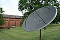
- Nomination A parabolic antenna --Specious 05:28, 9 October 2008 (UTC)
- Decline Grey desolated athmosphere --Twdragon 13:46, 9 October 2008 (UTC)
-

- Nomination Przhevalsky Monument in Kyrgyzstan --Ondřej Žváček 19:12, 8 October 2008 (UTC)
- Decline Low color saturation, some overexposured --Twdragon 13:50, 9 October 2008 (UTC)
-

- Nomination Agfa Isola --Berthold Werner 17:55, 8 October 2008 (UTC)
- Promotion --Twdragon 13:50, 9 October 2008 (UTC)
-

-
- Nomination Castro de Viladonga, Castro de Rei, Lugo, Galicia (Spain). --Lmbuga 16:45, 7 October 2008 (UTC)
- Decline Low color saturation, poor aesthetic effect, some visually blurred in details --Twdragon 13:54, 9 October 2008 (UTC)
-

-

-

- Nomination The Castle of Platamon - larger version. --Wisnia6522 12:38, 6 October 2008 (UTC)
- Promotion --Twdragon 14:00, 9 October 2008 (UTC)
-

- Nomination Xerocomus badius --Kosiarz-PL 11:36, 6 October 2008 (UTC)
- Decline Poor colors, too bright background --Twdragon 14:00, 9 October 2008 (UTC)
-

-

-

- Nomination A glass skyscraper in Chicago: the Medical Association's headquarters building at 515 North State Street -- Alvesgaspar 12:18, 4 October 2008 (UTC)
- Promotion There is CA visable on the right side of the building (green) and the building in the right lower corner (magenta). --Massimo Catarinella 14:41, 7 October 2008 (UTC) -- The color vibrance may be increased, but interesting viewpoint, good lights --Twdragon 14:06, 9 October 2008 (UTC)
-
- Nomination: Tenement house on the Warszawska Street in Katowice. --Lestath 21:11, 3 October 2008 (UTC)
- Review needed
-
- Nomination: The market square in Bytom. --Lestath 21:11, 3 October 2008 (UTC)
- Review needed
-

- Nomination: Triticum polonicum --Böhringer 20:36, 3 October 2008 (UTC)
- Review needed
-
- Nomination: Tower of the town hall in Bad Mergentheim --PetrusSilesius 19:34, 3 October 2008 (UTC)
- Review needed
-

- Nomination: Historical post box in Bad Mergentheim --PetrusSilesius 19:34, 3 October 2008 (UTC)
- Review needed
-

- Nomination: Wooden church in Kolanowice (Kollanowitz) --Pudelek 18:16, 3 October 2008 (UTC)
- Review needed
-
- Nomination: Octomeria ementosa --D-Kuru 15:15, 3 October 2008 (UTC)
- Review needed
-

-
- Nomination: Santa Cruz Mounatins in the January of 07-08 (This is a very rare shot, it snows there approximately every 10 years) --Mrmariokartguy 02:33, 3 October 2008 (UTC)
- Review needed
-

- Nomination: Old Portland Lighthouse in Wairoa, New Zealand by Alexander Klink --Mbdortmund 22:54, 2 October 2008 (UTC)
- Review needed
-

- Nomination: Tower of St Nicholas Church in Berlin-Spandau --PetrusSilesius 14:43, 2 October 2008 (UTC)
- Review needed
-

- Nomination: "St. Marien am Behnitz" in Berlin-Spandau --PetrusSilesius 14:43, 2 October 2008 (UTC)
- Review needed
-

- Nomination: Pulpit of "St. Marien am Behnitz", Berlin-Spandau --PetrusSilesius 14:43, 2 October 2008 (UTC)
- Review needed
-
- Nomination: Hallway in the mosque at Fatehpur Sikri near Agra, India by by dcastor --Mbdortmund 22:52, 2 October 2008 (UTC)
- Review needed
-
- Nomination: Sculptures om the wall of the theatre in Dortmund --Mbdortmund 19:18, 2 October 2008 (UTC)
- Review needed
-

- Nomination: The thermae of Spa, Belgium -- MJJR 18:57, 2 October 2008 (UTC)
- Review needed
-

- Nomination: Spa, Belgium: the tourist office (detail) -- MJJR 18:57, 2 October 2008 (UTC)
- Review needed
-
- Nomination: Dortmund, Memorial for the great Synagoge --Mbdortmund 16:41, 2 October 2008 (UTC)
- Review needed
-
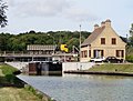
- Nomination: Canal lock and bridge in Berry-au-Bac, France. Vassil 16:03, 2 October 2008 (UTC)
- Review needed
-
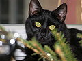
- Nomination Black cat. -- Albertus teolog 14:19, 7 October 2008 (UTC)
- Decline bad composition and partially overexposured --Mbdortmund 22:22, 7 October 2008 (UTC)
-

-

-

- Nomination Dortmund, opera, cupola above the auditorium--Mbdortmund 19:18, 2 October 2008 (UTC)
- Promotion --Good contrast and colors --Twdragon 13:32, 7 October 2008 (UTC)
-

-

- Nomination: Zeche Zollern, Dortmund, Germany --Mbdortmund 17:40, 1 October 2008 (UTC)
- Review needed
-

- Nomination: Zeche Zollern, Dortmund, Germany --Mbdortmund 17:40, 1 October 2008 (UTC)
- Review needed
-
- Nomination: Zeche Zollern, Dortmund, Germany --Mbdortmund 17:40, 1 October 2008 (UTC)
- Review needed
-
- Nomination: Zeche Zollern, Dortmund, Germany --Mbdortmund 17:40, 1 October 2008 (UTC)
- Review needed
-

- Nomination: Panoramic view from Vulcano Island --Chrisdelachal 14:31, 1 October 2008 (UTC)
- Review Comment
Can you provide geocoding on such picture?image updated Guérin Nicolas 07:36, 2 October 2008 (UTC)
-
-
-

-
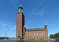
- Nomination Stockholm City Hall. -- Slaunger 21:20, 6 October 2008 (UTC)
- Decline hmmm... small distortion --Pudelek 21:26, 6 October 2008 (UTC)
-

- Nomination The death of Joseph, stained glass window in Ablis, France. --Eusebius 20:37, 6 October 2008 (UTC)
- Promotion Comment the black should IMHO be reduced. --Mbdortmund 22:12, 6 October 2008 (UTC)
 QuestionBetter now? --Eusebius 05:10, 7 October 2008 (UTC)
seelms better to me now --Mbdortmund 11:36, 7 October 2008 (UTC)
-

-

- Nomination Stained glass in Nysa (Neisse) cathedral --Pudelek 13:08, 6 October 2008 (UTC)
- Promotion good foto, terrible window --Mbdortmund 13:22, 6 October 2008 (UTC)
-

- Nomination Acer platanoides --Böhringer 08:35, 6 October 2008 (UTC)
- Promotion Looks good. --Calandrella 19:15, 6 October 2008 (UTC)
-
-

- Nomination Muslim cemetery near Tamga (Issyk Kul Province, Kyrgyzstan)--Ondřej Žváček 17:33, 3 October 2008 (UTC)
- Promotion Rather harsh light, but interesting subject. Acceptable for QI. -- MJJR 20:16, 6 October 2008 (UTC)
-

- Nomination Germany, Bamberg, St. Michael Monastry --Berthold Werner 08:37, 3 October 2008 (UTC)
- Promotion Too tight crop! But nevertheless acceptable for QI. -- MJJR 20:16, 6 October 2008 (UTC)
-

- Nomination An orb-weaving spider (Nephila clavipes) by Ianaré Sévi --Mbdortmund 22:54, 2 October 2008 (UTC)
- Promotion QI --Lestath 05:17, 7 October 2008 (UTC)
-
- Nomination: Park of Świerklaniec. --Lestath 09:28, 1 October 2008 (UTC)
- Review needed
-

- Nomination: Statue in Humenné, Slovakia --Przykuta 05:02, 1 October 2008 (UTC)
- Review needed
-

- Nomination: Legionistów street in Pińczów, Poland --Przykuta 05:02, 1 October 2008 (UTC)
- Review needed
-

- Nomination: cathédrale Notre-Dame d'Amiens by Vassil --Mbdortmund 21:17, 30 September 2008 (UTC)
- Review needed
-

- Nomination: Ågestasjön, Stockholm, Sweden, spring 2008. --Calandrella 19:34, 30 September 2008 (UTC)
- Review needed
-

- Nomination: Lemur catta at Skansen. --Calandrella 19:34, 30 September 2008 (UTC)
- Review needed
-
- Nomination: Contemporary monument of Svantevit near Wawel Hill. --Lestath 19:15, 30 September 2008 (UTC)
- Review needed
-

- Nomination: Tower of the castle of Montreal, Baiona, Galicia--Lmbuga 00:57, 25 September 2008 (UTC)
- Review Comment I don't like this tree on the left --Pudelek 19:47, 30 September 2008 (UTC)
-
-

-
- Nomination Papilio machaon (Oroso, Galicia (Spain) --Lmbuga 19:46, 5 October 2008 (UTC)
- Promotion good --Mbdortmund 20:16, 5 October 2008 (UTC)
-

-

-

-
- Nomination A train crossing the River Trym in Bristol. Mattbuck 02:50, 4 October 2008 (UTC)
- Promotion OK --Mbdortmund 18:36, 4 October 2008 (UTC) Comment geocoding, please -Pudelek 19:55, 5 October 2008 (UTC)
-

- Nomination Monument for Joachim II in Berlin-Spandau --PetrusSilesius 14:43, 2 October 2008 (UTC)
- Promotion QI --Massimo Catarinella 16:30, 5 October 2008 (UTC)
-
- Nomination Gentiana acaulis L. by f.corageoud --Mbdortmund 21:14, 2 October 2008 (UTC)
- Decline Noisy and not categorized. Lycaon 16:23, 5 October 2008 (UTC)
-
- Nomination Churrasco (Barbecue of Galicia (Spain)--Lmbuga 19:34, 5 October 2008 (UTC)
- Decline distracting background, main subject cut off Ianare 20:52, 5 October 2008 (UTC)
-

- Nomination building near palace in Szczekociny, Poland --Przykuta 05:02, 1 October 2008 (UTC)
- Promotion Acceptable quality --Massimo Catarinella 16:28, 5 October 2008 (UTC)
-
- Nomination: Patriarchy Bridge, Moscow, at night --Twdragon 08:58, 30 September 2008 (UTC)
- Review needed
-

- Nomination Hybrid Orchid: Cymbidium Leodogran --Calyponte 00:02, 27 September 2008 (UTC)
- Promotion Please categorise. --Stevenfruitsmaak 14:12, 28 September 2008 (UTC) Comment Done. Calyponte 02:18, 30 September 2008 (UTC)
Very detailed Ianare 20:55, 5 October 2008 (UTC)
-

- Nomination Atractomorpha lata. 池田正樹 04:09,5 October 2008 (UTC)
- Decline Sorry, this is an interesting picture, ruined by a wrong exposure choice (large shutter speed, small F number, ISO 200). This results is a blurry (out of focus) and noisy image. -- Alvesgaspar 11:47, 5 October 2008 (UTC)
-

-

- Nomination An orb-weaving spider (Nephila clavipes) by Ianaré Sévi --Mbdortmund 22:54, 2 October 2008 (UTC)
- Promotion Nice Quality --Chrisdelachal 14:03, 4 October 2008 (UTC)
-
-
- Nomination St. Michael's chapel on the old graveyard in Bad Mergentheim --PetrusSilesius 19:34, 3 October 2008 (UTC)
- Promotion good details --Mbdortmund 02:31, 4 October 2008 (UTC)
-

- Nomination Madonna and Child at a timber framed house in Bad Mergentheim --PetrusSilesius 19:34, 3 October 2008 (UTC)
- Decline tilted --Mbdortmund 02:31, 4 October 2008 (UTC)
-
- Nomination Statue of Leszek I the White. --Albertus teolog 14:08, 3 October 2008 (UTC)
- Promotion Technically very good, artistically a relevant angle. --B.navez 17:35, 3 October 2008 (UTC)
-
-

-

- Nomination Tom Parker Fountain, Napier, NZ --AlexanderKlink 09:35, 3 October 2008 (UTC)
- Promotion Very nice on, good sharpness and colours. --Lestath 16:35, 3 October 2008 (UTC)
-

- Nomination Statue of St. Peter in "St. Marien am Behnitz", Berlin-Spandau --PetrusSilesius 14:43, 2 October 2008 (UTC)
- Decline no good composition --Mbdortmund 02:33, 4 October 2008 (UTC)
-

-

- Nomination Former mill in Bruges (Belgium), transformed into appartment building. -- MJJR 20:40, 30 September 2008 (UTC)
- Promotion Good light and composition. --Kosiarz-PL 07:03, 4 October 2008 (UTC)
-

- Nomination Wawel Defensive Walls in Kraków (Poland). --Lestath 20:06, 27 September 2008 (UTC)
- Promotion Good --Massimo Catarinella 11:19, 4 October 2008 (UTC)
-

- Nomination: Mount Olympus. --Wisnia6522 12:15, 27 September 2008 (UTC)
- Review needed
-

- Nomination Street scene at Monument Circle. --Dschwen 22:10, 26 September 2008 (UTC)
- Decline The noise due to high ISO and perspective distortion tipped the scale. --Massimo Catarinella 15:50, 30 September 2008 (UTC)
Ok, but I really hope you didn't just look at the ISO value and then saw what you'd expect to see. ISO 800 has remarkably little noise on the full frame EOD 5D. In fact I don't see any noise. --Dschwen 23:08, 2 October 2008 (UTC) Nope, I always first look at the picture before checking out the data. I know that ISO 800 on a 5D gives the same amount of noise as ISO 200 on a 350D so to speak. --Massimo Catarinella 13:21, 3 October 2008 (UTC)
-

- Nomination: Soldiers and Sailors Monument in Indianapolis. --Dschwen 16:40, 26 September 2008 (UTC)
- Review Comment If you can fix the CA and the two stitching errors (both at far right in the white building, one huge one in the roof/window alignment, one smaller one four floors from the top—look for the black pixels), this will be a clear promotion. Thegreenj 02:18, 28 September 2008 (UTC)
-

- Nomination Stained glass in church of St. Francis in Kraków. --Lestath 23:29, 2 October 2008 (UTC)
- Promotion good --Mbdortmund 23:31, 2 October 2008 (UTC)
-

- Nomination Main altar in "St. Marien am Behnitz", Berlin-Spandau --PetrusSilesius 14:43, 2 October 2008 (UTC)
- Promotion I like! Mrmariokartguy 00:49, 3 October 2008 (UTC)
-

- Nomination Māori statue in Rotorua, New Zealand by Alexander Klink --Mbdortmund 22:49, 2 October 2008 (UTC)
- Promotion Nice one, good DOF and colours. --Lestath 23:43, 2 October 2008 (UTC)
-

- Nomination Caterpillar of Papilio machaon (Galicia)--Lmbuga 22:47, 2 October 2008 (UTC)
- Promotion nice portrait --Mbdortmund 23:30, 2 October 2008 (UTC)
-

- Nomination Dortmund, opera, cupola above the auditorium--Mbdortmund 19:18, 2 October 2008 (UTC)
- Promotion Still some slight CA fringes, but this time globally a good picture from an interesting architectural point of view --B.navez 03:51, 3 October 2008 (UTC)
-

- Nomination Germany, Bamberg, Holy Grave Chapel in the St. Michael Monastry --Berthold Werner 16:59, 2 October 2008 (UTC)
- Promotion really good --Mbdortmund 18:12, 2 October 2008 (UTC)
-

- Nomination Atractomorpha lata池田正樹 17:31,2 October 2008 (UTC)
- Promotion good --Mbdortmund 18:15, 2 October 2008 (UTC)
-

- Nomination House in Bruges, Belgium -- MJJR 20:57, 1 October 2008 (UTC)
- Promotion Ok --Berthold Werner 17:46, 2 October 2008 (UTC)
-
- Nomination Zeche Zollern, Dortmund, Germany --Mbdortmund 17:40, 1 October 2008 (UTC)
- Promotion Ok --Berthold Werner 17:46, 2 October 2008 (UTC)
-

-

- Nomination Traditonal costume of Vorarlberg --Böhringer 18:39, 30 September 2008 (UTC)
- Promotion Ok. Very good DOF usage! --Berthold Werner 17:55, 2 October 2008 (UTC)
-

- Nomination Franz Beckenbauer in front of some paparazzi --DerFalkVonFreyburg 17:03, 30 September 2008 (UTC)
- Decline Undealt subject. What is it ? Beckenbauer ? We can't recognize him. Paparazzi ? Legs cut off. --B.navez 03:56, 3 October 2008 (UTC)
-

- Nomination Hotels near Praia da Rocha, Portugal. --Stevenfruitsmaak 19:32, 27 September 2008 (UTC)
- Decline little tilt --Pudelek 17:48, 29 September 2008 (UTC) Info Better now? I can edit it further if you have more tilt concerns, found it hard to discern accurately. --Stevenfruitsmaak 09:52, 30 September 2008 (UTC). No tilt now, good exposure, good composition. Vassil 21:16, 30 September 2008 (UTC)
Too small. Lycaon 07:10, 3 October 2008 (UTC)
-

- Nomination: "Pöllauer Ursprung", a source in Pöllau by Marion Schneider & Christoph Aistleitner --Mbdortmund 20:37, 26 September 2008 (UTC)
- Review needed
-

- Nomination Cellar in Open air museum in Humenné, Slovakia --Przykuta 07:44, 26 September 2008 (UTC)
- Decline unfortunate lighting --Mbdortmund 22:45, 2 October 2008 (UTC)
-

- Nomination A sculpture made by Emmanuel Frémiet. --Lestath 21:16, 1 October 2008 (UTC)
- Promotion good composition --Mbdortmund 21:24, 1 October 2008 (UTC)
-

- Nomination The Villa royale in Spa, Belgium -- MJJR 20:57, 1 October 2008 (UTC)
- Promotion OK --Mbdortmund 21:23, 1 October 2008 (UTC)
-

- Nomination Monastry St. Michael, Bamberg, Germany --Berthold Werner 17:02, 1 October 2008 (UTC)
- Promotion nice church --Mbdortmund 00:22, 2 October 2008 (UTC)
-

- Nomination Finnair Stadium in Helsinki, Finnland seen from olympic tower --Jeses 15:20, 1 October 2008 (UTC)
- Promotion good --Mbdortmund 21:26, 1 October 2008 (UTC)
-

- Nomination Civil war reenactment - Gun fire --Dschwen 13:53, 1 October 2008 (UTC)
- Promotion QI,
but please geocode--Massimo Catarinella 20:53, 1 October 2008 (UTC)
-

- Nomination Civil war reenactment - Cannon fire --Dschwen 13:53, 1 October 2008 (UTC)
- Promotion QI,
but please geocode--Massimo Catarinella 20:53, 1 October 2008 (UTC)
-

- Nomination Germany, Rothenburg ob der Tauber, Klingenturm. --Berthold Werner 08:08, 1 October 2008 (UTC)
- Decline Very nice composition but poor image quality: pixelation in the sky and srtifacts around edges -- Alvesgaspar 16:32, 1 October 2008 (UTC)
-

- Nomination Shucked and sliced up rhubarb. DocteurCosmos 12:18, 1 October 2008 (UTC)
- Decline DOF to short --Mbdortmund 21:29, 1 October 2008 (UTC)
-
- Nomination Crag/Monadnock in Mirów, Poland --Przykuta 05:02, 1 October 2008 (UTC)
- Promotion good composition --Mbdortmund 19:15, 1 October 2008 (UTC)
-

- Nomination Incoming metro in Farsta Strand, Stockholm, Sweden. --Calandrella 19:34, 30 September 2008 (UTC)
- Decline lighting not good, no composition --Mbdortmund 23:05, 1 October 2008 (UTC)
-
- Nomination The Belgian sheerlegs Norma in the port of Bruges, Belgium (edited version, with reduced noise in the sky) -- MJJR 21:06, 29 September 2008 (UTC)
- Promotion seems to be better now --Mbdortmund 00:27, 2 October 2008 (UTC)
-
- Nomination: The promontory of Facho in a rainy day, view from here. São Martinho do Porto, west coast of Portugal. -- Alvesgaspar 11:48, 26 September 2008 (UTC)
- Review needed
-

- Nomination Cross in celebration of 146 anniversary of establishment of the Road of Cross in Vepriai Juliux 09:33, 26 September 2008 (UTC)
- Decline parts of the cross as the main subject unsharp --Mbdortmund 20:28, 26 September 2008 (UTC)
-
- Nomination: Cellar in Open air museum in Humenné, Slovakia (reconstuction) --Przykuta 07:44, 26 September 2008 (UTC)
- Review needed
-

- Nomination: Open air museum in Humenné, Slovakia --Przykuta 07:44, 26 September 2008 (UTC)
- Review needed
-

- Nomination: Orthodox church in Open air museum in Humenné, Slovakia --Przykuta 07:44, 26 September 2008 (UTC)
- Review needed
-

- Nomination carved watermelon --Przykuta 05:02, 1 October 2008 (UTC)
- Decline Too tight crop, distracting background - Alvesgaspar 11:00, 1 October 2008 (UTC)
-

- Nomination carved watermelon --Przykuta 05:02, 1 October 2008 (UTC)
- Decline Too tight crop, distracting background - Alvesgaspar 11:00, 1 October 2008 (UTC)
-

- Nomination by Mussklprozz --Mbdortmund 21:17, 30 September 2008 (UTC)
- Decline The gable in the foreground is distracting and let it seem tilted. --Berthold Werner 11:19, 1 October 2008 (UTC)
-
- Nomination Chapelle Saint-Sébastien de la cathédrale d'Amiens by Vassil --Mbdortmund 21:17, 30 September 2008 (UTC)
- Decline Good composition but noisy (look at the green and pink stains on angel's belly) --B.navez 03:01, 1 October 2008 (UTC)
-

- Nomination Statue of Peter the Hermit in Amiens (1854). Vassil 21:02, 30 September 2008 (UTC)
- Promotion good --Mbdortmund 21:13, 30 September 2008 (UTC)
-

- Nomination Simple espresso in a glass. DocteurCosmos 21:03, 30 September 2008 (UTC)
- Decline composition and light not so good. --Mbdortmund 20:59, 30 September 2008 (UTC)
-

- Nomination Soviet Christmas decoration "Coffeepot" --Twdragon 09:09, 30 September 2008 (UTC)
- Decline Poor lighting and sharpness -- Alvesgaspar 11:05, 1 October 2008 (UTC)
-

- Nomination Soviet Christmas decoration, 1950 --Twdragon 09:01, 30 September 2008 (UTC)
- Decline Poor lighting and sharpness -- Alvesgaspar 11:05, 1 October 2008 (UTC)
-

- Nomination Gladioli flower petal - macro --Twdragon 08:58, 30 September 2008 (UTC)
- Promotion Nice. --Calandrella 19:37, 30 September 2008 (UTC)
-

- Nomination Gladioli stamen --Twdragon 08:58, 30 September 2008 (UTC)
- Promotion Very good! --Calandrella 19:37, 30 September 2008 (UTC)
-

-

- Nomination cross at the "Franziskanerkirche" in Dortmund, germany --Mbdortmund 00:28, 30 September 2008 (UTC)
- Promotion Nice composition, though it would be better without the plants. --Massimo Catarinella 15:53, 30 September 2008 (UTC)
-

- Nomination River Bøvra in Lom, Norway --Pudelek 23:57, 29 September 2008 (UTC)
- Promotion Good enough, though on the soft side -- Alvesgaspar 11:05, 1 October 2008 (UTC)
-
-
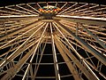
- Nomination Night shot of ferris wheel. --Mozillaman 16:34, 29 September 2008 (UTC)
- Decline Too unsharp --Massimo Catarinella 15:55, 30 September 2008 (UTC)
-

-

- Nomination Crypt in cathedral in Katowice. --Lestath 14:43, 29 September 2008 (UTC)
- Promotion Good enough for QI --Massimo Catarinella 15:57, 30 September 2008 (UTC)
-

- Nomination BRE Bank in Katowice. --Lestath 14:43, 29 September 2008 (UTC)
- Promotion Very nice light! --Calandrella 19:39, 30 September 2008 (UTC)
-

- Nomination Avocados --B.navez 10:55, 28 September 2008 (UTC)
- Promotion OK and useful --Mbdortmund 21:02, 30 September 2008 (UTC)
-

-
- Nomination A plunging view of the sea in a winter day. São Martinho do Porto, west coast of Portugal. --Alvesgaspar 12:05, 26 September 2008 (UTC)
- Promotion Should be a bit sharper but this is very nice landscape --Pudelek 19:52, 30 September 2008 (UTC)
-

-

- Nomination: old cross in Matiaška, Slovakia --Przykuta 05:46, 25 September 2008 (UTC)
- Review needed
-
-

-
-

- Nomination Historical skyscraper in Katowice. --Lestath 20:54, 28 September 2008 (UTC)
- Promotion No concerns. --Stevenfruitsmaak 10:00, 30 September 2008 (UTC)
-

-

-

-

-
-
- Nomination: Avocado flowers --B.navez 10:45, 24 September 2008 (UTC)
- Review needed
-

- Nomination: Detail of the Saint-Remacle church at Spa, Belgium. -- MJJR 20:11, 23 September 2008 (UTC)
- Review needed
-
- Nomination: Björn Kjellman reading Harry Potter 7 at its' release in Sweden. --Leo Johannes 11:20, 31 July 2008 (UTC)
- Review needed
-

- Nomination image of canon 30d --Asim18 01:32, 29 September 2008 (UTC)
- Promotion good --Mbdortmund 10:10, 29 September 2008 (UTC)
-

- Nomination Dead tree --Mrmariokartguy 13:24, 28 September 2008 (UTC)
- Decline Out of focus and blurred --Massimo Catarinella 22:25, 28 September 2008 (UTC) It would be awesome if I could make something in focus with a disposable camera. Mrmariokartguy 23:33, 28 September 2008 (UTC)
-

- Nomination Coastal line of Praia da Rocha, Portugal. --Stevenfruitsmaak 19:32, 27 September 2008 (UTC)
- Promotion Please make the horizon ... horizontal -- Alvesgaspar 22:00, 27 September 2008 (UTC)
Bad tilt. Lycaon 23:58, 27 September 2008 (UTC) Info Better now? --Stevenfruitsmaak 14:05, 28 September 2008 (UTC) -- Yes -- Alvesgaspar 18:27, 28 September 2008 (UTC)
-

- Nomination The spider which becomes mimesis--池田正樹01:55, 2727 September 2008 (UTC)
- Promotion Nice illustration of hide-and-seek. No obvious flaws. --Stevenfruitsmaak 14:11, 28 September 2008 (UTC)
-

- Nomination Exposure blended shot of the home of 23rd US president Bejamin Harrison. --Dschwen 22:25, 25 September 2008 (UTC)
- Promotion Good enough for QI --Massimo Catarinella 22:31, 28 September 2008 (UTC)
-

- Nomination Air Races opening ceremonies, Reno, Nevada. --Calyponte 19:52, 25 September 2008 (UTC)
- Decline Flag cut off. --Stevenfruitsmaak 18:11, 28 September 2008 (UTC)
-

- Nomination 薬師寺 東塔 by KENPEI --Jn1 13:57, 24 September 2008 (UTC)
- Decline A lot of CA --Massimo Catarinella 22:28, 28 September 2008 (UTC)
-

- Nomination The Cabot Circus development in Bristol. Mattbuck 22:52, 22 September 2008 (UTC)
- Promotion No obvious flaws --Massimo Catarinella 22:27, 28 September 2008 (UTC)
-
- Nomination The Cabot Circus development in Bristol. Mattbuck 22:52, 22 September 2008 (UTC)
- Decline Don't like composition, doesn't seem so sharp for a static object, overexposed sky at left top. --Stevenfruitsmaak 14:16, 28 September 2008 (UTC)
-

- Nomination: Opole (Oppeln) - view to Zaodrze (Odervorstadt) quarter --Pudelek 20:52, 22 September 2008 (UTC)
- Review needed


.JPG)


![* Nomination Abbey church in Neuzelle --PetrusSilesius 21:25, 23 October 2008 (UTC) * Decline Minus: contrast too strong, we can barely see any detail in the altar and the vault, while the columns on both sides are washed out; please try to improve the situation with a software such as Photoshop. Plus: nice perspective of this seemingly beautiful church.--Tango7174 00:32, 27 October 2008 (UTC) In situations like this I use a tripod, the exposure bracketing function of my camera and tufuse [1] to mix the photographs. --Berthold Werner 07:16, 27 October 2008 (UTC)](/wiki/File:Neuzelle_Klosterkirche_Mittelschiff.jpg)


_-_ul._%C5%9Bw._Wojciecha_i_Muzeum_%C5%9Al%C4%85ska_Opolskiego.JPG)
.jpg)


.jpg)

.JPG)


.jpg)


.jpg)


_edited.jpg)


.jpg)


-5.jpg)


_19.08.08_p.jpg)


_19.08.08_p.jpg)


Consensual review[edit]
File:Wasp April 2008-2.jpg[edit]

- Nomination Queen paper wasp guarding the nest -- Alvesgaspar 08:41, 25 September 2008 (UTC)
- Promotion
 Oppose Pure colors and good light, but Lack of composition, main subject is not truly recognizable --Twdragon 18:44, 26 September 2008 (UTC)
- Comment - Nonsense. The object is the nest plus the larvae plus the queen -- Alvesgaspar 21:17, 26 September 2008 (UTC)
 Support Meets criteria, interesting shot Muhammad Mahdi Karim 16:43, 27 September 2008 (UTC)
- Support --Massimo Catarinella 22:48, 27 September 2008 (UTC)
Running total: 2 support (excluding the nominator), 1 oppose → Promote? -- Alvesgaspar 07:41, 30 September 2008 (UTC)
File:Polistes April 2008-1.jpg[edit]

- Nomination Queen paper wasp feeding a larva -- Alvesgaspar 08:39, 25 September 2008 (UTC)
- Promotion
- Oppose Pure colors and good light, but Lack of composition, main subject is not truly recognizable --Twdragon 18:44, 26 September 2008 (UTC)
- Comment - Nonsense, maybe with a transparent nest one could see the whole creature? -- Alvesgaspar 21:17, 26 September 2008 (UTC)
- Support Meets criteria Muhammad Mahdi Karim 16:38, 27 September 2008 (UTC)
- Support --Massimo Catarinella 22:49, 27 September 2008 (UTC)
Running total: 2 support (excluding the nominator), 1 oppose → Promote? -- Alvesgaspar 07:41, 30 September 2008 (UTC)
File:La Manneporte-Etretat-Normandie.jpg[edit]

- Nomination the natural arch "La Manneporte" --Tobi 87 08:50, 21 September 2008 (UTC)
- Decline
- Support Good Mrmariokartguy 23:31, 25 September 2008 (UTC)
- Oppose Too much compression --Massimo Catarinella 22:53, 26 September 2008 (UTC)
- Oppose -- Poor image quality: noise, general unsharpness, white fringing -- Alvesgaspar 19:29, 27 September 2008 (UTC)
Running total: 1 support (excluding the nominator), 2 oppose → Decline? -- Alvesgaspar 07:39, 30 September 2008 (UTC)
Hibiscus boryanus flower[edit]

- Nomination Flower of Hibiscus boryanus --B.navez 07:36, 26 September 2008 (UTC)
- Withdrawn
- Oppose Compression looks too high. Guérin Nicolas 15:00, 26 September 2008 (UTC)
- Comment Where have you seen any compression ? --B.navez 15:24, 26 September 2008 (UTC)
- I withdraw my nomination --B.navez 02:26, 1 October 2008 (UTC)
Red peony[edit]

- Nomination Peony Red--池田正樹14:00 September 2008 (UTC)
- Promotion
- Oppose Lack of composition, overexposure in some areasTwdragon 17:31, 23 September 2008 (UTC)
- Support Good composition, no overexposure. --B.navez 02:43, 26 September 2008 (UTC)
- Support Per above. Mrmariokartguy 02:50, 27 September 2008 (UTC)
Running total: 2 support (excluding the nominator), 1 oppose → Promote? -- Alvesgaspar 07:37, 30 September 2008 (UTC)
Konica Minolta camera[edit]

- Nomination Portrait of my old camera, using focus bracketing -- Alvesgaspar 07:00, 23 September 2008 (UTC)
- Promotion
- Support Very high quality image, some underexposured, but the subject is truly recognizable on pastel background --Twdragon 09:40, 24 September 2008 (UTC)
- Oppose Not near sharp enough, even at 2MP. Thegreenj 22:41, 25 September 2008 (UTC)
- Support Sharpness isn't that bad. Mrmariokartguy 23:28, 25 September 2008 (UTC)
Running total: 2 support (excluding the nominator), 1 oppose → Promote? -- Alvesgaspar 07:37, 30 September 2008 (UTC)
- Question Was the background digitally altered? It looks a bit weird (upper right). Dori 02:01, 30 September 2008 (UTC)
- Info - The background is a glass table. I remember removing some blotches from my sensor -- Alvesgaspar 07:32, 30 September 2008 (UTC)
Fly poster[edit]

- Nomination A poster with sixteen different species of Dipterans (flies) -- Alvesgaspar 08:35, 24 September 2008 (UTC)
- Promotion
- Oppose Bored image with mosaic composition, low interested --Twdragon 09:59, 24 September 2008 (UTC)
- See above. --Dschwen 21:44, 24 September 2008 (UTC)
- Comment - So, boredom has become a technical reason to oppose. What about reading the instructions first? -- Alvesgaspar 10:19, 24 September 2008 (UTC)
 Neutral great potential there (in no way boring or low interest), but I think the text would look better with a slightly bigger font and an outline / shadow outline to bring out the letters. Another option could be to use large numerals with the description on image's page. --Ianare 18:50, 24 September 2008 (UTC)
- Support --Lestath 21:01, 25 September 2008 (UTC)
Running total: 1 support (excluding the nominator), 0 oppose → Promote? -- Alvesgaspar 07:36, 30 September 2008 (UTC)
- Oppose The poster is illustrative and well done. However I think a pure raster image is the wrong format for such a combined vector/raster graphic. The font looks ugly in thumbnails. I would no question support e.g. a .pdf version of the poster. --Ikiwaner 19:16, 30 September 2008 (UTC)
- Info -- Too late... Alvesgaspar 22:37, 30 September 2008 (UTC)
Bee and wasp poster[edit]

- Nomination A poster with twelve different species of Hymenopterans (bees and wasps) -- Alvesgaspar 08:33, 24 September 2008 (UTC)
- Promotion
- Oppose Bored image with mosaic composition, low interested --Twdragon 09:59, 24 September 2008 (UTC)
- and again, see above. --Dschwen 21:44, 24 September 2008 (UTC)
- Comment - So, boredom has become a technical reason to oppose. What about reading the instructions first? -- Alvesgaspar 10:19, 24 September 2008 (UTC)
- Neutral great potential there (in no way boring or low interest), but I think the text would look better with a slightly bigger font and an outline / shadow outline to bring out the letters. Another option could be to use large numerals with the description on image's page. --Ianare 18:50, 24 September 2008 (UTC)
- Support Good one! Mrmariokartguy 13:32, 28 September 2008 (UTC)
Running total: 1 support (excluding the nominator), 0 oppose → Promote? Alvesgaspar 23:31, 30 September 2008 (UTC)
- Oppose The poster is illustrative and well done. However I think a pure raster image is the wrong format for such a combined vector/raster graphic. The font looks ugly in thumbnails. I would no question support e.g. a .pdf version of the poster. --Ikiwaner 19:17, 30 September 2008 (UTC)
- Info -- Too late -- Alvesgaspar 23:31, 30 September 2008 (UTC)
File:Scorpionfly March 2008-1.jpg[edit]

- Nomination A female scorpion fly (Panorpa meridionalis) collecting nectar --Alvesgaspar 08:05, 23 September 2008 (UTC)
- Promotion
- Oppose Fail as the fly isn't fully in focus (left wing), which is a shame. Mattbuck 14:16, 23 September 2008 (UTC)
- Not a valid reason IMO. Short DOF is unavoidable in macro shots -- Alvesgaspar 14:22, 23 September 2008 (UTC)
- Support Neutralization : no problem with DOF for this picture. --B.navez 15:24, 23 September 2008 (UTC)
- Support res --Beyond silence 19:04, 28 September 2008 (UTC)
Running total: 2 support (excluding the nominator), 1 oppose → Promote? -- carol 01:36, 25 September 2008 (UTC)
Platamon castle[edit]
![]()
- Nomination The Castle of Platamon, Greece. --Wisnia6522 09:30, 27 September 2008 (UTC)
- Decline
- Support lights colors and illuminations well valued --B.navez 18:25, 30 September 2008 (UTC)
- Oppose I disagree. The lighting makes it look like something else. (bad lighting). Mrmariokartguy 23:31, 30 September 2008 (UTC)
- Oppose quality if below the requirement of 2 million pixels. (~1.8mill) I hate to oppose based on a technical issue like that. I think the lighting brings a very interesting drama to the image. J.smith 08:24, 2 October 2008 (UTC)
- That is a great photograph for a cellphone ;) -- carol (talk) 23:52, 2 October 2008 (UTC)
- Who has heard of a panorama made from a cellphone? Mrmariokartguy 01:52, 3 October 2008 (UTC)
- This is a size I would expect from a cellphone. If it was made with a different camera, then the uploader is just using the commons for display purposes and it really should be disqualified for this reason alone. QI has in its collection some beauties that are large enough to use. -- carol (talk) 06:34, 3 October 2008 (UTC)
- If this is from a cell phone then I am very impressed! J.smith 04:42, 4 October 2008 (UTC)
- This is not from a cell phone :)--Wisnia6522 08:17, 4 October 2008 (UTC)
- If this is from a cell phone then I am very impressed! J.smith 04:42, 4 October 2008 (UTC)
- This is a size I would expect from a cellphone. If it was made with a different camera, then the uploader is just using the commons for display purposes and it really should be disqualified for this reason alone. QI has in its collection some beauties that are large enough to use. -- carol (talk) 06:34, 3 October 2008 (UTC)
- Who has heard of a panorama made from a cellphone? Mrmariokartguy 01:52, 3 October 2008 (UTC)
- That is a great photograph for a cellphone ;) -- carol (talk) 23:52, 2 October 2008 (UTC)
- Info -- I uploaded larger version. --Wisnia6522 08:36, 5 October 2008 (UTC)
Running total: 1 support (excluding the nominator), 2 oppose → Decline? -- carol 23:18, 5 October 2008 (UTC)
- Support Interesting lowlight panorama, now of a reasonable resolution for the QI collection. -- carol (talk) 23:13, 5 October 2008 (UTC)
- Info Unfortunately, my vote doesn't count as it was made more than 48 hours after the last vote. Perhaps you can re-enter this now that it is of a resolution of its peers here? -- carol (talk) 23:18, 5 October 2008 (UTC)
Vilnius house Pilies street[edit]

- Nomination House in Pilies Street, Vilnius, Lithania. --Sfu 10:04, 22 September 2008 (UTC)
- Promotion
- Opposition (unsigned so no counted) : View blocked by market stalls and tree. (unsigned)
- Support Good picture. Above opinion is non sense : tree and stalls belong to the composition and to the reality of this street --B.navez 01:01, 28 September 2008 (UTC)
- Support I agree, the stalls add to the effect of the image --Mozillaman 16:37, 29 September 2008 (UTC)
Running total: 2 support (excluding the nominator), 0 oppose → Promote? --B.navez (talk) 14:29, 5 October 2008 (UTC)
File:Mikumi panorama.jpg[edit]

- Nomination Panorama of Mikumi National Park --Muhammad Mahdi Karim 11:21, 25 September 2008 (UTC)
- Promotion
- Comment The contrast needs to be increased so the colours don't look so washed out. I've tried and it worked... -- Alvesgaspar 13:57, 25 September 2008 (UTC)
- I'd be really careful with that. Don't just sex-up the image. If this is how it looked, don't make it more unrealistic just to get that gosh darn fracking WOW. --Dschwen 20:33, 25 September 2008 (UTC)
- Support --Beyond silence 19:10, 28 September 2008 (UTC)
- Support --Pudelek 17:50, 29 September 2008 (UTC)
Running total: 2 support (excluding the nominator), 0 oppose → Promote? --B.navez 14:30, 5 October 2008 (UTC)
File:Branná - nova radnica.jpg[edit]

- Nomination Town hall in Branna (Goldenstein), Czech Republic --Pudelek 09:06, 24 September 2008 (UTC)
- Promotion perspective should be corrected and a little bit more contrast would be good; good composition and atmosphere --Mbdortmund 10:03, 27 September 2008 (UTC)
- Info - new version --Pudelek 08:16, 30 September 2008 (UTC)
- Support In the sky over the tower on the left there ist a small dust spot, rest is OK now. --Mbdortmund 11:22, 1 October 2008 (UTC)
Running total: 1 support (excluding the nominator), 0 oppose → Promote? -- carol 03:30, 6 October 2008 (UTC)
Humenné skansen cerkiew[edit]

- Nomination Orthodox church in Open air museum in Humenné, Slovakia (light) --Przykuta 07:44, 26 September 2008 (UTC)
- Decline
- Support According to me, it follows quality image guidelines. Note : please add the geolocation template. Guérin Nicolas 15:10, 26 September 2008 (UTC)
- Oppose Noisy in dark parts, little contrast. --Lestath 08:34, 27 September 2008 (UTC)
- Oppose That's kinda weird for noise, but whatever it is it disqualifies the image for QI sorry. Dori 01:54, 30 September 2008 (UTC)
Running total: 1 support (excluding the nominator), 2 oppose → Decline? --B.navez 14:35, 5 October 2008 (UTC)
File:Sympetrum flaveolum 1(loz).jpg[edit]
.jpg)
- Nomination Male Sympetrum flaveolum --Loz 15:56, 16 September 2008 (UTC)
- Promotion
- Support Looks good --LC-de 19:42, 21 September 2008 (UTC)
- Oppose Sharpness issues in head and abdomen -- Alvesgaspar 07:26, 23 September 2008 (UTC)
- Not as severe as in the pic above... --LC-de 20:21, 23 September 2008 (UTC)
- Oppose Terrible background and the stick has some blur things. Mrmariokartguy 03:30, 27 September 2008 (UTC)
- Support Looks good for QI. --Beyond silence 19:03, 28 September 2008 (UTC)
- Support Good composition. --Kosiarz-PL 18:14, 29 September 2008 (UTC)
- Support Looks good for QI. --Böhringer 20:15, 1 October 2008 (UTC)
Running total: 4 support (excluding the nominator), 2 oppose → Promote? --B.navez 14:34, 5 October 2008 (UTC)
Chicago overview[edit]

- Nomination Chicago: night view to west, from the top of the Hancock building -- Alvesgaspar 12:02, 4 October 2008 (UTC)
- Promotion
- Support What a minute picture, what a world and what a waste of light ! What time was it really ? --B.navez 14:13, 4 October 2008 (UTC) --
- The time in the Exif file is Lisbon time. In Chicago it should be 6 hours less -- Alvesgaspar 15:21, 4 October 2008 (UTC)
- Oppose It seems oversharpened or overprocessed (levels?). Dori 16:15, 4 October 2008 (UTC) --
- Support It's not oversharpened IMO. There is some noise in the foreground (e.g. in the trees and on some buildings), but acceptable for QI though -- MJJR 16:58, 4 October 2008 (UTC)
Running total: 2 support (excluding the nominator), 1 oppose → Promote? -- carol 20:28, 6 October 2008 (UTC)
File:Melkende ameisen honigtau4.JPG[edit]

- Nomination Honeydew --Böhringer 13:00, 2 October 2008 (UTC)
- Promotion
- Support interesting --Mbdortmund 18:13, 2 October 2008 (UTC)
- Oppose Yes, interesting, but it's legs are badly blurred. Mrmariokartguy 00:53, 3 October 2008 (UTC)
- Support For such a macroshot, DOF is necessary shallow. Excellent focused capture of the "milking" time --B.navez 03:00, 4 October 2008 (UTC)
Running total: 2 support (excluding the nominator), 1 oppose → Promote? -- carol 20:29, 6 October 2008 (UTC)
File:Tipulidae Bastavales Galicia.jpg[edit]

- Nomination: Crane fly. Bastavales, Brión, Galicia (Spain)--Lmbuga 18:59, 21 September 2008 (UTC)
- Review
- SupportNice focus and composition. --Stevenfruitsmaak 19:12, 27 September 2008 (UTC)
- Oppose Needs more exact id. Lycaon 00:03, 28 September 2008 (UTC)
Running total: 1 support (excluding the nominator), 1 oppose → More votes? -- carol 20:34, 6 October 2008 (UTC)
Chapel of san Antonio[edit]

- Nomination: The chapel of Santo António (St. Anthony), São Martinho do Porto, west coast of Portugal -- Alvesgaspar 08:14, 24 September 2008 (UTC)
- Review
- Support lovely composition Ianare 18:38, 24 September 2008 (UTC)
- Oppose unsharp, CA fringes, akward composition (cropped roofs of the village) --B.navez 03:02, 26 September 2008 (UTC)
- Info - CA was minimized, as well as some sharpening artifacts and blotches. As for the angle, no better shooting position of the front side is possible, as the chapel is on the top of a small hill (see geocode) -- Alvesgaspar 09:06, 26 September 2008 (UTC)
- CommentThere is some very obvious CA (green) left at the stone thing at the left bottom border. --Simonizer 21:00, 29 September 2008 (UTC)
- Neutral due to dust spots (just trying to get people to clean those up), I don't see the CA issue (looks more like OOF leaves). Dori 01:59, 30 September 2008 (UTC)
- Can't see any dust spots -- Alvesgaspar 11:11, 1 October 2008 (UTC)
- From the left bell going up, but I'm no longer sure if they're dust spots (one looks more sure than the other, but I don't know), so changing my vote. Dori 00:42, 2 October 2008 (UTC)
- Can't see any dust spots -- Alvesgaspar 11:11, 1 October 2008 (UTC)
- Oppose The image looks pleasing. However I agree on B.navez about CA and composition. I can't see dust spots. --Ikiwaner 20:13, 2 October 2008 (UTC)
- Support Good and I can't find the CA. Mrmariokartguy 01:57, 3 October 2008 (UTC)
- Oppose Sorry, the composition is really good, but there are technical problems as B.navez said. There is a lack of saturation and contrast, too. --Mbdortmund 18:51, 4 October 2008 (UTC)
- Support --Pudelek 11:07, 5 October 2008 (UTC)
Running total: 3 support (excluding the nominator), 3 oppose → More votes? -- Lycaon 11:31, 7 October 2008 (UTC)
File:Zamek w Mirowie 12.08.08 p4.jpg[edit]

- Nomination: Mirów Castle, Poland --Przykuta 05:44, 24 September 2008 (UTC)
- Review
- Oppose Bad focusing, low viewfield depth, bad details visibility, poor color --Twdragon 09:55, 24 September 2008 (UTC)
- Support In my opinion focus and colors are ok --Pudelek 15:36, 24 September 2008 (UTC)
- Support Very good composition and colors Aotearoa 06:58, 7 October 2008 (UTC)
Running total: 1 support (excluding the nominator), 1 oppose → More votes? -- carol 23:21, 5 October 2008 (UTC)
File:Zamek w Mirowie 12.08.08 pl.jpg[edit]

- Nomination: Mirów Castle, Poland (by Pleple2000) --Przykuta 05:44, 24 September 2008 (UTC)
- Review
- Oppose Bad focusing, low viewfield depth, bad details visibility, poor color --Twdragon 09:55, 24 September 2008 (UTC)
- Support In my opinion focus and colors are ok--Pudelek 15:36, 24 September 2008 (UTC)
- Support Very good composition --Albertus teolog 12:18, 25 September 2008 (UTC)
- Oppose CW tilt. Lycaon 00:13, 28 September 2008 (UTC)
- Oppose ac Twdragon. --Lestath 15:55, 28 September 2008 (UTC)
- Support --Beyond silence 19:06, 28 September 2008 (UTC)
Running total: 3 support (excluding the nominator), 3 oppose → More votes? -- carol 23:29, 7 October 2008 (UTC)
File:Lasagnes.jpg[edit]

- Nomination Lasagna. DocteurCosmos 07:12, 1 October 2008 (UTC)
- Decline
- Support Looks good in two ways. Mrmariokartguy 00:59, 3 October 2008 (UTC) but it isn't straight and crop isn't the best. --Lestath 08:44, 3 October 2008 (UTC)
- Oppose Composition isn't that good. Dori 12:21, 4 October 2008 (UTC)
- Oppose terrible colours --Mbdortmund 18:39, 4 October 2008 (UTC)
- Oppose Per above and not particular sharp --Massimo Catarinella 16:26, 5 October 2008 (UTC)
Running total: 1 support (excluding the nominator), 3 oppose → Decline? -- carol 22:44, 8 October 2008 (UTC)
File:Coelogyne mooreana x C. Becarni.jpg[edit]

- Nomination Orchid Coelogyne mooreana Jwitos 19:08, 24 September 2008 (UTC)
- Decline
- Support OK --Mbdortmund 23:06, 1 October 2008 (UTC)
- Oppose Poor light and DOF for a picture not taken in the wild. Lycaon 07:27, 3 October 2008 (UTC)
- Oppose Poor DOF Ianare 00:19, 6 October 2008 (UTC)
Running total: 1 support (excluding the nominator), 2 oppose → Decline? -- carol 22:44, 8 October 2008 (UTC)
File:Juglans regia Echte Walnussfrucht 3.jpg[edit]

- Nomination Juglans regia --Böhringer 18:35, 30 September 2008 (UTC)
- Promotion
- Support Nice light. --Calandrella 19:35, 30 September 2008 (UTC)
- Oppose -- Disagree, it is too dark -- Alvesgaspar 11:02, 1 October 2008 (UTC)
- Support too dark? Main subject is appropriate lighting. _Fukutaro 17:33, 1 October 2008 (UTC)
- Neutral I like the mood (light) but on the other hand it's really dark with a median brightness of 17 out of 255! --Ikiwaner 20:20, 2 October 2008 (UTC)
- Oppose Too dark. Mrmariokartguy 01:52, 3 October 2008 (UTC)
- Support the main object is perhaps accentuated by the darkness of the rest. --Mbdortmund 15:45, 3 October 2008 (UTC)
- Oppose Due to lighting. Dori 12:22, 4 October 2008 (UTC)
- Oppose harsh lighting --Ianare 05:46, 5 October 2008 (UTC)
- Support Beautiful image, sharp and the lighting shows the subject beautifully. I was going to suggest this for FP. -- carol (talk) 08:14, 5 October 2008 (UTC)
- Support Light is excellent --B.navez 08:22, 5 October 2008 (UTC)
- Support count me in the pro camp. Lycaon 12:34, 6 October 2008 (UTC)
Running total: 6 support (excluding the nominator), 4 oppose → Promote? -- carol 22:43, 8 October 2008 (UTC)
File:Pioneer Village 9198.jpg[edit]

- Nomination American Revolutionary War reenactement at Pioneer Village (Daniel reminded me that I had some similar pics :). Dori 04:58, 4 October 2008 (UTC)
- Promotion
- Support good --Mbdortmund 12:02, 4 October 2008 (UTC)
- Oppose Could benefit from a bit of noise reduction, but especially from a half man's crop on the left. Lycaon 16:10, 5 October 2008 (UTC)
- Comment I thought about the crop before posting it, but I kinda like the guy pretending to be shot so I didn't cut it. As for noise, I apply a small amount of noise reduction, but I try not to go overboard. I prefer some noise to the loss of detail or smoothness that can result. Dori 18:13, 5 October 2008 (UTC)
- Support good Mrmariokartguy 03:46, 11 October 2008 (UTC)
Running total: 2 support (excluding the nominator), 1 oppose → Promote? -- carol 01:27, 15 October 2008 (UTC)
Mother-spider-and-spiderlings[edit]

- Nomination Mother spider. Adamantios 16:36, 4 October 2008 (UTC)
- Decline
- Oppose Very interesting picture but I'm afraid you will have to be more precise on the identification -- Alvesgaspar 00:15, 5 October 2008 (UTC)
- Support Outstanding. Also, placing here to give more time for someone to help ID. Ianare 20:39, 5 October 2008 (UTC)
- Oppose Nice picture; however, it could use a crop and, more importantly, the exact species. Pbroks13 (talk) 07:06, 8 October 2008 (UTC)
- Oppose like Pbroks --Mbdortmund 12:46, 8 October 2008 (UTC)
Running total: 1 support (excluding the nominator), 3 oppose → Decline? -- carol 01:27, 15 October 2008 (UTC)
File:Giglovce studnia 18.08.08 p.jpg[edit]

- Nomination well in Giglovce, Slowakia --Przykuta 05:02, 1 October 2008 (UTC)
- Decline
- Oppose Too low contrast. --Lestath 08:44, 3 October 2008 (UTC)
- Support I would have adjusted the levels a bit, but I think it's good. Dori 00:57, 5 October 2008 (UTC)
- Oppose Like Lestath, looks not really sharp, could show better details. --Mbdortmund 17:05, 7 October 2008 (UTC)
Running total: 1 support (excluding the nominator), 2 oppose → Decline? -- carol 01:26, 15 October 2008 (UTC)
Dynasty Fismes[edit]


- Nomination Dynasty, a Kiss tribute band in concert. Vassil 21:37, 29 September 2008 (UTC)
- Promotion
- Support Well done --Massimo Catarinella 15:54, 30 September 2008 (UTC)
- Oppose on the left side - visible cut background. --Lestath 18:32, 30 September 2008 (UTC)
- Comment You're right! I cloned out another musician on the left, as you can see on the original pic that I have uploaded. But, as the right arm is black on the shadow, is the cut really visible? I shall do an edit if so. Vassil (talk) 21:53, 30 September 2008 (UTC)
- there is a small line left, easy to remove --Mbdortmund 11:21, 1 October 2008 (UTC)
- Isn't it the right arm? Vassil 19:28, 7 October 2008 (UTC)
- Support Maybe, you're right. --Mbdortmund 22:29, 7 October 2008 (UTC)
Running total: 2 support (excluding the nominator), 1 oppose → Promote? -- carol 01:25, 15 October 2008 (UTC)
File:Chicago 2007-12.jpg[edit]

- Nomination A view of the Chicago river from the Clark Bridge to west. Chicago, USA. -- Alvesgaspar 08:19, 24 September 2008 (UTC)
- Promotion Should IMHO be turned a little bit to the left --Mbdortmund 10:06, 27 September 2008 (UTC)
OpposeSorry, I see a couple of dust spots. The one near the left building is more noticeable. Not that big a deal but then again neither is fixing them. Dori 01:51, 30 September 2008 (UTC)- Info -- Fixed the blotches. As for the tilt I'm afraid nothing effective can be done, this lens has a weird distortion pattern. -- Alvesgaspar 08:14, 30 September 2008 (UTC)
- Support (Chicago 2007-12.jpg) Dori 23:39, 30 September 2008 (UTC)
- Support I think it's OK now. --Mbdortmund 21:08, 30 September 2008 (UTC)
Running total: 2 support (excluding the nominator), 0 oppose → Promote? -- carol 21:08 2 October 2008 (UTC)
- The edited version received no votes of support -- please consider not uploading that version into this namespace. -- carol 01:22, 15 October 2008 (UTC)
File:Chicago 2007-12-Chicago 2007-12a.jpg[edit]

- Nomination A view of the Chicago river from the Clark Bridge to west. Chicago, USA. -- Alvesgaspar 08:19, 24 September 2008 (UTC)
- Decline
- The lens distortion can be fixed, for example with hugin. Distribute a number of vertical guide point pairs with short separation distances along vertical edges in the picture and optimize. This will fix tilt, perspective distortion, and lens distortions reliably! --Dschwen 00:24, 1 October 2008 (UTC)
- I tried this technique once, I failed miserably making the image much worse than the original. Do you know of any good tutorials explaining the procedure? Dori 00:33, 1 October 2008 (UTC)
- I'll have to write one then :-). I've used it several times now. Correct keypoint placement is crucial. If you have a vertical edge going from the top to the bottom of your frame, you'll have to put a keypoint pair in the top 20% of the edge, another in the bottom 25% of the edge, and some in the center and another one spanning the whole edge. If you don't include the short range paors you can't resolve barrel distortion. --Dschwen 01:16, 1 October 2008 (UTC)
- I tried this technique once, I failed miserably making the image much worse than the original. Do you know of any good tutorials explaining the procedure? Dori 00:33, 1 October 2008 (UTC)
- Info - This is the best I could do with Hugin. My feeling is that something is naturally tilted: the street-lamps? (not to be evaluated "per se". If this version is better, I'll just upload it on top of the original) -- Alvesgaspar 08:50, 1 October 2008 (UTC)
- Question Can the participants here determine which image got the votes? It appears to me that the original became QI at 21:08 (UTC) on 2 October 2008 -- carol (talk) 23:27, 5 October 2008 (UTC)
- Go ahead, Carol, I'll upload the improved version later on top of the original. -- Alvesgaspar 12:11, 6 October 2008 (UTC)
Running total: 0 support (excluding the nominator), 0 oppose → More votes? -- carol 01:22, 15 October 2008 (UTC)
ZamekMirowiePoland[edit]

- Nomination Mirów Castle, Poland (by Pleple2000) --Przykuta 05:44, 24 September 2008 (UTC)
- Promotion
- Comment I took the liberty of creating a better version. It does contain more compression though, since I didn't have a RAW-file to work with. --Massimo Catarinella 15:43, 30 September 2008 (UTC)
- Support Very good composition and colors Aotearoa 06:58, 7 October 2008 (UTC)
- Comment please add this vote to the edited version if that is the image you are supporting, this vote is too late to support the other version.... -- carol (talk) 23:29, 7 October 2008 (UTC)
Running total: 1 support (excluding the nominator), 0 oppose → Promote? -- carol 01:24, 15 October 2008 (UTC)
- Too late for these votes. -- carol 01:24, 15 October 2008 (UTC)
File:Dortmund-Oper 2586.JPG[edit]

- Nomination Sculptures om the wall of the theatre in Dortmund --Mbdortmund 19:18, 2 October 2008 (UTC)
- Decline
- Oppose Very unfortunate lighting - shadows obscure the nearest subject - Peripitus 12:06, 11 October 2008 (UTC)
- I took the picture because of the interesting shadows ;-] --Mbdortmund 23:03, 11 October 2008 (UTC)
- Comment I can see that but the shadows are underexposed (while bits of the facia are over) (0,0,0) so significant parts of the subject are flat black and the loss of detail doesn't work for me - the scene's dynamic range is beyond the camera's ability here - Peripitus 09:21, 12 October 2008 (UTC)
Running total: 0 support (excluding the nominator), 1 oppose → Decline? -- Lycaon 16:44, 17 October 2008 (UTC)
File:Milwaukee Wisconsin 0049.jpg[edit]

- Nomination Downtown Milwaukee. Dori 22:56, 4 October 2008 (UTC)
- Promotion
- Oppose Incorrect whitebalance, the picture is too red. I'm not judging it, since a conflict of interest ;) (I created a "better" version). --Massimo Catarinella 14:44, 7 October 2008 (UTC)
- Question How did you determine that the whitebalance was incorrect? The version you came up with was too green, and didn't truthfully represent how it looked. Dori 22:33, 7 October 2008 (UTC)
- By looking at white object. See the advertisement at the side of a building. --Massimo Catarinella 19:00, 8 October 2008 (UTC)
- So you're saying it's incorrect for that one object. Now there are many lights that cast different lights in the city, and many object that reflect different light. If I shine a red light on a white object how should that object appear in the picture? Since this isn't systemic to my camera how am I going to correct every pixel of the image to make it look how it's supposed to look instead of how it actually looked? As I said your correction actually made the image green (it might have made that object white though). Dori 23:59, 8 October 2008 (UTC)
- Great colors but low field depth, the lens aperture value possibly was too low --Twdragon 14:06, 9 October 2008 (UTC)
- Support Good details, colours are arbitrary --Mbdortmund 19:22, 9 October 2008 (UTC)
- Support Artificial light gives often an orange or red shine. Look at the moon and the evening sky: colours seem to be OK. -- MJJR 18:51, 10 October 2008 (UTC)
- Support Looks good. Like the colours, can't really fault the image - Peripitus 21:23, 10 October 2008 (UTC)
Running total: 3 support (excluding the nominator), 1 oppose → Promote? -- Lycaon 16:41, 17 October 2008 (UTC)
File:Chicago 2007-16.jpg[edit]

- Nomination The Chicago river, view to East from the Ohio bridge. At left, the Marina City building. -- Alvesgaspar 12:38, 4 October 2008 (UTC)
- Decline
- Oppose Low color saturation, overexposured sky, rotation needed --Twdragon 14:06, 9 October 2008 (UTC)
- Another opinion, please? Alvesgaspar 22:48, 9 October 2008 (UTC)
Running total: 0 support (excluding the nominator), 1 oppose → Decline? -- carol 22:53, 17 October 2008 (UTC)
- The sky is bright, but not overexposed. The colors are fine, but it does seem that it needs a little rotation or perspective correction. Then again, it could just be the way the bridges are. If the tilt is corrected or thats just the way it is, Support. --Digon3 14:38, 16 October 2008 (UTC)
- Comment this vote was more than seven days later than the first oppose and almost seven days later than the request for another opinion. -- carol (talk) 22:53, 17 October 2008 (UTC)
File:Swedish palace 2008-07-18 1 denoised.jpg[edit]

- Nomination Stockholm Palace a very early summer morning (yawn). -- Slaunger 21:23, 6 October 2008 (UTC)
- Decline
- Support very nice --Pudelek 21:26, 6 October 2008 (UTC)
- Oppose It is blurred in the centre (see the stairs and trees). --Eusebius 14:57, 7 October 2008 (UTC)
- Oppose Per Eusebius --Massimo Catarinella 21:15, 8 October 2008 (UTC)
- Comment I tend to agree with the opposers. As I recall, this is one of the first times I tried using Noiseware, and I think I applied a too aggressive filter in this first shot, and I overlooked the trees, when I checked the result (where I focussed on the details of the building). -- Slaunger 21:24, 8 October 2008 (UTC)
Running total: 1 support (excluding the nominator), 2 oppose → Decline? -- Lycaon 16:38, 17 October 2008 (UTC)
File:Lviv - Arsenal - 04.jpg[edit]

- Nomination Medieval helmet. --Lestath 19:08, 2 October 2008 (UTC)
- Decline would be better, if you would remove the white card, which is overexposured --Mbdortmund 22:25, 7 October 2008 (UTC)
- Oppose White card is distracting, moreover it's cropped. I also find the view angle could be lower. - Till.niermann 05:51, 15 October 2008 (UTC)
Running total: 0 support (excluding the nominator), 1 oppose → Decline? -- Lycaon 16:38, 17 October 2008 (UTC)
File:Gravestone in Brynica (Brinnitz).jpg[edit]
.jpg)
- Nomination Old gravestone in Brynica (Brinnitz) village --Pudelek 17:46, 29 September 2008 (UTC)
- Decline
- Oppose--Blurry image --Twdragon 13:28, 7 October 2008 (UTC)
Blurry? More opinion, please --Pudelek 18:27, 7 October 2008 (UTC)
Running total: 0 support (excluding the nominator), 1 oppose → Decline? -- carol 23:00, 17 October 2008 (UTC)
- Support it's OK IMHO --Mbdortmund 00:33, 10 October 2008 (UTC)
- Support
But too small: according to the guidelines, 2MP is the lower limit for QI. Sorry! Changed to "support". -- MJJR 20:26, 12 October 2008 (UTC) - This is over 2MP! exactly 5MP! --Pudelek 22:09, 12 October 2008 (UTC)
- 1,1 MB, isn't it? --Mbdortmund 18:05, 13 October 2008 (UTC)
- yes - 1,1 MB and 5MP. where is problem? --Pudelek 19:28, 13 October 2008 (UTC)
- 1,1 MB, isn't it? --Mbdortmund 18:05, 13 October 2008 (UTC)
- Comment I'm not sure about White Balance for this photo. --Lestath 21:18, 13 October 2008 (UTC)
- Oppose The flower is a bit distracting for me. Mrmariokartguy 12:40, 15 October 2008 (UTC)
- Support Ok for QI, and it is not blurry. --Digon3 14:36, 17 October 2008 (UTC)
- Comment late votes. -- carol (talk) 23:00, 17 October 2008 (UTC)
File:John of Nepomuk - statue in Kupp.jpg[edit]

- Nomination Statue of John of Nepomuk in Kup (Kupp) village --Pudelek 17:46, 29 September 2008 (UTC)
- Decline
- Oppose --Blurry image with some noise --Twdragon 13:28, 7 October 2008 (UTC)
- blurry? noise? where? More opinion, please --Pudelek 18:27, 7 October 2008 (UTC)
- Oppose Agressive light and contrast --B.navez 15:47, 9 October 2008 (UTC)
Running total: 2 support (excluding the nominator), 0 oppose → Promote? -- carol 22:56, 17 October 2008 (UTC)
- Support Not bad. Mrmariokartguy 12:42, 15 October 2008 (UTC)
- Support No noise that I can see. Lighting is ok. --Digon3 14:34, 17 October 2008 (UTC)
- Comment late votes, sorry. -- carol (talk) 22:56, 17 October 2008 (UTC)
File:Rezerwat przyrody Jezioro Martwe 1.JPG[edit]

- Nomination Nature reserve Jezioro Martwe, Poland. --Kosiarz-PL 16:14, 29 September 2008 (UTC)
- Decline
- Oppose--Not interested image with noise and poor colors --Twdragon 13:28, 7 October 2008 (UTC)
- Noise? Where is it? Colors seem to be ok. More opinions? --Kosiarz-PL 17:23, 7 October 2008 (UTC)
- Oppose Beautiful and interesting, good general quality. It's a pity foreground grasses are so blurred.--B.navez 15:35, 8 October 2008 (UTC)
- Neutral It is a great image with no noise that I can see, but I do agree with B.navez about grass. Colours are fine and the composition is great. --Digon3 14:45, 16 October 2008 (UTC)
Running total: 0 support (excluding the nominator), 2 oppose → Decline? -- Lycaon 16:36, 17 October 2008 (UTC)
Indiana State Capitol rectilinear pano[edit]

- Nomination: Wide angle shot of the Indiana State capitol. --Dschwen 14:20, 25 September 2008 (UTC)
- Review
- Question Why don't you apply perspective correction and then cut of the sides, which are unsharp? --Massimo Catarinella 17:18, 28 September 2008 (UTC)
- The perspective is correct. I chose this rectilinear projection to minimize distortions on the building! --Dschwen 12:58, 29 September 2008 (UTC)
- Yes, the perspective is that of a lense pointing downwards. Some prefer a remapping with the virtual lense being level, which has its merits. Personally I find it too restrictive to always use a horizontally aligned (real of virtual) camera lense. -- Klaus with K 12:06, 10 October 2008 (UTC)
- The perspective is correct. I chose this rectilinear projection to minimize distortions on the building! --Dschwen 12:58, 29 September 2008 (UTC)
- Neutral Was going to thank you for cleaning the dust from whatever and promote this but there is a small blemish on the right border which I think the image will be much improved when gotten rid of. -- carol 20:43, 6 October 2008 (UTC)
- Comment a little bit more saturation and contrast would be better, could be a bit darker, too. --Mbdortmund 12:45, 8 October 2008 (UTC)
Running total: 0 support (excluding the nominator), 0 oppose → More votes? -- Lycaon 16:35, 17 October 2008 (UTC)
File:Rhododendron ferrugineum (flowers).jpg[edit]
.jpg)
- Nomination Rhododendron ferrugineum in Moosalp, Switzerland. -- Lycaon 06:06, 15 October 2008 (UTC)
- Decline
- Oppose Too large glear fields. Please, use more cropping --Twdragon 14:04, 16 October 2008 (UTC)
- What are glear fields? Lycaon 12:41, 17 October 2008 (UTC)
- Oppose The Dof is too low and the flower seems a bit overexposed. --Digon3 14:31, 17 October 2008 (UTC)
Running total: 0 support (excluding the nominator), 2 oppose → Decline? --B.navez 17:27, 21 October 2008 (UTC)
File:PCI V.92 Fax Modem Card Digon3.jpg[edit]

- Nomination Fax Modem Card. --Digon3 21:43, 14 October 2008 (UTC)
- Decline
- Oppose Blurry image, it is possible to make it more crisp --Twdragon 14:07, 16 October 2008 (UTC)
- Another opinion, please? The back end is blured because of Dof, but that is intentional. --Digon3 14:32, 16 October 2008 (UTC)
Running total: 0 support (excluding the nominator), 1 oppose → Decline? --B.navez 17:29, 21 October 2008 (UTC)
File:Pet Rock-2003.jpg[edit]

- Nomination Pet rock. Photographs by Alvesgaspar and Digon3, graphic art and exif hack by carol -- carol 10:49, 9 October 2008 (UTC)
- Decline
- Oppose IMHO Unnatural shot, great shadow imitation, true Photoshop mastery, but strong lighting conditions difference and unnatural perspective --Twdragon 13:42, 9 October 2008 (UTC)
- Comment "True photoshop mastery" is very 2001 -- carol 19:45, 9 October 2008 (UTC) --
- Support It seems to me that this picture is technically very good, and the 'unnatural perspective' doesn't bother me -- MJJR 20:57, 9 October 2008 (UTC
- OpposeThe perspective issues are very distracting for me. It -looks- like it's a shoop... and if something looks shooped then it's failed in it's goal for me. --J.smith 01:42, 13 October 2008 (UTC)
- Comment It is an unbranded manipulation. -- carol (talk) 06:22, 13 October 2008 (UTC)
- Oppose Looks unnatural in some way that I can't quite put my finger on. I think it might be that the rock looks a lot sharper than the tablecloth. TimVickers 19:50, 13 October 2008 (UTC)
- Support Nothing is really bothering me. Mrmariokartguy 12:37, 15 October 2008 (UTC)
- Support Referring to Stanley Kubrick's 2001 ? Excellent ! --B.navez 17:02, 15 October 2008 (UTC)
- Oppose Good job working with this, but the varying light sources and the unnatural perspective in the background(it was taken from above, so it's showing the wrong part of each thread to have been taken like this) really keep me from accepting it as realistic. Thegreenj 15:23, 18 October 2008 (UTC)

.jpg)
.jpg)
.jpg)
_01.jpg)
Running total: 3 support (excluding the nominator), 4 oppose → Decline? -- --B.navez 17:32, 21 October 2008 (UTC)
File:Paryż inwalidzi ludwik.JPG[edit]

- Nomination Saint-Louis-des-Invalides -- Albertus teolog 12:42, 8 October 2008 (UTC)
- Promotion
- Support Ok for QI --Berthold Werner 17:57, 8 October 2008 (UTC)
- Oppose In need of perspective correction, noisy and CA. --Massimo Catarinella 19:41, 8 October 2008 (UTC)
- Support Grain more than noise, good quality for an inside picture. Perspective doesn't hurt my eyes.--B.navez 15:35, 9 October 2008 (UTC)
- Support
but image is too small: 2MP is the lower limit for QI. Sorry! Changed to "support". -- MJJR 20:22, 12 October 2008 (UTC) - Question too small? this picture?? --Pudelek 20:26, 12 October 2008 (UTC)
- Info This photo is more than 7 MP. Albertus teolog 13:46, 13 October 2008 (UTC)
- Neutral I've seen worse noise (not grain IMO) and CA. Lycaon 16:30, 17 October 2008 (UTC)
- Yeah, grain refers exclusively to film (as in grain size of a given film), so this really should be called noise. Thegreenj 15:27, 18 October 2008 (UTC)
Running total: 3 support (excluding the nominator), 1 oppose → Promote? -- --B.navez 17:32, 21 October 2008 (UTC)
Playing Complaints on Constitution Square in Warsaw[edit]

- Nomination Street play, Costitution Square, Warsaw, Poland by User:Gophi --Sfu 07:01, 22 October 2008 (UTC)
- Promotion
- Oppose Needs proper categorization and English description. Background elements are distracting --Elucidate 15:42, 22 October 2008 (UTC)
- Support Translated. Background is an intentional part of the playing and it fits very well with the costums and the title. Excellent quality shot of actors.--B.navez 19:54, 22 October 2008 (UTC)
- thx --Sfu 20:44, 22 October 2008 (UTC)
- Support Can't see any major problems for QI. Lycaon 13:19, 23 October 2008 (UTC)
Running total: 2 support (excluding the nominator), 1 oppose → Promote? --B.navez 13:22, 25 October 2008 (UTC)
File:Dishon004.jpg[edit]

- Nomination Addax nasomaculatus --MathKnight 17:49, 19 October 2008 (UTC)
- Decline
- Oppose
Very goodPer Lycaon --Massimo Catarinella 21:09, 20 October 2008 (UTC) - Oppose Too much chroma noise for my liking. Lycaon 22:35, 20 October 2008 (UTC)
- Oppose per Lycaon. - Till.niermann 06:56, 22 October 2008 (UTC)
- Support high res for qi --Beyond silence 20:19, 22 October 2008 (UTC)
- Oppose unnatural colours --Mbdortmund 07:52, 23 October 2008 (UTC)
Running total: 1 support (excluding the nominator), 4 oppose → Decline? --B.navez 13:20, 25 October 2008 (UTC)
File:Mt.Chausudake (Nasu) 01.jpg[edit]
_01.jpg)
- Nomination Volcanic crater of Mt.Chausudake, Tochigi, Japan. --Σ64 09:41, 17 October 2008 (UTC)
- Promotion
- Support Sharp, good exposure. Vassil 12:07, 17 October 2008 (UTC)
- Oppose Over exposure --Muhammad Mahdi Karim 19:59, 17 October 2008 (UTC)
- Support Sharp --Beyond silence 20:58, 20 October 2008 (UTC)
Running total: 2 support (excluding the nominator), 1 oppose → Promote? --B.navez 13:16, 25 October 2008 (UTC)
File:Arcte coerula larva 08Oct16.jpg[edit]

- Nomination Arcte coerula larva--池田正樹 15:17,16 October 2008 (UTC)
- Promotion
- Support The sharpness is very good --Massimo Catarinella 14:55, 16 October 2008 (UTC)
- Comment Picture is OK, but categorization is part of the quality assessment. Please fix. Lycaon 12:40, 17 October 2008 (UTC)
- I am Now fixed categorization.In this OK? 池田正樹 16:26.17 October 2008 (UTC)
- Support Categorisation seems to be fixed --Mbdortmund 21:15, 19 October 2008 (UTC)
Running total: 2 support (excluding the nominator), 0 oppose → Promote? --B.navez 13:17, 25 October 2008 (UTC)
File:MicroATX Motherboard with AMD Athlon Processor 2 Digon3.jpg[edit]

- Nomination MicroATX Motherboard. --Digon3 21:43, 14 October 2008 (UTC)
- Decline
- Oppose Blurry image, it is possible to make it more crisp --Twdragon 14:07, 16 October 2008 (UTC)
- Comment Are you suggesting I downsample it? It is not blurry. --Digon3 14:22, 16 October 2008 (UTC)
- Support Sharpness is fine, though a slightly lower exposure might have been nice. Thegreenj 15:20, 18 October 2008 (UTC)
- Support --Beyond silence 20:57, 20 October 2008 (UTC)
- Oppose Really not crisp enough for an easy static object. Lycaon 22:43, 20 October 2008 (UTC)
- Are you taking into account that this is more than three times higher resolution than the two-megapixel requirement? Thegreenj 00:51, 21 October 2008 (UTC)
- Yep, requirement says nothing about large pictures no having to be sharp ;-). Lycaon 18:06, 21 October 2008 (UTC)
- Yeah, but downsampled to 3 or 2 MP, this is incredibly sharp. What, would you support a downsampled version but not the original? That doesn't make much sense to me. Thegreenj 02:58, 22 October 2008 (UTC)
- I didn't mention downsampling, you did. And no, I would not support a downsampled image. Lycaon 13:22, 23 October 2008 (UTC)
- Sorry, I assumed too much. I don't understand how a downsampled version of this would be opposed, since it's perfectly sharp at 2MP. Still, as long as you're being consistant with your interperetation of the guidelines, I can't really question your evaluation. Thegreenj 23:19, 23 October 2008 (UTC)
- I didn't mention downsampling, you did. And no, I would not support a downsampled image. Lycaon 13:22, 23 October 2008 (UTC)
- Yeah, but downsampled to 3 or 2 MP, this is incredibly sharp. What, would you support a downsampled version but not the original? That doesn't make much sense to me. Thegreenj 02:58, 22 October 2008 (UTC)
- Yep, requirement says nothing about large pictures no having to be sharp ;-). Lycaon 18:06, 21 October 2008 (UTC)
- Are you taking into account that this is more than three times higher resolution than the two-megapixel requirement? Thegreenj 00:51, 21 October 2008 (UTC)
- Oppose Sorry but I find that the top is too bright (Looks like a flash or too much light) and the photo is also unsharp. Bidgee 04:39, 22 October 2008 (UTC)
Running total: 2 support (excluding the nominator), 3 oppose → Decline? --B.navez 13:18, 25 October 2008 (UTC)
File:Blooms of a yellow rose.jpg[edit]

- Nomination Flower of rose variety 'Lowell Thomas' --Elucidate 15:33, 22 October 2008 (UTC)
- Decline
- Oppose Good exposure, but distracting background, no WOW --Twdragon 17:41, 22 October 2008 (UTC)
- Info Rate technique, rather than an impression -- Albertus teolog 18:29, 23 October 2008 (UTC)
Running total: 0 support (excluding the nominator), 1 oppose → Decline? --B.navez 02:39, 28 October 2008 (UTC)
File:Castiñeiras GDFL 050806 009.jpg[edit]

- Nomination Castiñeiras (concello de Ribeira, provicia da Coruña, Galicia), Ria of Arousa--Lmbuga 20:11, 17 October 2008 (UTC)
- Decline
- Oppose Long exposure makes the moon look like a dying star. --B.navez 12:28, 19 October 2008 (UTC)
- open to discussion because opinion was hidden --B.navez 13:30, 25 October 2008 (UTC)
Running total: 0 support (excluding the nominator), 1 oppose → Decline? --B.navez 02:37, 28 October 2008 (UTC)
File:Castiñeiras noite Galiza.jpg[edit]

- Nomination Castiñeiras (concello de Ribeira, provicia da Coruña, Galicia), Ria of Arousa--Lmbuga 19:49, 17 October 2008 (UTC)
- Decline
- Oppose Long exposure makes the moon look like a dying star. --B.navez 12:28, 19 October 2008 (UTC)
- Support Difficult to make it better; I think the picture transports the atmosphere --Mbdortmund 13:16, 19 October 2008 (UTC)
- Support Looks great like silk! --Beyond silence 20:59, 20 October 2008 (UTC)
- Oppose Per B.navez. Lycaon 07:01, 22 October 2008 (UTC)
- Oppose Looks like a dying star. --Mrmariokartguy 02:46, 25 October 2008 (UTC)
Running total: 3 support (excluding the nominator), 2 oppose → Promote? --B.navez 02:38, 28 October 2008 (UTC)
File:Reem-Lavan002.jpg[edit]

- Nomination Oryx leucoryx --MathKnight 17:43, 19 October 2008 (UTC)
- Decline
- Support Very good, too bad of the compression artifacts though --Massimo Catarinella 21:09, 20 October 2008 (UTC)
- Oppose Too much noise. --Eusebius 18:23, 22 October 2008 (UTC)
- Support resolution --Beyond silence 00:56, 28 October 2008 (UTC)
- Oppose artefacts. Lycaon 17:15, 28 October 2008 (UTC)
- Oppose Too much artifacts. --Mrmariokartguy 03:03, 29 October 2008 (UTC)
Running total: 2 support (excluding the nominator), 3 oppose → Decline? --Lycaon 17:15, 28 October 2008 (UTC)
File:Proskowski-Lobkowitz CoA.jpg[edit]

- Nomination Coats of arms of Proskowski family (left) and Lobkowitz family in Opole (Oppeln) --Pudelek 21:14, 19 October 2008 (UTC) Probably too dark. --Lestath 08:21, 25 October 2008 (UTC
- Decline a few dark. and not sharp detail for sculpture. _Fukutaro 16:19, 27 October 2008 (UTC)) Too dark, the upper motif looks like it should be nearly white, not grey. --PieCam 14:15, 29 October 2008 (UTC)