File:Income percentiles, with median and relative poverty levels marked.png
Jump to navigation
Jump to search

Size of this preview: 800 × 451 pixels. Other resolutions: 320 × 180 pixels | 640 × 361 pixels | 1,024 × 577 pixels | 1,280 × 721 pixels | 1,942 × 1,094 pixels.
Original file (1,942 × 1,094 pixels, file size: 75 KB, MIME type: image/png)
Captions
Captions
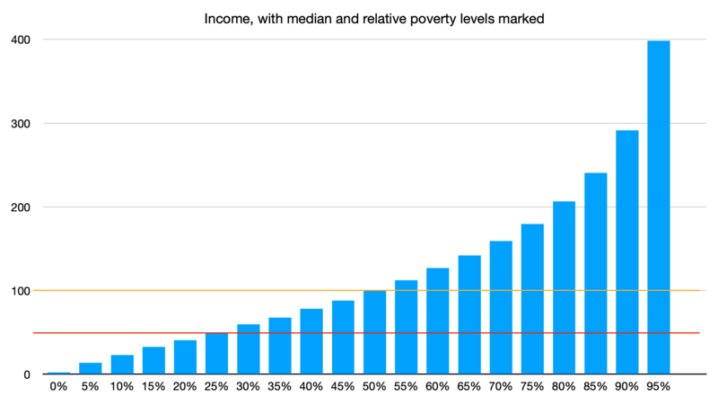
The blue bars represent the amount of money made by different people. The thin red line shows the relative poverty level. Anyone earning less than that, in this society, is relatively poor.
Summary[edit]
| Description |
English: Percentile curve for household income. This curve roughly follows the 2023 household income for the US, set to arbitrary units. The median household (50th percentile, orange line) earns "100" (100% of the median income). Relative poverty is marked at "50" (50% of the median income, red line). In this dataset, that point lines up with the 25th percentile. |
| Date | |
| Source | Own work |
| Author | WhatamIdoing |
Licensing[edit]
I, the copyright holder of this work, hereby publish it under the following license:
| This file is made available under the Creative Commons CC0 1.0 Universal Public Domain Dedication. | |
| The person who associated a work with this deed has dedicated the work to the public domain by waiving all of their rights to the work worldwide under copyright law, including all related and neighboring rights, to the extent allowed by law. You can copy, modify, distribute and perform the work, even for commercial purposes, all without asking permission.
|
File history
Click on a date/time to view the file as it appeared at that time.
| Date/Time | Thumbnail | Dimensions | User | Comment | |
|---|---|---|---|---|---|
| current | 00:45, 19 March 2024 | | 1,942 × 1,094 (75 KB) | WhatamIdoing (talk | contribs) | Uploaded own work with UploadWizard |
You cannot overwrite this file.
File usage on Commons
There are no pages that use this file.
File usage on other wikis
The following other wikis use this file:
- Usage on en.wikipedia.org