File:ACA Panel Chart v1.png
跳至導覽
跳至搜尋
預覽大小:800 × 448 像素。 其他解析度:320 × 179 像素 | 640 × 358 像素 | 1,305 × 731 像素。
原始檔案 (1,305 × 731 像素,檔案大小:186 KB,MIME 類型:image/png)
說明
說明
添加單行說明來描述出檔案所代表的內容
Understanding the chart[編輯]
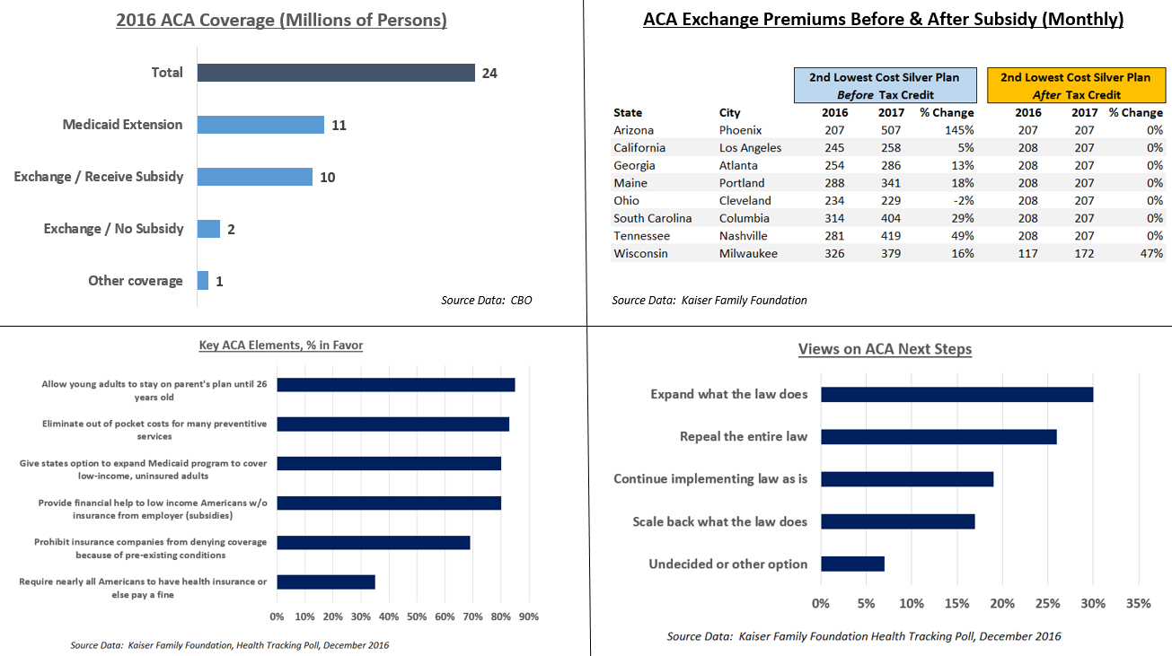
This panel chart illustrates several aspects of the Affordable Care Act (ACA). It includes coverage data from the CBO,[1] cost data from Kaiser,[2] and public opinion polls from Kaiser.[3]
Key points:
- There were 24 million covered by Obamacare exchanges and the Medicare extension. Of the 12 million on the exchanges, 10 million received subsidies.
- Key parts of the ACA are very popular, although the mandate is unpopular.
- The electorate narrowly prefers retaining or expanding the ACA, over repealing or scaling it back.
- Costs have gone up pre-subsidy on the exchanges, but subsidies (tax credits) rose as well, offsetting these increases. After subsidy, health insurance costs changed little from 2016 to 2017. The second lowest cost silver plan is a popular plan also used for calculations of subsidies. Prices shown are for 40-year old non-smoker earning $30,000 / year.
References[編輯]
- ↑ Federal Subsidies for Health Insurance Coverage for People Under Age 65:2016 to 2026. CBO. Retrieved on November 23, 2016.
- ↑ 2017 Premium Changes and Insurer Participation in the Affordable Care Act’s Health Insurance Marketplaces. Retrieved on December 3, 2016.
- ↑ After the Election, the Public Remains Sharply Divided on Future of the Affordable Care Act. Kaiser Family Foundation (December 3, 2016).
摘要[編輯]
| 描述 |
English: This panel chart illustrates several aspects of the Affordable Care Act, including coverage, cost, and public opinion. |
| 日期 | |
| 來源 | 自己的作品, using source data from CBO and Kaiser Family Foundation |
| 作者 | Farcaster |
授權條款[編輯]
我,本作品的著作權持有者,決定用以下授權條款發佈本作品:
此檔案採用創用CC 姓名標示-相同方式分享 4.0 國際授權條款。
- 您可以自由:
- 分享 – 複製、發佈和傳播本作品
- 重新修改 – 創作演繹作品
- 惟需遵照下列條件:
- 姓名標示 – 您必須指名出正確的製作者,和提供授權條款的連結,以及表示是否有對內容上做出變更。您可以用任何合理的方式來行動,但不得以任何方式表明授權條款是對您許可或是由您所使用。
- 相同方式分享 – 如果您利用本素材進行再混合、轉換或創作,您必須基於如同原先的相同或兼容的條款,來分布您的貢獻成品。
檔案歷史
點選日期/時間以檢視該時間的檔案版本。
| 日期/時間 | 縮圖 | 尺寸 | 使用者 | 備註 | |
|---|---|---|---|---|---|
| 目前 | 2016年12月11日 (日) 16:51 | | 1,305 × 731(186 KB) | Farcaster(留言 | 貢獻) | Correction |
| 2016年12月4日 (日) 22:18 |  | 1,420 × 793(271 KB) | Farcaster(留言 | 貢獻) | Clarify premiums are monthly | |
| 2016年12月4日 (日) 17:08 |  | 1,416 × 795(269 KB) | Farcaster(留言 | 貢獻) | User created page with UploadWizard |
無法覆蓋此檔案。
檔案用途
沒有使用此檔案的頁面。
全域檔案使用狀況
以下其他 wiki 使用了這個檔案:
- en.wikipedia.org 的使用狀況
- zh.wikipedia.org 的使用狀況