File talk:Carbon Dioxide 800kyr.svg
Apparent discrepancy between this and "Vostok Petit data"[編輯]

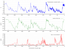
@Femkemilene: I perceive a discrepancy between your lovely Carbon Dioxide 800kyr.svg and File:Vostok Petit data.svg: The latter looks like it covers the last 450,000 years while your "Carbon Dioxide 800kyr.svg" purports to cover the last 800,000 years. File:Vostok Petit data.svg visually seems to match your plot except for the past roughly 100 years. Does their plot end around 1900?
Thanks very much for this plot. It's incredibly powerful -- but it needs to be correct. Thanks, DavidMCEddy (對話) 21:36, 14 July 2020 (UTC)
- Hello David. Thanks for your question. The older data in Carbon Dioxide 800 kyr.svg comes from the Dome C ice core, not from Vostok. The past 150 years are from Law Dome and direct measurements. The Vostok data set used in Carbon Dioxide 800 kyr.svg doesn't include the last 22 000 years. The data for the Vostok Petit data.svg definietly doesn't include the last 100 years, so you might be right it ends around 1900. Femkemilene (對話) 15:52, 17 July 2020 (UTC)
Unless one already knows it's a hockey stick chart, the little dotted lines make it really unclear whether the vertical at the end is a jump or just part of a box.[編輯]
Unless one already knows that it must be a hockey stick chart, the little dotted lines make it really unclear what the jump at the end is about. Even already knowing, it's hard to feel confident.
To communicate effectively, I suggest to identify what the little dotted lines are supposed to show and to show it another way.
Maybe use two charts?