Commons:Featured picture candidates/File:Catedral Vank, Isfahán, Irán, 2016-09-20, DD 118-120 HDR.jpg
Jump to navigation
Jump to search


File:Catedral Vank, Isfahán, Irán, 2016-09-20, DD 118-120 HDR.jpg, featured[edit]
Voting period is over. Please don't add any new votes.Voting period ends on 18 Mar 2018 at 07:06:29 (UTC)
Visit the nomination page to add or modify image notes.

- Category: Commons:Featured pictures/Places/Interiors/Religious buildings
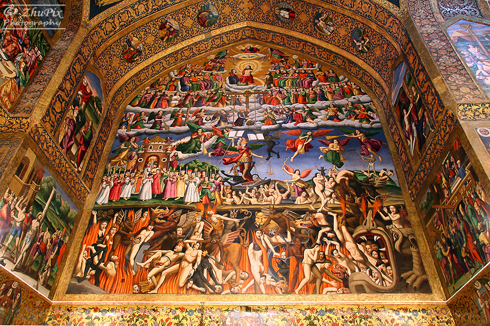
 Info View of the rich frescos and ceiling of the Vank Cathedral in Isfahan, posibly the most impressive christian temple in the Islamic Republic of Iran. The construction of the Armenian Apostolic church, formaly known as Holy Savior Cathedral, began in 1606 and was finished between 1655 and 1664. The temple was dedicated to the hundreds of thousands of Armenian deportees that were resettled by Shah Abbas I during the Ottoman War of 1603-1618. Note: there are already 2 FPs of this church (1, 2 but rather with a more general view of the whole ceiling) All by me, Poco2 07:06, 9 March 2018 (UTC)
 Support -- Poco2 07:06, 9 March 2018 (UTC)
- Support--Ermell (talk) 07:40, 9 March 2018 (UTC)
- Support--Peulle (talk) 08:06, 9 March 2018 (UTC)
- Support --Uoaei1 (talk) 10:47, 9 March 2018 (UTC)
- Support --Berthold Werner (talk) 11:45, 9 March 2018 (UTC)
- Support --A.Savin 12:50, 9 March 2018 (UTC)
 Comment Certainly lots of wow and detail. The colour isn't particularly pleasing though, being quite strongly yellow and a little green. Compare this, which isn't quite the same view, but is better coloured. The fleshtones are particularly off. Could the lighting be the compact fluorescent kind? If parts of the image are lit by daylight, and more neutral (e.g. top and some of the left arch) then perhaps one could process the scene twice with different colour balance, and then merge layers in Photoshop to blend. -- Colin (talk) 14:26, 9 March 2018 (UTC)
 Neutral per Colin. I also wonder if the split-toning tool in Camera Raw, as pointed to a while back by cart, might also fix this. Daniel Case (talk) 18:06, 9 March 2018 (UTC)
- Support - Colin's point makes sense to my eyes, but as he says, this has a lot of wow, so I support without reservation but also without prejudice to Colin's advice. I'd be happy if you improved the photo further. -- Ikan Kekek (talk) 20:30, 9 March 2018 (UTC)
- Comment I've uploaded a new version. Yes, it looks more natural now but getting it 100% homogenous is gonna be very difficult due to the mix of daylight and artificial lighting Poco2 21:42, 9 March 2018 (UTC)
- Comment Perhaps something like this? Along the lines Daniel suggested. Yours if you want it. --cart-Talk 22:29, 9 March 2018 (UTC)
- cart: thanks for your version, looks good. At the same time my last version and yours look pretty close to me. What difference do you see? what means Daniel with split-toning tool in Camera Raw? I'd like to have a look into that --Poco2 07:11, 10 March 2018 (UTC)
- @Poco a poco: The main difference in my version is that the colors are more homogeneous. The basis of this is the Split Toning (tutorial) you can do in Lightroom. Daniel just didn't remembered the name for it correctly. It's a tool you use to adjust the color temperature of highlights and shadows separately, you can make them the same or you can make them more different for effect. It works best if you have only one kind of light source, like sunshine. Here you have two conflicting light sources (like Colin pointed out) so it is not enough to use just split toning. The top left of the pic is mostly cold/blue/magenta/desaturated toned and the bottom right is warm/yellow/green/saturated. First of all you have to counter this by using two main gradient filters diagonally. You set the filters to the reverse of what you have in the two parts of the pic and the result is more harmonious. After that you can use a small mild version of the same settings to go over and touch up the pic the the brush. That way you get to fix individual areas. When the colors are more the same over the pic, you will find that this has affected the light in the photo since warm, saturated areas are usually darker than the cold/desaturated, and you have to fix this by using gradient filters for exposure. It is all done in the same session in Lightroom, no Photoshop involved. Fixing light is always easier in LR than PS. Hope you understand some of this, It's not easy put into words exactly what I do. ;-) --cart-Talk 10:45, 10 March 2018 (UTC)
- Thanks for the detail answer, cart. To be honest, I've never used the split toning. The other adjustments is mostly what I did in the last version. I also played with the split toning but the differences where really hard to notice, I think, I would leave it as it is. Poco2 16:56, 10 March 2018 (UTC)
- That's ok. I mostly wanted to see if it could be improved upon at all. :) For me when presenting an FPC, I'm never satisfied with just getting a picture through a nomination, I always want to try to make my photos as good as my raw material, equipment and knowledge can make them, even if it's overkill. --cart-Talk 19:03, 10 March 2018 (UTC)
- Support --Michielverbeek (talk) 21:55, 9 March 2018 (UTC)
- Support --Yann (talk) 06:37, 10 March 2018 (UTC)
- Support --Martin Falbisoner (talk) 10:06, 10 March 2018 (UTC)
- Support --Agnes Monkelbaan (talk) 18:42, 10 March 2018 (UTC)
- Support — Rhododendrites talk | 23:43, 11 March 2018 (UTC)
- Support --Harlock81 (talk) 19:43, 12 March 2018 (UTC)
- Support --Famberhorst (talk) 09:45, 13 March 2018 (UTC)
Confirmed results:
This image will be added to the FP gallery: Places/Interiors/Religious buildings