KAST kast
 KAST kast designed by Marcel Douwe Dekker in 1992 | |
| Type | Interior object |
|---|---|
| Inventor | Marcel Douwe Dekker |
| Inception | Start date 1991 |
| Manufacturer |
Marcello (1992-1996), Stephan Götz (1992), MDD (1997-1999) |
| Available | Not-available |
| Website | MDD Literal Art & Design collection |
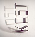
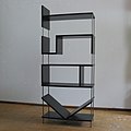
The KAST kast is an Dutch interior object constructed with the letters K, A, S, T on their side forming the word "KAST", whcih is Dutch for Case or Bookcase. It was designed by the conceptual artist and designer Marcel Douwe Dekker in 1991-1992 and has been developed into an Literal Art & Design collection,[1] and a series of art installations presented further on in the 1990s.
Product[edit]
Concept development, Prototypes and show models[edit]
In the beginning of 1991 Dekker had finished his studies at the Delft University of Technology in the field of mechanical engineering and business administration, and was determined to become an artist. In the spring of 1991 he had started working toward admission at the academy of art, initially the department of graphic design and photography.
His 2D interests developed in 3D work and he started orienting and experimenting with designing sculptures from different explicit concepts. One of the first concepts was a branch with leaves, which was replicated into a more abstract form using broomsticks.[2] In this process the concept of the KAST-kast emerged early summer 1991 and originated from his longstanding interest in graphic design.[3][4]
-
 Sketch Alphabetkast, 15.06.91
 -
 Sketch Harpkast 25.06.91
 -
 Sketch Letterkast, 26.06.91
 -
 Éight more years of sketching, 1991-99


Multiple prototypes had been made during 1991 resulting in a series of two show-models by the end of the year. Late Autumn 1991 in a presentation was given at the design store Fabricati in the Nieuwe Binnenweg in Rotterdam about opposite to the Center for Visual Art. The furniture designer Peter van Zoetendaal had taken an interests in two of the five prototypes presented. He suggested material, measurement and a price-range. The first show model was shown in the spring of 1992 for a month or so.[5]
At the art academy in 1992 teachers noticed the similarities of the letter designs and the early 1970s television decors[6] but in those days there were no way to check this out. With further ideas the concept development of the KAST-kast kept going eventually for almost eight years. In sketches different fundamental types of configurations were discovered.
The idea for book case with other words had been investigated for some time, when the idea emerged for an ALFABET-KAST system: For every letter a book case module, which could be combined to any possible word. The research and development of this concept was made possible by a grant by the Stichting SOFA.
Products[edit]
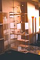
From 1992 to 1999 a series of about twelve KAST-kast bookcases have been made with different materials, size and construction.[7] The first two were black with the dimension of 165-70-30 cm. The third and forth in 1992-1993 were enlarged to 210-100-30 cm, the grey and red KAST-kast.[8]
- Images
-
 Original Black Kast-kast, 1992
 -
 Red KAST-kast in Galerie 2x2, 1994
 -
 Biennale Interieur Kortrijk, 1994
 -
 Letter Interior with Nature with SOFA kast
 -
 Back in Havenstraat, R'dam 2012


Spin-off[edit]
In spring 1994 with the exhibition "Nine Rooms" in Hilton Rotterdam a lecture as developed about "graphical language in interior design," the historical development. This lecture was held again early 1995 in The Hague in the Haagse Kunstkring.[9]
In the summer of 1994 the artist Saskia Meulendijks painted the image of the KAST-kast on canvas, which was intended for an exhibition somewhere (see image). Hereby the original conceptual ideas translated into design transcended back into art. This painting was exhibited at the Multimedia Building artists at Erolife, 1995 (see image).
In 1998-99 the concept development was developed into a retrospective installation. Around the same time a series of short Reviews were created showing Multiple lines of development
In 2008-10 a new effort was made on Flickr to investigate and categorize new developments in a series of Flickr galleries.
Presentation[edit]
In the early 1990s product presentations started in Rotterdam and Amsterdam and a series of design fairs in 1994-95.
- 1992. Fabricatie, Rotterdam[5] -- Galerie KIS, Amsterdam
- 1993. Museum Hillesluis, Rotterdam
- 1994. Galerie 2x2, Delfshaven -- Casa Europea 1, Antwerpen[3] -- Droom Design 1, Zuid Laren -- Nederlandse meubelprijzen 1994 -- Interieur RAI, Amsterdam 1994 -- Biennale Interieur Kortrijk ;
- 1995. Droom Design 2, Zuid Laren -- Interieur RAI, Amsterdam 1995 -- Nederlandse Meubelbeurs in Utrecht, 1995 -- Interior Design fair in Americahal in Apeldoorn, 1995
- Installations & art exhibitions
- 1993. Allemaal in Pak, Passerelstraat Atelier Collectief, Rotterdam
- 1994. A Room with a view, in exhibition "Nine Rooms", Hilton Rotterdam
- 1994. Donner boekhandel, Rotterdam
- 1994/95; Leesbare meubels, Haagse Kunstkring, Den Haag
- 1996. Kasten vol kasten Galerie Intermezzo, Dordrecht
- 1999. Expositie terugblik, Centrale Bibliotheek Rotterdam
- 2014. VORMenTAAL, Yksi Expo, Eindhoven: theme expo about dyslexia and design
- Images
-
Galerie 2x2 Delfshaven, 1994
-
 Casa Europea 1 Antwerp, 1994
 -
Biennale Interieur Kortrijk, 1994
-

-
 Yksi Expo Eindhoven, 2014
.jpg)


Representation[edit]
In the summer of 1991 there was a form of product placement of the fist prototypes in the photo comic Barwoella.[10] A first advertisement was placed on the back cover TENENO, a literary magazine by Marcel Douwe Dekker.[11] After a first presentation at the design gallery in Rotterdam, there was a first publication of the work in the Dutch Viva magazine.[5]
Supricing in the first presentations was, that people often didn't notice the crux of the matter: Furniture design made out of the shape of letters. Over the years some flyers, accompanying text and publication were created to explain the concepts.
-
 Text product design in Museum Hillesluis, 1993
 -
 Flyer An Ultimate Reflection Flyer, 1998
 -
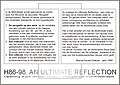 Flyer An Ultimate Reflection Flyer, 1998
.jpg)


Over the years the KAST-kast was published in a small number of magazines and newspapers. In 2012 there was a conflict on the English en Dutch Wikipedia, that this image should not be presented in Wikipedia articles, because the designer was also active as Wikipedian.
References[edit]
- ↑ Literal Art & Design collection by Marcel Douwe Dekker at Flcikr.
- ↑ Takkeding, op Flickr.com. Sculpture from Spring 1991.
- ↑ a b K.I.M. Artful facilities Rotterdam." in: Design special Casa Europea 1,, 7e jaargang nr. 4, (januari) 1994. p. 14.
- ↑ Marcel Douwe Dekker. "Design of display for agricultural farm in de Diepsmeer, North Holland in 1977," Flickr.com. Last update 24 April 2020. (in Dutch).
- ↑ a b c Red. "Wonen, Vitrine: Rotterdam, daar komen de leukste meubels vandaan." Viva, nr. 38. 10 sept. 1992.
- ↑ See for example here and here.
- ↑ Marcel Douwe Dekker, "CV 98. L'art pour l'art," Mdd Review, 12e jaargang, juli 1998.
- ↑ Marcel Douwe Dekker. CV98 - L'art pour l'art Cover, Mdd Review, Juli 1998.
- ↑ HKK kringbericht, Jan 1995.
- ↑ Gerrie Hondius, et al. "Barre Tijden, Woelige Tijden," Barwoel, nr. 17, september 1991.
- ↑ Marcel Douwe Dekker, Teneno, verhalen en schetsen voor als het uitkomt, Literair tijdschrift, augustus 1992.
External links[edit]
- Literal Art & Design collection by Marcel Douwe Dekker