User:Gust Justice/2022 Danish election
-
 A. Social Democrats
 -
 B. Social Liberals
 -
 C. Coinservative
 -
 D. New Right
 -
 F. Socialist People's Party
 -
 I. Liberal Alliance
 -
 K. Christian Democrats
 -
 M. Moderates
 -
 O. Danish People's Party
 -
 Q. Independent Greens
 -
 V. Venstre
 -
 Æ. Denmark Democrats
 -
 Ø. Red-Green Alliance
 -
 Å. The Alternative
 -
 Independents
 -
 Turnout


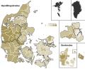
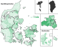
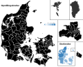
I want to provide some more background as to the choropleth maps I did for the 2022 Danish election. I used the data from the table FV22TOT on statistikbanken.dk. The maps themselves were made by coding to each nomination district/constituency shape the appropriate color corresponding to its vote share. I did this in excel using some formulas. I manually chose the margins myself, with the principles that 1) exactly 5 colors would be used for each party, 2) the cut-off points should be a rounded percentage, or at least have few decimals, 3) the margins should be approximately evenly spread out, and 4) each of the 5 colors should be used approximately the same number of times across the 98 nomination districts. I also preferred to have the two extreme colors (i.e. nomination districts where parties did the best or the worst) be used less frequently than the three median colors.
This is what the distribution looks like, with the numbers below the percentages showing how often the respective color was used. I generally tried to balance out those principles, meaning an exact algorithm wasn't used. Such an algorithm could have been to use the margins that would give a "perfect" 19-20-20-19 distribution, but this would have required to use less "clean" numbers, which would appear more arbitrary than using whole percentages or half percentages.