File:Amplitude & phase vs frequency for 3-term boxcar filter.svg
跳至導覽
跳至搜尋

此 SVG 檔案的 PNG 預覽的大小:435 × 400 像素。 其他解析度:261 × 240 像素 | 522 × 480 像素 | 835 × 768 像素 | 1,114 × 1,024 像素 | 2,227 × 2,048 像素。
原始檔案 (SVG 檔案,表面大小:435 × 400 像素,檔案大小:20 KB)
說明
說明
添加單行說明來描述出檔案所代表的內容
摘要
[編輯]| 描述 |
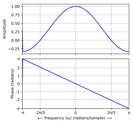
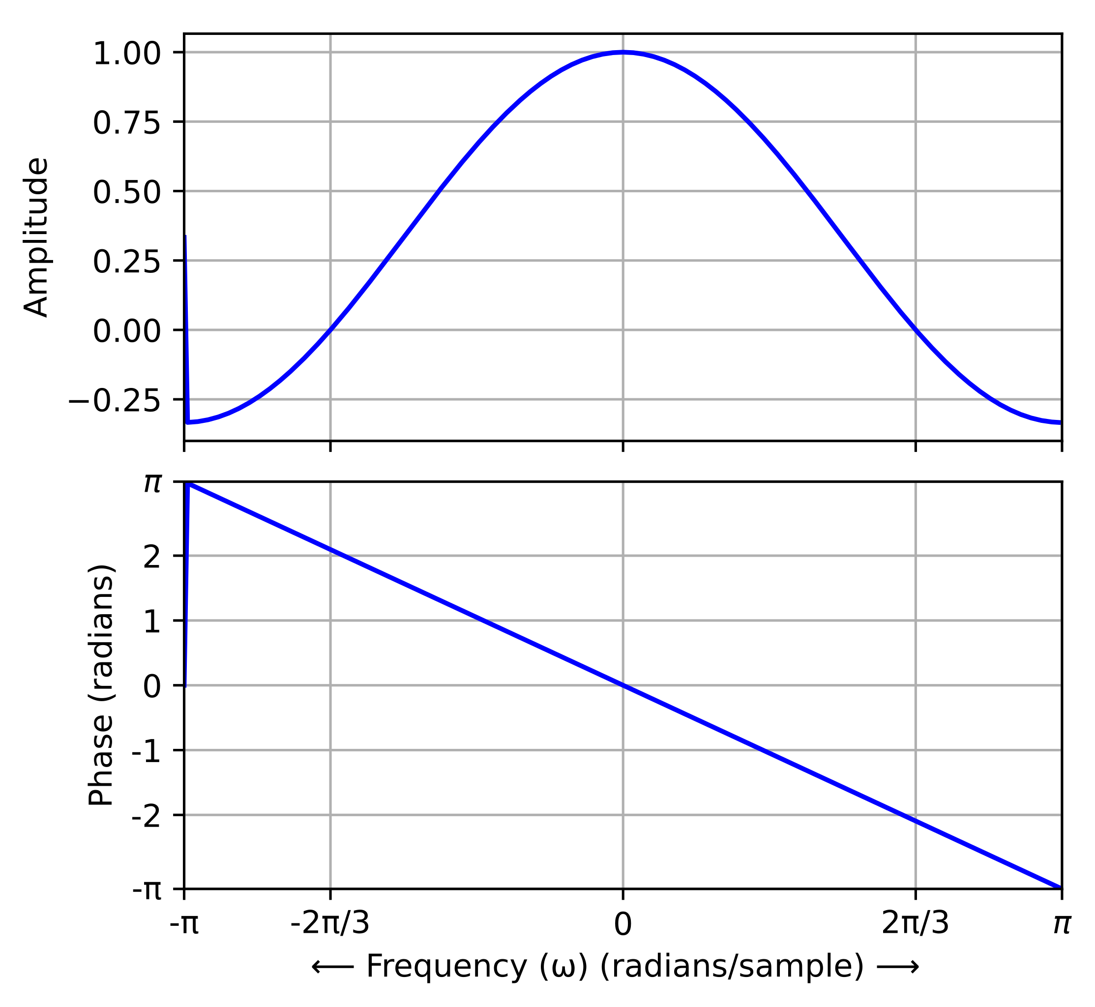
English: These graphs depict the same transfer function as File:Frequency response of 3-term boxcar filter.gif. But here, the amplitude is a signed quantity. And where it is negative, the quantity π has been added to the phase plot (before computing the principal value). The purpose is to illustrate the linear-phase property of the FIR filter.
Русский: Амлитудно-частотная и фазовая характеристики фильтра с конечной импульсной характеристикой скользящего среднего |
|||
| 日期 | ||||
| 來源 | 自己的作品 | |||
| 作者 |
original: Bob K vector version: Krishnavedala |
|||
| 授權許可 (重用此檔案) |
|
|||
| 其他版本 |
|
|||
| SVG開發 | ||||
| Python source | click to expand
This script is a translation of the original Octave script into Python, for the purpose of generating an SVG file to replace the GIF version. import scipy
from scipy import signal
import numpy as np
from matplotlib import pyplot as plt
N = 256
h = np.array([1., 1., 1.]) / 3
H = scipy.fftpack.shift(scipy.fft(h, n=N), np.pi)
w = np.linspace(-N/2, N/2-1, num=N) * 2 * np.pi / N
amplitude = abs(H)
L = int(np.floor(N/6))
negate1 = np.array(range(L)) + 1
negate2 = N - np.array(range(L)) - 1
amplitude[negate1] = -amplitude[negate1]
amplitude[negate2] = -amplitude[negate2]
H[negate1] = -H[negate1]
H[negate2] = -H[negate2]
fig = plt.figure(figsize=[5,5])
plt.subplot(211)
plt.plot(w, amplitude, 'blue')
plt.grid(True)
plt.ylabel('Amplitude')
plt.xlim([-np.pi,np.pi])
plt.xticks([-np.pi, -2*np.pi/3,0,2*np.pi/3,np.pi], [])
plt.subplot(212)
plt.plot(w, np.angle(H), 'blue')
plt.grid(True)
plt.ylabel('Phase (radians)')
plt.xlabel('$\\longleftarrow$ Frequency ($\\omega$) (radians/sample) $\\longrightarrow$')
plt.xticks([-np.pi, -2*np.pi/3,0,2*np.pi/3,np.pi], ['-$\pi$','-2$\pi$/3','0','2$\pi$/3','$\pi$'])
plt.xlim([-np.pi,np.pi])
plt.yticks([-np.pi, -2,-1,0,1,2,np.pi], ['-$\pi$','-2','-1','0','1','2','$\pi$'])
plt.ylim([-np.pi,np.pi])
plt.subplots_adjust(hspace=0.1)
plt.savefig('Amplidue & phase vs frequency response of 3-term boxcar filter.svg', bbox_inches='tight', transparent=True)
|
|||
| Octave/gnuplot source | click to expand
This script was derived from the original in order to address some GNUplot bugs: a missing title and two missing axis labels.  And to add an Octave print function, which creates an SVG file.  Alternatively, the gnuplot screen image has an export function that produces an SVG file, but the π characters aren't as professional-looking.  I think the resultant quality produced by this script is now better than the file produced by the Python script.
graphics_toolkit gnuplot
clear all; close all; clc

hfig = figure("position",[100 100 509 509]);

x1 = .12;               % left margin for name of Y-variable
x2 = .02;               % right margin
y1 = .10;               % bottom margin for ticks
y2 = .08;               % top margin for title
dy = .08;               % vertical space between rows

width = 1-x1-x2;
height= (1-y1-y2-dy)/2; % space allocated for each of 2 rows

x_origin = x1;
y_origin = 1;           % start at top of graph area
%=======================================================
  N= 256;
  h = [1 1 1]/3;              % impulse response
  H = fftshift(fft(h,N));     % samples of DTFT
  abscissa = (-N/2:N/2-1)*2*pi/N;  % normalized frequency

% Specify the bins that are to show a negative amplitude
  L = floor(N/6);
  negate = [1+(0:L) N-(0:L-1)];
  amplitude = abs(H);
  amplitude(negate) = -amplitude(negate);
  H(negate) = -H(negate);   % compensate the phase of those bins
  phase = angle(H);
%=======================================================
  y_origin = y_origin -y2 -height;        % position of top row
  subplot("position",[x_origin y_origin width height])
  plot(abscissa, amplitude, "linewidth", 2);
% Default xaxislocation is "bottom", which is where we want the tick labels.
% set(gca, "xaxislocation", "origin")
  hold on
  plot(abscissa, zeros(1,N), "color", "black")  % draw x-axis
  xlim([-pi pi])
  ylim([-.4 1.2])
  set(gca, "XTick", [-pi -2*pi/3 0 2*pi/3 pi])
  set(gca, "YTick", [-.2 0 .2 .4 .6 .8 1])
  grid("on")

  ylabel("Amplitude")
% set(gca, "ticklabelinterpreter", "tex")	% tex is the default
  set(gca, "XTickLabel", ['-\pi'; '-2\pi/3'; '0'; '2\pi/3'; '\pi';])
  set(gca, "YTickLabel", ['-.2'; '0'; '.2'; '.4'; '.6'; '.8'; '1';])
  title("Frequency response of 3-term boxcar filter", "fontsize", 12)
%=======================================================
  y_origin = y_origin -dy -height;
  subplot("position",[x_origin y_origin width height])
  plot(abscissa, phase, "linewidth", 2);
  xlim([-pi pi])
  ylim([-pi pi])
  set(gca, "XTick", [-pi -2*pi/3 0 2*pi/3 pi])
  set(gca, "YTick", [-pi -2 -1 0 1 2 pi])
  grid("on")

  xlabel('\leftarrow Frequency (\omega) (radians/sample) \rightarrow')
  ylabel("Phase (radians)")
% set(gca, "ticklabelinterpreter", "tex")	% tex is the default
  set(gca, "XTickLabel", ['-\pi'; '-2\pi/3'; '0'; '2\pi/3'; '\pi';])
  set(gca, "YTickLabel", ['-\pi'; '-2'; '-1'; '0'; '1'; '2'; '\pi';])

% The print function results in nicer-looking "pi" symbols
% than the export function on the GNUPlot figure toolbar.
print(hfig,"-dsvg", "-S509,509","-color", ...
'C:\Users\BobK\Amplitude & phase vs frequency for a 3-term boxcar filter.svg')
|


檔案歷史
點選日期/時間以檢視該時間的檔案版本。
| 日期/時間 | 縮圖 | 尺寸 | 用戶 | 備註 | |
|---|---|---|---|---|---|
| 目前 | 2020年10月1日 (四) 13:04 | | 435 × 400(20 KB) | Krishnavedala(對話 | 貢獻) | Text-to-graph aspect ratio renders poorly in thumbnails with text unreadable. |
| 2019年7月3日 (三) 01:25 |  | 512 × 512(42 KB) | Bob K(對話 | 貢獻) | change graph "linewidth" to 2 | |
| 2019年7月2日 (二) 13:03 |  | 512 × 512(42 KB) | Bob K(對話 | 貢獻) | Enlarge image. Add title. Improve rendering of "pi" symbols. | |
| 2017年8月22日 (二) 16:23 |  | 435 × 400(20 KB) | Krishnavedala(對話 | 貢獻) | corrections on phase plot | |
| 2017年8月22日 (二) 16:11 |  | 435 × 400(20 KB) | Krishnavedala(對話 | 貢獻) | new version using Matplotlib | |
| 2017年8月21日 (一) 15:26 |  | 512 × 384(42 KB) | Krishnavedala(對話 | 貢獻) | thicker lines and uses unicode text | |
| 2017年8月16日 (三) 22:01 |  | 576 × 432(43 KB) | Krishnavedala(對話 | 貢獻) | Use Unicode for Greek symbols | |
| 2017年8月16日 (三) 21:58 |  | 576 × 432(43 KB) | Krishnavedala(對話 | 貢獻) | Unicode symbols corrected | |
| 2017年8月16日 (三) 21:52 |  | 576 × 432(43 KB) | Krishnavedala(對話 | 貢獻) | regenerate using "gnuplot" backend | |
| 2017年8月16日 (三) 21:31 |  | 576 × 431(28 KB) | Krishnavedala(對話 | 貢獻) | User created page with UploadWizard |
無法覆蓋此檔案。
檔案用途
下列3個頁面有用到此檔案:
全域檔案使用狀況
以下其他 wiki 使用了這個檔案:
- en.wikipedia.org 的使用狀況
- zh.wikipedia.org 的使用狀況