File:PercentOfUSPopInEachState.gif
Jump to navigation
Jump to search

Size of this preview: 800 × 520 pixels. Other resolutions: 320 × 208 pixels | 640 × 416 pixels | 1,024 × 665 pixels | 1,513 × 983 pixels.
Original file (1,513 × 983 pixels, file size: 710 KB, MIME type: image/gif, looped, 25 frames, 13 s)
Captions
Captions
Add a one-line explanation of what this file represents
Summary[edit]
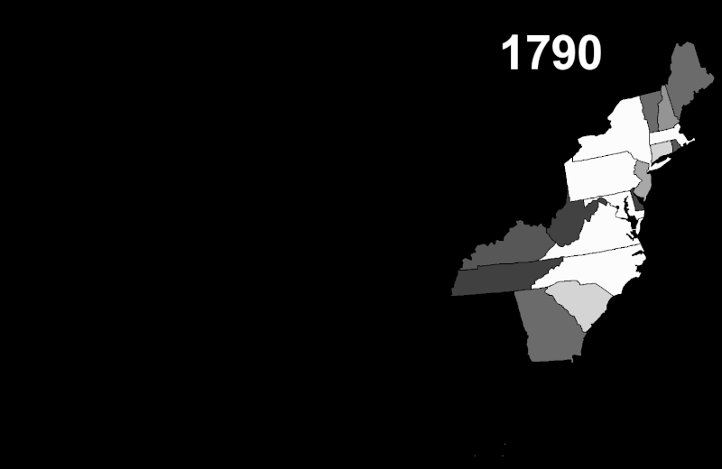
| Description | This map shows the historical movement of the US population among the various states and territories. Brighter states have a larger share of the national population; darker states have a smaller share. |
| Date | |
| Source | My own work, US Census data, PD Map |
| Author | Szu |
| Permission (Reusing this file) |
Public domain |
Licensing[edit]
| I, the copyright holder of this work, release this work into the public domain. This applies worldwide. In some countries this may not be legally possible; if so: I grant anyone the right to use this work for any purpose, without any conditions, unless such conditions are required by law. |
File history
Click on a date/time to view the file as it appeared at that time.
| Date/Time | Thumbnail | Dimensions | User | Comment | |
|---|---|---|---|---|---|
| current | 22:15, 11 October 2007 | | 1,513 × 983 (710 KB) | Szu (talk | contribs) | {{Information |Description=Lighter states have a larger share of the US population; darker states have a smaller share. |Source=My own work, US Census data, PD Map |Date=Oct 11 2007 |Author=Szu |Permission=Public domain |other_versions= }} |
You cannot overwrite this file.
File usage on Commons
There are no pages that use this file.
File usage on other wikis
The following other wikis use this file:
- Usage on en.wikipedia.org
- Usage on fr.wikipedia.org
- Usage on hy.wikipedia.org
- Usage on ka.wikipedia.org
- Usage on ru.wikipedia.org
- Usage on xmf.wikipedia.org