File talk:Greater royal coat of arms of Norway.svg
Royal «CoA» and «Arms»[编辑]


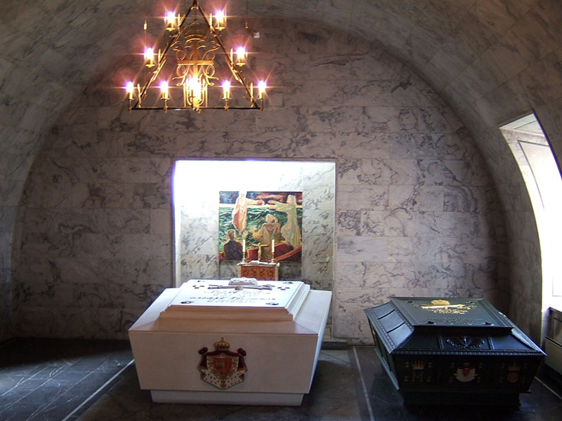
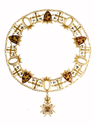
The King of Norway has not changed the Coat of Arms since 1905. You are able to see the original on the Kings sarcophagus. The Coat is purpure (purple, scarlet) with or (gold, yellow) fringes (around the whole Coat) and it is ermine on the inside. I think that the ermine in the CoA Denmark is depicted more correct. King Harald V changed the colour of the cap (inside the crown) from purpure to gules (red) in the Norwegian Coat of Arms. You are able to see the old purpure cap in the emblem of of the Norwegian Army. The lion in Arms is more correct than in CoA. Some of the small lions have the axe the in wrong direction on the Order of St Olav. The colour behind the lion is always tincture gules (red). I think that the Order of St. Olav is best in CoA. Please change the lions and the form of the shields.
Queen Elizabeth II wears an ermine robe during the State Opening of Parliament. Some more pictures of ermine robe on Commons:
- Ermine Robe (Heraldry).svg
- Weltliche Schatzkammer Wien (36).JPG
- Coat of Arms of the Bourbon Restoration (1815-30).svg
Regards Gryphonis (talk) 01:12, 11 February 2011 (UTC)
- Purple and scarlet are two different colours. Also, that picture, as well as the one I've sourced, AS well as a painting (3 sources now) show it red (scarlet is a form of red). They also show the more detailed lion. If it hasn't been changed since 1905, then the version I support is the correct one. I can't find any sources with it purple, nor has Ssolbergj been willing to provide one. I have respect for him, but his "preference" alone doesn't make it right. Fry1989 (talk) 01:22, 11 February 2011 (UTC)
- "The lion in Arms is more correct than in CoA" - how could it be more "correct"? The lion in CoA has a style that's in line with the rest of the image (i.e. no ultra-detailed shadow). That's what I emphesised when I replaced the detailed lion in CoA (Arms is an older version of CoA which I made and Fry later uploaded as a separate file). "The colour behind the lion is always tincture gules"; well this greater royal coat of arms of Norway is virtually no-where in real life. It's as "correct" as it heraldicly gets as long as it is a clear, red colour. If you think it's an ugly tone of red, then please say so, but don't say that it's incorrect, because it simply isn't. I know what an ermine robe looks like, but please do say why exactly a quasi-photographic pattern would be "correct" as opposed to a traditional, heraldic ermine pattern. E.g. File:James Terry Grant.jpg from 1709. - Ssolbergj (talk) 02:20, 11 February 2011 (UTC)
- I'm confused by the red versus scarlet versus purpure issue with the ermine mantling. Can someone provide a reference for the claim that "King Harald V changed the colour of the cap (inside the crown) from purpure to gules (red)"? The extremely stylised crown displayed above the non-royal state arms is probably not a relevant reference point, considering the fact that there is basically no consistency or organisation of state-level heraldry in Norway. Other than that, as far as I can see, both of the versions are equally "correct", it's just that Arms is inferior in terms of both technique consistency and detail. - Ssolbergj (talk) 02:59, 11 February 2011 (UTC)
- I uploaded the historical version that you created because I believe it is the one that should be used. I have attributed it to you, I'mnot claiming it as my own work. I'm confused as to what you mean why saying the lion is wrong. There's two examples of it actually engraved, which certainly don't show it as you do in the CoA version, but far more detailed. The same goes for what's on the Royal website. It's very small, but it's certainly also not your current version. Again, the purple is also of issue to me. Fry1989 (talk) 03:55, 11 February 2011 (UTC)

- Royal Decree December 14. 1905 gave the new nation's and the King's Coat of Arms. The King's CoA (kongevaabenet) was blazoned:«The Nation's (Riksvaabenet) shield with the Royal Ermine Coat surrounded by the Order of St. Olav's livery collar, Coat and the Crown's cap are purpure». (Translated from the Royal Decree but it is also in Norwegian Wikipedia. This King's CoA is normally called: the large CoA (det store kongevåpen), the small CoA (det lille kongevåpen) is the shield with helmet. I did not find a picture of the small version but it is almost similar with this exept of the form of shield and the lion. The artist responsible for all CoAs was en:Eilif Peterssen.
- Royal Decree March 19. 1937 blazoned the Nation's CoA but not the King's. The Royals kept the old lion. All versions of the CoA must have approval of the King or the Foreign Ministry. The term correct above means that you could not make a new CoA after the blazon. You must copy an approved one!
- In May 1944 en:Vidkun Quisling introduced a nazi version
- The Norwegian unofficial herold, no:Hallvard Trætteberg made new lions in 1939, 1964 (colour) and 1978. no:Georg Apenes called some of the versions cruelty to animals in 1990. The latest approved version is from 1992.
The Foreign Ministry emphasized the rules. The form of the shield is important. All new shields have the same form. As far as I know King Harald V changed the crown on the Royal CoA, you find the form of the shield and the crown here.
Gryphonis (talk) 06:34, 11 February 2011 (UTC)
- Scarlet is wrong. I was to fast. Since 1628 all shields, banners etc. with the King's Lion (short form: lion) was approved by the ruling King. From 1905 the King and the Foreign Ministry. One chief curator at the Armed Forces Museum could see a lion and determine the year of production plus minus ten years. Between 1200 and 1628 plus minus forty years. If you merge the reproduction of a painting and the CoA of the Royal website you have the form of shield. Use the lions from Arms, the livery collar from CoA and the gold fringes. My personal opinion for the ermine is: (1) CoA Denmark, (2) Arms and (3) CoA. Old heraldic CoAs was printed in black and white, carved in stone or moulded in a metal they used the tincture codes. Most of Wikipedia users know little about heraldic codes. Thats why I prefer the ermine in the CoA of Denmark.
The Norwegian Army has the following definition of tinctures:
| Tinctures | PMS1 | Screen | ||||||
| R | G | B | C | M | Y | K | ||
| Gules (red) | 185 | 241 | 0 | 65 | 0 | 91 | 76 | 0 |
| Azure (blue) | 300 | 0 | 98 | 200 | 100 | 43 | 0 | 0 |
| Vert (green) | 355 | 0 | 163 | 55 | 100 | 0 | 91 | 6 |
| Purpure (purple) | 242 | 125 | 15 | 91 | 9 | 94 | 0 | 51 |
| Sable (black) | BLACK | 0 | 0 | 0 | 0 | 0 | 0 | 100 |
| Or (gold) | 874 | |||||||
| Or (yellow2) | 116 | 255 | 219 | 0 | 0 | 15 | 94 | 0 |
| Argent (silver) | 877 | |||||||
| Argent (white3) | (White) | 255 | 255 | 255 | ||||
| 1 Pantone Matching System 2 Gold is impossible to depict. If you are not able to use gold substitute with yellow. 3 Silver is impossible to depict. If you are not able to use silver substitute with white. Purpure only used on Crown's cap above shields before 1992. | ||||||||
Gryphonis (talk) 08:50, 11 February 2011 (UTC)

The latest version by SSolbergj of this file is now very close to the real thing. For that reason it now appears in most Wikipedia articles on Norwegian heraldry. However, there are still improvements to be made. The lion is almost like the original by Peterssen, 1905. The blade of the axe differs, it ought to be symmetrical, as it is in all official versions. The paws of the lion are a bit more detailed than in the King's arms, but that is a minor detail. The most important dicrepancy is the crown. I is neither the official crown of 1905, nor the present crown of the Royal arms. The "lion cub" on the crown's globe gradually disappeared from the royal arms after the late thirties. Also, the crown was changed to a less stylized form fairly recently; exactly when is unknown to me. But its shape, and the absence of the "lion cub", is clearly seen in the heading of the Royal website: [1]. I hope that you, Ssolbegj, can help us with these adjustments. Roede (talk) 06:37, 9 July 2013 (UTC)
- Now then? - Ssolbergj (留言) 18:41, 13 March 2018 (UTC)