Commons:Featured picture candidates/File:Dýrafjörður, Vestfirðir, Islandia, 2014-08-15, DD 037 PAN.jpg
Jump to navigation
Jump to search

File:Dýrafjörður, Vestfirðir, Islandia, 2014-08-15, DD 037 PAN.jpg, featured[edit]
Voting period is over. Please don't add any new votes.Voting period ends on 6 Jul 2015 at 12:32:24 (UTC)
Visit the nomination page to add or modify image notes.

- Category: Commons:Featured pictures/Places/Natural
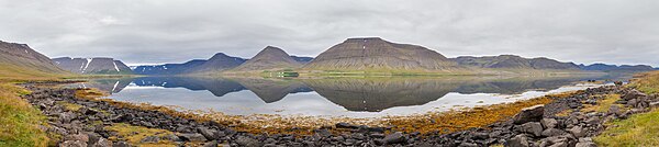
 Info 4-frames panorama of Dýrafjörður, one of the fjords comprising the Westfjords and situated between the fjords Arnarfjörður, in the South and Önundarfjörður, in the North. Dýrafjörður belongs to the municipality of Ísafjarðarbær and the fjord is 9 km wide and stretches 32 km into the land. All by me, Poco2 12:32, 27 June 2015 (UTC)
 Support -- Poco2 12:32, 27 June 2015 (UTC)
- Support Very nice view, I like this colors, reflections and the mood :) --Laitche (talk) 12:39, 27 June 2015 (UTC)
- Laitche:
 CA removed, thanks for the note Poco2 15:00, 27 June 2015 (UTC)
- Laitche:
 Comment I like it also but please see notes. --ArildV (talk) 12:47, 27 June 2015 (UTC)
- ArildV: stitching issues solved, thanks for the notes Poco2 15:00, 27 June 2015 (UTC)
- ArildV:
- Support now--ArildV (talk) 14:41, 27 June 2015 (UTC)
 Weak oppose
- DXR: Overexposure issue solved, about the sharpness I am not sure, I couldn't see a noticeable drop of sharpness, could you add a note? Poco2 15:00, 27 June 2015 (UTC)
- Oh, that's much better regarding the clouds! I think your second frame from the left is shaky-blurred, which is quite unfortunate. I'm going
 Neutral because that version certainly improves a lot. The sharpness issue can be seen quite easily when you follow the close side of the fjord.--DXR (talk) 15:26, 27 June 2015 (UTC)
- Oh, that's much better regarding the clouds! I think your second frame from the left is shaky-blurred, which is quite unfortunate. I'm going
- DXR:
- Weak support I had a bit of doubt about the colors in remote targets here. It reminds me a bit of my personal pictures I've taken during my holidays where the main subject is located in a far distance (just like in this picture). I was strongly disappointed when I saw my pictures as they were just incomparable with the real view I saw. I think this picture has just the same issue, because colors depth is just incomparable with those around rocks and those behind the river, which looks quite toneless. Another picture nominated below with quite remote mountains as well doesn't have such issue, so I guess it is possible to solve this somehow. Still, despite this issue the picture is appealing and worth support. -- Pofka (talk) 16:31, 27 June 2015 (UTC)
- Pofka: I've played around with the WB and came to the conclusion that the current colors are quite loyal to reality. Can you give me a hint (bluish, greenish,...)? Poco2 17:21, 27 June 2015 (UTC)
- Added note where I think it is too pale. I think it should look much greener live. Only the remote (where I noted) parts have issues for me. All these rocks, bushes at the bottom are of a great tone. -- Pofka (talk) 20:39, 27 June 2015 (UTC)
- Thanks, but I am not sure whether there is an issue and whether I should do some local correction. I'd like to hear other opinions Poco2 17:31, 28 June 2015 (UTC)
- Added note where I think it is too pale. I think it should look much greener live. Only the remote (where I noted) parts have issues for me. All these rocks, bushes at the bottom are of a great tone. -- Pofka (talk) 20:39, 27 June 2015 (UTC)
- Pofka: I've played around with the WB and came to the conclusion that the current colors are quite loyal to reality. Can you give me a hint (bluish, greenish,...)? Poco2 17:21, 27 June 2015 (UTC)
- Support Great composition! 😄 ArionEstar 😜 (talk) 22:24, 27 June 2015 (UTC)
- Support Issues noted, but on balance I think it works. Daniel Case (talk) 06:37, 29 June 2015 (UTC)
- Support --Tremonist (talk) 13:03, 30 June 2015 (UTC)
- Support --Kadellar (talk) 12:06, 3 July 2015 (UTC)
Confirmed results:
This image will be added to the FP gallery: Places/Natural