Commons:Featured picture candidates/File:Glasgow City Chambers - Banqueting Hall - 3.jpg
Jump to navigation
Jump to search

File:Glasgow City Chambers - Banqueting Hall - 3.jpg, featured[edit]
Voting period is over. Please don't add any new votes.Voting period ends on 31 Mar 2016 at 21:44:17 (UTC)
Visit the nomination page to add or modify image notes.

- Category: Commons:Featured pictures/Places/Interiors
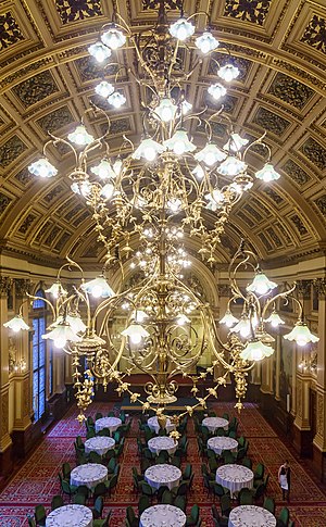
 Info One of the three electroliers, installed in 1885, lighting the banqueting hall in Glasgow City Chambers. Each need about 50 light bulbs. The hall is 16 metres in height, 27 metres in length, 14 metres wide, and covered in gold leaf. All by me. -- Colin (talk) 21:44, 22 March 2016 (UTC)
 Support The photo was taken from the balcony while on a guided tour of the building. So no tripod and a challenging dynamic range for a single shot. What makes it special for me, is that it captures a member of staff who was arranging the tables for a banquet, and who provides some scale and personality. -- Colin (talk) 21:44, 22 March 2016 (UTC)
- Support It's well done and unique. (I support either version) -- Ram-Man 01:10, 23 March 2016 (UTC)
- Moderate Support. I am more intellectually than emotionally wowed by this photo, but that's OK. Inevitably, the light bulbs, and therefore the electroliers, dominate the photo. However, it's hard for me to imagine that someone could have done a better job than you in capturing the rest of the photo at a good level of brightness and resolution. It takes the viewer some effort to look at the rest of the picture, perhaps, but it's a very good composition and though my knowledge and experience of photographic techniques is not at a very advanced level, I think this is a technical tour de force. And it's certainly an interesting and pretty view. -- Ikan Kekek (talk) 06:35, 24 March 2016 (UTC)
 Comment Technical: for me the photo has a significant yellow-greenish tint which I do not find very attractive. I would suggest a color balance correction (e.g. Photoshop color balance: Mid Tones: 0 / -16 / +16; Lightrooms WB does not work for this adjustment, because it does not selectively target the mid-tones). Rftblr (talk) 06:49, 24 March 2016 (UTC)
- I shall try to do what you suggest later tonight. There is a mix of lighting from the bulbs and daylight and reflected light from all that gold leaf on the walls. The shades on the electrolier are green, which might be causing the offending tint. I tried using WB and colour saturation adjustments but they didn't help. Other photos I took in the room (see Category:Glasgow City Chambers interior) weren't as problematic. In order to capture the dynamic range, I had to significantly under-expose the rest of the room, and it is possible that raising the exposure back in post has resulted in an unwanted colour shift. -- Colin (talk) 08:34, 24 March 2016 (UTC)
- As a reference, here is a link to a version corrected with photoshop color balance, mid tones 0 / -12 / 16: https://dl.dropboxusercontent.com/u/106488912/Glasgow_City_Chambers_-_Banqueting_Hall_-_3_CORRECTED.jpg -- Rftblr (talk) 09:06, 24 March 2016 (UTC)
- Thanks. That looks better. -- Colin (talk) 09:18, 24 March 2016 (UTC)
- Comment I've uploaded a new version based on suggestion from Rftblr. You may need to Ctrl-F5 (or Ctrl-Shift-R) on your browser to load the new one if you've got the current one in cache. @Ikan Kekek and Ram-Man: . -- Colin (talk) 09:55, 25 March 2016 (UTC)
- Comment - I see the difference. But which version do you suppose more accurately depicts the way the room looked? (And keep in mind that I support a feature, regardless of whether it's of this new version or the previous one, providing that the picture is actually accurate to the best of your ability.) -- Ikan Kekek (talk) 10:14, 25 March 2016 (UTC)
- Well I certainly didn't notice a green tinge when I was there. And my other photographs don't display it. However, the eye accommodates colour-balance changes without you noticing. So white paper looks white to you whether lit by the white-hot sun, by the blue sky (in shade), by yellow tungsten, or by dreadful phosphors in fluorescent tubes. To some extent, we have to make the colours look correct rather than be correct, as there's no absolute point of reference outside of a laboratory. As an aside, Google for "orange and teal" to see people complain about the heavy colour grading that happens in films these days. The Matrix films were very green, for example, but you probably didn't notice at the time, since the whole film is processed that way. -- Colin (talk) 10:42, 25 March 2016 (UTC)
- Thanks. That makes sense. And I think the new version does look better, all things being equal. -- Ikan Kekek (talk) 15:07, 25 March 2016 (UTC)
- Support Thanks Colin. For me the change in white balance made it FP. -- Rftblr (talk) 10:48, 25 March 2016 (UTC)
- And thanks for your help. -- Colin (talk) 10:49, 25 March 2016 (UTC)
- Support INeverCry 18:44, 25 March 2016 (UTC)
 Oppose
- King of Hearts, somehow the blacks crept up with processing. I've brought those back down with another version uploaded, so should now be richer and not "washed-out". The image was exposed for the highlights to keep details in the shades and gold framework. The pearl bulbs, as a diffuse source of light, don't really have any meaningful surface detail to capture and I think it important to render them bright (as an 8-bit JPG can manage) -- I really don't like when the highlights are reduced so much that light-sources look no brighter than paper. There is some glow near to the bulbs, but that's fairly natural effect. -- Colin (talk) 17:42, 26 March 2016 (UTC)
- Support Yeah, looks like it was an issue with the blacks and not the highlights. --King of ♥ ♦ ♣ ♠ 04:57, 27 March 2016 (UTC)
- Comment - I think that improved the photo. -- Ikan Kekek (talk) 05:16, 27 March 2016 (UTC)
- Support Christian Ferrer (talk) 09:01, 26 March 2016 (UTC)
- Support 😄 ArionEstar 😜 (talk) 13:29, 27 March 2016 (UTC)
- Support A different take on a photogenic interior, successfully executed. I like the way we can see the separate pieces of silver in every setting. Daniel Case (talk) 01:11, 28 March 2016 (UTC)
Confirmed results:
This image will be added to the FP gallery: Places/Interiors