Commons:Featured picture candidates/File:The Maughan Library - 2017-09-16-3.jpg
Jump to navigation
Jump to search

File:The Maughan Library - 2017-09-16-3.jpg, featured[edit]
Voting period is over. Please don't add any new votes.Voting period ends on 15 Oct 2017 at 22:27:29 (UTC)
Visit the nomination page to add or modify image notes.

- Category: Commons:Featured pictures/Places/Interiors#United Kingdom
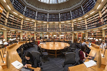
 Info The reading room of The Maughan Library. The students were very patient with the Open House visitors that weekend. Normally, photography and filming is not permitted, though it looks like something out of a movie. All by me. -- Colin (talk) 22:27, 6 October 2017 (UTC)
 Support -- Colin (talk) 22:27, 6 October 2017 (UTC)
- Support -- King of ♥ ♦ ♣ ♠ 22:55, 6 October 2017 (UTC)
 Oppose
- Support --Ermell (talk) 07:23, 7 October 2017 (UTC)
- Oppose Distort and nothing of interesting --LivioAndronico (talk) 08:27, 7 October 2017 (UTC)
- Support I think this is one of the instances where a fisheye distortion works. When you enter a library, you enter a bubble of calm, silent knowledge, a world of its own, so this is a fitting representation. It's not like anyone would think the room actually looks like this. We should embrace some artistic freedom in FPs too. All photography styles should be represented and we've had distorted fisheye FPs before. Examples: [1] [2] [3] [4]. --cart-Talk 08:29, 7 October 2017 (UTC)
![[1]](https://commons.wikimedia.org/wiki/File:Times_Square_Ball_from_above.jpg?fastcci_from=3864718&c1=3864718&c2=3943817&d1=15&d2=0&s=200)
![[2]](https://commons.wikimedia.org/wiki/File:Staircase_of_the_National_Museum_of_Slovenia.jpg?fastcci_from=3864718&c1=3864718&c2=3943817&d1=15&d2=0&s=200)
![[3]](https://commons.wikimedia.org/wiki/File:Lloyd%27s_Building_-_Escalators_fisheye.jpg?fastcci_from=3864718&c1=3864718&c2=3943817&d1=15&d2=0&s=200)
![[4]](https://commons.wikimedia.org/wiki/File:Sprinkenhof_(Hamburg-Altstadt).Innenhof.1.29135.ajb.jpg?fastcci_from=3864718&c1=3864718&c2=3943817&d1=15&d2=0&s=200)
- Ikan, we've got even more fisheye FPs than Cart's list: [5], [6], [7], [8], [9], [10], as well as [11] and [12] which are slightly defished. For comparison, I've uploaded this photo fully defished by Lightroom. Here is the photo defished and here is it scaled 50% to show even more of the corners, though it is no longer a rectangular image. The second photo is obviously extremely distorted in the corners (which stretch out to infinity) -- the nearby desk and notepads are huge. The first photo is borderline usable, with the main problems being the oversized near desks and the poor girl on the right has stretched arms and hands.
- So let's consider realism and distortion between the two: fished and defished. The fisheye doesn't maintain vertical lines to be vertical, nor horizontals to be horizontal, other than for the lines going through the midpoint. This fisheye lens (unlike some) additionally preserves diagonals that go through the midpoint (as seen in this photo). But it does preserve proportionate/relative size/position. The camera is on a tripod with the centre-pole extended so it is above head height. Everyone looks to be in reasonable proportion for humans, their notepads and laptops are reasonable, and the desk size is much as one would expect -- not stretched at all. The outer ring of desks and the little boxes the lamps are on help form a circle in your vision so you know this is a circular room. And everything is acceptably sharp from the corner of the desk next to the camera all the way to the far side and ceiling. Compare now the defished image, which one might achieve with a ultra-wide angle rectilinear lens. The proportions of the desks in the bottom corners are all wrong, and unforgivable for the student typing. The lampshades in the corner are a different shape to those in the middle. The zinc and glass ceiling is much stretched vertically so that one beings to doubt it is a dome rather than a huge cylinder. And although the centre is sharp, the corners are very very soft -- even the best ultra wide lenses are soft here. The stretching of the corners means the room now looks oval rather than round -- one no longer gets the impression it will circle round behind the camera.
- I've had this fisheye for many years now and my impression is that it creates images that have a very similar view to vision. We only really concentrate on the central portion of vision and the brain tells us that the lines are straight even if our vision doesn't actually create that optically -- our retinas are not flat. The problem is that I can't shift the view as you look around this image so that the bit you are concentrating on looks straight. To do that, we need a 360 panorama like this one. That would have been nice to create, had this room been empty with nobody to disturb or to move around. As it is, this image is a blend of five photos where I chose the best bits of people when they didn't move.
- I agree sometimes distortions and curves can mislead too much, but also portions and shape can mislead too. Up to you of course to decide if it works on balance here, or not. -- Colin (talk) 11:35, 7 October 2017 (UTC)
- Thanks, I appreciate you and cart addressing this seriously. I don't oppose the use of the fisheye lens in all cases; it's in a case like this in which it's obvious that the shelves couldn't function like that that I have more trouble with it. I take the argument that since it's obvious to me that this can't be the real appearance of the place, I should figure everyone else looking at it would draw the same conclusion and that makes it OK. Reasonable people can differ on that. I take these case by case, depending on how I react. -- Ikan Kekek (talk) 15:13, 7 October 2017 (UTC)
![[5]](https://commons.wikimedia.org/wiki/File:Vatican_Museums_Spiral_Staircase_2012.jpg)
![[6]](https://commons.wikimedia.org/wiki/File:Vatican_Museums_Spiral_Staircase_Looking_Up_2012.jpg)
![[7]](https://commons.wikimedia.org/wiki/File:Viborg_cathedral_ceiling.jpg)
![[8]](https://commons.wikimedia.org/wiki/File:King%27s_Cross_Western_Concourse.jpg)
![[9]](https://commons.wikimedia.org/wiki/File:City_Hall,_London,_Spiral_Staircase_-_1.jpg)
![[10]](https://commons.wikimedia.org/wiki/File:Galerie_Lafayette_Haussmann_Dome.jpg)
![[11]](https://commons.wikimedia.org/wiki/File:The_Scoop_at_More_London.jpg)
![[12]](https://commons.wikimedia.org/wiki/File:Royal_Albert_Hall_-_Gallery_Central_View.jpg)
- Support Cart nailed it --Martin Falbisoner (talk) 11:01, 7 October 2017 (UTC)
- Support Probably opposing will be from those who didnt try fish eyes (very wide angle lens) yet. cart you forget my shot here. It failed here, but won (somewhere else; check magazine Glasilo Ljubljana, številka 1, 2017, page 55). Known academic painter probably discovered some more. I think i will renominate it again. I didnt get FP, but i get 125 EUR. At least something. And i do like that shot. Somethime defishing will spoil nice curvatures. --Mile (talk) 11:24, 7 October 2017 (UTC)
-
WeakSuppport It's clearly a deliberate choice in style (which works for me in this case) rather than suggesting that the place really looks like that. Now if only the woman by the exit wasn't taking a photo on her phone.. -- KTC (talk) 11:25, 7 October 2017 (UTC)
.jpg)
- KTC, I found a sixth frame where she did not appear, so have blended that one in. She's vanished as if she never existed :-) If only I could do that with some politicians... (You may need to use Ctrl-F5 to refresh your browser cache). -- Colin (talk) 11:51, 7 October 2017 (UTC)
- Magic! :D -- KTC (talk) 13:45, 7 October 2017 (UTC)
- KTC, I found a sixth frame where she did not appear, so have blended that one in. She's vanished as if she never existed :-) If only I could do that with some politicians... (You may need to use Ctrl-F5 to refresh your browser cache). -- Colin (talk) 11:51, 7 October 2017 (UTC)
- Support Nice fisheye shoot and of course showing a irreal distortion imposible for the human eye see. Excellent --The Photographer 12:02, 7 October 2017 (UTC)
- Oppose It's too distorted for me. -- Lothar Spurzem (talk) 18:15, 7 October 2017 (UTC)
- Oppose I do not like the grey Second floor while the Bottom is bright. 晴空·和岩 讨论页·反互煮 04:59, 8 October 2017 (UTC)
- Support per Colin and cart. Daniel Case (talk) 13:39, 8 October 2017 (UTC)
- Oppose I agree with Ikan Kekek. HalfGig talk 14:10, 8 October 2017 (UTC)
 Comment User:HalfGig, Lothar Spurzem and Ikan Kekek. How you can see a "perspective fix", show distortion too in the real size of the library and cuting everything localed in the corners. IMHO a fisheye in this scenary is excellent because show more information and a point of view imposible for the human eye. File:The Maughan Library - 2017-09-16-3 alt.jpg
--The Photographer 14:12, 8 October 2017 (UTC)
- The new version is much better for me. This one is excellent. -- Lothar Spurzem (talk) 14:15, 8 October 2017 (UTC)
- But the people on bottom are distorted and the real library size too and the corners are cut. --The Photographer 14:18, 8 October 2017 (UTC)
- Comment I find that new/second/corrected version utterly boring and unpoetic. --cart-Talk 14:43, 8 October 2017 (UTC)
- The Photographer, what did you do to create the other version? It is less distorted than the the photo defished by applying Lightroom's lens profile. However, second floor verticals (see the red paint stripes) are a bit wobbly (esp the left) and some are still a bit curved. At the edges, the first floor verticals actually lean out slightly. Still, it is less strong a correction than a pure rectilinear, and might work well on some subjects that lack so many perfect vertical lines. -- Colin (talk) 16:13, 8 October 2017 (UTC)
- I applied a manual distortion change using photoshop distortion tool and warp tool. --The Photographer 17:14, 8 October 2017 (UTC)
- Comment - I like the "corrected" version and would support it. Yes, it contains a degree of distortion, but it's close enough to normalcy for me to accept it as a reasonable compromise. I can understand why you, cart et al. find the nominated version photographically interesting. It is. But it's disturbing to me and has a bit of a fun house vibe to it, as if the scene is reflected in a strange mirror. -- Ikan Kekek (talk) 19:05, 8 October 2017 (UTC)
- Our brain in this section became more and more like a square applying the rules like Noise fix, perspective fix and composition fix to all the photos alike and that is a serious error, each photo has its own peculiarities --The Photographer 19:41, 8 October 2017 (UTC)
- Ikan, I think that the version produced by The Photographer is an interesting experiment but isn't sufficiently perfect in its corrections (particularly the wobbly bits) to satisfy the perfectionists at FP. And per Cart, it loses the character of the original photo. All these students, with the phones listening to their own music, working on their own laptops, and thinking about their own studies, are in a bubble: and this photo is a bubble. -- Colin (talk) 20:11, 8 October 2017 (UTC)
- OK, you've gotten through to me with that bit of poetry. I will cross out my oppose vote on the basis of your metaphor. -- Ikan Kekek (talk) 20:30, 8 October 2017 (UTC)
- Another victim of the seduction artist --The Photographer 20:53, 8 October 2017 (UTC)
- Support Great idea, well executed. --Code (talk) 17:51, 9 October 2017 (UTC)
- The new version is much better for me. This one is excellent. -- Lothar Spurzem (talk) 14:15, 8 October 2017 (UTC)
- Support --fedaro (talk) 22:54, 8 October 2017 (UTC)
- Support A controversial nomination apparently. I'm not here to judge the choice of lens - rectilinear is not the only way to do architecture shots. It's of the usual high (wow) quality that Colin's images seem to be, and on that basis I believe it should be promoted. -- Thennicke (talk) 00:40, 9 October 2017 (UTC)
- Support IMHO Wow there is. Jacopo Werther iγ∂ψ=mψ 05:55, 9 October 2017 (UTC)
- Support Per cart. --Basotxerri (talk) 18:11, 9 October 2017 (UTC)
- Support nice. --B dash (talk) 10:37, 11 October 2017 (UTC)
- Oppose Way too distorted, especially the side book shelves. -- Pofka (talk) 15:52, 12 October 2017 (UTC)
- Support --M★Zaplotnik (edits) 10:30, 14 October 2017 (UTC)
- Oppose per other opposers. --Ivar (talk) 11:15, 14 October 2017 (UTC)
Confirmed results:
This image will be added to the FP gallery: Places/Interiors#United Kingdom