Commons:Quality images candidates/Archives April 23 2019
Jump to navigation
Jump to search

-
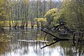
- Nomination Pond at Dyckburg Church in the Boniburg forest in Münster, North Rhine-Westphalia, Germany --XRay 04:45, 21 April 2019 (UTC)
- Promotion
 Support Good quality.--Agnes Monkelbaan 04:55, 21 April 2019 (UTC)
-

- Nomination Natural monument “Boniburgbuche” in the Boniburg forest in Münster, North Rhine-Westphalia, Germany --XRay 04:45, 21 April 2019 (UTC)
- Promotion Nice!--Agnes Monkelbaan 04:58, 21 April 2019 (UTC)
-

- Nomination Shell of a Plicated Pythia, Pythia plicata --Llez 03:50, 21 April 2019 (UTC)
- Promotion Good quality. -- Johann Jaritz 03:57, 21 April 2019 (UTC)
-

- Nomination Cones of a Canary Island pine; Llano del Jable, La Palma --Llez 03:50, 21 April 2019 (UTC)
- Promotion Good quality. -- Johann Jaritz 03:57, 21 April 2019 (UTC)
-

- Nomination Wayside shrine on Gaisrückenstrasse in Winklern5, Pörtschach am Wörther See, Carinthia, Austria -- Johann Jaritz 00:39, 21 April 2019 (UTC)
- Promotion Good quality. --Seven Pandas 01:48, 21 April 2019 (UTC)
-

- Nomination Alcove painting of Saint Andrew at the wayside shrine on Gaisrückenstrasse in Winklern, Pörtschach am Wörther See, Carinthia, Austria -- Johann Jaritz 00:39, 21 April 2019 (UTC)
- Promotion Good quality. --Seven Pandas 01:48, 21 April 2019 (UTC)
-

- Nomination Alcove painting of Saint Michael at the wayside shrine on Gaisrückenstrasse in Winklern, Pörtschach am Wörther See, Carinthia, Austria -- Johann Jaritz 00:39, 21 April 2019 (UTC)
- Promotion Good quality. --Seven Pandas 01:48, 21 April 2019 (UTC)
-

- Nomination Alcove painting of Saint Anthony of Padova in Carinthia at the wayside shrine on Gaisrückenstrasse in Winklern, Pörtschach am Wörther See, Carinthia, Austria -- Johann Jaritz 00:39, 21 April 2019 (UTC)
- Promotion Good quality. --Seven Pandas 01:48, 21 April 2019 (UTC)
-

- Nomination Alcove painting of Madonna and Child in Carinthia at the wayside shrine on Gaisrückenstrasse in Winklern, Pörtschach am Wörther See, Carinthia, Austria -- Johann Jaritz 00:39, 21 April 2019 (UTC)
- Promotion Good quality. --Seven Pandas 01:48, 21 April 2019 (UTC)
-

- Nomination A jug by the Church of Saint John in Larnaca --Podzemnik 00:18, 21 April 2019 (UTC)
- Promotion Good quality. -- Johann Jaritz 00:42, 21 April 2019 (UTC)
-
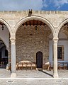
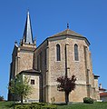
- Nomination Church of Saint John in Larnaca, Cyprus --Podzemnik 00:18, 21 April 2019 (UTC)
- Promotion Good quality. --Seven Pandas 01:48, 21 April 2019 (UTC)
-

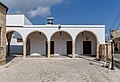
- Nomination Church of Saint John in Larnaca, Cyprus --Podzemnik 00:18, 21 April 2019 (UTC)
- Promotion Good quality. -- Johann Jaritz 00:42, 21 April 2019 (UTC)
-

- Nomination A relief on the Church of Saint John in Larnaca, Cyprus --Podzemnik 00:18, 21 April 2019 (UTC)
- Promotion Good quality. -- Johann Jaritz 00:42, 21 April 2019 (UTC)
-
- Nomination Church of Saint John in Larnaca, Cyprus --Podzemnik 00:18, 21 April 2019 (UTC)
- Promotion Good quality. --Seven Pandas 01:48, 21 April 2019 (UTC)
-

- Nomination Broadstairs Folk Week conversation. --Acabashi 23:48, 20 April 2019 (UTC)
- Promotion Good quality. -- Johann Jaritz 00:43, 21 April 2019 (UTC)
-

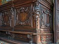
- Nomination House whose address is 15-17-19 Grande rue in Sens, France. --Chabe01 21:57, 20 April 2019 (UTC)
- Promotion Good quality. --Seven Pandas 00:12, 21 April 2019 (UTC)
-

- Nomination Gold Rush Rumble: roller derby scrimmage on 2018-07-21 (during Billy Barker days) in Quesnel, BC --Trougnouf 21:54, 20 April 2019 (UTC)
- Promotion Good quality --Michielverbeek 22:38, 20 April 2019 (UTC)
-

- Nomination Greave Dunning pub, Greasby --Rodhullandemu 21:38, 20 April 2019 (UTC)
- Promotion Support Good quality photo. Acabashi 23:45, 20 April 2019 (UTC)
-
- Nomination Greasby Cross, Greasby, Wirral --Rodhullandemu 21:05, 20 April 2019 (UTC)
- Promotion Support Good quality photo. Acabashi 21:10, 20 April 2019 (UTC)
-
- Nomination Impatiens niamniamensis Congo cockatoo. --Acabashi 20:20, 20 April 2019 (UTC)
- Promotion Good quality. -- Johann Jaritz 00:44, 21 April 2019 (UTC)
-

-

-
-

-

- Nomination Luther memorial at Market church in Hanover in 3D --C.Suthorn 16:14, 20 April 2019 (UTC) Support Good quality. --Websteralive 17:03, 20 April 2019 (UTC)
- Promotion {{{2}}}
- Nomination Luther memorial at Market church in Hanover in 3D --C.Suthorn 16:14, 20 April 2019 (UTC)
-

- Nomination Sundial at Market church in Hanover in 3D --C.Suthorn 16:14, 20 April 2019 (UTC) Support Good quality. --Websteralive 16:59, 20 April 2019 (UTC)
- Promotion {{{2}}}
- Nomination Sundial at Market church in Hanover in 3D --C.Suthorn 16:14, 20 April 2019 (UTC)
-

- Nomination View of roof with transepts and base of spire and 16 statues of apostels and evangelists of Notre-Dame de Paris in France. --Moroder 15:01, 20 April 2019 (UTC)
- Promotion Support Good quality. --Websteralive 17:03, 20 April 2019 (UTC)
-

- Nomination Fountain with statue of Venus in Brescia. --Moroder 13:48, 20 April 2019 (UTC)
- Promotion Support Good quality.--Famberhorst 15:34, 20 April 2019 (UTC)
-

- Nomination Panteon Veneto at the Loredan Palace on Campo Santo Stefano square in Venice. --Moroder 12:44, 20 April 2019 (UTC)
- Promotion Support Good quality. --Websteralive 16:59, 20 April 2019 (UTC)
-

- Nomination Greece, Delphi, sarcophagus in front of the museum --Berthold Werner 12:38, 20 April 2019 (UTC)
- Promotion Support Good quality. --Websteralive 17:03, 20 April 2019 (UTC)
-

- Nomination Lawn roller at Easton Lodge Gardens. --Acabashi 11:36, 20 April 2019 (UTC)
- Promotion Support Good quality. --Websteralive 17:00, 20 April 2019 (UTC)
-

- Nomination Maserati Levante at Geneva International Motor Show 2019, Le Grand-Saconnex --MB-one 10:24, 20 April 2019 (UTC)
- Promotion Support Good quality. --Websteralive 17:00, 20 April 2019 (UTC)
-

- Nomination View from watchtower in Viru BogI, the copyright holder of this work, hereby publish it under the following license:. By User:Abrget47j --2simple 10:02, 20 April 2019 (UTC)
- Promotion Support Good quality. --Websteralive 17:03, 20 April 2019 (UTC)
-
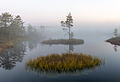
- Nomination Foggy morning in Viru BogI, the copyright holder of this work, hereby publish it under the following license:. By User:Abrget47j --2simple 10:02, 20 April 2019 (UTC)
- Promotion
Good photographic quality but needs better categorization --MB-one 10:27, 20 April 2019 (UTC) Support Added cats so should be alright now. Acabashi 11:28, 20 April 2019 (UTC)
-

- Nomination Interior of a Gulfstream G550 at European Business Aviation Convention and Exhibition 2018 --MB-one 09:57, 20 April 2019 (UTC)
- Promotion Support Good quality. --Websteralive 17:00, 20 April 2019 (UTC)
-

- Nomination Mercedes-Benz C 200 4Matic Swiss Star at Geneva International Motor Show 2019, Le Grand-Saconnex --MB-one 09:57, 20 April 2019 (UTC)
- Promotion Support Good quality. --Websteralive 16:58, 20 April 2019 (UTC)
-

- Nomination Tata Buzzard Sport at Geneva International Motor Show 2019, Le Grand-Saconnex --MB-one 09:57, 20 April 2019 (UTC)
- Promotion Support Good quality.--Famberhorst 15:32, 20 April 2019 (UTC)
-

-
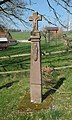
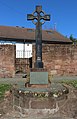
- Nomination Wayside cross,1673, in Malbergweich, Germany. --Palauenc05 09:15, 20 April 2019 (UTC)
- Promotion Support Good quality. --Tournasol7 14:55, 20 April 2019 (UTC)
-
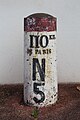
- Nomination Odometer 110 on the Nationale 5 at Sens, France. --Chabe01 09:15, 20 April 2019 (UTC)
- Promotion Support Good quality. --Websteralive 17:03, 20 April 2019 (UTC)
-

-
-

- Nomination Grand Bazaar, Tehran, Iran --Poco a poco 06:54, 20 April 2019 (UTC)
- Promotion Support Good quality. --Websteralive 16:58, 20 April 2019 (UTC)
-

- Nomination Dolat-Abad Garden, Yazd, Iran. --Poco a poco 06:54, 20 April 2019 (UTC)
- Promotion Beautiful photo, but we're not looking at a garden (that is, no plants are visible), so please explain in the file description where these windows are. -- Ikan Kekek 09:29, 20 April 2019 (UTC) Support Fuller description of the pavilion now added to the picture. Good quality. Acabashi 10:44, 20 April 2019 (UTC)
-

- Nomination Masoudieh Mansion, Tehran, Iran --Poco a poco 06:54, 20 April 2019 (UTC)
- Promotion Support Good quality. --Aristeas 09:25, 20 April 2019 (UTC)
-

- Nomination Malek mosque, Kerman, Iran --Poco a poco 06:54, 20 April 2019 (UTC)
- Promotion Support Good quality. --Tournasol7 07:02, 20 April 2019 (UTC)
-

- Nomination Field chapel in Pettstadt --Ermell 06:12, 20 April 2019 (UTC)
- Promotion Support Good quality. --Tournasol7 06:27, 20 April 2019 (UTC)
-

- Nomination Pipe organ of the catholic parish church St. Matthäus in Wiesenthau --Ermell 06:12, 20 April 2019 (UTC)
- Promotion Support Good quality. --Tournasol7 06:27, 20 April 2019 (UTC)
-

-

- Nomination Pipe organ of the Catholic Parish Church St. Matthew in Breitbrunn --Ermell 06:12, 20 April 2019 (UTC)
- Promotion Support Good quality. --Tournasol7 06:27, 20 April 2019 (UTC)
-

- Nomination Taranaki Falls Walking Track in Tongariro NP, New Zealand. --Tournasol7 06:01, 20 April 2019 (UTC)
- Promotion Support Good quality.--Famberhorst 15:26, 20 April 2019 (UTC)
-
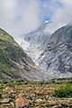
- Nomination Franz Josef Glacier in Westland National Park, New Zealand. --Tournasol7 06:01, 20 April 2019 (UTC)
- Promotion Support Good quality. --Ermell 06:06, 20 April 2019 (UTC)
-
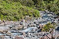
- Nomination Hollyford River in Fiordland National Park, South Island of New Zealand. --Tournasol7 06:01, 20 April 2019 (UTC)
- Promotion Support Good quality. --Ermell 06:05, 20 April 2019 (UTC)
-
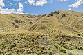
- Nomination Pisa Conservation Area in Otago Region, South Island of New Zealand. --Tournasol7 06:01, 20 April 2019 (UTC)
- Promotion Support Good quality. --Ermell 06:05, 20 April 2019 (UTC)
-

- Nomination Lake Tutira in Hawke's Bay Region, North Island of New Zealand. --Tournasol7 06:01, 20 April 2019 (UTC)
- Promotion The photo is on the dark side. But good enough for me.--Famberhorst 15:28, 20 April 2019 (UTC)
-

- Nomination Ballingbuer at Goingarijp. Tree stump on the waterfront of the Lijkvaart.
--Famberhorst 05:52, 20 April 2019 (UTC) - Promotion Support Good quality. --Websteralive 16:58, 20 April 2019 (UTC)
- Nomination Ballingbuer at Goingarijp. Tree stump on the waterfront of the Lijkvaart.
-
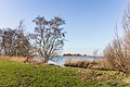
- Nomination Scharrewiel (Frysk) Skarrewiel. Beautiful birch on the bank of Scharrewiel.
--Famberhorst 05:52, 20 April 2019 (UTC) - Promotion Support Good quality. --Tournasol7 06:05, 20 April 2019 (UTC)
- Nomination Scharrewiel (Frysk) Skarrewiel. Beautiful birch on the bank of Scharrewiel.
-

- Nomination Motor ship Greate Griene 03800980 of state forest management in Friesland. Information about the ship.
--Famberhorst 05:52, 20 April 2019 (UTC) - Promotion Support Good quality. --Websteralive 16:58, 20 April 2019 (UTC)
- Nomination Motor ship Greate Griene 03800980 of state forest management in Friesland. Information about the ship.
-

- Nomination ring --Ercé 05:45, 20 April 2019 (UTC) Support Good quality. --Websteralive 16:58, 20 April 2019 (UTC)
- Promotion {{{2}}}
- Nomination ring --Ercé 05:45, 20 April 2019 (UTC)
-
- Nomination Goingarijp. Wind engine, detail.
--Agnes Monkelbaan 04:52, 20 April 2019 (UTC) - Promotion Support Promotion in advance. Please check your image. It's tilted CCW. Thank you. --XRay 05:05, 20 April 2019 (UTC)
 Done. Small correction. Thanks for your reviews.--Agnes Monkelbaan 17:20, 20 April 2019 (UTC)
- Nomination Goingarijp. Wind engine, detail.
-
- Nomination Ballingbuer at Goingarijp. Pollard willows along the way.
--Agnes Monkelbaan 04:52, 20 April 2019 (UTC) - Promotion Support Good quality. --XRay 05:05, 20 April 2019 (UTC)
- Nomination Ballingbuer at Goingarijp. Pollard willows along the way.
-

- Nomination Bark of a tree at Boniburg forest in Münster, North Rhine-Westphalia, Germany --XRay 04:44, 20 April 2019 (UTC)
- Promotion Support Good quality. --Websteralive 16:58, 20 April 2019 (UTC)
-

- Nomination Former castle gate at Boniburg forest in Münster, North Rhine-Westphalia, Germany --XRay 04:44, 20 April 2019 (UTC)
- Promotion Support Good quality.--Famberhorst 05:55, 20 April 2019 (UTC)
-

- Nomination Close wing position of Graphium chironides Honrath, 1884 – Veined Jay (by Sandipoutsider) --Atudu 04:25, 20 April 2019 (UTC)
- Promotion Support Good quality. --Ercé 05:48, 20 April 2019 (UTC)
-

- Nomination A pupa of Athyma selenophora Kollar, 1844 – Staff Sergeant (by Sandipoutsider) --Atudu 04:09, 20 April 2019 (UTC)
- Promotion Support Good quality. --Ercé 05:48, 20 April 2019 (UTC)
-

- Nomination Close wing position busking of Pareronia avatar Moore, 1857 – Pale Wanderer (by Subhendukhan) --Atudu 04:03, 20 April 2019 (UTC)
- Promotion Support Good quality. --Ercé 05:48, 20 April 2019 (UTC)
-
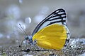
- Nomination Close wing position of Delias agostina Hewitson, 1852 – Yellow Jezebel (by Subhendukhan) --Atudu 03:53, 20 April 2019 (UTC)
- Promotion Support Good quality. --Ercé 05:48, 20 April 2019 (UTC)
-
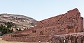
- Nomination Rumicolca, Cuzco, Peru --Poco a poco 11:27, 19 April 2019 (UTC)
- Promotion Support Good quality. --Websteralive 16:58, 20 April 2019 (UTC)
-

- Nomination Cambodia. Sihanoukville - Japanese warship. --Dmitry Makeev 10:01, 19 April 2019 (UTC) Support Good quality. --Websteralive 16:58, 20 April 2019 (UTC)
- Promotion {{{2}}}
- Nomination Cambodia. Sihanoukville - Japanese warship. --Dmitry Makeev 10:01, 19 April 2019 (UTC)
-

- Nomination Western gorilla (Gorilla gorilla), Tierpark Hellabrunn, Munich, Germany --Poco a poco 18:54, 17 April 2019 (UTC)
- Promotion The picture is far too pale in my opinion. -- Spurzem 19:49, 17 April 2019 (UTC) New version --Poco a poco 19:13, 18 April 2019 (UTC) Support Good quality. --Websteralive 16:58, 20 April 2019 (UTC)
-

- Nomination Alpina B7 at Geneva International Motor Show 2019, Le Grand-Saconnex --MB-one 14:30, 17 April 2019 (UTC)
- Promotion Support Good quality. --Websteralive 16:58, 20 April 2019 (UTC)
-

- Nomination VW Passat Alltrack at Geneva International Motor Show 2019, Le Grand-Saconnex --MB-one 14:30, 17 April 2019 (UTC)
- Promotion Support Good quality. --Websteralive 16:58, 20 April 2019 (UTC)
-

- Nomination Verbascum sp. (mullein) in Ponferrada (León, Spain). --Drow male 22:38, 16 April 2019 (UTC)
- Promotion Support Good quality. --Websteralive 16:58, 20 April 2019 (UTC)
-

- Nomination Verbascum sp. (mullein) in Ponferrada (León, Spain). --Drow male 22:38, 16 April 2019 (UTC)
- Promotion Support Good quality. --Websteralive 16:58, 20 April 2019 (UTC)
-

- Nomination Mercedes-Benz B 200 at Geneva International Motor Show 2019, Le Grand-Saconnex --MB-one 08:04, 16 April 2019 (UTC)
- Promotion Support Good quality. --Websteralive 16:58, 20 April 2019 (UTC)
-

- Nomination e-Ruf at Geneva International Motor Show 2019, Le Grand-Saconnex --MB-one 08:47, 15 April 2019 (UTC)
- Promotion Support Good quality. --Websteralive 16:58, 20 April 2019 (UTC)
-

- Nomination: Tairua Harbour in Tairua in Waikato Region, North Island of New Zealand. --Tournasol7 00:37, 14 April 2019 (UTC)
- Review Looks tilted cw a bit. Seven Pandas 01:31, 14 April 2019 (UTC)
Sorry, but it seems ok for me, or my eyes are too tired. --Tournasol7 21:01, 14 April 2019 (UTC)
-

- Nomination Fortress, Sástago, Zaragoza, Spain --Poco a poco 12:30, 13 April 2019 (UTC)
- Promotion Support Good quality. --Websteralive 16:58, 20 April 2019 (UTC)
-

- Nomination Match of handball between Argentina and Ecuador competing for the fifth place between Argentina and Ecuador in 2019 South American Beach Games --Ezarate 22:19, 12 April 2019 (UTC)
- Decline
A lot of noise ... Please have a look. Sharpness could be better too. Description should be better - name of the person. --XRay 04:52, 13 April 2019 (UTC) sharpness and denoise Done I am looking the name of the player, thanks!! --Ezarate 14:00, 13 April 2019 (UTC) Oppose
  Not done within a week. BTW: There is a license violation too. The photograph was modified, but the name of the editor of the derivate wasn't added as author. And the modfied image was uploaded over the source image. --XRay 05:09, 20 April 2019 (UTC)
-

- Nomination Cattle egret (बस्तु बकुल्ला) --Nirmal Dulal 07:35, 12 April 2019 (UTC)
- Decline
bird specific category needed --MB-one 08:38, 12 April 2019 (UTC) Done Hi MB-one, I fixed the category, Thank you.-- Nirmal Dulal 06:49, 15 April 2019 (UTC)
Lack of focus, over-grainy and CAs around bird. --Acabashi 09:25, 12 April 2019 (UTC) Oppose Not done within a week. --XRay 05:07, 20 April 2019 (UTC)
-
- Nomination Malva sylvestris, in Ponferrada (León, Spain). --Drow male 07:02, 12 April 2019 (UTC)
- Decline
 Comment Even though this works well, I don't think it will get through with such a tilt. I've spun it 14° CCW and cropped with a 4:9 AR. This puts it upright with the buildings and street post, and can be manipulated to include all the flowers. --Acabashi 21:56, 12 April 2019 (UTC) Oppose Not done within a week. --XRay 05:07, 20 April 2019 (UTC)
-
- Nomination Germany, Kinheim, Burgstraße 39 --Berthold Werner 11:08, 11 April 2019 (UTC)
- Decline
The gable is quite unsharp. Could you do something about that? --Ermell 19:22, 12 April 2019 (UTC) Oppose Not done within a week. --XRay 05:07, 20 April 2019 (UTC)
-


.jpg)


.jpg)


.jpg)


.jpg)
.jpg)
.jpg)
.001_-_San_Emiliano_(Leon).jpg)


_05.jpg)
_Skarrewiel_(d.j.b.)_01.jpg)
_06.jpg)

_06.jpg)
_05.jpg)


.jpg)


,_Tierpark_Hellabrunn,_M%C3%BAnich,_Alemania,_2012-06-17,_DD_03.JPG)
.jpg)
.jpg)


.jpg)
.jpg)


.jpg)


Consensual review[edit]
File:Portrait-glamour.jpg[edit]

- Nomination Romantic portraitureI, the copyright holder of this work, hereby publish it under the following license:. By User:Destailleur --Websteralive 04:07, 19 April 2019 (UTC)
- Promotion
- Support Good quality.--Agnes Monkelbaan 04:56, 19 April 2019 (UTC)
Why the land behind looks tilted? --Aldnonymous 06:45, 19 April 2019 (UTC) - Support It's a very good QI --Eatcha 09:15, 19 April 2019 (UTC) Support It may be whimsical, but it's quality. The 'tilted' effect is likely that the road is moving away or uphill. --Acabashi 09:48, 19 April 2019 (UTC)
- Oppose The cropped head is a no-go for me --Poco a poco 11:34, 19 April 2019 (UTC)
- Oppose per Poco --MB-one 10:40, 20 April 2019 (UTC)
- Support Good quality (I don't mind the cropped head and elbows). --Palauenc05 13:48, 20 April 2019 (UTC)
- Support per Pal -- Piotr Bart 20:16, 20 April 2019 (UTC)
- Support Very good image -- Spurzem 20:24, 20 April 2019 (UTC)
- Support per Pal --Cvmontuy 11:53, 22 April 2019 (UTC)
Total: 6 support (excluding the nominator), 2 oppose →  Promoted --Seven Pandas 10:20, 22 April 2019 (UTC)
File:KZ_Hinzert_Gedenkstätte_2018.jpg[edit]

- Nomination Hinzert concentration camp, memorial. --Cayambe 06:45, 11 April 2019 (UTC)
- Promotion Tilted CCW.--Peulle 07:41, 11 April 2019 (UTC) Done Tilt corrected. Thanks for the hint.--Cayambe 16:32, 12 April 2019 (UTC)
- Comment Dear Peulle: could you please review again this mage after the removal of the tilt? --Cayambe 09:24, 16 April 2019 (UTC) Time has come to discuss this image. --Cayambe 07:56, 19 April 2019 (UTC)
- Support - I might be missing something, but this looks alright to me. -- Ikan Kekek 06:46, 20 April 2019 (UTC)
- Support Fine 4 me. --Palauenc05 11:50, 20 April 2019 (UTC)
Total: 2 support (excluding the nominator), 0 oppose → Promoted --Seven Pandas 10:20, 22 April 2019 (UTC)
File:Apricots_Oranges_and_Saturn_Peaches_at_Broadstairs_Kent_England.jpg[edit]

- Nomination Apricots Oranges and Saturn Peaches. --Acabashi 09:54, 17 April 2019 (UTC)
- Promotion
- Support Good quality. -- Johann Jaritz 10:42, 17 April 2019 (UTC)
- Oppose Unfortunate lighting. The left upper part is too dark and some fruits are too bright. No QI for me. Please discuss. -- Spurzem 16:39, 17 April 2019 (UTC)
- Comment The vivid colour and brightness of the fruit is what attracted me. If you can believe, they were perhaps even richer. As for the shadow, I blame the sun. I didn't want to manufacture something that took it away from reality, and I felt the shadow helped bring out the intensity of the subject. Many thanks for comments for or against. Acabashi 11:53, 18 April 2019 (UTC)
- Support Burnt out jobs are hardly to be avoided in this situation and in my opinion tolerable.--Ermell 19:09, 20 April 2019 (UTC)
Total: 2 support (excluding the nominator), 1 oppose → Promoted --Seven Pandas 10:24, 22 April 2019 (UTC)
File:Logotipo_Dykrra.jpg[edit]
- Nomination Logotipo DykrraI. By User:Diego guerra --Websteralive 06:10, 16 April 2019 (UTC)
- Decline
- Support Good quality. --Piotr Bart 21:12, 16 April 2019 (UTC)
- Oppose Potential problems with copyrights. See image description --Jakubhal 04:46, 18 April 2019 (UTC)
- Oppose agree. Seven Pandas 21:16, 19 April 2019 (UTC)
 I withdraw my support Oppose File deleted -- Piotr Bart 01:12, 22 April 2019 (UTC)
Total: 1 support (excluding the nominator), 2 oppose →  Declined --Seven Pandas 10:25, 22 April 2019 (UTC)
File:Wikimedia_Community_Logo_Hindi_हिन्दी.svg[edit]
![]()
- Nomination Wikimedia Community Logo Hindi हिन्दी language --Suyash.dwivedi 14:15, 15 April 2019 (UTC)
- Promotion
- Support Good quality. --Yann 10:47, 16 April 2019 (UTC)
- Support Good quality. --Piotr Bart 21:12, 16 April 2019 (UTC)
- Oppose I disagree. IMO too simple. --Robert Flogaus-Faust 18:45, 17 April 2019 (UTC)
- Oppose Too simple.--Peulle 22:02, 18 April 2019 (UTC)
- Support - This isn't a triangle or something. I think it's complex enough to merit the QI designation. -- Ikan Kekek 01:31, 19 April 2019 (UTC)
- Support per Ikan -- Eatcha 16:30, 19 April 2019 (UTC)
Total: 4 support (excluding the nominator), 2 oppose → Promoted --Seven Pandas 10:26, 22 April 2019 (UTC)
File:Wikigraphists_Bootcamp_2018_India_Logo_hi.svg[edit]
![]()
- Nomination विकिग्राफिस्ट्स बूटकैम्प २०१८ भारत --Suyash.dwivedi 14:10, 15 April 2019 (UTC)
- Promotion
- Support Good quality. --Piotr Bart 21:12, 16 April 2019 (UTC)
- Oppose I disagree. This kind of logos is generally considered too simple. --Robert Flogaus-Faust 18:13, 17 April 2019 (UTC)
- Oppose Yes, all of the previous noms were declined for that reason.--Peulle 22:02, 18 April 2019 (UTC)
- Support - Not all that simple, IMO, and a good logo. -- Ikan Kekek 01:33, 19 April 2019 (UTC)
- Support per Ikan -- Eatcha 16:30, 19 April 2019 (UTC)
- Support per Ikan. --Trougnouf 09:11, 21 April 2019 (UTC)
Total: 4 support (excluding the nominator), 2 oppose → Promoted --Seven Pandas 10:26, 22 April 2019 (UTC)