Commons:Quality images candidates/Archives January 16 2014
Jump to navigation
Jump to search

-

-
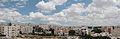
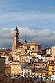
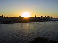
- Nomination Akropolis, Nicosia, Cyprus --Anna Anichkova 19:15, 13 January 2014 (UTC)
- Promotion Good quality. --Moroder 21:37, 13 January 2014 (UTC)
-

-
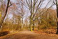
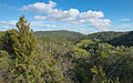
- Nomination Forest near the Malsaucy lake (under the moonlight) --ComputerHotline 17:34, 13 January 2014 (UTC)
- Promotion Good quality. --XRay 18:50, 13 January 2014 (UTC)
-
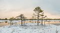
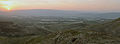
- Nomination Bog landscape at winter --Urmas83 16:04, 13 January 2014 (UTC)
- Promotion Good quality. --Poco a poco 16:51, 13 January 2014 (UTC)
Good quality!--Tonto II. 21:25, 13 January 2014 (UTC)
-

- Nomination Digitalis grandiflora. Low in the Netherlands hardy perennial.--
Famberhorst 16:02, 13 January 2014 (UTC) - Promotion Good quality. --Poco a poco 16:51, 13 January 2014 (UTC)
- Nomination Digitalis grandiflora. Low in the Netherlands hardy perennial.--
-

-

- Nomination Archaeological site in Freyenstein, Brandenburg, Germany --A.Savin 15:40, 13 January 2014 (UTC)
- Promotion
 Support ok --Christian Ferrer 20:34, 13 January 2014 (UTC)
-

- Nomination Archaeological site in Freyenstein, Brandenburg, Germany --A.Savin 15:40, 13 January 2014 (UTC)
- Promotion Good quality. --Poco a poco 16:51, 13 January 2014 (UTC)
-

-

- Nomination Buildings in Maiquetia --The Photographer 15:30, 13 January 2014 (UTC)
- Promotion Support --A.Savin 15:38, 13 January 2014 (UTC)
-

-

- Nomination Alexander Vogt, North Rhine-Westphalian SPD-politician and member of the Landtag of North Rhine-Westphalia --Martin Kraft 10:22, 13 January 2014 (UTC)
- Promotion Fine quality --DXR 10:27, 13 January 2014 (UTC)
-

- Nomination Alexander Vogt, North Rhine-Westphalian SPD-politician and member of the Landtag of North Rhine-Westphalia --Martin Kraft 10:22, 13 January 2014 (UTC)
- Promotion Support --A.Savin 15:33, 13 January 2014 (UTC)
-

- Nomination Ina Spanier-Oppermann, North Rhine-Westphalian SPD-politician and member of the Landtag of North Rhine-Westphalia --Martin Kraft 10:22, 13 January 2014 (UTC)
- Promotion Good quality. --Poco a poco 16:58, 13 January 2014 (UTC)
-

- Nomination Dietmar Brockes, North Rhine-Westphalian FPD-politician and member of the Landtag of North Rhine-Westphalia --Martin Kraft 10:22, 13 January 2014 (UTC)
- Promotion Good quality. --DXR 10:27, 13 January 2014 (UTC)
-

- Nomination Dietmar Brockes, North Rhine-Westphalian FPD-politician and member of the Landtag of North Rhine-Westphalia --Martin Kraft 10:22, 13 January 2014 (UTC)
- Promotion Good quality. --Poco a poco 16:58, 13 January 2014 (UTC)
-

- Nomination DX 5486 and DXC 5356 at picton --DXR 09:54, 13 January 2014 (UTC)
- Promotion Good quality. --Martin Kraft 10:22, 13 January 2014 (UTC)
-

-
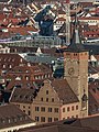
- Nomination The Würzburg city hall as seen from Festung Marienberg --DXR 09:54, 13 January 2014 (UTC)
- Promotion Good quality. --Poco a poco 16:51, 13 January 2014 (UTC)
-

- Nomination Trier, Denkmalzone Nells Ländchen, Verwalterhaus --Berthold Werner 08:49, 13 January 2014 (UTC)
- Promotion Good quality. --Smial 09:48, 13 January 2014 (UTC)
-

- Nomination Clifton, Bristol. Mattbuck 08:02, 13 January 2014 (UTC)
- Promotion Good quality. --Poco a poco 16:51, 13 January 2014 (UTC)
-

-

- Nomination Jubilee Campus. Mattbuck 08:02, 13 January 2014 (UTC)
- Promotion Ok for QI --Martin Kraft 10:22, 13 January 2014 (UTC)
-

- Nomination Chris Ashton, rugby union player (Saracens) --PierreSelim 07:22, 13 January 2014 (UTC)
- Promotion Support --A.Savin 15:29, 13 January 2014 (UTC)
-

- Nomination Church of the Ascension, Fuentes de Jiloca, Zaragoza, Spain --Poco a poco 06:23, 13 January 2014 (UTC)
- Promotion Good quality --DXR 09:24, 13 January 2014 (UTC)
-

- Nomination St Michael church, Daroca, Zaragoza, Spain --Poco a poco 06:23, 13 January 2014 (UTC)
- Promotion Good quality. --JLPC 18:23, 13 January 2014 (UTC)
-

- Nomination Fuentes de Jiloca, Zaragoza, Spain --Poco a poco 06:23, 13 January 2014 (UTC)
- Promotion Support --A.Savin 15:27, 13 January 2014 (UTC)
-
- Nomination St Mary church, Ateca, Zaragoza, Spain --Poco a poco 06:23, 13 January 2014 (UTC)
- Promotion Good quality. --Martin Kraft 10:22, 13 January 2014 (UTC)
-

- Nomination St Martin of Tours church, Morata de Jiloca, Zaragoza, Spain --Poco a poco 06:23, 13 January 2014 (UTC)
- Promotion Good quality. --Smial 09:55, 13 January 2014 (UTC)
-

- Nomination House door in Burbáguena, Teruel, Spain --Poco a poco 06:23, 13 January 2014 (UTC)
- Promotion Good quality --DXR 09:24, 13 January 2014 (UTC)
-
- Nomination Villeneuvette, Hérault, France. --Christian Ferrer 05:46, 13 January 2014 (UTC)
- Promotion Tiny hints of CA, but very good nevertheless --DXR 09:27, 13 January 2014 (UTC)
-

- Nomination Mourèze, Hérault, France. --Christian Ferrer 05:46, 13 January 2014 (UTC)
- Promotion Good quality --DXR 09:27, 13 January 2014 (UTC)
-

- Nomination Mourèze, Hérault, France. --Christian Ferrer 05:46, 13 January 2014 (UTC)
- Promotion Good quality. --Martin Kraft 10:22, 13 January 2014 (UTC)
-

- Nomination Pier in Seebad Heringsdorf, Usedom, Germany --XRay 04:38, 13 January 2014 (UTC)
- Promotion Good quality. --Martin Kraft 10:22, 13 January 2014 (UTC)
-
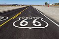
- Nomination Hist. Route 66 near Amboy, California, USA --XRay 04:38, 13 January 2014 (UTC)
- Promotion Ok for QI --Martin Kraft 10:22, 13 January 2014 (UTC)
-

-
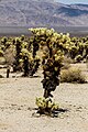
- Nomination Joshua Tree National Park, California, USA --XRay 04:38, 13 January 2014 (UTC)
- Promotion Ok for QI --Martin Kraft 10:22, 13 January 2014 (UTC)
-

- Nomination Ivy Quainoo at a concert in Gloria Theater, Cologne, in January 2014 --Achim Raschka 18:51, 12 January 2014 (UTC)
- Promotion Somewhat small DOF, and noise level could be slightly reduced, but QI regarding the lighting situation. --Smial 10:05, 13 January 2014 (UTC)
-

- Nomination Plaza Josefa Camejo --Rjcastillo 16:44, 12 January 2014 (UTC)
- Decline
 Oppose unsharp, sorry --A.Savin 15:24, 13 January 2014 (UTC)
-

-

- Nomination Aysgarth Falls. Mattbuck 09:17, 12 January 2014 (UTC)
- Decline I think I’m having a deja-vu. Still too much chroma noise for me. --Kreuzschnabel 10:55, 13 January 2014 (UTC)
-

-

- Nomination A street scene close to the Fujisan station in Fujiyoshida-shi, looking west --DXR 09:47, 11 January 2014 (UTC)
Left side needs some perspective correction Poco a poco 18:26, 11 January 2014 (UTC)
 Done Should be better now, sorry, lots of things which were not really vertical in real life... --DXR 19:17, 11 January 2014 (UTC)
 - Promotion Good quality. --Poco a poco 16:25, 13 January 2014 (UTC)
- Nomination A street scene close to the Fujisan station in Fujiyoshida-shi, looking west --DXR 09:47, 11 January 2014 (UTC)
-

-

- Nomination Kipchoge Keino --Ralf Roletschek 20:54, 10 January 2014 (UTC)
- Promotion Good quality and useful. --JLPC 18:45, 13 January 2014 (UTC)
-

-

-

- Nomination Palomas anidando en caja de pares telefonicos.Regla, La Habana, Cuba. by User:Ivan2010 09:59, 8 January 2014 (UTC)
- Decline Bad CA. --Mattbuck 23:11, 13 January 2014 (UTC)
-
- Nomination Atardecer en la Habana. La Habana. Cuba. by User:Ivan2010 09:59, 8 January 2014 (UTC)
- Decline 1024*768? Are you having a laugh? --Mattbuck 23:11, 13 January 2014 (UTC)
-

-

-
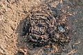
- Nomination cow dung --The Photographer 23:29, 7 January 2014 (UTC)
- Promotion QI is going to shit. --Mattbuck 23:11, 13 January 2014 (UTC)
-
- Nomination Maiquetía International Airport --The Photographer 23:29, 7 January 2014 (UTC)
- Decline Not sharp on the left. --Mattbuck 23:11, 13 January 2014 (UTC)
-

- Nomination Plaza de Toros. --The Photographer 23:29, 7 January 2014 (UTC)
- Decline Very noisy/ --Mattbuck 23:11, 13 January 2014 (UTC)
-

- Nomination Plaza de Toros de Monumental de Maracaibo. --The Photographer 23:29, 7 January 2014 (UTC)
- Decline Too slow an exposure causing blur. --Mattbuck 23:11, 13 January 2014 (UTC)
-

-

-

-

- Nomination Cape Greco (Κάβο Γκρέκο) - National Park, Cyprus--Anna Anichkova 15:35, 7 January 2014 (UTC)
- Promotion OK. --Mattbuck 23:11, 13 January 2014 (UTC)
-
-

-

- Nomination 2013 Longines Global Champions - Lausanne - 14-09-2013 - Christian Ahlmann et Codex One --Pleclown 12:59, 7 January 2014 (UTC)
Chromatic noise should be removed Poco a poco 17:23, 7 January 2014 (UTC) - Decline
 Not done --Mattbuck 23:11, 13 January 2014 (UTC)
- Nomination 2013 Longines Global Champions - Lausanne - 14-09-2013 - Christian Ahlmann et Codex One --Pleclown 12:59, 7 January 2014 (UTC)
-

-
-

-

-

-

-

- Nomination: Canary Wharf. Mattbuck 20:16, 6 January 2014 (UTC)
- Review Strong perspective problem and cut left bottom corner --The Photographer 20:17, 6 January 2014 (UTC)
Given the angle, perspective distortion removal would be counterproductive, so I just went with it. Mattbuck 21:13, 7 January 2014 (UTC)
-

- Nomination: Class 221 at tamworth. Mattbuck 20:16, 6 January 2014 (UTC)
- Review Understanding that blur motion was intentionally . Additionally there are also focus problems in other areas --The Photographer 15:39, 7 January 2014 (UTC)
-

-

-

- Nomination Stormy wind above Langweerderwielen-Langwarder Wielen.--
Famberhorst 05:52, 6 January 2014 (UTC) - Decline Lacking fine detail IMO. --Mattbuck 23:01, 13 January 2014 (UTC)
- Nomination Stormy wind above Langweerderwielen-Langwarder Wielen.--
-

- Nomination Eenrum, church NL --Michielverbeek 22:36, 5 January 2014 (UTC)
- Decline CAs and need for perspective correction --Martin Kraft 10:26, 13 January 2014 (UTC)
-

- Nomination Igreja Matriz Nossa Senhora da Ajuda, localizada na Praça Monsenhor Celso Pinheiro em Cristais, sul de Minas Gerais. --WOtP 22:33, 5 January 2014 (UTC)
 Request Perspective correction --Moroder 21:16, 13 January 2014 (UTC)
 - Decline Very unsharp at bottom and right. Mattbuck 22:48, 13 January 2014 (UTC)
- Nomination Igreja Matriz Nossa Senhora da Ajuda, localizada na Praça Monsenhor Celso Pinheiro em Cristais, sul de Minas Gerais. --WOtP 22:33, 5 January 2014 (UTC)
-

- Nomination Stadskanaal, church NL --Michielverbeek 22:25, 5 January 2014 (UTC) Request Perspective correction --Moroder 21:16, 13 January 2014 (UTC)
- Decline Blurry bottom left. --Mattbuck 22:48, 13 January 2014 (UTC)
- Nomination Stadskanaal, church NL --Michielverbeek 22:25, 5 January 2014 (UTC)
-

- Nomination: Ein 3,5-mm-Klinkenstecker. --Anıl Öztaş 16:55, 5 January 2014 (UTC)
- Review needed
-

- Nomination Bamberg, Concordiastraße 28, Villa Concordia --Berthold Werner 16:32, 5 January 2014 (UTC)
- Promotion Support ok --Christian Ferrer 20:29, 13 January 2014 (UTC)
-

- Nomination Street seller, Cholula, Puebla, México --Poco a poco 12:12, 5 January 2014 (UTC)
- Promotion The man in shadow is not good to me. IMO, the quarter below should be cropped out without damage, and the little thing on the right border should be cloned out.--Jebulon 20:13, 5 January 2014 (UTC) New crop Poco a poco 14:59, 6 January 2014 (UTC)
OK, though I'm not entirely sold on the curves - could do with more contrast between the bright stand and the backdrop. Mattbuck 22:48, 13 January 2014 (UTC)
-

- Nomination Decorations in 8 Norte St, Puebla, Mexico --Poco a poco 12:12, 5 January 2014 (UTC)
- Promotion Support ok --Christian Ferrer 20:29, 13 January 2014 (UTC)
-

- Nomination Fünffensterstrasse, Kassel, Germany --Poco a poco 12:12, 5 January 2014 (UTC)
- Promotion Support ok --Christian Ferrer 20:27, 13 January 2014 (UTC)
-

- Nomination Westferry Circus. Mattbuck 11:08, 5 January 2014 (UTC)
- Promotion Support ok --Christian Ferrer 20:27, 13 January 2014 (UTC)
-
- Nomination Previous city hall, Munkedal in Sweden. Long numeral is the national heritage ID number. --Bjoertvedt 15:17, 4 January 2014 (UTC)
- Promotion Blue channel satured --The Photographer 14:16, 7 January 2014 (UTC)
OK to me. Mattbuck 22:45, 13 January 2014 (UTC)
-

- Nomination Photograph of the newly build road in Valbona Valley --Church of emacs 14:25, 4 January 2014 (UTC)
 Comment A perspective correction would help --Moroder 18:34, 8 January 2014 (UTC)
 - Decline Lack of fine detail. --Mattbuck 22:45, 13 January 2014 (UTC)
- Nomination Photograph of the newly build road in Valbona Valley --Church of emacs 14:25, 4 January 2014 (UTC)
-

- Nomination Fountain in Los Angeles Downtown, California, USA --XRay 06:57, 4 January 2014 (UTC)
- Decline A lot of Purple fringing and or CA --Christian Ferrer 16:25, 12 January 2014 (UTC) Oppose due to flash reflections. Mattbuck 22:45, 13 January 2014 (UTC)
-

- Nomination Neustift Abbey near Brixen --Uoaei1 20:47, 3 January 2014 (UTC) Comment I don't like the crop on top and bottom, you might try a different one. It is not QI as it is here imo --Moroder 04:36, 7 January 2014 (UTC)
- Decline I think the crop is ok, but it's not sharp. --Mattbuck 22:40, 13 January 2014 (UTC)
- Nomination Neustift Abbey near Brixen --Uoaei1 20:47, 3 January 2014 (UTC)
-

- Nomination Canary Wharf. Mattbuck 13:12, 3 January 2014 (UTC)
- Promotion WB off IMHO (magenta), check neighbouring pics as well --Kreuzschnabel 12:47, 11 January 2014 (UTC) Done Mattbuck 12:42, 12 January 2014 (UTC) Support OK for me now. What kind of highly protected area is it ahead? --Kreuzschnabel 10:21, 13 January 2014 (UTC)
-

- Nomination The Ramblin Wreck leads the Georgia Tech football team in their Homecoming game. --User:An678ko 05:35, 3 January 2014 (UTC)
- Decline Is the author a commoner? --Kreuzschnabel 00:08, 11 January 2014 (UTC)
I don't think so. Mattbuck 22:40, 13 January 2014 (UTC)
-

- Nomination Phimeanakas, Angkor Thom, Cambodia --Poco a poco 11:23, 2 January 2014 (UTC)
- Promotion Issues in top left (CA, blurry) --Christian Ferrer 06:12, 9 January 2014 (UTC) Done Poco a poco 16:52, 13 January 2014 (UTC) Support ok --Christian Ferrer 20:21, 13 January 2014 (UTC)
-

-
-

- Nomination: The_flower_of_a_Trichosanthes_cucumerina_in_hand --Aathavan jaffna 12:09, 30 December 2013 (UTC)
- Review There is no categorization for this file --Christian Ferrer 11:56, 6 January 2014 (UTC)
Is there a larger version? It just clears the 2MP limit, but bigger would be better. Mattbuck 20:02, 7 January 2014 (UTC)
i add corrct catercory. this is the largest file i ave and can taken in my camera.--~~~~


_--_2012_--_5704.jpg)
,_South_Rim_nahe_Tusayan_--_2012_--_5892.jpg)
_--_2012_--_5666.jpg)


.jpg)


.JPG)


,_South_Olive_Street_--_2012_--_3.jpg)


.jpg)
_01.JPG)
Consensual review[edit]
File:Hotel_Mezdi_Seiser_Alm_Schigebiet.jpg[edit]

- Nomination The skiiing area of the Hotel Mezdi (demolished in the year 2013) on the Seiser Alm in South Tyrol --Moroder 14:43, 2 January 2014 (UTC)
- Promotion Oppose lacks details, poor composition not a QI to me, sorry --Alberto-g-rovi 05:10, 4 January 2014 (UTC)
I disagree. Pardon me, but that's a senseless review. --Moroder 16:36, 4 January 2014 (UTC) - Support QI --Christian Ferrer 19:06, 7 January 2014 (UTC)
- Support Good image, regarding the conditions and the subject. --Dirtsc 17:00, 8 January 2014 (UTC)
Total: 2 support (excluding the nominator), 1 oppose →  Promoted --LC-de 18:13, 15 January 2014 (UTC)
File:Dragon-fly (CherryX).jpg[edit]
.jpg)
- Nomination Eine junge Libelle / Young Butterfly --CherryX 23:52, 30 December 2013 (UTC)
- Decline
- Support Beautiful.--Leonie aus Bonn 09:20, 31 December 2013 (UTC)
- Oppose, Not sufficiently categorized and completely out of focus. Sorry, this is far from QI --LC-de 13:10, 31 December 2013 (UTC)
- Oppose Unsharp, blown areas. --Cayambe 14:57, 31 December 2013 (UTC)
- Oppose No caption and deplorable photographic quality. --Archaeodontosaurus 08:50, 7 January 2014 (UTC)
- Oppose Nice idea but insufficient quality. Nothing is sharp. --Kreuzschnabel 17:16, 8 January 2014 (UTC)
Total: 1 support (excluding the nominator), 4 oppose →  Declined --LC-de 18:12, 15 January 2014 (UTC)
File:Górnośląski_Park_Etnograficzny_DSC_8198.jpg[edit]

- Nomination Upper Silesian Ethnographic Park --Nemo5576 06:57, 29 December 2013 (UTC)
- Promotion
- SupportOk --Poco a poco 08:55, 29 December 2013 (UTC)
- Support --Moroder 15:35, 8 January 2014 (UTC)
- Done english description added and Support as of the good quality --LC-de (talk) 09:10, 5 January 2014 (UTC)
Total: 3 support (excluding the nominator), 0 oppose → Promoted --LC-de 18:08, 15 January 2014 (UTC)
File:Euryale_ferox,_Jardín_Botánico,_Múnich,_Alemania,_2013-09-08,_DD_02.JPG[edit]

- Nomination Fox nut (Euryale ferox), Munich Botanical Garden, Germany --Poco a poco 01:33, 24 December 2013 (UTC)
- Promotion
- OpposeDOF a bit low. --Mattbuck 13:49, 30 December 2013 (UTC)
- Given the resolution I believe it is acceptable --Poco a poco 12:59, 2 January 2014 (UTC)
- SupportOk for me too. --LC-de 20:55, 5 January 2014 (UTC)
- Support QI for me --Archaeodontosaurus 08:29, 7 January 2014 (UTC)
- Support --Christian Ferrer 11:45, 7 January 2014 (UTC)
Total: 3 support (excluding the nominator), 1 oppose → Promoted --LC-de 18:01, 15 January 2014 (UTC)
File:Girl Ericeira March 2013-1a.jpg[edit]

- Nomination Girl with boots and leggins -- Alvesgaspar 23:01, 27 December 2013 (UTC)
- Withdrawn
- Oppose Sharpness and CA issue. Insufficient quality. --Yndesai 05:22, 28 December 2013 (UTC)
- Support I don't like the edges, but 6,559 × 4,606 pixels, QI for me--Lmbuga 12:43, 28 December 2013 (UTC)
- Support Can be QI. --NorbertNagel 20:10, 30 December 2013 (UTC)
- Oppose High pixel count but little information. Also notice odd "steps". Very strong on the glasses. Good camera, bad lens I'd guess. Rather decrease size and reupload.--GMLSX 16:30, 3 January 2014 (UTC)
- Oppose Seat overexposed, strange artifacts, maybe overprocessed (see shoes or belt) --Kreuzschnabel 10:48, 4 January 2014 (UTC)
- Support --The Photographer 18:15, 7 January 2014 (UTC)
- Support I don't think it is bad, and I find it illogical that a higher-res camera makes an image shot with a mediocre lens, which would probably easily pass if shot with a 12MP cam, considered insufficient --DXR (talk) 21:41, 8 January 2014 (UTC)
- Oppose Overexposed, partly unsharp. -- Smial 16:22, 10 January 2014 (UTC)
 I withdraw my nomination -- Let the poor girl take a break!... Alvesgaspar 20:53, 15 January 2014 (UTC)
Running total: 4 support (excluding the nominator), 4 oppose → More votes? --LC-de 18:00, 15 January 2014 (UTC)
File:Galappel (Cynips quercusfolii) 01.JPG[edit]
_01.JPG)
- Nomination Galappel of eikengalwesp (Cynips quercusfolii).--
Famberhorst 16:12, 27 December 2013 (UTC) - Promotion
- SupportGood quality. --Cccefalon 19:09, 27 December 2013 (UTC)
- OpposeI disagree on sharpness, seems its front focused. --Yndesai 05:26, 28 December 2013 (UTC)
- SupportI don't understand the objection as the focus is totally fine on the main object. --LC-de (talk) 09:14, 5 January 2014 (UTC)
Total: 2 support (excluding the nominator), 1 oppose → Promoted --LC-de 17:59, 15 January 2014 (UTC)
File:Ta_Phrom,_Angkor,_Camboya,_2013-08-16,_DD_48.JPG[edit]

- Nomination Ta Phrom, Angkor, Cambodia --Poco a poco 03:32, 20 December 2013 (UTC)
- Decline Oppose A focus point too far of you : the first door, the bottom half and the top are blurred --Christian Ferrer 08:02, 25 December 2013 (UTC) New crop Poco a poco 16:16, 25 December 2013 (UTC) I'm not sure but I will easily understand if you want to go to CR --Christian Ferrer 11:52, 26 December 2013 (UTC)
Ok, let's do some CR :) --Poco a poco 16:59, 28 December 2013 (UTC) - Oppose I'm sorry, but Christian is right. (BTW: Geo coding would be appreciated) --P e z i 20:41, 7 January 2014 (UTC)
- Geodata added Poco a poco 20:52, 8 January 2014 (UTC)
Total: 0 support (excluding the nominator), 2 oppose → Declined --LC-de 17:58, 15 January 2014 (UTC)
File:Museo_de_Arte_contemporáneo_de_Caracas,_Venezuela.jpg[edit]

- Nomination Museo de Arte contemporáneo de Caracas, Venezuela --The Photographer 19:28, 26 December 2013 (UTC)
- Decline Oppose For a QI of an architectural structure, there are too many people in front of the entrance. Plus the colour of their clothing is attracting additional attention. The photo looks more like a shot for the family album. No QI for me, sorry. --Cccefalon 07:07, 27 December 2013 (UTC)
Comment Please be more gentle with your comments, remember that this is the work of someone. On the other hand, there are places where it is not possible to switch off people, public places that are made for people to visit. --The Photographer 15:13, 27 December 2013 (UTC)
It was not meant as an offense. I always try to find out, how a photo can become a QI and how I can push people beyond their limits to achieve it. Sometimes however, the circumstances are against a QI promotion and it might be hard to wait long time to get the perfect shot, but thats photographers life - it's like being a hunter ... I'm not against the presence of people in a photo. But in this special case, the man in red shirt and the family with the baby buggy are distracting the viewer from the building. If they were standing left or right side of the entrance, it might have been better. So next time, wait another three minutes and the motif might show up clearly. --Cccefalon 18:38, 27 December 2013 (UTC)
I waited about an hour until the museum was closed. But Caracas is one of the most dangerous cities in the world. You can die for a pair of shoes and much more easy for a camera. All this is completely circumstantial and I understand. However, thanks for your review. Simply removed from your comment "This looks like a family album." A hug. --The Photographer 18:58, 27 December 2013 (UTC)
Total: 0 support (excluding the nominator), 1 oppose → Declined --LC-de 19:13, 10 January 2014 (UTC)
File:Young hare scared.jpg[edit]

- Nomination Young European hare (Lepus europaeus) --Urmas83 15:47, 26 December 2013 (UTC)
- Decline Oppose Though the very blurry foreground could be avoided by a tighter crop, I think that the overall sharpness is not enough (DOF obviously too shallow) plus the gras stem in front of the animal is disturbing. --Cccefalon 08:16, 27 December 2013 (UTC) Dof is shallow but hare is sharp and the background and foreground is not important. Lets see what others think.--Urmas83 09:59, 27 December 2013 (UTC)
- Comment This is a very good picture, I will support this picture if the branch in front is removed cloning. Please remember to leave a line between a nomination and another to do the process easier. (This comment is for this image) --The Photographer 14:14, 30 December 2013 (UTC)
- Support I think the rabbit is just sharp enough --Christian Ferrer 05:46, 28 December 2013 (UTC)
- Oppose A grass in the foreground is disturbing. Not sharp enough IMO--Lmbuga 18:54, 30 December 2013 (UTC)
Total: 1 support (excluding the nominator), 2 oppose → Declined --LC-de 19:10, 10 January 2014 (UTC)
File:Kuhaiv-1.jpg[edit]

- Nomination Wooden church of the Epiphany (1693) in Kuhaiv, Pustomyty Raion, Lviv Oblast, Ukraine. Architectural monument of the national significance №495/1. By User:SvartKat --Ahonc 21:54, 23 December 2013 (UTC)
- Decline Oppose The perspective distortion cannot be fixed because there is too few space left on top. --Cccefalon 13:12, 26 December 2013 (UTC)
Not sure. Let's give a chance to try.--Jebulon 16:12, 27 December 2013 (UTC)
Considering the odd resolution of 3,774 × 2,527 and the file size, I think that the author already gave us full camera resolution. Before declining, I tried myself, using the fence poles and the cross on top of the church as reference. The result was, that the cross is crossing the border limits. But no problem, let User:SvartKat try herself. --Cccefalon 18:17, 27 December 2013 (UTC)
She had already uploaded highest resolution (This photo took 7th place in Ukrainian WLM, and we asked all authors from top-10 to upload high-resolution images)--Ahonc 23:17, 27 December 2013 (UTC)
Total: 0 support (excluding the nominator), 1 oppose → Declined --LC-de 19:05, 10 January 2014 (UTC))
File:Puerta de la Victoria, Angkor Thom, Camboya, 2013-08-16, DD 06.jpg[edit]

- Nomination East Gate, Angkor Thom, Cambodia --Poco a poco 10:45, 19 December 2013 (UTC)
- Decline Oppose Blurry on left I feel. --Mattbuck 00:50, 24 December 2013 (UTC)
Tough review, the gate is sharp and that area is not really blurry. May I ask for furthe opinions? --Poco a poco 17:19, 25 December 2013 (UTC)
![]() Comment I think I'd crop at least a third part of the empty bottom.--Jebulon 12:55, 28 December 2013 (UTC)
Comment I think I'd crop at least a third part of the empty bottom.--Jebulon 12:55, 28 December 2013 (UTC)
- Done Poco a poco 08:38, 29 December 2013 (UTC)
![]() Comment Really tough one. I think it is a good photo and can be very useful for Wikipedia, but I see clear field curvature in the top corners and sharpness really isn't quite great overall from a technical POV --DXR 21:29, 8 January 2014 (UTC)
Comment Really tough one. I think it is a good photo and can be very useful for Wikipedia, but I see clear field curvature in the top corners and sharpness really isn't quite great overall from a technical POV --DXR 21:29, 8 January 2014 (UTC)
Total: 0 support (excluding the nominator), 1 oppose → Declined --LC-de 17:57, 15 January 2014 (UTC))
File:Rathaus_Walldorf_und_Rathausplatz_bei_Nacht_-_Mörfelden-Walldorf_-_Germany_-_01.jpg[edit]

- Nomination Town-hall Walldorf by night --NorbertNagel 11:37, 20 December 2013 (UTC)
Needs some perspective correction, it can get tricky btw Poco a poco 11:46, 20 December 2013 (UTC)
What is wrong with the perspective? All vertical lines are vertical IMO. --NorbertNagel 11:59, 20 December 2013 (UTC)
Verticals are not everything, I understand but horizontals will not always be horinzontal, but in this case there is something wrong, because from that perspective it shouldn't be that the top part of the building is horizontal, but the lower is not. Taking the picture from a side I'd expect a similar effect in both sides (with a vanishing point), but this one looks distorted to me Poco a poco 12:20, 20 December 2013 (UTC)
Thanks for clarifying. I corrected this. Done --NorbertNagel 12:38, 20 December 2013 (UTC)
Now it is tilted, verticals are not vertical, should I give it a try? Poco a poco 14:23, 20 December 2013 (UTC)
I think, it's ok. --NorbertNagel 10:19, 21 December 2013 (UTC) - Promotion Support acceptable IMO --Christian Ferrer 10:49, 22 December 2013 (UTC)
- Support - seems ok to me. Mattbuck 19:16, 7 January 2014 (UTC)
Total: 2 support (excluding the nominator), 1 oppose → Promoted --LC-de 17:53, 15 January 2014 (UTC)
File:Toolse linnuse varemed.jpg[edit]

- Nomination Ruins of medieval Toolse stronghold --Urmas83 13:29, 18 December 2013 (UTC)
- Promotion
- Oppose Blurry, sorry --Poco a poco 20:24, 18 December 2013 (UTC)
- If you compare it to 2013-12-17 21-56-36 salbert-clair-de-lune.jpg you have approved it's equally blurry, isn't it?--Urmas83 09:00, 19 December 2013 (UTC)
- This picture is blurry, overexposed and with perspective problems. Other pictures are not relevant for the promotion of this one. If you have a problem with the promotion of another picture, please, address your issues THERE not here. Poco a poco 12:23, 19 December 2013 (UTC)
- Comment There is no perspective problem. The ruins are actually leaning. I just expect you to be more objective as we all should be evaluated equally here. --Urmas83 13:48, 19 December 2013 (UTC)
Dear Urmas83, you are the first one who accuses me of not being objective since I am here, and I have been here for years and reviewed thousands of pictures. Please, read this (especially applicable for newcomers). If you don't want to get pictures opposed, don't nominate any. Poco a poco 19:46, 19 December 2013 (UTC) - Comment You can also check the histogram of this photo to see it's not overexposed, in fact the exposure is perfect.
- Excuse but, the white triangle in the top right does actually mean that it is overexposed! Furthermore, the new version looks much better, and therefore this issue would be acceptable to me (the sky in the first one was rather cyan than blue), but the lack of sharpness is nothing you can fix. I am not a friend of downsampling. Poco a poco 14:28, 20 December 2013 (UTC) PD: It is custom here to announce that a new version has been uploaded addressing certain issues, otherwise others could think that the initial comments refer to the current version.
- Read the rules: " Burned highlights in large areas are a distracting element." There is also an example of normally exposed image. If you download the file and open it in Lightroom then you will see the same white triangle and significantly bigger area of blown out highlights. Small area of burned highlights are not only acceptable but also recommended to achieve detailed shadow areas, according to rules. I didn't make any other changes with the picture but re-size! I made the file smaller and it's better now? Yes it looks somewhat darker but I cant explain it, maybe I changed something by accident. But the histogram represents the second version. --Urmas83 15:14, 20 December 2013 (UTC)
- Don't interprete the rules the way you like. The rules don't say that highlights in smaller areas are accepted, they are not, clipping should be avoided. Anyhow, as said, that is not a problem in the picture anymore. If you changed something "by accident" you can realize it in the History tab. Sorry, I didn't mean downsampling but resizing. Poco a poco 15:54, 20 December 2013 (UTC)
- No, the rules don't say it but it can be seen in example image.
- The weight of your arguments is getting very light...Poco a poco 18:08, 20 December 2013
- Why do you refuse to comment on the example and answer with a quotation that is not even closely related to discussion. I really want you to explain me. And please don't take it as an attack, it is just a healthy discussion. I have read the guidelines carefully and also the part about exposure and I cannot agree with you. It states that only large areas with blown highlight are distracting. In addition, the example photo of proper exposure has burned highlights. But you keep saying its not accepted. I really don't understand. Please explain. --Urmas83 20:06, 20 December 2013 (UTC)(UTC)
- The weight of your arguments is getting very light...Poco a poco 18:08, 20 December 2013
- No, the rules don't say it but it can be seen in example image.
- Don't interprete the rules the way you like. The rules don't say that highlights in smaller areas are accepted, they are not, clipping should be avoided. Anyhow, as said, that is not a problem in the picture anymore. If you changed something "by accident" you can realize it in the History tab. Sorry, I didn't mean downsampling but resizing. Poco a poco 15:54, 20 December 2013 (UTC)
- I have already told you that I don't think that this picture has an overexposure problem anymore thank to your accidental edit. So, I don't know why you want to keep talking about that. If the triangle is white it means that there are areas (click on the triangle and they will be highlighted in red in the picture) with clipping, which means that the detail is gone due to excess of light. That should be always avoided, but having no clipping does not mean, though, that the exposure is good (this is what I tried to explain in the other nomination that you disagreed with). Furthermore, I don't like resizing or downsampling as a strategy to get an apparently sharp picture, if it wasn't in full resolution. Poco a poco 21:34, 20 December 2013 (UTC)
- Support acceptable IMO --Christian Ferrer 22:20, 22 December 2013 (UTC)
- Support Good quality, good exposure. How can someone say that it's overexposed ? --Shansov.net 03:18, 25 December 2013 (UTC)
- Oppose - Mildly unsharp, and decidedly tilted anticlockwise. The ruins may be tilted, but it seems unlikely they'd all be tilting the same way. Mattbuck 22:28, 27 December 2013 (UTC)
- Support Good quality, but tilting it clockwise will make it almost perfect. Shapness can be better. But that can't be fixed. --GMLSX 22:41, 5 January 2014 (UTC)
- Done a small cw rotation. --Urmas83 12:47, 7 January 2014 (UTC)
Total: 3 support (excluding the nominator), 2 oppose → Promoted --LC-de 17:50, 15 January 2014 (UTC)