Commons:Quality images candidates/Archives March 21 2015
Jump to navigation
Jump to search

-

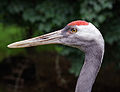
- Nomination Portrait of crested serpent eagle (Spilornis cheela), Gembira Loka Zoo, Yogyakarta --Crisco 1492 00:42, 19 March 2015 (UTC)
- Promotion Very nice catch, good quality in my opinion. --0x010C 01:11, 19 March 2015 (UTC)
-

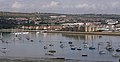
- Nomination Sifjorden, Senja, Norway in 2014 August --Ximonic 23:21, 18 March 2015 (UTC)
- Promotion Absolutely lovely. --Crisco 1492 00:46, 19 March 2015 (UTC)
-

- Nomination A view to Øksfjorden and Øksfjordjøkelen, Finnmark, Norway in 2014 August --Ximonic 23:21, 18 March 2015 (UTC)
- Promotion Good quality. --Crisco 1492 00:46, 19 March 2015 (UTC)
-

- Nomination At Mefjordvær, Senja, Norway in 2014 August --Ximonic 23:21, 18 March 2015 (UTC)
Haloing or something on the mountains.Crisco 1492 00:49, 19 March 2015 (UTC)
Do you mean the small "shadow" looking thing above the mountain ridge? It's an effect caused by light and the lens when the ridge is out of focus. I could remove it in post process but I wonder if I should since it's a natural occurrence. --Ximonic 02:24, 19 March 2015 (UTC)
The one right over the sign? I've never seen that occur naturally before, and it's not in your other images in this series. If this is HDR, it's possibly a ghosting effect.Crisco 1492 02:28, 19 March 2015 (UTC)
Uh oh. You're right. I was looking from the wrong place. It is weird. It is not HDR but I guess it has come apparent with some contrast adjusment tool or so. I gave it a fix having the original raw as a source. --Ximonic 02:56, 19 March 2015 (UTC) - Promotion Much better, though you seem to have gone a bit too far with highlights (there's some pure white just behind the mountains now). Minor enough, so QI for me.Crisco 1492 03:06, 19 March 2015 (UTC)
- Nomination At Mefjordvær, Senja, Norway in 2014 August --Ximonic 23:21, 18 March 2015 (UTC)
-

- Nomination Tour de la Lanterne under scaffolding, La Rochelle, France.--Jebulon 21:15, 18 March 2015 (UTC)
- Promotion Good quality. --Crisco 1492 03:32, 19 March 2015 (UTC)
-

- Nomination Top of the "Grosse Horloge", La Rochelle, France.--Jebulon 21:12, 18 March 2015 (UTC)
- Promotion Good quality. --Crisco 1492 03:32, 19 March 2015 (UTC)
-
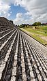
- Nomination Great Pyramid of Cholula, Puebla, Mexico --Poco a poco 21:09, 18 March 2015 (UTC)
- Promotion Interesting composition and good quality -- Spurzem 21:23, 18 March 2015 (UTC)
-

- Nomination Hamadryas baboon (Papio hamadryas), Tierpark Hellabrunn, Munich, Germany --Poco a poco 21:09, 18 March 2015 (UTC)
- Promotion Good quality -- Spurzem 21:21, 18 March 2015 (UTC)
-

- Nomination Great Coastal Gate, Tallinn, Estonia --Poco a poco 21:09, 18 March 2015 (UTC)
- Promotion Good quality -- Spurzem 21:19, 18 March 2015 (UTC)
-

- Nomination Electric powered boat entering the port of La Rochelle, France.--Jebulon 21:09, 18 March 2015 (UTC)
- Promotion A little soft at the top, but that's from the perspective correction. Looks to be good quality to me. --Crisco 1492 01:01, 19 March 2015 (UTC)
-
-

-

-
-

- Nomination Shell of a Flat Top Snail, Gibbula umbilicalis --Llez 20:05, 18 March 2015 (UTC)
- Promotion Good quality. --Livioandronico2013 20:10, 18 March 2015 (UTC)
-

- Nomination Tableau de Rosa Bonheur Labourage nivernais - Détail --Thesupermat 19:43, 18 March 2015 (UTC)
- Promotion Good quality --Llez 20:10, 18 March 2015 (UTC)
-

- Nomination Park on the way to Cascade. Yerevan, Armenia. --Halavar 19:23, 18 March 2015 (UTC)
- Promotion Good quality. --Jacek Halicki 20:49, 18 March 2015 (UTC)
-

- Nomination Park on the way to Cascade. Yerevan, Armenia. --Halavar 19:23, 18 March 2015 (UTC)
- Promotion Good quality. --Jacek Halicki 20:49, 18 March 2015 (UTC)
-

- Nomination Building of Ministry of Foreign Affairs of Armenia. Yerevan, Armenia. --Halavar 19:23, 18 March 2015 (UTC)
- Promotion Good quality. --Jacek Halicki 20:49, 18 March 2015 (UTC)
-

-

-

-

-

-
-
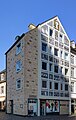
- Nomination Germany, Trier,Sternstraße 1 --Berthold Werner 16:20, 18 March 2015 (UTC)
- Promotion Good quality. And perfect file name ;-) I´m just kidding! --Hubertl 16:31, 18 March 2015 (UTC)
-

-
-

-

-

- Nomination Interieur of a Horch 853 built in 1936 Spurzem 11:08, 18 March 2015 (UTC)
- Promotion
 Support Excellent quality.--Johann Jaritz 11:10, 18 March 2015 (UTC)
-

- Nomination Howitzer on the Lake Predil with Mount Canin in the background, Tarvisio, Friuli-Venezia Giulia, Italy --Johann Jaritz 10:56, 18 March 2015 (UTC)
- Promotion Good quality --Llez 17:51, 18 March 2015 (UTC)
-
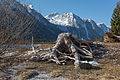
- Nomination Tree stump on the Lake Predil with Monte Canin in the background, Tarvisio, Friuli-Venezia Giulia, Italy --Johann Jaritz 10:53, 18 March 2015 (UTC)
- Promotion Support --Christian Ferrer 12:54, 18 March 2015 (UTC)
-
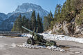
- Nomination Howitzer in front of Fort Lake Predil, Tarvisio, Friuli-Venezia Giulia, Italy --Johann Jaritz 10:52, 18 March 2015 (UTC)
- Promotion Good composition and very good quality -- Spurzem 11:10, 18 March 2015 (UTC)
-

- Nomination Howitzer in front of Fort Lake Predil, Tarvisio, Friuli-Venezia Giulia, Italy --Johann Jaritz 10:51, 18 March 2015 (UTC)
- Promotion Support Good quality --Halavar 11:49, 18 March 2015 (UTC)
-

- Nomination Roman town-gate Porta Nigra at Trier, Germany -- Spurzem 10:42, 18 March 2015 (UTC)
- Promotion Support Good quality.--Johann Jaritz 11:12, 18 March 2015 (UTC)
-

- Nomination Whirlabout butterfly (Polites vibex praeceps) male, Tobago --Charlesjsharp 10:23, 18 March 2015 (UTC)
- Promotion Good quality. --Jacek Halicki 15:38, 18 March 2015 (UTC)
-

- Nomination Lark-like bunting (Emberiza impetuani), Tswalu Kalahari Reserve, South Africa --Charlesjsharp 10:23, 18 March 2015 (UTC)
- Promotion Very nice and very good quality -- Spurzem 10:29, 18 March 2015 (UTC)
-

- Nomination Zebra heliconian longwing butterfly (Heliconius charitonius simulator) in Jamaica --Charlesjsharp 10:23, 18 March 2015 (UTC)
- Promotion QI -- Spurzem 10:33, 18 March 2015 (UTC)
-

- Nomination Saint Anne chapel in Szalejów Dolny 1 --Jacek Halicki 09:14, 18 March 2015 (UTC)
- Promotion Good quality. --Livioandronico2013 09:18, 18 March 2015 (UTC)
-

- Nomination Saint Anne chapel in Szalejów Dolny 2 --Jacek Halicki 09:14, 18 March 2015 (UTC)
- Promotion Good quality. --Hubertl 09:34, 18 March 2015 (UTC)
-

- Nomination Mary Magdalene chapel in Szalejów Dolny --Jacek Halicki 09:14, 18 March 2015 (UTC)
- Promotion Good quality. --Livioandronico2013 09:18, 18 March 2015 (UTC)
-

- Nomination Head of Marcus Vipsanius Agrippa in Museo Nazionale Romano --Livioandronico2013 09:04, 18 March 2015 (UTC)
- Promotion Good quality. --Hubertl 09:34, 18 March 2015 (UTC)
-

- Nomination Head of Julius Caesar (?) in Museo Nazionale Romano --Livioandronico2013 09:03, 18 March 2015 (UTC)
- Promotion Support Could be denoised a bit. Anyway, the quality is good. --Hockei 18:06, 18 March 2015 (UTC)
-
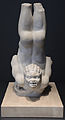
- Nomination Roman statue of young African tightrope --Livioandronico2013 08:49, 18 March 2015 (UTC)*
 Comment what means tightrope in this context and do you realize, that this is (obviously!) a gargoyle as part of am antique fountain or bassin? ;-)--Hubertl 09:34, 18 March 2015 (UTC)
on the description of the museum was written acrobat,I honestly do not know where it was. Thanks--Livioandronico2013 13:08, 18 March 2015 (UTC) - Promotion Good quality. But look at the mouth! And don´t believe italian curators. They are mostly underpaid, in this case probably overpaid.--Hubertl 13:24, 18 March 2015 (UTC)
- Nomination Roman statue of young African tightrope --Livioandronico2013 08:49, 18 March 2015 (UTC)*
-

- Nomination Southern out of Canyon Kapıkaya. Karaisalı, Adana - Turkey. --Zcebeci 07:45, 18 March 2015 (UTC)
- Promotion Good quality.--Johann Jaritz 08:22, 18 March 2015 (UTC)
-

-

- Nomination Liverpool South Parkway. Mattbuck 06:43, 18 March 2015 (UTC)
- Promotion Good quality?--PIERRE ANDRE LECLERCQ 09:38, 18 March 2015 (UTC)
-
-

- Nomination 377212 at Bedford. Mattbuck 06:43, 18 March 2015 (UTC)
- Promotion Good quality. --Jacek Halicki 15:38, 18 March 2015 (UTC)
-

- Nomination Scarborough railway station. Mattbuck 06:43, 18 March 2015 (UTC)
- Promotion Good quality. --Jacek Halicki 20:49, 18 March 2015 (UTC)
-

- Nomination Seed Boxes Serratula seoanei, Blade. Location, Garden Valley Reserve Jonker.
Famberhorst 05:49, 18 March 2015 (UTC) - Decline You can do it much better - especially with this motive. It is not sharp at all. Sorry. --Hubertl 10:12, 18 March 2015 (UTC)
- Nomination Seed Boxes Serratula seoanei, Blade. Location, Garden Valley Reserve Jonker.
-

- Nomination Jakarta, Indonesia: Food hawkers in Chinatown Jakarta, Glodok quarter. --Cccefalon 05:43, 18 March 2015 (UTC)* Comment are you really sure that this motive is straight like this? --Hubertl 09:37, 18 March 2015 (UTC) Comment Yeah. According to gravity law, the ropes of the hangers should be vertical (plus/minus, depends a little bit if the hanger is balanced) --Cccefalon 09:45, 18 March 2015 (UTC)
- Promotion Good quality. Ok then! --Hubertl 10:09, 18 March 2015 (UTC)
- Nomination Jakarta, Indonesia: Food hawkers in Chinatown Jakarta, Glodok quarter. --Cccefalon 05:43, 18 March 2015 (UTC)*
-

- Nomination Yogyakarta, Indonesia: A decorated "Exit" sign in the Taman Sari compound. --Cccefalon 05:43, 18 March 2015 (UTC)
- Promotion Good quality. --Jacek Halicki 15:38, 18 March 2015 (UTC)
-

- Nomination Jakarta, Indonesia: Bowsprits of Pinisi ships in the old port of Jakarta. --Cccefalon 05:43, 18 March 2015 (UTC)
- Promotion Good quality.--Johann Jaritz 08:24, 18 March 2015 (UTC)
-

- Nomination Yogyakarta, Indonesia: One of the Perwara temples of Prambanan. Hundreds of those temples, arranged in 4 concentric square rows, were situated around the main temple complex. This one is located at the west side of the complex. --Cccefalon 05:43, 18 March 2015 (UTC)
- Promotion Good quality.--Famberhorst 05:51, 18 March 2015 (UTC)
-
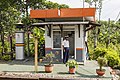
- Nomination Baron, Nganjuk, Java Timur, Indonesia: Gatekeeper at Baron Railway Station. --Cccefalon 05:43, 18 March 2015 (UTC)
- Promotion Great! --Crisco 1492 12:42, 18 March 2015 (UTC)
-

- Nomination Sarcophaga carnaria (Common Flesh Fly) --Christian Ferrer 05:42, 18 March 2015 (UTC)
- Promotion Good quality.--Famberhorst 05:54, 18 March 2015 (UTC)
-

- Nomination Building of the Salins de Frontignan, Hérault, France. --Christian Ferrer 05:42, 18 March 2015 (UTC)
- Promotion Good quality. --Cccefalon 05:51, 18 March 2015 (UTC)
-
-

- Nomination Christ Church, Dülmen, North Rhine-Westphalia, Germany --XRay 04:37, 18 March 2015 (UTC)
- Promotion Support --Christian Ferrer 05:46, 18 March 2015 (UTC)
-

- Nomination Sculpture “Der gescheiterte Varus” (Wilfried Koch), Haltern am See, North Rhine-Westphalia, Germany --XRay 04:37, 18 March 2015 (UTC)
- Promotion Good quality. --Jacek Halicki 20:49, 18 March 2015 (UTC)
-

-

- Nomination Noisy miner, Gembira Loka Zoo, Yogyakarta - Crisco 1492 00:44, 18 March 2015 (UTC)
- Promotion Support --Christian Ferrer 05:47, 18 March 2015 (UTC)
-

- Nomination Vulturine guineafowl portrait, Gembira Loka Zoo, Yogyakarta - Crisco 1492 00:44, 18 March 2015 (UTC)
- Promotion Good quality. Would be even better with a small crop on the right side. --Hubertl 09:44, 18 March 2015 (UTC)
Thanks for the input, but I kinda prefer it with a bit more space. As if the bird's looking at freedom, just on the other side of this mesh. Crisco 1492 11:43, 18 March 2015 (UTC)
-

- Nomination African spurred tortoise, Gembira Loka Zoo, Yogyakarta - Crisco 1492 00:44, 18 March 2015 (UTC)
- Promotion Support Good quality. --XRay 17:58, 18 March 2015 (UTC)
-

- Nomination Gold tegu, Gembira Loka Zoo, Yogyakarta - Crisco 1492 00:44, 18 March 2015 (UTC)
- Promotion Support Good quality. --XRay 17:58, 18 March 2015 (UTC)
-
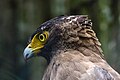
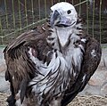
- Nomination Portrait of changeable hawk-eagle, Gembira Loka Zoo, Yogyakarta - Crisco 1492 00:44, 18 March 2015 (UTC)
- Promotion Nice. Although there is a bit unsharpness in sharp end of beak, good quality in general. --Zcebeci 07:27, 18 March 2015 (UTC)
-

-

-

-

- Nomination Figures at the facade of the Michaelertrakt, seen from Michaeler square --Hubertl 00:19, 18 March 2015 (UTC)
- Promotion Good quality. --Livioandronico2013 09:18, 18 March 2015 (UTC)
-
-

-

- Nomination Kjálkafjörður fjord, Vestfirðir, Iceland --Poco a poco 19:42, 17 March 2015 (UTC)
- Promotion Good quality. --Cccefalon 10:19, 18 March 2015 (UTC)
-

-
- Nomination Bahçecik Waterfall in the Kapıkaya Canyon. Karaisalı, Adana - Turkey. --Zcebeci 09:51, 17 March 2015 (UTC){{some aéras seem overexposed--PIERRE ANDRE LECLERCQ 14:07, 17 March 2015 (UTC)}}{{Taken at F22 and 0 brightness level. I think the local variations you indicated was because of brightness variability of the clouds. Thanks a lot for your review. --Zcebeci 19:39, 17 March 2015 (UTC)}}
- Promotion OK good quality for me.--PIERRE ANDRE LECLERCQ 10:08, 18 March 2015 (UTC).
-

- Nomination Head of Marcus Cocceius Nerva in Museo Nazionale Romano --Livioandronico2013 21:31, 16 March 2015 (UTC)
- Promotion Contrast could be a little bit higher, but image complies with QI standard though. --Cccefalon 06:04, 18 March 2015 (UTC)
 Done Thanks for review --Livioandronico2013 08:27, 18 March 2015 (UTC)
-

- Nomination Île de Riou, Calanques de Marseille and Town of Cassis from Cap Canaille --Imehling 19:51, 16 March 2015 (UTC)
- Promotion Horizon tilts on the left side. --Milseburg 20:53, 16 March 2015 (UTC) Done --Imehling 19:32, 17 March 2015 (UTC) Support QI for me now. --Milseburg 14:49, 18 March 2015 (UTC)
-

- Nomination Blown out match, smoking --F. Riedelio 10:45, 16 March 2015 (UTC)
- Promotion Comment Wow! I would love to support but i'm still strugling with the noise/noise reducal result. --Ximonic 17:11, 16 March 2015 (UTC) Done
Thank you for the review Ximonic. I tried to reduce the ISO-noise. --F. Riedelio 19:08, 17 March 2015 (UTC) Support I give it my support as I think it is quite good for the kind. --Ximonic 03:54, 19 March 2015 (UTC)
-

- Nomination Neuer Wenkenhof in Riehen, Switzerland --Taxiarchos228 19:42, 15 March 2015 (UTC)
- Promotion Good quality. --Isiwal 20:06, 18 March 2015 (UTC)
-

-

-

- Nomination: BMW 502 V8 in the parking lot of the airfield Borkenberge, Lüdinghausen, North Rhine-Westphalia, Germany --XRay 04:36, 13 March 2015 (UTC)
- Review needed
-

- Nomination A wild-goat shaped ritual objects, clay. Archaeological museum of Heraklion, Crete, Greece.--Jebulon 17:10, 10 March 2015 (UTC)
- Decline Difficult to have a focal point on the eyes...--Jebulon 23:12, 15 March 2015 (UTC)
 weak oppose The nose is clearly out of focus, sorry. --C messier 16:29, 17 March 2015 (UTC)No need to be sorry, you are obviously right.--Jebulon 20:44, 18 March 2015 (UTC)
-

- Nomination Head of woman in Palazzo Massimo alle Terme (Rome) --Livioandronico2013 09:46, 10 March 2015 (UTC)
- Promotion Support Good quality. --Hockei 18:39, 18 March 2015 (UTC)
-

- Nomination Nyköping Castle --ArildV 21:18, 9 March 2015 (UTC)
- Promotion Is it possible to clone out your shadow head ? --Christian Ferrer 21:54, 9 March 2015 (UTC) Sorry Christian, I forgot this images. I uploaded a new crop.--ArildV 08:46, 17 March 2015 (UTC) Support ok --Christian Ferrer 11:53, 18 March 2015 (UTC)
-
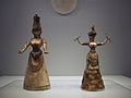
- Nomination Snake goddesses figurines. --C messier 20:57, 8 March 2015 (UTC)
Could you painyt out the blue area? Mattbuck 19:20, 15 March 2015 (UTC) Done--C messier 15:02, 17 March 2015 (UTC) - Promotion Support very difficult to take, I know what I'm talking about...--Jebulon 20:48, 18 March 2015 (UTC)
- Nomination Snake goddesses figurines. --C messier 20:57, 8 March 2015 (UTC)
-

- Nomination Silver-spotted skipper butterfly (Hesperia comma) female --Charlesjsharp 11:39, 5 March 2015 (UTC)
- Promotion Comment Please check for the lens flare top right.--XRay 13:43, 13 March 2015 (UTC)
Well spotted. Sorted. --Charlesjsharp 12:46, 16 March 2015 (UTC)
There's a weird halo around the butterfly now, because you darkened the background but left it the same exposure. I'd have just used a cloning tool to remove the flare.Crisco 1492 01:11, 18 March 2015 (UTC) Done Reverted to original image with flare cloned out. --Charlesjsharp 13:58, 18 March 2015 (UTC)
The crop was different. I've given it a shot. Revert if you disagree with the edit. Crisco 1492 16:27, 18 March 2015 (UTC)
I'm happy with it. --Charlesjsharp 16:48, 18 March 2015 (UTC)
Good quality. --Crisco 1492 00:53, 19 March 2015 (UTC)
-

- Nomination Inselschule, Juist, Lower Saxony, Germany --XRay 04:44, 5 March 2015 (UTC)
- Withdrawn Nice light and good sharpness. But is there a reason for the tight crop at right? --Dirtsc 21:45, 11 March 2015 (UTC) Comment The building continues on the right with a disturbing tree.--XRay 16:37, 12 March 2015 (UTC) Comment I'm not convinced of the composition. It looks as if the building was cut on the right. Do you have a version including the tree so I can compare the two? --Dirtsc 16:26, 16 March 2015 (UTC)
 I withdraw my nomination You're right. The other versions are already nominated. --XRay 17:40, 18 March 2015 (UTC)
,_Gembira_Loka_Zoo,_Yogyakarta,_2015-03-15_02.jpg)


,_Tierpark_Hellabrunn,_M%C3%BAnich,_Alemania,_2012-06-17,_DD_07.JPG)


.jpg)
.jpg)
.jpg)
.jpg)
.jpg)


.jpg)
_male.JPG)

.jpg)


_in_Museo_Nazionale_Romano.jpg)


,_Gembira_Loka_Zoo,_Yogyakarta,_2015-03-15.jpg)
,_Gembira_Loka_Zoo,_2015-03-15.jpg)
,_Gembira_Loka_Zoo,_2015-03-15.jpg)
,_Gembira_Loka_Zoo,_Yogyakarta_2015-03-15.jpg)


.jpg)


_female_underside.jpg)

.JPG)
.JPG)
.jpg)
Consensual review[edit]
File:Cistanche_phelypaea_Habitus_01.jpg[edit]

- Nomination Yellow Broomrapes, Cistanche phelypaea --Llez 17:25, 15 March 2015 (UTC)
- Promotion
Too much noise imho--Berthold Werner 18:03, 15 March 2015 (UTC)
* I uploaded a completely new version --Llez 18:23, 15 March 2015 (UTC) - Support Good now --Berthold Werner 08:26, 16 March 2015 (UTC)
- Support IMO OK. --XRay 18:08, 16 March 2015 (UTC)
Total: 2 support (excluding the nominator), 0 oppose →  Promoted --C messier 12:35, 20 March 2015 (UTC)
File:Jaisalmer_Jain_Temple_10.jpg[edit]

- Nomination Interior of Jaisalmer Jain Temple --Imehling 12:01, 14 March 2015 (UTC)
- Promotion
- Weak Support Good quality, but sharpness could be better. --XRay 13:03, 14 March 2015 (UTC)
- Moving to
 Neutral, the new version doesn't deserve an oppose Poco a poco 18:26, 19 March 2015 (UTC)
- Moving to
- I've uploaded a new version. I hope you like it more. --Imehling 14:12, 14 March 2015 (UTC)
- Support Good enough for QI. Alvesgaspar 14:25, 15 March 2015 (UTC)
- Support, much better now. –Be..anyone 17:29, 15 March 2015 (UTC)
- Support --PIERRE ANDRE LECLERCQ 10:21, 16 March 2015 (UTC)
Total: 4 support (excluding the nominator), 0 oppose → Promoted --C messier 12:36, 20 March 2015 (UTC)
File:14-05-05-placido-domingo-RalfR-2.jpg[edit]

- Nomination Placido Domingo bei der Preisverleihung Europa Nostra in Wien --Ralf Roletschek 19:32, 13 March 2015 (UTC)
- Decline
- Oppose Insufficient quality. Ich finde die Vorschau super aber in groß... nö. --Tobias "ToMar" Maier 13:04, 14 March 2015 (UTC)
- Support Unter Berücksichtigung der Bedingungen, unter denen das Bild gemacht werden musste, ist es ein hervorragend komponiertes Foto von guter Qualität. Zu beanstanden und leicht zu entfernen sind die CAs. Bitte weitere Meinungen hören. -- Spurzem 21:15, 14 March 2015 (UTC)
- Oppose Don’t need to zoom to 100% to see the lack of sharpness. Maybe this has been taken in adverse conditions but QIC is about the result IMHO, and this is below threshold. --Kreuzschnabel 05:59, 15 March 2015 (UTC)
- Oppose Framing too tight.--PIERRE ANDRE LECLERCQ 10:24, 15 March 2015 (UTC)
- Oppose I have to agree, not sharp at all. I mean the photo, not the singing, which comes from the very best tenor of today and one the best of all times! -- Alvesgaspar 14:27, 15 March 2015 (UTC)
- Oppose Longitudal CA could be reduced manually, motion blur not. Why not ISO3200 or even ISO6400 to reduce effects of camera shake? The D800 works fine up to ISO3200 and still acceptable at ISO6400, if the image is somewhat downscaled. Better a sharp image at 6 to 12 MPix than a blurred one at 36. -- Smial 14:00, 16 March 2015 (UTC)
Total: 1 support (excluding the nominator), 5 oppose →  Declined --C messier 12:37, 20 March 2015 (UTC)
File:Eingangtor_Trostburg.jpg[edit]

- Nomination The castle Trostburg in South Tyrol - Detail of eastern portal --Moroder 13:28, 27 February 2015 (UTC)
- Promotion
- I am not convinced about the top crop Poco a poco 20:31, 27 February 2015 (UTC)
- Comment I like it the way it is with the two embrasures --Moroder 09:57, 5 March 2015 (UTC)
Well, but they are cropped, so I'd say either more of them or less of them. More opinions? Poco a poco 15:35, 7 March 2015 (UTC)
- I'm also not convinced by it, seems a bit blurry at the top.
 Weak oppose Mattbuck 20:57, 10 March 2015 (UTC)
- Done Cropped the top --Moroder 13:37, 13 March 2015 (UTC)
- weak from me --Hubertl 20:06, 13 March 2015 (UTC)
- Support QI for me now Poco2 13:29, 14 March 2015 (UTC)
- Support --PIERRE ANDRE LECLERCQ 10:38, 17 March 2015 (UTC)
Total: 3 support (excluding the nominator), 1 oppose → Promoted --C messier 12:43, 20 March 2015 (UTC)
File:OrangeBlossomSpecialFestival--0200.jpg[edit]

- Nomination Reverend Shine Snake Oil Co. at Orange Blossom Special Festival (black & white shot). By User:Chris W. Braunschweiger --Achim Raschka 22:35, 27 February 2015 (UTC)
- Promotion Comment Would have been an instant support for me if it weren't for the microphone in the upper left corner – I find it very distracting. Any chance for this to be cloned out? (I'm usually NOT a fan of retouching pictures like that, but for reasons that are not entirely clear to me myself it seems necessary here) --El Grafo 16:10, 4 March 2015 (UTC)
 Not done Mattbuck 22:17, 9 March 2015 (UTC)
I don't see a reason to retouche the microphone since it is part of the picture and situation, please discuss -- Achim Raschka 06:33, 10 March 2015 (UTC)
True, but reality has problems, and a microphone head on its own is disturbing. Mattbuck 20:57, 10 March 2015 (UTC) - Support I like the composition, including the fact that verticals are off. What I don't like are the overexposed parts para those are not too distracting. Alvesgaspar 14:40, 15 March 2015 (UTC)
- Support As for Alvesgaspar. I don't understand the criticism about microphones in stage photogrphy. They are present. Everywhere. Btw: I asked musicians and other artists about cropping or cloning out such details - all of them rejected such intentions. -- Smial 14:10, 16 March 2015 (UTC)
- Support Per Smial. --Palauenc05 07:36, 17 March 2015 (UTC)
- Comment @Smial, Achim Raschka, and Palauenc05: there is of course absolutely nothing wrong with microphones in stage photography in general, and usually I would oppose cropping or cloning them out quite strongly! It's very hard for me to explain what's different about this image (especially in English), but I'll try nevertheless: In this picture, we have a very good separation of subject and background, which is achieved through the subject being in focus and the background being nicely blurred. However, the microphone is also in focus, so it is automatically perceived as "important". That alone wouldn't be a bad thing, but in combination with the placement of the microphone it becomes a bit of a problem. Being placed far away in the corner, the mike doesn't have a real connection to the person, making it a separate object perceived as "important". Through that, it takes away attention from the subject, making my eyes bounce to and fro between the two "points of interest" – it's acting a bit like a little gnome hovering in the corner, waving his arms and crying for attention ;-) I think it would actually be far less disturbing if the mike was placed nearer to the person's face – that would create a connection and merge the two "points of interest" into a single one. Instead of cloning it out, it might actually be sufficient to just slightly blur it. Please note, however, that do not oppose here because it is without doubt a great example of concert photography, but I can't really support either. --El Grafo (talk) 10:08, 17 March 2015 (UTC)
- I see your point and understand it. But this is a matter of taste. Of course it is ok to decline an image because of this minor problem, if we were at com:fpc, where matter of taste counts more ;-) -- Smial 13:58, 17 March 2015 (UTC)
Total: 3 support (excluding the nominator), 0 oppose → Promoted --C messier 12:41, 20 March 2015 (UTC)
File:Klooster_Nijmegen.jpg[edit]

- Nomination A church in Nijmegen, Holland --Abigor 19:31, 23 February 2015 (UTC)
- Promotion Comment Nice picture, but it should be properly categorized --Shansov.net 23:25, 23 February 2015 (UTC)
I think there's some fisheye distortion too. Mattbuck 16:29, 3 March 2015 (UTC) - Comment I've put it into the appropriate category. Not sure about lens distortion – if it's there I don't find it disturbing. Maybe the back wall could benefit from a little bit of brightening? --El Grafo 15:48, 4 March 2015 (UTC)
- Not done Mattbuck 19:42, 8 March 2015 (UTC)
- Support Let's get more opinions. I think that it's good image. Maybe needs a little bit of cropping to make it more symmetric. I don't see any disturbing lens distortion --Shansov.net 11:35, 10 March 2015 (UTC)
- Support Despite the overexposed parts. Alvesgaspar 14:42, 15 March 2015 (UTC)
- Support Good enough for me. --El Grafo 09:42, 17 March 2015 (UTC)
Total: 3 support (excluding the nominator), 0 oppose → Promoted --C messier 12:40, 20 March 2015 (UTC)
File:Santiagobernabeupanoramav44.JPG[edit]

- Nomination Santiago Bernabéu Stadium.--لا روسا 13:29, 28 February 2015 (UTC)
- Decline Tilted, please see my note--PIERRE ANDRE LECLERCQ 10:25, 5 March 2015 (UTC)
@PIERRE ANDRE LECLERCQ: i tried to correct it, review it now.--لا روسا 06:00, 7 March 2015 (UTC)
- Support It's good for me--PIERRE ANDRE LECLERCQ 17:56, 7 March 2015 (UTC)
- Oppose Significant motion blur. --C messier 12:44, 13 March 2015 (UTC)
- Oppose per C messier. Too much even if the subject is moving, never mind a empty stadium. -- KTC 23:56, 15 March 2015 (UTC)
Total: 1 support (excluding the nominator), 2 oppose → Declined --C messier 12:39, 20 March 2015 (UTC)
[edit]
.JPG)
- Nomination Royal Naval College, Greenwich.--لا روسا 09:58, 26 February 2015 (UTC)(UTC)
- Decline Comment It needs perspective and tilt correction, not very detailed for a 3 Mpix image, maybe due to low jpeg quality (or the small sensor). --C messier 18:04, 26 February 2015 (UTC)
Done @C messier: .--لا روسا 22:02, 2 March 2015 (UTC) weak oppose Sorry, IMHO it is too unsharp for its size. --C messier 14:58, 4 March 2015 (UTC)
Comment Sorry, could you let it to another one to review it as you mentioned that weak oppose.--لا روسا 04:48, 5 March 2015 (UTC) - Oppose - Rather purple, foreground inclusion is problematic. Mattbuck 20:51, 5 March 2015 (UTC)
- Done I tried to correct it, review it now @C messier and Mattbuck: .--لا روسا 14:04, 9 March 2015 (UTC)
- The upsizing has made the image completely unsharp and full of jpeg artifacts. --C messier 14:31, 9 March 2015 (UTC)
- Then, what should i do, if i resized it again to be the original one, would be fine.--لا روسا 07:23, 14 March 2015 (UTC)
[edit]
.JPG)
- Nomination Royal Naval College, Greenwich.--لا روسا 09:58, 26 February 2015 (UTC)(UTC)
- Decline Comment It needs perspective and tilt correction, not very detailed for a 3 Mpix image, maybe due to low jpeg quality (or the small sensor). --C messier 18:04, 26 February 2015 (UTC)
Done @C messier: .--لا روسا 21:46, 2 March 2015 (UTC) weak oppose Sorry, IMHO it is too unsharp for its size. --C messier 14:58, 4 March 2015 (UTC)
Comment Sorry, could you let it to another one to review it as you mentioned that weak oppose.--لا روسا 04:48, 5 March 2015 (UTC) - Oppose - Cyanotic sky, not brilliant perspective, odd bright spot bottom left, generally purple and a bit unsharp. Mattbuck 20:50, 5 March 2015 (UTC)
- Done I tried to correct it, review it now @C messier and Mattbuck: .--لا روسا 14:24, 9 March 2015 (UTC)
File:Malleus_(5_von_16).jpg[edit]
.jpg)
- Nomination Malleus beim Feel Festival 2014 in Berlin --Pistenwolf 08:43, 25 February 2015 (UTC)
- Decline
- Support Good quality. --C messier 16:26, 4 March 2015 (UTC)
- Oppose Unnecesary vignetting, unnatural colours, looks like ana "artistic" filter. Slight CA. --Kadellar 17:10, 4 March 2015 (UTC)
- Oppose - The overexposure on the neck spoils it. Mattbuck 20:43, 5 March 2015 (UTC)
- Support imho it's QI. Taken under live gig conditions, the 'strange' colours obviously result from the LED stage lighting, as the light spot in the neck too. --Rs-foto 22:29, 7 March 2015 (UTC)
- Oppose Jpeg artifacts --PIERRE ANDRE LECLERCQ 15:24, 10 March 2015 (UTC)
- I can't spot them, can you add a note? --C messier 15:48, 10 March 2015 (UTC)
- in fact, it is the blue highlight too pronounced, on top tents and some unnatural colours in the sky. No doubt that by removing the image would be better. - --PIERRE ANDRE LECLERCQ 10:37, 11 March 2015 (UTC)
- I can't spot them, can you add a note? --C messier 15:48, 10 March 2015 (UTC)
Total: 2 support (excluding the nominator), 3 oppose → Declined --Hubertl 01:30, 16 March 2015 (UTC)