Commons:Quality images candidates/Archives November 29 2014
Jump to navigation
Jump to search

-

-

-

- Nomination The end of the railway line from Wrist to Itzehoe in September 2014 --Nightflyer 23:07, 26 November 2014 (UTC)
- Promotion Good quality. --Steindy 23:22, 26 November 2014 (UTC)
-

-
-

-

-

-

- Nomination Perito Moreno Glacier, Argentina --Poco a poco 18:59, 26 November 2014 (UTC)
- Promotion
 Support Nice and interesting--Lmbuga 19:30, 26 November 2014 (UTC)
-

- Nomination Indiana World War Memorial Building, Indianapolis, USA --Poco a poco 18:59, 26 November 2014 (UTC)
- Promotion Very good! --Steindy 23:28, 26 November 2014 (UTC)
-

- Nomination Building in 27 Grudnia 3, Poznan, Poland --Poco a poco 18:59, 26 November 2014 (UTC)
- Promotion Good quality. Please tell next time the lady that she should remain ;-) --Steindy 23:28, 26 November 2014 (UTC)
-

- Nomination Main building of the Ludwig Maximilian University, Munich, Bavaria, Germany. --Poco a poco 18:59, 26 November 2014 (UTC)
- Promotion Support Good quality --Halavar 19:17, 26 November 2014 (UTC)
-

- Nomination Digital Reflex Camera Nikon D5300 --0x010C 17:57, 26 November 2014 (UTC)
- Decline Too dark Alvesgaspar 18:14, 26 November 2014 (UTC)
-

-
- Nomination Petergofskoe Highway near Baltic Pearl District in Saint Petersburg --Florstein 17:19, 26 November 2014 (UTC)
- Promotion Good quality. --Poco a poco 19:26, 26 November 2014 (UTC)
-

- Nomination Admirala Tributsa Street in Saint Petersburg --Florstein 17:19, 26 November 2014 (UTC)
- Promotion Good quality. --Jacek Halicki 17:51, 26 November 2014 (UTC)
-

- Nomination Pearl Plaza Mall in Saint Petersburg --Florstein 17:19, 26 November 2014 (UTC)
- Promotion Good quality. --Jacek Halicki 17:51, 26 November 2014 (UTC)
-
- Nomination Flower and leaves of a Hottentot Fig -- Alvesgaspar 17:01, 26 November 2014 (UTC)
- Promotion Good quality. --Hubertl 18:11, 26 November 2014 (UTC)
-

- Nomination Oriental Poppy, Madrid Botanical Garden -- Alvesgaspar 16:52, 26 November 2014 (UTC)
- Promotion Good quality. --Poco a poco 19:26, 26 November 2014 (UTC)
-

- Nomination Oriental Poppy, Madrid Botanical Garden -- Alvesgaspar 16:52, 26 November 2014 (UTC)
- Promotion Support QI --Rjcastillo 18:54, 26 November 2014 (UTC)
-

- Nomination Lycoperdon perlatum (Lycoperdon perlatum). Location, Hortus (Haren, Groningen).
--Famberhorst 16:48, 26 November 2014 (UTC) - Promotion Support QI --Rjcastillo 18:54, 26 November 2014 (UTC)
- Nomination Lycoperdon perlatum (Lycoperdon perlatum). Location, Hortus (Haren, Groningen).
-
-

-

- Nomination Limit of the sand yacht zone (and fisherman's chair), la Grande Côte, Saint-Palais-sur-Mer, Charente-Martitime, France. --JLPC 16:43, 26 November 2014 (UTC)
- Promotion Good quality. --Poco a poco 19:26, 26 November 2014 (UTC)
-

-

-

-

- Nomination Italy, Paestum, Temple of Athena --Berthold Werner 14:48, 26 November 2014 (UTC)
- Promotion Support Good quality --Halavar 14:55, 26 November 2014 (UTC)
-

- Nomination Cayenne, French Guiana: place des palmistes. --Cayambe 14:25, 26 November 2014 (UTC)
- Promotion
 Comment please turn it, its tilted! --Hubertl 14:53, 26 November 2014 (UTC)
 Done Perspective corrected. Thanks for the review. --Cayambe 19:25, 26 November 2014 (UTC)
Its ok now, good quality. --Hubertl 21:30, 26 November 2014 (UTC)
-

-

-

-

- Nomination Heidelberg tram --Bahnfrend 12:24, 26 November 2014 (UTC)
- Promotion Good quality, but yet tilted slightly cw. --Cccefalon 13:25, 26 November 2014 (UTC) Done Tilt fixed -- Bahnfrend 15:51, 26 November 2014 (UTC)
Very good photo with a blemish: Unfortunately, the target screen is unreadable by the short exposure time. --Steindy 20:34, 26 November 2014 (UTC)
Yes, but still quality good enough for QI. --Cccefalon 22:06, 26 November 2014 (UTC) Comment The destination screen may have been changing to a different message at the time I took the photo. -- Bahnfrend 01:02, 27 November 2014 (UTC)
-

-

- Nomination Car in San Juan Street --The Photographer 12:16, 26 November 2014 (UTC)
- Promotion Good quality. --Jacek Halicki 16:39, 26 November 2014 (UTC)
-

- Nomination Consolata Cemetery --The Photographer 12:16, 26 November 2014 (UTC)
- Promotion Good quality. --Poco a poco 19:31, 26 November 2014 (UTC)
-

- Nomination Turtle in São Paulo Zoo --The Photographer 12:16, 26 November 2014 (UTC)
- Promotion Good quality. --JLPC 16:43, 26 November 2014 (UTC)
-
- Nomination Замок князів Острозьких-Любомирських (мур.), Дубно, вул.Шевченка. By User:Юрій Петруняк --Ahonc 11:43, 26 November 2014 (UTC)
- Promotion Good quality. --Hubertl 13:46, 26 November 2014 (UTC)
-
- Nomination Водонапірна башта, Вінниця, вул. Грушевського, 11. By User:Posterrr --Ahonc 11:43, 26 November 2014 (UTC)
- Decline Below 2MP size requirement. --Cccefalon 13:08, 26 November 2014 (UTC)
Larger version here--Ahonc 13:54, 26 November 2014 (UTC)
-

- Nomination Костьол св. Миколая, Київ, Червоноармійська вул., 77. By User:Brizhnichenko --Ahonc 11:43, 26 November 2014 (UTC)
- Promotion Good quality. --Poco a poco 19:31, 26 November 2014 (UTC)
-

- Nomination Houses in Lapad district seen from the main port. Dubrovnik, Dubrovnik-Neretva County, Croatia. --Halavar 10:44, 26 November 2014 (UTC)
- Promotion Comment The coastline needs correction! --Hubertl 15:20, 26 November 2014 (UTC) Comment Not fixable. --Halavar 17:10, 26 November 2014 (UTC), Support I fixed it, the picture has really good quality --Hubertl 17:56, 26 November 2014 (UTC) Comment Thanks for the help. I noticed a CA on the mast, so I removed it and uploaded fixed version. --Halavar 19:14, 26 November 2014 (UTC)
-

- Nomination 400-year old stone house with a stone wall in the Gruž district. Dubrovnik, Dubrovnik-Neretva County, Croatia. --Halavar 10:44, 26 November 2014 (UTC)
- Promotion Good quality. --Jacek Halicki 11:22, 26 November 2014 (UTC)
-

-

-
- Nomination Gothic Tower of the City Observatory of Edinburgh, Scotland, UK. --Kadellar 10:42, 26 November 2014 (UTC)
- Promotion Good quality. --Jacek Halicki 11:22, 26 November 2014 (UTC)
-

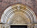
- Nomination Sélestat library, with statue of Jean Mentel, printer and publisher (1410-1478), signed Sichler SC, 1842. By User:Ctruongngoc --Yann 10:37, 26 November 2014 (UTC)
- Promotion No doubt, featured picture! --Hubertl 11:08, 26 November 2014 (UTC)
The tilt difference between the bust and the shelves is a bit disturbing (but it's there). Agree with Hubertl. --Kadellar 11:11, 26 November 2014 (UTC)
-

- Nomination Saint George church in Wilkanów 1 --Jacek Halicki 10:06, 26 November 2014 (UTC)
- Promotion Support Good quality --Halavar 10:44, 26 November 2014 (UTC)
-
- Nomination Saint George church in Ziębice 2 --Jacek Halicki 10:06, 26 November 2014 (UTC)
- Promotion Good quality. --Cccefalon 11:19, 26 November 2014 (UTC)
-

- Nomination Saint George church in Ziębice 3 --Jacek Halicki 10:06, 26 November 2014 (UTC)
- Promotion Good quality. --Cayambe 19:52, 26 November 2014 (UTC)
-

-

-

-

- Nomination District Line train at Richmond. Mattbuck 08:05, 26 November 2014 (UTC)
- Promotion Good quality. --Jacek Halicki 10:14, 26 November 2014 (UTC)
-

- Nomination Metropolitan police boats. Mattbuck 08:05, 26 November 2014 (UTC)
- Promotion Good quality. --Jacek Halicki 10:14, 26 November 2014 (UTC)
-
-

- Nomination Tambunan, Sabah: Holy Cross Catholic Church Tambunan --Cccefalon 07:55, 26 November 2014 (UTC)
- Promotion Good quality. --Jacek Halicki 10:14, 26 November 2014 (UTC)
-
- Nomination Limau-Limauan, Sabah: "Jalan Parapat Limau-Limauan" --Cccefalon 07:55, 26 November 2014 (UTC)
- Promotion Good quality. --Jacek Halicki 10:14, 26 November 2014 (UTC)
-

-

- Nomination Dalian, Liaoning, China: Dalian Port Passenger Terminal & Ticket Centre --Cccefalon 07:55, 26 November 2014 (UTC)
- Promotion Good quality. --Jacek Halicki 10:12, 26 November 2014 (UTC)
-

- Nomination Eisenach, Germany: "Wandelhalle", a historic health spa facility including drinking of the natural spring waters. It was built in 1906 by architect Johannes Bollert. --Cccefalon 07:55, 26 November 2014 (UTC)
- Promotion Good quality. --Jacek Halicki 10:12, 26 November 2014 (UTC)
-
- Nomination Hypholoma fasciculare (Hypholoma fasciculare). Location, Hortus (Haren, Groningen).
Famberhorst 05:47, 26 November 2014 (UTC) - Promotion Good quality. --Poco a poco 19:31, 26 November 2014 (UTC)
- Nomination Hypholoma fasciculare (Hypholoma fasciculare). Location, Hortus (Haren, Groningen).
-

-

- Nomination Preveli Lake (Limni Preveli) in the lower reach of the Megalopotamos river, Crete --Uoaei1 05:39, 26 November 2014 (UTC)
- Promotion Good quality.--Famberhorst 05:52, 26 November 2014 (UTC)
-
-
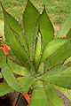
- Nomination Agave Interior --Ram-Man 04:42, 26 November 2014 (UTC)
- Promotion Good quality. --Poco a poco 19:31, 26 November 2014 (UTC)
-

- Nomination Light traces of a carousel, Viktorkirmes in Dülmen, North Rhine-Westphalia, Germany --XRay 04:36, 26 November 2014 (UTC)
- Promotion Good quality. --Jacek Halicki 10:12, 26 November 2014 (UTC)
-
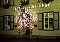
- Nomination Old Pharmacy, Recklinghausen, North Rhine-Westphalia, Germanys --XRay 04:36, 26 November 2014 (UTC)
- Promotion Good quality. --Jacek Halicki 10:12, 26 November 2014 (UTC)
-

- Nomination Catawissa Mountain. Jakec 00:53, 26 November 2014 (UTC)Good quality.--Famberhorst 05:55, 26 November 2014 (UTC)
- Promotion {{{2}}}
-

- Nomination At Tsu Castle --663highland 00:43, 26 November 2014 (UTC)
- Promotion Good quality.--Famberhorst 05:58, 26 November 2014 (UTC)
-

- Nomination At Yagyu Iris Garden --663highland 00:43, 26 November 2014 (UTC)
- Decline At shallow depth of field. It would be better to cut the picture in the middle or switch to a lower angle. --Steindy 23:10, 26 November 2014 (UTC)
-

- Nomination At Grand Front Osaka --663highland 00:43, 26 November 2014 (UTC)
- Promotion Good quality. --Steindy 23:10, 26 November 2014 (UTC)
-

-

- Nomination Porto Palermo Castle, Albania --Pudelek 23:01, 25 November 2014 (UTC)
- Promotion Support QI --Rjcastillo 13:24, 26 November 2014 (UTC)
-
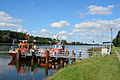
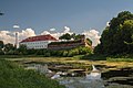
- Nomination Impressions of the pilot station Rüsterbergen the Kiel Canal --Nightflyer 22:33, 25 November 2014 (UTC)
- Promotion Good quality. --Steindy 20:40, 26 November 2014 (UTC)
-

- Nomination Dome of Saint Peter in the afternoon --Livioandronico2013 22:23, 25 November 2014 (UTC)
- Promotion Good quality.--Famberhorst 06:01, 26 November 2014 (UTC)
-

-

-

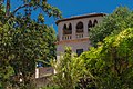
- Nomination A house in the Generalife, Granada, Andalusia, Spain.--Jebulon 20:40, 25 November 2014 (UTC)
- Promotion Good quality. --Berthold Werner 07:47, 26 November 2014 (UTC)
-
- Nomination The Generalife Palace, detail, Granada, Andalusia, Spain.--Jebulon 20:37, 25 November 2014 (UTC)
- Promotion Good quality. --Berthold Werner 07:47, 26 November 2014 (UTC)
-

- Nomination Cartucho Tricolor HP122 --Ezarate 20:32, 25 November 2014 (UTC)
- Decline Sorry, the exposure time of this photo was not properly adjusted. During postprocessing, you raised artefacts and colour noise. For a high-key photo, there is too much background. For a gradient background there is too much blown out. --Cccefalon 08:33, 26 November 2014 (UTC)
-

-

-

- Nomination Strahov Stadium, Prague; Detail --Ralf Roletschek 13:04, 25 November 2014 (UTC)
- Promotion
 Oppose
Procedure is to delete the surplus nominations. --Cccefalon 14:35, 25 November 2014 (UTC) Dieser Regelfetischismus macht keinen Spaß. danke für den Fisch. Ich bin weg hier. --~~~~
Now only five images are nominated and this photo is undoubtedly good for QI. --Steindy 21:09, 26 November 2014 (UTC)
-

- Nomination Tampere, Finnland, bicycle sign --Ralf Roletschek 13:04, 25 November 2014 (UTC)
- Promotion
Procedure is to delete the surplus nominations. --Cccefalon 14:35, 25 November 2014 (UTC)
Now only five photos are nominated. Good quality. --Steindy 21:09, 26 November 2014 (UTC)
-

- Nomination Hopsnes lighthouse, Suðurnes, Iceland --Poco a poco 12:24, 25 November 2014 (UTC)
- Promotion This one is perfectly sharp. However, according to the focal distance, a perspective correction should be done. --Cccefalon 13:24, 25 November 2014 (UTC) Done Poco a poco 17:14, 25 November 2014 (UTC)
Good quality. --Cccefalon 08:07, 26 November 2014 (UTC)
-

- Nomination Gobi Desert landscape. Dornogovi Province, Mongolia. --Halavar 11:07, 25 November 2014 (UTC)
The person has red CA Poco a poco 12:39, 25 November 2014 (UTC) Done Thanks, you were right. I uploaded new version. Please take a look again. --Halavar 23:15, 25 November 2014 (UTC) - Promotion Good quality. --Poco a poco 19:32, 26 November 2014 (UTC)
- Nomination Gobi Desert landscape. Dornogovi Province, Mongolia. --Halavar 11:07, 25 November 2014 (UTC)
-

- Nomination View of the city from the Gana's Guest House. Ulan Bator, Mongolia. --Halavar 11:07, 25 November 2014 (UTC)
The buildings on the left are slightly leaning to the left. --JLPC 18:26, 25 November 2014 (UTC) Done New, fixed version uploaded. --Halavar 11:05, 26 November 2014 (UTC)
OK now. --JLPC 16:44, 26 November 2014 (UTC) - Promotion {{{2}}}
- Nomination View of the city from the Gana's Guest House. Ulan Bator, Mongolia. --Halavar 11:07, 25 November 2014 (UTC)
-

- Nomination Sandakan, Sabah, Malaysia: Sculpture "Utan" by Michael Kwa Wei Choon, 2012, permanently installed at Sandakan Harbour Square --Cccefalon 08:41, 25 November 2014 (UTC)
- Promotion There's an aura around the lamp left see note.--Famberhorst 16:30, 25 November 2014 (UTC) Done I made some enhancements. Thank you again. --Cccefalon 18:55, 26 November 2014 (UTC)
Oké.--Famberhorst 19:16, 26 November 2014 (UTC)
-

-

-
-

-

-

-

- Nomination: Headquarters of the German Sparkassen Association, Bonn, Germany (by Hasenläufer).--Leit 14:14, 20 November 2014 (UTC)
- Review Comment Left side is not straight. I left a note. --Halavar 15:56, 20 November 2014 (UTC)
-

- Nomination Green Door Red Bricks Ram-Man 04:32, 20 November 2014 (UTC)
Technically fine, but I find the crop below at the corner of the door is too tight. Do you have more in the raw? -- Slaunger 20:35, 25 November 2014 (UTC)
No. WYSIWYG. Ram-Man 04:44, 26 November 2014 (UTC) - Decline Sorry, the WYSIWYG is not good enough for me for QI, but I think we are in a grey zone here. Feel free to CR for other opinions --Slaunger 22:28, 26 November 2014 (UTC)
- Nomination Green Door Red Bricks Ram-Man 04:32, 20 November 2014 (UTC)
-

-

-

-

-

- Nomination Old town hall, Cologne, North Rhine-Westphalia, Germany --XRay 04:33, 18 November 2014 (UTC) Comment Why crop off the bottom? --Moroder 15:40, 25 November 2014 (UTC)
- Promotion Comment There was a very disturbing construction site. So this crop ist better than the building with this site.--XRay 16:12, 25 November 2014 (UTC) Comment I really hesitate to promote it and will leave that to someone else. I'd prefer then a crop with more emphasis on the second floor and a perspective correction. Cheers --Moroder 17:40, 25 November 2014 (UTC)
I'll accept the reason for the crop because the rest of this image looks great. Perspective fixing is a mixed idea. It can make the image look unnatural. I say, it's just good enough. --Ram-Man 03:44, 27 November 2014 (UTC)
- Nomination Old town hall, Cologne, North Rhine-Westphalia, Germany --XRay 04:33, 18 November 2014 (UTC)
-

- Nomination Holy Cross church, Dülmen, North Rhine-Westphalia, Germany --XRay 04:33, 18 November 2014 (UTC)
- Promotion Both sides are leaning out a bit --Christian Ferrer 05:52, 24 November 2014 (UTC) Fixed Thanks. It's fixed now.--XRay 16:19, 25 November 2014 (UTC) Support --Christian Ferrer 05:56, 26 November 2014 (UTC)
-

- Nomination Pillory in Kłodzko 2 --Jacek Halicki 13:49, 16 November 2014 (UTC)
Not sharp at the top. Mattbuck 18:24, 20 November 2014 (UTC) - Promotion Done--Jacek Halicki 12:57, 21 November 2014 (UTC)
It is by no means perfect, but I think it passes the threshold, just so. --Ram-Man 03:42, 27 November 2014 (UTC)
- Nomination Pillory in Kłodzko 2 --Jacek Halicki 13:49, 16 November 2014 (UTC)


._Locatie,_Hortus_(Haren,_Groningen)_02.JPG)


.jpg)

_IMGP4574_smial_wp.jpg)


.jpg)
.jpg)
.jpg)
.jpg)


._Locatie,_Hortus_(Haren,_Groningen)_02.JPG)


.JPG)


_03.JPG)


.jpg)
.jpg)


,_Kolosseum_--_2013_--_3406.jpg)


.jpg)


.JPG)
.jpg)
.jpg)
.jpg)
Consensual review[edit]
File:Patella_tenuis_tenuis_01.jpg[edit]

- Nomination Shell of a true limpet, Patella tenuis tenuis --Llez 19:57, 26 November 2014 (UTC)
- Promotion
- Oppose Sorry, but the right slice is totally out of focus. --Steindy 20:25, 26 November 2014 (UTC)
- It is not. Please have a close look on the surface structure, the fine lines and the dust particles are completely sharp! Perhaps you got the impression of unsharpness on the first sight, for the inner surface of the shell is very smooth. --Llez 21:27, 26 November 2014 (UTC)
- Sorry, then my flatscreen must have a defect. I see only in the outer region of some structures. --Steindy 22:13, 26 November 2014 (UTC)
- Yes, exactly. We have good visible structures in the periphery, the rest is completety smooth (with some very fine, barely visible lines, the dust particles and and small scratches (white) are completely sharp). Have you ever seen such a shell in reality for comparison? BTW, all views are made by focus stacking, see [1] --Llez 05:47, 27 November 2014 (UTC)
- Okay, when I see these photos, I do not hesitate to withdraw my comment and like to apologize for the misunderstanding. Sorry that I have caused you problems. --Steindy 20:44, 28 November 2014 (UTC)
- Yes, exactly. We have good visible structures in the periphery, the rest is completety smooth (with some very fine, barely visible lines, the dust particles and and small scratches (white) are completely sharp). Have you ever seen such a shell in reality for comparison? BTW, all views are made by focus stacking, see [1] --Llez 05:47, 27 November 2014 (UTC)
- Sorry, then my flatscreen must have a defect. I see only in the outer region of some structures. --Steindy 22:13, 26 November 2014 (UTC)
- It is not. Please have a close look on the surface structure, the fine lines and the dust particles are completely sharp! Perhaps you got the impression of unsharpness on the first sight, for the inner surface of the shell is very smooth. --Llez 21:27, 26 November 2014 (UTC)
- Support It really looks like out of focus but I believe in Llez, who in an expert on these creatures... Alvesgaspar 18:28, 27 November 2014 (UTC)
- Support Out of focus??? is better that you change monitor! In my 27 inches is absolutely perfect! Llez is perfect as always. --Livioandronico2013 07:49, 28 November 2014 (UTC)
- Support OK for me. Yann 09:41, 28 November 2014 (UTC)
- Support Good quality. --Steindy 20:44, 28 November 2014 (UTC)
- Thanks! --Llez 21:33, 28 November 2014 (UTC)
I promote it as the only opponent withdrew --Livioandronico2013 23:02, 28 November 2014 (UTC)
File:Rheinberg,_St._Peter,_2014-08_CN-15.jpg[edit]

- Nomination Organ gallery in the Catholic Saint Peter Church in Rheinberg --Carschten 15:14, 14 November 2014 (UTC)
- Promotion
- See my two annotations please --Cccefalon 21:53, 14 November 2014 (UTC)
- Done --Carschten 11:18, 18 November 2014 (UTC)
- I don't like the crop - there's too much at the bottom for it to be of the organ, but too little to be a general shot. Mattbuck 18:05, 20 November 2014 (UTC)
- Oppose Completely unnatural equalization in an effort to get the vertical lines vertical. In addition, the window is toal outshines top left. --Steindy 21:07, 20 November 2014 (UTC
- Support. Good quality for me! Don't forget that we here have not to vote about featured images and please discuss. -- Spurzem 22:54, 20 November 2014 (UTC)
- Half Support The (lack of) crop is fine, sometimes I like a little context to my images. But the angle is very awkward, causing a rather distracting perspective. But the base quality is very good: sharp, good exposure, excellent color balance, and perhaps most importantly, it's illustrative. It has the look of a downsampled image, but the EXIF is missing (intentionally?). If so, the original full size image should be uploaded, even if it leads to inevitable opposes. -- Ram-Man 04:50, 21 November 2014 (UTC)
- Support This is fine to me although I would prefer it cropped in the bottom. Alvesgaspar 13:54, 22 November 2014 (UTC)
Total: 3 support (excluding the nominator), 1 oppose →  Promoted --Livioandronico2013 13:43, 28 November 2014 (UTC)
File:USO-CAB_-_20131130_-_Régis_Lespinas.jpg[edit]

- Nomination USO-CAB - 20131130 - Régis Lespinas --Pleclown 11:32, 14 November 2014 (UTC)
- Promotion
- Support Nice pregame portrait-he keeps our attention despite the guy behind him --Daniel Case 04:33, 19 November 2014 (UTC)
- Oppose Not accessible sufficiently sharp and especially to strong noise. --Steindy 20:57, 20 November 2014 (UTC)
- Weak Support
{{neutral}} This is a borderline image, so I'm going to think about this.I agree that the composition is unusual in that the person in the background is not very distracting. The resolution is not high and the noise level approaches unacceptable, but that is not atypical for this type of "sports photography", so I think it might just be fine. Ram-Man 04:54, 21 November 2014 (UTC) - Support --Livioandronico2013 11:55, 21 November 2014 (UTC)
- Oppose Very small (I assume a downsampling), very noisy, chromatic noise in the hair, sharpness beyond the limit IMO.--Jebulon 10:59, 22 November 2014 (UTC)
- Oppose Poor quality and composition. Alvesgaspar 13:58, 22 November 2014 (UTC)
- Support Noise and size acceptable for sports photography. (I remember PierreSelim's comment in an earlier FPC.) Jkadavoor 03:07, 23 November 2014 (UTC)
- Oppose Noise reduction has gone too far imo. I prefer more noise with a bit more sharpness. Very slight CA. -Kadellar 12:17, 24 November 2014 (UTC)
- Support For QI enough.--Hubertl 12:57, 25 November 2014 (UTC)
- Support For QI enough.--Ralf Roletschek 13:03, 25 November 2014 (UTC)
Total: 6 support (excluding the nominator), 4 oppose → Promoted --Livioandronico2013 13:42, 28 November 2014 (UTC)
File:Nottingham railway station MMB 12 158842.jpg[edit]

- Nomination 158842 at Nottingham. Mattbuck 07:53, 17 November 2014 (UTC)
- Promotion
- I like the idea (would have cropped a bit tighter, though), but I think it's not sharp enough. --El Grafo 10:52, 19 November 2014 (UTC)
- Seems fairly sharp to me - you can read the unit code quite clearly. --Mattbuck 18:29, 20 November 2014 (UTC)
- Oppose Dark,sky overexposed,CA,noise --Livioandronico2013 20:07, 20 November 2014 (UTC)
- It's not overexposed as it's not #FFFFFF. I can't see any CA even on zooms over 300% and it's actually remarkably not noisy. Mattbuck 23:43, 20 November 2014 (UTC)
- For me is as above....the rest are words... --Livioandronico2013 08:58, 21 November 2014 (UTC)
- It's not overexposed as it's not #FFFFFF. I can't see any CA even on zooms over 300% and it's actually remarkably not noisy. Mattbuck 23:43, 20 November 2014 (UTC)
 Neutral Neither do I see CAs, nor is there any noise. The sky isn't blown out as well. But I'm not sure whether the composition is ok for QI or not since most of the picture is nothing but pure black. Anyway I think I am not experienced enough to make a clear decision. It would be interesting to hear the opinions of some of the QI-regulars here. --Code 18:10, 21 November 2014 (UTC)
- Support I've been hesitant to weigh in and cast a vote because it is so different than the typical images we see. At first glance the clarity isn't great, there is a lot of "dead space", and I wanted to reject out of hand. But not all photos have to have the same technical and compositional attributes. This image is really about the lighting. You get the glow on the train, the glow on the tracks, the glow from the lights in the tunnel, and the glow off the building. It's actually quite a thematic image and visually aesthetic. Why can't an image show it's subject primarily through light instead of detail? It is a very impressive use of light, and regardless of the outcome of this vote for QI purposes, I want to compliment the photographer for a superb job. -- Ram-Man 18:32, 21 November 2014 (UTC)
- Neutral -- I can't oppose this pciture because I like it a lot although I recognize that image quality in on the poor size: little detail probably caused by an agreessive de-noising? Alvesgaspar 14:02, 22 November 2014 (UTC)
- No, just an older camera. Mattbuck 16:51, 22 November 2014 (UTC)
- Support interesting. --Ralf Roletschek 12:26, 24 November 2014 (UTC)
- Support I see some noise, but not disturbing, some oversharpening, big black areas, and an interesting contre-jour photo. -- Smial 15:51, 25 November 2014 (UTC)
- Support As Smial, Roletschek and Ram-Man. It is not overexposed! --Hubertl 14:16, 26 November 2014 (UTC)
Total: 4 support (excluding the nominator), 1 oppose → Promoted --Livioandronico2013 13:41, 28 November 2014 (UTC)
File:St._Verena_in_Rotwand_Ritten_Westansicht.jpg[edit]

- Nomination: St. Verena in Rotwand church in Ritten. --Moroder 21:11, 16 November 2014 (UTC)
- Review
- Comment Perspective correction is needed. --Halavar 22:08, 16 November 2014 (UTC)
- Done Thanks for the hint. The cross is tilted. Regards --Moroder 18:18, 19 November 2014 (UTC)
- OpposeNot really crisp enough IMO. Mattbuck 18:24, 20 November 2014 (UTC)
- Support I do not agree. QI for me --Halavar 22:44, 20 November 2014 (UTC)
- Support Unlike many other building shots, this has perfect lighting/exposure/dynamic range, proper depth of field, it's sharp, and the composition is slightly interesting. It looks good even at 100%. As for the perspective I wouldn't mind if the cross were straight, but it's the only thing I don't care for in the image. Ram-Man 03:35, 21 November 2014 (UTC)
- Support Very good. For me, the first version was better, because it corresponded to the natural vision. --Steindy 21:51, 21 November 2014 (UTC)
- Oppose too strong distortet. --Ralf Roletschek 12:46, 25 November 2014 (UTC)
- Support Sharp, no disturbing artifacts. @Ralf: Gegenüber anderen Entzerrversuchen ist das hier aber mal noch durchaus im Rahmen. Mit einer Shiftlinse oder einem waagerecht gehaltenen 17er (unten dann entsprechend viel abschneiden für denselben Bildausschnitt) sähe das ganz ähnlich aus. Du weißt, daß mich zwanghaftes Senkrechtzwingen ebenfalls nervt, aber hier geht es wirklich noch. -- Smial 16:06, 25 November 2014 (UTC)
- Oppose I find, with Ralf, that the bell tower perspective is overcorrected and this make the picture looking unnatural.--Jebulon 22:11, 25 November 2014 (UTC)
 Question What is "overcorrected" and what does "overcorrected" mean? --Moroder 13:33, 26 November 2014 (UTC)
- Comment Overcorrecting means straightening the verticals on every expense. With images taken from small distances, this usually leads to distorted proportions in other respects. --Kreuzschnabel 22:51, 27 November 2014 (UTC)
- Oppose Per Jebulon --Livioandronico2013 23:36, 25 November 2014 (UTC)
Total: 4 support (excluding the nominator), 4 oppose →  Inconclusive result after 8 consensual review days --Livioandronico2013 13:39, 28 November 2014 (UTC)
File:Mongolskie_zapasy_na_lokalnym_festiwalu_Naadam_(10).jpg[edit]
.jpg)
- Nomination Traditional Mongolian wrestling during the local Naadam festival. Kharkhorin, Övörkhangai Province, Mongolia. --Halavar 11:19, 13 November 2014 (UTC)
- Promotion Support Good quality. --Pleclown 12:39, 18 November 2014 (UTC)
White balance needs adjustment. --Mattbuck 07:47, 19 November 2014 (UTC) Done New, fixed version uploaded. --Halavar 22:38, 19 November 2014 (UTC) - Support Nice --The Photographer 12:52, 26 November 2014 (UTC)
Total: 2 support (excluding the nominator), 0 oppose → Promoted --Livioandronico2013 12:17, 27 November 2014 (UTC)
File:Mongolskie_zapasy_na_lokalnym_festiwalu_Naadam_(12).jpg[edit]
.jpg)
- Nomination The judges and viewers. Traditional Mongolian wrestling during the local Naadam festival. Kharkhorin, Övörkhangai Province, Mongolia. --Halavar 11:19, 13 November 2014 (UTC)
- Promotion Support Good quality. --Pleclown 12:39, 18 November 2014 (UTC)
The white balance is not correct here - everything's green/yellow. --Mattbuck 07:47, 19 November 2014 (UTC) Done New, fixed version uploaded. --Halavar 22:38, 19 November 2014 (UTC) - Support Its QI IMHO --The Photographer 08:41, 26 November 2014 (UTC)
Total: 2 support (excluding the nominator), 0 oppose → Promoted --Livioandronico2013 12:12, 27 November 2014 (UTC)
File:Belinskogo_Bridge_SPB_01.jpg[edit]

- Nomination Belinskogo Bridge in Saint Petersburg --Florstein 20:33, 17 November 2014 (UTC)
- Promotion
- Oppose Combination of bad foreground lighting and wires obstructing the best part. --Ram-Man 01:42, 19 November 2014 (UTC)
- Wat? No-no, you have mistaken, it's not FPC, I require the arbitral tribunal. :) --Florstein 19:38, 19 November 2014 (UTC)
- Ha, funniest thing I heard all day! It's true that I may emphasize composition more than some others, so let's see what they say. Incidentally, this is an example where the red-channel clipping is unimportant. Ram-Man 20:44, 19 November 2014 (UTC)
- Wat? No-no, you have mistaken, it's not FPC, I require the arbitral tribunal. :) --Florstein 19:38, 19 November 2014 (UTC)
- The lighting in my opinion is unbalanced and the image seems to be a bit pressed. -- Spurzem 21:48, 19 November 2014 (UTC)
- Support Extreme wide angle perspetive is a bit irritating, but quality is acceptable. -- Smial 15:27, 21 November 2014 (UTC)
- Support --Ralf Roletschek 12:47, 25 November 2014 (UTC)
- Support A very nice image, highly evocative of Saint Petersburg. The wires are not a problem - there are lots of trams and trolleybuses in Saint Petersburg - and I think in any case they assist with the composition. I also like the wide angle look. --Bahnfrend 12:33, 26 November 2014 (UTC)
Total: 3 support (excluding the nominator), 1 oppose → Promoted --Livioandronico2013 12:11, 27 November 2014 (UTC)
File:Zespół_klasztoru_Gandan_(01).jpg[edit]
.jpg)
- Nomination Gateway. Gandantegchinlen Monastery, Ulan Bator, Mongolia. --Halavar 20:23, 17 November 2014 (UTC)
- Promotion
- Support Good quality. --Jacek Halicki 20:25, 17 November 2014 (UTC)
- Oppose tilt, tight crop.--Jebulon 21:09, 17 November 2014 (UTC)
- Oppose per Jebulon --Kreuzschnabel 18:07, 18 November 2014 (UTC)
- Support Nice facade detail. -- Smial 13:07, 19 November 2014 (UTC)
- I agree, but here we are talking about technical qualities of pictures, not beauty of subjects.--Jebulon 00:27, 21 November 2014 (UTC)
- Yes, of course. The detail is very well depicted with good sharpness, colours and lighting. So we see nice facade details. If I want to show a detail, I do not need to show the complete thing. And I do not need to do a perspectivic correction if I want to show a special perspective. My special view as a photographer would be broken then. -- Smial 15:15, 21 November 2014 (UTC)
- I agree, but here we are talking about technical qualities of pictures, not beauty of subjects.--Jebulon 00:27, 21 November 2014 (UTC)
- Support per Smial. --Ram-Man 20:55, 19 November 2014 (UTC)
- Oppose per Jebulon. --Kadellar 13:14, 24 November 2014 (UTC)
- Support --Ralf Roletschek 12:48, 25 November 2014 (UTC)
- Oppose per Jebulon.--Lmbuga 14:45, 25 November 2014 (UTC)
- Support Ok, a thight crop. Still an QI. I absolutely agree Smial. -- DerFussi 09:17, 27 November 2014 (UTC)
- Support OK for me. Yann 18:17, 28 November 2014 (UTC)
Total: 6 support (excluding the nominator), 4 oppose → Promoted --Livioandronico2013 12:08, 27 November 2014 (UTC)
File:Dülmen,_Heilig-Kreuz-Kirche_--_2014_--_2781.jpg[edit]

- Nomination Holy Cross church, Dülmen, North Rhine-Westphalia, Germany --XRay 04:37, 13 November 2014 (UTC)
- Decline Distortion and CA at upper right; sky seems overexposed --Daniel Case 05:30, 17 November 2014 (UTC) Fixed Thanks for your review. Distortion and CAs are fixed.--XRay 16:47, 17 November 2014 (UTC)
- Oppose I don’t like the strong distortion of the tower, sorry. --Kreuzschnabel 06:13, 20 November 2014 (UTC)
- Oppose as per Kreuzschnabel. Yann 13:18, 21 November 2014 (UTC)
- Oppose too strong distortet --Ralf Roletschek 12:28, 24 November 2014 (UTC)
Total: 0 support (excluding the nominator), 3 oppose →  Declined --Livioandronico2013 12:01, 26 November 2014 (UTC)
File:2014_Żelazno,_Kościół_św._Marcina_02.JPG[edit]

- Nomination Church of Saint Martin in Żelazno 1 --Jacek Halicki 18:25, 10 November 2014 (UTC)
- Promotion
- Oppose I've looked at this four times. There are so many noisy shadow areas, the lighter areas are not tack sharp. It's underwhelming. Ram-Man 03:22, 16 November 2014 (UTC)
- I disagree, please discussion --Jacek Halicki 23:25, 17 November 2014 (UTC)
- Comment The sky looks unnatural indeed. This may in this case be the result of a low JPEG quality. Can you upload another version with better JPEG quality settings? --Code 10:17, 18 November 2014 (UTC)
- Support. QI! It is the lack of many good photos that colors are more beautiful than in reality. But this is no reason to decline. Further I can not see that the image would be too noisy. -- Spurzem 18:42, 19 November 2014 (UTC)
- Support Per Spurzem--Livioandronico2013 21:57, 19 November 2014 (UTC)
- Support --Ralf Roletschek 12:29, 24 November 2014 (UTC)
Total: 3 support (excluding the nominator), 1 oppose → Promoted --Livioandronico2013 12:00, 26 November 2014 (UTC)
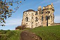
File:Schloss_Pottendorf_-_view_heading_west.jpg[edit]

- Nomination Ruins of palace Pottendorf and chapel. View heading west. --Herzi Pinki 22:34, 9 November 2014 (UTC)
- Decline
- Oppose Distracting foreground elements. --Ram-Man 00:13, 11 November 2014 (UTC)
- Support I disagree, for me QI --Hubertl 13:49, 11 November 2014 (UTC)
- Support I think the composition is acceptable. --Code 18:26, 13 November 2014 (UTC)
- Oppose nice, but unsharp. --Carschten 15:39, 14 November 2014 (UTC)
- Oppose Nice composition but unsharp Alvesgaspar 17:43, 15 November 2014 (UTC)
- Support The sharpness could be better, but it is acceptable for QI. However, there are two sensor spots to eliminate. --Steindy 01:41, 20 November 2014 (UTC)
- Oppose Blown sky, posterizing clouds, and most of the subject is unsharp. Sorry, I don’t think it was possible to take a QI by single shot in this lighting. --Kreuzschnabel 08:44, 21
November 2014 (UTC)
- Oppose Per Kreuzschnabel --Livioandronico2013 23:37, 25 November 2014 (UTC)
Total: 3 support (excluding the nominator), 5 oppose → Declined --Livioandronico2013 11:58, 26 November 2014 (UTC)