File talk:Emblem of Yugoslavia (1963–1992).svg
 | This file was nominated for deletion on 10 November 2012 but was kept. If you are thinking about re-nominating it for deletion, please read that discussion first. |
Source[edit]
National emblem on some printed materials from Yugoslavia:
- http://img76.imageshack.us/img76/2905/staripasoshq0.jpg
- http://img116.imageshack.us/img116/2281/lkisecakjd0.jpg
- http://www.ebay.com/itm/Yugoslavia-Order-of-military-merit-with-silver-swords-Document-/230855761379?pt=LH_DefaultDomain_0&hash=item35c0135de3
- http://www.ebay.com/itm/Yugoslavia-Order-of-Labor-with-Silver-Wreath-Original-document-/230834489288?pt=LH_DefaultDomain_0&hash=item35becec7c8
- http://www.ebay.com/itm/YUGOSLAVIA-REGISTRATION-CARD-FOR-ANIMAL-DRAWN-VEHICLE-/160515962353?pt=LH_DefaultDomain_0&hash=item255f7f35f1
- http://fc03.deviantart.net/fs32/f/2008/228/6/4/banknotes___YUGOSLAVIA_no_1_by_gapystock.jpg
- http://i-collect-it.com/images/paper%20money/Yugoslavia/Yugoslavia%2050%20Dinara%201990.300dpi.jpg
- http://www.coin-banknote.com/images/wholesale100pcs/europe/cc032.jpg
Ericmetro (talk) 17:54, 6 October 2012 (UTC)
I based the version I drew on a photograph of the design of the official arms of the SFRY, banknote versions of the arms varied[edit]
As said above, the version I drew is based on a photograph of the official arms of the SFRY. There are multiple variations and renditions of coats of arms, just because it is used on a banknote, it does not mean that that is the sole rendition of the arms. I support the version I designed because it was based upon a photograph of the design of the coat of arms. If you disagree, upload a separate version of the coat of arms in a new image file.--R-41 (talk) 01:53, 15 October 2012 (UTC)


- To show the artistic variations of coat of arms used on banknotes, here are two examples of Yugoslav bank notes with a completely different design of the coat of arms than the one designed by the user Ericmetro.
- I agree that banknotes are not sole renditions of the arms, and there should not be any artistic variation on the national emblem. Actually the previous version is based on several sources besides banknotes, which I'll list them in the next section.
- In my opinion, the differences of the emblem on the 1968 and 1986 banknotes with the previous one are the radiant background and the round kernels, these two details are the artistic variations. Other details such as the fire and the oval shape were accordant with the previous one.
- The current version seems to be based on this picture: File:Coat_of_arms_of_the_Socialist_Federal_Republic_of_Yugoslavia.png, it's a picture from World Intellectual Property Organization website. However, there seems to be no information to indicate this is the official layout from Yugoslavia government.
- And please notice the red star on that picture. From the technical view the star seems to be added by computer but not printed. Therefore I doubt if this version is original and official. By the way there seems to be no other sources support this design, the picture seems to be a sole source.
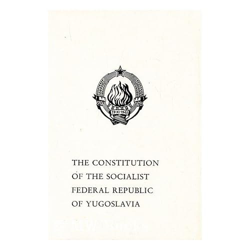
Emblem on the Constitution and other sources[edit]

published by The Secretariat of the Federal Assembly Information Service Begrade: (N.P.); 1St Edition edition (1974)
To make the emblem accord with historical facts, I suggest we find some realiable source issued by Yugoslavian government at that time, and we should select the one that most sources supported, and less artistic variations on that version.
From the Constitution of Yugoslavia, we can see the previous version is used:
Source:
- The Constitution of the Socialist Federal Republic of Yugoslavia
- Publisher: The Secretariat of the Federal Assembly Information Service
- Begrade: (N.P.); 1St Edition edition (1974) [1]
Another source:
* [2] (From Google book:[3])
There're also other sources (by the Yugoslavian government) supporting this version, as to prove this is not a sole source.
From these sources below, we could find these features in common, which are what the current version lacks:
- Shape: An oval emblem.
- The shape of the wheat and the banner: The wheat becomes narrower (stair-step style) near the star. Also the thin banner and the font.
- The style of the fire: A carving style fire.
-
 Passport Cover
 -
 Passport Cover
 -
 Fuel voucher
 -
 On Yugoslav Air Force logo.
 -
 Coins
Coins -
 Passport background
 -
 Passport first page
 -
 Diplomatic Passport of Josip Broz Tito
 -
 Government stamp


.png)
-- Ericmetro (talk) 05:46, 16 October 2012 (UTC)
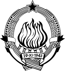
The coat of arms currently used on the page for SFRJ is wrong! It is the original coat of arms from 1943 but is NOT the OFFICIAL coat of arms that I have known all my life. This coat of arms is the correct one as it is the one that displays 6 DISTINCT FLAMES that represent 6 Socialist Republics that make up SFRJ, i.e. Slovenia, Hrvatska, Bosna i Hercegovina, Srbija, Crna Gora & Makedonija. The older coat of arms does not display 6 distinct flames. Also wheat should be blocky and more geometric in shape and both sides of the ribbon end with a "serif" (a bit of a flutter at each end). I do not know how to manipulate wikipedia to put the file back to the way it was prior to 2nd November 2012 so someone please do. Next time I see someone uploading the incorrect file I will report them to the wikimedia editors.
This edit war needs to stop, now![edit]
It's really getting ridiculous. Obviously neither version is fully satisfactory or accurate, so what I suggest is we combine the best aspects of both. On this version, the flames, torches, and overall more oval shape is superior, but it's banner, date, and wheat sheafs leave something to be desired. The star needs to be fixed to be a properly alligned star, right now it's a little odd as well. On the older version, the wheat isn't really that much better, but I would suggest making a completely new wheat modeled off it and some of the other options available. This is the only way this is gonna stop. Fry1989 eh? 18:40, 16 October 2012 (UTC)
- Thank you - Maybe indeed it's time for us to sit down and have some consensus on this topic for now. : ) However I'm not sure if we need to combine some features of the old design into this new one. Combination would be a good solution for the issue which both sides have sufficient and realiable sources, and they can not decide which one is more superior. (As in the case of File_talk:Coat_of_arms_of_Bulgaria_(1971-1990).svg, both sides have realiable sources showing the emblem in darker and lighter color, therefore they picked up a combined version for the emblem).
- However, in this case, personally I think is a little bit different. There seems to be only one sole source for the older version:
- File:Coat_of_arms_of_the_Socialist_Federal_Republic_of_Yugoslavia.png, and I doubt it's accurancy as the red star was added by computer later but not printed in the original material (I think if it's official they won't make such a obvious mistake, and no sources to prove it was from Yugoslavian government). The design of the wheat looks like borrowed from COA of SR Slovenia. And except for that graph, no other sources support that version. While we have abundant sources support the newer version. With only one sole source on one side and numerous sources on the other side, in such a case I think it is possible for us to decide which one is the appropriate version.
- Well maybe the wheat and banner doesn't look good in our eyes, but I don't know ... shouldn't we edit according to original sources? I took a close view of the emblem on the Constitution and found the wheat seemed to have sharp corner in the original design as the new version shows. But I agree that we could have some slight adjustment on the numbers and other small details. The size of the number could be unified, as the number 3 seems to be a bit smaller. -- Ericmetro (talk) 17:12, 17 October 2012 (UTC)
- Ericmetro, I created an SVG version of this File:Coat_of_arms_of_the_Socialist_Federal_Republic_of_Yugoslavia.png, assuming that User:Rainman had put the computerized red star over some blurred image or something. However when that link was available online, and when I did view it, I realized that User:Rainman for some bizarre reason decided to obscure the real version of the star, that looks more like the star in your version. I just haven't bothered yet to correct it yet, as I would have to correct several images as well that have the coat of arms on it. So you are correct, User:Rainman's edited version with the computerized star is inaccurate as the original version shown on WIPO doesn't display it that way. However, WIPO means the World Intellectual Property Organization, and that image is the original and official version designed by Đorđe Andrejević Kun and Antun Augustinčić as recorded on WIPO. The version that you have shown appears to be a stylized version of it.--R-41 (talk) 23:40, 19 October 2012 (UTC)
Uploaded this as the stamp version of the Emblem of SFR Yugoslavia. It appears to be a stylized rendition of the version recorded on WIPO as being designed by Đorđe Andrejević Kun and Antun Augustinčić. - I have not yet seen a single example of Ericmetro's version done in the full colours as shown on the one on WIPO. Upon review, it clearly seems to be a stamp version used for government documents, including passports. Thus I have uploaded it in black and white as a stamp version and put it on the Emblem of Yugoslavia article. It is based upon the original version that I drew an SVG version of, as recorded on WIPO as designed by Đorđe Andrejević Kun and Antun Augustinčić. As I mentioned, the star of the version I drew based on the one on WIPO was drawn over by User:Rainman for some bizarre reason, when I did look at the one available to be seen on WIPO, the star's shape looked the same as the stamp version. So I will redesign it. Evidence needs to be presented that the other version that Ericmetros' supports has been used in full colour.--R-41 (talk) 17:41, 20 October 2012 (UTC)
- The only thing that's good about the current version is the torches and flames. Everything else either needs to be fixed or redone. The star is a bit uneven, that can be fixed, the wheat and banner and words need a complete redo, they're horrible. The more ovoid shape is also more desirable. I stand by this assessment. Fry1989 eh? 17:57, 20 October 2012 (UTC)
.svg)
.svg&action=edit§ion=1)
.svg#c-Ericmetro-2012-10-06T17:54:00.000Z-Source)
.svg&action=edit§ion=2)
.svg#c-R-41-2012-10-15T01:53:00.000Z-I_based_the_version_I_drew_on_a_photograph_of_the_design_of_the_official_arms_of)
.svg#c-Ericmetro-2012-10-16T05:41:00.000Z-I_based_the_version_I_drew_on_a_photograph_of_the_design_of_the_official_arms_of)
.svg&action=edit§ion=3)
.svg#c-Ericmetro-2012-10-16T05:46:00.000Z-Emblem_on_the_Constitution_and_other_sources)
.svg&action=edit§ion=4)
.svg#c-Fry1989-2012-10-16T18:40:00.000Z-This_edit_war_needs_to_stop,_now!)
.svg)
.svg#c-Ericmetro-2012-10-17T17:12:00.000Z-Fry1989-2012-10-16T18:40:00.000Z)
.svg#c-R-41-2012-10-19T23:40:00.000Z-Ericmetro-2012-10-17T17:12:00.000Z)
.svg#c-R-41-2012-10-20T17:41:00.000Z-Ericmetro-2012-10-17T17:12:00.000Z)
.svg#c-Fry1989-2012-10-20T17:57:00.000Z-R-41-2012-10-20T17:41:00.000Z)

- The wheat leaves on the version I based my version on from WIPO need to be redone, I admit they look terrible the way I drew them. If the stamp version's wheat leaves are drawn the way it is drawn, then that is the way it is drawn for that version - redrawing it would misrepresent that version. As for my version based on that on WIPO, perhaps using the wheat leaves on the SVG version of the SR Croatia arms would be the best choice. I based the design that I drew on the official version recorded on WIPO, and the torches appear that way whether you or I like it or not, that is how Đorđe Andrejević Kun and Antun Augustinčić designed them, and my stance is to replicate their version as has been recorded on WIPO.--R-41 (talk) 18:38, 20 October 2012 (UTC)
.svg#c-R-41-2012-10-20T18:38:00.000Z-This_edit_war_needs_to_stop,_now!)
- At first I was not sure if the version on WIPO was actually used in Yugoslavia as all the photos I found show a oval version emblem. However when I searched some flags with the emblem, I realized both versions were used in Yugoslavia. It seems the emblem on flags tend to use the round version:
- Presidential Flag (Zastava predsjednika Republike / Titova zastava):
- Flag of Minister of Defence:
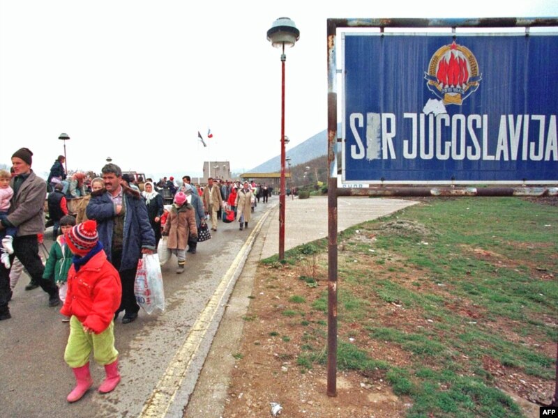
- While in other cases, the oval one with thin banner was used (including 1946-63 version). On printed material the stamp version is often used. On signs, medals, coins the thin banner is kept and the flame varies. Users from former Yugoslavia seemed to be more familar with the oval version as the round version was seldom seen beside flags.
- http://commons.wikimedia.org/wiki/File:Jugoslavia_1_dinaro.JPG
- http://www.ebay.com/itm/YUGOSLAVIA-SERBIA-EARLY-POLICE-BORDER-BREAST-BADGE-/150916470548?pt=LH_DefaultDomain_0&hash=item2323529714
- http://gdb.rferl.org/323730C7-767B-4BCD-8C13-83B8EFCDCFB6_mw800_s.jpg
- http://edition.cnn.com/WORLD/europe/9904/07/kosovo.refugees.02/link.border.crossing.jpg
- http://www.flickr.com/photos/borderfilms/15101371/
- http://www.zou114.com/sjgq/images/20021025881400.jpg
- http://img.timeinc.net/time/magazine/archive/covers/1955/1101550606_400.jpg
- Therefore my suggestion is, we could keep both versions. There's no need to modify the emblem on flags and both version can be shown on the Wikipedia page. The historical versions can be list in the related section. -- Ericmetro (talk) 13:42, 21 October 2012 (UTC)
- I don't see that as an acceptable solution. Neither is fully satisfactory right now or else we wouldn't have this dumb edit war, and it will only move on to Wikipedia if we keep one of each. We need to merge the best features of both and make a good file that everyone accepts. Fry1989 eh? 15:35, 21 October 2012 (UTC)
- Nope, we shouldn't merge "the best" of each - that opens a new pandora's box of interpretation and competition of what is "the best". Which one has been patented? The answer is the one I created is based on the one that is recognized on the World Intellectual Property Organization (WIPO). That is the original version as designed by its creators. There are other versions, like the stylized stamp version, and other renditions. But the one I based my SVG design on, has been recorded by WIPO, that is as official and recognized as it is going to get by international institutions regarding a person's patented design.--R-41 (talk) 00:16, 25 October 2012 (UTC)
- That's nonsense, this whole edit war started because people like some things from one and some things from the other. Fry1989 eh? 18:08, 25 October 2012 (UTC)
- What you're advocating is nonsense, you are advocating some political-style compromise to an issue that is swiftly resolved by merely observing the World Intellectual Property Organization's (WIPO) patented version. The edit war is continuing only because an editor is not acknowledging the WIPO patented version. The other version is a variant of it that appears to be used as a stamp version. The WIPO version is the official patented version, period.--R-41 (talk) 02:41, 29 October 2012 (UTC)
- What I am advocating is a viable solution to this stupid edit war and will provide a far better file then either of the two that currently exist. If you don't like that, too bad, but it's what I feel is our best option. Fry1989 eh? 19:30, 5 November 2012 (UTC)
- I and User:DIREKTOR disagree with you. DIREKTOR reverted it. This "stupid edit war" that you call it, started because someone did not simply observe the World Intellectual Property Organization's (WIPO) patented version, that is the fact of the matter. You are getting too frustrated about this and looking for a political-style compromise which is inappropriate given that WIPO has recorded a patented version of the emblem. You say your proposal would provide a "far better file" - that is your opinion, and it would be an original creation - not representing the artistic works of the people who designed either of the versions. There are disputes where one side wins in spite of all the complaints by the other side, WIPO records the version that I based my design on. Thus, the best option is following the internationally-patented version as recorded by WIPO - that is an official international recognition of the design by its original designers.--R-41 (talk) 16:48, 6 November 2012 (UTC)
- You can disagree with me all you want, it won't stop me from stating my opinion, so get over it. Fry1989 eh? 19:25, 6 November 2012 (UTC)
- Calm down.--R-41 (talk) 01:02, 10 November 2012 (UTC)
- I am calm. Fry1989 eh? 01:12, 10 November 2012 (UTC)
- Calm down.--R-41 (talk) 01:02, 10 November 2012 (UTC)
- You can disagree with me all you want, it won't stop me from stating my opinion, so get over it. Fry1989 eh? 19:25, 6 November 2012 (UTC)
- I and User:DIREKTOR disagree with you. DIREKTOR reverted it. This "stupid edit war" that you call it, started because someone did not simply observe the World Intellectual Property Organization's (WIPO) patented version, that is the fact of the matter. You are getting too frustrated about this and looking for a political-style compromise which is inappropriate given that WIPO has recorded a patented version of the emblem. You say your proposal would provide a "far better file" - that is your opinion, and it would be an original creation - not representing the artistic works of the people who designed either of the versions. There are disputes where one side wins in spite of all the complaints by the other side, WIPO records the version that I based my design on. Thus, the best option is following the internationally-patented version as recorded by WIPO - that is an official international recognition of the design by its original designers.--R-41 (talk) 16:48, 6 November 2012 (UTC)
- What I am advocating is a viable solution to this stupid edit war and will provide a far better file then either of the two that currently exist. If you don't like that, too bad, but it's what I feel is our best option. Fry1989 eh? 19:30, 5 November 2012 (UTC)
- What you're advocating is nonsense, you are advocating some political-style compromise to an issue that is swiftly resolved by merely observing the World Intellectual Property Organization's (WIPO) patented version. The edit war is continuing only because an editor is not acknowledging the WIPO patented version. The other version is a variant of it that appears to be used as a stamp version. The WIPO version is the official patented version, period.--R-41 (talk) 02:41, 29 October 2012 (UTC)
- That's nonsense, this whole edit war started because people like some things from one and some things from the other. Fry1989 eh? 18:08, 25 October 2012 (UTC)
- Nope, we shouldn't merge "the best" of each - that opens a new pandora's box of interpretation and competition of what is "the best". Which one has been patented? The answer is the one I created is based on the one that is recognized on the World Intellectual Property Organization (WIPO). That is the original version as designed by its creators. There are other versions, like the stylized stamp version, and other renditions. But the one I based my SVG design on, has been recorded by WIPO, that is as official and recognized as it is going to get by international institutions regarding a person's patented design.--R-41 (talk) 00:16, 25 October 2012 (UTC)
- I don't see that as an acceptable solution. Neither is fully satisfactory right now or else we wouldn't have this dumb edit war, and it will only move on to Wikipedia if we keep one of each. We need to merge the best features of both and make a good file that everyone accepts. Fry1989 eh? 15:35, 21 October 2012 (UTC)
- Therefore my suggestion is, we could keep both versions. There's no need to modify the emblem on flags and both version can be shown on the Wikipedia page. The historical versions can be list in the related section. -- Ericmetro (talk) 13:42, 21 October 2012 (UTC)
.svg#c-Ericmetro-2012-10-21T13:42:00.000Z-R-41-2012-10-20T18:38:00.000Z)
.svg#c-Fry1989-2012-10-21T15:35:00.000Z-Ericmetro-2012-10-21T13:42:00.000Z)
.svg#c-R-41-2012-10-25T00:16:00.000Z-Fry1989-2012-10-21T15:35:00.000Z)
.svg#c-Fry1989-2012-10-25T18:08:00.000Z-R-41-2012-10-25T00:16:00.000Z)
.svg#c-R-41-2012-10-29T02:41:00.000Z-Fry1989-2012-10-25T18:08:00.000Z)
.svg#c-Fry1989-2012-11-05T19:30:00.000Z-R-41-2012-10-29T02:41:00.000Z)
.svg#c-R-41-2012-11-06T16:48:00.000Z-Fry1989-2012-11-05T19:30:00.000Z)
.svg#c-Fry1989-2012-11-06T19:25:00.000Z-R-41-2012-11-06T16:48:00.000Z)
.svg#c-R-41-2012-11-10T01:02:00.000Z-Fry1989-2012-11-06T19:25:00.000Z)
.svg#c-Fry1989-2012-11-10T01:12:00.000Z-R-41-2012-11-10T01:02:00.000Z)
WIPO[edit]
.svg&action=edit§ion=5)
When searching documents of the emblem on WIPO, I found that the image seems to be saved for the Article 6ter of the Paris Convention: Protection of State Emblems, and Names, Abbreviations and Emblems of International Intergovernmental Organizations. ([4]). Some of the countries send images of their national emblem to WIPO for the requirement for 6ter.
Then I found this pdf file: [5]. From the document we can see the Socialist Federal Republic of Yugoslavia government sent their emblem to WIPO. Well then if the previous image was sent by SFRY government itself to WIPO, I think maybe we can take that for the main usage. As the variation version seems to be commonly seen in SFRY period on printed material, I suggest we show that image below, as what is like on English Wikipedia now.
By the way, I found the WIPO 6ter searching tool [6] is quite handy. Selecting the country list in "State" and we can easily find some regulations on WIPO like this: [7] [8] [9]. --Ericmetro (talk) 10:19, 13 November 2012 (UTC)
.svg#c-Ericmetro-2012-11-13T10:19:00.000Z-WIPO)
.svg&oldid=539679245)