User talk:JoeSchlabotnik
|
Our first steps tour and our frequently asked questions will help you a lot after registration. They explain how to customize the interface (for example the language), how to upload files and our basic licensing policy (Wikimedia Commons only accepts free content). You don't need technical skills in order to contribute here. Be bold when contributing and assume good faith when interacting with others. This is a wiki. More information is available at the community portal. You may ask questions at the help desk, village pump or on IRC channel #wikimedia-commons (webchat). You can also contact an administrator on their talk page. If you have a specific copyright question, ask at the copyright village pump. |
|
-- Wikimedia Commons Welcome (talk) 15:11, 9 August 2014 (UTC)
File:Canadian Federal Election Cartogram 2019.svg[edit]
Hi, Equal-area maps are much more adequate than other maps to present election results, so I'm glad to see that you made this file and I thank you for it. However, why do you use seven hexagons per riding? The map would be more understandable and prettier with the usual one hexagon per riding, don't you think? -- Asclepias (talk) 15:27, 22 October 2019 (UTC)
- @Asclepias: Thank you for your encouragement and constructive suggestions.
- The reason for using seven hexagons was to address a shortfall found in similar cartograms that others have published. It is impossible using a single shape to place the ridings so that ridings which share a border in real life usually share a border in the cartogram. The one I have published is also not perfect in this regard, but it gets about 90% there. Also, using a single shape doesn't give you the flexibility to get that "stretching effect" found in shape-warping contiguous cartograms which illustrates how the population concentrated in urban areas is surrounded by different voting behaviour in the surrounding, thinly-populated rural ridings.
- My inspiration for this map is the one published by The Guardian for the the UK parliamentary elections. You can find their most recent version at
- I found The Guardian maps really illustrate how voters are concentrated in urban centres and how the principle of "representation by population" means most ridings are urban (despite the fact that rural areas are over-represented by population both in Canada and in the UK). You can clearly see in their map the distinction between, on the one hand, central London, Manchester, Birmingham, Liverpool, Newcastle, and, on the other hand, rural England.
- Prettiness wasn't a goal of mine, but there are plenty of options out there that are more esthetically pleasing. Two favourites of mine are:
- https://electoralcartogram.ca/ -- I really like this one for including the provincial border areas, the light green showing the "empty" land, and especially the stylization and labelling of the major bodies of water which serve to orient the reader. (If I didn't have a full-time job and a six-year old, I would would fix my own version to include the water elements, as they are so helpful.) But, except for the greater Toronto area, this version really doesn't convey much about the rural-urban divide. You can't really see how Ottawa, Quebec City, Kitchener, London, Hamilton, Windsor and Winnipeg vote differently from the surrounding rural areas. Even the Bloc Quebecois domination of Montreal's French-speaking suburbs doesn't come across.
- https://attaboy.ca/images/misc/canada-map-by-riding-large.png -- This one is not as pretty but is probably more useful. I really like this one as a good compromise between mine and https://electoralcartogram.ca/, as you can kind of discern where the urban areas are without having previously memorized the name of each riding.
- Compare this with my 2019 version at https://upload.wikimedia.org/wikipedia/commons/f/fd/Canadian_Federal_Election_Cartogram_2019.svg. I do not claim that the version I have published is superior to these, only that each attempts to bring a different emphasis.
- Jonathan Crowe's map blog has more on this exchange: https://www.maproomblog.com/2019/11/mapping-the-canadian-election-results-technical-details/
Canadian Federal Election Cartogram 2021[edit]
Hello. The cartogram look very promising, but could you please use a light grey for independents, for exemple #DCDCDC so as to fit with the color already in use on election pages? Cordially. --Aréat (talk) 14:29, 20 September 2021 (UTC)
- @Aréat: Thank you, I will do so in the next revision. Suggesting the exact shade to use is particularly helpful. Maybe I will change the colour for "races not called" to white or something. JoeSchlabotnik (talk) 15:51, 20 September 2021 (UTC)
- I think it would help too, making it less confusing without two shades of grey. Thanks again for your work!--Aréat (talk) 16:06, 20 September 2021 (UTC)
Proportional Representation and Cartograms[edit]
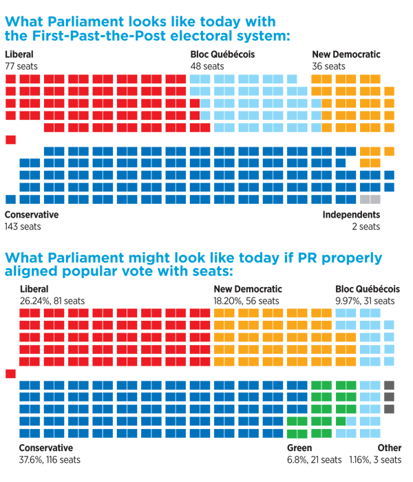
Thanks for this lovely cartogram. Any possibility that a comparative cartogram could be done assuming that Proportional Representation was used as a voting system with the same data? Thanks! — Preceding unsigned comment added by Kanadont (talk • contribs) 18:12, 21 September 2021 (UTC)
- @Kanadont: Thank you for the kind words.
- There are many difficulties with applying the same techniques to proportional representation. First, with pure proportional representation, there is nothing you can map, because all votes are spread out over all ridings, so a bar chart or a pie chart is all the visualization you need or can get. You would end up only with one of those graphs showing the seats in parliament, which are readily available. For example, see https://this.org/wp-content/uploads/2010/07/ja10-pr-parliament.png. It is possible to map back to ridings under schemes like single transferable vote (STV) or it's one-representative equivalent, instant run-off voting (IRV), but you can't fill in the map for those schemes unless you know all voters' second and third and fourth choices, which we do not. And even voters' first choice would change in many cases if that were the voting system. For hybrid schemes like mixed member proportional (MMP), some of the members represent a district and some do not, so you would need a different style of map - one which shows the party-list members in a side table beside the riding winners. For a standard map example, see https://en.wikipedia.org/wiki/File:German_Federal_Election_2017_-_Results_by_Constituency_%26_Regional_Seats.svg. But attempting to generate such a map using the current election data is dubious, because it assumes that all voters would vote for the same party under MMP that they did under the current system (i.e, that no voters vote strategically or specifically to support a particular local MP), which is not true. Voter behaviour changes when you change the voting system. So, in short, no matter which proportional scheme you prefer, it's quite difficult to map the current election results into any riding map of any style.
Cartogram heat map[edit]
Hello, I understand that you are the creator of:
I notice that if one hovers the mouse over a cluster, that the name of the riding appears. How did you do that?
In my case, I would like to create a clickable image, where clicking on an element hyperlinks to another page. What I have in mind is, basically, a system diagram which with unique hypertext links assigned to different elements in the diagram. Is this possible? If so, is this only possible for SVG, or can it be implemented for bit map graphics too? Any assistance to point me in the right direction would be greatly appreciated. And/or, if you could suggest where else I might look for guidance.
Thanks in advance, Enquire (talk) 16:55, 5 October 2021 (UTC)
- @Enquire: This drawing was done using Microsoft Visio. In Visio, you can add what they call a "ScreenTip" which appears as rollover text. Then, when you save the Visio drawing as an .svg file, it carries over the rollver text to the appropriate SVG format. This does not sound like what you are going for.
- It sounds like what you want is more like what Luke Andrews has implemented at https://github.com/attaboy/electoralcartogram. He has done his version in code in some way, and shapes appear to be clickable. JoeSchlabotnik (talk) 15:30, 6 October 2021 (UTC)
- I think I may have found a solution here:
- This appears to be a fully generalized approach to enabling a single image to have multiple links, each associated with uniquely defined (non-overlapping) regions of the image. This requires investigation...
- Enquire (talk) 02:18, 17 January 2022 (UTC)