Commons:Graphic Lab/Illustration workshop/Archive/2020
 | This is an archive of past discussions. Do not edit the contents of this page. If you wish to start a new discussion or revive an old one, please do so on the current talk page. |
Vectorize coat of arms
-
 Vectorize

Article(s): en:History of Portugal (1834–1910)
- Request
- Hello, please vectorize this file of a historical Portuguese coat of arms. Thank you! --TextClick (talk) 06:26, 18 January 2020 (UTC)
- @TextClick: The creator also uploaded a vector version under a different name – File:Coat of Arms of the Kingdom of Portugal 1640-1910 (3).svg. Resolved?--TFerenczy (talk) 12:24, 19 January 2020 (UTC)
- @TFerenczy: Yes, resolved.
UK location in the European Communities 1975 image creation and modification.
-
 Please can a new map be created and be modified in which the the UK coloured orange and named as UK location in the EC 1975.svg please.

Article(s):Various
- Request
- Please can a new map be created and be modified in which the the UK coloured orange and named as the UK location in the EC 1975.svg please in a way that’s similar to the UK location in the EU 2016.svg image please. (2A02:C7F:5622:2000:F00C:C3C8:5BB1:C267 10:20, 18 January 2020 (UTC))
- Graphist opinion(s)

![]() Done User:2A02:C7F:5622:2000:F00C:C3C8:5BB1:C267 please confirm this is what is required. Ian Furst (talk) 02:16, 20 January 2020 (UTC)
Done User:2A02:C7F:5622:2000:F00C:C3C8:5BB1:C267 please confirm this is what is required. Ian Furst (talk) 02:16, 20 January 2020 (UTC)
- That is perfect thank you (2A02:C7F:5622:2000:C4D5:4C8F:4130:2002 14:03, 20 January 2020 (UTC))
- This section was archived on a request by: Minoraxtalk (formerly 大诺史) 13:50, 21 January 2020 (UTC)
Sex Education logo
-
 Czech logo of TV series Sex Education
 -
 SVG
SVG
Article(s): cs:Sexuální výchova (seriál)
- Please change color of the text SEXUÁLNÍ VÝCHOVA from white to black. Pleasae delete text N SERIÁL. Thank you! --Patriccck (talk) 13:50, 17 January 2020 (UTC)
- Graphist opinion(s)
![]() Request taken by Sushant savla (talk) 11:59, 21 January 2020 (UTC)
Request taken by Sushant savla (talk) 11:59, 21 January 2020 (UTC)
- @Patriccck: please check. --Sushant savla (talk) 13:15, 21 January 2020 (UTC)
- @Sushant savla: Thank you very much! It is great, but I can see grey dots on letter V. Can you please fix it? --Patriccck (talk) 13:35, 21 January 2020 (UTC)
- @Patriccck: rectified pls check. --Sushant savla (talk) 17:46, 22 January 2020 (UTC)
- Great! --Patriccck (talk) 18:29, 22 January 2020 (UTC)
- @Patriccck: rectified pls check. --Sushant savla (talk) 17:46, 22 January 2020 (UTC)
- @Sushant savla: Thank you very much! It is great, but I can see grey dots on letter V. Can you please fix it? --Patriccck (talk) 13:35, 21 January 2020 (UTC)
Convert presidential standards of Kenya to SVG
-
 Presidential Standard of Jomo Kenyatta (convert to SVG)
 -
 Presidential Standard of Jomo Kenyatta (SVG)
 -
 Presidential Standard of Uhuru Kenyatta (convert to SVG)
 -
 Presidential Standard of Uhuru Kenyatta (SVG)


Article(s): various
- Request
- These flags are Kenya's presidential standards, so thank you for converting them to SVG. In fact, I made the request last time, but since there is no response, I request it again now. --Tcfc2349 (talk) 12:06, 11 January 2020 (UTC)
- Graphist opinion(s)
- And when converting these files to SVG, I think it's a good idea to refer to the Arapmoi's flag you've already created. --Tcfc2349 (talk) 12:09, 11 January 2020 (UTC)
 Request taken by Sushant savla (talk) 13:25, 21 January 2020 (UTC)
- @Sushant savla: Thank you for making it. I fixed it more correctly. --Tcfc2349 (talk) 11:12, 24 January 2020 (UTC)
 Done And the other one was based on the file you created. --Tcfc2349 (talk) 16:41, 24 January 2020 (UTC)
- @Sushant savla: Thank you for making it. I fixed it more correctly. --Tcfc2349 (talk) 11:12, 24 January 2020 (UTC)
Vectorize flag file
-
Vectorize
-
Vectorized SVG
Article(s): en:Shangrao
- Request
- Please vectorize this flag file for the Flag of Shanghai, China. Thanks! TextClick (talk) 17:36, 14 January 2020 (UTC)
- Graphist opinion(s)
Ciao @TextClick: The flag is ready.MacMoreno (talk) 22:42, 29 January 2020 (UTC)
- @MacMoreno: Grazie!
Please vectorise these signatures
-
 Kedah Crown Prince's signature
 -
 Kedah Crown Prince consort signature
 -
 Sultan of Kelantan signature
 -
 Sultan of Kedah signature
 -
 Sultanah of Kedah signature
 -
 Monarch of Malaysia signature
 -
 Queen of Malaysia signature


Article(s): en:Tunku Sarafudin Badlishah ms:Che Puan Muda Zaheeda Mohamad Ariff en:Muhammad V of Kelantan en:Sallehuddin of Kedah ms:Sultanah Maliha en:Abdullah of Pahang en:Tunku Azizah Aminah Maimunah Iskandariah
- Request
- Please vectorise these pictures. Thanks --Tofeiku (talk) 06:03, 15 January 2020 (UTC)
- Graphist opinion(s)
I'm working on it ...MacMoreno (talk) 23:47, 30 January 2020 (UTC)
-
 Kedah Crown Prince's signature
 -
 Kedah Crown Prince consort signature
 -
 Sultan of Kelantan signature
 -
 Sultan of Kedah signature
 -
 Sultanah of Kedah signature
 -
 Monarch of Malaysia signature
 -
 Queen of Malaysia signature


- Ciao @Tofeiku: Vectorisations of signatures are ready MacMoreno (talk) 18:15, 31 January 2020 (UTC)
- @MacMoreno: Thank you very much :D --Tofeiku (talk) 07:19, 1 February 2020 (UTC)
- This section was archived on a request by: Minoraxtalk (formerly 大诺史) 14:04, 1 February 2020 (UTC)
POL Przeworsk flag

Article(s): en:Przeworsk
- Request
- Top part should be white instead of transparent?--Roy17 (talk) 12:48, 1 February 2020 (UTC)
- Graphist opinion(s)
@Roy17: I don't know if it's only me but the top part remains transparent even though it appeared fine @ File:Test.svg. Minoraxtalk (formerly 大诺史) 14:01, 1 February 2020 (UTC)
- @Minorax: thanks! I think you just needed a purge. (I like to use the UTC clock gadget for that.)
- I think this is Done. Many thanks again!--Roy17 (talk) 14:12, 1 February 2020 (UTC)
SVG Image spacing adjustment and text movement
-
 A mathematical graphic that includes text

Article(s): en:Radiodrome
- Request
- Reduce excess empty space in the image
- Specifically, remove the significant empty space at the top of the image in addition to moving the text "Hare at initial time" to the left so that the end of text in closer to the image's border, remove excess space there as will. —The Editor's Apprentice (Talk) 23:30, 26 January 2020 (UTC)
- Done--Sushant savla (talk) 14:15, 8 February 2020 (UTC)
- Thank you very much for your work Sushant salva, the image looks great, I really appreciate your help!
- Graphist opinion(s)
![]() Request taken by Sushant savla (talk) 17:34, 28 January 2020 (UTC)
Request taken by Sushant savla (talk) 17:34, 28 January 2020 (UTC)
- Thank you very much Sushant savla for the changes so far. Unfortunately, when I view the file preview on its Commons page, and some other places, the bottom of the text "Hare at initial time" is partially cut off. Can you make it so that all of the text is always visible? —The Editor's Apprentice (Talk) 19:37, 2 February 2020 (UTC)
- This section was archived on a request by: —The Editor's Apprentice (Talk) 21:05, 8 February 2020 (UTC)
Vectorize flag file
-
 Vectorize
 -
 Vectorized
_sheet.png)
_sheet.svg)
Article(s): en:Flag of the Republic of China
- Request
- I believe that my previous request for vectorizing this file was removed without completion for whatever reason, so I am making a new request to vectorize this file. TextClick (talk) 05:16, 11 February 2020 (UTC)
- Graphist opinion(s)
Ciao@TextClick: The svg file is ready.MacMoreno (talk) 14:34, 11 February 2020 (UTC)
- @MacMoreno: Grazie! TextClick (talk) 17:43, 11 February 2020 (UTC)
Sakaran Dandai signature
-
 Tun Mustapha Tower plaque with Sakaran Dandai's signature
 -
 SVG
SVG

Article(s): en:Sakaran Dandai
- Request
- Help create a svg signature of Sakaran Dandai from that picture. Thank you. --Tofeiku (talk) 18:41, 14 February 2020 (UTC)
- Graphist opinion(s)
- @Tofeiku: Done --Mrmw (talk) 19:48, 14 February 2020 (UTC)
- Thank you very much!
White background
-
 Figurine of an infant by Edith Maryon
 -
 Winged Victory by Herbert Maryon


Article(s): en:Edith Maryon; en:Herbert Maryon; en:Works of Herbert Maryon; en:Works of Edith Maryon
- Request
- Would somebody please make the background of these images white? Please upload over the original images. Thanks, --Usernameunique (talk) 23:46, 21 February 2020 (UTC)
- Graphist opinion(s)
- Ciao @Usernameunique: I retouched up the sculptures, can it be fine?MacMoreno (talk) 18:37, 22 February 2020 (UTC)
- Those look fantastic, MacMoreno—thanks for your work. I think there may be a small amount of the original background below and to the bottom right of the infant. But those are small matters—if you care to take a look great, but I’m also happy to mark this as resolved. Cheers, —Usernameunique (talk) 03:03, 23 February 2020 (UTC)
Remove watermark
-
 Richard III cortege
.jpg)
Article(s): Tobias Capwell
- Request
- Please remove the watermark. Thanks, --Usernameunique (talk) 03:49, 6 February 2020 (UTC)
- Graphist opinion(s)
@Usernameunique: --Mrmw (talk) 23:00, 6 February 2020 (UTC)
- Thanks, Mrmw. Ideally, however, it would be nice to remove the watermark with photoshop or a similar program, rather than to simply crop the photo. --Usernameunique (talk) 00:51, 9 February 2020 (UTC)
- reverted edit --Mrmw (talk) 06:47, 14 February 2020 (UTC)
![]() Done@Usernameunique: --Dixy52 (talk) 23:35, 16 February 2020 (UTC)
Done@Usernameunique: --Dixy52 (talk) 23:35, 16 February 2020 (UTC)
- Thanks, Dixy52. Any particular reason for using a lower-resolution photograph? —Usernameunique (talk) 00:08, 17 February 2020 (UTC)
2015 House of Commons composition

Article(s): Various
- Request
- Please replace Conservative blue seat in opposition column and replace with independent unionist light blue please.
- Please can the colours be adjusted as there is a blue seat in the opposition column when it should be a light blue independent as it’s a independent unionist.
- (2A02:C7F:5622:2000:5511:D3D5:EE9A:30BF 14:24, 4 January 2020 (UTC))
- Graphist opinion(s)
- perhaps this would be useful: Parliament diagram tool --Mrmw (talk) 11:23, 8 January 2020 (UTC)
Logo of the Ta-Ching Government Bank
-
Description of image
Article(s): en:Ta-Ching Government Bank, fr:Banque Daqing, and zh:大清银行.
- Request
- I would like to have an image of the logo of the Ta-Ching Government Bank created. This logo looks like a coat of arms supported by two horses with in the middle what seems to be an image of a dragon chasing a wish-granting pearl / flaming pearl. An example of the image and a discussion related to its details could be found in the discussion below. Unfortunately I have not been able to find a version anywhere online of a banknote where this emblem/logo is depicted on that shows a lot of detail but I hope that the linked pages below shall be sufficient for the creation of such an emblem. --Donald Trung 『徵國單』 (No Fake News 💬) (WikiProject Numismatics 💴) (Articles 📚) 09:34, 12 January 2020 (UTC)
| Original discussion for details on the emblem and its symbolism. |
| Copied from https://commons.wikimedia.org/w/index.php?title=Commons:Village_pump&oldid=386966430#January_12 & https://commons.m.wikimedia.org/w/index.php?title=Commons:Village_pump&oldid=386966430&mobileaction=toggle_view_mobile |
 (or maybe they're just horses 🐴?). |
| The Ta-Ching Government Bank (now the Bank of China and Mega International Commercial Bank) was a government agency of the Manchu Qing Dynasty and had its own distinct logo, however, I have not been able to find a separate image of this logo. So if someone who is experienced with making coat of arms could extract this logo for me I would be really grateful, or direct me to a website where I could attempt to make a logo myself from my mobile device if possible. --Donald Trung 『徵國單』 (No Fake News 💬) (WikiProject Numismatics 💴) (Articles 📚) 19:48, 7 January 2020 (UTC) |
| :If we had a high-resolution image of such a bank note, we could probably reproduce these arms. However, from what I can find online, it's not clear which heraldic components have been used there. I found something on Ebay that reveals something at least: 🐴 in supporters and a mountaineous landscape in the shield, but the crest is completely unclear. De728631 (talk) 13:53, 9 January 2020 (UTC) |
| :@Donald Trung: Cutting out the picture would not be difficult, but the low resolution makes the usage of the final file very limited. @De728631: I believe the shield actually depicts a dragon circling around the edge with its head in the centre, mouth open and looking left, a motif that is repeated on another banknote in the category.--TFerenczy (talk) 16:55, 9 January 2020 (UTC) |
| ::Ok, that makes sense with regards to Chinese bank notes. De728631 (talk) 16:58, 9 January 2020 (UTC) |
| ::: Yes, viewing it from that higher resolution image I would in fact think that it's a dragon, the logo itself looks like a combination between a typical European coat of arms and the Ottoman Empire's emblem, so recreating it using the same software that made those other files here on Wikimedia Commons. --Donald Trung 『徵國單』 (No Fake News 💬) (WikiProject Numismatics 💴) (Articles 📚) 19:40, 9 January 2020 (UTC) |
| :::: And the crest seems to be a flaming/wish-granting pearl with two sets of sun beams coming out of it. The last missing pieces would be the exact pattern on the border of the shield and if there's anything at all on the ribbon or just decoration. Making a file like this is beyond my ability however, try to open a request in Commons:Graphic_Lab/Illustration_workshop and either refer to this thread or copy&paste the necessary information and maybe someone will create the file for you. If you want to try to make a vector file in Inkscape yourself, there are some horses and dragons available in Category:SVG coat of arms elements - horses, Category:Horses in supporters and Category:SVG coat of arms elements - dragons and Ribbons.--TFerenczy (talk) 21:26, 9 January 2020 (UTC) |
| ::::: @TFerenczy: , thank you very much for the information, when I have the time I file a request at the vector laboratory. --Donald Trung 『徵國單』 (No Fake News 💬) (WikiProject Numismatics 💴) (Articles 📚) 19:00, 11 January 2020 (UTC) |
--Donald Trung 『徵國單』 (No Fake News 💬) (WikiProject Numismatics 💴) (Articles 📚) 09:33, 12 January 2020 (UTC)
- Graphist opinion(s)
Pictorial representation of Brexit
-
 EU-Austritt (47521165961).jpg
 -
 SVG
SVG
.jpg)
.svg)
Article(s): en:Brexit and numerous others, via en:Template:Brexit sidebar.
- Request
- Could somebody please convert this JPG to an SVG file, with the background made transparent? Ham II (talk) 10:58, 22 February 2020 (UTC)
- Graphist opinion(s)
- @Ham II: Done --Mrmw (talk) 17:49, 22 February 2020 (UTC)
- Thank you! Ham II (talk) 18:11, 22 February 2020 (UTC)
- This section was archived on a request by: Minoraxtalk (formerly 大诺史) 15:51, 12 March 2020 (UTC)
Inflation graph Argentina
-
 International Version

Article(s): en:Hyperinflation
- Request
- can someone insert
<switch>of languages?
| Language | Headline | Jahreszahl | Jahr | Inflation in Prozent |
|---|---|---|---|---|
| en | Inflation in Argentina | date | year | Inflation in percent |
| nl | Inflatie in Argentinië | Jaartal | Jaar | Inflatie in procenten |
--Bigbossfarin (talk) 21:05, 5 March 2020 (UTC)
- Graphist opinion(s)
I can work on this. clpo13(talk) 16:07, 12 March 2020 (UTC)
- Done User:Bigbossfarin, please check to see if everything looks good to you. clpo13(talk) 16:45, 12 March 2020 (UTC)
- @Clpo13: Thank You very much! It looks fine to me. Greetings Bigbossfarin (talk) 21:55, 12 March 2020 (UTC)
- This section was archived on a request by: clpo13(talk) 22:01, 12 March 2020 (UTC)
Kabumpo in Oz: This Book Belongs to
-
 Internet Archive scan
 -
 Library of Congress scan
 -
 Cleand SVG
.jpeg)
.jpeg)
.svg)
Article(s): s:en:Kabumpo in Oz
- Request
- For one clean version to be used on Wikisource
- Details of your request go here… We are fortunate enough to have multiple scans. Unfortunately, previous graphists have hard-annotated the version. Can someone produce one image that shows how it originally looked?--Prosfilaes (talk) 03:56, 19 February 2020 (UTC)
- @Prosfilaes: , please check. --Sushant savla (talk) 06:16, 19 February 2020 (UTC)
- Thank you.--Prosfilaes (talk) 07:49, 19 February 2020 (UTC)
- @Prosfilaes: , please check. --Sushant savla (talk) 06:16, 19 February 2020 (UTC)
- Graphist opinion(s)
![]() Request taken by Sushant savla (talk) 06:16, 19 February 2020 (UTC)
Request taken by Sushant savla (talk) 06:16, 19 February 2020 (UTC)
![]() Done --Sushant savla (talk) 12:42, 21 February 2020 (UTC)
Done --Sushant savla (talk) 12:42, 21 February 2020 (UTC)
- @Prosfilaes: Kindly check and close if you're happy with it.
- @Prosfilaes: Minoraxtalk (formerly 大诺史) 15:54, 12 March 2020 (UTC)
Catholic Church in Georgia

Article(s): en:Catholic Church in Georgia
- Request
- Overall improvement, as much as you might be interested and able to do.
- Hello. I recently was able to draw this CoA of Catholic Church in Georgia, but my drawing skills are very basic, and the image in general is much inferior to the original (Specially the knot on the Cross - according to the legend, it was knotted not with a rope, but with hair - and I subsequently failed to make it look like hair). Second problem is the ribbon and the inscription on it. I will be really grateful if there is anyone who might be interested. --Melberg (talk) 20:22, 3 January 2020 (UTC)
- Graphist opinion(s)
- Ciao @Melberg: I retouched up the emblem, can it be fine?MacMoreno (talk) 21:58, 20 January 2020 (UTC)
- @MacMoreno: It is so much better now! Thank you very much!--Melberg (talk) 05:22, 21 January 2020 (UTC)
- This section was archived on a request by: Minoraxtalk (formerly 大诺史) 06:54, 14 March 2020 (UTC)
Teamfight Tactics new logo
-
 This is very simple to convert
 -
 SVG
SVG
Article(s): en:Teamfight Tactics
- Request
- Please convert to SVG. --175.176.84.35 09:54, 10 March 2020 (UTC)
- Graphist opinion(s)
@175.176.84.35: Done. Pbrks (talk) 14:52, 11 March 2020 (UTC)
- This section was archived on a request by: Minoraxtalk (formerly 大诺史) 14:54, 20 March 2020 (UTC)
Cropped SVG

- Request
- Hello! I cropped this file in Inkscape. When I uploaded the new version the borders were placed further in than what I saw when I saved in Inkscape. The outermost parts of the racket isn't visible now. Why is this and how can it be fixed? --Jonteemil (talk) 03:52, 16 March 2020 (UTC)
- Graphist opinion(s)
![]() Done @Jonteemil: I can't tell you what exactly happened and why, just that Inkscape tends to do weird things with SVGs it didn't create. I adjusted the width and height of the SVG canvas (the values in the
Done @Jonteemil: I can't tell you what exactly happened and why, just that Inkscape tends to do weird things with SVGs it didn't create. I adjusted the width and height of the SVG canvas (the values in the <svg> tag) so the whole image is in view. Let me know how it looks now. clpo13(talk) 06:27, 16 March 2020 (UTC)
- @Clpo13: It looks good, thanks!Jonteemil (talk) 06:35, 16 March 2020 (UTC)
- This section was archived on a request by: Minoraxtalk (formerly 大诺史) 14:54, 20 March 2020 (UTC)
SVG Chart
Hi, it seems that the template SVG Chart is not being maintained anymore. I found the instructions a bit cryptic and I note that in the last few years, there are only a few posts on the talk page, most of which have gone unanswered. Should this page perhaps be marked historical or deprecated or something? I also see a reference to "another SVG generator that is under development" from 2015, do you know what/where that is? Alternatively, do you know of a better way to create SVG charts that can easily be updated by laypeople? I have tried various pieces of software, but they all produce SVG files that have completely unreadable source code (for humans). I really like the idea of this SVG Chart template... Is it true that the Graph extension needs to be applied to every language wiki separately as claimed on the same talk page? KarlFrei (talk) 09:04, 5 February 2020 (UTC)
- I transferred the above from https://commons.wikimedia.org/w/index.php?title=User_talk:Jeff_G.&diff=392260243&oldid=391903979 - please help. — Jeff G. ツ please ping or talk to me 14:44, 5 February 2020 (UTC)
Phuang malai (Thai style garland)
-
Effect
Article(s): en:Phuang malai
- Request
- Need is a garland. If you don't understand this thing, you can see the article (en:Phuang malai). --Thyj (talk) 07:55, 7 February 2020 (UTC)
- Graphist opinion(s)
William Russell (Lord Mayor)
- Request
Lord Mayor Russell's personal arms for his year of office are:
City (dexter) impaling Russell (sinister)


Would it be possible for Lord Mayor Russell's arms to be drawn please?
Many thanks, Minotaur432
- Heraldist opinion(s)
- How delightful to see an English coat with Scot-style cadency! —Tamfang (talk) 23:56, 14 January 2020 (UTC)
- Not a matter of cadency, but marshalling the arms of office! 194.50.30.10 21:47, 8 February 2020 (UTC)
- Graphist opinion(s)
-
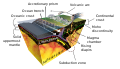 Diagram of the geological process of subduction.

Article(s): It's POTY 2017 finalist, it is already used on many pages.
- Request
- Please fix displaying of text "Lithosphere" in the current version – on preview/bitmap images it is not displayed at all and SVG under Firefox does not look nice, although the text is visible. IMO all texts should look like in version from 16th December 2019. --jdx Re: 10:48, 10 February 2020 (UTC)
- Graphist opinion(s)
- The renderer does not have some of the text attributes coded, so sometimes text won't render in PNGs despite it appearing fine when looking at the SVGs in browsers.
- In the older version, the text was converted into paths. This means that it looks consistent across all browsers, but is impossible to translate. You may prefer the text when it was like this, but it seems that the choice was made to make the file translatable.
- I have corrected the file without changing the text back to paths, but the label follows a straight line rather than a curve. If this doesn't look good to you, then you may want to propose that the file is reverted to how it was in December 2018. NikNaks talk - gallery - wikipedia 11:50, 10 February 2020 (UTC)
- What about font size? On the preview (generated by rsvg AFAIR) texts are much bigger than in SVG rendered by my FF. A problem with font substitution list? BTW. Perhaps "Lithosphere" should be converted into paths… --jdx Re: 12:10, 10 February 2020 (UTC)
EEA members map
-
 Please can the map be modified to put the UK in green now they are no longer a member of the EU and also please include Croatia as a EU member.

Article(s): various
- Request
- Please can the map be modified to put the UK in green now they are no longer a member of the EU and also please include Croatia as a EU member (2A02:C7F:5622:2000:84AD:5BCA:8712:7D40 10:48, 2 February 2020 (UTC))
- Graphist opinion(s)
Hi. I think the UK should not be marked in green as that map seems to mark in green the members of the EEA area. And I think the UK is not a member of EEA for the time being. As regards Croatia of course it should be blue. Are there not other maps already updated depicting Croacia as member of the EU?. Regards, Basquetteur.
- I get that, why can’t we have the UK in red to show the UK is withdrawing from the EEA. Also I haven’t seen any other maps at this time showing Croatia as a EEA. (2A02:C7F:5622:2000:6816:E7A1:D642:D710 07:19, 15 February 2020 (UTC))
- Non-graphist comment
The map shows countries that are (a) in (b) not in the EEA. Marking otherwise would introduce an entirely new element. Comment for graphist, not at all intended to patronise (made in case you're outside the UK, because it's not always known by non-UK people): there is a small part of the UK on the island of Ireland, which has also left the EU, namely Northern Ireland. Hope this helps. SCHolar44 (talk) 02:37, 16 February 2020 (UTC)
Abdullah Ahmad Badawi signature
-
 Plaques with signature of him

Article(s): en:Abdullah Ahmad Badawi
- Request
- Make svg signature of him. --Tofeiku (talk) 07:58, 15 February 2020 (UTC)
- Graphist opinion(s)
Vectorize signature: John G. Hawthorne
-
 John G. Hawthorne signature (vectorized)
Article(s): en:John G. Hawthorne
- Request
- Would somebody please vectorize this signature? In doing so, please remove the horizontal line at the bottom. Thanks, --Usernameunique (talk) 15:23, 2 April 2020 (UTC)
- Graphist opinion(s)
- @Usernameunique: Done , MacMoreno (talk) 21:13, 9 April 2020 (UTC)
- Looks great. Thanks very much, MacMoreno. --Usernameunique (talk) 21:14, 9 April 2020 (UTC)
Help with GIFs


Article(s): [[]]
- Request
- I require assistance in making high quality GIF images. As you can see in the example provided above, my GIF has choppy edges around the outside of the red triangle, however I have seen plenty of GIF files without this flaw. If someone could make a higher quality version, or better yet teach me how to do so myself (as there are other GIF files I wish to upload in the future), I would be most thankful. Fry1989 eh? 20:03, 18 February 2020 (UTC)
- Graphist opinion(s)
Fry1989 Can´t it have something to do with scaling the image. If you look at the gif in 100% (1,200 × 1,049 pixels) the edges looks much better. All images should be made as close as it can to the image size it will be viewed in. Diagonal lines in gif is very sensitive to patterns like this. Gif uses indexed colors and they are as most 255 (256) colors. The one you have made is 239 colors so if you start from the svg file and convert it in Gimp, save as gif it will get 255 colors. That and a correct size might make it better. --Goran tek-en (talk) 18:23, 3 March 2020 (UTC)
- The size of the file probably does have an impact as I made it quite large. I have found instructions for using GIMP and Blender here, I will give that an attempt. Fry1989 eh? 19:48, 3 March 2020 (UTC)
- It looks like I have been able to improve the GIF. The edges are still a bit jagged but not as much as before. Fry1989 eh? 21:01, 3 March 2020 (UTC)
- Hi Fry1989. You're running into an inherent limitation of the GIF file format. Pixels in a GIF can either be fully opaque or fully transparent, but not partially transparent. Your edges look jagged because there is a hard boundary where the transparent background takes over that can't be smoothed out with semi-transparent red pixels.
- You'll find that the jaggedness will disappear if you make the background white, but this may not be ideal for all scenarios. NikNaks talk - gallery - wikipedia 14:49, 5 March 2020 (UTC)
- Ah, I see. Such a shame. Oh well, I'll have to accept it for what it is then, unless there is a better alternative to the GIF format. Fry1989 eh? 18:39, 5 March 2020 (UTC)
- It looks like I have been able to improve the GIF. The edges are still a bit jagged but not as much as before. Fry1989 eh? 21:01, 3 March 2020 (UTC)
- The size of the file probably does have an impact as I made it quite large. I have found instructions for using GIMP and Blender here, I will give that an attempt. Fry1989 eh? 19:48, 3 March 2020 (UTC)
- This section was archived on a request by: Minoraxtalk (formerly 大诺史) 16:00, 10 April 2020 (UTC)
Flag of New Hampshire used 1909 to 1931
-
 Flag of New Hampshire (1909-1931) (PNG)
 -
Flag of New Hampshire (1909-1931) (SVG)
.png)
Article(s): various
- Request
- This flag was used from 1909 to 1931 in New Hampshire. Thank you for if you could remake this file as an SVG file. --Tcfc2349 (talk) 04:39, 21 February 2020 (UTC)
- Graphist opinion(s)
- There is also a seal file in Wikimedia Commons at the time. Please refer to this file when remake. --Tcfc2349 (talk) 04:39, 21 February 2020 (UTC)
Flag of Nevada used 1915 to 1929
-
 Flag of Nevada (1915-1929) (PNG)
 -
 Flag of Nevada (1915-1929) (JPG)
 -
 Flag of Nevada (1915-1929) (SVG)
.png)
.jpg)
.svg)
Article(s): various
- Request
- This flag was used from 1915 to 1929 in Nevada. Thank you for if you could remake this file as an SVG file. --Tcfc2349 (talk) 04:28, 21 February 2020 (UTC)
- Graphist opinion(s)
- There are two flags in Wikimedia Commons: PNG and JPG. Please refer to the two flag pictures appropriately when you remake. --Tcfc2349 (talk) 04:31, 21 February 2020 (UTC)
- And the seal in the middle of flag can use the seal file of the state of Nevada. --Tcfc2349 (talk) 05:55, 22 February 2020 (UTC)
Vectorize design
-
 Benty Grange hanging bowl escutcheon design
 -
 Benty Grange hanging bowl escutcheon design red


Article(s): en:Benty Grange hanging bowl
- Request
- Would somebody please create a vectorized image, in color, similar to fig. 42 on p. 119? The colors are simple: yellow with silver borders. I can email a higher-resolution diagram in color to whoever takes this request. Thanks, --Usernameunique (talk) 17:36, 29 March 2020 (UTC)
- Graphist opinion(s)
![]() Done You mentioned yellow in your description but fig 42 is purple like the design I've added, thoughts? — Preceding unsigned comment added by Carlinmack (talk • contribs) 17:07, 1 April 2020 (UTC)
Done You mentioned yellow in your description but fig 42 is purple like the design I've added, thoughts? — Preceding unsigned comment added by Carlinmack (talk • contribs) 17:07, 1 April 2020 (UTC)
- That looks great, thanks Carlinmack! Would you mind also creating a version in yellow? I think the reason the linked version looks purple is a scanning issue; in person it looks black and white, while the yellow version is contained on a plate (which is outside the Google Books preview). I can email you a copy of the color version if you send me your email address. --Usernameunique (talk) 18:56, 1 April 2020 (UTC)
- Usernameunique how does this look, happy to take any other requests Carlinmack (talk) 00:14, 2 April 2020 (UTC)
- Thanks again, Carlinmack. The yellow version is perfect. I'm sorry I wasn't more clear regarding the red design; could you please leave the silver parts as silver, and change the background to red? I'll send you a jpeg momentarily with what I have in mind. --Usernameunique (talk) 00:31, 2 April 2020 (UTC)
- Carlinmack, just following up regarding the yellow/red version. Also, it's a minor nit, but would you mind reducing the margins on the files? The extra space would be helpful at en:Benty Grange hanging bowl, where the illustrations are currently bumping each other down. Thanks, --Usernameunique (talk) 20:38, 10 April 2020 (UTC)
- Usernameunique Hi sorry for the late reply, there's the new version with decreased margins like you asked — Preceding unsigned comment added by Carlinmack (talk • contribs) 20:14, 12 April 2020 (UTC)
- Fantastic, thanks Carlinmack! Last adjustment request: Could you please also reduce the margins on the yellow-on-yellow version? --Usernameunique (talk) 19:37, 15 April 2020 (UTC)
- Usernameunique :) Carlinmack (talk) 03:58, 16 April 2020 (UTC)
- Perfect. Carlinmack, thanks again for your excellent work on this. --Usernameunique (talk) 04:02, 16 April 2020 (UTC)
- Usernameunique :) Carlinmack (talk) 03:58, 16 April 2020 (UTC)
- Fantastic, thanks Carlinmack! Last adjustment request: Could you please also reduce the margins on the yellow-on-yellow version? --Usernameunique (talk) 19:37, 15 April 2020 (UTC)
- Usernameunique Hi sorry for the late reply, there's the new version with decreased margins like you asked — Preceding unsigned comment added by Carlinmack (talk • contribs) 20:14, 12 April 2020 (UTC)
- Carlinmack, just following up regarding the yellow/red version. Also, it's a minor nit, but would you mind reducing the margins on the files? The extra space would be helpful at en:Benty Grange hanging bowl, where the illustrations are currently bumping each other down. Thanks, --Usernameunique (talk) 20:38, 10 April 2020 (UTC)
- Thanks again, Carlinmack. The yellow version is perfect. I'm sorry I wasn't more clear regarding the red design; could you please leave the silver parts as silver, and change the background to red? I'll send you a jpeg momentarily with what I have in mind. --Usernameunique (talk) 00:31, 2 April 2020 (UTC)
- Usernameunique how does this look, happy to take any other requests Carlinmack (talk) 00:14, 2 April 2020 (UTC)
Hope for Wildlife
-
 Hope for Wildlife
Article(s): en:Hope for Wildlife
- Request
- Please create a new image with the "TV" and vertical bar cropped out (preferably centered)
- The current logo is the logo of the website for the TV show, the TV show logo itself is missing the "TV" portion.
- --65.94.170.207 13:57, 11 April 2020 (UTC)
- Graphist opinion(s)
- Ok, someone overwrote this file with a different file, can someone reupload this with the original version [1] under a different filename? Like FILE: Hope for Wildlife TV web.png or something? The new overwritten version is equivalent to this original request here, so that should be kept around as well. -- 65.94.170.207 09:33, 18 April 2020 (UTC)
- This appears as though it can be resolved through the history split request at Commons:History_merging_and_splitting/Requests#File:Hope_for_Wildlife_TV.png_→_File:Hope_for_Wildlife_streaming_network.png_and_File:Hope_for_Wildlife_foundation.png -- 65.94.170.207 14:37, 18 April 2020 (UTC)
- Done This was reprocessed as a split to File:Hope for Wildlife streaming network.png and File:Hope for Wildlife foundation.png -- 65.94.170.207 13:43, 19 April 2020 (UTC)
-
Hope for Wildlife TV series
-
 Hope for Wildlife streaming site
 -
 Hope for Wildlife foundation and center

- This section was archived on a request by: 65.94.170.207 13:43, 19 April 2020 (UTC)
Unexpected error message in uploading SVG diagram
Power-system protection
- Request
Hi, I have been referred here to ask this question. If this is still not the right place please let me know.
I have created a new drawing using Draw.io. Here is a link to the drawing I have made: https://drive.google.com/open?id=1eYe2KxfoSikfo3jDIttvpl99SJ1lqE1f I have exported a copy of this drawing in .svg format, but when I try to upload this into Wikimedia Commons I get this error message:
Time-graded co-ordination.svg This SVG file contains an illegal namespace "http://www.w3.org/1999/xhtml".
I have now conducted a few tests. A version of the diagram without text labels uploaded successfully. See: https://commons.wikimedia.org/wiki/File:Time-graded_co-ordination.svg When I then added text labels - either inside a polygon, or as a separate text box, and tried to upload a new version, I got the same error message. Frustrating.
I had a look at Inkscape as a different tool, but it seems excessively complicated and difficult to use. Plus it doesn't seem to have the nice libraries of pre-defined objects and symbols that I want to use.
Can you suggest anything please ? I have spent a bit of time creating this drawing, and I want to use it in the Wikipedia article on Power-system protection, so I need to overcome this problem. Continuing to uses Draw.io is my preference but I must add text labels I hope you can help. Marshelec (talk) 03:47, 21 April 2020 (UTC)
- Graphist opinion(s)
![]() Request taken by Mrmw (talk) 08:12, 22 April 2020 (UTC)
Request taken by Mrmw (talk) 08:12, 22 April 2020 (UTC)
- @Marshelec: Done --Mrmw (talk) 17:45, 22 April 2020 (UTC)
- @Mrmw: Many thanks for fixing this diagram for me. I will put more time into trying to learn Inkscape as an alternative to draw.io, with the hope that several other SVG drawings I wish to create will upload trouble free.
Frame and Perspective


Article(s): fa:فهرست نقاشیهای کمالالملک
- Request
- Please remove the frames and fix the perspective distortion. Hanooz 16:02, 23 April 2020 (UTC)
- Graphist opinion(s)


![]() Done Ezarateesteban 16:46, 23 April 2020 (UTC)
Done Ezarateesteban 16:46, 23 April 2020 (UTC)
- Thanks. Hanooz 15:24, 24 April 2020 (UTC)
- This section was archived on a request by: Hanooz 15:24, 24 April 2020 (UTC)
Vectorize road shields
-
 Poinciana Parkway shield PNG
 -
 Osceola County Expressway Authority logo PNG
 -
 Osceola Parkway shield PNG

Articles: en:Poinciana Parkway and en:Osceola Parkway
- Request
- Hello, please vectorize these road shields. Thanks! TextClick (talk) 00:56, 14 March 2020 (UTC)
- Graphist opinion(s)
- @TextClick: I can do these guys, but I notice that in all the online versions of the OCX, the horizontal slashes are present only across the "O" and the "C" and not across the "X". Should I omit the slashes in across your PNGs' "O"? —RCraig09 (talk) 19:38, 23 April 2020 (UTC)
- @RCraig09: I'm assuming you meant omit the slashes from the "X", so yes, please do. However, if you meant the "O", both the "O" and the "C" have horizontal slashes across them, so no. TextClick (talk) 01:57, 24 April 2020 (UTC)
- @TextClick: D'Oh! I meant... omit from the "X". Be thankful I'm not an air traffic controller!
- I'm doing the Follow the Sun image now; are you aware of a particular font for the red lettering? If not, I can just find a "close" font and adjust the shape of the letters. —RCraig09 (talk) 02:17, 24 April 2020 (UTC)
- @RCraig09: Sorry, I don't. I hope this doesn't overcomplicate things. TextClick (talk) 02:34, 24 April 2020 (UTC)
- @TextClick: "Follow The Sun" is completed. The native text didn't follow a standard font, so I derived or created manually (details in image file description page.) One down, two to go... —RCraig09 (talk) 17:26, 24 April 2020 (UTC)
- @RCraig09: Sorry, I don't. I hope this doesn't overcomplicate things. TextClick (talk) 02:34, 24 April 2020 (UTC)
- @RCraig09: I'm assuming you meant omit the slashes from the "X", so yes, please do. However, if you meant the "O", both the "O" and the "C" have horizontal slashes across them, so no. TextClick (talk) 01:57, 24 April 2020 (UTC)
Done! (I think) But :-\ I'm having trouble figuring out how to replace the old jpg or png images in Wikipedia infoboxes. The images' filename specifications are somehow buried in a template (or some similar torture device). Please advise! —RCraig09 (talk) 18:33, 25 April 2020 (UTC)
- @RCraig09: Thank you so much for making them! Yeah, that's unfortunate. I'll probably have to ask someone else who's more knowledgeable with infoboxes for help. TextClick (talk) 19:46, 25 April 2020 (UTC)
- @RCraig09: Yay! I asked another user and they have helped replace the signs! Thank you so much for making these! TextClick (talk) 22:02, 25 April 2020 (UTC)
- De nada, User:TextClick. I'm gaining proficiency at Inkscape. —RCraig09 ( talk) 03:16, 26 April 2020 (UTC)
- For posterity: diff for change to one template—still a mystery to me! —RCraig09 (talk) 03:42, 26 April 2020 (UTC)
- @RCraig09: Yay! I asked another user and they have helped replace the signs! Thank you so much for making these! TextClick (talk) 22:02, 25 April 2020 (UTC)
-
 Poinciana Parkway shield.svg (25 Apr 2020)
 -
 Osceola County Expressway Authority logo.svg (25 Apr 2020)
 -
 Osceola Parkway logo.svg (24 Apr 2020)

Replace the English in File:Illu01 head neck.jpg with translated versions
-
 Illu01 head neck.jpg — The illustration with English words
 -
 Result:
Illu01 head neck da.svg — with Danish words


Article(s): da:Sprog
- Request
- The English-language FA on Language has been translated to Danish, but this illustration is lacking a Danish translation and I'm too much of a graphic imbecile to do it myself.
- The translation of the words are:
- Nasal Cavity → Næsehule
- Lips → Læber
- Jaw → Kæbe
- Palate → Gane
- Oral Cavity → Mundhule
- Tongue → Tunge
- Pharynx → Svælg
- Epiglottis → Strubelåg
- Larynx → Strubehoved
- Larynx opening into pharynx → Strubehovedåbning ind i svælget
- Esophagus → Spiserør
Thank you very much! --Metalindustrien (talk) 10:26, 26 April 2020 (UTC)
- Graphist opinion(s)
- I plan to create and upload an SVG file named File:Illu01 head neck da.svg. Let me know if this name is not acceptable. —RCraig09 (talk) 20:01, 26 April 2020 (UTC)
- Completed! For future translatability, I used an SVG as a basis rather than the original (2007) jpg image. Let me know if there is any problem with the new graphic. —RCraig09 (talk) 22:24, 26 April 2020 (UTC)
- That is beautiful! Thank you very much User:RCraig09 :) --Metalindustrien (talk) 08:54, 27 April 2020 (UTC)
- Completed! For future translatability, I used an SVG as a basis rather than the original (2007) jpg image. Let me know if there is any problem with the new graphic. —RCraig09 (talk) 22:24, 26 April 2020 (UTC)
![]() Done
Done
RCraig09 You created and uploaded this file as a svg file and as it contains raster graphics it is not a true svg file. To show this it's very good to add some of the templates showing this;

or
and there are several others. I do understand your point on easier translation but a lot of people do not know how to check if a svg contains raster graphics and there fore it can not be used as a true svg. One could upload a xcf (Gimp) or Photoshops own file format so that text layers is saved and then it's as easy to translate. --Goran tek-en (talk) 18:12, 29 April 2020 (UTC)
- Thank you, User:Goran tek-en. I only learned Inkscape in February, so I am a newbie!
- I have added
{{BadSVG}}to the file description page. I think all of the 'family' were png, jpg, or had a raster layer in svg. —RCraig09 (talk) 18:59, 29 April 2020 (UTC)- RCraig09 That is great. I don't know how much you know about different file formats and the differences between vector (svg) and bitmap (png, jpg...) but if you don't it would be useful for you to search for "difference svg bitmap" on internet and study that. Also we have a lot of info here att commons also; svg info, creating templates Inkscape, templates svg and much more. It's also very good to work towards creating Valid svg code in the files. As I said I don't know how much you know so please see all of this just as suggestions if you didn't know. If you already know I'm sorry to bring it up. If you ever think I might be able to support you just contact me, thanks for your understanding. --Goran tek-en (talk) 13:43, 30 April 2020 (UTC)
- Thanks, User talk:Goran tek-en, for the links—I have saved them in my en.WP talk page, for reference.
- I well know the vectorization concept, and love Inkscape's Bezier tool though I still consider myself an Inkscape newbie.
- For this particular 'family' of images, no one has generated a 'path' to replace the raster image. Thanks for your kind offer. —RCraig09 (talk) 16:31, 30 April 2020 (UTC)
- RCraig09 That is great. I don't know how much you know about different file formats and the differences between vector (svg) and bitmap (png, jpg...) but if you don't it would be useful for you to search for "difference svg bitmap" on internet and study that. Also we have a lot of info here att commons also; svg info, creating templates Inkscape, templates svg and much more. It's also very good to work towards creating Valid svg code in the files. As I said I don't know how much you know so please see all of this just as suggestions if you didn't know. If you already know I'm sorry to bring it up. If you ever think I might be able to support you just contact me, thanks for your understanding. --Goran tek-en (talk) 13:43, 30 April 2020 (UTC)
Vectorization of coat of arms of Kadaň
-
 Coat of arms of Kadaň PNG
 -
 Coat of arms of Kadaň.SVG
 -
 Version II SVG


Article(s): e.g. cs:Kadaň
- Request
- Hello, coat of arms (of my town) is not anywhere in good resolution. I think best will be vectorization. I hope someone can help me. Thanks, --janbery (talk) 15:15, 15 April 2020 (UTC)
- Graphist opinion(s)
- The resolution of this PNG image is excellent. I do not see any application here that requires a higher resolution. To vectorize this COA would end up in a loss of detail quality and authenticity. Enjoy the quality of this image which is far better than the majority of COA files available here. - MaxxL - talk 16:56, 15 April 2020 (UTC)
- Hi, Jan. Since the image has only 436 × 500 pixels, I'd like to try to improve it using Inkscape (new hobby!). MaxxL is correct that there would be a loss of "authenticity" but I know I can make the details clearer. User:Janbery: please tell me if you want me to proceed, because it will take a serious amount of time. —RCraig09 (talk) 06:04, 17 April 2020 (UTC)
- @RCraig09: Hello, thanks a lot for help. I can do basic things in Inkscape, but this is way harder. If you have time, I will be very pleased. Take your time, it's not urgent. I don't know, if I can do anything for you, but if you have any idea, I will be happy to help. One more time, thank you. Best regards, --janbery (talk) 08:50, 17 April 2020 (UTC)
- Thanks, Jan. I will try in Inkscape, and report back here within a few days. —RCraig09 (talk) 14:41, 17 April 2020 (UTC)
- User:Janbery, the SVG is now uploaded to File:Coat of arms of Kadaň.svg. I hope it is acceptable! —RCraig09 (talk) 18:25, 19 April 2020 (UTC)
- It's great! Thank you so much. Taky care, --janbery (talk) 18:39, 19 April 2020 (UTC)
- @RCraig09: Hello, thanks a lot for help. I can do basic things in Inkscape, but this is way harder. If you have time, I will be very pleased. Take your time, it's not urgent. I don't know, if I can do anything for you, but if you have any idea, I will be happy to help. One more time, thank you. Best regards, --janbery (talk) 08:50, 17 April 2020 (UTC)
- Hi, Jan. Since the image has only 436 × 500 pixels, I'd like to try to improve it using Inkscape (new hobby!). MaxxL is correct that there would be a loss of "authenticity" but I know I can make the details clearer. User:Janbery: please tell me if you want me to proceed, because it will take a serious amount of time. —RCraig09 (talk) 06:04, 17 April 2020 (UTC)
I am sorry, but I have to intervene. Citing Voltaire, "The Better is the enemy of the Good"
- @RCraig09: - Good job. But as you have experienced it now how difficult and time-consuming the task is. As so many details are insufficient (e.g. Bohemian lion has no yellow claws, lines and borders are mixed and its thickness in wrong order, etc) this is not an acceptable and suitable vectorisation. - MaxxL - talk 07:13, 21 April 2020 (UTC)

- — User:Janbery: @MaxxL: Definitely, the lion was the most difficult and time-consuming portion! Earlier, I could not find a clear image of the Kadaň lion. However, now, you mention the "Bohemian lion" and today I found the image at right (for the entire Czech Republic). The Czech Republic lion is much clearer. Can the Czech Republic lion be substituted into the Kadaň coat of arms? (I apologize for not understanding these things.) —RCraig09 (talk) 16:41, 21 April 2020 (UTC)
- Update: I have replaced the lion with that from File:Small coat of arms of the Czech Republic.svg to form Version 2 of the Kadaň coat of arms. If this change is not acceptable, it can be reverted to Version 1. —RCraig09 (talk) 02:43, 22 April 2020 (UTC)
- — User:Janbery: @MaxxL: Definitely, the lion was the most difficult and time-consuming portion! Earlier, I could not find a clear image of the Kadaň lion. However, now, you mention the "Bohemian lion" and today I found the image at right (for the entire Czech Republic). The Czech Republic lion is much clearer. Can the Czech Republic lion be substituted into the Kadaň coat of arms? (I apologize for not understanding these things.) —RCraig09 (talk) 16:41, 21 April 2020 (UTC)
- @Janbery: - The rule is stated in the VVA template flag: "This is a vector version of this file. It should be used in place of this raster image when not inferior.". It is obvious that the JPG version is superior in detail and authenticity. Having explained the shortcoming of this SVG the replacements have to be reverted. - MaxxL - talk 07:13, 21 April 2020 (UTC)
- @MaxxL: @Janbery: Can you tell me if the updated version, using the improved lion, is acceptable? Is there something more that I can do? If needed, I would rather do a little bit more work and have it be acceptable. —RCraig09 (talk) 18:12, 25 April 2020 (UTC)
- Dear @RCraig09: - I personally appriciate your contribution of this CoA. But judging it as a true vector version it fails. It takes more. Just loading both images in inkscape in two levels shows the short commings. It takes more than graphic skills and inkscape experience to deliver a sufficent result. i am glad you took on the challenge buit the original is still "better" than your faksimile. Pls don't be discouraged to take other graphic vector improvments. - MaxxL - talk 16:42, 26 April 2020 (UTC) (handeicaped and using speechrecognition in place)
- I was hoping you MaxxL could be more specific as to why my new graphic fails. Is it the visual appearance (authenticity)? Or is it a problem internal to my SVG construction? (I don't understand why "two levels", or what the "shortcomings" are.) —RCraig09 (talk) 16:56, 26 April 2020 (UTC)
- If you could provide a link to a higher-resolution version of this particular CoA, that would be helpful. File:Coat of arms of Kadaň.png is very pixellated. —RCraig09 (talk) 16:58, 26 April 2020 (UTC)
- Dear @RCraig09: - I personally appriciate your contribution of this CoA. But judging it as a true vector version it fails. It takes more. Just loading both images in inkscape in two levels shows the short commings. It takes more than graphic skills and inkscape experience to deliver a sufficent result. i am glad you took on the challenge buit the original is still "better" than your faksimile. Pls don't be discouraged to take other graphic vector improvments. - MaxxL - talk 16:42, 26 April 2020 (UTC) (handeicaped and using speechrecognition in place)
- I can put in a lookalike lion on this arms from the original picture. If its OK by RCraig09 I'll put it in. Regards, --D'Arch (talk) 17:40, 26 April 2020 (UTC)
- @D'Arch: I'm not sure what you mean by "original picture". Is it the small, unclear, pixellated image File:Coat of arms of Kadaň.png? If so, I don't think that would be an improvement over the lion in File:Small coat of arms of the Czech Republic.svg. I think that User:MaxxL was raising different objections. —RCraig09 (talk) 18:52, 26 April 2020 (UTC)
- First, there are several versions online. This seems to be the original drawing. See the differences in the lion. However, the request is for the edited JPG version. There's no lion with golden tongue or crown. The PNG. drawing is in high resolution, it should not be a problem to make a vector of this with an authentic look. That is, definitely use the original lion, not stick something on it that has a different style.
- See my version, which will be 90% equal to the original. If I wish this to 100%, skewed or uneven lines from the original would have to be copied exactly. Your version will be 60% because you have used a lion in a different style and appearance. --D'Arch (talk) 05:20, 27 April 2020 (UTC)
- You User talk:D'Arch have certainly done an amazing job. I wish I had a better 'original' to work from. My Google searches only turned up pixellated images. I'm still unsure what the authoritative "right" CoA is. But you have certainly made a high-quality image that mostly closely matches Janberry's original version File:Coat of arms of Kadaň.png. —RCraig09 (talk) 16:52, 27 April 2020 (UTC)
- @RCraig09: - I just have to disclose a little secret: Arch has a more than 15 years experience in artistic heraldry. Only three more "masters" of his skill are still busy here and you have to be patient as their appearance is rare and suddenly. ;-) - MaxxL - talk 17:08, 27 April 2020 (UTC)
- You User talk:D'Arch have certainly done an amazing job. I wish I had a better 'original' to work from. My Google searches only turned up pixellated images. I'm still unsure what the authoritative "right" CoA is. But you have certainly made a high-quality image that mostly closely matches Janberry's original version File:Coat of arms of Kadaň.png. —RCraig09 (talk) 16:52, 27 April 2020 (UTC)
- @ RCraig09, keep on drawing, you are doing an excellent job. Your first version is always better than version two, because it is authentic. Authenticity is more important than its beauty or details. Although it is less clear, the lion just belongs to that drawing. @ MaxxL thanks for the kind words, it is nice to see that you are still here. Kind regards to all and have a nice day.

- Thank you for your guidance, User talk:D'Arch. I will be reverting my upload to "Version 1", which though cruder than your "Version II", is probably more authentic than my "Version 2". —RCraig09 (talk) 17:26, 28 April 2020 (UTC)
- @D'Arch: I'm not sure what you mean by "original picture". Is it the small, unclear, pixellated image File:Coat of arms of Kadaň.png? If so, I don't think that would be an improvement over the lion in File:Small coat of arms of the Czech Republic.svg. I think that User:MaxxL was raising different objections. —RCraig09 (talk) 18:52, 26 April 2020 (UTC)
Vectorize road shield files
-
 Newfoundland PNG
 -
 Yellowhead PNG


-
 Newfoundland NL TCH sign.SVG
 -
 TCH-Yellowhead-16.SVG
.svg)

Article(s): Various
- Request
- Hi! Please vectorize these raster road shield files. Thank you! --TextClick (talk) 08:01, 27 April 2020 (UTC)
- Graphist opinion(s)
I'll handle these babies, too! ![]() Request taken by RCraig09 (talk) 22:09, 27 April 2020 (UTC)
Request taken by RCraig09 (talk) 22:09, 27 April 2020 (UTC)
Thank you so much again! -- TextClick (talk) 17:24, 28 April 2020 (UTC)
Brighter colour of two pictures
-
 Image 1 (PRO presenteert ontwikkelingsvisie 2019 - 2.PNG)
 -
 Image 2 (Joan Nibte 2019.PNG)


Article(s):
- Request
- I would like to have these images a little bit brighter. Just a little bit in order to make be able to see the faces better. Could someone please do that? Thanks in advance! --Ymnes (talk) 09:30, 26 April 2020 (UTC)
- Graphist opinion(s)
- Request taken by RCraig09 (talk) 19:11, 29 April 2020 (UTC)
- Completed! If Version 2 is too dark or too light, please reply here. I can change again. —RCraig09 (talk) 19:30, 29 April 2020 (UTC)
- @RCraig09: Thank you very much! Ymnes (talk) 17:30, 30 April 2020 (UTC)
- Completed! If Version 2 is too dark or too light, please reply here. I can change again. —RCraig09 (talk) 19:30, 29 April 2020 (UTC)
Better illustration for synthetic aperture radar
-
 Synthetic Aperture Radar (2016)
 -
 Synthetic Aperture Radar.svg (uploaded 27 April 2020)


Article(s): en:Synthetic-aperture radar
- Request
- Could someone make a nice vector image of this? --Rob Hurt (talk) 00:21, 27 April 2020 (UTC)
- Graphist opinion(s)
I will start this project and get back to you within a day or two.... Question: Should that ellipse appear to be lying flat on the ground, or in a plane including the beam and emitter?
![]() Request taken by RCraig09 (talk) 03:19, 27 April 2020 (UTC)
Request taken by RCraig09 (talk) 03:19, 27 April 2020 (UTC)
- Creation and upload completed. Please verify acceptability, as I had to interpret various ambiguities. —RCraig09 (talk) 15:55, 27 April 2020 (UTC)
- Beautiful, thank you! Yes, there are some things I should have clarified. First, the length of the synthetic aperture is the total travel distance of the aperture (the place where the red lines exit the box) along the azimuth. Is there a way we can illustrate that more clearly? That's probably the single most important point of the figure, and I know the original file I submitted didn't depict it well. Second, the swath width should be elongated along y so it covers the fill width of the red circle. Finally, it might make things simpler if we made the y axis pass through the red dot on the left, and then instead of the black dashed line, we had theta_a going from the left red dashed line to the y axis. Thanks again, and please let me know if you have other questions! Rob Hurt (talk) 19:43, 29 April 2020 (UTC)
- Thanks for your explanations, User:Rob Hurt.
- I'm not sure what you mean by "where the red lines exit the box" since the red lines exit the box at is, literally, a point, not a distance. Which two points in the diagram, exactly, determine the SA's length? And which two points, exactly, should those two points be aligned with?
- No problemo re width of swath. That change actually simplifies things!
- No problemo re moving axes.
- I don't want to proceed again without understanding Item 1. —RCraig09 (talk) 20:36, 29 April 2020 (UTC)
- Thanks for your explanations, User:Rob Hurt.
- Sure, sorry about that. The box itself is actually moving along the azimuth, sending out and collecting pulses of light as it goes. So the synthetic aperture is the distance from the point where the red lines exit during the first pulse, to that point when the box has moved all the way down the azimuth. Maybe this picture (https://www.dlr.de/content/en/articles/missions-projects/terrasar-x/synthetic-aperture-radar.html) makes the scanning nature more clear. Does that help some? Maybe we could duplicate the box and the lines coming out of it and paste a more transparent version of it further down the azimuth to show the motion. Or would that make the image to cluttered? Rob Hurt (talk) 20:59, 29 April 2020 (UTC)
- I had always wondered why the 2016 diagram was so different from most other SAR diagrams, in not really showing motion! It makes sense to introduce a second transceivers/ellipse set. I should complete that (non-trivial) change within a day. —RCraig09 (talk) 21:52, 29 April 2020 (UTC)
- I just couldn't wait. Version 4 is done! The details of the angular representations were tricky, but I think everything's proper now. —RCraig09 (talk) 04:26, 30 April 2020 (UTC)
- I had always wondered why the 2016 diagram was so different from most other SAR diagrams, in not really showing motion! It makes sense to introduce a second transceivers/ellipse set. I should complete that (non-trivial) change within a day. —RCraig09 (talk) 21:52, 29 April 2020 (UTC)
- Sure, sorry about that. The box itself is actually moving along the azimuth, sending out and collecting pulses of light as it goes. So the synthetic aperture is the distance from the point where the red lines exit during the first pulse, to that point when the box has moved all the way down the azimuth. Maybe this picture (https://www.dlr.de/content/en/articles/missions-projects/terrasar-x/synthetic-aperture-radar.html) makes the scanning nature more clear. Does that help some? Maybe we could duplicate the box and the lines coming out of it and paste a more transparent version of it further down the azimuth to show the motion. Or would that make the image to cluttered? Rob Hurt (talk) 20:59, 29 April 2020 (UTC)
- This looks great! I can't think of any more changes. Thanks so much! Rob Hurt (talk) 05:07, 30 April 2020 (UTC)
![]() Done
Done
Map of Sabah
-
 Kota Kinabalu, Sabah
 -
 The divisions


Article(s): en:Sabah
- Request
- Make a map for Sabah as a whole. The one existing (pic 1) is only for Kota Kinabalu. --Tofeiku (talk) 04:12, 10 March 2020 (UTC)
- Graphist opinion(s)
Image for time of flight
Article(s): en:Time of flight
- Request
- Could someone make a nice image showing the concept of time-of-flight? Here are some images for inspiration: ([3]), ([4]), ([5])
- The concept it needs to depict is that a laser sends a pulse of light at the target, the pulse bounces off and gets detected by the camera, and the time that this process takes is measured. Then the distance can be calculated as: distance = (speed of light) / (time of flight). Please let me know if there are any questions! --Rob Hurt (talk) 21:13, 29 April 2020 (UTC)

- Graphist opinion(s)
- Is a simplified version of the timing diagram in Fig. 9 of this patent be OK? The patent shows multiple echoes; we would be concerned with only one echo. A time-domain diagram really shows the
D=V/TD=VT relationship. I'd rather make the time axis vertical and the distance traversed horizontal. —RCraig09 (talk) 22:06, 29 April 2020 (UTC) Formula corrected RCraig09 (talk) 04:30, 1 May 2020 (UTC)
- Sure, I think that's a great idea! It certainly seems like you understand the concept, so I think your interpretation of how to illustrate it is as good or better than mine :) Rob Hurt (talk) 01:01, 30 April 2020 (UTC)
- You probably realized this already, but I made a silly mistake--should be D = VT Rob Hurt (talk) 16:32, 30 April 2020 (UTC)
- Finito! —RCraig09 (talk) 04:30, 1 May 2020 (UTC)
- Hm. I was just thinking that the sine waves in the light paths might be inappropriate. Should they be square pulses? or left out altogether? —04:41, 1 May 2020 (UTC) But then again, a pulse would just be a pulsed sine wave, yes? —RCraig09 (talk) 05:20, 1 May 2020 (UTC)
- Finito! —RCraig09 (talk) 04:30, 1 May 2020 (UTC)
- Beautiful! I think this is great. To answer your question, technically it would look like this (thumb|Pulse-chirp), but really in 3D like this this. Up to you if you want to include that detail. The only thing I'm wondering is if this would be clear to someone who didn't understand the concept, or if they might miss the fact that the y axis is time and would think that the laser and camera have to move. There's no question that this is technically correct, but do you think it would be more clear to make two copies of the image, one with the pulse traveling to the target and one with it traveling away? Just a thought, but do what you think is best! Rob Hurt (talk) 18:22, 1 May 2020 (UTC)
- — I'm presuming you mean the top waveform of Pulse-chirp; hmmm, I'll experiment to see what the details look like in context.
- — The link to
http://data:image/... etc...does not work ("about:blank#blocked"). - — I definitely think there should be a continuous representation of the transmission and echo paths, so I'm disinclined to separate into two copies; I think the dominant display of the time axis makes the concept clear, especially since most viewers will only encounter this image if they're already a bit scientifically knowledgeable. —RCraig09 (talk) 18:51, 1 May 2020 (UTC)
- Beautiful! I think this is great. To answer your question, technically it would look like this (thumb|Pulse-chirp), but really in 3D like this this. Up to you if you want to include that detail. The only thing I'm wondering is if this would be clear to someone who didn't understand the concept, or if they might miss the fact that the y axis is time and would think that the laser and camera have to move. There's no question that this is technically correct, but do you think it would be more clear to make two copies of the image, one with the pulse traveling to the target and one with it traveling away? Just a thought, but do what you think is best! Rob Hurt (talk) 18:22, 1 May 2020 (UTC)
- Ok, sounds good! Yup, it's the top image. Does this one work (https://www.quora.com/We-all-know-that-light-is-an-electromagnetic-wave-that-means-it-consists-of-magnetic-and-electric-field-but-as-of-light-its-particle-is-photon-Which-has-no-charge-then-how-are-these-fields-created-in-light)? Rob Hurt (talk) 19:39, 1 May 2020 (UTC)
- Pulsed sinusoid has been added per your suggestion. The diagram must remain a diagram of a single physical dimension over time, so I opted against a 3-D version of the sinusoid, which would have added confusion. —RCraig09 (talk) 04:55, 2 May 2020 (UTC)
- Ok, sounds good! Yup, it's the top image. Does this one work (https://www.quora.com/We-all-know-that-light-is-an-electromagnetic-wave-that-means-it-consists-of-magnetic-and-electric-field-but-as-of-light-its-particle-is-photon-Which-has-no-charge-then-how-are-these-fields-created-in-light)? Rob Hurt (talk) 19:39, 1 May 2020 (UTC)
- Beautiful! Now I'll have to come up with other scientific concepts for you to illustrate :) Rob Hurt (talk) 17:29, 2 May 2020 (UTC)
slight error, made by a 3rd party, to "paint in" the resulting winning party of a local-election results-map (Hyndburn 2016) ...
-
 Election map from 2016 with error
 -
 Election map from 2018 with wrong colour (PNG)
 -
 Election map from 2012
 -
 Election map from 2019 (PNG)


Article(s): w:2016 Hyndburn Borough Council election
- Request
In the 2016 Hyndburn Borough Council election, ONLY two ward-seats were won by Conservatives / the two neighbouring Barnfield & Baxenden wards (bottom-RIGHT corner of map) , the erroneous [St Oswalds ward, bottom LEFT corner - looks like "Florida"] was won by Labour and should be paint-filled in as RED, not as BLUE.
- for reference - a local council map of each named-ward (*16) can be found at - https://www.geopunk.co.uk/council/Hyndburn-District-(B) -
I am currently working on a draft-copy of the next 2020-Hyndburn Borough Council-elections results page, which references the previous 4yr old results. Over the past decade, I've relied upon other 3rd-party contributors to "edit/tweak" the results-maps, as I myself an NOT any kind of a "paintshop-expert".
. EG, in 2014 "they" picked a much darked BLUE than previously/subsequently used ... and 'again' in 2018, another 'darker blue' was used ...
pls refer to - w:2012 Hyndburn Borough Council election w:2014 Hyndburn Borough Council election w:2018 Hyndburn Borough Council election w:2019 Hyndburn Borough Council election
Warrenlm (talk) 13:43, 26 February 2020 (UTC)
- Graphist opinion(s)
- I have modified the 2016 map. Please referesh and check if that map is correct now. – b_jonas 15:37, 12 March 2020 (UTC)
PDF to SVG: license plates
-
 PDF source
 -
 SVG equivalent, as improved by User:NikNaks
Article(s): all pages linked to d:Q22706
- Request
- Could be this PDF diagram redone as SVG? The PDF preview is really strange, otherwise it is very useful graphic. — Draceane talkcontrib. 12:27, 29 April 2020 (UTC)
- Graphist opinion(s)
- Is File:License plate sizes.svg (2014) an acceptable substitute? —RCraig09 (talk) 14:48, 29 April 2020 (UTC)
- @RCraig09: I think that it's OK, but the SVG should be fixed, because the text doesn't appear in thumbnails and preview... — Draceane talkcontrib. 08:11, 30 April 2020 (UTC)
Section is apparently resolved. —RCraig09 (talk) 22:05, 8 May 2020 (UTC)
Vectorize signature
-
 John Richard Clark Hall signature
 -
 File:1911 England Census - John Richard Clark Hall signature.svg
Article(s): en:John Richard Clark Hall
- Request
- Would somebody please vectorize the above signature? Thanks, --Usernameunique (talk) 05:51, 4 May 2020 (UTC)
- Graphist opinion(s)
![]() Request taken by —RCraig09 (talk) 18:37, 8 May 2020 (UTC)
Request taken by —RCraig09 (talk) 18:37, 8 May 2020 (UTC)
![]() Done
Done
- Thanks, RCraig09, that looks great. It does a particularly nice job of capturing the boldness of the signature. —Usernameunique (talk) 22:16, 8 May 2020 (UTC)
Brighter colour of photographs
-
 Michel Felisi 2018 - 1.PNG
 -
 Michel Felisi 2018 - 2.PNG
 -
 Michel Felisi 2018 - 3.PNG


Article(s): nl:Michel Felisi
- Request
- These photographs are quite dark. Is it possible to brighten them up so one can see the person on the photo better?
- Ymnes (talk) 15:17, 12 April 2020 (UTC)
- Graphist opinion(s)
- @Ymnes: Done MacMoreno (talk) 15:59, 12 April 2020 (UTC).
- @MacMoreno: Very nice, thank you very much! Ymnes (talk) 16:00, 12 April 2020 (UTC)
- Apparently resolved by User:MacMoreno's newly uploaded versions.
- @MacMoreno: Very nice, thank you very much! Ymnes (talk) 16:00, 12 April 2020 (UTC)
Coat of arms of Jakarta
-
 Vectorize. File name: Coat of Arms of Jakarta (1951-1963)
 -
 Vectorized SVG

.svg)
Article(s): en:Coat of arms of Jakarta
- Graphist opinion(s)
Done —User:MacMoreno
- Apparently resolved by User:MacMoreno's SVG uploaded 7 May 2020.
Commander’s Award for Public Service
-
Commander’s Award for Public Service Award Ribbon
Article(s): en:Public Service Commendation Medal
- Request
- This image was uploaded in a raster graphics format. However, it contains information that could be stored more efficiently and/or accurately in the SVG format, as a vector graphic. If possible, could someone please upload an SVG version of this image. Thanks a lot! --2600:1700:ADB0:5ED0:993A:6F1:BDD5:AA9 04:25, 18 March 2020 (UTC)
Oops...just realized that this is on the English Wikipedia and not Commons!--2600:1700:ADB0:5ED0:68FE:50FB:53DC:9E1E 13:32, 18 March 2020 (UTC)
- Graphist opinion(s)
ČT3
-
 Logo of ČT3
 -
Logo of ČT3 without background
-
Description of third image (if needed; don't request too many at once, though)
Article(s):
- Request
- Please delete background of the file. Thank you! --Patriccck (talk) 14:23, 19 March 2020 (UTC)
- Graphist opinion(s)
Coat of arms of Armstrong, Santa Fe
Please, based on File:Escudo_de_Armstrong_(Santa_Fe).jpg complete File:Armstrong.svg the right down part, it's very difficult for me vectorize it, regards!! Ezarateesteban 16:23, 23 April 2020 (UTC)
Graphist response:
- I will generate a new SVG. —RCraig09 (talk) 17:53, 10 May 2020 (UTC)
![]() Request taken by RCraig09 (talk) 17:53, 10 May 2020 (UTC)
Request taken by RCraig09 (talk) 17:53, 10 May 2020 (UTC)
-
File:Armstrong.svg (created 10 May 2020)
I've completed and uploaded Version 4 of File:Armstrong.svg, based on the government website here.
I see that the rings aren't centered above the shield, which seemed wrong. However, I stayed true to the government website. I can change if necessary. Tell me if you have suggestions. —RCraig09 (talk) 22:54, 10 May 2020 (UTC)
- Why you now place this file in many local wikis instead of simple replacing old file on Wikidata? In ru-wiki, for example, during long time we use automatic import from wikidata without unnecessary boilerplate code. Slb nsk (talk) 00:23, 11 May 2020 (UTC)
- Slb nsk,
I don't understand how Wikidata relates to Commons images.I thought that replacing JPG images with SVG images was normal policy.I don't know how to "replace an old file on Wikidata".00:56, 11 May 2020 (UTC) I just figured out how to make an image display through Wikidata. —RCraig09 (talk) 04:32, 11 May 2020 (UTC)
- Slb nsk,
- Why you now place this file in many local wikis instead of simple replacing old file on Wikidata? In ru-wiki, for example, during long time we use automatic import from wikidata without unnecessary boilerplate code. Slb nsk (talk) 00:23, 11 May 2020 (UTC)
- This section was archived on a request by: Ezarateesteban 12:49, 11 May 2020 (UTC) thanks a lot!!! Ezarateesteban 12:49, 11 May 2020 (UTC)
- User:Ezarate, I have uploaded Version 5. The rings are now centered above the shield (improving (?) over official government website), and other small changes. Thanks for nominating as a valued image—that process is new to me. —RCraig09 (talk) 19:28, 11 May 2020 (UTC)
- Thank you for your job!! Ezarateesteban 19:40, 11 May 2020 (UTC)
Flags of East Indonesia
-
 Ratio 3:2
 -
 Ratio 3:1
 -
 Ratio 3:2
 -


Article(s): en:State of East Indonesia
- Request
- Please replace the mock up vector with a real vector. Thanks. --Jeromi Mikhael (talk) 07:39, 11 May 2020 (UTC)
- Graphist opinion(s)
It may take a few days for all of them. I'll start with the simpler ones. ![]() Request taken by —RCraig09 (talk) 20:13, 11 May 2020 (UTC)
Request taken by —RCraig09 (talk) 20:13, 11 May 2020 (UTC)
- ✔ Blue presidential pennant completed. —RCraig09 (talk) 21:41, 11 May 2020 (UTC)
- ✔ Black/yellow/red/white presidential flag completed. —RCraig09 (talk) 04:14, 12 May 2020 (UTC)
- — D'oh! @Mrmw: We've duplicated our efforts! Please confirm ahead of time whether you will be pursuing these other projects. 04:17, 12 May 2020 (UTC) I can handle the last two, but please let me know, either way. —RCraig09 (talk) 04:28, 12 May 2020 (UTC)
- @Jeromi Mikhael: where do the ratios in your request come from? especially 3:2 for File:Flag of the President of East Indonesia.svg --Mrmw (talk) 06:55, 12 May 2020 (UTC)
- @Mrmw: it was stated in the website (45x30 cm).--Jeromi Mikhael (talk) 08:13, 12 May 2020 (UTC)
- I have changed the blue-pennant image to 3:1 aspect ratio because the text says 45x15 cm, even though the image there has a different aspect ratio. Per your (Mrmw) note on my Talk Page, I will handle the last two images. —RCraig09 (talk) 14:23, 12 May 2020 (UTC)
- @Mrmw: it was stated in the website (45x30 cm).--Jeromi Mikhael (talk) 08:13, 12 May 2020 (UTC)
- @Jeromi Mikhael: where do the ratios in your request come from? especially 3:2 for File:Flag of the President of East Indonesia.svg --Mrmw (talk) 06:55, 12 May 2020 (UTC)
- — D'oh! @Mrmw: We've duplicated our efforts! Please confirm ahead of time whether you will be pursuing these other projects. 04:17, 12 May 2020 (UTC) I can handle the last two, but please let me know, either way. —RCraig09 (talk) 04:28, 12 May 2020 (UTC)
- ✔ Coat of Arms is completed. —RCraig09 (talk) 22:50, 12 May 2020 (UTC)
- ✔ Flag of the Prime Minister is completed. Let me know if there are any problems! —RCraig09 (talk) 04:39, 13 May 2020 (UTC)
- Thanks RCraig09, Mrmw! —Jeromi Mikhael (talk)
- User:Jeromi Mikhael, it would be good to know the purpose behind introducing these images to Wikimedia/Wikipedia. I see the Coat of Arms is used in Wikipedia, but not the others. Do you have a goal in mind? —RCraig09 (talk) 16:19, 13 May 2020 (UTC)
- @RCraig09: Yep. I'll begin with the president.--Jeromi Mikhael (talk) 16:24, 13 May 2020 (UTC)
- Thanks RCraig09, Mrmw! —Jeromi Mikhael (talk)
Insignia of the Pasundan Police Department
-
 Insignia of the Pasundan Police Department.svg

Please replace the mock up vector with a real vector. Thanks. Jeromi Mikhael (talk) 07:39, 11 May 2020 (UTC)
- Graphist comments
![]() Request taken by —RCraig09 (talk) 04:36, 14 May 2020 (UTC)
Request taken by —RCraig09 (talk) 04:36, 14 May 2020 (UTC)
![]() Done
Done
- Let me know if there are any issues.
Coat of arms of Wiranatakusumah V
-
 Coat of arms of Wiranatakusumah V.svg

Please replace the mock up vector with a real vector. Thanks. Jeromi Mikhael (talk) 07:39, 11 May 2020 (UTC)
- Inscription: لا حول ولا قوة إلا بالله العلي العظيم--Jeromi Mikhael (talk) 01:18, 12 May 2020 (UTC)
- Graphist comments
- The details in the center aren't clear, but I'll try. Is it possible for you to describe in words, or provide a more detailed image?
- Should the three initials in the lower right be included? —RCraig09 (talk) 03:58, 15 May 2020 (UTC)
- Request taken by RCraig09 (talk) 03:58, 15 May 2020 (UTC)
- True SVG has been uploaded. Please check it out, User:Jeromi Mikhael, especially the text, and the elements in the center that were unclear in the original raster image. —RCraig09 (talk) 17:51, 15 May 2020 (UTC)
- Nice! Should be enough for this moment. Thanks again, RCraig09!--Jeromi Mikhael (talk) 00:56, 16 May 2020 (UTC)
Mislabelled axes on svg

Article(s): b:Geometry for Elementary School/Rectangular coordinate system
- Request
- Can someone upload a new version of this file with the x & y axes correctly labelled i.e. x is the horizontal axis and y is the vertical axis Nthep (talk) 18:06, 2 April 2020 (UTC)
- Graphist opinion(s)
- @Nthep: Done --Mrmw (talk) 12:26, 7 April 2020 (UTC)
Issue apparently resolved ~six weeks ago; OK to archive.
Chart of New Zealand Political System
-
 Chart of New Zealand political system
 -
 Model chart


Article(s): en:Politics of New Zealand
- Request
- Please create an svg version of this chart. --Hazhk (talk) 15:12, 2 May 2020 (UTC)
- Graphist opinion(s)
- Before vectorization to SVG: should this chart be refined in substance before being used? Compare to Constitution Act 1986. —RCraig09 (talk) 16:08, 2 May 2020 (UTC)
- It's not a comprehensive chart but it gives a brief summary of the New Zealand political system. If one were to make a more detailed version of the chart then perhaps a modified version of this comparable chart of the UK political system – with the lower house named "House of Representatives" and minus the upper house (the Lords), with the addition of the governor-general — would be more suitable. I don't know how easy it would be to modify the UK chart, but perhaps that would be more informative. Thanks for the suggestion. --Hazhk (talk) 16:38, 2 May 2020 (UTC)
- —I would feel much more comfortable if you could first modify your own diagram, with the interconnecting lines being explained, and element names being more formally correct (since the diagram is for an encyclopedia). For example, the names "government departments" and "statutory bodies" are vague, or so broad as to cover entities not directly under the executive.
- —See Category:Political organization charts. The particular example File:Political System of the United States.svg is more detailed than you need to be, but I think it's a good, longstanding, widely used diagram to use as a model.
- —As a yank, I won't tackle New Zealand government structure myself, but in any event I think today's version of the chart is not ready for use in an encyclopedia. —RCraig09 (talk) 17:46, 2 May 2020 (UTC)
- Yes, you're right that the chart is oversimplified compared to the other political organizational charts you linked to. I admit that I wasn't familiar with those images. I tried to keep it simple in part because I don't know how to create a complex chart. It's asking a lot of you to create an entirely new chart. For that reason, I'll withdraw this request and try and find a more suitable image first. Thanks for the recommendations. --Hazhk (talk) 08:19, 3 May 2020 (UTC)
- I think you User:Hazhk will find a number of people here who will want to do the graphics work, once a mature diagram is developed. Best wishes. —RCraig09 (talk) 14:39, 3 May 2020 (UTC)
- Yes, you're right that the chart is oversimplified compared to the other political organizational charts you linked to. I admit that I wasn't familiar with those images. I tried to keep it simple in part because I don't know how to create a complex chart. It's asking a lot of you to create an entirely new chart. For that reason, I'll withdraw this request and try and find a more suitable image first. Thanks for the recommendations. --Hazhk (talk) 08:19, 3 May 2020 (UTC)
- It's not a comprehensive chart but it gives a brief summary of the New Zealand political system. If one were to make a more detailed version of the chart then perhaps a modified version of this comparable chart of the UK political system – with the lower house named "House of Representatives" and minus the upper house (the Lords), with the addition of the governor-general — would be more suitable. I don't know how easy it would be to modify the UK chart, but perhaps that would be more informative. Thanks for the suggestion. --Hazhk (talk) 16:38, 2 May 2020 (UTC)
![]() Not done
Not done
(second attempt)
-
Organisational chart of New Zealand political system (prior PNG)
-
 File:20200508 New Zealand government structure.svg

Article(s): en:Politics of New Zealand
- Request
- I've gone back to the drawing board and created this more detailed chart of the New Zealand political system. I have uploaded a new version of the file; you may need to purge the cache to see the changes. (It depicts the political system as set out in the Constitution Act 1986 as well as conventional practices.) Please would a graphic designer create a more polished version of this chart in .svg format. Thanks in advance! --Hazhk (talk) 20:18, 4 May 2020 (UTC)
- Graphist opinion(s)
- a) It's a step in the right direction. However, it's standard for organizational charts to have the "highest" (supervisory, most powerful) entities at the top, with subordinate entities beneath. Examples: Are all three courts directly connected (allow direct appeals) to the Supreme Court? Is the Prime Minister really "within" the Executive Council? etc.
- b) The ~13 different colors are confusing; if different colors are used, the entities should be color-coded to distinguish meaning and distinction or similarities of the various blocks. Don't just decorate.
- c) I see the listing of "Government departments, Crown entities, statutory bodies" remains. This listing seems to be vague and overly broad and, to an outsider's view at least, apparently incorrect and not illuminating.
- d) I again suggest you take a serious look at File:Political System of the United States.svg and refine your existing chart. —RCraig09 (talk) 20:43, 4 May 2020 (UTC)
- Thanks for the recommendations. I did look at the U.S. chart and others and while they are helpful I think it would be inaccurate to model the New Zealand chart off an explanation of the U.S. presidential system. In parliamentary systems such as NZ there is no strict separation of powers; yes, the prime minister is an ordinary member of the Executive Council and Cabinet as well as Parliament.
The connections between the courts was a silly error on my part and one that I corrected. I revisit the colour coding. As is very evident, I have no experience in graphics design or creating charts and diagrams, and my request is that someone who does have expertise in designing charts will be able to create one. --Hazhk (talk) 22:00, 4 May 2020 (UTC)- 1) I was definitely not attempting to liken the U.S. government structure to the N.Z. government structure. I was referring to the approach of the U.S. chart versus your chart.
- 2) Specifically, the U.S. diagram has legends explaining a small number of consistently applied color codes, legends explaining colored arrows, elements clearly contained in other elements versus separate from other elements, etc. In contrast, beyond the number of colors in your chart, the meaning of the Governor-General spanning the edge of your Parliament block is unclear, etc.
- 3) A graphics guy could simply convert your chart to an SVG format, but that would not serve readers well. The choke point here is clarifying what you want the graphics guy to actually create. Maybe you could find a suitable NZ government chart(s) and post link(s) here; you can't be the first one in history to have thought of the idea! —RCraig09 (talk) 06:33, 5 May 2020 (UTC)
- I have made further changes to the chart and I believe it is now adequate. That is, the essential information is present. This is meant to be an illustration of the more-detailed explanatory text within the en:Politics of New Zealand article. I would appreciate it if a graphics editor could take the information from this file and apply it to an svg template; the new chart does not need to be perfectly replicate my attempt, it merely needs to convey the same diagram/layout. I hope that this is OK. --Hazhk (talk) 15:35, 5 May 2020 (UTC)
- I think that this version is workable. I'll be busy on an unrelated project for at least a day or two, so another illustrator can take up the project if I don't get to it. I will post the {{I take ___ }} template if no one else accepts. —RCraig09 (talk) 16:11, 5 May 2020 (UTC)
- Thanks for your recommendations. I await to see who will work on this. --Hazhk (talk) 18:18, 5 May 2020 (UTC)
- I think that this version is workable. I'll be busy on an unrelated project for at least a day or two, so another illustrator can take up the project if I don't get to it. I will post the {{I take ___ }} template if no one else accepts. —RCraig09 (talk) 16:11, 5 May 2020 (UTC)
- I have made further changes to the chart and I believe it is now adequate. That is, the essential information is present. This is meant to be an illustration of the more-detailed explanatory text within the en:Politics of New Zealand article. I would appreciate it if a graphics editor could take the information from this file and apply it to an svg template; the new chart does not need to be perfectly replicate my attempt, it merely needs to convey the same diagram/layout. I hope that this is OK. --Hazhk (talk) 15:35, 5 May 2020 (UTC)
- Thanks for the recommendations. I did look at the U.S. chart and others and while they are helpful I think it would be inaccurate to model the New Zealand chart off an explanation of the U.S. presidential system. In parliamentary systems such as NZ there is no strict separation of powers; yes, the prime minister is an ordinary member of the Executive Council and Cabinet as well as Parliament.
It may take a while since it will take a bit of background research, but... ![]() Request taken by —RCraig09 (talk) 20:00, 7 May 2020 (UTC)
Request taken by —RCraig09 (talk) 20:00, 7 May 2020 (UTC)
- I found good textual description sourcing (listed in the file description page). Let me know if anything is "off" (especially in the relationship between the Ministers and Parliament). I can revise if needed. —RCraig09 (talk) 06:45, 8 May 2020 (UTC)
- I think it looks superb. The "support … opposition" text is not the usual terminology but that's not a problem. The only element that I feel could be confusing is the arrangement of ministers in the 'Executive' box. Ministers of the Crown and the Executive Council are one and the same; all ministers are members of the Executive Council but only the senior ministers are members of the Cabinet. In my crude mock-up I tried to show Cabinet as a subset of the Executive Council with a discrete group of ministers outside Cabinet. Do you think there is an easy way to convey this? At least removing 'Ministers of the Crown', leaving only "Prime minister, Cabinet ministers, ministers outside Cabinet" would be better. Apart from that, I am very grateful for your work. --Hazhk (talk) 09:44, 8 May 2020 (UTC)
- I've made the suggested changes. Thanks for all your input; I think the project has turned out well. I'm surprised such a chart hadn't been made for NZ already! —RCraig09 (talk) 17:41, 8 May 2020 (UTC)
- Thanks. --Hazhk (talk) 18:34, 8 May 2020 (UTC)
- I've made the suggested changes. Thanks for all your input; I think the project has turned out well. I'm surprised such a chart hadn't been made for NZ already! —RCraig09 (talk) 17:41, 8 May 2020 (UTC)
- I think it looks superb. The "support … opposition" text is not the usual terminology but that's not a problem. The only element that I feel could be confusing is the arrangement of ministers in the 'Executive' box. Ministers of the Crown and the Executive Council are one and the same; all ministers are members of the Executive Council but only the senior ministers are members of the Cabinet. In my crude mock-up I tried to show Cabinet as a subset of the Executive Council with a discrete group of ministers outside Cabinet. Do you think there is an easy way to convey this? At least removing 'Ministers of the Crown', leaving only "Prime minister, Cabinet ministers, ministers outside Cabinet" would be better. Apart from that, I am very grateful for your work. --Hazhk (talk) 09:44, 8 May 2020 (UTC)
SVG font rendering in New Zealand chart
- @RCraig09:
- This file has trivial shapes (rectangles and Manhattan arrows) and two dozen text strings, but the original upload was more than 400 kB. I want WMF to serve most SVG files directly rather than going through a (flawed) rasterization step, but that's not going to happen if the typical SVG is a large file.
- This illustration should use straight text. It should not convert its text elements to curves. Making the text hidden does not help with translation but rather confounds it. https://tools.wmflabs.org/svgtranslate/File:20200508_New_Zealand_government_structure.svg is unusable — adding transparent translations to a file serves no purpose. The tool sees some text, offers to translate, but never changes the image because the translations are also transparent. Even if it did display the translations, the tool would not know how to remove the text converted to curves. By the way, the text is not "transparent"; the text has
display="none"; such text cannot be selected and then pasted elsewhere. - The illustration has become very complicated to work around a problem that is simple to fix.
- It is far less work to just make generic fonts work. Then translations to other languages are then easy. The text layer already uses
text-anchor="middle", so minor font differences should have little impact. In ordinary circumstances, a generic CSS font would work fine. - The illustration does tickle a
librsvgrendering bug because the fonts are 5.6, 7, 8.5, and 10 pixels high. That's because the image uses a smallviewBox="0 0 317.5 238.125". If the image used a largerviewBox(say 900×700 pixels) and scaled the fonts to fit that box, then the fonts would look fine. (librsvgdoes a reasonable job painting 15, 21, 24, and 30px fonts) - If you upload the illustration without the text-to-curves but keeping its current
viewBox, JoKalliauer can use one of his black magic scripts and scale the image. - In the future, if you make your illustrations on a larger canvas and use bigger fonts, then
librsvgshould look OK. - Glrx (talk) 22:48, 10 May 2020 (UTC)
- — Wow. I had ongoing problems with text rendering (especially of thumbnails), even when using
Liberation Sans, Arial, Helvetica, sans-serifas suggested on SVG help on en.wikipedia. In this particular text-intensive image I used 20-28pt fonts on a 1200x900px "page". This file is not "unusable"; it's just that Inkscape or equivalent would have to be used to translate. - — I am familiar with Inkscape, but (like probably most editors) not with XML intricacies. I have no clue what
viewBoxis, or involves. User:JoKalliauer has already made a newer, smaller version with an edit summary that's beyond my skill level. - — A few months ago, a more graphically experienced editor User_talk:Efbrazil also encountered text rendering issues, ending up submitting a formal request to fix this longstanding font rendering issue (sorry I don't remember where or how, exactly). He can explain better than I.
- — If you know an easy way to "make generic fonts work" without having to become an XML coder, please explain. —RCraig09 (talk) 01:30, 11 May 2020 (UTC)
- — Wow. I had ongoing problems with text rendering (especially of thumbnails), even when using
- @RCraig09:
- You are using the correct text anchors, so the actual choice of the font does not matter. You do not need to specify the four fonts, and it is probably best if you just specify
sans-serif. The font substitution list is important when the artist has anchored the text in the wrong manner but uses the font length to make it appear correct. Imagine centering text by adjusting the starting point of the text. If somebody else uses a different font with different metrics, then the text may not look centered anymore. The four-font substitution list is trying to use fonts with similar metrics, so if the artist did rely on the font metrics for positioning, the result will still be close. The New Zealand image does not have that problem but rather the small font problem. The New Zealand image is not using 20px fonts but rather 5.6px fonts. Also "20pt" (20 points) is not "20px" (20 pixels). - The
viewBoxis the natural size of the image, which in this case is 317.5 wide × 238.125 pixels tall. That means the SVG coordinates in the file will use those values. A font that is 7px high would be about 7⁄238 or about 1⁄30 of the rendered height. You may think your diagram is 1200 × 900 pixels, but its not. The SVG file says<svg … width="1200" height="900" … viewBox="0 0 317.5 238.125" xmlns="http://www.w3.org/2000/svg" …>
- The
viewBoxdescribes the rectangle of the SVG coordinate system to view. Thewidthandheighttell the browser to scale that viewing area into a 1200 × 900 area on the screen. It also turns out that MW will ignorewidthandheightand use the width and height requested by the wiki page. The important point is thelibrsvgbug is based on the pixel size commanded in the SVG code, and in the New Zealand case, that size is 5.6px. I do not know Inkscape, but Inkscape may be reporting the apparent font size of (1200⁄317)×5.6 ≅ 21. The font sizes in the SVG file must be bigger to avoid thelibrsvgbug.
- The bug is long standing, but it is not a MW bug. MW uses the free software
librsvg, and that software has many outstanding issues that will probably not be fixed anytime soon. That's one of the reasons to have small SVG files: it may be that WMF will start to serve small SVG files beforelibrsvgfixes this rendering bug. - You make the generic fonts work by starting with a larger native (not scaled) image size (1200 pixels wide rather than 317) and use font sizes appropriate to that larger native area. JoKalliauer would know the appropriate incantations to Inkscape. (Just taking a 317px wide image and scaling it by a factor of 4 does not avoid the bug.)
- You are using the correct text anchors, so the actual choice of the font does not matter. You do not need to specify the four fonts, and it is probably best if you just specify
- Glrx (talk) 03:44, 11 May 2020 (UTC)
- Thanks for the explanations, Glrx. It's a mystery to me why the file recites
viewBox="0 0 317.49999 238.125"in the first place. It seems like specifying a larger viewBox at the outset, might avoid problems. I'll await further word from JoKalliauer. —RCraig09 (talk) 04:37, 11 May 2020 (UTC)- @RCraig09: Afaik I wrote the suggestion of the fallback-fonts, knowingly it can be seen differently. (I care about the font-metrics so I don't care about sans-serif and would remove it, and Glrx cares about the generic font families (Serif or not) so he would remove all fallback-font except sans-serif, so the compromise was to add both. More infos see: Help:SVG#fallback)
- Also I generally agree with User:Glrx, however I have a different flavour/liking: I not even changed the font in the file (only some differences of the renderer), and File:20200508_New_Zealand_government_structure.svg has (imho serious) alignment problems: "Elected MPs" and "judicial review" touch/cross paths (they imho should be changed to
text-anchor="end"), those problems dissapear as soon as you open the svg in your favourite browser (assuming you have "Liberation Sans" or "Arial" or both installed). If you would allow different font-families with different metrics, the Problems can be much more serious. - @RCraig09: I optimized you file much more agressively, If you don't like it revert it or tell me what to change.
- — Johannes Kalliauer - Talk | Contributions 08:10, 11 May 2020 (UTC)
- Thanks for the explanations, Glrx. It's a mystery to me why the file recites
- @RCraig09:
- I appreciate the time you have spent, explaining things. Thank you & vielen Dank.
- — To summarize: The details are complicated and technical, but the two choices are:
- Smaller file size, easier to translate "automatically" — good for tech-savvy XML editors
- Exact font-path rendering, consistent font-path rendering across platforms, reasonably easy to translate in user-friendly programs (Inkscape) — good for the viewer, good for most WP editors.
- — Here, the thumbnails of this file new version do not render "Interpretation; judicial review" consistently across three articles Government of New Zealand, Politics of New Zealand, Constitution of New Zealand on my desktop, or iPhone Safari. I think that if you (Johannes) want to adjust this text object, and "Elected MPs", that would be good.
- — Bottomline: the fact the we are having this long conversation, linking to help: pages etc., shows there is a huge problem, with no clean solution in sight. I'm impressed the file has gone from 421KB to 8KB; however I don't have the technical knowledge to understand or perform extreme optimization. —RCraig09 (talk) 16:38, 11 May 2020 (UTC)
- As to your points
- The smaller file should work for everybody and everything. You should be able to pull the file into Inkscape or any other graphic editor and easily modify it. Smaller files have some other technical benefits.
- Exact font-path rendering (aka converting fonts to curves) is NOT "reasonably easy to translate in user-friendly programs". It requires somebody who has reasonable skills with a graphics editor. Files that have hidden text (
display="hidden") are not expected by typical graphics editors. Marginal notes (text placed outside of the viewport) are also unexpected but sometimes used by other artists.
- None of the fonts in the New Zealand illustration seem to be important artistic decisions; many fonts would be acceptable. That's the situation where I advocate a generic font (
sans-serif). There are other situations where the font choice is important, and other fonts do not convey the same message. Coca-Cola is invested in Spencarian Script; a generic serif (Coca–Cola) or a generic script font (Coca–Cola, Coca–Cola) is not an acceptable substitute. - The reason the text "Interpretation; judicial review" is inconsistent across several articles / images sizes is the text has the wrong anchor. All of the text in the illustration is aligned by its center (
text-anchor="middle"). That's correct for most of the text, but the "Interpretation..." text should have been right aligned (text-anchor="end") instead. If you look at the illustration, the text should be close to the vertical line to the right, but it should never cross that line. I missed that point earlier, but the ever-sharp Johannes did not. - One of the tests I sometimes do is increase a font size by a factor of 2. It quickly shows if the text is reasonably resistant to variations in font metrics.
- I disagree with the long conversation implies no good solution. There are clean solutions for many illustrations, and the New Zealand illustration is in that category. The Inkscape advice I was looking for was how to set the view port to a large enough size to avoid the
librsvgfont size bug. - Glrx (talk) 21:03, 11 May 2020 (UTC)
- As to your points
— As a practical matter, if you don't use Inkscape, then how would one first create a text-intensive graphic like the New Zealand diagram? Even afterwards, it seems extraordinary to expect the average uploader to make changes directly to the XML.
— I was not trying to be argumentative. It just seems like a large burden on a few highly knowledgeable individuals, that ~thousands (?) of editors should have to rely on their expert knowledge (you mention "magic scripts"). There does not seem to be a location on Commons that contains a foolproof, understandable-to-all, step-by-step user procedure for achieving consistent font renderings in compact files; I had thought that en.WP's SVG help was the best destination, but apparently it's not. Commons' Help:SVG#Fonts, text provides explanations, but not a step-by-step user procedure. You and User:JoKalliauer might save some time by writing such "instructions" once, so you don't have to explain separately to multiple individuals. —RCraig09 (talk) 15:24, 12 May 2020 (UTC)
- @RCraig09:
- I'm not asking you or anyone else to edit XML. I do not expect users to understand
viewBoxor the arcane details of how WMF handles images. I'm not asking users to post process their SVG with some magic/arcane script. I am using the SVG/XML descriptions to be precise about what the problem is. - I also do not want to discourage users from contributing images. I understand that can be a frustrating experience. Somebody uses Adobe Illustrator to make a fabulous looking diagram and uploads it to Commons. It is very likely that the result on Commons does not look good. First, the font substitutions will be way off because Commons does not have Adobe's commercial fonts (or follow Adobe's use of the PostScript name of the font). The user may make a few attempts to fix the ugly font problem, get frustrated, and then convert the text to curves so the result looks right even if the file is now 30 times larger. Second, even if the user fixes the fonts without resorting to curves, the result may look horrible because the font sizes are too small — Commons SVG files are not truly scalable. That's a huge waste of time, and I blame WMF for that lossage. WMF says its a downstream bug of
librsvg, andlibrsvgsays it is downstream from it. The problem is the bug has a huge impact on contributors and the ultimate usability of Commons images. - I do expect the contributors at this workshop to be a little more sophisticated than most users. Having to convert text to curves should raise a RED FLAG that the illustrator is doing something wrong and needs a simple fix. The correction for that problem SHOULD NOT be converting text to curves and adding hidden layers; it should be fixing the underlying problem rather than kludging around it. I want the contributors here to recognize that some text labels should be middle or right aligned rather than always left aligned. Selecting the appropriate alignment should be easy to do in any graphics editor. It is not something that needs to be fixed by editing arcane XML with a lowly text editor.
- The small font (< 12px) is a harder fix. An appropriate workaround is to start drawing on a bigger area. I do not use Inkscape, so I do not know how to set the drawing size. I was hoping that JoKalliauer would have a simple answer for how to do that, but he did not. Some research shows it is much more complicated than I expected. https://graphicdesign.stackexchange.com/questions/84163/svg-and-viewbox-values gives an explanation of Inkscape's inner workings. A user sets the width and height to be 1200px × 900px. Inkscape converts those pixels to mm (its default internal unit) and comes up with 1200×0.2645 by 900×0.2645 = 317×238mm. That's why we get the funny numbers above. If Inkscape's default configuration is used, then to work around the
librsvgsmall font problem, the smallest font needs to be greater than 12mm / 0.5in / 48px / 36pt. I'm not sure what the right advice would be here. Either make your illustrations about 1200mm wide and use 48mm fonts or change the default configuration to pixels. - In the long run, it is better for a user to upload an illustration with the small font problem rather than converting the font to curves. Later, somebody else can run a script fixes the small font issue.
- Glrx (talk) 17:10, 12 May 2020 (UTC)

with upright=1.70
with upright=1.75- — Thanks again for your explanations.
- — In Version 6, I've right-aligned "Interpretation", but it still has a bit of a shifting problem (a survivable problem). Also, at bigger thumbnail sizes (above
upright=1.7) the center-aligned "House of Representatives" object spills to the right (work around by changing down to 1.6). - — FYI: In Inkscape: File... Document Properties... allows specification of "Display units" in mm, px (also cm, in, pt, pc!). Separately, the Custom size of the 'page' can be specified in the same six units. Changing the 1200x900 Custom size from px to mm makes the 'page' almost 4x larger which enables/requires use of huge fonts.
- — I'm concluding that the best approach is to start with a huge 'page' size (~3600x2700px?) and use correspondingly huge fonts. Unfortunately, when clicking on the main image in the WM file description page, the resulting image is much bigger than the screen: is there a hidden problem in that? I basically don't see that in any other SVGs. —RCraig09 (talk) 03:41, 14 May 2020 (UTC)
- @RCraig09:
- The "Interpretation" label.
- The text specifies and end point of 2704.5256.
- The leader is at 2536.2+207.12 = 2743.32, so the text should be about 29px to the left of the line. The text is italic, so it will lean a little closer. The text touches the end marker arrow (url(#n), sw=5.29, 1.1×5.29×4.018 ≅ 24px). Moving the text down should avoid the arrow. Is there some other problem with the "Interpretation" label?
- The "House of Representatives" label.
- I cannot explain why it is so odd; the font size is 70.56px.
librsvghas the text substantially left of center in both upright=1.6 and upright=1.7. There's a problem, but it sounds like you have some other complaint. - The text is contained in rectangle defined by
<path xmlns="http://www.w3.org/2000/svg" d="m1367.4 998.9h855.4v352.7h-855.4z" fill="#faacae" stroke="#f00" stroke-width="4.99" id="path61"/>
- That puts the middle of rectangle at 1367.4 + 0.5 × 855.4 = 1795.1.
- The text elements rendered in that rectangle are
<text x="1793.5" y="1082.8"
      id="text149">House of Representatives</text>
<text x="1795.2" y="1201.1" id="text155">
    <tspan
       x="1795.2" y="1201.1"
       id="tspan151">~120 MPs</tspan>
    <tspan
        x="1795.2" y="1271.7"
        id="tspan153">(support . . . opposition)</tspan>
  </text>
- The "House of Representatives" should be painted almost dead center of the box by any SVG implementation (it's 2px left of center).
- The "~120 MP" is actually "~120 MP " (a space tacked onto the end), so any SVG implementation should have the visible text 1/2 space left of center.
- The "(support . . . opposition)" text should be dead center.
- All of the text in the box looks shifted substantially to the left of its proper position, and I do not have an explanation. Perhaps it is another, but slightly more subtle, manifestation of the small font bug. The more characters in the string, the more it is shifted to the left. That suggests a cumulative quantization error. Perhaps some other image sizes will have the errors shifted to the right. I do not know.
- I cannot explain why it is so odd; the font size is 70.56px.
- Yes, one approach is to make the size of the illustration huge and use correspondingly huge fonts. That fixes the small font problem but introduces a side-effect. If the
widthandheightare given large values (such as 2000), then SVG agents will try to display them at that size, so they will overflow the screen. Think of width and height as being commands to display the SVG image at a definite size: the SVG is saying alsways display this image at 2000px. In most situations, it is better if the SVG file does not specify the width or height or if the SVG specifies them as a relative dimension of 100% (meaning the dimensions of the HTML container). I do not know how to tell Inkscape how to do that.
- The "Interpretation" label.
- Glrx (talk) 18:08, 14 May 2020 (UTC)
- Going to upright=1.75 (above) from 1.70 introduces a qualitatively worse thumbnail rendering problem for my Chrome/iMac setup. I'm saddened that there are ongoing problems that even more experienced Graphic Dudes haven't resolved. User:Glrx, please don't feel obligated to investigate in detail, as this particular image is definitely usable. —RCraig09 (talk) 21:43, 14 May 2020 (UTC)
- I changed the 1.6 example to 1.70.
- Many editors are frustrated and lose a lot of time because of MW's SVG rendering problems and limitations.
- The failure to center the strings is the fault of
librsvg. - The text overflowing the boxes is due in part to the text tightly fitting the box.
- First consider a font substitution. If the SVG agent substituted a font with slightly wider metrics, the strings would overflow the boxes even at large sizes. To make diagrams resistant to overflow, the text should have reasonable margins instead of being tight against the edge of the box. Leaving lots of room also makes subsequent translations easier because it is more likely that a translation will fit in the existing width.
- Second consider font rendering. When I ask for a font at a certain size, the rendering engine will make a bitmap font that conforms to underlying canvas. That means it will adjust the font to fit the bitmap, and Adobe made its name making readable fonts at small pixel sizes in the 1980s. At an upright of 1.70, the font's x-height is 5 pixels. At an upright of 1.75, the font's x-height is 6 pixels. In other words, for a 2 percent increase in image size, the font dimensions increased by 20 %. Fonts may not scale linearly with image size; leaving more room for the text defends against surprises.
- Glrx (talk) 17:04, 15 May 2020 (UTC)
- RCraig09, Glrx I haven't read everything here and I don't have the extreme code knowledge of Inkscape and what
librsvghas for problems. Yes, it does have problems which are very frustrating but I try to see it from a more practical point of view. Nothing, nothing is 100%, everything (most things in my life anyway) has it's issues and problems and we can put in a lot of time and energy to try to fix does issues. For me, I don't have that extra time and energy so I try to design my maps/illustrations so there is space enough for the text's to behave like it does, working with left. center, right alignment and so on. Even if they fixed those issues there would arose new ones when something else is updated in Inkscape or on the server, it's an all time ongoing thing. We will never (not in my life time) see that everything works to 100%. So I try to focus on where my time and energy is most useful. --Goran tek-en (talk) 18:32, 15 May 2020 (UTC)
- RCraig09, Glrx I haven't read everything here and I don't have the extreme code knowledge of Inkscape and what
- Going to upright=1.75 (above) from 1.70 introduces a qualitatively worse thumbnail rendering problem for my Chrome/iMac setup. I'm saddened that there are ongoing problems that even more experienced Graphic Dudes haven't resolved. User:Glrx, please don't feel obligated to investigate in detail, as this particular image is definitely usable. —RCraig09 (talk) 21:43, 14 May 2020 (UTC)
- @RCraig09:
Thanks to those who have contributed their time and knowledge to this discussion. I think we can let it be archived now; I'm saving a copy of the discussion to my hard drive for future reference in SVG projects. —RCraig09 (talk) 03:46, 17 May 2020 (UTC)
Brighter colour of photographs
-
 Varsha Ramrattan, no 1
 -
 Varsha Ramrattan, no 2
 -
 Varsha Ramrattan, no 3


Article(s): nl:Varsha Ramratan
- Request
- These photographs are quite dark. Is it possible to brighten them up so one can see the person on the photo better?
- Thank you in advance -- Ymnes (talk) 16:03, 23 May 2020 (UTC)
- Graphist opinion(s)
Hello again, Ymnes!
![]() Request taken by —RCraig09 (talk) 20:06, 23 May 2020 (UTC)
Request taken by —RCraig09 (talk) 20:06, 23 May 2020 (UTC)
- I have cropped the pictures, so the subject is centered. Let me know if cropping is not acceptable; I can change if needed. ——RCraig09 (talk) 21:14, 23 May 2020 (UTC)
- Cropping the photo is very well, it was even what I planned and don't need to do anymore. Thank you very much again! Ymnes (talk) 22:19, 23 May 2020 (UTC)
- I have cropped the pictures, so the subject is centered. Let me know if cropping is not acceptable; I can change if needed. ——RCraig09 (talk) 21:14, 23 May 2020 (UTC)
![]() Done
Done
Public Service Commendation Medal
-
 Ribbon for the Public Service Commendation Medal of the United States Army
 -
 SVG Version of Ribbon for the Public Service Commendation Medal of the United States Army
Article(s): en:Public_Service_Commendation_Medal
- Request
- Could someone please create an SVG version of this ribbon? --Boven (talk) 02:46, 10 April 2020 (UTC)
- Graphist opinion(s)
- @Boven: Done MacMoreno (talk) 16:28, 12 April 2020 (UTC)
- Section apparently resolved by MacMoreno's work. —RCraig09 (talk) 03:32, 31 May 2020 (UTC)
Please help with Unsafe CSS removal
Hi ,
As EugeneZelenko was suggesting I created a logo on SVG but when I try to upload it on commons it says that there are unsafe CSS in the style element of uploaded SVG file. Is there anyone who can please help me to fix this issue ? Many thanks--Neverstopthat (talk) 15:38, 15 March 2020 (UTC)
- Neverstopthat I don't know which issues it complains about but at this link you can test a svg file before uploading. For your file it complains about "Font type Open Sans Condensed is not available in Wikimedia software.". Not all fonts work here and there is a link for you to check which fonts that work. At this place you can also check your file. Very often it's very good to save it as "optimized svg", then check it at those places and see what is wrong, if any. If it passes this last check place you can also put out "Valid W3C code" on the file, it's good to do so. --Goran tek-en (talk) 16:42, 9 April 2020 (UTC)
- @Neverstopthat: The current file has CSS with a
@font-facerule that loads a font from aurl(data:...). Such a URL is probably unsafe because fonts are programs. The URL could also be unsafe because an arbitrary font may not have a free license. The SVG file should not define a font; it should just use available/generic fonts. Glrx (talk) 20:07, 9 April 2020 (UTC)
- @Neverstopthat: The current file has CSS with a
Replacing cartoonish social distancing graphics with better ones


Article(s): en:Social distancing, en:Coronavirus disease 2019, en:2019–20 coronavirus pandemic
- Request
- This request was also made a the en.wp Graphics Lab: [6]. —RCraig09 (talk) 20:31, 9 April 2020 (UTC)
- We request a remake of these graphics to adopt a more suitably encyclopedic aesthetic. See w:Talk:Social distancing#Cartoonishness of graphics for context. Given the prominence of these articles, any redesigns you create are likely to be seen by tens of millions of readers in the coming weeks. --Sdkb (talk) 21:42, 24 March 2020 (UTC)
- Who is this "we" being referred to? Many of I think these images are fine. Doc James (talk · contribs · email) 19:36, 4 April 2020 (UTC)
- The "we" is the consensus editors at w:Talk:Social distancing#Cartoonishness of graphics. —RCraig09 (talk) 20:43, 5 April 2020 (UTC)
- Who is this "we" being referred to? Many of I think these images are fine. Doc James (talk · contribs · email) 19:36, 4 April 2020 (UTC)
- Graphist opinion(s)


.gif)

Covid-19-curves-graphic-social-v3.gif in Malay
-
 The gif
Article(s):
- Request
- Please translate this to Malay (ms).
- Flatten the curve=Ratakan lengkung
- y-axis=Bilangan kes, x-axis=Masa sejak kes pertama
- Healthcare system capacity=Muatan sistem penjagaan kesihatan, Full=Penuh
- The 3 points=Basuh tangan. Jangan sentuh muka. Duduk di rumah apabila sakit.
- Dialogue=:Apa-apa sajalah, ini seperti selesema atau demam. Usah cemas namun berwaspadalah.
- Adapted from=Diolah dari, And the CDC=Dan CDC --Tofeiku (talk) 13:25, 17 March 2020 (UTC)
- Graphist opinion(s)
"International versions" are devoid of text, for use by non-English Wikipedias. —RCraig09 (talk) 20:52, 10 April 2020 (UTC)]] and 21 April 2020
-
 21:01, 6 April 2020 — "Flatten the curve" international version (no text)
 -
 03:19, 11 April 2020 — Flatten the curve AND raise the line GIF international version
 -
 04:17, 10 April 2020 — Pandemic resurgence - effect of inadequate mitigation - International version
The effectiveness of social distancing
-
Description of first image
-
Description of second image (if needed)
-
Description of third image (if needed; don't request too many at once, though)
Article(s): en:Social distancing
- Request
- Please reproduce these graphs in a manner suitable for Wikimedia
- There are various graphs on the National Geographic article about the effects of social distancing during the en:Spanish flu pandemic. I request that someone use the data to reproduce similar graphs for inclusion in Wikipedia projects. --~ R.T.G 15:57, 30 March 2020 (UTC)
- Graphist opinion(s)
- The indicated original source for those graphs is doi:10.1001/jama.298.6.644, which contains a few graphs and a table with limited data. I was unable to find the source data at the resolution used to make those graphs. I was able to find graphs in the supplement. Reproducing them appears to require extracting the raw data from the graphs, which is less than ideal. --AntiCompositeNumber (talk) 16:29, 15 April 2020 (UTC)
PNG to SVG
-
 Coco logo in PNG version
Article(s): es:Coco (película)
- Request
- Hi. I just need to convert the PNG logo in a SVG file, if possible. Thanks in advance. --5truenos (talk) 01:37, 10 April 2020 (UTC)
- Graphist opinion(s)
The quality, size and resolution of the PNG image is sufficient for any use imaginable here. Therefore it would be a waste of time to vectorize it beside the fact that the complexity of the many dents and holes makes the task extremely time consuming. Stay with the PNG whose quality is far beyond of thousands of traced and vectorized files here. - MaxxL - talk 16:49, 15 April 2020 (UTC)
Image corruption detected in File:... created by JPEGcrop application

Drawings of two coins
Article(s): [[]]
- Request
- To enable categorizing and using these two coin drawings independently, I wanted to split the original image and drop the embedded captions, but recalled I could not use Commons:CropTool as this would replace the original image by the (one and only one) cropped version.
- Instead, as per Help:Removing_watermarks I used the lossless JPEGcrop application, twice. The resulting two JPG files looked OK in IrfanView, so I uploaded them to File:2-3_Thaler_1721_Georg_Ludwig.jpg and File:2-3_Thaler_1754_Georg_II.jpg, respectively.
- However, both attempts were flagged with error messages e.g.: "Image corruption detected in File:2-3 Thaler 1721... Hello HReuter, it appears that the version of File:2-3 Thaler 1721 Georg Ludwig.jpg which you uploaded 2020-04-10T12:25:38Z is broken... " and the uploads could not be viewed -- no idea why.
- As a workaround, I did similar crops using an old version of Photoshop I had and could now upload the resulting single images without any problem, but lossy (at least in principle) and with larger filesizes.
- While I could leave it this way, I am still interested to learn what went wrong, or how to do better, even more so since a similar situation may arise anytime.
- Thanks in advance, HReuter (talk) 16:09, 13 April 2020 (UTC)
- Graphist opinion(s)
- @HReuter: You can upload to a new file using toolforge:croptool, it's an option that appears after previewing the crop. In many cases, it will in fact be the default option. I can confirm that firefox refuses to open the image, but ImageMagick (the software that Wikimedia uses to make thumbnails) and jpegtran (the software that CropTool and Jpegcrop use) are entirely fine with it. There are three typical types of corruption that I see: Missing end marker (some of the image data got left behind), two images in one file, and improper encoding. This file appears to have all the data, doesn't have anything tacked on to the end as far as I can see, and has the correct w:JFIF encoding. @TheSandDoctor: do you have any ideas? --AntiCompositeNumber (talk) 17:33, 15 April 2020 (UTC)
Arabic Version of a gif image
-
 An animation of a typical human red blood cell cycle in the circulatory system

Article(s): خلية دم حمراء
- Request
- can you please create an Arabic version of this file. Translation is as follows:
- Carbon dioxide = ثُنائي أكسيد الكربون (if it doesn't fit on the same line, you can place ثُنائي أُكسيد on the top and الكربون on the bottom)
- Oxygen = الأُكسجين
thanks in advance--باسم (talk) 11:08, 28 May 2020 (UTC)
- Graphist opinion(s)

.

Let me know if there are any problems باسم otherwise ![]() Done Ian Furst (talk) 11:31, 6 June 2020 (UTC)
Done Ian Furst (talk) 11:31, 6 June 2020 (UTC)
- Hello @Ian Furst: , there's a problem on Arabic words on translated version, that Arabic words appear divided, and this is a known problem (How to Fix Arabic and Hebrew typing Problems). Also, I've another question that if you can learn us how to translate (edit) gif files, as we can edit all type of files on arwiki graphics lab instead of those gif one. Thanks on advance --Alaa :)..! 11:47, 6 June 2020 (UTC)
- @Ian Furst: thank you for your effort. @علاء: already pointed out the problem--باسم (talk) 11:51, 6 June 2020 (UTC)
- @علاء: @باسم and باسم: Corrected the script error (I was wondering why all the characters were separated) but you may need to clear your cache to see the differences. SVG images can be easily translated in Notepad (see File:Electric car diagram Ar.svg as an example). For the .gif this is how I do it. 1) Open in Photoshop 2) Cover english labels with background cover 3) insert arabic labels (using the method you linked to for correct script) 4) export to gif (File>>Export>>Save for web (legacy)>>A dialogue box will open with the existing image on the top and your output gif on the bottom. On the right choose Preset: "[unnamed]", in the dropdown under preset choose "GIF", at the bottom choose Looping options: "forever". If you select fewer "colours" the image size will drop considerably (but so will the quality)). Ping me if you want to set-up a netmeeting and I can show you. I don't know how to do it in inkscape. Ian Furst (talk) 18:59, 6 June 2020 (UTC)
- @Ian Furst: thank you for your effort. @علاء: already pointed out the problem--باسم (talk) 11:51, 6 June 2020 (UTC)
- Thanks @Ian Furst: . I'll try and ping you on your talk page for any questions. Thanks a lot --Alaa :)..! 21:04, 7 June 2020 (UTC)
- @Ian Furst: thank you so much for this great work best--باسم (talk) 21:14, 7 June 2020 (UTC)
- @Ian Furst: thank you so much for this great work
- Hello @Ian Furst: , there's a problem on Arabic words on translated version, that Arabic words appear divided, and this is a known problem (How to Fix Arabic and Hebrew typing Problems). Also, I've another question that if you can learn us how to translate (edit) gif files, as we can edit all type of files on arwiki graphics lab instead of those gif one. Thanks on advance --Alaa :)..! 11:47, 6 June 2020 (UTC)
- This section was archived on a request by: --Alaa :)..! 21:04, 7 June 2020 (UTC)
Drawing of child front and back


Source Article(s): Hebrew Pain scale
- Request
- I need a line drawing of one color clothed child front and back like the source I`ve attached. I need a similar drawing of the child only (I`ll add the Hebrew squares). Have been searching commons for hours but all I have found is those two pictures in the top.
- Graphist opinion(s)
- Is the source image free media? I've traced it but now realise that it's from the ~1970s (?) and probably can't be traced due to copyright reasons. If you can find the licence I'll upload my traced SVG Carlinmack (talk) 16:49, 13 April 2020 (UTC)
- As I wrote, it is`nt. I need a line draw similar to the right picture of a young kid. I need a black fading gradient on left shoulder or another pain area. Tal (רונאלדיניו המלך, talk) 22:54, 16 April 2020 (UTC)
Text OK in original SVG, but not one rendered into PNG by Wikimedia Commons
-
 Description of first image

Article(s): en:Golden Gate Cloning
- Request
- Hello,
I've been making several illustrations and uploading them to Wikimedia Commons, and to preserve resolution, I want to upload them as vector images. I had originally been using the PDF format, but I see that these images are downsampled for display on pages. I then tried using SVG, but when the images get rendered by Wikimedia Commons into PNGs for display, I've often found that text isn't rendered properly. I'm attaching one image as an example, but this has happened with many images. You'll see that the text is fine in the original SVG, but not in the rendered PNG. I intentionally switched to Wikipedia-compatible fonts (liberation, deja vu), but this did not solve the issue. Do you have any suggestions for how to fix this going forward? Rob Hurt (talk) 18:15, 9 April 2020 (UTC)
- Graphist opinion(s)
- Hi, Rob. As an SVG newbie I discovered the same problem. The problem is the way Wikipedia renders fonts, and as far as I can tell there is no easy "solution" in the true sense of the word. A request to solve the problem technically has been submitted, but it's an old problem so salvation is not at hand. You can "work around" the problem, however: see the purple section of this link “”[7]. Good luck to you, sir! —RCraig09 (talk) 23:50, 9 April 2020 (UTC)
- Thanks! Converting text to paths solved the issue this time. Rob Hurt (talk) 22:57, 10 April 2020 (UTC)
- The fonts in the image are too small. Although MediaWiki does have problems rendering small fonts, that does not seem to be the problem. When MW renders fonts below about 15px, the letter spacing becomes erratic. That's not the problem for the given file. The fonts are just too small for the height of the image.
- The image is 3000px high, but the fonts are (on quick inspection) in the range of 28 to 56px; that is 0.9% to 1.9%. Although those fonts are readable when printed out on a letter-size page, the images on WP are usually displayed much smaller. If the displayed image height is a 2 inches (51 mm), then the 56px font will be 0.037333333333333 inches (0.95 mm) tall. One would not expect such a font to be easily readable.
- Make the font sizes much larger.
- Glrx (talk) 22:01, 10 April 2020 (UTC)
- Thank you for the suggestion. Interestingly, it's actually the larger fonts in the image that I'm having problems with--the smaller ones are fine. I converted the fonts to curves, which worked in this case. Rob Hurt (talk) 22:57, 10 April 2020 (UTC)
- Rob Hurt I just want to give you some reflections regarding size. I downloaded your file but when I opened it in Inkscape and looked at the page size the unit (px, mm, ...) is not set correctly. When I draw a box to check the size it's about 8000 px (pixels) high. That is not good (to my understanding) to draw something that big if it's intended to be used as an illustration within wikimedia. "Most" screen resolutions are about 1080 px high or slightly more. This is what I assume that the viewer of my graphic work probably will have. Then there is always frames and stuff both at top and bottom so the actually view area is even less. So in my graphic work I try to use that height and then I think about the size of text. I will never know at which size an illustration/map will be viewed at. So if I can't get a specific size from the requester I try to stick to max 1000 px in height and then I make it work in 100%. Then I can view in Inkscape or whatever program one uses that the illustration/map is legible at 100% regarding text, illustrations, lines etc. So for the illustration you link to it's very hard to know how it will be viewed when the page size is not set correctly. I write all of this just as my experience and I mean all well with it. --Goran tek-en (talk) 18:06, 17 April 2020 (UTC)
- Thank you for the suggestion. Interestingly, it's actually the larger fonts in the image that I'm having problems with--the smaller ones are fine. I converted the fonts to curves, which worked in this case. Rob Hurt (talk) 22:57, 10 April 2020 (UTC)
New SVG version of Countries served by Tesco.png


Article(s): en:Tesco
- Request
- Could you please make a world map showing the correct info per Tesco wiki article? You dont have to vectorise this particular map but use another base template and make a new one. Thanks!--Roy17 (talk) 13:20, 19 May 2020 (UTC)
- Graphist opinion(s)
- @Roy17: Done --AntiCompositeNumber (talk) 17:37, 23 May 2020 (UTC)
- This section was archived on a request by: Minoraxtalk (formerly 大诺史) 07:06, 10 June 2020 (UTC)
Map for 2019–20 locust infestation
Hi, can anyone make a map showing the spread of locusts for this article en:2019–20 locust infestation? There's an example of a good map in this FAO briefing but unfortunately it's not free. Thank you! -- Phoebe (talk) 13:15, 28 April 2020 (UTC)
Arms of Lord Mayor Russell
- Request
An image of Lord Mayor Russell's coat of arms for his term of office (2019–21) which impales his corporate arms with those of his family, viz:
-
 City of London arms
 -
 Russell arms
Please advise - many thanks.
Yours, 194.50.30.10 00:28, 11 April 2020 (UTC)
- Graphist opinion(s)
Exactly what work do you want done? Please be specific. —RCraig09 (talk) 02:53, 23 April 2020 (UTC)
- User:Robin S. Taylor, by any chance do you know what is being requested here? I see you uploaded File:Russell_of_Killowen_Escutcheon.png; could it just be a request to convert to SVG? Oddly, File:Blason_ville_uk_Londres.svg is already SVG. —RCraig09 (talk) 21:07, 3 May 2020 (UTC)
- I'm a little confused, but I would guess that the request is for an impaled shield with the arms of the Lord Mayor of London in the dexter and William Russell's personal arms in the sinister. Robin S. Taylor (talk) 21:21, 3 May 2020 (UTC)
- ~ scratches head ~ It sounds like a bit of artistic license is called for. It looks like the component elements are in SVG already, but as a heraldic newbie I'd only be guessing at what to do. If no more specific instructions are given, someone else will have to handle. —RCraig09 (talk) 00:47, 4 May 2020 (UTC)
- I'm a little confused, but I would guess that the request is for an impaled shield with the arms of the Lord Mayor of London in the dexter and William Russell's personal arms in the sinister. Robin S. Taylor (talk) 21:21, 3 May 2020 (UTC)
Cropping request for File:Trixsi logo.svg
-
 This one
Article(s): de:Trixsi
- Request
- Can someone please crop this .svg image? this logo with its transparent frame does not look good in info boxes. Thanks --Patchall (talk) 12:34, 4 July 2020 (UTC)
- Graphist opinion(s)
-
- I will start from scratch with true SVG, not image. Request taken by RCraig09 (talk) 17:31, 4 July 2020 (UTC)
- Fertig! (glaub' ich :-). Gut genug? —RCraig09 (talk) 19:06, 4 July 2020 (UTC)
- Danke, ist wahnsinnig gut! --Patchall (talk) 10:46, 5 July 2020 (UTC)
- Fertig! (glaub' ich :-). Gut genug? —RCraig09 (talk) 19:06, 4 July 2020 (UTC)
- I will start from scratch with true SVG, not image.
![]() Done
Done
- This section was archived on a request by: — Jeff G. ツ please ping or talk to me 13:17, 5 July 2020 (UTC)
Modify a SVG image of mathematical parametric graphs
-
 Reference image of a sine wave and its parallel curves

Article(s): en:Parallel curve and possibly the equivalent articles on other Wikipedias, e.g. nl:Parallelkromme and de:Parallelkurve.
- Request
- Change the number and distances of the parallel curves
- Please remove all of the current parallel curves, except the teal (#00cccc) one. In addition, please add parallel curves at distance of .375 and 1.125. The paramterizations for the parallel curves are for d = .375 and d = 1.125. Thank you very much.—The Editor's Apprentice (Talk) 18:49, 14 May 2020 (UTC)
- Graphist opinion(s)

-
 New logo of en:Public Services International
Article(s): en:Public Services International
- Request
- Crop to visible content
- There is too much whitespace. — Jeff G. ツ please ping or talk to me 14:50, 4 July 2020 (UTC)
- Graphist opinion(s)
- Request taken by RCraig09 (talk) 19:15, 4 July 2020 (UTC)
![]() Done
Done
- Margin is minimized. I'm not sure if the text should be white rather than transparent. Let me know if another change is needed. —RCraig09 (talk) 19:33, 4 July 2020 (UTC)
- @RCraig09 and Mrmw: Thanks! Pinging @Marcelonettorodrigues as original uploader. — Jeff G. ツ please ping or talk to me 09:25, 5 July 2020 (UTC)
- Margin is minimized. I'm not sure if the text should be white rather than transparent. Let me know if another change is needed. —RCraig09 (talk) 19:33, 4 July 2020 (UTC)

Article(s): {{Het Utrechts Archief}}
- Request
- We need https://hetutrechtsarchief.nl/templates/cust-utr-website/img/svg/logo-web.svg imported which has a background of 232,75,55 on https://hetutrechtsarchief.nl/ as File:Logo Het Utrechts Archief.svg, thank you. --Achim (talk) 14:05, 6 July 2020 (UTC)
- Graphist opinion(s)
- @Achim55: Done --Mrmw (talk) 22:15, 7 July 2020 (UTC)
- Mrmw, thank you very much! --Achim (talk) 06:54, 8 July 2020 (UTC)
File:IRV counting flowchart.svg
-
 IRV counting flowchart

File:IRV counting flowchart.svg has 2 embedded translations.


Article(s): fa:رأی بدیل
- Request
- Please translate this SVG image into Persian.
- IRV counting flowchart فلوچارت شمارش رأی بدیل
- Count votrts' first choices: انتخاب اول رأیدهندگان را بشمار
- Does a candidate have a majority? آیا نامزدی حائز اکثریت شده است؟
- Yes بله
- Winner found برنده پیدا شد
- No نه
- Eliminate last place candidate نامزد رتبهٔ آخر را حذف کن
- Distribute eliminated candidates's ballot آرای نامزد حذفشده را توزیع کن
- --4nn1l2 (talk) 14:54, 8 July 2020 (UTC)
- Graphist opinion(s)
- @4nn1l2: Thank you for the translations! I redrew the file to use embedded text (for some reason, the original file was a straight conversion of text to paths) and created a multi-language file using your text as an embedded Farsi translation. Please look through and make sure the line breaks were chosen appropriately. Cheers, Mliu92 (talk) 17:07, 8 July 2020 (UTC)
@Mliu92: Thank you! Line breaks are okay. 4nn1l2 (talk) 18:09, 8 July 2020 (UTC)
ABS-CBN horizontal logo
-

-
 Match with the logo
.svg)
Article(s): en:ABS-CBN
- Request
- Please replace the dash with the iconic symbol. --49.146.15.107 05:44, 11 May 2020 (UTC)
- Graphist opinion(s)
I don't understand which of the two documents should be changed, or how. Could you explain, and post a link to the result that you want? —RCraig09 (talk) 17:15, 19 May 2020 (UTC)
- He means he is asking for the horizontal version of the logo.
England only 2019 GE Election Map
-
 UK 2019 Election Map (Please can a new map be created which is similar to this that excludes Scotland Wales and Northern Ireland to make it a England only map.
 -
 England 2017 Election Map (Please can a new map like this be created which shows results from the 2019 election).


Article(s): Various
- Request
- Please can a map similar to this be recreated but exclude result from Wales Scotland and Northern Ireland to make it a England only map. (MOTORAL1987 (talk) 15:11, 26 April 2020 (UTC))
- Graphist opinion(s)
- I will give this a try and report back within a day or two. —RCraig09 (talk) 17:19, 26 April 2020 (UTC)
- Thank you. If you need any help this link might help you as it’s from the 2017 election and the broundries used were exectly the same For the 2019 election. (MOTORAL1987 (talk) 17:54, 26 April 2020 (UTC))
- @MOTORAL1987: Regrettably, the internal complexity of the SVG file make this change beyond my skill level in Inkscape (it's not just a matter of deleting colored areas, as it turns out). I can email anyone the SVG as far as I've taken it, but someone else will have to either continue it or start from scratch. Sorry to disappoint. —RCraig09 (talk) 18:33, 26 April 2020 (UTC)
- Thank you. If you need any help this link might help you as it’s from the 2017 election and the broundries used were exectly the same For the 2019 election. (MOTORAL1987 (talk) 17:54, 26 April 2020 (UTC))
To emphasize: this request is still open for others to handle. Sorry I can't. —RCraig09 (talk) 18:55, 1 May 2020 (UTC)
- I have added a map from the 2017 election that could be used as a template for the 2019 results map. Please can someone take this up. (MOTORAL1987 (talk) 14:37, 7 May 2020 (UTC))
- Please can someone take this up and create the map? (2A02:C7F:5622:2000:DBE:5A6F:8533:D9DF 10:43, 20 May 2020 (UTC))
Typo fix in map needed
-
 A map with a typo
 -
 Uncropped version of same
.JPG)

Article(s): en:Honolulu Volcanics
- Request
- The "International" in the map has an extra "l" in it; can it be edited out? The new file(s) should be uploaded over the old ones. --Jo-Jo Eumerus (talk) 15:55, 22 May 2020 (UTC)
- Graphist opinion(s)
User: Jo-Jo Eumerus ![]() Done uncropped version Ian Furst (talk) 23:41, 24 May 2020 (UTC)
Done uncropped version Ian Furst (talk) 23:41, 24 May 2020 (UTC)
2019 UK general election constituency map
-
 The results of the 2017 UK general election in equal sized constituency blocks with regional borders
 -
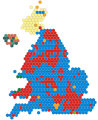 The results of the 2019 UK General Election in equal sixes constituency blocks without regional borders (Please can regional borders be added to this map.


Article(s): Various
- Request
- Please can the image of the 2019 UK General Election Constituency map in equal sized blocks be modified so that reagional and the boundaries of Scotland and Wales can be seen in the map so the format looks the same to the 2017 map as shown. (MOTORAL1987 (talk) 13:12, 26 May 2020 (UTC))
- Graphist opinion(s)
UK Government Coat of Arms
en:File:Coat of Arms of the British Government.jpg
Article(s): Various
- Request
- Please can this version of the coat of arms of the UK Government be converted into a SVG file please. (2A02:C7F:5622:2000:5011:FEB7:7720:1995 14:51, 7 April 2020 (UTC))
- Graphist opinion(s)
- Is there a purpose for vectorizing this simple image, given the existence of the more extensive and widely used File:Royal Coat of Arms of the United Kingdom.svg? —RCraig09 (talk) 03:30, 31 May 2020 (UTC)
Vectorize a logo
Article(s): es:Tarzán (película de 1999)
- Request
- Hi. I am looking for someone who could vectorize the Tarzan's Disney movie logo in order we can use in Wikipedia versions with no Fair Use rights. More or less like other Disney movie logos. Thank you very much in advance. --5truenos (talk) 05:33, 6 June 2020 (UTC)
- Graphist opinion(s)
No time to die


Article(s): wikidata:Q21534241
- Request
- Could someone make SVG logos of the movie in all languages as seen in example? All logos are in the video --Piotr Bart (talk) 13:55, 14 May 2020 (UTC)
- Graphist opinion(s)
- @Piotr Bart: Done --Mrmw (talk) 18:43, 25 June 2020 (UTC)
- Thank you.
 This section is resolved and can be archived. If you disagree, replace this template with your comment. Piotr Bart (talk) 12:12, 4 August 2020 (UTC)
ADL logo
Article(s): en:Anti-Defamation League
- Request
- Please remove the slogan --49.146.7.43 01:43, 26 June 2020 (UTC)
- Graphist opinion(s)
- Done --Mrmw (talk) 06:11, 26 June 2020 (UTC)
- This section was archived on a request by: Minoraxtalk (formerly 大诺史) 06:07, 8 August 2020 (UTC)
Seal of John C. Carney, Governor of Delaware.svg
-
 Obsolete seal
 -


Article(s): en:Seals of governors of the U.S. states
- Request
- The seal now shown for Delaware is obsolete. In the new seal, the text "JACK MARKELL" should be replaced by "JOHN C. CARNEY". (See this image.) --Lambiam 18:30, 27 June 2020 (UTC)
- Graphist opinion(s)
- @Lambiam: Done --Mrmw (talk) 20:02, 27 June 2020 (UTC)
- This section was archived on a request by: Minoraxtalk (formerly 大诺史) 06:07, 8 August 2020 (UTC)
Pastel Neurodiversity symbol into SVG
-
 Neurodiversity symbol in pastel color
 -
 SVG
SVG


- Request
- Hello. is anyone could change this file into SVG? Because the creator created it with Clipstudio, It should be re-written into vector-based and enhanced. - Ellif (talk) 19:11, 2 August 2020 (UTC)
- Graphist opinion(s)
Pinging @MissLunaRose12 as uploader. — Jeff G. ツ please ping or talk to me 19:22, 2 August 2020 (UTC)
- @Ellif: Done --Mrmw (talk) 20:54, 2 August 2020 (UTC)
- This section was archived on a request by: Minoraxtalk (formerly 大诺史) 06:08, 8 August 2020 (UTC)
Please create a sketch for Bruce Payne
Article(s): Bruce Payne
- Request
- Hello, article of the English actor Bruce Payne does not have any image since its creation in 2005-06 and it has "9,222 pageviews" from 30 days ago, there was no image of him in here and I couldn't find any free image for him, and unfortunately I don't have any Twitter or Facebook account to ask him donate an image, even if he has one official account. I saw that the article Anders Behring Breivik uses a free digital sketch of him, and in Category:Emma Watson there are some painting of her, so can someone please create a basic sketch or painting for Mr. Bruce Payne so that we can use it for the infobox in all WP languages? since he is sill alive, it is not possible to use a copy-righted image as fair use. I will be really grateful, thanks. -- Editor-1 (talk) 13:41, 21 June 2020 (UTC)
- Graphist opinion(s)
NACA
-

-
 new
new

.png)
Article(s): en:NACA
- Request
- please remove background outside of ring… --Kintetsubuffalo (talk) 10:18, 9 August 2020 (UTC)
- Graphist opinion(s)
- @Kintetsubuffalo: Done, Image background has been removed. Blue Sonic (talk) 10:18, 14 August 2020 (UTC)
- Fantastic, thank you!Kintetsubuffalo (talk) 00:33, 15 August 2020 (UTC)
GIF explanation to PRC vs ROC vs Taiwan
-
Map of Qing dynasty immediately before cession of Taiwan to Japan in 1895.
-
1895, Taiwan ceded to Japan
-
1912. Qing overthrown. ROC established.
-
1945. Japan lost WWII. Taiwan returned to ROC.
-
1949-50. ROC retreated to Taiwan. PRC established.
-
 a rough sketch of my idea

Article(s): Taiwan
- Request
- I am hoping to create simple maps with two-line captions and one simple GIF illustration to explain the problematic confusion between the ROC between 1912 and 1949 (aka China) and the ROC from 1949 to today (aka Taiwan), but I dont have SVG editing skills.
- 1st map (before 1895) would look like File:Ching Dynasty 1892.png. Coloured in yellow. Caption: before 1895 Qing dynasty
- 2nd map (1895) like File:Ching Dynasty 1896.png. China coloured in yellow. Taiwan coloured in white or ivory? Caption: 1895 Formosa (Taiwan) ceded to Japan
- 3rd map like File:China blank map (1936).svg. China coloured in blue. Taiwan coloured like 2nd map. Caption: 1912 Republic of China (ROC) established
- 4th map like File:People's Republic of China - Taiwan.svg (Mongolia became independent). China and Taiwan coloured in blue. Caption: 1945 Japan lost WWII Taiwan handed over to ROC
- 5th map like 4th map. China coloured in Red. Taiwan in blue. Caption: People's Republic of China (PRC), established in 1949, is commonly referred to as China. Republic of China (ROC), which retreated to Taiwan and other islands, is commonly referred to as Taiwan.
- All other countries should be coloured in gray and no borders shown, because borders changed too often and they are not really what this series addresses.
- Finally, combine them into one GIF.
- So we have 6 files to easily explain this confusion.--RZuo (talk) 18:24, 25 June 2020 (UTC)
- File:China in 1911.svg might be a good base map to work on. This can serve as the base for maps #1,2,3.
- File:China in 1950.svg can serve for maps #4,5.
- For maps #4,5 It's also easier to understand if you put in the flags of ROC and PRC File:Flag of the Republic of China.svg File:Flag of the People's Republic of China.svg. (Not for map #3!)--RZuo (talk) 20:10, 25 June 2020 (UTC)
- I would like to check the five SVG first before making the GIF. Also please overwrite my sketch with the finished GIF and you can use whichever licence you prefer. It will of course be credited to you.--RZuo (talk) 20:13, 25 June 2020 (UTC)
- Graphist opinion(s)
Logo of Modern Vidya Niketan schools
- en:File:Modern Vidya Niketan.jpg - original

Article(s): en:Modern Vidya Niketan schools, sa:मॉडर्न विद्या निकेतन विद्यालयः शृंखला
- Request
- Please make an SVG version of this logo, and upload it to Commons. Probable source: http://mvneducation.com/ — Jeff G. ツ please ping or talk to me 13:58, 18 August 2020 (UTC)
- Graphist opinion(s)
- @Jeff G.:
- Please make a version undeletion request of old versions of w:en:File:Modern Vidya Niketan.jpg#filehistory (otherwise the vectorication would be difficult of such low-resolution images)
- Please do Point 3 in https://translate.google.at/translate?sl=auto&tl=en&u=https%3A%2F%2Fde.wikipedia.org%2Fwiki%2FBenutzer%3AJoKalliauer%2FGrafikwerkstatt%2FAntr%25C3%25A4ge%23Bevor_du_eine_Anfrage_stellst_checke_bitte%3A that would save much work
- — Johannes Kalliauer - Talk | Contributions 18:25, 18 August 2020 (UTC)
- @JoKalliauer: Thanks. I had the old versions restored, and I reverted to the biggest one. You may find the left portion of https://mvneducation.com/wp-content/uploads/2016/05/header2.png (or the image on the left pane of the first page (pamphlet back cover) or in the top right corner of the right pane of the first page (pamphlet front cover) of https://mvneducation.com/wp-content/uploads/2010/06/mvn_book.pdf) helpful. — Jeff G. ツ please ping or talk to me 01:13, 19 August 2020 (UTC)
- Done @Jeff G.: I might wrote unclear, as mentioned in the gallery I already created File:Modern Vidya Niketan.svg from Vectordata https://mvneducation.com/wp-content/uploads/2018/01/mvn-franchise.pdf — Johannes Kalliauer - Talk | Contributions 08:56, 19 August 2020 (UTC)
- @JoKalliauer: Thanks again! — Jeff G. ツ please ping or talk to me 13:02, 19 August 2020 (UTC)
- @Jeff G.: Sorry I overlooked your pdf, however the titlepage of https://mvneducation.com/wp-content/uploads/2010/06/mvn_book.pdf only contain a singe rastergraphic over the whole page. I'm currently on Linux, however as far as I know if you open a PDF in Acrobat Reader, if it is a raster image you can click on it, then it should be marked and then you can copy it, if it is vector you neither can mark nor copy it. Or in any pdf-viewer you can just zoom in to detect if is pixaleted or not. — Johannes Kalliauer - Talk | Contributions 16:59, 19 August 2020 (UTC)
- @JoKalliauer: Thanks again! — Jeff G. ツ please ping or talk to me 13:02, 19 August 2020 (UTC)
- @JoKalliauer: Thanks. I had the old versions restored, and I reverted to the biggest one. You may find the left portion of https://mvneducation.com/wp-content/uploads/2016/05/header2.png (or the image on the left pane of the first page (pamphlet back cover) or in the top right corner of the right pane of the first page (pamphlet front cover) of https://mvneducation.com/wp-content/uploads/2010/06/mvn_book.pdf) helpful. — Jeff G. ツ please ping or talk to me 01:13, 19 August 2020 (UTC)
- This section was archived on a request by: — Jeff G. ツ please ping or talk to me 13:02, 19 August 2020 (UTC)
Is there something wrong with this file?
-
 File in question
 -
 Alternative version


Article(s): en:Ontario Highway 407
- Request
- This file appears to have some errors whenever it is displayed, most notably the yellow bar being slightly displaced, and the background between the black and blue frames is transparent. However, whenever I look in the file's page, the file appears to be perfectly fine. Can someone please check to see if there is anything wrong with this file? Thanks! --TextClick (talk) 23:34, 12 August 2020 (UTC)
- Graphist opinion(s)
@TextClick: Hello, I personally didn't see a problem with the file, I think sometimes rendering text in SVGs can be a bit finicky. I made an alternative version of the sign that fixes that problem and also looks more accurate. ❧ affius (talk) 18:29, 21 August 2020 (UTC)
- @Affius: Thank you! TextClick (talk) 03:07, 22 August 2020 (UTC)
Fix typo in SVG


Article(s): Coat of arms of Mississippi
- Request
- Fix typo in SVG
- SVG has typo, says "at" instead of "et". JPG linked to show what it should look like. --– Illegitimate Barrister (talk • contribs), 02:29, 30 July 2020 (UTC)
- Graphist opinion(s)
Revised version is uploaded. Let me know if anything is amiss!
![]() Done —RCraig09 (talk) 18:12, 1 August 2020 (UTC)
Done —RCraig09 (talk) 18:12, 1 August 2020 (UTC)
- @Illegitimate Barrister: Kindly check. --Minoraxtalk (formerly 大诺史) 06:07, 8 August 2020 (UTC)
Improve Seal of the Federal Acquisition Institute
-
 Seal of the Federal Acquisition Institute.

Article(s): Federal Acquisition Institute (Q98649212)
- Request
- I extracted this SVG from a PDF with Inkscape, but it could to be made bigger and that is beyond my ability. --William Graham (talk) 00:39, 27 August 2020 (UTC)
- Graphist opinion(s)
- @William Graham: The updated version of the file is uploaded. Let me know if it's what you are looking for. Done ❧ affius (talk) 13:51, 27 August 2020 (UTC)
- @Affius: Looks great. Thanks. --William Graham (talk) 23:24, 27 August 2020 (UTC)
- This section was archived on a request by: ❧ affius (talk) 01:58, 28 August 2020 (UTC)
request
-
Description of first image
-
Description of second image (if needed)
-
Description of third image (if needed; don't request too many at once, though)
Article(s): [[]]
- Request
- Details of your request go here… --Cherurbino (talk) 09:58, 28 August 2020 (UTC)
- Graphist opinion(s)
File:Serenissima.svg
- Request
Please replace the year in the legend header „L’Adriatico Italiano dalla Repubblica di Venezia al…”: 1955 → 1915.
Thank you. Cherurbino (talk) 09:58, 28 August 2020 (UTC)
Request cancelled, sorry. Cherurbino (talk) 10:07, 28 August 2020 (UTC)
- Graphist opinion(s)
- This section is resolved and can be archived. If you disagree, replace this template with your comment. Goran tek-en (talk) 14:27, 6 September 2020 (UTC)
Fix the size of rendered SVG file
-
 i3wm logo
Article(s): en:I3 (window manager)
- Request
- The File:I3 window manager logo.svg is not rendered properly, the right and bottom part of the logo is cropped. But if I viewed as the original file, the rest of the logo will be showed up. I would like the logo rendered as the original logo. Thank you. Labdajiwa (talk) 02:17, 8 September 2020 (UTC)
- Graphist opinion(s)
![]() Done -- Fulvio 314 17:31, 9 September 2020 (UTC)
Done -- Fulvio 314 17:31, 9 September 2020 (UTC)
- Thank you very much! Labdajiwa (talk) 02:05, 10 September 2020 (UTC)
arms of Diego de Vargas
-
 arms as seen on d:Q96631042 before removal
 -
 arms as seen on d:Q96639516 and maybe also d:Q96639416


see also diagram from Kiva, Cross, Crown from the NPS
Article(s): en:Diego de Vargas, maybe also en:statue of Diego de Vargas
- Request
- I would like to request a vector recreation of these arms (was not able to find if there was a heraldry working group on Commons). I noticed that these are similar but different; I am not sure if one or both are in error or the arms merely changed during de Vargas' lifetime, but either way having the files would be useful, particularly since the depiction itself of de Vargas has become relevant recently. I would imagine that parts of contemporary arms from the Spanish Empire might be useful in creating the SVG. --Arlo James Barnes 20:09, 14 July 2020 (UTC)
- Graphist opinion(s)
@Arlo Barnes: The Wikidata Q numbers you specified for File:De Vargas arms painting.jpg are identical. — Jeff G. ツ please ping or talk to me 05:59, 19 July 2020 (UTC)
- @Jeff G.: No, they are separated by 100 and refer to two separate physical paintings in two places in the world, one in Spain and a copy in New Mexico. Being an original and a copy, they should be near-identical in appearance, but as Commons only has a photo/scan of the copy, I cannot confirm this. Arlo James Barnes 20:10, 19 July 2020 (UTC)
Simple graphics
Article(s): I need these for en:Cleavage (breasts), an article I believe is on the way to become at least a Good Article
- Request
- These are low res, bad finishing, badly colored images. Cleaning them up, enlarging them somewhat and enhancing the color would be highly useful. Aditya (talk) 17:13, 25 July 2020 (UTC)
- Graphist opinion(s)
- double-request: en:WP:GL/I#Request
- Yes. For lack of response. Is there anyone who would lend a hand? Aditya (talk) 15:51, 26 July 2020 (UTC)
- No takers? :( Aditya (talk) 23:56, 30 July 2020 (UTC)
- Yes. For lack of response. Is there anyone who would lend a hand? Aditya (talk) 15:51, 26 July 2020 (UTC)
- This section was archived on a request by: Minoraxtalk 02:57, 11 September 2020 (UTC)
Map Images of Madawaska County
Article(s): Madawaska Parish, New Brunswick; Saint-Jacques Parish, New Brunswick; Saint-Joseph Parish, New Brunswick (all on English site; I tried to link but wasted significant time for no result)
- Request
- Please add a caption to the effect that the map is inaccurate. Both Madawaska and Saint-Jacques Parishes are bisected by Saint-Joseph Parish and both their northeastern portions are shown as part of Saint-Joseph Parish. The descriptions in the Territorial Division Act and on cadastral map numbers 9 and 20 are evidence of this error. G. Timothy Walton (talk) 00:48, 20 July 2020 (UTC)
- I formed links above. —RCraig09 (talk) 04:22, 20 July 2020 (UTC)
Vectorize DFAS logo
-
 Logo of Defense Finance Accounting Services in PNG
 -
 Extracted version of logo
Article(s): en:Defense Finance and Accounting Service
- Request
- Please translate the image to SVG. The font is Cobe Heavy Italic by Stawix. Also please omit the logline "Your Financial Partner @ Work" because it is no longer used. An alternative PNG is found here. --William Graham (talk) 19:57, 12 September 2020 (UTC)
- Graphist opinion(s)
- Request taken by ❧ affius (talk) 21:31, 12 September 2020 (UTC)
- Done @William Graham: Let me know if this works. ❧ affius (talk) 23:29, 12 September 2020 (UTC)
- @Affius: looks great but can you make the star white instead of transparent? Most depictions of the logo on solid color backgrounds have a white star. William Graham (talk) 23:41, 12 September 2020 (UTC)
- @William Graham: I am unsure on my opinion, but I personally disagree about the making the star white. There might be a precedent internally, but as far as I can tell their external branding is all over the place regarding thier logo. Some versions have a white star, some have a white outline, and others have both. I think the logo without a white star or a white outline is the best version. While looking for their logo I found that ~95% of the time their logo was presented on white, so an assumption could be made that the white star is part of the background. Let me know what you think.
Here are a few examples of the logo that I found:- With the white star:
- [8] from https://mypay.dfas.mil/ (the one you linked)
- [9] has a weird white outline
- [10] single color green
- [11] with outline
- Without the white star:
- @Affius: Sounds good to me then, consider it complete. William Graham (talk) 02:00, 13 September 2020 (UTC)
- With the white star:
- @William Graham: I am unsure on my opinion, but I personally disagree about the making the star white. There might be a precedent internally, but as far as I can tell their external branding is all over the place regarding thier logo. Some versions have a white star, some have a white outline, and others have both. I think the logo without a white star or a white outline is the best version. While looking for their logo I found that ~95% of the time their logo was presented on white, so an assumption could be made that the white star is part of the background. Let me know what you think.
- @Affius: looks great but can you make the star white instead of transparent? Most depictions of the logo on solid color backgrounds have a white star. William Graham (talk) 23:41, 12 September 2020 (UTC)
- This section was archived on a request by: ❧ affius (talk) 19:08, 13 September 2020 (UTC)
Northern Rhodesia Regiment crest
-
 Northern Rhodesia cap badge

Article(s): en:Northern Rhodesia Regiment
- Request
- Can an SVG vector be made of the cap badge for ther Northern Rhodesia Regiment please? The C of E (talk) 08:00, 26 July 2020 (UTC)
- Graphist opinion(s)


Article(s):
- Hello, I uploaded File:Symptoms of coronavirus disease 2019 4.0-cs.svg, but text is not in Czech, but in English. How to translate text correctly (like here)? --Patriccck (talk) 16:46, 24 July 2020 (UTC)
- Graphist opinion(s)
- @Patriccck: try this --Mrmw (talk) 21:45, 24 July 2020 (UTC)
- @Mrmw: Apparently you didn't understand me, maybe I wrote it badly. This file is translated to Czech language, but I must use param lang=cs. I want defult Czech language like here. Do you understand? Patriccck (talk) 18:13, 27 July 2020 (UTC)
Image of superionic water
-
 Unit cell of body-centered cubic crystal lattice
 -
 Unit cell of face-centered cubic crystal lattice
 -
 Many cells of face-centered cubic crystal lattice
 -
 Face-centered space-filling model of a crystal lattice
 -
 Unit cell of body-centered cubic crystal lattice


.svg)
Article(s): en:Superionic water
- Request
- Superionic water has gotten a lot of press within the last year since it was reported here, and I think it might be nice to have an image of it.
- It would look something like the images in Fig. 2a of this paper, where the red dots represent H+ and the white ones represent O2-. A key component of the diagram will be to show that the O2- ions are fixed in the lattice, but that the H+ ions are free to move through it. If there is no voltage applied across the system, then they will bounce around randomly, but if there is a voltage, then the system will conduct it and the H+ ions will all move in the same direction through the holes of the lattice, parallel to the electric field.
- As far as the details of how the lattice should look, it should be body-centered, not face-centered, and probably space-filling. If you want to put units on it, the distance between planes of O2- in the crystal is about 1.8 Å.
- Thanks, and let me know if there are any questions! --Rob Hurt (talk) 21:40, 15 May 2020 (UTC)
- Graphist opinion(s)
- The link to https://login.clsproxy.library.caltech.edu/login?url=https://doi.org/10.1103/PhysRevLett.117.135503 requires login with "access.caltech (IMSS) username and password." —RCraig09 (talk) 16:07, 16 May 2020 (UTC)
- It looks like the first and second images above are body-centered, and only the third is face-centered, contrary to their captions ... though I may not understand what the terms mean. In any event, an accessible link to a good "model" image would be helpful. —RCraig09 (talk) 16:07, 16 May 2020 (UTC)
- Sorry about that! I fixed both issues above (I hope). Does that help? --Rob Hurt (talk) 18:25, 16 May 2020 (UTC)
- The captions are clearer now, thanks. However, I'm an electrical/computer guy and based on Fig. 2 I don't think I could competently handle chemical stuff, sorry. Maybe someone else here is up to it! —RCraig09 (talk) 20:19, 16 May 2020 (UTC)
- Rob Hurt I might be able to help you, I have done some other things similar to this like File:NaCl polyhedra.svg but I'm a graphic worker and don't have any background knowledge for your request. This means that you have to explain in common language and explain more for me.
- The image 2A are 2 dimensional but the images you have added here are a gitter in 3 dimensions. So which should the new image be in?
- I actually don't fully understand what you mean is the difference between face- and body-centered, you will have to explain that more?
- You also say you want it to be space-filling. Do you by this mean that you want H+ and O2- sizes be in relation to each other? If so then you have to state the relation.
- You also write that H+ behave differently for voltage or no voltage and you want that to be shown. Does this mean you want two different images?
- Once I understand the things above I will also need more info about the linked image 2a. I do hope you understand that it's hard for us graphic workers to understand this with out info. Please ping me, thanks. --Goran tek-en (talk) 15:52, 10 June 2020 (UTC)
- Rob Hurt I might be able to help you, I have done some other things similar to this like File:NaCl polyhedra.svg but I'm a graphic worker and don't have any background knowledge for your request. This means that you have to explain in common language and explain more for me.
- The captions are clearer now, thanks. However, I'm an electrical/computer guy and based on Fig. 2 I don't think I could competently handle chemical stuff, sorry. Maybe someone else here is up to it! —RCraig09 (talk) 20:19, 16 May 2020 (UTC)
- Sorry about that! I fixed both issues above (I hope). Does that help? --Rob Hurt (talk) 18:25, 16 May 2020 (UTC)
- Hi Goran tek-en, thanks very much for being willing to work on this. Here goes:
- To start, I would make something very similar to File:NaCl polyhedra.svg, but with all the atoms being red and the same size, and the bonds between them being a bit thinner. The only major thing that will need to be changed about that figure is that it's face-centered, and would need to be body-centered. The way to think about the difference is that if you can draw a cube that touches all the atoms in a unit cell of the lattice, then it's face-centered. If it doesn't touch all of them, then it's body-centered. Does that help to understand the images shown above here? To get this from the image you have, I would just add an extra atom in the middle of each of the cubes (unit cells) in the lattice.
- Then you can add the H+ ions. We'll need to think carefully about this part, because it's scientifically the most important part of the figure. This is what distinguishes superionic ice from regular ice: in regular ice, the two H+ ions stay pretty close to their O2- ion, but in ionic ice, they're free to move around through the holes of the lattice. That's what fig. 2 in that paper is trying to show. This is important because it means that ionic ice can conduct electricity, while regular ice can't. That's the exciting part about this discovery. To demonstrate this concept, I'm imagining something like this pair of images, showing that the electrons in a wire are free to move around, and it's not until you give them a positively-charged end to migrate to that they start to all move in the same direction (this unidirectional movement is what we know as an electric current). I actually really like this figure from a scientific standpoint, even if it's not the prettiest.
- I hope that helps some, but please let me know if you have more questions. Rob Hurt (talk) 00:05, 10 July 2020 (UTC)
- Hi Goran tek-en, thanks very much for being willing to work on this. Here goes:
![]() Request taken by Goran tek-en (talk) 16:06, 10 July 2020 (UTC)
Request taken by Goran tek-en (talk) 16:06, 10 July 2020 (UTC)
Rob Hurt Thanks for the information and I found that we have a page that explains body- face- thing.
- Then I suggest that we start with the base lattice and the red atoms, which are they: H+ or O2-?
- Can you tell me how many atoms you want on the different axis, x y z?
- What is the distance between the atoms in atoms diameter (2,5 times or something else) and if they differ in x y z?
- Should the atoms be solid or have some transparency?
Please always ping me, thanks. --Goran tek-en (talk) 16:06, 10 July 2020 (UTC)
- @Goran tek-en: , this sounds great.
- I think the number of atoms and the transparency is up to you--whatever makes the presentation of the scientific concepts the most clear. Could those be easily changed later?
- The red atoms in the lattice would be O2-
- In terms of the lattice spacing, I would make the distances match up to the fifth image above, with the ratio of r:a being about 1:4.
- Hope that helps some, Rob Hurt (talk) 02:20, 11 July 2020 (UTC)
- Rob Hurt No, it's not easy to change later on, that's why I ask. So think about it and let me know, thanks. --Goran tek-en (talk) 09:37, 12 July 2020 (UTC)
- @Goran tek-en: Then I'd make it 3x3x3 O2- ions. The most important part is to show the behavior of the H+ ions passing through the lattice, so let's not make the lattice include so many O2- ions that it's hard to see the behaviors of individual H+ ions. Rob Hurt (talk) 20:42, 12 July 2020 (UTC)
- Rob Hurt I want you to check this draft to see so the sizes, distances etc is what you want. I have only worked with the top left atom and its bindings so it doesn't looks correct for the rest. So give me feedback, thanks. --Goran tek-en (talk) 16:03, 16 July 2020 (UTC)
- @Goran tek-en: Then I'd make it 3x3x3 O2- ions. The most important part is to show the behavior of the H+ ions passing through the lattice, so let's not make the lattice include so many O2- ions that it's hard to see the behaviors of individual H+ ions. Rob Hurt (talk) 20:42, 12 July 2020 (UTC)
- @Goran tek-en: happy to, could you set the permissions so I can view it? Rob Hurt (talk) 17:25, 17 July 2020 (UTC)
- Rob Hurt Sorry, fixed. --Goran tek-en (talk) 13:17, 18 July 2020 (UTC)
- @Goran tek-en: happy to, could you set the permissions so I can view it? Rob Hurt (talk) 17:25, 17 July 2020 (UTC)
- @Goran tek-en: I think this looks great, the only thing I might change is to make the lines slightly thicker so it’s a bit easier for the eye to perceive the depth. Rob Hurt (talk) 04:58, 19 July 2020 (UTC)
- Rob Hurt This is a draft with the lattice of the O2-. Check this and give me feedback on that part.
- After that, to my understanding you want to show different states; 1-no voltage, 2- a voltage.
- 1. The H+ bounce around randomly.
- 2. The H+all move the same, parallel to the electric field.
- So we should do two illustrations?
- Which size (compared to O2-) and color should H+ have?
- How many in each cubic hole? --Goran tek-en (talk) 17:03, 3 August 2020 (UTC)
- @Goran tek-en: I think this looks great. Yes, let's do two images, similar to this. The H+ is usually shown as white, and would be about half the diameter of O2-. There should be two H+ for each O2-. Thanks again, and let me know if you have more questions. Rob Hurt (talk) 00:55, 7 August 2020 (UTC)
- Rob Hurt Does the H+ move in the same direction (no voltage) all the time once it has started to move, or do they change direction every now and then? --Goran tek-en (talk) 17:07, 7 August 2020 (UTC)
- @Goran tek-en: I think this looks great. Yes, let's do two images, similar to this. The H+ is usually shown as white, and would be about half the diameter of O2-. There should be two H+ for each O2-. Thanks again, and let me know if you have more questions. Rob Hurt (talk) 00:55, 7 August 2020 (UTC)
- @Goran tek-en: should be completely random Brownian_motion with no voltage, just bouncing off each other and the O2- in the lattice. Rob Hurt (talk) 03:50, 10 August 2020 (UTC)
- Rob Hurt Before I continue I want you to give me feedback. In this draft there is 27 H+ and 8 of them have the moving illustrations on them. All together there will be 54 H+. The yellow background is just so you can see what is transparent etc. Draft to give me feedback on, thanks. --Goran tek-en (talk) 13:04, 13 August 2020 (UTC)
- @Goran tek-en: I think this is looking great. The one thing I might change is the curves coming out of the backs of the particles, because to me these look like the particles are emitting waves. Maybe the arrows could be set up similar to this, but with the particle being at the middle of the arrow and the arrow's head being solid and the tail being dashed. Rob Hurt (talk) 23:04, 14 August 2020 (UTC)
- Rob Hurt Before I continue I want you to give me feedback. In this draft there is 27 H+ and 8 of them have the moving illustrations on them. All together there will be 54 H+. The yellow background is just so you can see what is transparent etc. Draft to give me feedback on, thanks. --Goran tek-en (talk) 13:04, 13 August 2020 (UTC)
- @Goran tek-en: should be completely random Brownian_motion with no voltage, just bouncing off each other and the O2- in the lattice. Rob Hurt (talk) 03:50, 10 August 2020 (UTC)
Rob Hurt Draft with 18. The exact placing of them might change when the rest are added. The preview here is not as good as it will be at wikimedia. Feedback, thanks. --Goran tek-en (talk) 15:38, 16 August 2020 (UTC)
- @Goran tek-en: this looks great, I don’t think there are any problems with it scientifically. I might put a gray background for display purposes, but that’s up to you. Rob Hurt (talk) 19:40, 18 August 2020 (UTC)
- Rob Hurt We use a lot of grey in the illustration so here are four different options which each gives very different result.
- 0
- 16
- 36
- 72
- You have to check everything, number of H, shadows etc. I have tried my best but after a while you get kind of lost, feedback, thanks. --Goran tek-en (talk) 17:03, 21 August 2020 (UTC)
- Rob Hurt We use a lot of grey in the illustration so here are four different options which each gives very different result.
- Goran tek-en I really like the look of the last one, 72. A very minor thing I noticed is that if you compare the bonds at the front and back of the lattice (for example the bond in the front middle compared to the one in the bottom rear), they don't look parallel--is that just parallax from the view angle?
- I think we can probably move on to the next part, which is to show the special electrochemical properties of superionic water by combining the ideas of an electric field created between two charged plates and the movement of charged particles in an electric field. Rob Hurt (talk) 00:26, 22 August 2020 (UTC)
- Rob Hurt Is this what you mean. The tool I used creates a 3 dimensional box where the lines straight up is parallel, the lines left-right has a meeting point which is red lines here and the lines back-front has a meeting point in the back which is yellow lines here. This is a normal way to show 3d in 2d. I will start to look at the next one. --Goran tek-en (talk) 18:59, 22 August 2020 (UTC)
- Rob Hurt If I have + on the left side, - on the right side, how would the H move? --Goran tek-en (talk) 19:15, 22 August 2020 (UTC)
- Goran tek-en yes, I think that's it. No problem if that's the normal way to do it. H+ is positively charged, so it should be repelled by the + plate and attracted to the - plate. Rob Hurt (talk) 19:36, 23 August 2020 (UTC)
- Rob Hurt After your question about the perspective I checked my work and I found that I actually had made some manual adjustments which might have created what you fond, so thanks for that.
- So I have made a new version and I want you to compare those two and tell me which you want. I think the new version.
- Goran tek-en that’s great, I think the new version is excellent. Rob Hurt (talk) 18:10, 29 August 2020 (UTC)
- Rob Hurt After your question about the perspective I checked my work and I found that I actually had made some manual adjustments which might have created what you fond, so thanks for that.
- Goran tek-en yes, I think that's it. No problem if that's the normal way to do it. H+ is positively charged, so it should be repelled by the + plate and attracted to the - plate. Rob Hurt (talk) 19:36, 23 August 2020 (UTC)
Rob Hurt Here is a first draft. Feedback, thanks. --Goran tek-en (talk) 18:26, 30 August 2020 (UTC)
- Goran tek-en this looks great, I think the only thing I’d change is that instead of having the H+ aligned in lines like many of them are, having them randomly distributed (though all still facing the direction you have them). Rob Hurt (talk) 19:45, 30 August 2020 (UTC)
- Rob Hurt Will do but the images you have linked me to have them lined up like that so I thought that was what you wanted, will be back. --Goran tek-en (talk) 16:31, 31 August 2020 (UTC)
- Goran tek-en yes, the way it would actually happen is that they would start out randomly ordered and randomly oriented, then when the electric field is applied they would all orient with this field as shown, then start moving from + to -. After moving for a while, they will ultimately line up in the space between planes of O2- so they can move through the lattice without hitting them, but this would only happen after several collisions with the lattice O2-, kind of like a Plinko board. I think the best way to illustrate this concept would be to make an "animation" with five frames, one showing each step of the process (all of which you'll have after making this last one), perhaps in a style like this (https://upload.wikimedia.org/wikipedia/commons/1/1e/Turk-knights-tour_anim.svg) but with each of the five frames lasting for two seconds or so. Rob Hurt (talk) 18:59, 31 August 2020 (UTC)
- Rob Hurt Like this? --Goran tek-en (talk) 16:51, 3 September 2020 (UTC)
- Goran tek-en yes, this looks excellent. Rob Hurt (talk) 02:03, 4 September 2020 (UTC)
- Rob Hurt Like this? --Goran tek-en (talk) 16:51, 3 September 2020 (UTC)
- Goran tek-en yes, the way it would actually happen is that they would start out randomly ordered and randomly oriented, then when the electric field is applied they would all orient with this field as shown, then start moving from + to -. After moving for a while, they will ultimately line up in the space between planes of O2- so they can move through the lattice without hitting them, but this would only happen after several collisions with the lattice O2-, kind of like a Plinko board. I think the best way to illustrate this concept would be to make an "animation" with five frames, one showing each step of the process (all of which you'll have after making this last one), perhaps in a style like this (https://upload.wikimedia.org/wikipedia/commons/1/1e/Turk-knights-tour_anim.svg) but with each of the five frames lasting for two seconds or so. Rob Hurt (talk) 18:59, 31 August 2020 (UTC)
- Rob Hurt Will do but the images you have linked me to have them lined up like that so I thought that was what you wanted, will be back. --Goran tek-en (talk) 16:31, 31 August 2020 (UTC)
Rob Hurt Then I will need the following for those two files;
- Name of the file
- Description (/language)
- Captions/s (/language)
- Category/ies at commons
to be able to upload it at commons. If you don'y know about Captions read here.--Goran tek-en (talk) 15:54, 4 September 2020 (UTC)
- Goran tek-en here's a start, but I might add a bit more after you post them:
- For the first image:
- Name of the file: superionic_ice_rest
- Description (/language): In its superionic form (ice XVIII), the O2- ions (red) of ice form a lattice and the H+ ions (white) diffuse randomly through it.
- Captions/s (/language): Superionic ice (ice XVIII) at rest.
- Category/ies at commons: ice, water
- For the second image:
- Name of the file: superionic_ice_conducting
- Description (/language): When placed in an electric field, the H+ ions (white) in superionic ice (ice XVIII) flow through the O2- ion lattice from the cathode to the anode.
- Captions/s (/language): Superionic ice (ice XVIII) conducting protons in an electric field.
- Category/ies at commons: ice, water, electrical conduction
Rob Hurt (talk) 23:21, 10 September 2020 (UTC)
- Rob Hurt I'm trying to upload the files now but I'm having problems with the preview, the full image is correct. There is a lot of problems with svg previews here at commons. I don't know how to fix this right now but I will be back.
- The category: electrical conduction does not exist on commons.
- file:superionic_ice_conducting.svg
- file:superionic_ice_rest.svg --Goran tek-en (talk) 15:24, 14 September 2020 (UTC)
- Rob Hurt I found away to work around the preview problems but the files are bigger in Mb.
- You wrote about an animation you wanted and If you want I hope I can help you, but I want us to close this request and start a new one either here (ping me) or that you contact me on my talk page, thanks.
- If you are happy with this please put the code
{{section resolved|1=~~~~}}on this request so it can be archived, thanks. Done --Goran tek-en (talk) 15:45, 14 September 2020 (UTC)
- Rob Hurt I found away to work around the preview problems but the files are bigger in Mb.
- Rob Hurt I'm trying to upload the files now but I'm having problems with the preview, the full image is correct. There is a lot of problems with svg previews here at commons. I don't know how to fix this right now but I will be back.
Looks great to me. Thanks for doing this, and I’ll start another request here for the animation. Rob Hurt (talk) 20:00, 21 September 2020 (UTC)
Vectorize PNG images
-
 Wordmark
 -
 Wordmark
 -
 Poster

.png)
Article(s): Black Is King
- Request
- Hi! Anyone that could make these images into SVG files/format? The poster is the most important. Thanks --Premeditated (talk) 09:01, 1 August 2020 (UTC)
- Graphist opinion(s)
Communist Party of Spain emblem, 1930s
-
 Emblem of the Communist Party of Spain in the 1930s.
 -

-


.svg)

Article(s): es:Partido Comunista de España
- Request
- Can we improve and cleanup this raster so that it looks crisper and it can be re-usable in other articles? The source includes an original representation of the emblem for reference.--Fer1997 (talk) 09:37, 4 August 2020 (UTC)
- Graphist opinion(s)
WE Charity
-
 WE Day logo
 -
 Me to WE logo
 -
 WE logo
Article(s): wikidata:Q495642-related articles, such as w:fr:WE Charity
- Request
- Please create a new image, by cropping to the "WE" box, as that is the logo for the WE Charity (without the "Day" or "Me to" portion)
- --67.70.32.97 09:32, 29 September 2020 (UTC)
- Graphist opinion(s)
![]() Done -- MaxxL - talk 12:11, 29 September 2020 (UTC)
Done -- MaxxL - talk 12:11, 29 September 2020 (UTC)
- Thanks -- 67.70.32.97 20:37, 29 September 2020 (UTC)
- This section was archived on a request by: 67.70.32.97 20:37, 29 September 2020 (UTC)
DjVu: missing pages

Article(s): s:Index:The Harvard Classics Shelf of Fiction Vol. 10.djvu
- Request
- Pages 460, 461, 466, and 467 are missing. Could you please add them from https://archive.org/details/harvardclassics02eliogoog. Thanks in advance. --Ratte (talk) 20:32, 14 September 2020 (UTC)
- Graphist opinion(s)
European Union Exclusive Economic Zones
-
 European Union Exclusive Economic Zone (Prior to Brexit)

Article(s): Various
- Request
- Please can a new pre Brexit SVG version of this map be made and also create a second map which excludes the United Kingdom due to Brexit as the current map is of very poor Quality and I feel something much better can now be made.
- (MOTORAL1987 (talk) 07:39, 11 August 2020 (UTC))
- Graphist opinion(s)
Hi @MOTORAL1987: I can do it. Are there specific sources? I found EEZ boundaries here (https://www.marineregions.org/downloads.php).
![]() Done – Here you can find the SVG version. I also updated the PNG one, I don't know if it's the correct procedure.
Done – Here you can find the SVG version. I also updated the PNG one, I don't know if it's the correct procedure.
-
 Redraw in SVG

Coats of arms of Provinces of Ecuador
Please, I ask an expert in heraldry to create the following shields in SVG format:
Article(s): Category:Coats of arms of provinces of Ecuador
- Request
- Details of your request go here… --David C. S. 15:32, 15 August 2020 (UTC)
- Graphist opinion(s)
NDLS-Kanpur-.DDU-Daltonganj-Ranchi railway route.gif
-
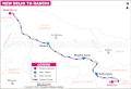 New Delhi to Ranchi via Kanpur, Deen Dayal Upadhyay Jn. railway route

Article(s): en:Daltonganj railway station
- Request
- Mughalsarai junction have been renamed to Pandit Deen Dayal Upadhyaya Junction.(Ref here) Can the name be updated here ? PS: Use the station code DDU if the name looks too long on the map. --श्रीमान २००२ (talk) 12:02, 27 August 2020 (UTC)
- Graphist opinion(s)
Design Commons query service favicon
-
 Favicon of Wikidata Query Service https://wcqs-beta.wmflabs.org/
 -
 logo used for Structured data on Commons
 -
 unused alternative SDC logo
 -
 Proposed by MaxxL
SVG -
 Proposed by MaxxL
PNG 48x48px

Commons query service (WCQS), at https://wcqs-beta.wmflabs.org/, uses at the moment Wikidata Query Service (WDQS) Favicon: ![]() . There is a phabricator ticket phabricator:T258835 to use different favicon for WCQS, but we do not have any good candidates. The idea would be to use logo used for Structured data on Commons:
. There is a phabricator ticket phabricator:T258835 to use different favicon for WCQS, but we do not have any good candidates. The idea would be to use logo used for Structured data on Commons: ![]() (or alternative logo
(or alternative logo ![]() ) and a magnifying glass
) and a magnifying glass ![]() to create a new logo. New SVG logo should resemble WDQS logo and should work at small sizes. --Jarekt (talk) 03:09, 1 September 2020 (UTC)
to create a new logo. New SVG logo should resemble WDQS logo and should work at small sizes. --Jarekt (talk) 03:09, 1 September 2020 (UTC)
--Jarekt (talk) 03:09, 1 September 2020 (UTC)
- Graphist opinion(s)
- @Jarekt: Is that what you had in mind? -- MaxxL - talk 06:37, 1 September 2020 (UTC)
- MaxxL, That would work quite well. Thank you. I will pass the info to phabricator:T258835. --Jarekt (talk) 12:26, 2 September 2020 (UTC)
- @Jarekt: Is that what you had in mind? -- MaxxL - talk 06:37, 1 September 2020 (UTC)
Christmas card

Article: en:Paul Martin (illustrator). The image is not in this WP article, but is reachable via Ref. #164.
- Request
- Hello. I uploaded this picture to Commons in July 2020. I first thought this was too minor of a fix request to mention, but OTOH, I don't think it's a real super hard fix to make either. I uploaded the picture off a CD. No other image of it exists. I did not touch it up. It wasn't necessary. There are a couple "snow" spots in the margins, but those are part of the image. The problem is the inter-alignment. It was taken with a camera in front of the greeting card instead of overhead. Hence, the alignment is off. The inner black border image should be a perfectly shaped rectangle. Notice how it curves inwardly near the top left and especially the top right. It needs to be stretched in-out so that the black border is completely rectangular in shape, like is (for the most part) the top and bottom.
- This image is on the lower end of importance. However, it would have been lost to history if not uploaded to Commons. It basically just backs up some part of the text of the WP article: Paul Martin (illustrator). His studio was on the second floor of his home. "Northern light" came into his studio from the extra large window, on the left side. (That's indirect sunlight which artists prefer over direct sunlight. The lighting is constant and doesn't move.) The artist Paul Martin drew this greeting card of his home, so it's somewhat of an artistic credit as well. Thanks. JimPercy (talk) 05:14, 20 September 2020 (UTC)
- Graphist opinion(s)
- @JimPercy: done Sette-quattro (talk) 11:57, 21 September 2020 (UTC)
![]() Done
Done
- Thanks for the alignment (perspective) fix. That helped a lot. JimPercy (talk) 12:55, 21 September 2020 (UTC)
- This section was archived on a request by: — Jeff G. ツ please ping or talk to me 00:17, 27 October 2020 (UTC)
Extract the mountain from the flag of Sabah
-
 Flag of Sabah
 -
 The leaf extracted from the Canadian flag
 -


.svg)
Article(s): Use as Sabah symbol.
- Request
- Can you extract the mountain from the flag? Thanks. --Tofeiku (talk) 13:30, 10 September 2020 (UTC)
- Graphist opinion(s)
![]() Done by Mrmw -- Blue Sonic (talk) 14:00, 10 September 2020 (UTC)
Done by Mrmw -- Blue Sonic (talk) 14:00, 10 September 2020 (UTC)
- Thank you very much! --Tofeiku (talk) 06:17, 11 September 2020 (UTC)
- Tofeiku If you are happy with this please put the code
{{section resolved|1=~~~~}}on this request so it can be archived, thanks. --Goran tek-en (talk) 18:36, 31 October 2020 (UTC)
- Tofeiku If you are happy with this please put the code
perspective distortion of magazine cover
Article(s): en:Paul Martin (illustrator). The image is not in this WP article, but is reachable via its Ref. #64.
- Request
- Hello. I uploaded this cover image of a bearded man fixing a clock, to Commons in July 2018. I uploaded the picture off a CD. No other image if it exists (likely anywhere). The problem is the camera's original awkward position, which made the lettering (not image) come out curved. Hence, the perspective distortion. Notice how the wording along the top is curved. I don't know how to straighten that out some, because the curvy pattern touches the top of the man's head. (Maybe, a GIMP program or similar, has the ability to draw an outline around the upper head, before straightening that section out.) The bottom part wording (including the long black bar) also curves. It should be even. It would help having the top and bottom parts straighten out some.
- This image is on the lower end of importance. However, it would have been lost to history if not uploaded to Commons. It basically just backs up some part of the text in the WP article: Paul Martin (illustrator). A section states he drew covers for four different trade magazines, including this one. It would be impossible to back up this credit w/o the upload. Thanks. JimPercy (talk) 02:30, 1 October 2020 (UTC)
- Graphist opinion(s)
JimPercy This request should really be in the section of Photography. I have two drafts for you stright of and one sharpen image. It could be sharpened even more but then it affects the image much more. Feedback, thanks. --Goran tek-en (talk) 18:30, 31 October 2020 (UTC)
- Thanks. That helped. I decided to go with the first. I already uploaded it to Commons. The sharpened one just doesn't look natural enough. But, others would see it differently. I'll try to remember about the Photography Workshop for similar request. I thought the lab was going to bypass on this one for whatever reason. JimPercy (talk) 19:23, 31 October 2020 (UTC)
JimPercy Although commons is an open place it doesn't mean that you can upload an image which I have edited, you do not have that right. I who has done the edit has that right, no one else, and you don't know under which license I wanted to release it. We do have a lot of different licenses here and it's only the creator who can decide that. In fact you have wrongly stated that this version is your own work which it is not.
I specifically wrote 'drafts' as that is what I show the requester, very often I have to work more on the file before I say it's ready to be uploaded.
My intention was to upload this as a png image and not as a jpg. Jpg is a destructive format (it deletes image information) and to use that on an image that already is blurry is really bad, png is a none destructive format and therefore better.
Also the work flow here at the graphic lab is as follows: The requester makes a request, a graphic worker takes on this request. When the graphic worker is happy with its work he puts the code {{done}} here and if the requester accepts this work he puts the code {{section resolved|1=~~~~}} here so it can be archived. ![]() Done --Goran tek-en (talk) 22:58, 1 November 2020 (UTC)
Done --Goran tek-en (talk) 22:58, 1 November 2020 (UTC)
- I just don't know anything about png. I wasn't familiar with it. I was thrown off since the lab experts in past, have always made the change right at the image's page on Commons. I guess in hindsight, I should have just stated my preference of the two options. Please convert to png or do whatever is proper or deemed necessary. Thanks. JimPercy (talk) 23:24, 1 November 2020 (UTC) PS. I put that tag in there, because of my reading of the last line in the one above with heading "Extract the mountain from the flag of Sabah." I just goofed, by not picking up on the exact order of how it's done.
- JimPercy New image uploaded, GoodHardware straightened. If you upload a new version on the image page or you upload a totally new image depends on which work that has been done, how much it's changed, and who uploads it. This is not something exact, it depends on the uploader and if it is of interest to keep the original image. So it's always a balance, more info. Everything is always kept here at commons (in the back) so it can be traced. --Goran tek-en (talk) 11:48, 2 November 2020 (UTC)
Google China
-
 PNG
PNG -
 SVG
SVG
Article(s): en:Google China
- Request
- SVG version needed to fix because of bad trace --John123521 (talk) 12:45, 2 October 2020 (UTC)
- Graphist opinion(s)
- @John123521: are these the correct symbols? 谷歌 If yes i can upload the vector version Sette-quattro (talk) 21:06, 5 October 2020 (UTC)
- Done – when the request is done.
- I'm okay with this--John123521 (talk) 12:22, 3 November 2020 (UTC)
Convert image to SVG
-
 This screenshot demonstrates the use of a convolutional neural network node to execute a machine learning task with PolyAnalyst.
Article(s): en:Draft:PolyAnalyst
- Request
- Could you convert this image to SVG for me? Sam at Megaputer (talk) 20:14, 16 October 2020 (UTC)
- Graphist opinion(s)
Sam at Megaputer Checking the different links it feels a bit like promotion of that company. You are very open with your connection so that is no problem but it still feels a bit strange, but maybe I misunderstood it. Is there some kind of public free knowledge in this, as that is what commons (wikimedia) is all about for me. --Goran tek-en (talk) 17:50, 31 October 2020 (UTC)
- I asked some questions about image uploading at the help desk, and they said they would prefer if I converted it the SVG. I tried to do it myself, but the free converters I used didn't work properly. Sam at Megaputer (talk) 19:33, 31 October 2020 (UTC)
- Sam at Megaputer That was not at all what I asked about. Is there a public interest in this more than for that company?
- Please always ping me, thanks. --Goran tek-en (talk) 11:30, 1 November 2020 (UTC)
- @Goran tek-en: By "this", do you mean converting the image? I assume so, otherwise they wouldn't have asked me to do it at the help desk. They said it would "improve the quality of the upload". Sam at Megaputer (talk) 13:05, 1 November 2020 (UTC)
- Sam at Megaputer I'm sorry to be unclear. What I ask is this;
- Has this illustration a public interest outside from that company?
- Has that article a public interest outside from that company? --Goran tek-en (talk) 14:24, 1 November 2020 (UTC)
- @Goran tek-en: Honestly, the image will probably not be used outside of the article on PolyAnalyst. I don't know if the article will have a public interest outside of the company. It is my opinion that it is in the public interest to have good coverage of the maximum number of subjects, including companies, but I understand that there are some people here who disagree. Sam at Megaputer (talk) 15:58, 1 November 2020 (UTC)
- Sam at Megaputer I'm sorry to be unclear. What I ask is this;
- @Goran tek-en: By "this", do you mean converting the image? I assume so, otherwise they wouldn't have asked me to do it at the help desk. They said it would "improve the quality of the upload". Sam at Megaputer (talk) 13:05, 1 November 2020 (UTC)
- Sam at Megaputer That was not at all what I asked about. Is there a public interest in this more than for that company?
Sam at Megaputer I don't have any knowledge of this subject but it seems to be a kind of analytical method and if so that is something that can be used in many places and circumstances.
![]() Request taken by Goran tek-en (talk) 17:40, 1 November 2020 (UTC) But during the process I will need your feedback and knowledge as the illustration we have is not that great in detail.
Request taken by Goran tek-en (talk) 17:40, 1 November 2020 (UTC) But during the process I will need your feedback and knowledge as the illustration we have is not that great in detail.
- Are you looking for an 'exact' copy or the symbols can be altered? --Goran tek-en (talk) 17:40, 1 November 2020 (UTC)
- @Goran tek-en: Thanks. I'll be glad to supply any information you need. I would like to converted image to be as close to the original as possible. Sam at Megaputer (talk) 20:05, 1 November 2020 (UTC)
- Sam at Megaputer I would need some explanation on the symbols.
- CSV is a database
- Derive, is that some kind of pluming, to find what you want in a larger amount?
- Partition, cutting up an excel (or similar) to the pieces you need?
- 10 000 or 20 000 rows, a symbol for any amount of rows
- Convolutional Neural Network, like this kind of machine learning?
- Model testing, a magnifying glas, key and what? --Goran tek-en (talk) 15:24, 2 November 2020 (UTC)
- @Goran tek-en: Your assessments are pretty accurate. This software imports data (in this case with a CVS node), and stores it is a form that is pretty similar to a spreadsheet. Then nodes are linked into a flowchart (aka en:directed acyclic graph) to perform an analysis. The text below each node is the node's name, which has been given by the user.
- Sam at Megaputer I would need some explanation on the symbols.
- @Goran tek-en: Thanks. I'll be glad to supply any information you need. I would like to converted image to be as close to the original as possible. Sam at Megaputer (talk) 20:05, 1 November 2020 (UTC)
- CSV is a database.
- The derive node takes two columns of data as input and creates a new column as output by applying a function specifies by the user.
- The partition node prepared the dataset to be split into pieces.
- The following nodes are "filter row" nodes. Basically, they are just applying the partition that has already been specified. Based on the nodes names, I can infer that the top node has 20,000 rows, and the bottom node has 10,000.
- The Convolutional Neural Network is like this, as you suspected.
- The icon for the model testing node is composed of a magnifying glass over a key and a pie chart. If you were to take away the magnifying glass, you would be left with PolyAnalyst's logo.
- Is this what you needed? Sam at Megaputer (talk) 17:38, 2 November 2020 (UTC)
- Sam at Megaputer That is great thanks, it's also interesting for me overall. The derive node illustration, is that like plumbing? That doesn't fit with what you explained for me. --Goran tek-en (talk) 12:17, 3 November 2020 (UTC)
- Sam at Megaputer I do need answer to this question: The derive node illustration, is that like plumbing? --Goran tek-en (talk) 15:59, 5 November 2020 (UTC)
- @Goran tek-en: It looks that way to me. My guess it that it's a bit of a metaphor. The data goes in one side, travels through the "pipes", and comes out converted to a new form. "Plumbing" or "pipes" might be a good descriptors of the image. Sam at Megaputer (talk) 16:43, 5 November 2020 (UTC)
- Sam at Megaputer I do need answer to this question: The derive node illustration, is that like plumbing? --Goran tek-en (talk) 15:59, 5 November 2020 (UTC)
Sam at Megaputer Draft to give me feedback on, thanks. --Goran tek-en (talk) 14:58, 6 November 2020 (UTC)
I forgot the arrows, new draft will come. --Goran tek-en (talk) 12:38, 7 November 2020 (UTC)
- Sam at Megaputer New draft, feedback thanks. --Goran tek-en (talk) 14:31, 7 November 2020 (UTC)
- @Goran tek-en: Sorry for the late reply. I took the weekend off. Here is what I noticed.
- 1) The contrast is a little low. Do you think you could increase it?
- 2) The CVS node should be gray, not blue.
- 3) Could you make the arrows arrows pointing away from the 10,000 rows/20,000 rows nodes strait?
- 4) The picture seems like a bit of a close-up. I think that a tad more whitespace around the edges would fix this.
- Looks like its coming along well. Thanks again for your help. Sam at Megaputer (talk) 15:19, 9 November 2020 (UTC)
- Sam at Megaputer
- 1) Of course I can do that but to me it's always also the perspective of creating something which is pleasant and nice to look at. So more contrast falls within that. Why do you want more contrast?
- 2) I'm using colors here also for the flow through the process. Green/blue in CSV is floating in to Derive and changing to grey/brown etc. Why should the CSV be gray, is that a standard?
- 3) Will do.
- 4) I made the symbols bigger in relation to the whole image size so that they are easily to view, that's why. I will spread out/add space. --Goran tek-en (talk) 16:04, 9 November 2020 (UTC)
- @Goran tek-en:
- 1) I'm comparing the new image to the original, and I think that if you made the blacks blacker it would sharpen up the borders.
- 2) The CSV nodes appear gray in the software, so I think we should preserve the original colors as much as possible. But if you have another idea, you may know what you are talking about. This is my first time doing this :) Sam at Megaputer (talk) 16:29, 9 November 2020 (UTC)
- Sam at Megaputer I'm always trying to think freely around an illustration, not comparing with the 'original'. To me an illustration like this should be easy to understand and to achieve this one work with both color and shape, not all who will view this will have knowledge about this subject but should as far as possible still be able to understand. It should also be pleasant to look at (very personal). It should be able to be reproduced in as many ways as possible. Once this illustration has been uploaded to commons it can be used in ways we didn't think about and by who ever wants, that is also something I consider. You say the color of the CSV should be gray because it looks like that in some software. You know that but does most people who will view this that, probably not. If you search for data base symbol you can see that they have all kind of colors. The Partition part is some kind of spread sheet so then maybe it should be white. As I said before the colors is used to visually show the flow. I will do a new draft for you. --Goran tek-en (talk) 18:41, 9 November 2020 (UTC)
- Sam at Megaputer New draft. How much white there is around the illustration is up to who will use it. It is transparent except for what is visible and there is no border around it. So that is what the user will add as is needed. To me, as described above, it's more important with larger symbols than longer arrows. --Goran tek-en (talk) 18:55, 9 November 2020 (UTC)
- Sam at Megaputer
- @Goran tek-en: Sorry for the late reply. I took the weekend off. Here is what I noticed.
- @Goran tek-en: Thanks for the info. The picture looks good to me, so if you think its done I'd go ahead an publish it. This process has been pretty cool to watch =) Sam at Megaputer (talk) 20:29, 9 November 2020 (UTC)
- Sam at Megaputer It is not up to you to upload it. Will be back with more info later today. --Goran tek-en (talk) 09:31, 10 November 2020 (UTC)
- Sam at Megaputer I have my way of working here as a graphic worker, it will of course differ depending on who is the graphic worker. I always wants to include the requester as much as possible because that person has knowledge and information about this subject, I have some graphic knowledge and added together we can create something. Even if it is me as the creator who uploads it and sets the license I always include and credit the requester for its knowledge and information. I have to be able to be proud and stand for what I create here, if that doesn't fit I will not do the work. Other graphic workers does it differently.
- I don't know what you otherwise is active with here at wikimedia and I'm pretty sure Megaputer doesn't know what applies when using material from commons. Everything here at commons is 'free', but not 'free' as in 'do what ever you want'. Every media file here must have a license on it. Any user, within or outside of wikimedia, must apply to what that license demands. Within wikimedia it's easy as everythin is linked together. This page gives you information for reusing content_outside_Wikimedia. It is very important that you inform Megaputer about this and the license I will use on this illustration will be CC-BY-SA 4.0 and as you also will see on it's page this license is not compatible with the licensing terms of YouTube, Facebook, Twitter and many other social networks, so there fore it can't be uploaded to such places. Breaking the terms of this license is just as bad as breaking against any copyright or ownership otherwise.
- So I will need the following;
- Name of the file
- Description (/language)
- Captions/s (/language)
- Category/ies at commons
- to be able to upload it at commons. If you don'y know about Captions read here.--Goran tek-en (talk) 11:07, 10 November 2020 (UTC)
- @Goran tek-en: Thanks for explaining about the copyright. I have informed Megaputer, and we're ok with those terms. Here are my recommendations for the upload:
- Name of file: Convolutional-neural-network-polyanalyst-flowchart-example.svg (same as the original, but with the svg extention)
- Description: PolyAnalyst's GUI contains a number of linkable nodes, each of which performs a different function. An analyst must link these nodes into a flowchart to performs an analysis. This image demonstrates the use of a convolutional neural network node to execute a machine learning task with PolyAnalyst. (Same as in the original upload, but with the word "image" in place of "screenshot". Don't forget to attribute it you keep it.)
- Caption: This image shows a PolyAnalyst flowchart that performs a machine learning task.
- Categories: Software, Data science, Machine learning, Directed acyclic graphs.
- I hope this helps. Sam at Megaputer (talk) 20:54, 11 November 2020 (UTC)
- @Goran tek-en: Thanks for explaining about the copyright. I have informed Megaputer, and we're ok with those terms. Here are my recommendations for the upload:
- Sam at Megaputer I have my way of working here as a graphic worker, it will of course differ depending on who is the graphic worker. I always wants to include the requester as much as possible because that person has knowledge and information about this subject, I have some graphic knowledge and added together we can create something. Even if it is me as the creator who uploads it and sets the license I always include and credit the requester for its knowledge and information. I have to be able to be proud and stand for what I create here, if that doesn't fit I will not do the work. Other graphic workers does it differently.
- Sam at Megaputer It is not up to you to upload it. Will be back with more info later today. --Goran tek-en (talk) 09:31, 10 November 2020 (UTC)
- @Goran tek-en: Thanks for the info. The picture looks good to me, so if you think its done I'd go ahead an publish it. This process has been pretty cool to watch =) Sam at Megaputer (talk) 20:29, 9 November 2020 (UTC)
Sam at Megaputer Now you can find it here file:Convolutional-neural-network-polyanalyst-flowchart-example.svg. If you are happy with this please put the code {{section resolved|1=~~~~}} on this request so it can be archived, thanks. ![]() Done --Goran tek-en (talk) 11:11, 12 November 2020 (UTC)
Done --Goran tek-en (talk) 11:11, 12 November 2020 (UTC)
- Done it. Thanks. Sam at Megaputer (talk) 16:00, 12 November 2020 (UTC)
Update plane

Article(s): Many
- Request
- Update South plane
- Flight 175 aircraft was in a banking left turn before reaching the south tower, this should be updated. --BevinKacon (talk) 18:08, 15 September 2020 (UTC)
- Graphist opinion(s)
-
- The focus is on the impact location. So there is no need to twist the air craft silhouette as it would not add any information value. Even if you would replace the plane by a simple arrow the message would be the same and would have no impact on the quality. -- MaxxL - talk 07:20, 16 September 2020 (UTC)
- If the focus is on the impact location, they should replaced with arrows then. It gives the false impression that both aircraft were level.--BevinKacon (talk) 11:40, 21 September 2020 (UTC)
- As this file is not in use, there is no need to edit it. It is just an offer to illustrate which was not chosen yet. MaxxL - talk 12:07, 21 September 2020 (UTC)
- If the focus is on the impact location, they should replaced with arrows then. It gives the false impression that both aircraft were level.--BevinKacon (talk) 11:40, 21 September 2020 (UTC)
- The focus is on the impact location. So there is no need to twist the air craft silhouette as it would not add any information value. Even if you would replace the plane by a simple arrow the message would be the same and would have no impact on the quality. -- MaxxL - talk 07:20, 16 September 2020 (UTC)
Translate maps into Malay
-
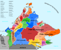 Sabah federal constituencies
 -
 New seats


Article(s): ms:Pilihan raya negeri Sabah 2020
- Request
- Help translate these 2 constituency maps. Republic of the Philippines=Republik Filipina, Celebes Sea=Laut Sulawesi, Sulu Sea=Laut Sulu, South China Sea=Laut China Selatan, Brunei Bay=Teluk Brunei, Darvel Bay=Teluk Darvel. All the S with numbers change to N (eg. S13=N13). 2020 New Seats=Kerusi Baru 2020. Thank you! --Tofeiku (talk) 08:11, 21 September 2020 (UTC)
- Graphist opinion(s)
Adapt superionic water image for electrical conduction

Article(s): en:Electrical resistance and conductance, en:Electrical conductor, en:Electrical resistivity and conductivity, en:Electric current,
- Request
Goran tek-en, could we make a version of this that we can use to demonstrate the concept of the flow of electrons through a wire in electrical conduction? This would involve:
- Changing the colors so it's clear that the new image is different from the current one (I would make the lattice atoms shiny and copper-colored, the electrons blue, and the - plate black)
- Switching the + and - plates (or reversing the directions of all the arrows)
- Optionally, adding a "zoomed out" image of the wire the electrons are flowing through like this, to connect the microscopic and macroscopic
Thanks, and let me know what you think. --Rob Hurt (talk) 01:22, 23 September 2020 (UTC)
- Graphist opinion(s)
![]() Request taken by Goran tek-en (talk) 13:56, 23 September 2020 (UTC)
Request taken by Goran tek-en (talk) 13:56, 23 September 2020 (UTC)
@Rob Hurt: Can do but I have some other stuff also going on, shall we do animation or this first?
I can't find any information of copyright on that site so it's best just to use it as information. --Goran tek-en (talk) 13:56, 23 September 2020 (UTC)
@Goran tek-en: sure, all sounds good to me. —Rob Hurt (talk) 04:50, 24 September 2020 (UTC)
Sutton Hoo helmet design 2
Article(s): en:Sutton Hoo helmet
- Request
- Could somebody please create a version of design 2 from the Sutton Hoo helmet? An example can be seen here, but I can email a high quality version from which to trace. Ideally this should result in something similar to this version of design 1, which Goran tek-en kindly created last year. --Usernameunique (talk) 06:02, 4 May 2020 (UTC)
- Graphist opinion(s)
![]() Request taken by Goran tek-en (talk) 13:07, 4 May 2020 (UTC) Usernameunique Will get back to you soon but you can send me the high resolution meanwhile. --Goran tek-en (talk) 13:07, 4 May 2020 (UTC)
Request taken by Goran tek-en (talk) 13:07, 4 May 2020 (UTC) Usernameunique Will get back to you soon but you can send me the high resolution meanwhile. --Goran tek-en (talk) 13:07, 4 May 2020 (UTC)
- Sent, thanks! --Usernameunique (talk) 06:07, 5 May 2020 (UTC)
- Usernameunique This is not so clear to what is known or not as the other one. I'm working on it but it will take a bit of time, other parts of life also need it's time, I will be back. --Goran tek-en (talk) 17:06, 12 May 2020 (UTC)
- Usernameunique Now I need your help to check so I got all the known parts in this draft. Please check so I got all the known parts, it's quit difficult in some areas. After your feedback I will continue to work but be aware that this might take some time, hope you understand, thanks. --Goran tek-en (talk) 18:18, 14 May 2020 (UTC)
- Thanks, Goran tek-en. I'll take a look and follow up shortly. There's no rush at all as far as I'm concerned—this is the most complicated design on the helmet (by far), and I really appreciate your volunteering to help with it. --Usernameunique (talk) 22:50, 15 May 2020 (UTC)
- Goran tek-en, this looks great. As you said, this is a very difficult design, but I only have a few nits:
- 1) The "known" part of the horse's head is a little smaller. It should be brought in a tad, with the outlines shown as "reconstructed".
- 2) The triangular portion that is highlighted below the horse's head (i.e., in the space between its head/neck and the strap that the figure with the sword is grasping) is mostly empty space—its primary significance is that makes the outline of the horse's neck "known".
- 3) A few parts of the horse should be marked as "known":
- a) The chest of the horse (the small portion right where the sword enters)
- b) The shaded section a little to the right of this (next to the vertical "hair" which is next to the shield)
- c) The shaded sections beneath the shield
- d) The small shaded sections to the right of the back-strap (above the horse's hind legs)
- e) The egg-shaved ovals in the strap (and to its right) --Usernameunique (talk) 03:36, 20 May 2020 (UTC)
- Goran tek-en, this looks great. As you said, this is a very difficult design, but I only have a few nits:
- Thanks, Goran tek-en. I'll take a look and follow up shortly. There's no rush at all as far as I'm concerned—this is the most complicated design on the helmet (by far), and I really appreciate your volunteering to help with it. --Usernameunique (talk) 22:50, 15 May 2020 (UTC)
- Usernameunique Now I need your help to check so I got all the known parts in this draft. Please check so I got all the known parts, it's quit difficult in some areas. After your feedback I will continue to work but be aware that this might take some time, hope you understand, thanks. --Goran tek-en (talk) 18:18, 14 May 2020 (UTC)
- Usernameunique This is not so clear to what is known or not as the other one. I'm working on it but it will take a bit of time, other parts of life also need it's time, I will be back. --Goran tek-en (talk) 17:06, 12 May 2020 (UTC)
Usernameunique As all the lines between known and unknown doesn't follow the shaded parts it's hard to know exactly where. To me they have shown the unknown parts/things/objects with dashed lines and not the whole unknown area and it's not shaded. So I have guessed in some parts.
1) I don't understand the word "tad" and how do you mean by smaller? Is it possible for you draw lines on my draft and send me.
2) Yes, to me that is a part of the horses throat and it will be mainly shaded to show the shape. It will be more clear later on.
3)
- a) Yes
- b) Yes
- c) Yes
- d) Yes
- e) Yes, thanks for this. --Goran tek-en (talk) 15:16, 20 May 2020 (UTC)
- Thanks, Goran tek-en. I just emailed you with an image of the horse's head; let me know if that is clear, or if you have any questions about it. By the way, "a tad" is just a colloquial term for "a little" or "slightly." --Usernameunique (talk) 15:33, 20 May 2020 (UTC)
- Usernameunique This design has a background also which the previous didn't have.
- Do you know what it is sticking out down to the left, I don't understand?
- Draft with known parts and transparent unknown parts.
- Draft with known parts and unknown parts as green. Fwwdback thanks and I will work on the unknown parts meanwhile. --Goran tek-en (talk) 15:21, 10 June 2020 (UTC)
- Usernameunique Just wanted to check if you have seen the info above. --Goran tek-en (talk) 15:32, 18 June 2020 (UTC)
- Sorry for the delay, Goran tek-en. Just one very minor comment: the vertical line that forms part of the rider's arm and that is directly next to where the reconstructed sword hilt is reconstructed, not known. I'll send you an email highlighting the area, to be clear. By the way, I see the drafts are pngs; will it be possible to render the final versions as svgs?
- The thing that is sticking out down to the left is a scabbard. From a book on the subject: "The scabbard, though in a somewhat abnormal position in relation to the wearer's body, neatly fills the empty space that would otherwise exist under the fallen warrior's back in this corner of the panel. ... The position of the scabbard may have relevance to the method by which the sword was suspended. It is explicable if the sword was carried on a baldric or shoulder strap, but not if attached at or below the waist." --Usernameunique (talk) 17:53, 21 June 2020 (UTC)
- Usernameunique Thanks for info. I forgot to tell you that of course I work in svg and the files to be uploaded will be svg. The server where I show my drafts doesn't render svg's the same way as wikimedia does, so that is why I show my drafts as png. --Goran tek-en (talk) 17:28, 22 June 2020 (UTC)
- Usernameunique Just wanted to check if you have seen the info above. --Goran tek-en (talk) 15:32, 18 June 2020 (UTC)
- Usernameunique This design has a background also which the previous didn't have.
- Thanks, Goran tek-en. I just emailed you with an image of the horse's head; let me know if that is clear, or if you have any questions about it. By the way, "a tad" is just a colloquial term for "a little" or "slightly." --Usernameunique (talk) 15:33, 20 May 2020 (UTC)
Usernameunique I had an incident in the family so it might be a few weeks before I continue, it's hard to say right now. --Goran tek-en (talk) 09:12, 1 July 2020 (UTC)
- No problem, Goran tek-en, take your time. Hope your family's doing okay. —Usernameunique (talk) 19:05, 1 July 2020 (UTC)
- Usernameunique Now there is a draft for you to check.
- Here you can see some red lines. It shows two areas at which you have to decide what to do.
- To the left, to my understanding, it is like a harness that goes around the front of the horse. Do you think I should add that?
- To the right I think the behind legs should be moved backwards to meet with the known line. DO you think I should adjust it? Give me feedback, thanks. --Goran tek-en (talk) 16:17, 26 July 2020 (UTC)
- Usernameunique Did you see my posting above. --Goran tek-en (talk) 18:25, 15 August 2020 (UTC)
- Goran tek-en, thanks again for your work on this, and my apologies for taking so long to respond. On #1, I don't think we should add the harness. There might have been one (there appears to be one on the Pliezhausen brooch, which has a similar design), but it's speculative on the Sutton One design. On #2, that's an interesting observation, but I think it makes sense to leave it as is. Zooming in on the design I emailed you, it looks like the end of the known line is the beginning of the horse's tail (there appears to be a small line separating the tail from the horse's rump) so it is probably okay to leave it as is. I've emailed you a close-up image showing this separation. --Usernameunique (talk) 06:33, 13 September 2020 (UTC)
- Usernameunique So should I do the different versions as we did with the other one (I will look at the tail)? --Goran tek-en (talk) 16:25, 14 September 2020 (UTC)
- Goran tek-en, yes please. As we did before, the versions are 1) full, 2) known, 3) reconstructed-known, and 4) reconstructed. --Usernameunique (talk) 02:45, 15 September 2020 (UTC)
- Usernameunique I have made som changes to the tail part, to me it's better?
- Goran tek-en, yes please. As we did before, the versions are 1) full, 2) known, 3) reconstructed-known, and 4) reconstructed. --Usernameunique (talk) 02:45, 15 September 2020 (UTC)
- Usernameunique So should I do the different versions as we did with the other one (I will look at the tail)? --Goran tek-en (talk) 16:25, 14 September 2020 (UTC)
- Goran tek-en, thanks again for your work on this, and my apologies for taking so long to respond. On #1, I don't think we should add the harness. There might have been one (there appears to be one on the Pliezhausen brooch, which has a similar design), but it's speculative on the Sutton One design. On #2, that's an interesting observation, but I think it makes sense to leave it as is. Zooming in on the design I emailed you, it looks like the end of the known line is the beginning of the horse's tail (there appears to be a small line separating the tail from the horse's rump) so it is probably okay to leave it as is. I've emailed you a close-up image showing this separation. --Usernameunique (talk) 06:33, 13 September 2020 (UTC)
- Usernameunique Now there is a draft for you to check.
Usernameunique I haven't heard from you in a while so I have uploaded the illustrations now. If anything needs to be changed in them just contact me, thanks.
-
 Sutton Hoo helmet design 2-reconstructed-known
 -
 Sutton Hoo helmet design 2-known
 -
 Sutton Hoo helmet design 2-reconstructed
 -
 Sutton Hoo helmet design 2-full


If you are happy with this please put the code {{section resolved|1=~~~~}} on this request so it can be archived. ![]() Done --Goran tek-en (talk) 11:20, 27 October 2020 (UTC)
Done --Goran tek-en (talk) 11:20, 27 October 2020 (UTC)
- Goran tek-en, thanks for your fantastic work on this! Also, sorry I've been slow to respond during the process. If you get a chance, the reconstructed design should not have the outlines that are currently in white (i.e., the "known" portions of the design). And the full design should not differentiate between the known and reconstructed portions of the horse's tail. In any event, this makes a great addition to the Sutton Hoo helmet article; thanks again. --Usernameunique (talk) 21:41, 18 November 2020 (UTC)
- Usernameunique Uploaded new version of reconstructed. The second thing I don't understand, can you explain in other words or show me on an image which best, thanks. --Goran tek-en (talk) 15:49, 19 November 2020 (UTC)
- Thanks, Goran tek-en. What I mean is that the "full" design shows which part of the horse's tail is known, and which part is reconstructed—it should not make this distinction. I just emailed you with an image highlighting the area in question. --Usernameunique (talk) 18:46, 19 November 2020 (UTC)
- Usernameunique Uploaded new version of reconstructed. The second thing I don't understand, can you explain in other words or show me on an image which best, thanks. --Goran tek-en (talk) 15:49, 19 November 2020 (UTC)
Tortoise speed


en:Zeno's paradoxes#Achilles and the tortoise fr:Paradoxe d'Achille et de la tortue#Résolution du paradoxe
- Request
The image supposes that a tortoise can run 5 m/s. No source supports this speed. The world record is 0.28 m/s. The French Wikipedia allows that 5 m/s is "unlikely" but says that the 5 m/s speed "makes the graph more readable". I submit that the graph would be quite readable if it reflected a plausible speed of 0.2 m/s for the tortoise, and I have modified the English text accordingly. Please bring the figure into the realm of possibility, perhaps redrafting it as an SVG. Thanks.
--Peter M. Brown (talk) 00:35, 10 August 2020 (UTC)
- Graphist opinion(s)
@Peter M. Brown: hi, here you have the diagram as svg - in my opinion its not recommendable to use the real speed of the toiroise in the diagramm - it would mean a almost horizontal line
is there any discussion about this topic in english? --Mrmw (talk) 17:33, 10 August 2020 (UTC)
- @Mrmw: No, there hasn't been and there should be. You're right, we can't use the real speed of the tortoise. The options seem to be:
- No change.
- Delete the graph from the articles, counting on the text to make the relevant points.
- Modify the legend — it represents the course of the race if a tortoise could run at 5 m/s or if Achilles were racing a squirrel.
- I will initiate a discussion of the matter and get back to you. I note that I have 60 days to do this.
- If we keep using a graph, it would be nice to replace it with your SVG version. You would have to label the Achilles and tortoise (squirrel?) lines and label the axes "distance" and "time".
- Thanks for your efforts.
- Peter M. Brown (talk) 22:13, 10 August 2020 (UTC)
- If nothing else, a graph should be prepared for French readers with labels "temps" and "tortue".
- Peter M. Brown (talk) 22:32, 10 August 2020 (UTC)
- @Peter M. Brown: i would like to keep the svg international - you could use fr:Modèle:Légende,
- see: de:Achilles und die Schildkröte#Mathematische Lösung
- --Mrmw (talk) 05:41, 11 August 2020 (UTC)
- @Peter M. Brown: i would like to keep the svg international - you could use fr:Modèle:Légende,
- @Mrmw: I have deleted the figure from the English Wikipedia, a measure proposed in :en:Talk:Zeno's paradoxes § Remove the distance vs. time graph in § Achilles and the Tortoise?. I note that you have already installed an svg in the German version, with the lines for Achilles and the tortoise color-coded and identified in the legend. I do not understand the German legend text (what is the Strahlensatz?), but I recommend that this approach be applied to the French version which, as I have noted, does not share the difficulties of the English. Do you want to do this, or shall I?
- @Peter M. Brown: you could use this svg for any wiki you want with any legend you like - feel free --Mrmw (talk) 21:37, 28 September 2020 (UTC)
SVG: Darstellung von Mustern/Musterfeldern in der PNG-Vorschau
-
 Das angelegte Muster auf dem Felsen (unten) wird nicht angezeigt.

- Request
- Ich habe ein Wappen gescannt (Pixelgrafik) und mit Adobe Illustrator verktorisiert. Der Felsen, auf dem der Hirsch steht, ist im Original mit einem Punktraster gefüllt, für das ich in AI ein entsprechendes Musterfeld angelegt habe. Der mit diesem Muster gefüllten Pfad wird in der PNG-Vorschau nicht gerendert (geparced?), sichtbar ist die Ebene darunter (schwarz). Kann man da unkompliziert etwas im Text (SVG-Code) machen, ohne dass die Dateigröße unnötig aufgeblasen wird?
- I scanned a coat of arms (pixel graphics) and vectorized it with Adobe Illustrator. The rock on which the deer is standing is originally filled with a point grid, for which I created a corresponding pattern field in AI. The path filled with this pattern is not rendered (parced?) in the PNG preview, the layer below is visible (black). Can you easily do something in the text (SVG code) without unnecessarily inflating the file size? --Puck04 (talk) 23:01, 26 October 2020 (UTC)
- Graphist opinion(s)
- @Puck04: Done --Mrmw (talk) 15:14, 5 November 2020 (UTC)
- @Mrmw: Danke sehr. Mich würde interessieren, wo der Fehler war. Verrätst du es mir und den anderen Interessierten hier, wenn's nicht zu aufwendig für dich ist?--Puck04 (talk) 14:08, 20 November 2020 (UTC)
- @Puck04: der fehler lag wohl in der attributierung der betreffenden elemente - welches genau kann ich nicht sagen - es empfiehlt sich das svg in inkscape unter 'optimiertes svg' zu speichern - dabei werden viele der unnötigen attribute, wie hier z.b. von adobe erzeugt, entfernt --Mrmw (talk) 16:06, 20 November 2020 (UTC)
- @Mrmw: Danke sehr. Mich würde interessieren, wo der Fehler war. Verrätst du es mir und den anderen Interessierten hier, wenn's nicht zu aufwendig für dich ist?--Puck04 (talk) 14:08, 20 November 2020 (UTC)
Flag of House Mantear
-
 Anvil
Anvil -


Article(s): List of Wheel of Time characters
- Request
- Could someone please create an SVG file of the Flag of House Mantear, which is described in The Wheel of Time Companion book as consisting of a "silver anvil on a field quartered blue and red" (and I'd recommend putting blue in the first quarter). I've provided an image containing an anvil above for use as a template if anyone wishes to try it. And I'd also ask that the image be made in a 3:5 size ratio. Thanks. Snow Lion Fenian (talk) 22:16, 16 November 2020 (UTC)
- Graphist opinion(s)
- @Snow Lion Fenian: Done --Mrmw (talk) 09:31, 18 November 2020 (UTC)
- @Mrmw: That's great work, and thank you for doing this one. Snow Lion Fenian (talk) 12:40, 18 November 2020 (UTC)
Flag of House Carand
-
 Arrow template
 -


Article(s): List of Wheel of Time characters
- Request
- Would someone please create an SVG file of the Flag of House Carand, which is described in The Wheel of Time Companion as consisting of "three golden arrows, points upward, the center arrow slightly raised, on a field of red." I've provided an arrow template above for anyone who wants to try it. And I'd also ask that the flag be kept in a 3:5 size ratio. Thanks. Snow Lion Fenian (talk) 14:20, 17 November 2020 (UTC)
- Graphist opinion(s)
- @Snow Lion Fenian: Done --Mrmw (talk) 09:31, 18 November 2020 (UTC)
- @Mrmw: Thanks so much for doing this. Although just one thing, is there any chance that all three arrows could be completely coloured gold? Snow Lion Fenian (talk) 12:42, 18 November 2020 (UTC)
- @Snow Lion Fenian: Done --Mrmw (talk) 12:46, 18 November 2020 (UTC)
- @Mrmw: That's perfect, and thanks for your time. Snow Lion Fenian (talk) 12:49, 18 November 2020 (UTC)
- @Snow Lion Fenian:
- @Mrmw: Thanks so much for doing this. Although just one thing, is there any chance that all three arrows could be completely coloured gold? Snow Lion Fenian (talk) 12:42, 18 November 2020 (UTC)
Flag of House Coelan

Article(s): List of Wheel of Time characters
- Request
- Will someone please create an SVG file of the Flag of House Coelan, which is described in The Wheel of Time Companion as "two red roses, side by side, on a field of horizontal blue and white stripes." The number of stripes can be left up to interpretation, although I would ask that there be an even number of them, and also that the topmost stripe be blue. And I would also recommend making the flag in a 3:5 size ratio. Thanks. Snow Lion Fenian (talk) 14:34, 17 November 2020 (UTC)
- Graphist opinion(s)
- @Snow Lion Fenian: Done --Mrmw (talk) 09:31, 18 November 2020 (UTC)
- @Mrmw: Great work, and thank you. Although now that I see it, is there any chance the flag could be modified so that it has just one more blue stripe at the bottom, but still kept in the 3:5 ratio and with the two roses still in the centre? Sorry about this. Snow Lion Fenian (talk) 13:01, 18 November 2020 (UTC)
- @Snow Lion Fenian: Done --Mrmw (talk) 13:08, 18 November 2020 (UTC)
- @Mrmw: That's fantastic, and thanks a lot for all your hard work on all these files. I appreciate it very much. Snow Lion Fenian (talk) 13:23, 18 November 2020 (UTC)
- @Snow Lion Fenian:
- @Mrmw: Great work, and thank you. Although now that I see it, is there any chance the flag could be modified so that it has just one more blue stripe at the bottom, but still kept in the 3:5 ratio and with the two roses still in the centre? Sorry about this. Snow Lion Fenian (talk) 13:01, 18 November 2020 (UTC)
Personal flag of Logain Ablar
-
 Crown
Crown -


Article(s): List of Wheel of Time characters
- Request
- Can someone please create an SVG file of the Personal flag of Logain Ablar, which is described in Chapter 18 of Knife of Dreams as consisting of "three golden crowns in a field of blue." For anyone who wishes to try this, I'd recommend using the crown provided in the image above as a template, and also that the three crowns be arranged in a vertical line, one above the other. And, as with my other requests, I'd like for the flag to be made in a 3:5 size ratio. Thanks. Snow Lion Fenian (talk) 16:00, 17 November 2020 (UTC)
- Graphist opinion(s)
- @Snow Lion Fenian: Done --Mrmw (talk) 09:31, 18 November 2020 (UTC)
- @Mrmw: Superbly done, and thanks. Though perhaps the crowns could be enlarged a bit, if it's okay? Snow Lion Fenian (talk) 12:43, 18 November 2020 (UTC)
- @Snow Lion Fenian: Done --Mrmw (talk) 12:50, 18 November 2020 (UTC)
- @Mrmw: That's brilliant, and thanks again for your help. Snow Lion Fenian (talk) 12:57, 18 November 2020 (UTC)
- @Snow Lion Fenian:
- @Mrmw: Superbly done, and thanks. Though perhaps the crowns could be enlarged a bit, if it's okay? Snow Lion Fenian (talk) 12:43, 18 November 2020 (UTC)
Flag of Kafr El-Sheikh Governorate
-
 (1) Correct original flag
 -
 (2) Unoriginal design
 -
 (3) redarwn version, based on (1)


Article(s): more than +300 articl at Arabic Wikipedia like محافظة كفر الشيخ
- Request
- I request replace this original flag No. (1) to be SVG version; instead of No. (2) unoriginal flag, Thank you… --Faris El-Gwely (talk) 21:09, 26 September 2020 (UTC)
- Graphist opinion(s)
- @Faris knight: Are you sure that this is the official one? I looked online but without finding any other version of the file. Do you have it in an higher resolution? Sette-quattro (talk) 19:28, 7 October 2020 (UTC)
- Done, but I had to guess some shapes due to the poor quality. Sette-quattro (talk) 20:27, 7 October 2020 (UTC)
Indonesian legislative
-
 DPR-RI (1st photo)
 -
 DPD-RI (2nd photo)
 -
 MPR-RI (3rd photo)


Article(s): en:People's Representative Council en:Regional Representative Council en:People's Consultative Assembly
- Request
- (1) Change the font used in 3rd photo to the font that is used in 1st and 2nd photo.
(2) Change the red color in the shield to RGB 255-0-0 because the red color is based on the flag and the law and is used in File:Flag of Indonesia.svg & File:National emblem of Indonesia Garuda Pancasila.svg --Hddty (talk) 04:56, 10 October 2020 (UTC) - Graphist opinion(s)
standard of ottoman
.svg)

Article(s): File:Caliphate_standard_of_Abdulmejid_II_(1922–1924).svg, File:Naval standard of the Ottoman Sultan.svg
- Request
- Hello. I am not an English speaker. Please excuse me. But while I was walking around Wikimedia, I noticed a distorted flag, 2. "The Caliphate Ensemble of the Yacht Söttlü" and The Ensign of the Battlecruiser Hamidiye in "Naval Museum" and I think it's the exact flag that remains. Is there anyone who can make it? --고려 (talk) 13:03, 26 September 2020 (UTC)
- Graphist opinion(s)
- @고려: Updated according to your source, I updated the existing SVG but now i have the doubt they are actually the same flags that I replaced. If not, i can re-upload them as new images.
- I've chekced, and actually it is another flag. the correct Imperial standard is more similar to the previous version (see here: [18] and [19]). I'll fix everything asap. Sette-quattro (talk) 07:20, 16 October 2020 (UTC)
- @Sette-quattro: It's not true. I didn't distort it. The flags drawn can be distorted. But I brought a real flag from the museum. I've brought a real "standard" from a Turkish museum. There's also evidence that I'm not lying.--고려 (talk) 11:56, 16 October 2020 (UTC)
- @고려: I'm not accusing you of anything :) I'm just a graphic designer, not expert on the topic. If you think this is the correct one, let's keep it. What about then the other flag? This one [20]? Should i draw also that one? Finally, from which book is taken the page you showed in the previous post (this [21])? we should add it as additional reference in the page. Sette-quattro (talk) 13:25, 16 October 2020 (UTC)
- @Sette-quattro: It's not true. I didn't distort it. The flags drawn can be distorted. But I brought a real flag from the museum. I've brought a real "standard" from a Turkish museum. There's also evidence that I'm not lying.--고려 (talk) 11:56, 16 October 2020 (UTC)
- I've chekced, and actually it is another flag. the correct Imperial standard is more similar to the previous version (see here: [18] and [19]). I'll fix everything asap. Sette-quattro (talk) 07:20, 16 October 2020 (UTC)
Friedrich Wilhelm Joseph Schelling's signature
Article(s): w:Friedrich Wilhelm Joseph Schelling
- Request
- Please extract the signature of the German philosopher. The existing version is incomplete. Thanks. --Ratte (talk) 13:34, 2 October 2020 (UTC)
- Graphist opinion(s)
- @Ratte: are you sure that's Schelling signature? it's very different from the uploaded one. Anyway I'll upload it asap. Sette-quattro (talk) 20:57, 5 October 2020 (UTC)
- @Sette-quattro: yes, I am sure, because it is taken from Shelling's book. And the uploaded one doesn't have any reliable source. Ratte (talk) 10:08, 6 October 2020 (UTC)
- @Ratte: Uploaded the SVG version. I think the commons description page could be improved. Sette-quattro (talk) 11:12, 6 October 2020 (UTC) Done
- @Sette-quattro: Great job, thank you very much! But could you please add some white space at the top? See, for example, File:Hegel Unterschrift.svg. Ratte (talk) 18:17, 6 October 2020 (UTC)
- It is possible, but why should we add border to the signature? the background is transparent. If you need margin it hink it's more appropriate to add it via template, anyway I don't know which are the best practices on commons/wikipedia about margins Sette-quattro (talk) 19:34, 7 October 2020 (UTC)
- @Ratte: hi I have found this other File:Friedrich Wilhelm signature.svg (2) signature form an handwritten letter. It is more close to the previous one and different from the one you identified, please check which version is better. Sette-quattro (talk) 09:13, 16 October 2020 (UTC)
- It is possible, but why should we add border to the signature? the background is transparent. If you need margin it hink it's more appropriate to add it via template, anyway I don't know which are the best practices on commons/wikipedia about margins Sette-quattro (talk) 19:34, 7 October 2020 (UTC)
- @Sette-quattro: Great job, thank you very much! But could you please add some white space at the top? See, for example, File:Hegel Unterschrift.svg. Ratte (talk) 18:17, 6 October 2020 (UTC)
- @Ratte: Uploaded the SVG version. I think the commons description page could be improved. Sette-quattro (talk) 11:12, 6 October 2020 (UTC)
- @Sette-quattro: yes, I am sure, because it is taken from Shelling's book. And the uploaded one doesn't have any reliable source. Ratte (talk) 10:08, 6 October 2020 (UTC)
Translate this to Malay
-
 Seat plan

Article(s): ms:Kelas perjalanan
- Request
- First Class=Kelas Pertama, Business Class=Kelas Perniagaan, Economy Class=Kelas Ekonomi. Thank you --Tofeiku (talk) 08:37, 16 October 2020 (UTC)
- Graphist opinion(s)
- @Tofeiku: you can do it on your own using the SVG translate tool: https://svgtranslate.toolforge.org/File:Asiana_Boeing_747-400_Seat_Plan.svg Sette-quattro (talk) 09:03, 16 October 2020 (UTC)
- @Sette-quattro: Thank you for telling me about this great tool! How do I put labels on picture with words? Some files I tried states that it does not have any labels to translate. --Tofeiku (talk) 09:16, 16 October 2020 (UTC)
- @Tofeiku: Maybe they are traced (so not real text, but shapes). Can you provide an example? Sette-quattro (talk) 13:28, 16 October 2020 (UTC)
- @Sette-quattro: This for example File:Stock-indices-2020crash.svg. --Tofeiku (talk) 08:18, 18 October 2020 (UTC)
- @Tofeiku: Maybe they are traced (so not real text, but shapes). Can you provide an example? Sette-quattro (talk) 13:28, 16 October 2020 (UTC)
- @Sette-quattro: Thank you for telling me about this great tool! How do I put labels on picture with words? Some files I tried states that it does not have any labels to translate. --Tofeiku (talk) 09:16, 16 October 2020 (UTC)
- This section was archived on a request by: MaxxL - talk 12:11, 16 December 2020 (UTC)
Angstrom unicode explanation - correction
-
 the description in this pictur has an error.
Article(s): en:Angstrom, de:Ångström (Einheit), eo:Anstromo, es:Unicode and others
- Request
- correction of text in this graphics
- it is a useful graphics describing three methods (the third one deprecated) to encode the angström sign in unicode. The second method is combining the ordinary letter "A" with the ring symbol. Unfortunately, the current text ("U+212B + U+030A (line break) LATIN CAPITAL LETTER + COMBINING RING ABOVE") is wrong: "U+212B" must be replaced by "U+0041" and "LATIN CAPITAL LETTER" must be replaced by "LATIN CAPITAL LETTER A"
- Graphist opinion(s)
- @the-guy-who-posted-the-request: I changed it. Hope, I did it well. If not, let me know. --Puck04 (talk) 17:04, 27 October 2020 (UTC)
- This section was archived on a request by: MaxxL - talk 10:54, 16 December 2020 (UTC)
New No Facebook SVG
Article(s): ![]()
- Request
- Please consider to change/update the SVG to go along with the new Facebook logo since 2019
 --185.209.239.23 19:35, 8 November 2020 (UTC)
 - Graphist opinion(s)
-
- @185.209.239.23: Done Sette-quattro (talk) 08:00, 9 November 2020 (UTC)
- Thanks. Should the color be updated too? 185.209.239.23 12:06, 16 November 2020 (UTC)
- @185.209.239.23:
- This section was archived on a request by: MaxxL - talk 10:55, 16 December 2020 (UTC)
Re-create this world map statistic
-
 A Map of the world showing rape per 100,000 population.
 -
 Vector version

_-_LRW-SCALE-11.svg)
Article(s): en:Rape
- Request
- Re-create the above image from scratch, without the watermark
- The linked image is watermarked, under an OTRS permission and of very low overall quality. Since it's basically just a colored version of the world map (we have plenty of those illustrations already), it should be pretty easy to re-create in a new, higher-quality version which would be free of the watermark and restrictions of the current license. --Metalindustrien (talk) 13:39, 21 November 2020 (UTC)
- Graphist opinion(s)
- Done @Metalindustrien: added the SVG version created from scratch Sette-quattro (talk) 17:25, 3 December 2020 (UTC)
- This section was archived on a request by: MaxxL - talk 10:57, 16 December 2020 (UTC)
Military Standard of Morocco
-
 laurels redrawn.
 -
 Royal Moroccan Armed Forces
 -
 Air force
 -
 Naval force
 -
 Ground force
 -
 Gendarmerie


Article(s): en:Royal Moroccan Armed Forces and others.
- Reconstruct the Laurel Branches
- The current Laurel Branches are slightly different from the ones used in the official standards. [22] [23] [24] Can anyone update the existing Laurel Branches with a rendering more faithful to the originals? Thanks in advance! --Flaspec (talk) 22:33, 21 November 2020 (UTC)
- Graphist opinion(s)
- @Flaspec: can you find a flat picture of the correct laurel? from these pictures it's difficult to reproduce it correctly Sette-quattro (talk) 15:15, 30 November 2020 (UTC)
- Hello @Sette-quattro: , I could find this flat picture [25] of the ground forces. Please note that all five banners have the same laurels. --Flaspec (talk) 20:01, 30 November 2020 (UTC)
- @Flaspec: Hello, using your image and a collage i made from other sources [26] i redrew the laurels, following the correct pattern on the sides. I'm not completely satisified with the shape of leaves, when I will have time i could improve them. Let me know what you think. Sette-quattro (talk) 08:21, 1 December 2020 (UTC)
- @Sette-quattro: The new laurels are more faithful to the originals (and more beautiful tooǃ). I hope we can update the current standards soon. Congratulations, you nailed itǃ --Flaspec (talk) 03:13, 6 December 2020 (UTC)
- @Sette-quattro: I updated the current files, if you make improvements just let me know and we can update them again! Cheers. --Flaspec (talk) 01:53, 7 December 2020 (UTC)
- @Sette-quattro: The new laurels are more faithful to the originals (and more beautiful tooǃ). I hope we can update the current standards soon. Congratulations, you nailed itǃ --Flaspec (talk) 03:13, 6 December 2020 (UTC)
- @Flaspec: Hello, using your image and a collage i made from other sources [26] i redrew the laurels, following the correct pattern on the sides. I'm not completely satisified with the shape of leaves, when I will have time i could improve them. Let me know what you think. Sette-quattro (talk) 08:21, 1 December 2020 (UTC)
- Hello @Sette-quattro: , I could find this flat picture [25] of the ground forces. Please note that all five banners have the same laurels. --Flaspec (talk) 20:01, 30 November 2020 (UTC)
- This section was archived on a request by: MaxxL - talk 10:58, 16 December 2020 (UTC)
Menlo Park California Logo
-
 SVG
SVG -
 GIF
GIF
Article(s): en:Menlo Park, California
- Request
Can someone make the tree green? The color you can see on the second IMG. --Vlixes (talk) 20:13, 5 December 2020 (UTC)
- Graphist opinion(s)
- @Vlixes: you say the SVG is your own work. I assume that refers to the vectorization, because the GIF is attributed to the city government, so why can’t you change it yourself?—Odysseus1479 (talk) 20:30, 5 December 2020 (UTC)
Odysseus1479, it vectorized online. I will delete the grey scale image when the colored will be done. The licension goes to city goverment, yes (PD-CAGov). CC license i choose for fast upload. --Vlixes (talk) 20:37, 5 December 2020 (UTC)
- If there’s no use for the monochrome version, it’s simplest to overwrite it with the colour version. Anyway, it’s acceptable to take shortcuts while uploading, but only if the information is corrected immediately afterward. In future please be sure to fix the attribution & licence as soon as possible, and to qualify “own work” where the file is not entirely original to you.
- I notice the traced logotype is pretty poor, so I’ll see what I can do about cleaning that up, while I‘m at it. Request taken by —Odysseus1479 (talk) 21:06, 5 December 2020 (UTC)
- Done @Vlixes: I recreated the whole thing, using elements from a PDF I found on the city website, and filled in the background with white. (I note that they don’t seem to be using the cartouche any more—and the logotype on the stationery is in grey, but I made it black here anyway. The green in the tree is also darker than in the GIF.) Let me know if you’d like any further tweaks.—Odysseus1479 (talk) 23:52, 5 December 2020 (UTC)
- Great work! I hope it was exciting for you - spend so much time for this logo, Odysseus1479. --Vlixes (talk) 00:34, 6 December 2020 (UTC)
- This section was archived on a request by: MaxxL - talk 11:13, 16 December 2020 (UTC)
Transparent background
-
 Asthall barrow bowl/cauldron fragment
 -
 Asthall barrow hinge-loop
 -
 Asthall barrow strap end
 -
 Asthall barrow strap attachment
 -
 Asthall barrow suspension fitting
 -
 Asthall barrow pear-shaped mount
 -
 Asthall barrow strap mount
 -
 Asthall barrow Merovingian bottle
.png)
.png)
.png)
.png)
.png)
.png)
.png)
Article(s): Asthall barrow
- Request
- Would somebody please make the background of these images pure white? For the final one (Asthall barrow Merovingian bottle), please only make the part outside of the outline white. Thanks, --Usernameunique (talk) 04:01, 6 December 2020 (UTC)
- Graphist opinion(s)
- @Usernameunique: would it not be better to remove the backgrounds altogether? The PNG format supports transparency, and you can still put them on a white background if desired, or indeed any other colour.—Odysseus1479 (talk) 05:39, 6 December 2020 (UTC)
- That's a good idea, Odysseus1479, thanks. I've changed the name of the section accordingly. --Usernameunique (talk) 05:42, 6 December 2020 (UTC)
- It’s a pity they’re so small, which will make the edges less clean-looking than they might be—but at least it’ll make the job quicker. ;) Request taken by —Odysseus1479 (talk) 05:51, 6 December 2020 (UTC)
- Thanks, Odysseus1479. Agreed that the size (and resolution) is a shame. They're all taken from a 1924 article; slightly better images are around, but copyrighted. Once the Asthall barrow article is in better shape I'll ask the Ashmolean if they'd be willing to provide better images, although this is probably a long shot. --Usernameunique (talk) 06:07, 6 December 2020 (UTC)
- It’s a pity they’re so small, which will make the edges less clean-looking than they might be—but at least it’ll make the job quicker. ;)
- That's a good idea, Odysseus1479, thanks. I've changed the name of the section accordingly. --Usernameunique (talk) 05:42, 6 December 2020 (UTC)
![]() Done @Usernameunique: please check them over, particularly the bottle, and let me know if further tweaks are needed. They’re all a little rough in places, but not very noticeably without zooming in.—Odysseus1479 (talk) 21:53, 14 December 2020 (UTC)
Done @Usernameunique: please check them over, particularly the bottle, and let me know if further tweaks are needed. They’re all a little rough in places, but not very noticeably without zooming in.—Odysseus1479 (talk) 21:53, 14 December 2020 (UTC)
- Thanks, Odysseus1479. These look great. It's a bit indulgent to ask, but would you be interested in helping out with four further files (1, 2, 3, 4) that I added to the article since the initial request? (#3 and #4 would be like the bottle, that is, with the interior left as is and the exterior made transparent.) No worries if you've had your fill; I can post these as a separate request instead. --Usernameunique (talk) 23:17, 14 December 2020 (UTC)
- No problem, @Usernameunique, and I’ll have a go at the others; you can either leave this request open until the additions are taken care of, or mark it “resolved” and any required follow-up discussion can take place on one of our UTPs.—Odysseus1479 (talk) 23:46, 14 December 2020 (UTC)
- Thanks again, Odysseus1479. May as well keep the discussion here for now for the sake of organization. —Usernameunique (talk) 01:29, 15 December 2020 (UTC)
- No problem, @Usernameunique, and I’ll have a go at the others; you can either leave this request open until the additions are taken care of, or mark it “resolved” and any required follow-up discussion can take place on one of our UTPs.—Odysseus1479 (talk) 23:46, 14 December 2020 (UTC)
- This section was archived on a request by: MaxxL - talk 11:19, 16 December 2020 (UTC)
Stellantis logo
-
 Stellantis logotype
Article(s): Stellantis
- Request
- Please update the logo so that it matches the official one which was presented yesterday (see here). Thank you. --InfattiVedeteCheViDice (talk) 07:54, 10 November 2020 (UTC)
- Graphist opinion(s)
![]() Done --Sushant savla (talk) 12:30, 15 November 2020 (UTC)
Done --Sushant savla (talk) 12:30, 15 November 2020 (UTC)
- InfattiVedeteCheViDice, just making sure you saw this. --Usernameunique (talk) 22:43, 28 November 2020 (UTC)
- Usernameunique Sorry for my late answer! Perfect, thank you! --InfattiVedeteCheViDice (talk) 17:05, 17 December 2020 (UTC)
Arms of Ķūļciems Parish

- Article(s)
- Any article this is already on.
- Request
- Could someone please redraw the above PNG image as SVG. Thanks. Snow Lion Fenian (talk) 19:59, 11 December 2020 (UTC)
- Graphist opinion(s)
- @Snow Lion Fenian: - For what good reason or application do you need an SVG? The present PNG is of an excellent quality and high resolution. It should fulfil all imaginable reuse. As Ludger1961 has created the SVG of which he generated the PNG, you should ask him whether he is willing to release the original first. -- MaxxL - talk 10:39, 16 December 2020 (UTC)
- @MaxxL: I see where you're coming from. But what exactly do you mean by the current image being able to fulfill all imaginable reuse? I'd genuinely like to know, if it's okay. Snow Lion Fenian (talk) 12:25, 16 December 2020 (UTC)
- @Snow Lion Fenian: - What I mean is that any imaginable encyclopedia usage or need can be satisfactory covered with the presently available PNG. The only party that needs a SVG are those that copy SVGs here and offer them disrespecting any license on their websites like shutterstock.com, alamy.com etc. Therefore artists decided to upload only PNG-images with medium resolution of their artwork to avoid exploitation. -- MaxxL - talk 12:47, 16 December 2020 (UTC)
- @MaxxL: I see where you're coming from. But what exactly do you mean by the current image being able to fulfill all imaginable reuse? I'd genuinely like to know, if it's okay. Snow Lion Fenian (talk) 12:25, 16 December 2020 (UTC)
Finndomo logo JPEG to SVG vectorization
-
 svg logo
- SVG at FI-Wiki: fi:Tiedosto:Finndomo logo.svg
Article(s): fi:Finndomo
- Request
- This logo should be vectorized and uploaded to Commons. (as it contains only text, it should be licensed as PD-textlogo) --Toteemipaalu (talk) 12:05, 9 December 2020 (UTC)
- Graphist opinion(s)
- @Toteemipaalu: i uploaded svg at fi-wiki - you could export to commons by yourself Done --Mrmw (talk) 11:33, 14 December 2020 (UTC)
Magnum PI (reboot) logo
-
 Current logo of Magnum PI (2018–2020)
 -
 B/W Version
Article(s): en:Magnum P.I. (2018 TV series)
- Request
- Black-colored version of the Magnum PI (reboot) logo would be nice. Thanks. --George Ho (talk) 07:23, 15 December 2020 (UTC)
- Graphist opinion(s)
![]() Done -- MaxxL - talk 10:29, 16 December 2020 (UTC)
Done -- MaxxL - talk 10:29, 16 December 2020 (UTC)
- Thanks. Can you change the background from opaque to transparent? I would appreciate it. George Ho (talk) 10:34, 16 December 2020 (UTC)
- Done -- MaxxL - talk 10:47, 16 December 2020 (UTC)
Kotatsu.svg rendering issue
-
 Kotatsu diagram

- Request
- The label in the upper-right corner is supposed to say "Blanket". The thumbnail view on Wikipedia and the file page incorrectly show a black box, but directly viewing the file in Chrome looks correct. The thumbnails of the previous versions of this file look correct. --Chris857 (talk) 00:06, 21 December 2020 (UTC)
- Graphist opinion(s)
![]() Done – Nancystodd (talk) 15:02, 22 December 2020 (UTC)
Done – Nancystodd (talk) 15:02, 22 December 2020 (UTC)
Ozone cycle
-
 The file (SVG)
 -
 New version without text


Article(s): en:Ozone layer
- Request
- This file is in svg but does not has <text/> and cannot use in svgtranslate. anyway it would be grate if this can translate easier. — 𝙋𝙖𝙩𝙨𝙖𝙜𝙤𝙧𝙣 𝙔.ᴛᴀʟᴋ 07:38, 6 December 2020 (UTC)
- Graphist opinion(s)
- @Patsagorn Y.: I made a new version of the graphic, without text, which can be used adding the description as normal text. If you want i can add etibalt texts to it. Sette-quattro (talk) 20:39, 9 December 2020 (UTC)
- @Sette-quattro: That's okay. Thank you for your help. — 𝙋𝙖𝙩𝙨𝙖𝙜𝙤𝙧𝙣 𝙔.ᴛᴀʟᴋ 08:18, 30 December 2020 (UTC)
- This section was archived on a request by: — 𝙋𝙖𝙩𝙨𝙖𝙜𝙤𝙧𝙣 𝙔.ᴛᴀʟᴋ 08:18, 30 December 2020 (UTC)
Location map for whole Sabah
-
With Kota Kinabalu highlighted
-
 Example from other Malaysian state, Johor
 -
 Sabah map with lines


Article(s): en:Sabah
- Request
- There is a location map for the capital city of Sabah but there's no location map for Sabah however. I want to use it for Location map module in Wikipedia. --Tofeiku (talk) 14:34, 15 November 2020 (UTC)
- Graphist opinion(s)
Representation of the gluon field in the nucleons


Article(s): en:Antiproton, en:Antineutron (depending on outcome of discussion)
- Request
- There is an ongoing dispute over which representation of the gluon field should be used in the relevant English Wikipedia articles. A version of the first image (with the gluon flux tubes) is requested for the antiproton and antineutron. –LaundryPizza03 (dc̄) 02:33, 16 November 2020 (UTC)
- Graphist opinion(s)
- @LaundryPizza03: Done --Mrmw (talk) 11:48, 16 November 2020 (UTC)
- there are problems with local version in en-wiki for
- i think you should delete this files in en-wiki to avoid conflicts and to make sure to dispaly commons-version in en-wiki --Mrmw (talk) 12:50, 16 November 2020 (UTC)
Vectorize design
Article(s): en:Sutton Hoo helmet
- Request
- Could somebody please create a vectorized version of this image? I can email the full-resolution image to whomever takes the request. Thanks, --Usernameunique (talk) 22:07, 18 November 2020 (UTC)
- Graphist opinion(s)
Red Kingspenny blossom

Article(s): Certain articles relating to The Wheel of Time series.
- Request
- Could someone please create an SVG heraldic template of the Red Kingspenny blossom, which is a fictional flower within the TWOT universe. One such impression of the flower can be seen as part of this image here. Thanks. Snow Lion Fenian (talk) 13:11, 13 December 2020 (UTC)
- Graphist opinion(s)
-- Snow Lion Fenian!Only one flower is to be created or all three? what about back ground? --Sushant savla (talk) 17:00, 29 December 2020 (UTC)
- @Sushant savla: Only one flower, and no background at all. Snow Lion Fenian (talk) 23:45, 29 December 2020 (UTC)
- Snow Lion Fenian! Done, Kindly as suitable category and metadata. --Sushant savla (talk) 09:39, 10 January 2021 (UTC)
- @Sushant savla: Brilliant work, and thanks so much for doing this. Snow Lion Fenian (talk) 13:01, 10 January 2021 (UTC)
- Snow Lion Fenian!
Sudan/Chad/CAR locator maps
- Request
I made a request at Commons:Graphic_Lab/Map_workshop#Sudan/Chad/CAR_locator_maps that does not require any mapping expertise (just basic SVG editing). Cross-posting here because the map workshop looks pretty dead. Thanks! Calliopejen1 (talk) 18:33, 19 October 2020 (UTC)
- Details of your request go here… --2409:4061:94:E633:0:0:11E7:A8AC 20:28, 19 October 2020 (UTC)
- Graphist opinion(s)
Calliopejen1, looks like this was done. Confirming you have what you need and this can now be archived. --Usernameunique (talk) 16:51, 17 December 2020 (UTC)
Non-free frame

Article(s): [[]]
- Request
- Please remove the frame. Hanooz 21:36, 2 December 2020 (UTC)
- Graphist opinion(s)
![]() Done-- Fulvio 314 08:38, 16 January 2021 (UTC)
Done-- Fulvio 314 08:38, 16 January 2021 (UTC)
- Fulvio314 Thanks. Hanooz 19:07, 23 January 2021 (UTC)
- This section was archived on a request by: Hanooz 19:07, 23 January 2021 (UTC)
Vectorize image
-
 Sutton Hoo helmet winged dragon motif

Article(s): en:Sutton Hoo helmet
- Request
- Could somebody please create a svg version of this image? Four comments:
- 1) I will email a high-resolution image to whomever takes the request
- 2) In the linked image, both wings have 21 garnets (the black boxes under the wings). Please modify the right wing to have 22 garnets. But please keep the length of the wings the same.
- 3) Please remove the curved line at the very bottom
- 4) If it helps to have some context, this is the simplified design from the front of the Sutton Hoo helmet (image).
- Thanks, --Usernameunique (talk) 05:42, 23 November 2020 (UTC)
- Graphist opinion(s)
- @Usernameunique: Doable, but I don't know if it would be allowed. The original image is under copyright, and uplaoded downscaled following the 'fair use' approach. If we vectorialize it? who is the rights owner? I'm not expert of that so i would suggest you to check this before. Sette-quattro (talk) 14:41, 30 November 2020 (UTC)
- Thanks, Sette-quattro. Although the image linked to is from a 1972 article, the underlying design is from the sixth or seventh century, and thus well out of copyright. The 1972 image is extremely faithful to the original—including minor differences in the number of silver wires in the wings (43 vs. 46), and a right wing that is millimeters shorter than the left—so I don’t think it has much claim to copyright protection of its own. Let me know if you think anything else is needed. Thanks, —Usernameunique (talk) 15:13, 30 November 2020 (UTC)
- @Usernameunique: , I think the descriptiona and the categories should be refined. Sette-quattro (talk) 16:33, 30 November 2020 (UTC)
- That looks really great, thanks Sette-quattro. Would you mind also making the two slight alterations listed above (#2 and #3)? —Usernameunique (talk) 17:17, 30 November 2020 (UTC)
- Done @Usernameunique: edited the line and the number of squares. If you think is resolved, please mark the section for automatic archiving Sette-quattro (talk) 14:05, 3 December 2020 (UTC)
- Thanks, Sette-quattro. The left side should have 21 squares, however; only the right side should have 22. (For reasons not relevant here, the eyebrows on the Sutton Hoo helmet were slightly different. It's discussed in the last paragraph of Sutton Hoo helmet § Construction, and the second paragraph of Sutton Hoo helmet § Dragon motifs.) And if you have time and feel like it, there are two other very minor edits that could me made. First, there is a stray dot on the far left (in the lip of the left boar's head). Second, there could be slightly less white space separating each of the black squares; there is more space separating the boxes to the right of eyebrow than there is separating the boxes to the left of each eyebrow. The spacing on the left sides is perfect.
- In any event, these are minor comments. Thanks again for your work on this. --Usernameunique (talk) 02:22, 4 December 2020 (UTC)
- Sette-quattro, just following up to see if you might be able to make the tweaks described above. Thanks, --Usernameunique (talk) 16:54, 17 December 2020 (UTC)
- Sette-quattro, just following up. Thanks, --Usernameunique (talk) 00:02, 24 January 2021 (UTC)
- @Usernameunique: hi check if now i0'ts fine. best Sette-quattro (talk) 14:48, 24 January 2021 (UTC)
- Perfect, thanks Sette-quattro! --Usernameunique (talk) 23:32, 24 January 2021 (UTC)
- @Usernameunique: hi check if now i0'ts fine. best Sette-quattro (talk) 14:48, 24 January 2021 (UTC)
- That looks really great, thanks Sette-quattro. Would you mind also making the two slight alterations listed above (#2 and #3)? —Usernameunique (talk) 17:17, 30 November 2020 (UTC)
- @Usernameunique: , I think the descriptiona and the categories should be refined. Sette-quattro (talk) 16:33, 30 November 2020 (UTC)
- Thanks, Sette-quattro. Although the image linked to is from a 1972 article, the underlying design is from the sixth or seventh century, and thus well out of copyright. The 1972 image is extremely faithful to the original—including minor differences in the number of silver wires in the wings (43 vs. 46), and a right wing that is millimeters shorter than the left—so I don’t think it has much claim to copyright protection of its own. Let me know if you think anything else is needed. Thanks, —Usernameunique (talk) 15:13, 30 November 2020 (UTC)
KNIL heraldy
-
 The army's emblem
 -
 The air force division's coat of arms

Article(s): Royal Netherlands East Indies Army and Royal Netherlands East Indies Army Air Force
- Request
- Would someone improve both heraldy to SVG? For the references take a look at this site (army, air force) and also this site. Astronommica (talk) 01:26, 5 December 2020 (UTC)
- Graphist opinion(s)
Logo for Saraiki Wikipedia
Hi, would there be someone who could upload this svg logo
to https://meta.wikimedia.org/wiki/File:Wikipedia-logo-v2-skr.svg
Kindly help for Logo for Wikipedia. See also
https://commons.wikimedia.org/wiki/User_talk:Odder#Saraiki_Wikipedia
I am waiting for you help. Sraiki (talk) 03:36, 4 December 2020 (UTC)
- From talk page. --Minoraxtalk 02:10, 6 December 2020 (UTC)
- @Sraiki: Kindly wait for a volunteer to process your request. Thanks. --Minoraxtalk 02:10, 6 December 2020 (UTC)
Broe helmet image
-
Reconstruction of the Broe helmet
Article(s): en:Broe helmet
- Request
- Could somebody please create a replacement free version of this file? It should look largely the same, if possible, but the vertical animal head on the crest should be removed. Please email me for the high-resolution image. Thanks, --Usernameunique (talk) 23:39, 14 December 2020 (UTC)
- Graphist opinion(s)
Add elements to SVG flag of Columbus
-
 SVG flag
 -
 JPG flag, with all elements present


Article(s): Flag of Columbus, Ohio
- Request
- Hello! I'd like to use the SVG version of the flag within the article, however, it is missing a key element and is inferior to the JPG. I need eight white five-pointed stars on both sides of the blue part of the shield. I would also like the black borders removed of the design within the circle. Thank you so much! --Jordano53 (talk) 14:38, 19 October 2020 (UTC)
- Graphist opinion(s)
- @Jordano53: Hello! Do you have any offical source that we can use? Sette-quattro (talk) 14:47, 21 October 2020 (UTC)
- @Sette-quattro: Yes. This is the Columbus municipal code, sections 105.02 and 105.021 are relevant here. Jordano53 (talk) 22:44, 23 October 2020 (UTC)
- @Jordano53: Hello! Concerning the "key element eight five-pointed stars" they do not exist on Coat of arms of the United States or on the chief (upper band) of the national shield of the USA. The American Heraldry Society quotes the Department of State blazon as “The ARMS. Paleways of thirteen pieces argent and gules; a chief, azure.” No stars. Why do you want the stars? -- MaxxL - talk 13:23, 16 December 2020 (UTC)
- @MaxxL: I wonder if that is a mess up on the part of the city. This image clearly shows stars and this engraved seal at the city hall also shows the stars. It's a great observation, and now I have to go down the rabbit hole again and see if I can find why these stars were added. Jordano53 (talk) 14:46, 16 December 2020 (UTC)
- @Jordano53: Hello! In heraldry the only relevant, factual information is the blazon - the written description of the shield. All pictures you will find are just an artist interpretation of the blazon which may vary widely. Every flag manufacturer or communication agency has its own preferred artist and layout. The longer or intensively you search the more versions you will find. -- MaxxL - talk 14:55, 16 December 2020 (UTC)
- @MaxxL: The 13 stars in this National Shield seem to originate from the 1912 flag decided by city council. The American Heraldry Society blazons the 13 stars within the CREST above the ARMS, not in the azure field of the SHIELD. Couldn't find dictation to explain when the changes were decided, but I'd reason it was a stylistic choice. 17 stars representing admission into the union, and 13 stars for the colonies becomes too cluttered when the usage is in a small format (think letterheads, print documents etc.) Looks great on that wood carving though! --Suzy K Wells (talk) 04:33, 17 December 2020 (UTC)
Change the color of the SVG format logo from the Ministry of Education and Culture of the Republic of Indonesia Wikicommons version.
-
 Logo of Ministry of Education and Culture of Republic of Indonesia

Article(s): Kemdikbud
- Request
- English: Hello, who read. Before starting my request, I told him that I wasn't very good at using English. I translate, using Google translation. So I apologize if the translation is wrong :). Continue to the heart of the request. I opened the kemdikbud.go.id site just for fun. Then I went to the About Logo section. Then I noticed that the color version in Commons was different from the law at the Ministry of Education and Culture. So, just change the blue and yellow colors according to the site. ~ THX ~
- --Fahriahmad306 (talk) 04:53, 28 December 2020 (UTC)
- Graphist opinion(s)
- @Fahriahmad306: Done--Mrmw (talk) 09:05, 28 December 2020 (UTC)
- This section was archived on a request by: Fahri talk📬 23:06, 10 February 2021 (UTC)
For wikigraphists working on the request, mark request with:
![]() Request taken by Fahri talk📬 – when you'll be working on the request
Request taken by Fahri talk📬 – when you'll be working on the request
![]() Done – when the request is done.
Done – when the request is done.
- This section was archived on a request by: Fahri talk📬 23:06, 10 February 2021 (UTC) – when finished to trigger automatic archiving
Sport record icons
-
Sports record icon for National U20 Record
-
 Sports record icon for World U20 Record
 -
Sports record icon for European U20 Record (also version for Africa (AF), North America (NA), South America (SA), Asia (AS) and Oceania (O))
-
Sports record icon for World U18 Best Performances
-
Sports record icon for European U18 Best Performance
-
Sports record icon for National U18 Best Performance
-
Sports record icon for European U23 Record
-
 Sports record icon for Diamond League Record (in Diamond color) - Version 1
 -
 Sports record icon for Diamond League Record (in Diamond color) - Version 2
Article(s): en:Diamond League; de:Diamond League
- Request
- Please create these icons which would improve athletics record lists and also athletes' bios and club pages. Example how they should look like:
 in this category https://commons.wikimedia.org/wiki/Category:Sport_records_icons --194.8.192.162 09:52, 6 November 2020 (UTC)
 - Graphist opinion(s)
- I created two of the requested icons but need more information for the rest. For the Diamond League icon, I wasn't sure what you would prefer so I created two versions using the logo gradient and the darker blue in the logo. Use the one you prefer and we can delete the unused one. For the following requested icons it looks like there is an existing version already:
* National record under 20- 
* European record under 20 - 
* European record under 23 - 
* North American record under 20 -. Likewise for Africa
, South America
, Asia
, and Oceania
.
For the World, European, and National under 18 Best Performance, what should be in the text? WB18, EB18, NB18 or something else? Let me know so I can create anything else you need.
Nancystodd (talk) 23:12, 21 December 2020 (UTC)
Mandate acquired to redesign English Wikipedia GA/FA topicons
You are invited to join the discussion and submit proposals at en:WP:GL/I#Good article and featured article topicon redesign. Regards, {{u|Sdkb}} talk 22:12, 24 December 2020 (UTC)
Please Review - Wrong Colour Palette
Article(s): File:Thai-Airlines-Logo 2008.svg
- Request
(Taken from File talk:Thai-Airlines-Logo 2008.svg)
- According to the internal document on page 16, the yellow text on a white background is incorrect due to "Wrong use of colour on wordmark". The correct use of Thai Airways' text colour is
- If the background is "transparent", "white", and according to the document on page 15, "Light colour backgrounds" and depends on the "Image backgrounds", the text colour shall be purple.
- If the background is, "purple", and according to the document on page 15, "Corporate colour and corporate colour gradient backgrounds", "Dark colour backgrounds" and depends on the "Image backgrounds", the text colour shall be yellow.
- the description above do not include single colour brand signatures, but explanation available on the document. --Bebiezaza (talk) 15:25, 26 December 2020 (UTC)
- Graphist opinion(s)
Flag of the Japanese Resident General of Korea
.svg)
Article(s): File:Flag of the Japanese Resident General of Korea (1905–1910).svg
- Request
- If you look at page 5 of the "The Script Signed by the Emperors, 1906, Imperative Order No.21, Defines the Flag of the Resident General" document found in the "Japan Center for Asian Historical Record," there is a Flag of the Resident General. I would appreciate it if you could modify it accordingly.--고려 (talk) 15:16, 21 October 2020 (UTC)
- Graphist opinion(s)
고려 For us graphic workers without any knowledge of this subject it's impossible to understand what you want changed, really. You would have to be more explicit for us to understand and then consider to take this request. Please always think that we have zero knowledge of the subject which probably is your specialty. --Goran tek-en (talk) 12:32, 8 November 2020 (UTC)
- There's a design on page 5, so you can draw it as it is. I don't understand what kind of explanation I need.--고려 (talk) 12:41, 8 November 2020 (UTC)
- 고려 There is an outline flag (just black lines on brown) on that page so it doesn't tell me anything about color or else. So to me I don't understand what you want changed. But if you don't understand let someone else work on this, otherwise always ping me, thanks. --Goran tek-en (talk) 20:24, 10 November 2020 (UTC)
- 고려, are you asking for changes to be made to the above image? If so, what changes? --Usernameunique (talk) 07:30, 27 December 2020 (UTC)
- 고려 There is an outline flag (just black lines on brown) on that page so it doesn't tell me anything about color or else. So to me I don't understand what you want changed. But if you don't understand let someone else work on this, otherwise always ping me, thanks. --Goran tek-en (talk) 20:24, 10 November 2020 (UTC)
- There's a design on page 5, so you can draw it as it is. I don't understand what kind of explanation I need.--고려 (talk) 12:41, 8 November 2020 (UTC)
Animation for proton conduction in superionic ice
-
 First frame of the animation
 -
 Fourth frame
 -
 Example of a simple animation with only a few frames


Article(s): en:Superionic water, en:Ionic conductivity (solid state), en:Fast ion conductor
- Request
Goran tek-en as we discussed, it could be helpful to take the images you already have for superionic ice and to make an animation that would show the process by which it becomes conductive in an electric field (which is the most remarkable feature of superionic ice). Here's a proposal for what the frames could be:
- H+ ions are randomly ordered and randomly oriented
- Charged plates appear, indicating that an electric field is applied
- H+ ions rotate in place to orient with this field
- H+ ions start moving from + to -
- More frames of them moving
I think this animation is great: in the beginning you can see them bouncing randomly around the lattice, and as soon as the switch is flipped, they all start moving in one direction, still bouncing off the lattice atoms as they encounter them.
Those are just a few thoughts to start off with, but let's brainstorm some more.
--Rob Hurt (talk) 01:49, 22 September 2020 (UTC)
- Graphist opinion(s)
![]() Request taken by Goran tek-en (talk) 13:44, 22 September 2020 (UTC)
Request taken by Goran tek-en (talk) 13:44, 22 September 2020 (UTC)
| Extended content |
|---|
|
I don't know how much you know about different file formats and especially svg - gif. For svg and animation that includes coding at a level I don't have, and with so many objects we will have it would be complicated, compared to the one you linked to.
Rob Hurt As we don't show all sides around the O atoms (not outside the lattice) we should not have O*2 for the H. We have two 'corridors' left-right but have three 'walls' of O. We show all the H in the 'corridors' but we only show the H which are on the inside of the 'corridors'. This is the the same for front-back.
Rob Hurt Draft random 2. 15 frames each 300 ms. --Goran tek-en (talk) 18:01, 8 November 2020 (UTC)
Rob Hurt So we are now at list number 2 and 3.
Goran tek-en I think we should model it after this, and you can pay particular attention to when the light get turned on, which is equivalent to when the plates appear. The rate at which they change direction will be proportional to the rate at which the plates appear. So if they appear gradually the H+ ions will change direction gradually, and if they appear suddenly, the H+ ions will change direction quickly. --Rob Hurt (talk) 01:32, 26 November 2020 (UTC)
|
Rob Hurt Draft 400-2. --Goran tek-en (talk) 12:11, 10 February 2021 (UTC)
- Goran tek-en this looks great to me. Thanks for all of your hard work on this. Perhaps we should upload versions with and without the titles. Is there a way to also upload the original file so that other users could modify it if they want? -Rob Hurt (talk) 20:50, 10 February 2021 (UTC)
- Rob Hurt I will need the following for each file (with and without titles);
- Name of the file
- Description (/language)
- Captions/s (/language)
- Category/ies at commons
- to be able to upload it at commons. If you don'y know about Captions read here.
- Rob Hurt I will need the following for each file (with and without titles);
- It is many many steps in seven different Inkscape files and then export from those, import to Gimp with some steps there and finally export from that. It would need an extensive instruction for someone else to be able to use them and probably they would create it in another way. So I can't really see that as doable. --Goran tek-en (talk) 10:58, 11 February 2021 (UTC)
- Goran tek-en here's the info:
- With titles
- Name of the file: proton_conduction_superionic_ice_titled
- Description (/language): In superionic ice (ice XVIII), the O2- ions (red) form a lattice, and the H+ ions (white) diffuse through it. When an electric field is applied, superionic ice becomes a fast ion conductor, and the H+ ions migrate through the lattice towards the anode.
- Captions/s (/language): animation showing proton conduction through superionic ice (ice XVIII) in a static electric field (with titles)
- Category/ies at commons: Ice, Water molecule, Ions, Electric field, Crystal structures, Fast ion conductor
- Without titles
- Name of the file: proton_conduction_superionic_ice
- Description (/language): In superionic ice (ice XVIII), the O2- ions (red) form a lattice, and the H+ ions (white) diffuse through it. When an electric field is applied, superionic ice becomes a fast ion conductor, and the H+ ions migrate through the lattice towards the anode.
- Captions/s (/language): animation showing proton conduction through superionic ice (ice XVIII) in a static electric field
- Category/ies at commons: Ice, Water molecule, Ions, Electric field, Crystal structures, Fast ion conductor
- Without titles
Rob Hurt Now you can find them here file:Proton conduction superionic ice titled.gif, file:Proton conduction superionic ice.gif. If you are happy with this please put the code {{section resolved|1=~~~~}} on this request so it can be archived, thanks. ![]() Done
Done
- Didn't we talk about changing the lattice in those images file:Superionic ice rest.svg, file:Superionic ice conducting.svg --Goran tek-en (talk) 10:44, 12 February 2021 (UTC)
- Goran tek-en this looks great--I think it's done. I didn't archive it so you can see my response, but feel free to. Yes, let's change the lattice to be face-centered like in the animation. We can leave the H+ ions as they are, because they look good with the arrows. Technically, we should add two H+ ions for every O2- ion you add to the lattice, but we also don't want to make it too crowded. I'll defer to your opinion as to whether we should add more. -Rob Hurt (talk) 21:21, 20 February 2021 (UTC)
Jpeg to svg project
-
 jpeg
jpeg -
 jpeg
jpeg -
 jpeg
jpeg


Article(s): A field book of the stars and A Field Book of the Stars
- Request
- a whole book jpeg to svg
- It is a book of star maps, simple. A lot of boring arcs, arrows, and names of mythical beings that get mis-spelled. --RaboKarbakian (talk) 18:01, 11 November 2020 (UTC)
- Graphist opinion(s)
| Extended content |
|---|
|
To even consider this request there has to be a requester, no one has signed this request. There will be questions, drafts to be checked, etc so someone has to be able to provide this. It's a major request so to have this backup is very important. --Goran tek-en (talk) 17:31, 31 October 2020 (UTC)
licensing: gutenberg vs commons (posted here at artists request) I mentioned a book whose images I uploaded here that were deleted. I was doing the images for a gutenberg project. As gutenberg is managed by people from the United States, all of the books there qualify under the US Public Domain rules. But this book was published in the United Kingdom and the illustrator was alive well into the 1900s and as such is not in the public domain in the United Kingdom. The book was published there, but the images were deleted here. Ye Sundial Book at gutenberg and here, you can see mention of the deletion log Category:Ye Sundial Booke and here, on my talk page where my work was deleted due to the United Kingdom public domain rules (which involve the death of the illustrator who died in 1985). Commons is far more rigorous for licensing than any other site I know, uploads are 'trolled' by software and people, as they are managing a whole world of content. Also, if you learn what old stuff can be here and why, you will learn the most. At least, that has been my experience.
Further, I am responsible for the jpegs in that category because I was making them for the gutenberg post-processor, image size, and the limited ROM of my e-reader; while others are responsible for the png because they were making them for here, where the guidelines are to make diagrams as png due to file type clarity (or lack of lossiness). SVG will be the best, however!-- RaboKarbakian (talk) 18:03, 16 November 2020 (UTC)
RaboKarbakian I'm sorry but I have forgotten about this but will be back on it now, sorry. --Goran tek-en (talk) 17:42, 16 January 2021 (UTC) RaboKarbakian If I take to long to respond just ping me, thanks.
In the above draft 1-1 I have some things I need your answers to.
RaboKarbakian Not all Europeans, but many, yes it's very practical even if I have meet Americans who more or less expect every one to understand them. I have meet quit a few and I have traveled a cross USA so in general I like Americans as human beings but not the USA at all times. I can see this request will learn me a lot, I'm thankful.
RaboKarbakian, Inductiveload As we are writing in two places I ping both of you so you will see this.
1-2. To my understanding the best approach would be to create svg files in the manner (good looking, color blind safe, any size printable) that we have done for file:40N_21_1-April.svg.
RaboKarbakian Yeas I'm a detail person, always has and always will be.
RaboKarbakian
RaboKarbakian Draft 103-1 of file:Aquarius-Fieldbook_of_Stars-103.png. --Goran tek-en (talk) 18:03, 23 January 2021 (UTC)
|


- Draft 027-1 Xtha == Talitha. Xx == ω, the image has the symbol for Saturn (shrugs). At the right "Cor Caroli in Canes Venatici" is missing. Other than that it looks good.
- Draft 029-1 has a dark background. I can't read it.
- Draft 079-1 looks good.
- Draft 101-1 looks good as well.--RaboKarbakian (talk) 17:22, 23 February 2021 (UTC)
- RaboKarbakian
- Draft 027-2.
- Draft 029-2. --Goran tek-en (talk) 17:58, 23 February 2021 (UTC)
- RaboKarbakian
- Done file:Field Book of the Stars-079-Virgo.svg You will have to check description, caption categories etc.
- Done file:Field Book of the Stars-101-Triangula.svg You will have to check description, caption categories etc. --Goran tek-en (talk) 18:06, 23 February 2021 (UTC)
- RaboKarbakian
- RaboKarbakian
- Both Drafts look great.--RaboKarbakian (talk) 19:18, 23 February 2021 (UTC)
- RaboKarbakian
- Done file:Field Book of the Stars-029-Ursa Minor.svg You will have to check description, caption categories etc.
- Done file:Field Book of the Stars-027-Ursa Major.svg You will have to check description, caption categories etc.
- Is this it, is it done? --Goran tek-en (talk) 10:55, 24 February 2021 (UTC)
- Goran tek-en Yes, it is done. I feel happy and sad about this. Thank you for everything.--RaboKarbakian (talk) 14:19, 24 February 2021 (UTC)
- RaboKarbakian
- Both Drafts look great.--RaboKarbakian (talk) 19:18, 23 February 2021 (UTC)
RaboKarbakian I agree, thanks for good cooperation. If you ever think I can do something for you, just ping me. I will contact you regarding my template.
If you are happy with this please put the code {{section resolved|1=~~~~}} on this request so it can be archived, thanks. ![]() Done --Goran tek-en (talk) 14:28, 24 February 2021 (UTC)
Done --Goran tek-en (talk) 14:28, 24 February 2021 (UTC)
United Kingdom removal from EEA map.
-
Please remove the UK after 23:00 GMT
-
 uk as territory with individual agreement

Article(s): Various
- Request
- Please can the UK be removed from the EEA map as it will leave the agreement when the Brexit transition period ends at 23:00 GMT on 31 December 2020.--MOTORAL1987 (talk) 11:36, 31 December 2020 (UTC)
- Graphist opinion(s)
- @MOTORAL1987: removed uk (map:
id="gGBR", insert:class="landxx coastxx gb") - Done --Mrmw (talk) 15:25, 31 December 2020 (UTC)
Clean up/vectorize signature
-
 Will P. Brady signature
 -
 Will P. Brady signature
Article(s): en:Will P. Brady
- Request
- Would somebody please 1) clean up the current png, making the background white and removing the text? Please upload over the existing file. Then, would you please 2) create an svg version of the signature? Thanks, --Usernameunique (talk) 21:04, 26 December 2020 (UTC)
- Graphist opinion(s)
![]() Request taken by Sushant savla (talk) 09:20, 27 December 2020 (UTC)
Request taken by Sushant savla (talk) 09:20, 27 December 2020 (UTC)
![]() Done--Sushant savla (talk) 10:02, 27 December 2020 (UTC)
Done--Sushant savla (talk) 10:02, 27 December 2020 (UTC)
- Thanks, Sushant savla! One small nit: could you please remove the bump on the top right of the "B" in "Brady"? I believe that is part of the text (specifically, the bottom arm of the "E" in "ARE"), not signature. --Usernameunique (talk) 19:24, 27 December 2020 (UTC)
- Sushant savla, just wanted to check to see if it would be possible to make the small edit described above? Thanks, --Usernameunique (talk) 00:01, 24 January 2021 (UTC)
- Usernameunique, Bit occupied, will take some time --Sushant savla (talk) 05:19, 24 January 2021 (UTC)
- Thanks, Sushant savla. Take your time. —Usernameunique (talk) 05:57, 24 January 2021 (UTC)
- Usernameunique, Bit occupied, will take some time --Sushant savla (talk) 05:19, 24 January 2021 (UTC)
- Sushant savla, just wanted to check to see if it would be possible to make the small edit described above? Thanks, --Usernameunique (talk) 00:01, 24 January 2021 (UTC)
Image scaling request...
-
 UK Traffic Sign 511 (1981)
 -
 UK Traffic Sign 534.1 (1981)
 -
 UK Traffic Sign 519.1 (1981)
 -
 UK Traffic Sign 814 (1981)
.svg)
.svg)
.svg)
Article(s): s:Index:UKSI19810859.pdf as images in Page: content.
- Request
- Please scale these more appropriately (can SVG do that internally?) with respect to other traffic signs images in the relevant Commons Category and those used in the linked article. Asking here as it's simple task that an experienced user can do rapidly...
- --ShakespeareFan00 (talk) 18:53, 21 November 2020 (UTC)
- Graphist opinion(s)
- @ShakespeareFan00, can you be more specific about what’s wrong with the size or proportions? Is it just the nominal pixel dimensions? Yes, with SVGs scaling is usually very easy—it says so right on the tin! But one needs to know what one’s trying to achieve.—Odysseus1479 (talk) 04:41, 22 December 2020 (UTC)
- It is indeed the nominal pixel dimensions, I had drawn these at actual size, whereas the ones from the Traffic Signs Database are based on how they were sized for print reproduction, which are considerably smaller. I was wanting someone to scale these to be more suited to display on screen and print compared to the existing traffic sign images Commons holds.ShakespeareFan00 (talk) 09:33, 22 December 2020 (UTC)
- Was there any progress on this? Or can it be tagged as stale?ShakespeareFan00 (talk) 20:50, 10 February 2021 (UTC)
![]() Done @ShakespeareFan00: The files specified large, fixed, sizes in millimeters via the
Done @ShakespeareFan00: The files specified large, fixed, sizes in millimeters via the width and height attributes. I removed those attributes from all the files, so SVG defaults the size to 100% of the container. I do not think any other changes are needed. Glrx (talk) 21:38, 15 March 2021 (UTC)
Lutetium phthalocyanine
-
 The only currently available file representing this compound
 -
 Perspective version
 -
 Top-down view in staggered configuration, skeletal formula


Article(s): en:Lutetium phthalocyanine
- Request
- Need a chem diagram that shows this molecule's coordination, as it is a sandwich compound. Also request a 3D model; see Bidermane et al. for details. --–LaundryPizza03 (dc̄) 07:50, 16 December 2020 (UTC)
- Graphist opinion(s)
![]() Done – See above. Benjah-bmm27 (talk · contribs) might be able to assist with a 3D model; I didn't find any crystal data deposited for this compound in CCDC, but if anyone can whip one up, it's Ben. Fvasconcellos (t·c) 01:21, 1 January 2021 (UTC)
Done – See above. Benjah-bmm27 (talk · contribs) might be able to assist with a 3D model; I didn't find any crystal data deposited for this compound in CCDC, but if anyone can whip one up, it's Ben. Fvasconcellos (t·c) 01:21, 1 January 2021 (UTC)
- I've done the 3D images, based on Inorg. Chem. (1985) 24, 3162-3167. they're in Category:Lutetium bis-phthalocyanine. Happy new year! --Ben (talk) 10:00, 1 January 2021 (UTC)
- Something looks off-kilter in the 3D images... –LaundryPizza03 (dc̄) 05:37, 21 February 2021 (UTC)
Convert Almohad banner to SVG
-
 Flag, just for reference
 -
 Banner, to be converted
 -
 SVG version, by Goran tek-en
.svg)
.jpg)
.svg)
.svg)
.svg)
.jpg)
![[1]](https://upload.wikimedia.org/wikipedia/commons/archive/1/1c/20200414110020%21Hope_for_Wildlife_TV.png)
![[3]](https://www.stemmer-imaging.com/media/cache/default_image_1100/uploads/cameras/sis/gl/glossary-3D-time-of-flight-cameras-1-en.jpg)
![[4]](https://www.terabee.com/wp-content/uploads/2019/04/time-of-flight-principle.png.png)
![[5]](https://blog.seeedstudio.com/wp-content/uploads/2020/01/image-91.png)
.jpg&action=edit&redlink=1)
.svg)
![[9]](https://www.dfas.mil/portals/98/Images/Debt%20and%20Claims/PMD02242020.jpg?ver=2020-02-24-093523-297)
![[12]](https://www.dfas.mil/Portals/98/dfas_logo_small.png?ver=2020-03-09-150344-757)
![[25]](http://img.xooimage.com/files1/c/h/chiaar2-1105b.jpg)
.png)
.png)
.png)
.png)
Article(s): en:Almohad Caliphate
- Request
- Convert Almohad banner to SVG. I know this isn't an easy one, if it's any consolation, they didn't imagine you would be working on this back in 1212 AD. —When choosing a filename, please note this is the banner not the flag. --Flaspec (talk) 22:39, 21 December 2020 (UTC)
- Graphist opinion(s)
| Extended content |
|---|
|
Flaspec The source you have provided is not good enough, it's impossible to create anything with quality from that. Would also need someone who can read and write the language (some version of Arabic) written on it and generally you would have to help with feedback and check on drafts. Fix those things and then you can ping me, thanks. --Goran tek-en (talk) 17:37, 16 January 2021 (UTC)
@Flaspec: I don't understand, that link doesn't provide any image I can work from. This source [30] page 34 is provided by Veverve, is that correct and can I work from that? --Goran tek-en (talk) 20:59, 26 February 2021 (UTC)
Just so you know, according to here, the engraving was made by Magín Pujadas, who has a WCommons category. Veverve (talk) 13:00, 14 March 2021 (UTC)
Goran tek-en There is a flag that appeared in the old literature, and I think it's related to that flag. Flaspec I don't know if this flag is well historical research. Could you please review it?--고려 (talk) 14:14, 26 March 2021 (UTC)
|
_(14780336692).jpg)
.jpg)
Flaspec Now you can find it here file:Banner of the Moors (1212).svg. If you are happy with this please put the code {{section resolved|1=~~~~}} on this request so it can be archived, thanks. ![]() Done --always ping me--Goran tek-en (talk) 16:57, 27 April 2021 (UTC)
Done --always ping me--Goran tek-en (talk) 16:57, 27 April 2021 (UTC)
- @Goran tek-en There is a problem with these items [31], could you please check that out? --Flaspec (talk) 19:38, 27 April 2021 (UTC)
- @Goran tek-en Also, Rub el Hizb star should be interwoven [32], similar to the modern Star of Morocco.svg. --Flaspec (talk) 21:54, 28 April 2021 (UTC)
- Flaspec The thing farthest to the right I can see. What is wrong with the to inner things, be more specific.
- What is wrong with the inner "stars", I just added green to show them more and next to it is the original. Be more specific about what is wrong, thanks. --always ping me--Goran tek-en (talk) 17:29, 29 April 2021 (UTC)
- @Goran tek-en Here are the main problems:
- Circles have green background (incorrect) [33]
- Right margin is blank (incorrect in thumbnail only) [34]
- As for the star, the pattern knots on the right side are horizontally/vertically opposed to the left side [35]. Thank you. --Flaspec (talk) 20:38, 29 April 2021 (UTC)
- Flaspec Please always ping me.
- Thanks for finding the issue with the star. When I check there is more which I have missed when mirroring the sides. I will correct but maybe it will take a little bit of time, will be back. --always ping me--Goran tek-en (talk) 11:07, 30 April 2021 (UTC)
- Goran tek-en Okey, take your time. --Flaspec (talk) 05:08, 2 May 2021 (UTC)
- Flaspec New version uploaded. --always ping me--Goran tek-en (talk) 18:25, 8 May 2021 (UTC)
- Goran tek-en I appreciate your dedication and professionalism. Thank you! --Flaspec (talk) 18:37, 8 May 2021 (UTC)
- Flaspec New version uploaded. --always ping me--Goran tek-en (talk) 18:25, 8 May 2021 (UTC)
- Goran tek-en Okey, take your time. --Flaspec (talk) 05:08, 2 May 2021 (UTC)
- @Goran tek-en Here are the main problems:
- Flaspec The thing farthest to the right I can see. What is wrong with the to inner things, be more specific.