Commons:Photography critiques/December 2006
Jump to navigation
Jump to search
Turntable
[edit]- Adamantios 17:51, 29 November 2006 (UTC)
- There is something strange with this picture. At first I thought it was a computer rendered image, only in in full resolution I noticed the grain. Is all this noise on purpose? Alvesgaspar 14:27, 30 November 2006 (UTC)
- Oh no, it's not on purpose! I definitely need a better camera, but I'm not so sure it's the one to blame in this case. Adamantios 16:24, 30 November 2006 (UTC)
Besides the camera quality issue: I'd put a lamp from the side in an acute angle to make the groves of the disc visible. Currently it looks flat. The white background without shadows looks unnatural->put shadows in. --Ikiwaner 17:49, 30 November 2006 (UTC)
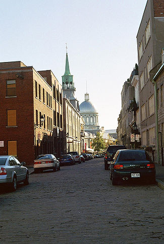
Rue Saint-Paul, Montreal
[edit]- I kinda like it as it is, but I also think it could do with a little off the bottom. Not sure I want to crop the top much, if at all - it would make the picture a little too dark, IMHO. I took it the in Montreal shortly before Columbus Day. Any further opinions? AnnaKucsma 21:30, 20 November 2006 (UTC)
- Yes, first thing to do is to put all vertical lines parallel. That should be easy with Photoshop or any other editing application. Second, you should remove the cars from the right side of the street, they really spoil the perspective :-). Third, why is the resolution so poor? Alvesgaspar 21:42, 20 November 2006 (UTC)
- Looks like there indeed is a no parking sign on the right side. Street cleaning? I'm not too fond of the lighting. It exceeds the dynamic range of the camera. Detail is lost on the dome, and the sky looks blown out. Try it with a polarizer maybe? Or at a different time of day. Compositionwise I think there is a tad too much street in the bootom/front part. --Dschwen 22:07, 20 November 2006 (UTC)
- I didn't notice precicely why they didn't want people to park, for the same reason a re-shoot will have to wait until 2007: I was in Montreal on vacation (and no, I didn't have a car there). Mention of a polarizer came up in another, about different picture that would have come out much better if the sky hadn't come out the same color as the Stade Olympique. As for the resolution, the only thing I can think of that reduced the resolution is having had to rotate it: I use different computers and one may have done something when I tried to get the picture back up to portrait. I also have this picture here, if it helps. AnnaKucsma 15:16, 21 November 2006 (UTC)
- I tried to improve the image but with little sucess. We have to blame the original sin refered by Dschwen: the excessive dynamic range of reality... The easy part is done: making the verticals (more or less) parallel and croping a little at the bottom. Alvesgaspar 16:12, 21 November 2006 (UTC)
- The angle you have chosen was I assume because there was an interesting feature on the left side of the road, My thought would be to reduce the foreground and right hand side by limiting this the camera would have adjusted for the lighter areas and reduced some of the dynamic range problems, though the shadows would be deeper and loose some detail. Gnangarra 11:48, 1 December 2006 (UTC)
Race is over
[edit]- Another one from my last trip to Reno. I like the "movement" captured here. Please, "critique" away. --Calyponte 06:14, 7 November 2006 (UTC)
- Always difficult at event to get just the right angle, IMHO the person directing the aircraft is detracting. Ideal would be without him, but when you cant avoid it in these cricumstances theres a lot to be said about a uniform for officials.
- Ditto. I like the composition as is, but without that dude directing traffic. It can't really be helped, though: he was just in frame when you were shooting. That said, his coat blends in well, and he's more unobtrusive on the right side of the frame than he would have been on the left. AnnaKucsma 21:36, 20 November 2006 (UTC)
- Disagree! The dude is ok since he is part of whats going on, guiding the taxiing plane. But the crop is too tight. It feels crammed into the frame. And one thing is problematic about the dude: his arms are at level with the wings of the plane, making the composistion a little confusing, especially since the colors of the jacket and the plane match. --Dschwen 21:39, 26 November 2006 (UTC)
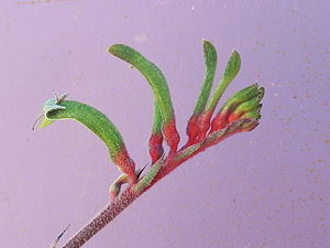
Kangaroo Paw
[edit]- The flower is Anigozanthos manglesii or the Kangaroo Paw, found in the southwest of Western Australia. Its the same flower, both taken outside the one on the left is in full shade(even light) and the one on the right was moved so that it was in sunlight. The plant is growing in a pot, and the background is the door of the drinks fridge. Since I'm able to recreate the basics of the setup again over the next few days any alternative suggestions are appreciated. Gnangarra 11:39, 1 December 2006 (UTC)
- Right is more interesting tham left, but I'd try to blur the BG more, the noisy structure of your fridge is a bit distracting. And try to fill the shadows by bouncing light off a white sheet of paper just outside the camera frame. --Dschwen 01:44, 2 December 2006 (UTC)
- Thanks I'll try that later today Gnangarra 02:04, 4 December 2006 (UTC)


