Commons:Quality images candidates/Archives November 04 2016
Jump to navigation
Jump to search

-

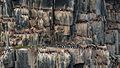
- Nomination Nizhny Novgorod: Chkalov staircase cascade --A.Savin 03:58, 2 November 2016 (UTC)
- Promotion Good quality. --Johann Jaritz 04:02, 2 November 2016 (UTC)
-

- Nomination Nizhny Novgorod: Oktyabrskaya Hotel --A.Savin 03:58, 2 November 2016 (UTC)
- Promotion Good quality. --Johann Jaritz 04:02, 2 November 2016 (UTC)
-

-

- Nomination Phintella sp --Vengolis 03:39, 2 November 2016 (UTC)
- Promotion Good quality. --Johann Jaritz 04:01, 2 November 2016 (UTC)
-

-

- Nomination Omiodes Sp --Vengolis 03:39, 2 November 2016 (UTC)
- Promotion Good quality. --Johann Jaritz 04:01, 2 November 2016 (UTC)
-

- Nomination Gan Boon Leong International Gym - Gan Boon Leong Statue. Malacca City, Malacca, Malaysia. --Halavar 03:23, 2 November 2016 (UTC)
- Promotion Good quality. --Johann Jaritz 03:58, 2 November 2016 (UTC)
-

- Nomination Colourful cycle rickshaws. Malacca City, Malacca, Malaysia. --Halavar 03:23, 2 November 2016 (UTC)
- Promotion Very special! Good quality. --Johann Jaritz 03:57, 2 November 2016 (UTC)
-

- Nomination Parish church Saint Bartholomew, Friesach #37, Friesach, Carinthia, Austria --Johann Jaritz 03:11, 2 November 2016 (UTC)
- Promotion Good quality. --A.Savin 03:50, 2 November 2016 (UTC)
-

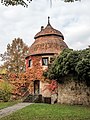
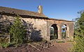
- Nomination Subsidiary church Saint Peter on Petersberg #209 and former rectory on Petersbergweg #7, Friesach, Carinthia, Austria --Johann Jaritz 03:11, 2 November 2016 (UTC)
- Promotion Good quality --Halavar 03:23, 2 November 2016 (UTC)
-

- Nomination Romanesque keep of archbishop Konrad I. (1124–1130 A.D.) on Petersberg #18, Friesach, Carinthia, Austria --Johann Jaritz 03:11, 2 November 2016 (UTC)
- Promotion Good quality. --Vengolis 03:58, 2 November 2016 (UTC)
-

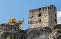
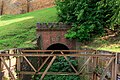
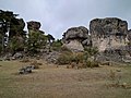
- Nomination Ruin of a fortification tower at the Petersberg, Friesach, Carinthia, Austria --Johann Jaritz 03:11, 2 November 2016 (UTC)
- Promotion Good quality --Halavar 03:24, 2 November 2016 (UTC)
-

- Nomination Newark skyline from Harrison. --King of Hearts 02:19, 2 November 2016 (UTC)
- Promotion Good quality --Halavar 03:23, 2 November 2016 (UTC)
-
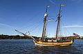
- Nomination Schooner Sultana on the Chester River --Acroterion 02:08, 2 November 2016 (UTC)
- Promotion Good quality. --King of Hearts 03:40, 2 November 2016 (UTC)
-

- Nomination El Prado, looking east across the Cabrillo Bridge towards the Museum of Man --Rhododendrites 22:34, 1 November 2016 (UTC)
- Promotion Good quality. --Ralf Roletschek 02:14, 2 November 2016 (UTC)
-

- Nomination The Temple of Music at Roger Williams Park in Providence, Rhode Island. --Rhododendrites 22:34, 1 November 2016 (UTC)
- Decline
 Oppose For a small resolution like this, I expect a perfectly crisp picture - this one is not, unfortunately. Compression (?) artefacts on the sky too --A.Savin 03:45, 2 November 2016 (UTC)
Ah well. Came across this photo from an older camera recently and thought it may be borderline. Perhaps not. :) Rhododendrites 04:21, 2 November 2016 (UTC)
-
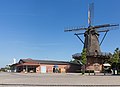
- Nomination Georgsdorf-Niedersachsen, windmill --Michielverbeek 21:55, 1 November 2016 (UTC)
- Promotion Good quality. --Ralf Roletschek 02:14, 2 November 2016 (UTC)
-

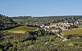
- Nomination Winemaker alley with press houses and wine cellars "Oehlberg". Located in Pillersdorf, municipality Zellerndorf, District Hollabrunn,Lower Austria (Weinviertel). By User:Kellergassen Niederösterreich 2016 --Hubertl 21:11, 1 November 2016 (UTC)
- Promotion Sharp photo, good focus to main object --Michielverbeek 21:42, 1 November 2016 (UTC)
-

- Nomination Historic gatehouse (1551) in Treinfeld (Markt Rentweinsdorf, district of Hassberge, Lower Franconia). --Ermell 21:09, 1 November 2016 (UTC)
- Promotion Good quality. --Jacek Halicki 21:14, 1 November 2016 (UTC)
-
- Nomination Defence tower of the fortification of Weismain in Upper Franconia --Ermell 21:06, 1 November 2016 (UTC)
- Promotion Good quality. --Jacek Halicki 21:13, 1 November 2016 (UTC)
-

- Nomination Monument to the home-displaced in the Bamberg park --Ermell 21:06, 1 November 2016 (UTC)
- Promotion Good quality. --Jacek Halicki 21:13, 1 November 2016 (UTC)
-
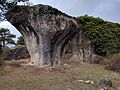
- Nomination Castle ruin Neideck over the Wiesenttal --Ermell 21:06, 1 November 2016 (UTC)
- Promotion Good quality. --Jacek Halicki 21:13, 1 November 2016 (UTC)
-

-

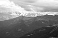
- Nomination Solifluction and rockglaciers in Adventdalen, Svalbard --AWeith 18:30, 1 November 2016 (UTC)
- Promotion
 Support Good quality.--Famberhorst 19:19, 1 November 2016 (UTC)
-

-
-

- Nomination Spain, Cordoba, Alcázar de los Reyes Cristianos --Berthold Werner 16:42, 1 November 2016 (UTC)
- Promotion Good quality. --Basotxerri 17:14, 1 November 2016 (UTC)
-

- Nomination Town view of Saarburg at water fall of Leukbach with mueseum 'Amüseum' --Tuxyso 16:39, 1 November 2016 (UTC)
- Promotion Support Good quality.--Famberhorst 17:23, 1 November 2016 (UTC)
-

- Nomination Information board. Mountain hiking of parking in power station Malga Mare to Lago del Careser.
--Famberhorst 16:20, 1 November 2016 (UTC) - Promotion Good quality. --Basotxerri 17:16, 1 November 2016 (UTC)
- Nomination Information board. Mountain hiking of parking in power station Malga Mare to Lago del Careser.
-

- Nomination Vrana Palace - spring. By User:Noncho --Vodnokon4e 15:37, 1 November 2016 (UTC)
- Promotion Good quality. --Slaunger 19:48, 1 November 2016 (UTC)
-

- Nomination Church of the Monastery "Seven Thrones". By User:Batr41 --Vodnokon4e 15:37, 1 November 2016 (UTC)
- Decline Insufficient quality. --A.Savin 03:39, 2 November 2016 (UTC)
-

- Nomination Архитектурно-парков комплекс „Двореца". By User:Tat2713 --Vodnokon4e 15:37, 1 November 2016 (UTC)
- Promotion Sufficient quality. 3 Mpixels is not much, but nice composition, good colors and light. And the pixel quality is good. --Slaunger 19:51, 1 November 2016 (UTC)
-

- Nomination Main building in National Palace Vrana. By User:KapiM --Vodnokon4e 15:37, 1 November 2016 (UTC)
- Decline Below minimum resolution of 2 MP, Unacceptable black border at sides,, bad crop and pink tint. --Slaunger 19:58, 1 November 2016 (UTC)
-
- Nomination град Созопол - пристанище. By User:Tat2713 --Vodnokon4e 15:37, 1 November 2016 (UTC)
- Decline Insufficient quality. Very noisy. Image artifacts, poor detail level. --Slaunger 19:59, 1 November 2016 (UTC)
-

- Nomination Frescos in Boyana Church. By User:Georgy Palpurin ShareBulgaria team --Лорд Бъмбъри 15:05, 1 November 2016 (UTC)
- Promotion Good quality. --Berthold Werner 16:41, 1 November 2016 (UTC)
-

- Nomination Madara Rider, National historical archaeological reserve, Bulgaria. By User:Borislav krustev --Лорд Бъмбъри 15:05, 1 November 2016 (UTC)
- Promotion Marginal resolution (2.8 Mpixels), but good light, texture detail level and clean composition --Slaunger 19:53, 1 November 2016 (UTC)
-

- Nomination Shipka Memorial Church. By User:Bulpa --Лорд Бъмбъри 15:05, 1 November 2016 (UTC)
- Decline Unacceptable lens artifacts centered on strong reflections in golden towers. Otherwise nice. --Slaunger 20:01, 1 November 2016 (UTC)
-

- Nomination Thracian Tomb of Sveshtari. By User:Georgy Palpurin ShareBulgaria team --Лорд Бъмбъри 15:05, 1 November 2016 (UTC)
- Promotion Support Good quality.--Famberhorst 16:33, 1 November 2016 (UTC)
-

-

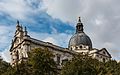
- Nomination St. Vitus Cathedral, Prague. Alvesgaspar 11:24, 1 November 2016 (UTC)
- Promotion Good quality. --Poco a poco 13:28, 1 November 2016 (UTC)
-

- Nomination St. Vitus Cathedral, Prague. Alvesgaspar 11:24, 1 November 2016 (UTC)
- Promotion Good quality. --Johann Jaritz 13:34, 1 November 2016 (UTC)
-

- Nomination Roofs in Prague. View from near Pragues' Castle. Alvesgaspar 11:24, 1 November 2016 (UTC)
- Promotion Good quality. --Ermell 11:56, 1 November 2016 (UTC)
-

- Nomination Stained-glass window in St. Vitus Cathedral, Prague -- Alvesgaspar 11:24, 1 November 2016 (UTC)
- Promotion Good quality. --Johann Jaritz 13:35, 1 November 2016 (UTC)
-
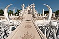
- Nomination Wat Rong Khun, The bridge of "the cycle of rebirth", White Tempel, Thailand --Hans-Jürgen Neubert 10:06, 1 November 2016 (UTC)
Please, don't nominate the image again and again after each change and just write a note in the initial nomination. Poco a poco 10:13, 1 November 2016 (UTC) - Decline What Poco a poco said. I see you did indeed get rid of all the dust spots on the right side, but you also need to address the problems Poco found. And when you do, don't renominate the photo again; just put a note in the original nomination explaining what improvements you've made. -- Ikan Kekek 10:41, 1 November 2016 (UTC) Ikan: I edit here with notepad, pls. move, delete or poke it to the right place. Second comment not work. Don´t know why. Btw. Comment to Poko is there. I asked him for check it out with Lines, it´s not a fault there. It´s a visuell trick with lines. Have done same with his "Palacio de los Shirvanshah", we will see how he will do --Hans-Jürgen Neubert 11:58, 1 November 2016 (UTC) Oppose Yet another upsampled picture. Note that every picture you upsample from 12 to 24 megapixels will be declined by me. There is no way to improve it - except taking the original 12 mpix shot and processing it properly. --A.Savin 03:35, 2 November 2016 (UTC)
- Nomination Wat Rong Khun, The bridge of "the cycle of rebirth", White Tempel, Thailand --Hans-Jürgen Neubert 10:06, 1 November 2016 (UTC)
-

- Nomination Sète cityscape, France --Christian Ferrer 10:06, 1 November 2016 (UTC)
- Promotion Good quality. --Ralf Roletschek 10:32, 1 November 2016 (UTC)
-

- Nomination Saint Matthew church in Kochanów 1 --Jacek Halicki 09:46, 1 November 2016 (UTC)
- Promotion Good quality. --Poco a poco 10:11, 1 November 2016 (UTC)
-

- Nomination Saint Matthew church in Kochanów 2 --Jacek Halicki 09:46, 1 November 2016 (UTC)
- Promotion Good quality. --Poco a poco 10:11, 1 November 2016 (UTC)
-

- Nomination Saint Matthew church in Kochanów 3 --Jacek Halicki 09:46, 1 November 2016 (UTC)
- Promotion Good quality. --Zcebeci 10:26, 1 November 2016 (UTC)
-

- Nomination Saint Matthew church in Kochanów 4 --Jacek Halicki 09:46, 1 November 2016 (UTC)
- Promotion Good quality. --Poco a poco 10:11, 1 November 2016 (UTC)
-

- Nomination Church of Saint Bartholomew in Czermna --Jacek Halicki 09:46, 1 November 2016 (UTC)
- Promotion Good quality. --Slaunger 19:55, 1 November 2016 (UTC)
-

- Nomination Psolos fuligo --Jkadavoor 09:34, 1 November 2016 (UTC)
- Promotion Good quality. --Poco a poco 10:11, 1 November 2016 (UTC)
-

- Nomination Bird watching viewpoint near Garaio, Ullíbarri-Gamboa reservoir. Álava, Basque Country, Spain --Basotxerri 08:43, 1 November 2016 (UTC)
- Promotion Good quality. --Poco a poco 08:54, 1 November 2016 (UTC)
-

- Nomination Tourist information at Garaio. Ullíbarri-Gamboa reservoir. Álava, Basque Country, Spain --Basotxerri 08:43, 1 November 2016 (UTC)
- Promotion Support Good quality. MAy be better with a readable sign at the building. --XRay 09:14, 1 November 2016 (UTC)
-

- Nomination Meadows at Garaio. Ullíbarri-Gamboa reservoir. Álava, Basque Country, Spain --Basotxerri 08:43, 1 November 2016 (UTC)
- Promotion Good quality. --Jkadavoor 09:35, 1 November 2016 (UTC)
-

- Nomination Ruins of the abandoned village Garaio at the Ullíbarri-Gamboa reservoir. Álava, Basque Country, Spain --Basotxerri 08:43, 1 November 2016 (UTC)
- Promotion Good quality. --Poco a poco 08:49, 1 November 2016 (UTC)
-

- Nomination Parking lot at the tourist information of Garaio. Ullíbarri-Gamboa reservoir. Álava, Basque Country, Spain --Basotxerri 08:43, 1 November 2016 (UTC)
- Promotion Good quality. --Ermell 11:59, 1 November 2016 (UTC)
-

- Nomination Rohanpur Octagonal Tomb. By User:Nahid.rajbd --NahidSultan 08:14, 1 November 2016 (UTC)
- Promotion Sufficient quality, I believe, but I'd welcome a second opinion. -- Ikan Kekek 08:35, 1 November 2016 (UTC)
-

- Nomination Tarash Bhaban. By User:Krabdallah --NahidSultan 08:14, 1 November 2016 (UTC)
- Decline To me, this is not a QI. There are unsharp areas and overexposed sunny areas. -- Ikan Kekek 08:37, 1 November 2016 (UTC)
-

- Nomination Mirzanagar Nabab Bari Hammam Khana. By User:Prasun.kp --NahidSultan 08:14, 1 November 2016 (UTC)
- Decline Too unsharp, in my judgment. -- Ikan Kekek 08:35, 1 November 2016 (UTC)
-

- Nomination Panam City. By User:Samia ety --NahidSultan 08:14, 1 November 2016 (UTC)
- Promotion - Pretty and a good composition, but could you please sharpen it a bit? Right now, it feels like it's right around the border between being or not being a QI, but if it were a bit sharper, I'd feel like a promotion is more justified. -- Ikan Kekek 08:40, 1 November 2016 (UTC)
fixed --Aftabuzzaman 17:02, 1 November 2016 (UTC)
I'm not fully convinced it's a QI, as it seems to me to look pretty noisy at full size. But it's certainly sharper, and for that plus the composition, I think it does deserve a promotion, overall. -- Ikan Kekek 01:25, 2 November 2016 (UTC)
-
- Nomination The village of Minerve. Hérault, France. --Christian Ferrer 08:11, 1 November 2016 (UTC)
- Promotion Good quality. --Basotxerri 08:42, 1 November 2016 (UTC)
-
- Nomination Chapelle Notre-Dame des Clans, Celles, Hérault, France. --Christian Ferrer 08:11, 1 November 2016 (UTC)
- Promotion Good quality. --Basotxerri 08:45, 1 November 2016 (UTC)
-

- Nomination Flughafen Graz --Ralf Roletschek 08:03, 1 November 2016 (UTC)
- Promotion Good quality. --Jacek Halicki 09:51, 1 November 2016 (UTC)
-

- Nomination Flughafen Graz --Ralf Roletschek 08:03, 1 November 2016 (UTC)
- Promotion Good quality. --Jacek Halicki 09:51, 1 November 2016 (UTC)
-

- Nomination Peter Tschernko, austrian politican --Ralf Roletschek 08:03, 1 November 2016 (UTC)
- Promotion Good quality. --Basotxerri 08:44, 1 November 2016 (UTC)
-

- Nomination Babīte railway station in Riga, Latvia --Ralf Roletschek 08:03, 1 November 2016 (UTC)
- Promotion Good quality. --Johann Jaritz 14:53, 1 November 2016 (UTC)
-

- Nomination Pachliopta pandiyana --Jkadavoor 06:59, 1 November 2016 (UTC)
- Promotion Good quality. --Johann Jaritz 07:09, 1 November 2016 (UTC)
-
- Nomination Menacing clouds around the reservoir. Mountain hiking of parking in power station Malga Mare to Lago del Careser.
--Famberhorst 06:39, 1 November 2016 (UTC) - Promotion I like this photo very much. It reminds me of classic black & white photos from the first half or so of the 20th century. Excellent composition and good quality. -- Ikan Kekek 06:47, 1 November 2016 (UTC)
- Nomination Menacing clouds around the reservoir. Mountain hiking of parking in power station Malga Mare to Lago del Careser.
-

- Nomination Flowering heathland. Location, Schaopedobbe (Schapenpoel) in the Netherlands.
--Famberhorst 06:39, 1 November 2016 (UTC) - Promotion Unsharp foreground, but that's at most only slightly bothersome in this context. But before I promote this picture: What is the diagonal gray thing just above and to the left of the rightmost tree? A smudge, a bird, perhaps a tiny cloud? -- Ikan Kekek 07:00, 1 November 2016 (UTC)
 Done. spot removed. Thank you.--Famberhorst 16:08, 1 November 2016 (UTC) Thank you! Ikan Kekek 01:34, 2 November 2016 (UTC)
- Nomination Flowering heathland. Location, Schaopedobbe (Schapenpoel) in the Netherlands.
-

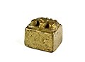
- Nomination Akan Gold Weight, Geometric weight, line- patterned --Ercé 06:09, 1 November 2016 (UTC)
- Promotion Good quality. --Poco a poco 09:03, 1 November 2016 (UTC)
-

- Nomination Akan Gold Weight, Geometric weight, spiral- and indented- patterned --Ercé 06:09, 1 November 2016 (UTC)
- Promotion Good quality. --Poco a poco 09:03, 1 November 2016 (UTC)
-

- Nomination Facade detail of Hamburg Süd office building in Hamburg. --Ajepbah 06:04, 1 November 2016 (UTC)
- Promotion Quite good. -- Ikan Kekek 06:43, 1 November 2016 (UTC)
-

- Nomination Facade detail of Kajen 6 office building in Hamburg. --Ajepbah 06:04, 1 November 2016 (UTC)
- Promotion Really good idea. The focus is not pinpoint, but I think this is pretty clearly a QI. -- Ikan Kekek 06:40, 1 November 2016 (UTC)
-

-

-

- Nomination Great textbook image of the juxtaposing of intentionally blurred surroundings (station) with great focus on the entering train, with the driver showing very clearly, Chicago CTA Loop. -- B137 05:48, 1 November 2016 (UTC)
- Decline Not by a Commoner, ineligible for QI --A.Savin 03:30, 2 November 2016 (UTC)
-

- Nomination Walking through flowering heaths and shifting sands of Schaopedobbe (Schapenpoel) in the Netherlands.
--Agnes Monkelbaan 05:37, 1 November 2016 (UTC) - Promotion Support Good quality. --XRay 05:43, 1 November 2016 (UTC)
- Nomination Walking through flowering heaths and shifting sands of Schaopedobbe (Schapenpoel) in the Netherlands.
-

- Nomination BMW Mini on a country lane in the hamlet Börnste, Kirchspiel, Dülmen, North Rhine-Westphalia, GermanyThe vehicle was illuminated from the front and from the side. --XRay 05:36, 1 November 2016 (UTC)
- Promotion Good quality. --Мирослав Видрак 06:25, 1 November 2016 (UTC)
-

- Nomination View from Royal Observatory, Greenwich, London, England, United Kingdom --XRay 05:36, 1 November 2016 (UTC)
- Promotion Dramatic clouds and good quality. -- Ikan Kekek 05:56, 1 November 2016 (UTC)
-

- Nomination White Tower, Tower of London, London, England, United Kingdom --XRay 05:36, 1 November 2016 (UTC)
- Promotion Good quality, in my opinion. -- Ikan Kekek 05:53, 1 November 2016 (UTC)
-
- Nomination Brompton Oratory, London, England, United Kingdom --XRay 05:36, 1 November 2016 (UTC)
- Promotion Support Good quality.--Famberhorst 06:46, 1 November 2016 (UTC)
-

- Nomination North sea at the eastern beach in Norderney, Lower Saxony, Germany --XRay 05:36, 1 November 2016 (UTC)
- Promotion Support Good quality.--Agnes Monkelbaan 05:40, 1 November 2016 (UTC)
 Comment Not yet, it´s tilted ccw. See horizon. --Milseburg 13:08, 1 November 2016 (UTC) Fixed Sorry. It's fixed now. --XRay 13:24, 1 November 2016 (UTC) Support Now I aggree with Agnes. --Milseburg 20:58, 1 November 2016 (UTC)
-

- Nomination Shoulder titles/plated of National Cadet Corps (India) --Krishna Chaitanya Velaga 03:21, 1 November 2016 (UTC)
- Decline Oppose Unsharp, far from QI to me --A.Savin 03:15, 2 November 2016 (UTC)
-
- Nomination Nizhny Novgorod: tunnel portal of the former Kremlin Funicular --A.Savin 01:58, 1 November 2016 (UTC)
- Promotion Support Good quality.--Agnes Monkelbaan 05:45, 1 November 2016 (UTC)
-

- Nomination San Duo Temple. Malacca City, Malacca, Malaysia. --Halavar 01:31, 1 November 2016 (UTC)
- Decline Sorry, but in this case, I think your depth of field is too low. Fell free to take this to CR if you like. -- Ikan Kekek 05:50, 1 November 2016 (UTC)
-

- Nomination Jalan Tokong (Temple Street) - "the Street of Harmony". Malacca City, Malacca, Malaysia. --Halavar 01:31, 1 November 2016 (UTC)
- Promotion Nice slice of life. Hazy, but good quality. -- Ikan Kekek 05:59, 1 November 2016 (UTC)
-

- Nomination Malay and Islamic World Museum. Malacca City, Malacca, Malaysia. --Halavar 01:31, 1 November 2016 (UTC)
- Promotion Good quality. --Jacek Halicki 09:51, 1 November 2016 (UTC)
-

- Nomination Lion of St. Mark - Piazza delle Erbe - Verona --Jbribeiro1 01:07, 1 November 2016 (UTC)
- Decline Oppose Insufficient quality. Sorry. Overexposed at the head of the lion, DoF too small, sharpness should be better. --XRay 05:49, 1 November 2016 (UTC)
-

- Nomination Wooden bell tower in Shchyrets, Ukraine. --Rbrechko 12:25, 31 October 2016 (UTC)
- Promotion Sharp photo from which quality is high enough for Q1 --Michielverbeek 06:11, 1 November 2016 (UTC)
-

- Nomination Reflextions on 111 W Upper Wacker Dr building (OneEleven), Chicago. -- Alvesgaspar 11:18, 31 October 2016 (UTC)
- Promotion Good quality. --Ermell 07:35, 1 November 2016 (UTC)
-

-

- Nomination Hamburg, City Nord, office building New-York-Ring 2 --Dirtsc 18:24, 30 October 2016 (UTC) Comment If you turn it cw a bit it will work.--Ermell 20:10, 30 October 2016 (UTC) Comment Ups, I'm sorry. I didn't do ANY perspective correction. Don't know why. Please look at the new version. Thanks --Dirtsc 20:26, 31 October 2016 (UTC)
- Promotion Good quality. --Ermell 21:14, 1 November 2016 (UTC)
- Nomination Hamburg, City Nord, office building New-York-Ring 2 --Dirtsc 18:24, 30 October 2016 (UTC)
-
- Nomination Akan Gold Weight, Cubic weight. --Ercé 05:53, 29 October 2016 (UTC)
I'm asking again: you nominate regularly here pictures and have been around for years, I'd expect that you also review others' pictures Poco a poco 06:36, 29 October 2016 (UTC) - Promotion Good quality. --Poco a poco 09:02, 1 November 2016 (UTC)
- Nomination Akan Gold Weight, Cubic weight. --Ercé 05:53, 29 October 2016 (UTC)
-

- Nomination Outside the Exploratorium, facing the city (San Francisco) --Rhododendrites 05:28, 28 October 2016 (UTC)
- Decline Not sharp enough. Sorry --Ermell 08:02, 28 October 2016 (UTC)
@Ermell: No worries. But are you looking at certain areas in particular such that it may be fixable? Rhododendrites 15:21, 28 October 2016 (UTC) Btw-IMO a good composition, with objects in the front and more backwards --Michielverbeek 21:53, 28 October 2016 (UTC) Comment The focus seems to be on the front objects although they are not very sharp as well. The verticals are not correct as well which is easy to fix.--Ermell 20:21, 30 October 2016 (UTC)
@Michielverbeek and Ermell: Thanks. Ok. One more try. :) I uploaded a new version, attempting to sharpen/straighten things a bit. Rhododendrites 22:40, 1 November 2016 (UTC)
-

- Nomination Corpus Christi church in Nowa Ruda 1 --Jacek Halicki 08:47, 27 October 2016 (UTC)
- Decline Even if the photo is sharp and all there are simply too many distrurbing elements in the pic, the part of the house to the left, the half car down right, small builing cutting into the church to the right, wire across the top of the pic and the white overcast sky. Sorry, I don't think this is salvageable. --W.carter 09:36, 1 November 2016 (UTC)
-

- Nomination Building (Stiftsplatz 6) in Nottuln, North Rhine-Westphalia, Germany --XRay 04:41, 27 October 2016 (UTC)
- Withdrawn The building is so hidden behind the dominating trees that I think the only way is to make the picture about the sculptured spruces in front of the house instead. That would also require a bit of cropping to center those instead of the house. W.carter 09:27, 1 November 2016 (UTC)
 I withdraw my nomination I think you're right. --XRay 13:27, 1 November 2016 (UTC)
-

- Nomination: Церква Успіння Пресвятої Богородиці, Крилос,. By User:Demmarcos --Ahonc 19:20, 26 October 2016 (UTC)
- Review The image is leaning out, please correct the perspective. However, it is very likely that there will be cropped out the tower or the building on the left which could lead to decline the image. Anyway, please give it a try and we'll see. --Basotxerri 20:35, 26 October 2016 (UTC)
-

- Nomination Театр опери та балету, в якому виступали видатні співаки, артисти, композитори світової слави, Львів, Свободи пр., 28. By User:Brizhnichenko --Ahonc 19:20, 26 October 2016 (UTC)
- Decline Insufficient quality. A nice picture but the exposure was a bit too long so many of the details on the building are just blown and lost, sorry. --W.carter 09:04, 1 November 2016 (UTC)
-
-
-

- Nomination Bahnhof Falkenberg/Elster --Ralf Roletschek 08:16, 26 October 2016 (UTC)
- Promotion Good quality. --W.carter 09:04, 1 November 2016 (UTC)
-
- Nomination Bacteriapolis at the Exploratorium. (Photosynthetic bacteria) --Rhododendrites 05:12, 26 October 2016 (UTC)
- Promotion needs a bit of perspective adjustment, the upper part of the frame is leaning out towards the sides. W.carter 08:55, 1 November 2016 (UTC)
@W.carter: Uploaded new version that I think addresses this. Thanks. Rhododendrites 23:41, 1 November 2016 (UTC)
Indeed it did. Good quality. --W.carter 23:46, 1 November 2016 (UTC)


_02160.jpg)

.jpg)
.jpg)


.jpg)


_05.jpg)


.01.12060.ajb.jpg)
.Fassadendetail.11870.ajb.jpg)
.Fassadendetail.2.29123.ajb.jpg)
.Treppenhaus.Detail.13746.ajb.jpg)

_22.jpg)


.jpg)
.jpg)
.jpg)


Consensual review[edit]
File:Stade rennais vs USM Alger, July 16th 2016 - Adama Diakhaby 1.jpg[edit]

- Nomination French soccer player Adama Diakhaby --Buff 14:27, 31 October 2016 (UTC)
- Promotion
- Support yes, it's in shadow but in my eyes good quality. --Ralf Roletschek 14:49, 31 October 2016 (UTC)
- Oppose A QI includes also the process to manage it and a much better lighting would have been possible, as it looks like --Poco a poco 23:29, 31 October 2016 (UTC)
- Support Good enough for me. Alvesgaspar 11:19, 1 November 2016 (UTC)
- Oppose A real good snap, but not a good portrait. Cant believe eyes are so blooded dirty and dark, still with high contrast. Only some small changes with Light and then it´s real good. Images should have the same impression when you change the size. Her it´s only good looking in a very high reso--Hans-Jürgen Neubert 14:36, 1 November 2016 (UTC)
- Support ok for me. --Hubertl 20:42, 1 November 2016 (UTC)
- Weak Support Background somewhat distracting, in all other matters very good. Snapshots at live events should not be compared with studio shots. --Smial 11:08, 2 November 2016 (UTC)
- Support Good enough for me.--Lmbuga 16:42, 2 November 2016 (UTC)
Total: 5 support (excluding the nominator), 2 oppose →  Promoted --Hubertl 03:52, 4 November 2016 (UTC)
File:16-07-05-Flughafen-Graz-RR2_0444.jpg[edit]

- Nomination Flughafen Graz --Ralf Roletschek 12:44, 28 October 2016 (UTC)
- Comment Sorry, but it's tilted
CW. Perhaps it needs a bit of perspective correction. It's a good picture IMO--Lmbuga 01:07, 29 October 2016 (UTC)
Sorry, it's not straight IMO, I'm agree with Ermell. And there are problems of distortion and it needs perspective correction IMO--Lmbuga 15:19, 2 November 2016 (UTC) - Comment it's no tiltet, see next picture, from outside. --Ralf Roletschek 07:51, 29 October 2016 (UTC)
- Promotion
- Oppose Tilted IMO, CW. I don't know wich is the picture that you say. I saw File:16-07-05-Flughafen-Graz-RR2 0450.jpg and the lines are not tilted--Lmbuga 20:12, 31 October 2016 (UTC)
- I mean this. --Ralf Roletschek 07:56, 1 November 2016 (UTC)
- Gracias, pero su racionamiento es estúpido--Lmbuga 16:40, 2 November 2016 (UTC)
- I mean this. --Ralf Roletschek 07:56, 1 November 2016 (UTC)
- Support - Ralf's other picture clearly shows that the tilt is in the walls, not the photo. Also, look how horizontal the railing outside the room is in this picture. Good quality and a straight photo of a room with tilted walls. -- Ikan Kekek 08:09, 1 November 2016 (UTC)
- Support Looks OK.--Peulle 12:16, 1 November 2016 (UTC)
- Comment Leaning to the left if you look at the table stands.--Ermell 21:56, 1 November 2016 (UTC)
- Die Tischbeine sind schief, siehe Geländer hinten auf der Terrasse. Würde ich auf die Tischbeine geraderichten, wäre alles andere schief. --Ralf Roletschek 21:14, 3 November 2016 (UTC)
Total: 2 support (excluding the nominator), 1 oppose → Promoted --Peulle 17:06, 3 November 2016 (UTC)
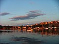
File:Novosibirsk Zapadny railway station 07-2016 img2.jpg[edit]

- Nomination Novosibirsk: Zapadny railway station --A.Savin 15:25, 26 October 2016 (UTC)
- Promotion
- Comment Some CAs on the left (see the note) --Halavar 16:41, 26 October 2016 (UTC)
- Comment I looked at the area you marked, but failed to see any CA. --A.Savin 17:07, 27 October 2016 (UTC)
- Oppose bad composition --Ralf Roletschek 11:11, 31 October 2016 (UTC)
- Comment I disagree, sir --A.Savin 13:21, 31 October 2016 (UTC)
- SupportI see nothing wrong with the composition. -- Colin 19:51, 31 October 2016 (UTC)
- Support - Composition is excellent. -- Ikan Kekek 06:18, 1 November 2016 (UTC)
- Support As above. Alvesgaspar 11:17, 1 November 2016 (UTC)
- Oppose Gluted, colours are not real. I remind a diff. orange but red tones really to much. See old woman and right blonde in the sun. (Spyder checked with 2 screens) Composition none, like it must be with architecture, but this is not Rhein III. 5 Meters ahead and view and the real idea from the picture will be reached. (The Fight between Lacy and forbidden)...Active Railwaysstations need peoble, not only tracks and wires otherwise it´s only a really boring pic, not a image--Hans-Jürgen Neubert 14:24, 1 November 2016 (UTC)
- Rarely seen such unqualified, weird comments... Where do you see unreal colours? Have you looked at the sky as reference? For me, real colours on a sunny day is when the sky is blue, and not green, yellow, or purple! The lack of people is not a quality issue, and the rest of your comment I don't understand (not even sure you understand it yourself). I recently declined a bunch of your pictures because you upscaled them from 12 to 24 megapixels, and now your revenge vote here... Maybe I was wrong in declining your photos, but at least I provided a fair rationale; and you even failed to do the same... Kindergarten! --A.Savin 13:41, 1 November 2016 (UTC)
- Comment Boomerang? Not really, but Kindergarten is nice and neutral, it´s international. With Colours it´s not difficult, my Dear. I load the pic in PS reload ACR and check saturation with colour proof. Than you can see peaks of red and blue (I checked it two times, with two screens and with 18% grey (means not a matter of screen or chip). Check temperature and skin´s not coloured hairs, but red trousers and left side. Have done in same way by discussion of perspektive, a lot of work, normally to much for such pics. It´s still not a photography. May I remember you I am the newbie here, was wondering about critics here (of course! and checked the "MASTERS of Quality" and get info about you from other peoble (2 Russian, one German, one german speaker). Take a mirror, you are the "famous" not me :)--Hans-Jürgen Neubert 17:07, 01 November 2016 (UTC)
- Your ridiculous conspiracy theories you can eat yourself. Can you please state which Image guideline, in your opinion, I disregarded with this picture? "It's not a photography" -> you're surely kidding? If it's not a photography, then what else? A painting? A vector graphics? Yes, I have been here on QIC for five years now, but rarely seen such stupid "reviews"! As you didn't response why you consider it necessary to revenge voting because I declined some of your nominations and also nominated for deletion a copyright violation you uploaded, any further discussion with you is just stupid and useless. Fortunately, QIC are not only corrupted "reviewers" like Roletschek and you. --A.Savin 15:29, 1 November 2016 (UTC)
- Rarely seen such unqualified, weird comments... Where do you see unreal colours? Have you looked at the sky as reference? For me, real colours on a sunny day is when the sky is blue, and not green, yellow, or purple! The lack of people is not a quality issue, and the rest of your comment I don't understand (not even sure you understand it yourself). I recently declined a bunch of your pictures because you upscaled them from 12 to 24 megapixels, and now your revenge vote here... Maybe I was wrong in declining your photos, but at least I provided a fair rationale; and you even failed to do the same... Kindergarten! --A.Savin 13:41, 1 November 2016 (UTC)
- Comment Maybee, someone can help me. Don´t understand the Critic with digital zoom or upscaling (not used), have info I should please not use "Downscaling" and that´s from FX not DX. What´s up here?--Hans-Jürgen Neubert 17:15, 01 November 2016 (UTC)
- Support maybe a little bit too much satured, but a good image --Christian Ferrer 13:44, 1 November 2016 (UTC)
- I think the woman has dyed hair, and this is her color is not natural (lol) Christian Ferrer 13:46, 1 November 2016 (UTC)
- Comment Igor and Valentin have warned me, too late. I have not talked with Ralf Roletschek Fell free to ask him- Anyway take a look to your title and then the pic (snap, pic, image, photography are phrases not from admins, from people they print) Min. 35 % are rails (ok), low fence (not ok) and wires without mast (who likes it?), cutted peoble- Again, It´s not Rhein III, more a lazy point of view. "5 Meters ahead was my suggested tip for the pic "Maschendrahtzaun". And some of your arguments not neutral and not common (PS uses layers, this is not digital zoom, 24mm f16 1/1000tel nothing in focus and so on). Feel free to check this out, too. Open it, use ACR and tell me something about colours, the red ones --Hans-Jürgen Neubert 17:15, 01 November 2016 (UTC)
- Support Good quality for me.--Ermell 21:51, 1 November 2016 (UTC)
- Support Good enough for QI.--Peulle 09:27, 2 November 2016 (UTC)
- Support --Alchemist-hp 15:51, 2 November 2016 (UTC)
- Support Good picture, QI IMO, but wires are disturbing (but wires are important in the picture)--Lmbuga 16:38, 2 November 2016 (UTC)
- Support Good composition and quality good enough for QI for me. W.carter 19:57, 2 November 2016 (UTC)
- Ok, ich akzeptiere, daß die Mehrheit es anders sieht. Mein Kontra basiert darauf, daß vom Bahnhof zwar das Gebäude sichtbar ist, aber langweilig frontal und symmetrisch (subjektiv, klar). Viel Gleis im Vordergrund ist für einen Bahnhof ja noch ok aber lauter Stromleitungen, Zäune, Gitter usw - insgesamt für mich subjektiv nicht gut. Kann man anders sehen, sehen viele anders. ok. Ich hätte als Bahnhofsbild mehr Bahnsteig usw. erwartet. Nur als Erklärung für mein Votum. --Ralf Roleček 21:12, 3 November 2016 (UTC)
Total: 9 support (excluding the nominator), 2 oppose → Promoted --Hubertl 07:50, 3 November 2016 (UTC)