Commons:Quality images candidates/Archives September 21 2014
Jump to navigation
Jump to search

-

-

-
- Nomination Beach of Augas Santas or beach of the Cathedrals, Devesa, Ribadeo, Galicia -20 --Lmbuga 21:11, 18 September 2014 (UTC)
- Promotion Good quality. --Livioandronico2013 21:36, 18 September 2014 (UTC)
-

- Nomination City Scales House in Nysa --Jacek Halicki 20:58, 18 September 2014 (UTC)
- Promotion Good quality. --ArildV 21:24, 18 September 2014 (UTC)
-

- Nomination Tele2 Arena at night, view from south. --ArildV 20:45, 18 September 2014 (UTC)
- Promotion Good quality. --Jacek Halicki 21:02, 18 September 2014 (UTC)
-

- Nomination Tele2 Arena at night, view from north. --ArildV 20:45, 18 September 2014 (UTC)
- Promotion Good quality. --Jacek Halicki 21:02, 18 September 2014 (UTC)
-

- Nomination Tele2 Arena at night. --ArildV 20:45, 18 September 2014 (UTC)
- Promotion Good quality.Can be a FP --Livioandronico2013 21:41, 18 September 2014 (UTC)
-

- Nomination Franzensburg, clock tower, palace garden of Laxenburg Castle, Lower Austria --P e z i 20:07, 18 September 2014 (UTC)
- Promotion Good quality. --Livioandronico2013 22:27, 18 September 2014 (UTC)
-

-
- Nomination 13 Market Square in Lądek-Zdrój --Jacek Halicki 18:39, 18 September 2014 (UTC)
- Promotion Good quality. --P e z i 21:07, 18 September 2014 (UTC)
-

- Nomination 13 Market Square in Lądek-Zdrój --Jacek Halicki 18:39, 18 September 2014 (UTC)
- Promotion Good quality. --P e z i 21:07, 18 September 2014 (UTC)
-

- Nomination 13 Market Square in Lądek-Zdrój --Jacek Halicki 18:39, 18 September 2014 (UTC)
- Promotion Good quality. --P e z i 21:07, 18 September 2014 (UTC)
-

- Nomination Egorova Street in Saint Petersburg --Florstein 18:29, 18 September 2014 (UTC)
- Promotion Good quality. --Jacek Halicki 18:40, 18 September 2014 (UTC)
-

- Nomination Brinko Lane in Saint Petersburg --Florstein 18:29, 18 September 2014 (UTC)
- Promotion Good quality. --Jacek Halicki 18:40, 18 September 2014 (UTC)
-

-

-
- Nomination Dresden, Germany: "Neue Skultpurenhalle" (New Sculptures Hall) of Albertinum --Cccefalon 16:25, 18 September 2014 (UTC)
- Promotion Good quality. --Jacek Halicki 18:44, 18 September 2014 (UTC)
-

-

-

-

-

- Nomination House at Nesoddtangen, Oslo, Norway --Ralf Roletschek 15:47, 18 September 2014 (UTC)
- Promotion Good quality. --Jacek Halicki 18:44, 18 September 2014 (UTC)
-

- Nomination Island Nakkholmen, Oslo, Norway --Ralf Roletschek 15:47, 18 September 2014 (UTC)
- Promotion Good quality. --Jacek Halicki 18:44, 18 September 2014 (UTC)
-

- Nomination Number plate in Norway --Ralf Roletschek 15:30, 18 September 2014 (UTC)
- Promotion Good quality. --JLPC 15:59, 18 September 2014 (UTC) 15:57, 18 September 2014 (UTC)
-

- Nomination isle Nakkholmen, Oslo, Norway --Ralf Roletschek 15:30, 18 September 2014 (UTC)
- Promotion Good quality. --Jacek Halicki 18:44, 18 September 2014 (UTC)
-

-

-

-

- Nomination 6 Market Square in Lądek-Zdrój --Jacek Halicki 12:10, 18 September 2014 (UTC)
- Promotion Good quality. --DXR 13:13, 18 September 2014 (UTC)
-

- Nomination 7 Market Square in Lądek-Zdrój --Jacek Halicki 12:10, 18 September 2014 (UTC)
- Promotion Good quality. --JLPC 16:08, 18 September 2014 (UTC)
-

- Nomination 13 Market Square in Lądek-Zdrój --Jacek Halicki 12:10, 18 September 2014 (UTC)
- Promotion Good quality. --Cccefalon 12:31, 18 September 2014 (UTC)
-

- Nomination 13 Market Square in Lądek-Zdrój --Jacek Halicki 12:10, 18 September 2014 (UTC)
- Promotion Good quality. --Cccefalon 12:32, 18 September 2014 (UTC)
-

- Nomination Beklemishev Tower of Kremlin in Moscow, Russia (by Ludvig14) --A.Savin 12:03, 18 September 2014 (UTC)
- Promotion Good quality. --Jacek Halicki 12:13, 18 September 2014 (UTC)
-

- Nomination Borovitskaya Tower of Kremlin in Moscow, Russia (by Ludvig14) --A.Savin 12:03, 18 September 2014 (UTC)
- Promotion Good quality. --Jacek Halicki 12:13, 18 September 2014 (UTC)
-

- Nomination Cathedral of Zachatyevsky Convent in Moscow, Russia (by Ludvig14) --A.Savin 12:03, 18 September 2014 (UTC)
- Promotion Good quality. --Jacek Halicki 12:13, 18 September 2014 (UTC)
-

- Nomination Church of StAnna's Conceiving in Moscow, Russia (by Ludvig14) --A.Savin 12:03, 18 September 2014 (UTC)
- Promotion Good quality. --Jacek Halicki 12:13, 18 September 2014 (UTC)
-

- Nomination Limonium vulgare narbonense (Statice of Narbonne). --Christian Ferrer 11:59, 18 September 2014 (UTC)
- Promotion Good quality. --JLPC 16:08, 18 September 2014 (UTC)
-

- Nomination Swiss Open Geneva - 20140712 - Semi final Quad - D. Wagner vs D. Alcott --Pleclown 11:53, 18 September 2014 (UTC)
- Promotion Good quality. --Jacek Halicki 12:13, 18 September 2014 (UTC)
-

-

-

-

-
-

- Nomination Interior of the Salisbury Cathedral, Salisbury, England --Poco a poco 08:21, 18 September 2014 (UTC)
- Promotion Good quality. --JLPC 16:02, 18 September 2014 (UTC)
-

- Nomination King's Bath, Bath, England --Poco a poco 08:21, 18 September 2014 (UTC)
- Promotion Good quality. --Cccefalon 12:29, 18 September 2014 (UTC)
-

- Nomination Exterior of the Salisbury Cathedral, Salisbury, England --Poco a poco 08:21, 18 September 2014 (UTC)
- Promotion Good quality. --Cccefalon 12:30, 18 September 2014 (UTC)
-

- Nomination Germany, Baden-Württemberg, Schwetzingen castle, "mosque" --Berthold Werner 08:13, 18 September 2014 (UTC)
- Promotion Interesting and QI --Poco a poco 08:36, 18 September 2014 (UTC)
-

-

-
- Nomination River Thames. Mattbuck 07:01, 18 September 2014 (UTC)
- Promotion Good quality. --Poco a poco 08:36, 18 September 2014 (UTC)
-

-

- Nomination East Midlands Trains DMUs at Derby. Mattbuck 07:01, 18 September 2014 (UTC)
- Decline main objects in strong shadow --Taxiarchos228 08:50, 18 September 2014 (UTC)
-

-

- Nomination Canary Wharf DLR station. Mattbuck 07:01, 18 September 2014 (UTC)
- Promotion Good quality. --Poco a poco 08:34, 18 September 2014 (UTC)
-

- Nomination Ruins of castle in Šášovské Podhradie, Slovakia --Pudelek 06:54, 18 September 2014 (UTC)
- Promotion Good quality. --Poco a poco 08:34, 18 September 2014 (UTC)
-

-
-

- Nomination Partizánske, Slovakia - water castle --Pudelek 06:54, 18 September 2014 (UTC)
- Promotion Good quality. --Poco a poco 08:32, 18 September 2014 (UTC)
-

- Nomination Basler Münster --Taxiarchos228 05:56, 18 September 2014 (UTC)
- Promotion
 Support very crisp --A.Savin 11:44, 18 September 2014 (UTC)
-
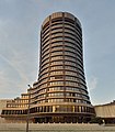
- Nomination Basel: Bank for International Settlements --Taxiarchos228 05:56, 18 September 2014 (UTC)
- Promotion Good quality.--ArildV 07:28, 18 September 2014 (UTC)
-

-

- Nomination Cologne, Germany: Interior of St. Maria Lyskirchen (Köln) --Cccefalon 04:05, 18 September 2014 (UTC)
- Promotion Stained glass not perfeclty managed but QI to me anyhow --Poco a poco 08:32, 18 September 2014 (UTC)
-

-

-

- Nomination Street light at the Panthéon, Paris, France --XRay 03:32, 18 September 2014 (UTC)
- Promotion Good quality. --Poco a poco 08:34, 18 September 2014 (UTC)
-

- Nomination Fish-hook --AntanO 00:05, 18 September 2014 (UTC)
- Decline Blurry, not a QI, sorry --Poco a poco 08:34, 18 September 2014 (UTC)
-

-

- Nomination 3 Market Square in Lądek-Zdrój --Jacek Halicki 23:30, 17 September 2014 (UTC)
- Promotion Good quality.--ArildV 07:15, 18 September 2014 (UTC)
-

- Nomination 4 Market Square in Lądek-Zdrój --Jacek Halicki 23:30, 17 September 2014 (UTC)
- Promotion Good quality.--ArildV 07:15, 18 September 2014 (UTC)
-

- Nomination 5 Market Square in Lądek-Zdrój --Jacek Halicki 23:30, 17 September 2014 (UTC)
- Promotion Support good --A.Savin 11:39, 18 September 2014 (UTC)
-

- Nomination Borsfleth, St. Urban Church Memorial to the fallen in World War I soldiers in 1914 at the cemetery --Nightflyer 22:06, 17 September 2014 (UTC)
- Promotion Good quality. --XRay 18:50, 18 September 2014 (UTC)
-

-

-

-

-

-

-

- Nomination Manor in Nowy Waliszów --Jacek Halicki 21:32, 15 September 2014 (UTC)
- Promotion Good quality. --XRay 19:01, 18 September 2014 (UTC)
-

-

-

- Nomination Statues on Fontana dell'Acqua Felice --Livioandronico2013 16:24, 13 September 2014 (UTC)
- Promotion Please identify the CoA and categorize properly.--Jebulon 22:48, 16 September 2014 (UTC)
 Done Thanks for review. --Livioandronico2013 20:15, 17 September 2014 (UTC)
Jebulon can you check now? Thanks --Livioandronico2013 08:24, 18 September 2014 (UTC) Needs a crop at right for symmetry, but good for QI. Please look at the new categories ! --Jebulon 11:33, 18 September 2014 (UTC)
Done and ok boss  --Livioandronico2013 20:11, 18 September 2014 (UTC)
-

- Nomination 25 North Collonade. Mattbuck 13:30, 13 September 2014 (UTC)
- Promotion
 Comment Good picture, but would not it be better with less space on the top?--Lmbuga 10:01, 14 September 2014 (UTC) Done Mattbuck 20:28, 16 September 2014 (UTC) Support Good quality--Lmbuga 20:07, 18 September 2014 (UTC)
-

- Nomination Statues on the colonnades of Saint Peter's Square --Livioandronico2013 07:50, 13 September 2014 (UTC)
- Promotion Good, but needs a little bit perspective enhancement: It is slightly rotated cw and the left side is leaning in. See my notes. --Cccefalon 11:21, 13 September 2014 (UTC)
Done Better? Danke for review. --Livioandronico2013 14:35, 13 September 2014 (UTC) Comment Unfortunately not, the left side is still leaning in. I am not sure, if perhaps your software has limitations about handling this. I downloaded your image and corrected it with Adobe Lightroom. You can see the result here (smaller resolution than the original), giving you an idea, that it is not a problem with the image. Want to give it another try? --Cccefalon 19:28, 13 September 2014 (UTC)
Done See now. Thanks . --Livioandronico2013 20:11, 13 September 2014 (UTC)
@Livioandronico2013: I would love to. However, I think, you forgot to upload the new version --Cccefalon 04:57, 14 September 2014 (UTC)
Excuse me Cccefalon,now? --Livioandronico2013 09:53, 14 September 2014 (UTC)
Cccefalon can you check now? Thanks --Livioandronico2013 08:25, 18 September 2014 (UTC) You bypassed the challenge. But I like the result. Good for QI IMO. --Cccefalon 11:02, 18 September 2014 (UTC)
Unfortunately, I'm lazy :D --Livioandronico2013 20:16, 18 September 2014 (UTC)
-

- Nomination: Chocolade Museum and Statue of Nikolaus, Cologne, North Rhine-Westphalia, Germany --XRay 13:09, 12 September 2014 (UTC)
- Review needed
-

-

-

- Nomination: Heiligenhäuschen am Buschdorfer Kirchweg in Auerberg (Bonn) --Hagman 18:42, 10 September 2014 (UTC)
- Review Needs removal of chromatic aberrations. Needs perspective correction. --Cccefalon 18:59, 10 September 2014 (UTC) Done, as far as I can (this is my first experiment with GIMPs fix-ca); enhanced sky while I was at it --Hagman 22:03, 10 September 2014 (UTC)
Sorry, but the magenta CA is still present (see left part of the image). --Cccefalon 17:43, 12 September 2014 (UTC)
-

- Nomination Swiss Open Geneva - 20140712 - Semi final Quad - D. Wagner vs D. Alcott --Pleclown 11:28, 10 September 2014 (UTC)
- Promotion Support --Christian Ferrer 17:08, 18 September 2014 (UTC)
-

-

- Nomination Villajoyosa, Spain --Poco a poco 10:51, 8 September 2014 (UTC)
- Promotion Needs two minor enhancements IMO. See my notes. --Cccefalon 19:06, 9 September 2014 (UTC) Done Poco a poco 19:27, 10 September 2014 (UTC)
Good quality. --Cccefalon 11:14, 18 September 2014 (UTC)
-
- Nomination: Porte de Thann, Cernay, France --ComputerHotline 16:57, 6 September 2014 (UTC)
- Review Please apply perspective correction --Cccefalon 19:27, 6 September 2014 (UTC) Done. --ComputerHotline 07:54, 7 September 2014 (UTC)
I made you annotations which markers you should use to get the right perspective. I don't expect it to be perfect, but so far it is still not good enough. --Cccefalon 09:06, 7 September 2014 (UTC)
Posterisation in the flowers. Mattbuck 00:22, 13 September 2014 (UTC)
-

- Nomination: Saint Dorothy church in Radków 1 --Jacek Halicki 13:38, 5 September 2014 (UTC)
- Review Please see note--Jebulon 13:54, 5 September 2014 (UTC)
I disagree with the note, but find the wires disturbing. Mattbuck 00:10, 13 September 2014 (UTC)
-

- Nomination: sheljuzhko's brown argus (Aricia artaxerxes ssp. sheljuzhkoi), Giresun - Turkey -- Zeynel Cebeci 20:43, 4 September 2014 (UTC)
Is the top wingtip quite in focus? Mattbuck 23:31, 12 September 2014 (UTC) - Review needed
- Nomination: sheljuzhko's brown argus (Aricia artaxerxes ssp. sheljuzhkoi), Giresun - Turkey -- Zeynel Cebeci 20:43, 4 September 2014 (UTC)
-

- Nomination The harbour of Île aux Moines, Morbihan, France.--Jebulon 09:26, 4 September 2014 (UTC)
CA on left, tilted clockwise. Mattbuck 23:31, 12 September 2014 (UTC)Txs, correction coming.--Jebulon 20:16, 16 September 2014 (UTC) fixed Please have another look now, Thank you.--Jebulon 15:05, 18 September 2014 (UTC) - Promotion Now QI --MB-one 16:59, 18 September 2014 (UTC)
- Nomination The harbour of Île aux Moines, Morbihan, France.--Jebulon 09:26, 4 September 2014 (UTC)


_1.JPG)
_-_Thonetovsk%C3%BD_ka%C5%A1tie%C4%BE.JPG)


_Heck.jpg)
.JPG)


_full.JPG)


.JPG)
.jpg)
.jpg)
Consensual review[edit]
File:Statue_4_in_front_of_Campo_Verano.jpg[edit]

- Nomination Statue 4 in front of Campo Verano --Livioandronico2013 20:46, 18 September 2014 (UTC)
- Withdrawn
 Oppose too soft --A.Savin 12:11, 19 September 2014 (UTC)
- Done Hi A.Savin,can I ask tu you to check this other version? thanks --Livioandronico2013 19:32, 19 September 2014 (UTC)
- Not any better for me. Rather even worse than the previous version. --A.Savin 11:14, 20 September 2014 (UTC)
 I withdraw my nomination Perfect,thanks --Livioandronico2013 17:58, 20 September 2014 (UTC)
- Not any better for me. Rather even worse than the previous version. --A.Savin 11:14, 20 September 2014 (UTC)
File:Maria_Cruz_Profpic_062013.JPG[edit]

- Nomination Community Coordinator of Program Evaluation & Design, Wikimedia Foundation by Damian Martone--Ezarate 20:41, 17 September 2014 (UTC)
- Decline Background badly blurred --DXR 21:36, 17 September 2014 (UTC) see now Ezarate 22:42, 17 September 2014 (UTC) Oppose Sorry, but the masking (the complete outline of the person) isn't quality. --Llez 08:09, 18 September 2014 (UTC) Oppose Per Llez --Livioandronico2013 08:27, 18 September 2014 (UTC)
Total: 0 support (excluding the nominator), 3 oppose →  Declined --A.Savin 21:51, 20 September 2014 (UTC)
File:14-09-02-oslo-RalfR-090.jpg[edit]

- Nomination ski jump "Holmernkollenbakken" in Oslo, Norge --Ralf Roletschek 14:51, 15 September 2014 (UTC)
- Promotion QI for me. --Dnalor 01 14:57, 15 September 2014 (UTC)
dust spots --A.Savin 17:22, 15 September 2014 (UTC) Done --Ralf Roletschek 19:20, 15 September 2014 (UTC) - Support OK --A.Savin 10:52, 16 September 2014 (UTC)
- Support One Dustspot left (easily to remove, see note), but QI --DKrieger 22:04, 16 September 2014 (UTC) Done --Ralf Roletschek 12:13, 17 September 2014 (UTC)
Total: 2 support (excluding the nominator), 0 oppose →  Promoted --A.Savin 21:49, 20 September 2014 (UTC)
File:14-09-02-oslo-RalfR-089.jpg[edit]

- Nomination ski jump "Holmernkollenbakken" in Oslo, Norge --Ralf Roletschek 14:51, 15 September 2014 (UTC)
- Promotion QI for me. --Dnalor 01 14:57, 15 September 2014 (UTC)
dust spots --A.Savin 17:22, 15 September 2014 (UTC) Done --Ralf Roletschek 19:20, 15 September 2014 (UTC) - Support OK --A.Savin 10:52, 16 September 2014 (UTC)
- Support Quality image --DKrieger 19:23, 17 September 2014 (UTC)
Total: 3 support (excluding the nominator), 0 oppose → Promoted --A.Savin 21:48, 20 September 2014 (UTC)
File:14-09-02-oslo-RalfR-104.jpg[edit]

- Nomination ski jump "Holmernkollenbakken" in Oslo, Norge --Ralf Roletschek 14:51, 15 September 2014 (UTC)
- Promotion QI for me. --Dnalor 01 14:57, 15 September 2014 (UTC)
dust spots --A.Savin 17:22, 15 September 2014 (UTC) Done --Ralf Roletschek 19:20, 15 September 2014 (UTC) - Support OK --A.Savin 10:49, 16 September 2014 (UTC)
Total: 2 support (excluding the nominator), 0 oppose → Promoted --A.Savin 21:47, 20 September 2014 (UTC)
File:Äußerer Klosterhof und Türme der Basilika Seckau 1.jpg[edit]

- Nomination Seckau Abbey courtyard, Seckau, Styria, Austria. --Dnalor 01 14:10, 15 September 2014 (UTC)
- Decline Good quality. --Ralf Roletschek 14:42, 15 September 2014 (UTC)
noise, poor sharpness --A.Savin 17:27, 15 September 2014 (UTC) This is not my view of the things. --Dnalor 01 04:42, 16 September 2014 (UTC) - Oppose As for A.Savin. Noise reduction often also reduces sharpness. -- Smial 13:11, 16 September 2014 (UTC)
- Comment New, corrected version uploaded! --Dnalor 01 05:31, 17 September 2014 (UTC)
- Comment sky needs denoising. --P e z i 21:40, 18 September 2014 (UTC)
Total: 1 support (excluding the nominator), 2 oppose → Declined --A.Savin 21:46, 20 September 2014 (UTC)
File:Basilika Seckau, Augustinus-Altar 3.jpg[edit]

- Nomination Augustinus-Altar, Basilica Seckau, Styria, Austria. --Dnalor 01 14:10, 15 September 2014 (UTC)
- Decline Good quality. --Ralf Roletschek 14:42, 15 September 2014 (UTC)
noise, poor sharpness --A.Savin 17:27, 15 September 2014 (UTC) This is not my view of the things. --Dnalor 01 04:42, 16 September 2014 (UTC) - Oppose Inappropriate lighting (direct flash) burns highlights and makes hard shadows. Also rather noisy. Please use a tripod instead of high ISO - church interior usually does not move too fast. -- Smial 13:22, 16 September 2014 (UTC)
- Comment A new, corrected version uploaded. --Dnalor 01 06:00, 17 September 2014 (UTC)
- Oppose unsharp due to noise reduction. --P e z i 21:38, 18 September 2014 (UTC)
Total: 1 support (excluding the nominator), 2 oppose → Declined --A.Savin 21:45, 20 September 2014 (UTC)
File:2014_Stary_Waliszów,_dom_nr_112_02.JPG[edit]

- Nomination House number 112 in Stary Waliszów --Jacek Halicki 20:43, 14 September 2014 (UTC)
- Promotion
{{o}}Wire (cable) is disturbing. Other of your pictures with this subject has not this wire--Lmbuga 00:02, 15 September 2014 (UTC)
Comment Sorry, I'm not sure. It's only my criteria. It's better "discuss", other users can think and I can Learn--Lmbuga 22:40, 15 September 2014 (UTC) Done
I retouched the wire--Jacek Halicki 00:26, 16 September 2014 (UTC) - Support Good quality --Lmbuga 20:10, 18 September 2014 (UTC)
- Support Good quality --Cccefalon 06:38, 20 September 2014 (UTC)
Total: 2 support (excluding the nominator), 0 oppose → Promoted --A.Savin 21:44, 20 September 2014 (UTC)
File:Kemabong_Sabah_Dataran-Daerah-Kecil-Kemabong-01.jpg[edit]

- Nomination Shop rows in Pekan Kemabong, Sabah along Subdistrict Square --Cccefalon 13:40, 13 September 2014 (UTC)
- Promotion Can you brighten it a bit? --Tuxyso 14:20, 13 September 2014 (UTC) Done brightened --Cccefalon 17:33, 13 September 2014 (UTC)
Probably a bit too bright now, but imho QI now. --Tuxyso 08:51, 14 September 2014 (UTC) Oppose The photo is unmistakably wrong. See Notes. --Steindy 15:06, 15 September 2014 (UTC) Comment I dont think so. When you dont stand exactly in front of a building and shoot a centered image, you won't have parallel lines. --Cccefalon 16:07, 15 September 2014 (UTC) Support Uwe is right, the non-straight horizontal lines of the building are due to the non-centered shooting position - no problem here. --Tuxyso 17:37, 15 September 2014 (UTC) - Support QI. --P e z i 21:33, 18 September 2014 (UTC)
Total: 2 support (excluding the nominator), 1 oppose → Promoted --A.Savin 21:42, 20 September 2014 (UTC)
File:Falcon September 2014-1b.jpg[edit]

- Nomination A Peregrine Falcon in captivity -- Alvesgaspar 22:17, 14 September 2014 (UTC)
- Promotion
{{o}}It seems tilted IMO. The head has overexposed areas (blown out). The resolution is not excellent. Too much space at top --Lmbuga 23:46, 14 September 2014 (UTC) -- A second opinion, please - Alvesgaspar 04:18, 15 September 2014 (UTC)- Support That cup thing goes to one side and the bird into the other direction. So if you'd "untilt" it, it will open up another can of worms. And I don't mind the rim light on the head. I embrace it as seperation from the background. Image doesen't knock me of my feet but I still think it's QI.--Tobias "ToMar" Maier 22:35, 17 September 2014 (UTC)
- Weak Support. About 4 MPIxel is not overwhelming, neither the sharpness. Somewhat disturbing minor sharpening artifacts. All in all certainly a useful image that meets QI criteria a bit tedious. -- Smial 13:46, 18 September 2014 (UTC) (But that bird looks so sad...)
 Neutral--Lmbuga 22:40, 20 September 2014 (UTC)
Total: 2 support (excluding the nominator), 0 oppose → Promoted --A.Savin 21:41, 20 September 2014 (UTC)
File:Cologne_Germany_St-Kunibert-10.jpg[edit]

- Nomination Cologne, Germany: west transept with calvary in the Basilica St. Kunibert --Cccefalon 13:03, 7 September 2014 (UTC)
- Promotion Top is too unsharp due to perspective. --Mattbuck 18:27, 13 September 2014 (UTC)
I disagree. And I swear, today was the last day I donated full size images to Commons. --Cccefalon 18:47, 13 September 2014 (UTC) - Support It works for me, but the resolution is quite low --Uoaei1 16:49, 14 September 2014 (UTC)
- That would be because CCCefalon just downsampled it to 2MP out of spite. Mattbuck 21:27, 17 September 2014 (UTC)
- Support -- Spurzem 19:56, 16 September 2014 (UTC)
Total: 2 support (excluding the nominator), 1 oppose → Promoted --A.Savin 21:38, 20 September 2014 (UTC)
File:Hansa 1100, Bj. 1959 (2014-08-31 6769).JPG[edit]
.JPG)
- Nomination Hansa 1100 from 1959 at spa gardens of Bad Neuenahr, Germany -- Spurzem 18:14, 4 September 2014 (UTC)
- Promotion The van in the background is too disturbing. --Mattbuck 23:31, 12 September 2014 (UTC)
Support In this case is possible ask a crop,anyway the van isn't so disturbing for me. --Livioandronico2013 07:15, 13 September 2014 (UTC) - Support There is enough separation (in this case by color and brightness), ok for me - the crop would be ok as well but not required. --Generic1139 16:35, 15 September 2014 (UTC)
Total: 2 support (excluding the nominator), 1 oppose → Promoted --A.Savin 21:35, 20 September 2014 (UTC)
File:1. SC Sollenau vs. FC Red Bull Salzburg 2014-07-12 (083).jpg[edit]
.jpg)
- Nomination Marcel Sabitzer, FC Red Bull Salzburg. --Steindy 23:19, 2 September 2014 (UTC)
- Decline Oppose Left side of the face out of focus (not enought depth of field) --MB-one 19:37, 10 September 2014 (UTC)
I disagree, please discussion. --Steindy 00:31, 11 September 2014 (UTC) - Support Somewhat low DOF, but not disturbing. Very good lighting for a non studio shot. -- Smial 23:13, 13 September 2014 (UTC)
- Oppose Eyepart is not sharp enough. Also, as a matter of courtesy, it is not polite, to show the bad teeth of people in a portrait photo. --Cccefalon 16:14, 15 September 2014 (UTC)
- Bad teeth? Want the professional player who is examined several times a year on health, offend? Quite apart from the fact that as a photographer I can not help you choose outrageous arguments to discredit just to my photo? If you is fun, then do so. Removed personal insults by User:Steindy --A.Savin 18:35, 15 September 2014 (UTC) --Steindy (talk) 17:54, 15 September 2014 (UTC)
- Comment There is a possibility to bleach such a defect. I pointed out at several other portrait reviews, that a portrait shot has to obey some curtesy retouchments, e.g. pimple removal etc. Especially a portrait photo of a public person in WikiCommons has to follow higher requirements of respect, as this photo might be published in different media. --Cccefalon 18:54, 15 September 2014 (UTC)
- So you think that I should make a fake photo?! Just incredible what turned out to take some users here. This makes your photos appear in a new light. And I thought it's about an encyclopedia here. For some, just the ego is important. --Steindy 19:16, 15 September 2014 (UTC)
- Comment guys, look what I've found here:
 from about a year earlyer. He may or may not be examined several times a year on health. But what he does about it is still his own buisness.--Tobias "ToMar" Maier 12:05, 16 September 2014 (UTC)
- And what do you want with this overexposed photo say (besides, of me)? Want to tell me that this is better? --Steindy 16:50, 16 September 2014 (UTC)
- He is running around like this for over a year. Despite medical check up.
Besides: This was directed towrds Cccefalon--Tobias "ToMar" Maier 20:23, 16 September 2014 (UTC)
- He is running around like this for over a year. Despite medical check up.
- And what do you want with this overexposed photo say (besides, of me)? Want to tell me that this is better? --Steindy 16:50, 16 September 2014 (UTC)
- So you think that I should make a fake photo?! Just incredible what turned out to take some users here. This makes your photos appear in a new light. And I thought it's about an encyclopedia here. For some, just the ego is important. --Steindy 19:16, 15 September 2014 (UTC)
- Oppose Not sharp enough. And next time just ask the guy or his management if they like the picture. There are people proud of scars and I doubt german actor Jürgen Vogel or american actor Michael Dorn in Worf make up will have a problem showing so called bad teeth. There are also people with gold teeth.--Tobias "ToMar" Maier 11:28, 16 September 2014 (UTC)
- I have rarely read such witty comments. I have rarely read such witty comments. Have they missed the forum or just discovered this page? --Steindy 16:50, 16 September 2014 (UTC)
- Support I agree with Smial. --Dnalor 01 19:20, 16 September 2014 (UTC)
- Support --Ralf Roletschek 16:46, 17 September 2014 (UTC)
- Oppose The depicted person is obviously posing. It is not a motion shot, so I may demand a certain minimum of crispness which is not the case here. Also, I agree with Uwe. <personal attack removed --Steindy 22:15, 19 September 2014 (UTC)> --A.Savin 17:26, 17 September 2014 (UTC)
- Comment Dear A.Savin! It is not necessary to discredit others for their votes. This makes your voice is not valuable, but falls back on you and spoil here to participate. I have already learned my lesson through these incredible comments. I'm impressed that you know exactly how this photo was created. Sure, during a footballmatch you can also arbitrarily detain you long before the bench and make whole photo series. Apparently it was not about the quality of a photo, but for the health of teeth and I am aware that there are many experts in this field here. You can rate all my pictures negative way, continue to be happy. Thanks for that! --Steindy 22:15, 19 September 2014 (UTC)
- Oppose Agree with MB-one.--Jebulon 16:40, 18 September 2014 (UTC)
- Neutral purple CAs on the tee-shirt --Christian Ferrer 18:47, 20 September 2014 (UTC)
Total: 3 support (excluding the nominator), 5 oppose → Declined --A.Savin 21:33, 20 September 2014 (UTC)
File:1. SC Sollenau vs. FC Red Bull Salzburg 2014-07-12 (085).jpg[edit]
.jpg)
- Nomination: Valentino Lazaro, FC Red Bull Salzburg. --Steindy 23:19, 2 September 2014 (UTC)
- Review Oppose not enough depth of field --MB-one 19:37, 10 September 2014 (UTC)
I disagree, please discussion. --Steindy 00:31, 11 September 2014 (UTC) - Support Somewhat low DOF, but not disturbing. Very good lighting for a non studio shot. -- Smial 23:17, 13 September 2014 (UTC)
- Oppose Too tight crop on top. The border is cutting off a part of the hairs. --Cccefalon 16:18, 15 September 2014 (UTC)
- So you know how long his hair is? Respect! Okay, and 12 pixels from the left and 45 from the top is also blurred. Look even sure if you still do not find something to discredit the photo. See also the comment one over it (Marcel Sabitzer). Removed personal insults by User:Steindy --A.Savin 18:35, 15 September 2014 (UTC) --Steindy 18:00, 15 September 2014 (UTC)
- Support I agree with Smial. --Dnalor 01 19:20, 16 September 2014 (UTC)
- Support Someone may argue about the hair and ear. But for me it's just a testament of photographic style in this age. You nailed that one quite well. Try to Improove upon it. I know that I will.--Tobias "ToMar" Maier 05:19, 17 September 2014 (UTC)
- Oppose His right eye is not sharp.--Jebulon 16:36, 18 September 2014 (UTC)
Total: 3 support (excluding the nominator), 3 oppose →  Inconclusive result after 8 consensual review days --A.Savin 21:32, 20 September 2014 (UTC)
File:2014_Lądek-Zdrój,_rynek_02.JPG[edit]

- Nomination Town hall in Lądek-Zdrój --Jacek Halicki 19:17, 1 September 2014 (UTC)
- Decline Insufficient quality. Sorry. The image is tilted CW and the shadow in the front is very disturbing. --XRay 12:33, 7 September 2014 (UTC)
I disagree, please discussion --Jacek Halicki 17:41, 9 September 2014 (UTC)
Total: 0 support (excluding the nominator), 1 oppose → Declined --A.Savin 21:31, 20 September 2014 (UTC)
File:Netherfield railway station MMB 07.jpg[edit]

- Nomination: Netherfield railway station. Mattbuck 09:30, 30 August 2014 (UTC)
- Review Comment IMO the image needs perspective correction. Please have a look to the ligths.--XRay 12:15, 7 September 2014 (UTC)
too dark --Taxiarchos228 13:48, 8 September 2014 (UTC) Brightened. --Mattbuck 17:48, 9 September 2014 (UTC) - Comment both sides are leaning out --Christian Ferrer 17:26, 10 September 2014 (UTC)
- Sorry, I didn't notice the perspective correction comment. I disagree however - the streetlamp on the left is pretty clearly leaning - even if there were perspective distortion it would be nowhere near enough to make it that bad. The right side of the shelter looks pretty much vertical and the signal box in the background was likely where I took my reference point from. Further, if there were any perspective distortion it would have been the other way - leaning in, not out. Mattbuck 23:55, 12 September 2014 (UTC)
- Maybe the right and the middle of the image are straight however the left wall of the bridge is leaning, it was where I took my reference point from because I know that the streetlamp on the left is maybe not a good reference. So I correct my sentence : both side are not leaning out, only the left is leaning out. --Christian Ferrer 05:18, 13 September 2014 (UTC)
Total: 0 support (excluding the nominator), 0 oppose → Inconclusive result after 8 consensual review days --A.Savin 21:29, 20 September 2014 (UTC)
File:Mallorca_-_Cap_de_Capdepera1.jpg[edit]

- Nomination: Cap of Capdepera --Taxiarchos228 06:04, 25 August 2014 (UTC)
- Review Comment Please have a look to the horizon. It looks like a barrel.--XRay 08:06, 31 August 2014 (UTC)
 Not done Mattbuck 08:39, 7 September 2014 (UTC) Support - I disagree , its correct --Ralf Roletschek 22:58, 8 September 2014 (UTC)
 - Oppose Barrel distortion is not ok. --Iifar 05:40, 9 September 2014 (UTC)
- Support This is a wide angle shot. The earth is not flat. -- Smial 11:04, 10 September 2014 (UTC)
- Oppose until it's fixed (easy to fix) --Christian Ferrer 17:17, 10 September 2014 (UTC)
- Support Looks as spherical as it does on google earth (I guess)--Tobias "ToMar" Maier 20:45, 10 September 2014 (UTC)
- Support Komisch: Panoramaaufnahmen mit Kurven, wo in Wirklichkeit Geraden sind, werden an anderer Stelle als exzellent ausgezeichnet. Und hier soll die leichte Biegung des Horizonts ein gravierender Mangel sein? -- Spurzem 10:18, 12 September 2014 (UTC)
- Oppose See [1], you need to be around 35,000 feet (10.6km) to hope to see the curvature of the horizon. The first report of seeing it was 51,783 ft in Germany(1931), the first photo was from a trip up to 72,395 ft. Pilots report seeing it around 50,000 ft. This image, on the other hand, has barrel distortion which is easily corrected. --Generic1139 16:27, 15 September 2014 (UTC)
Total: 4 support (excluding the nominator), 4 oppose → Inconclusive result after 8 consensual review days --A.Savin 21:28, 20 September 2014 (UTC)
File:Canon_EF_35-70mm_F3.5-4.5.jpg[edit]

- Nomination: Old Canon EF 35-70mm F3.5-4.5 Objective. Had to choose between diffraction blur and sharpness. Loosing a bit out on featureless edges. --Tobias "ToMar" Maier 18:31, 7 September 2014 (UTC)
- Review Good quality. --Jacek Halicki 20:43, 7 September 2014 (UTC)
Sorry but two problems (see notes, please) : blown out higlights and blurry lower right part of the lens. --JLPC 21:54, 7 September 2014 (UTC) Comment By adjusting the exposure for an 18% greycard, I get 97% / RGB 247 for the infinity wall. Which by accident matches the checkmate requirements for the product background on turbosquid.com. And the complaint is for going over 94% / RGB 240 ? It is true that the lens CAP isn't sharp. But the area in the rectangular note is just part of the shadow!--Tobias "ToMar" Maier 03:00, 8 September 2014 (UTC) - Weak Support Sharpness, DOF, and colours are ok. RGB(f8f8f8) is not blown. Noise level somewhat high, but acceptable. Why ISO800 with a still shot? I don't like the artifical looking shadows and the soft edges at the lens cap, but these are minor issues and unimportant for QI standards. -- Smial 15:37, 8 September 2014 (UTC)
- Comment The setup worked well for the Camera

Do you like this one better?
Note that this setup has over all less scharpness and will also introduces a nasty highlight on the ring with the lens name.--Tobias "ToMar" Maier 02:34, 9 September 2014 (UTC) - Comment Reshoot with lower ISO due to lower flash gun position. Note reflection around EF letters. Had to add a couple of graduation filters to even out the light fall off and sharpening the bottom. Still missed the cap which isn't the subject anyway.--Tobias "ToMar" Maier 19:09, 9 September 2014 (UTC)
- Now it is a completely different image. Why uploaded with the same name? The central reflection is very distracting now. Noise is much better, sharpness again nice. -- Smial 11:15, 10 September 2014 (UTC)
- It is same view of the same Item. Unless the old one gets deleted, it makes no sense to upload under another name. Btw. did a lokal adjustment on the highlights. Also trie to lit it with an improvised V-Flat. Almost no shadows or reflections and looking somewhat boring and unnatural. So I did not bother to upload. --Tobias "ToMar" Maier 20:55, 10 September 2014 (UTC)
- The last version is the best, but, no, it is not exactly the same setup like the first version, it has a slightly different view. My supporting vote from above remains active. -- Smial 10:47, 11 September 2014 (UTC)
- It is same view of the same Item. Unless the old one gets deleted, it makes no sense to upload under another name. Btw. did a lokal adjustment on the highlights. Also trie to lit it with an improvised V-Flat. Almost no shadows or reflections and looking somewhat boring and unnatural. So I did not bother to upload. --Tobias "ToMar" Maier 20:55, 10 September 2014 (UTC)
- Now it is a completely different image. Why uploaded with the same name? The central reflection is very distracting now. Noise is much better, sharpness again nice. -- Smial 11:15, 10 September 2014 (UTC)
- Strong Oppose The first prerequisite for such a picture that the lens cleaned so that no dust particles are seen. In addition, the property photo is not sharp enough. --Steindy 17:00, 16 September 2014 (UTC)
- Comment Removed spots caused by dust on the image sensor.--Tobias "ToMar" Maier 21:05, 16 September 2014 (UTC)
- Comment I think this is all I can do for now. Got my better tripod back and propper reflective umbrella plus a 3x flash gun bracket is in the mail.--Tobias "ToMar" Maier 05:35, 17 September 2014 (UTC)
Total: 2 support (excluding the nominator), 2 oppose → Inconclusive result after 8 consensual review days --A.Savin 21:26, 20 September 2014 (UTC)
File:Aerial_view_-_Lörrach_-_Rosenfels_Campus1.jpg[edit]

- Nomination Aerial view of "Rosenfels-Campus" in Lörrach --Taxiarchos228 18:58, 24 August 2014 (UTC)
- Decline Perspectives : both sides are leaning out --Christian Ferrer 10:54, 29 August 2014 (UTC) Oppose Also clipping issue bottom left. Mattbuck 20:35, 29 August 2014 (UTC)
nothing is leaning, look note --~~~~ Oppose not done --Christian Ferrer 05:24, 2 September 2014 (UTC)
here is n.th. to be done --Taxiarchos228 04:52, 4 September 2014 (UTC)
Well how about getting rid of the clipping error for a start... Mattbuck 20:59, 4 September 2014 (UTC)
Make clear what should be wrong with this picture. --Taxiarchos228 04:39, 8 September 2014 (UTC)
(1) As I already said there is no significant distortion (see image notes) (2) The crop shows exactly what it has to show, the Rosenfels Campus. Your arguments are not clear. Please proof againt or explain in a reasonable way what should be here the problem for a QI. --Taxiarchos228 07:08, 9 September 2014 (UTC)
- Regarding the crop; I suppose that Mattbuck are refering to the lower left corner (see note).--ArildV 07:25, 9 September 2014 (UTC)
- Okay, this I see now, I'll correct this soon. But the distortion is not relevant IMO for a aerial view. --Taxiarchos228 10:11, 9 September 2014 (UTC)
- Could you please explain why ?--Jebulon 23:12, 9 September 2014 (UTC)
- because it's minor and doesn't effect the image impression --Taxiarchos228 06:22, 10 September 2014 (UTC)
- Could you please explain why ?--Jebulon 23:12, 9 September 2014 (UTC)
- Okay, this I see now, I'll correct this soon. But the distortion is not relevant IMO for a aerial view. --Taxiarchos228 10:11, 9 September 2014 (UTC)
- Support Absolutely natural view just as it is expected by the average viewer. This is aerial photography, not a drawing by an architect. I've tried a 100% correction at home - this looks more amusing instead of more natural. -- Smial 11:11, 11 September 2014 (UTC)
- Smial, the bottom left corner crop exceeds the image limits - an image with that cannot be QI, surely. Mattbuck 23:58, 12 September 2014 (UTC)
- Oppose Left vertical lines are tilted. Right vertical lines seems Ok. Improvable and perhaps QI if you want--Lmbuga 07:27, 12 September 2014 (UTC)
- Comment New version. -- Smial 10:19, 13 September 2014 (UTC)
- Support QI --Generic1139 19:04, 15 September 2014 (UTC)
- Comment Perhaps is the cache, but left vertical lines are tilted CW and right vertical lines are straight--Lmbuga 22:56, 15 September 2014 (UTC)
Total: 2 support (excluding the nominator), 3 oppose → Declined --A.Savin 21:25, 20 September 2014 (UTC)
File:Certina 1888 DS Podium Chronograph.jpg[edit]

- Nomination Certina 1888 DS Podium Chronograph. --Dnalor 01 11:11, 25 August 2014 (UTC)
- Decline Not very sharp. --Mattbuck 10:36, 31 August 2014 (UTC) I can't find any problem with the sharpness. --Dnalor 01 07:32, 1 September 2014 (UTC)
- Support Good quality! What against sharpness? Sharpness is good. -- Spurzem 21:08, 2 September 2014 (UTC)
- Comment And compare to this File:Taschenuhr Omega 1900 - H3463.jpg and File:Montre revolutionnaire-IMG 4629-black.jpg at 1:1 to see sharp watch faces and hands --Generic1139 21:22, 2 September 2014 (UTC) And this one didn't show up in my first search because it was too new to have the quality image assigned, but the recently promoted File:Omega Genève Handaufzug, Cal. 613.jpg by User:Dnalor 01 is also a nice sharp image --Generic1139 21:48, 2 September 2014 (UTC)
- Comment Thank you for your statement, you're right, I've seen the differences! But I've uploaded a new version now, so the problem could be solved ... --Dnalor 01 07:14, 4 September 2014 (UTC)
- Support The new version is much better. Looks good to me. --Generic1139 (talk) 17:51, 4 September 2014 (UTC)
- Oppose Sorry, for a studio shot not sharp enough and too much noise --Berthold Werner 17:51, 6 September 2014 (UTC)
- Oppose Sharpness is not overwhelming, but acceptable. Yet noise is too high for a studio shot and some areas are clipping. -- Smial 12:47, 8 September 2014 (UTC)
- Support For me is good --Livioandronico2013 19:43, 11 September 2014 (UTC)
- Oppose Per Smial --Lmbuga 07:13, 12 September 2014 (UTC)
- Comment noise reduction. Done --Dnalor 01 19:04, 16 September 2014 (UTC)
- Support May not look good if you have to zoom in and scroll around on 1080p. But will look nice on the coming 8K.--Tobias "ToMar" Maier 21:18, 16 September 2014 (UTC)
- Oppose Per Berthold . Denoising is a bit strong, it does not add to sharpness...--Jebulon 16:33, 18 September 2014 (UTC)
Total: 4 support (excluding the nominator), 5 oppose → Declined --A.Savin 21:23, 20 September 2014 (UTC)
- Comment I can count: 4 times Support, 4 times Oppose (because 1 Oppose is cancelled (
File:Basilika Seckau, Habsburger Mausoleum, Wappen der Wittelsbach auf Kenotaph.jpg[edit]

- Nomination Putti on cenotaph holding coat of arms of Wittelsbach, Habsburger mausoleum, Seckau basilica, Styria, Austria. --Dnalor 01 09:36, 31 August 2014 (UTC)
- Decline
- Oppose This one lacks sharpness --Poco a poco 09:46, 31 August 2014 (UTC) I'm sorry, I can't find any problem with the sharpness ... --Dnalor 01 09:54, 31 August 2014 (UTC)
I do, compare it with the head of Charles II. If you don't agree go ahead and put it on discussion, no problem with that Poco a poco 10:03, 31 August 2014 (UTC)For me there are no problems with the sharpness. --Dnalor 01 10:19, 31 August 2014 (UTC) - Support Sharpness is OK IMO. Yann 11:28, 1 September 2014 (UTC)
- Comment Sharpness is ok, but noise is too strong, especially in the background (ISO 1600!). Can you try to reduce it? --Uoaei1 16:52, 1 September 2014 (UTC) I'm very sorry, but unfortunately I'm not able to do that by myself ... --Dnalor 01 18:28, 1 September 2014 (UTC)
- Oppose noise --A.Savin 11:01, 16 September 2014 (UTC)
- Comment noise reduction. Done --Dnalor 01 19:04, 16 September 2014 (UTC)
- Support I'm almost opposeing it b/c of sharpness. Almost.--Tobias "ToMar" Maier 04:53, 17 September 2014 (UTC)
- Oppose Sharpness issue (DoF, IMO), see heads of putti. Noise acceptable.--Jebulon 16:28, 18 September 2014 (UTC)
Total: 2 support (excluding the nominator), 3 oppose → Declined --A.Savin 21:22, 20 September 2014 (UTC)