Commons:Featured picture candidates/File:Laguna Cañapa, Bolivia, 2016-02-03, DD 70-74 PAN.JPG
Jump to navigation
Jump to search

File:Laguna Cañapa, Bolivia, 2016-02-03, DD 70-74 PAN.JPG, featured[edit]
Voting period is over. Please don't add any new votes.Voting period ends on 16 Jun 2017 at 04:39:41 (UTC)
Visit the nomination page to add or modify image notes.

- Category: Commons:Featured pictures/Places/Natural
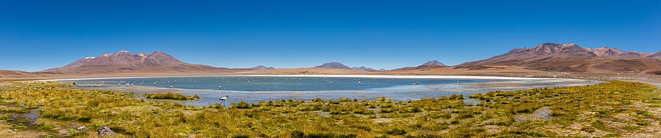
 Info Panoramic view of Cañapa Lake, Bolivia. Created and uploaded by Diego Delso - nominated by TheAmerikaner (talk) 04:39, 7 June 2017 (UTC)
 Support -- TheAmerikaner (talk) 04:39, 7 June 2017 (UTC)
- Support Thank you for the nomination, TheAmerikaner! It is indeed a nice one! There are some stitching issues, though, that I'll fix tonight Poco2 06:54, 7 June 2017 (UTC)
- I already addressed the stitching issues I saw, please, let me know if you see any others. Poco2 08:54, 7 June 2017 (UTC)
 Comment I don't know if it's on my screen. The grass, or the plants, in the foreground look somewhat crusty. But I find the picture very successful. Best regards. --TheAmerikaner (talk) 13:22, 7 June 2017 (UTC)
- I already addressed the stitching issues I saw, please, let me know if you see any others. Poco2 08:54, 7 June 2017 (UTC)
- Support Daphne Lantier 06:55, 7 June 2017 (UTC)
- Support --Martin Falbisoner (talk) 06:56, 7 June 2017 (UTC)
- Support - Yet another great South American panorama by Diego. -- Ikan Kekek (talk) 08:22, 7 June 2017 (UTC)
- Support --Pudelek (talk) 11:12, 7 June 2017 (UTC)
- Support Beautiful Lagoon in Bolivia --The Photographer 12:59, 7 June 2017 (UTC)
- Support Very nice. Charles (talk) 14:54, 7 June 2017 (UTC)
- Support --Hockei (talk) 16:27, 7 June 2017 (UTC)
- Support -- Wolf im Wald 02:28, 8 June 2017 (UTC)
- Support -- Johann Jaritz (talk) 02:30, 8 June 2017 (UTC)
- Support Daniel Case (talk) 05:03, 8 June 2017 (UTC)
- Support. But it takes a lot of time to review such big works through my limited Internet. Jee 16:29, 8 June 2017 (UTC)
- Support -- King of ♥ ♦ ♣ ♠ 02:15, 9 June 2017 (UTC)
- Support --Agnes Monkelbaan (talk) 05:40, 9 June 2017 (UTC)
- Support --Kiril Simeonovski (talk) 11:04, 9 June 2017 (UTC)
- Support Good composition. -- Colin (talk) 12:03, 9 June 2017 (UTC)
 Oppose --(for now) Comment But still, one of your best images in term of density of colors of that area. I didn't check it close, but there's already a problem of color balance: very magenta in the mountains. I known, it's a very tricky region, I have this problem in mines too. I will try to propose here an edited version of this photograph this w-e. Sting (talk) 01:59, 10 June 2017 (UTC)
- Sting per consensus at talk FPC, please don't nominate an alt here without the nominator/creator's permission. Colour balance issues are best fixed on the raw files, rather than trying to alter JPGs, so I'm sure Poco could apply a fix if required. I don't know what the rock colours are here, so perhaps the mountains are somewhat coloured. Perhaps best approach would be to upload your suggestion to Dropbox for others to comment on whether it is an improvement. -- Colin (talk) 08:24, 10 June 2017 (UTC)
- Sting, Colin: I've no problem with alt versions but surely agree with Colin that creating one of the RAW file would be more suitable. I find a oppose really harsh as I was there and cannot confirm that we are actually facing a WB problem. Still, I can give it a try and upload an alt but it will have to wait till tomorrow. This weekend I'm attending a Wikimedia event away from home. Poco2 09:12, 10 June 2017 (UTC)
- Just to clear what can be a misunderstanding, the color balance is not wrong on the whole image but on the distant mountains here. That’s a characteristic I noticed there in Atacama: red/brown mountains with blue sky reflection/haze turns them in purple, while on close range the salt, slightly yellow/orange from dust, with cyan/light blue reflection turns it green. Add a Hue/Saturation adjustment layer, pushing to 100% the green and magenta saturation and you will see what I mean. And there’s no way to make a one-step global correction: add a Color Balance adjustment layer, trying to correct the magenta cast (keep the Hue/Saturation layer on for illustration) and you will get a too green foreground.
- The Raw is useful for bringing back darks and highlights but there’s no need to go back that far in the post-processing to correct a local color balance and I doubt anyone would do that for a panorama. Working on a 16 bits file is perfectly fine for that task, as well as easier. Sting (talk) 14:09, 10 June 2017 (UTC)
- Colour balance is exactly the sort of thing that gets fixed in a raw file, as the raw file doesn't yet have one assigned. But what do you mean by "local colour balance". If you mean fixing small areas of the image you think are the wrong colour, then I'm not sure that is justified here. -- Colin (talk) 14:40, 10 June 2017 (UTC)
- Add a Color Balance layer to the upper part of the mountains with +20 of red and +20 of yellow in the midtones (approximate values just for a rapid check) and you will see their colors pop up again and that there's a magenta cast on the original file. Sting (talk) 16:38, 10 June 2017 (UTC)
- Why on earth would Poco want to fix 2 hills on the sides with "purple cast" while the middle hills, that are also further out, are not "affected"? Maybe shooting with an UV filter would've helped, maybe not (not sure if it's an issue at 2400m) but point is: if it affects only part of the image, isn't it just a natural phenomenon? Then why would anyone want to "fix" it? -- KennyOMG (talk) 21:21, 11 June 2017 (UTC)
- Digital cameras don't need UV filters (other than as a protective filter if desired). -- Colin (talk) 21:57, 11 June 2017 (UTC)
- clear glass filters provide better quality at a lower cost...
 --Martin Falbisoner (talk) 03:52, 12 June 2017 (UTC)
- Martin, my information comes from LensRentals Blog and other writers. It seems the most important factor is the quality of the multi-coating, which can mean transmission is >99% or as poor as 90%, which will affect flare/sharpness as well as exposure. I have not found it easy to buy just a "protector" filter compared to buying a UV filter. Just in case anyone interprets your comment wrongly, "clear glass" on its own, with no coatings, would be a very bad choice, as would a really cheap ebay filter. The point about colours is that I understand that digital sensors are not affected by UV light in the same way as film was. I don't know if altitude has an effect, other than making the sky deeper blue. Another factor that can alter colours in subtle ways is the calibration profile chosen in Lightroom/ACR such as "Adobe Standard" or "Camera Standard". -- Colin (talk) 07:51, 12 June 2017 (UTC)
- Colin, I totally agree! Of course the quality of lenses' coating is absolutely essential. I do use high quality "clear glass" protectors (if need be... in the desert or on the beach, e.g. Most of the time I don't use protectors at all). It never ceases to amaze me, though, why people keep buying even more expensive UV-lenses in the digital age. As you correctly point out, sensors don't need UV filters - unlike photographic film. --Martin Falbisoner (talk) 13:00, 12 June 2017 (UTC)
- Martin, my information comes from LensRentals Blog and other writers. It seems the most important factor is the quality of the multi-coating, which can mean transmission is >99% or as poor as 90%, which will affect flare/sharpness as well as exposure. I have not found it easy to buy just a "protector" filter compared to buying a UV filter. Just in case anyone interprets your comment wrongly, "clear glass" on its own, with no coatings, would be a very bad choice, as would a really cheap ebay filter. The point about colours is that I understand that digital sensors are not affected by UV light in the same way as film was. I don't know if altitude has an effect, other than making the sky deeper blue. Another factor that can alter colours in subtle ways is the calibration profile chosen in Lightroom/ACR such as "Adobe Standard" or "Camera Standard". -- Colin (talk) 07:51, 12 June 2017 (UTC)
- clear glass filters provide better quality at a lower cost...
- Digital cameras don't need UV filters (other than as a protective filter if desired). -- Colin (talk) 21:57, 11 June 2017 (UTC)
- Why on earth would Poco want to fix 2 hills on the sides with "purple cast" while the middle hills, that are also further out, are not "affected"? Maybe shooting with an UV filter would've helped, maybe not (not sure if it's an issue at 2400m) but point is: if it affects only part of the image, isn't it just a natural phenomenon? Then why would anyone want to "fix" it? -- KennyOMG (talk) 21:21, 11 June 2017 (UTC)
- Add a Color Balance layer to the upper part of the mountains with +20 of red and +20 of yellow in the midtones (approximate values just for a rapid check) and you will see their colors pop up again and that there's a magenta cast on the original file. Sting (talk) 16:38, 10 June 2017 (UTC)
- Colour balance is exactly the sort of thing that gets fixed in a raw file, as the raw file doesn't yet have one assigned. But what do you mean by "local colour balance". If you mean fixing small areas of the image you think are the wrong colour, then I'm not sure that is justified here. -- Colin (talk) 14:40, 10 June 2017 (UTC)
- Sting, Colin: I've no problem with alt versions but surely agree with Colin that creating one of the RAW file would be more suitable. I find a oppose really harsh as I was there and cannot confirm that we are actually facing a WB problem. Still, I can give it a try and upload an alt but it will have to wait till tomorrow. This weekend I'm attending a Wikimedia event away from home. Poco2 09:12, 10 June 2017 (UTC)
- Sting per consensus at talk FPC, please don't nominate an alt here without the nominator/creator's permission. Colour balance issues are best fixed on the raw files, rather than trying to alter JPGs, so I'm sure Poco could apply a fix if required. I don't know what the rock colours are here, so perhaps the mountains are somewhat coloured. Perhaps best approach would be to upload your suggestion to Dropbox for others to comment on whether it is an improvement. -- Colin (talk) 08:24, 10 June 2017 (UTC)
- Comment I've uploaded a new version (not a alt) with a reduction of the purple tones in the background mountains. To be honest I didn't upload a new alt because the differences are subtle to me and, Sting, I'm still astonish that this topic is a reason to decline. Declines should not be used to ensure that an issue somebody points out is actually addressed but should rather reflect whether the picture overall deserves or doesn't the FP star. I always adress all issues in my pictures. Sorry for not uploading it yesterday, I got too late when I came back home. Poco2 17:56, 12 June 2017 (UTC)
- A very conservative edit ;-D, but you tried. I would have done it also for the left and right mountains which present as well that color shift, but it’s your image and choice.
- Don’t be astonished because I opposed: a vote can be changed (and I’m doing it right now, as I did before for an other of your panoramas) and doesn’t have any side effect for the result as it will remain a 100% support. If I did so: first, yes, it’s to catch the attention of the author about what I think is a problem in the image because, second, several authors don’t care trying to improve their image when someone points out an issue in a “simple” comment, and some don’t even care having some justified opposing votes as long as they reach the FP label. Just my 2 cents, because I think this FPC area can also be an exchange of experience. Sting (talk) 21:54, 12 June 2017 (UTC)
- I agree with Poco that an oppose here is unfriendly, Sting. It happened to me on another nomination because the horizon as <0.3° tilted, as if that 0.3° is the difference between featured and not, or a slight purple hue on the mountains is the difference between featured or not. Like the other opposer, you claim to do that in order to get your way, citing past example where nominator didn't make the change. Well this is not COM:AGF as most people are accommodating if there an improvement that can be made, but you should also respect the creator's opinion as to whether a suggested change is actually an improvement. I've seen FPC's damaged because someone opposed over noise and the image then ends up soft plastic, for example. And although here your oppose was not joined by anyone else opposing, it also killed off the supports too, so I think it was actually harmful to the nomination and you should reconsider your approach to be more trusting and respectful of the photographer who was there. -- Colin (talk) 19:11, 13 June 2017 (UTC)
Confirmed results:
Result: 17 support, 0 oppose, 0 neutral → featured. /Daphne Lantier 18:53, 13 June 2017 (UTC)
This image will be added to the FP gallery: Places/Natural