Commons:Quality images candidates/Archives May 23 2017
Jump to navigation
Jump to search

-

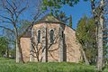
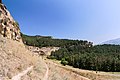
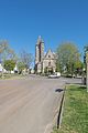
- Nomination Cemetery chapel in Göriach, Hohenthurn, Carinthia, Austria --Johann Jaritz 01:57, 21 May 2017 (UTC)
- Promotion
 Support Good quality.--Agnes Monkelbaan 04:42, 21 May 2017 (UTC)
-

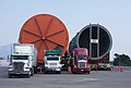
- Nomination Kettles on transit for Tula refinery, Hildalgo, Mexico --Cvmontuy 00:22, 21 May 2017 (UTC)
- Promotion Good quality. -- Johann Jaritz 03:04, 21 May 2017 (UTC)
-

- Nomination Rotterdam, pub (café Beurs) at the de Kruiskade - Feyenoord makes 2-0 in match for championship --Michielverbeek 23:01, 20 May 2017 (UTC)
- Promotion Support Good quality.--Agnes Monkelbaan 04:48, 21 May 2017 (UTC)
-

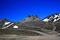
- Nomination Three Volcanoes Protected Area, Kamchatka Krai, Russia. (by Козинцев) --SKas 20:10, 20 May 2017 (UTC)
- Promotion Good. -- Ikan Kekek 22:10, 20 May 2017 (UTC)
-
- Nomination Camel Butte, Kamchatka Krai, Russia. (by Козинцев) --SKas 20:10, 20 May 2017 (UTC)
- Promotion Good. -- Ikan Kekek 22:10, 20 May 2017 (UTC)
-
- Nomination Panorama of Lake Bracciano from Montefiascone --Livioandronico2013 18:56, 20 May 2017 (UTC)
- Promotion Good quality but wrong categorization. This is not lake Bolsena or am I wrong? --Ermell 19:04, 20 May 2017 (UTC)
Yes yes...i'm being too old Done,thanks --Livioandronico2013 19:19, 20 May 2017 (UTC)
-
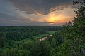
- Nomination Sunset view from the rock "Shaitan-Kamen'" --N 3 14 15 92 65 18:06, 20 May 2017 (UTC)
- Promotion A bit noisy but beautiful and a QI, in my opinion. -- Ikan Kekek 22:16, 20 May 2017 (UTC)
-

- Nomination Entry Mustergärten to park Grugapark in Essen --Tuxyso 17:49, 20 May 2017 (UTC)
- Promotion Good quality. --Basotxerri 19:00, 20 May 2017 (UTC)
-

-

- Nomination Golden Fishtail Mountain (Machhapuchhre Himal), Nepal by Prakat Shrestha--Biplab Anand 17:21, 20 May 2017 (UTC)
- Promotion Good quality. --Livioandronico2013 19:21, 20 May 2017 (UTC)
-

- Nomination Geum rivale 'Leonardii'.
--Famberhorst 16:24, 20 May 2017 (UTC) - Promotion Good quality. --Livioandronico2013 19:21, 20 May 2017 (UTC)
- Nomination Geum rivale 'Leonardii'.
-

- Nomination Wijnjeterper Schar, Natura 2000 area of Friesland province. Detail of partially rooted birch.
--Famberhorst 16:24, 20 May 2017 (UTC) - Promotion Good quality --Halavar 16:36, 20 May 2017 (UTC)
- Nomination Wijnjeterper Schar, Natura 2000 area of Friesland province. Detail of partially rooted birch.
-

- Nomination Castle of La Treyne, Lacave, Lot, France. --Tournasol7 15:53, 20 May 2017 (UTC)
- Promotion SupportGood quality.--Manfred Kuzel 20:55, 20 May 2017 (UTC)
-

- Nomination Sanctuaire de Rocamadour, Lot, France. --Tournasol7 15:53, 20 May 2017 (UTC)
- Promotion Maybe maybe something sharper, but good enough for me.--Famberhorst 16:15, 20 May 2017 (UTC)
-
- Nomination Saint Cyr and Saint Julitte Church of La Pannonie, Couzou, Lot, France. --Tournasol7 15:53, 20 May 2017 (UTC)
- Promotion Good quality --Halavar 16:39, 20 May 2017 (UTC)
-

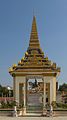
- Nomination King Norodom statue and King Ang Duong's stupa. Royal Palace. Phnom Penh, Cambodia. --Halavar 15:34, 20 May 2017 (UTC)
- Promotion Support Good quality.--Famberhorst 16:12, 20 May 2017 (UTC)
-
- Nomination King Norodom statue. Royal Palace. Phnom Penh, Cambodia. --Halavar 15:34, 20 May 2017 (UTC)
- Promotion Good quality. Tournasol7 22:26, 20 May 2017 (UTC)
-

- Nomination King Norodom stupa. Royal Palace. Phnom Penh, Cambodia. --Halavar 15:34, 20 May 2017 (UTC)
- Promotion Good quality. Tournasol7 22:26, 20 May 2017 (UTC)
-

-

- Nomination Nettuno fountain on the Piazza del Popolo in Rome. --Moroder 15:00, 20 May 2017 (UTC)
- Promotion Good quality. -- Johann Jaritz 15:17, 20 May 2017 (UTC)
-

- Nomination Catholic Parish Church of the Annunciation in Bischwind --Ermell 13:45, 20 May 2017 (UTC)
- Promotion Good quality. --Poco a poco 14:18, 20 May 2017 (UTC)
-

- Nomination Catholic Parish Church of the Annunciation in Bischwind --Ermell 13:45, 20 May 2017 (UTC)
- Promotion Good quality. -- Johann Jaritz 15:15, 20 May 2017 (UTC)
-
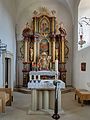
- Nomination Altar in the Catholic Parish Church of the Annunciation in Bischwind --Ermell 13:45, 20 May 2017 (UTC)
- Promotion Good quality. --Poco a poco 14:18, 20 May 2017 (UTC)
-
- Nomination Catholic Parish Church of the Annunciation in Bischwind --Ermell 13:45, 20 May 2017 (UTC)
- Promotion Good quality. --Poco a poco 14:18, 20 May 2017 (UTC)
-

- Nomination Cypripedium calceolus --Anntinomy 13:12, 20 May 2017 (UTC)
- Promotion Good quality, but please take care yourself of the specific categories --Poco a poco 14:21, 20 May 2017 (UTC)
-

- Nomination Graphium agamemnon --Anntinomy 13:12, 20 May 2017 (UTC)
- Promotion Good quality. --Poco a poco 14:18, 20 May 2017 (UTC)
-

- Nomination Oleshky Sands --Anntinomy 13:12, 20 May 2017 (UTC)
- Decline Not sharp enough for Q1 and it looks totally blurred --Michielverbeek 13:19, 20 May 2017 (UTC)
-

- Nomination Court of the Quirinal Palace in Rome. --Moroder 11:15, 20 May 2017 (UTC)
- Promotion Good. -- Ikan Kekek 11:54, 20 May 2017 (UTC)
-

- Nomination Mud volcanos, Qobutan National Reserve, Azerbaijan --Poco a poco 11:11, 20 May 2017 (UTC)
- Promotion Good quality --Halavar 11:37, 20 May 2017 (UTC)
-

- Nomination Persepolis, Iran --Poco a poco 11:11, 20 May 2017 (UTC)
- Promotion Very good. -- Ikan Kekek 11:53, 20 May 2017 (UTC)
-

- Nomination Law Rock, Þingvellir National Park, Suðurland, Iceland --Poco a poco 11:11, 20 May 2017 (UTC)
- Promotion Really good. -- Ikan Kekek 12:01, 20 May 2017 (UTC)
-
- Nomination Ruta de las Caras, Cuenca, Spain --Poco a poco 11:11, 20 May 2017 (UTC)
- Promotion Good quality --Halavar 11:38, 20 May 2017 (UTC)
-

- Nomination Sacsayhuamán, Cusco, Peru --Poco a poco 11:11, 20 May 2017 (UTC)
- Promotion Good quality. --Moroder 11:25, 20 May 2017 (UTC)
-

- Nomination Werder (Havel): railway station --A.Savin 10:59, 20 May 2017 (UTC)
- Promotion Good quality. --Poco a poco 11:17, 20 May 2017 (UTC)
-

- Nomination Werder (Havel): Holy Spirit Church --A.Savin 10:59, 20 May 2017 (UTC)
- Promotion Good quality. --Poco a poco 11:17, 20 May 2017 (UTC)
-

- Nomination Werder (Havel): St.Mary "Star of the Sea" Church --A.Savin 10:59, 20 May 2017 (UTC)
- Promotion Good quality. -- Johann Jaritz 15:14, 20 May 2017 (UTC)
-

- Nomination Roof fresco of Pantokrator, Nativity of the Theotokos Church, Bitola, Macedonia --PetarM 10:06, 20 May 2017 (UTC)
- Promotion SupportGood quality.--Manfred Kuzel 10:16, 20 May 2017 (UTC)
-
-

- Nomination Apollo Kaitharoidos, Marble Museo nazionale romano di palazzo Altemps in Rome. --Moroder 08:47, 20 May 2017 (UTC)
- Promotion Not optimal due to a tight top crop but still ok --Poco a poco 11:17, 20 May 2017 (UTC)
-

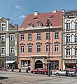
- Nomination 1 Market Square in Wałbrzych 1 --Jacek Halicki 07:54, 20 May 2017 (UTC)
- Promotion Good quality --Llez 08:11, 20 May 2017 (UTC)
-

- Nomination 1 Market Square in Wałbrzych 2 --Jacek Halicki 07:54, 20 May 2017 (UTC)
- Promotion Good quality --Llez 08:11, 20 May 2017 (UTC)
-
- Nomination 2 Market Square in Wałbrzych 1 --Jacek Halicki 07:54, 20 May 2017 (UTC)
- Promotion Good quality --Llez 08:09, 20 May 2017 (UTC)
-

- Nomination 2 Market Square in Wałbrzych 2 --Jacek Halicki 07:54, 20 May 2017 (UTC)
- Promotion Good quality. -- Johann Jaritz 08:32, 20 May 2017 (UTC)
-

- Nomination 2 Market Square in Wałbrzych 3 --Jacek Halicki 07:54, 20 May 2017 (UTC)
- Promotion Good quality. -- Johann Jaritz 08:32, 20 May 2017 (UTC)
-
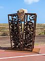
- Nomination Sculpture "Conexión - Desconexión" by Petre Petrov, Morro Jable, Fueerteventura --Llez 07:51, 20 May 2017 (UTC)
- Promotion Good quality. -- Johann Jaritz 08:32, 20 May 2017 (UTC)
-

- Nomination Sculpture "Playing with the wind" by Amancio Gonzáles, Morro Jable, Fueerteventura --Llez 07:51, 20 May 2017 (UTC)
- Promotion Good quality. -- Johann Jaritz 08:32, 20 May 2017 (UTC)
-

- Nomination Papilio polymnestor pre-pupatory larva --Jkadavoor 07:17, 20 May 2017 (UTC)
- Promotion Good quality. -- Johann Jaritz 07:35, 20 May 2017 (UTC)
-

- Nomination Underground gas pipeline signs in the Elgea mountain range. Álava, Basque Country, Spain --Basotxerri 05:23, 20 May 2017 (UTC)
- Promotion Support Good quality.--Agnes Monkelbaan 05:45, 20 May 2017 (UTC)
-

- Nomination Underground gas pipeline signs in the Elgea mountain range. Álava, Basque Country, Spain --Basotxerri 05:23, 20 May 2017 (UTC)
- Promotion Support Good quality.--Manfred Kuzel 06:00, 20 May 2017 (UTC)
-

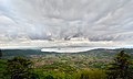
- Nomination Ullíbarri-Gamboa reservoir, viewed from the Elgea mountain range. In the background Vitoria-Gasteiz. Álava, Basque Country, Spain --Basotxerri 05:23, 20 May 2017 (UTC)
- Promotion Support Good quality. --XRay 06:15, 20 May 2017 (UTC)
-

- Nomination Ullíbarri-Gamboa reservoir, viewed from the Elgea mountain range. In the background Vitoria-Gasteiz. Álava, Basque Country, Spain --Basotxerri 05:23, 20 May 2017 (UTC)
- Promotion
 Info This image is nominated twice. --XRay 06:13, 20 May 2017 (UTC)
@XRay: Sorry, my fault, here's the correct one. --Basotxerri 06:27, 20 May 2017 (UTC) Support Good. --A.Savin 10:51, 20 May 2017 (UTC)
-

- Nomination John Deere 1210E forwarder in the Entzia mountain range. Álava, Basque Country, Spain --Basotxerri 05:23, 20 May 2017 (UTC)
- Promotion SupportGood quality.--Manfred Kuzel 06:02, 20 May 2017 (UTC)
-
- Nomination Objekt in der Kellergasse Etzmannsdorf/Niederösterreich. --Manfred Kuzel 04:54, 20 May 2017 (UTC)
- Promotion Support Good quality.--Agnes Monkelbaan 05:48, 20 May 2017 (UTC)
-

- Nomination Objekt in der Kellergasse Etzmannsdorf/Niederösterreich. --Manfred Kuzel 04:54, 20 May 2017 (UTC)
- Promotion Support Good quality. --XRay 06:15, 20 May 2017 (UTC)
-

- Nomination Objekt in der Kellergasse Etzmannsdorf/Niederösterreich. --Manfred Kuzel 04:54, 20 May 2017 (UTC)
- Promotion Support Good quality. --XRay 06:15, 20 May 2017 (UTC)
-

- Nomination Kellergasse Etzmannsdorf/Niederösterreich. --Manfred Kuzel 04:54, 20 May 2017 (UTC)
- Promotion Support Good quality. --XRay 06:15, 20 May 2017 (UTC)
-

- Nomination Detail of sand drift.
--Agnes Monkelbaan 04:49, 20 May 2017 (UTC) - Promotion Support Good quality. :-) --XRay 06:12, 20 May 2017 (UTC)
- Nomination Detail of sand drift.
-
-

- Nomination Ilse falls in the Ilsetal in Harz National Park near Ilsenburg, Saxony-Anhalt, Germany --XRay 02:20, 20 May 2017 (UTC)
- Promotion Support Good quality. -- Johann Jaritz 06:40, 20 May 2017 (UTC)
-

- Nomination View from the Baumkronenpfad in the Hainich National Park near Schönstedt, Thuringia, Germany --XRay 02:20, 20 May 2017 (UTC)
- Promotion Support Good quality. -- Johann Jaritz 06:40, 20 May 2017 (UTC)
-

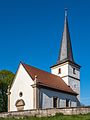
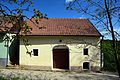
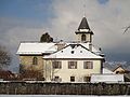
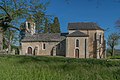
- Nomination Porch of the subsidiary church Saint Cyriacus with cemetery, Hohenthurn, Carinthia, Austria --Johann Jaritz 02:04, 20 May 2017 (UTC)
- Promotion Support Good quality. --XRay 06:12, 20 May 2017 (UTC)
-

- Nomination The Otokar Vectio U LE n°25240 of Transdev Rhône-Alpes Interurbain, on the school line 653 of the Stac (Saint Louis du Mont, Chambéry↔Collège de Maistre, Saint-Alban-Leysse), in Saint-Alban-Leysse on May 16, 2017. --Lev. Anthony 22:20, 19 May 2017 (UTC)
- Decline
 Oppose Insufficient quality. Sorry. No details and noise. --XRay 06:17, 20 May 2017 (UTC)
-

- Nomination The Heuliez GX 137 n°4114 of the Stac at the yard, in Chambéry, on April 14, 2017. --Lev. Anthony 22:20, 19 May 2017 (UTC)
- Decline Oppose Insufficient quality. Sorry. No details and noise. --XRay 06:17, 20 May 2017 (UTC)
-
- Nomination The presbytery and the church Saint-Vincent of Challes-les-Eaux, under snow, on January 15, 2017. --Lev. Anthony 22:20, 19 May 2017 (UTC)
- Decline Oppose Insufficient quality. Sorry. Nice compostion, but no details and noise. --XRay 06:10, 20 May 2017 (UTC)
-
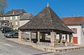
- Nomination Halle de Thémines, Lot, France. --Tournasol7 21:24, 19 May 2017 (UTC)
- Promotion Good quality. --A.Savin 10:46, 20 May 2017 (UTC)
-
- Nomination Nettuno fountain detail on the Piazza del Popolo in Rome. --Moroder 19:44, 19 May 2017 (UTC)
- Promotion Good quality.--Manfred Kuzel 05:09, 20 May 2017 (UTC)
-

- Nomination Statuette Karajà, young girl with loin cloth --Ercé 19:33, 19 May 2017 (UTC)
- Promotion SupportGood quality.--Manfred Kuzel 05:16, 20 May 2017 (UTC)
-

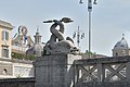
- Nomination Fountain of thedeity Roma on the Piazza del Popolo in Rome. --Moroder 19:29, 19 May 2017 (UTC)
- Promotion Good quality.--Manfred Kuzel 05:11, 20 May 2017 (UTC)
-

- Nomination Chefchaouen, Morocco. By User:M1abdelrahman --Reda benkhadra 14:50, 19 May 2017 (UTC)
- Decline Insufficient quality. Colors, not sharp.Why f/4.8 with a still image at daytime? --Moroder 09:13, 20 May 2017 (UTC)
-

- Nomination Variegated grasshopper (Zonocerus variegatus), Ghana --Charlesjsharp 14:46, 19 May 2017 (UTC)
- Promotion That grasshopper is beautiful!
 Question But how big is it? At full size, there are issues with sharpness and noise, but if full screen on my laptop is the size or nearly the size of the grasshopper, I believe the photo should be promoted as good quality. I can't find my tape measure at the moment, but I would estimate that its body, excluding its antennae, measures about 4 inches at full screen on my monitor. -- Ikan Kekek 12:11, 20 May 2017 (UTC)
Body about 2 - 2 1/2 inches. Charlesjsharp 21:21, 20 May 2017 (UTC) Support -In that case, good quality IMO. -- Ikan Kekek 22:27, 20 May 2017 (UTC)
-
- Nomination Weaver ant (Oecophylla longinoda) nest, Ghana --Charlesjsharp 14:46, 19 May 2017 (UTC)
- Promotion Good and quite interesting. -- Ikan Kekek 12:13, 20 May 2017 (UTC)
-

-

-

- Nomination Castle of La Treyne, Lacave, Lot, France. --Tournasol7 21:30, 18 May 2017 (UTC)
- Promotion Could you remove the unsharp parts on the left, please? --Basotxerri 17:05, 19 May 2017 (UTC)
@Basotxerri: Done. Tournasol7 21:43, 19 May 2017 (UTC)
Thank you. OK for me now. --Basotxerri 12:38, 20 May 2017 (UTC)
-

- Nomination White-throated bee-eater (Merops albicollis), Ghana --Charlesjsharp 20:59, 18 May 2017 (UTC)
- Promotion Good quality. --Cvmontuy 01:53, 21 May 2017 (UTC)
-

- Nomination King Norodom statue. Royal Palace. Phnom Penh, Cambodia. --Halavar 18:28, 17 May 2017 (UTC)
Could you get rif of the half street lamp on the left? Poco a poco 19:55, 17 May 2017 (UTC) Done Thanks for the hint. New fixed version uploaded. --Halavar 20:07, 17 May 2017 (UTC) - Promotion Good quality. --Poco a poco 11:30, 20 May 2017 (UTC)
- Nomination King Norodom statue. Royal Palace. Phnom Penh, Cambodia. --Halavar 18:28, 17 May 2017 (UTC)
-

- Nomination Greater Rhea --Deepugn 05:45, 16 May 2017 (UTC)
- Promotion
 Comment COM:Categories should be fixed --A.Savin 08:46, 16 May 2017 (UTC) Done Hi Savin, thanks for reminding, possible categories added to the image. Are those fine? Deepugn 09:04, 16 May 2017 (UTC) Comment One too much--A.Savin 16:51, 16 May 2017 (UTC) Done by Jee, OK now. --A.Savin 11:04, 19 May 2017 (UTC) CommentThanks Jeevan and Savin --Deepugn 16:11, 20 May 2017 (UTC)
-

-

- Nomination Eine Gans am Borner See --Freddy2001 09:29, 15 May 2017 (UTC)
- Promotion Good Quality IMO --Cvmontuy 01:46, 21 May 2017 (UTC)
-

- Nomination Portal eines Objektes in der Kellergasse Eggendorf im Thale/Niederösterreich. --Manfred Kuzel 03:56, 15 May 2017 (UTC)
- Promotion Good quality. --Cvmontuy 04:40, 21 May 2017 (UTC)
-

- Nomination sunrise in the Deaad Horse Point State Park --Christian Pietzsch 17:53, 15 May 2017 (UTC)
- Decline Noisy and not sharp enough, sorry --Cvmontuy 04:43, 21 May 2017 (UTC)
-

- Nomination: Saint Cyr and Saint Julitte Church of La Pannonie, Couzou, Lot, France. --Tournasol7 22:27, 14 May 2017 (UTC)
- Review needed
-
- Nomination: Saint Cyr and Saint Julitte Church of La Pannonie, Couzou, Lot, France. --Tournasol7 22:27, 14 May 2017 (UTC)
- Review needed
-

- Nomination: River at the bottom of the Grand Canyon of Crimea --N 3 14 15 92 65 14:27, 14 May 2017 (UTC)
- Review needed
-
- Nomination Saint Peter Church of Assier, Lot, France. --Tournasol7 22:14, 12 May 2017 (UTC)
- Decline IMO main object is too small and the car in the front spoils the composition, sorry no Q1 for me. Without the car and a stronger zoom might have been much better --Michielverbeek 07:10, 20 May 2017 (UTC)
-

- Nomination Al Wahda Dam (Morocco). By User:Ritahouari --Reda benkhadra 14:33, 13 May 2017 (UTC)
- Decline Insufficient quality. Disturbing power lines, almost all the photo out of focus. Sorry --Moroder 15:04, 20 May 2017 (UTC)


.jpg)
.jpg)
.jpg)


.jpg)


.jpg)


.jpg)
_-_Stac_(Chamb%C3%A9ry).jpg)
_-_Challes-les-Eaux,_2017.jpg)


_2.jpg)
_nest_2.jpg)


_2.jpg)
.jpg)


_(freddy2001).jpg)


Consensual review[edit]
File:Gora Koltso tract1.jpg[edit]

- Nomination Caucasian Mineral Waters. Area of the mountains "Ring" --AlixSaz 08:47, 20 May 2017(UTC)
- Promotion
- Support Good quality.--Manfred Kuzel 10:05, 20 May 2017 (UTC)
- Weak Oppose This one seems somewhat oversharpened, please more opinions. --A.Savin 10:56, 20 May 2017 (UTC)
- Support - I admit that I am very unlikely to have nearly the keen eyes for oversharpening that A.Savin has, but the photo looks good enough for QI to me. -- Ikan Kekek 11:58, 20 May 2017 (UTC)
File:Gutleutkaserne,_Frankfurt,_Central_Gate,_Southeast_view_20170514_1.jpg[edit]

- Nomination A southeast view of the central gate of the Gutleutkaserne, Frankfurt am Main --DXR 08:28, 14 May 2017 (UTC)
- Promotion
- Do those towers really lean out that way, or are they actually straight and parallel to each other? If it's the latter, please correct, as they look strange this way. If not, say so. Otherwise, good. -- Ikan Kekek 09:16, 14 May 2017 (UTC)
- DXR, could you please confirm that they do lean? -- Ikan Kekek 22:29, 16 May 2017 (UTC)
- I voted to promote this photo, but I would really like someone to address whether these two towers really do lean in opposite directions, because if not, they shouldn't in the photo. I haven't been to Frankfurt, and other photos are inconclusive on this question. -- Ikan Kekek 21:59, 18 May 2017 (UTC)
- strong support The vertical lines are perfect. The leaning is just an optical illusion due to the deformation of the top which ivariably happens with perspective correction--Wolfgang Moroder (talk) 10:13, 19 May 2017 (UTC)
- Optical illusion? You mean that's not how the photo actually looks? I think it should be corrected, so I will Oppose, though I know it's symbolic and won't carry the day. -- Ikan Kekek 09:33, 20 May 2017 (UTC)
- Optical illusion? You mean that's not how the photo actually looks? I think it should be corrected, so I will
- Comment This is a typical example of the absurd demand that every photograph of a building must be corrected in perspective in such a way that all verticals are strictly vertical. The architect, of course, draws his buildings with vertical walls and towers. And these will hopefully be built vertically accordingly. However, the architect is completely free in his designs when choosing the perspective. If one looks at drawings of classical buildings, one immediately sees that these are always represented, so to say, from the infinite, or at least from a very great distance. For multi-storey buildings or towers regularly also from an elevated point of view. For us photographers, in most cases it is impossible to find the same or at least a similar location in order to photograph a building as the architect has once drawn. The more unfavorable the camera location, the more blatant the "corrected" image results. Over the last few years, an ideology has emerged, and at the same time an aesthetic, which has nothing to do with a realistic, encyclopaedic, natural representation. The availability of extreme wide-angle lenses and their awkward use does not make things any better. --Smial 10:36, 19 May 2017 (UTC)
- Support More than OK for me. Nonetheless I wish the EXIF data was still there. --A.Savin 11:02, 19 May 2017 (UTC)
- Support. --Peulle 09:39, 20 May 2017 (UTC)
- Comment Ikan Kekek, et al., this image is a mosaic of nine photos shot at 35mm to give an equivalent focal length of ca. 16mm after cropping, with much more detail than a single image could give. However, this method means that there is no such thing as "a" photo to start with. I must manually tell the software how to place the combined images on a canvas to get a final image, and for that I believe that going for corrected verticals (and in this case, horizontals) is a natural thing. I get that there are valid issues with straightened verticals in wide angles (such as the fact that anything that is not actually perfectly straight becomes exaggerated, such as here, which was created the same way), though I could think of far worse examples than this image and I am yet to hear a much better alternative to correcting the verticals (unstraightened lines also look awkward imo and there would always be a lot of judgment concerning which level of converging lines is the right one - is this really preferable? I know, we all want this view, but it isn't on offer in real life without tearing down an entire quarter ;-) ).
- I also understand the perception that "something is not quite right", because not all lines appear to be perfectly vertical. At the end of the day, I have to make some judgment call about which edges to focus on for correcting the verticals, and I believe that here, they are not all fully parallel. Keep in mind that this building is from 1879, so it might as well be not 100% perfect. If I compare the image to this, there also seems to be some imperfection in the way the towers are leaning (and the image is totally distorted vertically), similar here --DXR (talk) 13:00, 21 May 2017 (UTC)
- Thanks for your detailed reply. the Limburg Cathedral view is a lot gentler in leaning. Anyway, I respect your thinking. Ikan Kekek 22:22, 21 May 2017 (UTC)
File:Prenzlau 10-2016 photo05.jpg[edit]

- Nomination Prenzlau (Brandenburg): St.Mary Magdalene Church --A.Savin 08:34, 15 May 2017 (UTC)
- Promotion
- Is the white balance really ok? It looks a bit yellow to me, making the sky look a little off. --W.carter 09:34, 15 May 2017 (UTC)
- Comment The picture was taken outdoor on a normal sunny day, same settings as other pictures of this series. Why shouldn't the WB be OK. --A.Savin 13:23, 15 May 2017 (UTC)
- Comparing the three photos, this one does seem too dark for such a sunny day, unless there was a very brief, really strong cloud cover. I don't know why the WB would be off. What do you think accounts for the discrepancy? -- Ikan Kekek 01:20, 18 May 2017 (UTC)
- Comment Seems a bit yellowish, I would say... --Basotxerri 18:08, 18 May 2017 (UTC)
- Support QI for me--Lmbuga 22:18, 18 May 2017 (UTC)
- Comment - In isolation, the photo looks perfectly good to me. But did you look at the other linked photos? There's a mystery about the white balance in this one, by comparison to the other two. -- Ikan Kekek 07:57, 19 May 2017 (UTC)
- Comment OK, new version. --A.Savin 08:42, 19 May 2017 (UTC)
- Support Thank you. Very nice now. --W.carter 09:37, 19 May 2017 (UTC)
- Support In my opinion, the coloring is a matter of taste, in technically view it is different whether the light is reflected frontally or laterally (look at the angle of the shaddows).--Zoppo59 20:24, 19 May 2017 (UTC)
- Support - Looks much better, IMO. -- Ikan Kekek 04:27, 20 May 2017 (UTC)