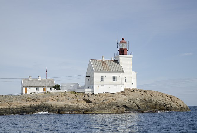
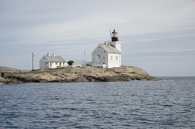
Commons:Featured picture candidates/Set/Lyngør lighthouse
Jump to navigation
Jump to search
Lyngør lighthouse, not featured
[edit]Voting period is over. Please don't add any new votes.Voting period ends on 27 Aug 2017 at 22:20:37 (UTC)
-
From the west.
-
From the southwest.
-
From the northwest.
 Info all by me, including the boat piloting. :) The lighthouse was first built in 1879, and is currently a listed building. Automated in 2004, it was opened as a tourist hut available for rent after refurbishing in 2011. -- Peulle (talk) 22:20, 18 August 2017 (UTC)
 Support -- Peulle (talk) 22:20, 18 August 2017 (UTC)
 Comment The second picture seems a bit overexposed. --A.Savin 22:35, 18 August 2017 (UTC)
 Comment Hmmm ... not sure I agree. I do have the .RAW file so small tweaks can be made, but since other images in the series have the same exposure (800), I think perhaps the difference in light is due to the direction of the sun. What do you think?--Peulle (talk) 13:01, 19 August 2017 (UTC)
- Some details on the facade are blown. And I would use more contrast on all three photos (perhaps matter of taste). --A.Savin 14:00, 19 August 2017 (UTC)
- Yes, perhaps the "southwest" one could do with a bit more contrast, although I think the "west" image would look overprocessed if I increase it on that.--Peulle (talk) 15:28, 19 August 2017 (UTC)
- Some details on the facade are blown. And I would use more contrast on all three photos (perhaps matter of taste). --A.Savin 14:00, 19 August 2017 (UTC)
 Comment - This is a very good effort, and if not FP, very close, IMO. I like the compositions of the first two pictures, find them restful and consider them FPs. The left crop of the 3rd picture feels to me too close to the bridge over the stream (I guess that is). Would it be possible to add more room to the left? -- Ikan Kekek (talk) 08:19, 19 August 2017 (UTC)
 Comment No, it's already at the maximum, but other sides can be cropped if you think that would improve the compositional balance. Perhaps you could add a note if you have a specific crop in mind?--Peulle (talk) 12:56, 19 August 2017 (UTC)
- I think nothing can really compensate for the lack of room to the left, so this is something else you can consider for your next go at photographing this motif. -- Ikan Kekek (talk) 21:06, 19 August 2017 (UTC)
 Oppose Not seeing an FP in any of these. Also I don't think FP sets are designed so you can gain 3-for-1 FPs by photographing from a few angles. Photos one and three aren't significantly different. I think perhaps the "set" description of FP needs some work, as I can't recall anyone featuring a set like this. It would need to be a pretty amazing building to give "wow" from all facades. Even Diliff didn't nominate sets, vs choosing the best of many photos taken inside or out. -- Colin (talk) 08:34, 19 August 2017 (UTC)
 Comment Yes, I agree that each of the images would have to satisfy FP status in order for the set to reach it (i.e. one should not be able to "sneak in" a non-FP amongst other images). As for the different angles, the reason I did it this way is that I noticed A.Savin using this strategy with his stadium photos. Thanks for reviewing. :) --Peulle (talk) 12:53, 19 August 2017 (UTC)
 Comment - I would like the horizon in the same height in picture and same distance to the lighthouse. --Villy Fink Isaksen (talk) 10:39, 19 August 2017 (UTC)
 Comment The "northwest" photo can certainly be cropped a bit at the bottom. Do you think that would improve the image?--Peulle (talk) 12:54, 19 August 2017 (UTC)
- Yes it would, but the best solution is probably a new serie of pictures. --Villy Fink Isaksen (talk) 13:21, 19 August 2017 (UTC)
- A project for next year, that. Summer's over. :) --Peulle (talk) 13:26, 19 August 2017 (UTC)
- I see this set as a Triptych and that is the reason for my suggestions. --Villy Fink Isaksen (talk) 18:13, 19 August 2017 (UTC)
- A project for next year, that. Summer's over. :) --Peulle (talk) 13:26, 19 August 2017 (UTC)
- Yes it would, but the best solution is probably a new serie of pictures. --Villy Fink Isaksen (talk) 13:21, 19 August 2017 (UTC)
 Comment I might be able to get behind #2 as a FP but on # 1 and especially #3 my eye is drawn to the Power Lines too much and that just keeps spoiling it with if you don’t count the uninteresting water on #3. Nominating a set is hard. Sixflashphoto (talk) 19:25, 19 August 2017 (UTC)
 Oppose per Colin. Not a set, and not individually FPs either. -- King of ♥ ♦ ♣ ♠ 21:02, 19 August 2017 (UTC)
 Comment Thanks for all comments; I will keep working on them and try nominating a single one later. :) --Peulle (talk) 06:48, 21 August 2017 (UTC)
Confirmed results:


