Commons:Quality images candidates/Archives January 18 2024
Jump to navigation
Jump to search

-

- Nomination Window shutters at the west wall of apartments Werzer on Annastraße #10, Pörtschach, Carinthia, Austria -- Johann Jaritz 03:05, 16 January 2024 (UTC)
- Promotion
 Support Good quality. --Tagooty 03:12, 16 January 2024 (UTC)
-

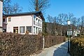
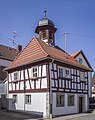
- Nomination Hotel Sonnengrund in der Annastraße #9, Pörtschach, Carinthia, Austria -- Johann Jaritz 03:05, 16 January 2024 (UTC)
- Promotion Support Good quality. --Tagooty 03:12, 16 January 2024 (UTC)
-
- Nomination Bed and breakfast inn on Wahlißstraße #7, Pörtschach, Carinthia, Austria -- Johann Jaritz 03:05, 16 January 2024 (UTC)
- Promotion Support Good quality. --Tagooty 03:12, 16 January 2024 (UTC)
-

- Nomination Steles in Burana Tower site, Kyrgyzstan --Bgag 00:53, 16 January 2024 (UTC)
- Promotion Support Good quality. --Johann Jaritz 03:06, 16 January 2024 (UTC)
-

- Nomination Registan in Samarkand, Uzbekistan --Bgag 00:53, 16 January 2024 (UTC)
- Promotion Support Good quality. --Johann Jaritz 03:06, 16 January 2024 (UTC)
-

- Nomination Petroglyph Museum of Cholpon-Ata, Kyrgyzstan. The petroglyph depicts an ibex hunt with a snow leopard. --Bgag 00:53, 16 January 2024 (UTC)
- Promotion Support Good quality. --Johann Jaritz 03:06, 16 January 2024 (UTC)
-

-

- Nomination Magalia Community Church in Butte County, California --Frank Schulenburg 00:53, 16 January 2024 (UTC)
- Promotion Support Good quality. --Johann Jaritz 03:07, 16 January 2024 (UTC)
-

-

- Nomination Eurasian spoonbill (Platalea leucorodia) in breeding plumage walking, Ranganathittu Bird Sanctuary, Karnataka, India --Tagooty 00:44, 16 January 2024 (UTC)
- Promotion Support Good quality. --Frank Schulenburg 00:53, 16 January 2024 (UTC)
-

-
-

-

-

-

-

- Nomination Grave of Constantin Tănase in the Bellu Cemetery in Bucharest, Romania --Neoclassicism Enthusiast 17:13, 15 January 2024 (UTC)
- Promotion Good quality. --Berthold Werner 18:51, 15 January 2024 (UTC)
-

-

- Nomination Mirador Building, Madrid, Spain. --Kadellar 15:39, 15 January 2024 (UTC)
- Promotion Good quality. --Kritzolina 18:42, 15 January 2024 (UTC)
-
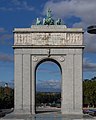
- Nomination Victory arch, Madrid, Spain. --Kadellar 15:39, 15 January 2024 (UTC)
- Promotion Good quality. --Berthold Werner 17:00, 15 January 2024 (UTC)
-

- Nomination Mitsubishi ASX (2nd generation) in Gerlingen --Alexander-93 10:36, 15 January 2024 (UTC)
- Promotion Good quality -- Spurzem 12:45, 15 January 2024 (UTC)
-

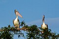
- Nomination Australasian darter (Anhinga novaehollandiae) male --Charlesjsharp 10:34, 15 January 2024 (UTC)
- Promotion Support Good quality. --Ermell 10:36, 15 January 2024 (UTC)
-

- Nomination Australasian darter (Anhinga novaehollandiae) female --Charlesjsharp 10:34, 15 January 2024 (UTC)
- Promotion Support Good quality. --Ermell 10:36, 15 January 2024 (UTC)
-

- Nomination Australasian darter (Anhinga novaehollandiae) male --Charlesjsharp 10:34, 15 January 2024 (UTC)
- Promotion Support Good quality. --Ermell 10:36, 15 January 2024 (UTC)
-

- Nomination Australasian darter (Anhinga novaehollandiae) male --Charlesjsharp 10:34, 15 January 2024 (UTC)
- Promotion Support Good quality. Nice set --George Chernilevsky 13:03, 15 January 2024 (UTC)
-

- Nomination Australasian darter (Anhinga novaehollandiae) male --Charlesjsharp 10:34, 15 January 2024 (UTC)
- Promotion Support Good quality. Nice set --George Chernilevsky 13:03, 15 January 2024 (UTC)
-

-

- Nomination Former indoor swimming pool Bamberg --Ermell 09:55, 15 January 2024 (UTC)
- Promotion Support Good quality. --George Chernilevsky 13:05, 15 January 2024 (UTC)
-

-
-

-

-
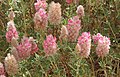
- Nomination Cretan ebony (Ebenus cretica) --Robert Flogaus-Faust 08:35, 15 January 2024 (UTC)
- Promotion Support Good quality. --Ermell 10:35, 15 January 2024 (UTC)
-

- Nomination Allium strictum --Robert Flogaus-Faust 08:35, 15 January 2024 (UTC)
- Promotion Support Good quality. --Ermell 10:35, 15 January 2024 (UTC)
-

-
-

-
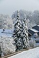
- Nomination Winter in Zell - trees at the bottom of the Wehnerwiese seen from Zeller Straße --Kritzolina 07:42, 15 January 2024 (UTC)
- Promotion Support Good quality. --Aristeas 08:47, 15 January 2024 (UTC)
-

- Nomination Cemetery in Zell, Schäftlarn - Cross looking over the newest part of the cemetery --Kritzolina 07:42, 15 January 2024 (UTC)
- Promotion Support Good quality. --Plozessor 07:49, 15 January 2024 (UTC)
-
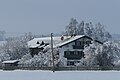
- Nomination Farmhouse called Marxnhof or Beim Angermüller on Neufahrnerstraße in Zell, Schäftlarn seen from the Zell cemetery --Kritzolina 07:42, 15 January 2024 (UTC)
- Promotion Support Good quality. --George Chernilevsky 13:07, 15 January 2024 (UTC)
-

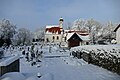
- Nomination St. Michael in Zell in winter with hall of blessing seen from the cemetery --Kritzolina 07:42, 15 January 2024 (UTC)
- Promotion Support Good quality. --Plozessor 07:49, 15 January 2024 (UTC)
-
- Nomination St. Michael in Zell in winter with hall of blessing seen from the cemetery --Kritzolina 07:42, 15 January 2024 (UTC)
- Promotion Support Good quality. --Aristeas 08:47, 15 January 2024 (UTC)
-

- Nomination Carved pumpkin, pumpkin festival in the garden of Ludwigsburg Palace, Ludwigsburg, Baden-Württemberg, Germany. --Llez 06:16, 15 January 2024 (UTC)
- Promotion Support Good quality. --George Chernilevsky 13:09, 15 January 2024 (UTC)
-

-

-

- Nomination Lagenaria siceraria "Indian Mix", pumpkin festival in the garden of Ludwigsburg Palace, Ludwigsburg, Baden-Württemberg, Germany --Llez 06:16, 15 January 2024 (UTC)
- Promotion Support Good quality. --George Chernilevsky 13:09, 15 January 2024 (UTC)
-

- Nomination Fountain in the south garden of Ludwigsburg Palace, Ludwigsburg, Baden-Württemberg, Germany --Llez 06:16, 15 January 2024 (UTC)
- Promotion
This is tilted ccw. --Plozessor 06:24, 15 January 2024 (UTC) Done Thanks for the hint --Llez 07:16, 15 January 2024 (UTC) Support Good quality. --Plozessor 08:30, 15 January 2024 (UTC)
-

-

-
-

- Nomination Giant hogweed at "biodiversity trail" near Rauhenebrach --Plozessor 05:56, 15 January 2024 (UTC)
- Promotion Is it possible to reduce the highlights a bit? --Llez 06:25, 15 January 2024 (UTC)
@Llez: Better?
OK, good quality --Llez 07:11, 15 January 2024 (UTC) --Plozessor 06:50, 15 January 2024 (UTC)
-

- Nomination Rhododendron at Biddulph Grange Garden. By User:Mike Peel --XRay 05:40, 15 January 2024 (UTC)
- Promotion Good quality --Llez 06:20, 15 January 2024 (UTC)
-
- Nomination At Fuerteventura 2022. By User:Mike Peel --XRay 05:40, 15 January 2024 (UTC)
- Promotion Support Good picture, filename should be more specific --Plozessor 06:01, 15 January 2024 (UTC)
-

- Nomination . By User:Mike Peel --XRay 05:40, 15 January 2024 (UTC)
- Promotion Support Background is slightly leaning out but that is IMO not an issue as the subject is the tree. --Plozessor 06:01, 15 January 2024 (UTC)
-

- Nomination Ferocactus hamatacanthus at Jardin de Cactus in 2022. By User:Mike Peel --XRay 05:40, 15 January 2024 (UTC)
- Promotion Good quality --Llez 06:18, 15 January 2024 (UTC)
-

- Nomination Tail of storm Gerrit over the Langweerderwielen.
--Agnes Monkelbaan 05:27, 15 January 2024 (UTC) - Promotion Support Good quality. --Johann Jaritz 05:36, 15 January 2024 (UTC)
- Nomination Tail of storm Gerrit over the Langweerderwielen.
-

- Nomination House in the center of Ardez, Bröl dadaint 18. (Detail)
--Agnes Monkelbaan 05:27, 15 January 2024 (UTC) - Promotion Support Good quality. --Johann Jaritz 05:36, 15 January 2024 (UTC)
- Nomination House in the center of Ardez, Bröl dadaint 18. (Detail)
-

- Nomination Ardez Castle Ruins. Part of the castle ruins on the Steinsberg plateau.
--Agnes Monkelbaan 05:27, 15 January 2024 (UTC) - Promotion Support Good quality. --Johann Jaritz 05:36, 15 January 2024 (UTC)
- Nomination Ardez Castle Ruins. Part of the castle ruins on the Steinsberg plateau.
-

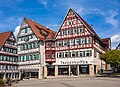
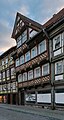
- Nomination Kirchplatz 7 in Hann. Münden, Lower Saxony, Germany. --Tournasol7 05:08, 15 January 2024 (UTC)
- Promotion Support Good quality.--Agnes Monkelbaan 05:20, 15 January 2024 (UTC)
-

- Nomination Burgstraße 7 in Hann. Münden, Lower Saxony, Germany. --Tournasol7 05:08, 15 January 2024 (UTC)
- Promotion Support Good quality. --XRay 05:41, 15 January 2024 (UTC)
-

- Nomination Burgstraße 11 in Hann. Münden, Lower Saxony, Germany. --Tournasol7 05:08, 15 January 2024 (UTC)
- Promotion Support Good quality.--Agnes Monkelbaan 05:22, 15 January 2024 (UTC)
-
- Nomination Burgstraße 12 in Hann. Münden, Lower Saxony, Germany. --Tournasol7 05:08, 15 January 2024 (UTC)
- Promotion Support Good quality. --XRay 05:41, 15 January 2024 (UTC)
-

- Nomination Burgstraße 13 in Hann. Münden, Lower Saxony, Germany. --Tournasol7 05:08, 15 January 2024 (UTC)
- Promotion Support Good quality.--Agnes Monkelbaan 05:21, 15 January 2024 (UTC)
-

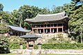
- Nomination Lotus Pond and Manharu Pavillion in Gongsanseong Fortress, Gongju, South Korea --Bgag 04:17, 15 January 2024 (UTC)
- Promotion Support Good quality.--Agnes Monkelbaan 05:23, 15 January 2024 (UTC)
-
-

- Nomination Buyongjeong Pavilion in Huwon Garden, Seoul --Bgag 04:16, 15 January 2024 (UTC)
- Promotion
A bit overexposed? --Tagooty 04:40, 15 January 2024 (UTC)
Done --Bgag 14:47, 15 January 2024 (UTC) Support Good quality. --JoachimKohler-HB 00:01, 16 January 2024 (UTC)
-
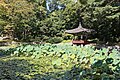
- Nomination Aeryeonji Pond and Aeryeonjeong Pavilion in Huwon Garden, Seoul --Bgag 04:16, 15 January 2024 (UTC)
- Promotion Support Good quality.--Tournasol7 05:12, 15 January 2024 (UTC)
-

- Nomination Tic Tac 1 --Jacek Halicki 03:59, 15 January 2024 (UTC)
- Promotion Support Good quality.--Tournasol7 05:10, 15 January 2024 (UTC)
-

- Nomination Tic Tac 2 --Jacek Halicki 03:59, 15 January 2024 (UTC)
- Promotion Support Good quality.--Tournasol7 05:10, 15 January 2024 (UTC)
-

- Nomination Tic Tac 3 --Jacek Halicki 03:59, 15 January 2024 (UTC)
- Promotion Support Good quality. --Johann Jaritz 05:35, 15 January 2024 (UTC)
-
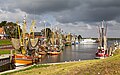
- Nomination Fishing boats resting in Greetsiel (East Frisia) --JoachimKohler-HB 01:20, 15 January 2024 (UTC)
- Decline
 Oppose Sorry, but this is quite blurry, and the white ship is blown out. --Plozessor 06:05, 15 January 2024 (UTC)
-

- Nomination Aerial photographs of Narapatir Dhap, Cumilla. By User:Azimronnie --আফতাবুজ্জামান 00:26, 15 January 2024 (UTC)
- Promotion Support Good quality. --Plozessor 06:05, 15 January 2024 (UTC)
-
- Nomination Aerial view of Mahangar Natya Mancha, Dhaka. By User:Fxxabir --আফতাবুজ্জামান 00:26, 15 January 2024 (UTC)
- Promotion Good quality. --Kritzolina 07:44, 15 January 2024 (UTC)
-

- Nomination Construction of Padma Bridge (2019). By User:Azimronnie --আফতাবুজ্জামান 00:26, 15 January 2024 (UTC)
- Promotion Support Good quality. --Plozessor 06:05, 15 January 2024 (UTC)
-

-

-

-

-
-
-

-

-

-

-

- Nomination Audi A4 in Playa Grande, Mar del Plata, Argentina --Ezarate 23:08, 13 January 2024 (UTC)
- Promotion
Looks like you sharpened a lot of noise. Maybe apply a stronger mask before sharpening --MB-one 16:07, 14 January 2024 (UTC)
done, also resaved at 100% --Ezarate 22:46, 14 January 2024 (UTC) Support Good quality now --MB-one 20:34, 15 January 2024 (UTC)
-
- Nomination Varese Beach in January 2024, Mar del Plata, Argentina --Ezarate 23:08, 13 January 2024 (UTC)
- Promotion
 color banding Unfortunately there's color banding in the sky, probably from too strong JPG compression. Can you convert it with higher quality? --Plozessor 05:19, 14 January 2024 (UTC)
Thanks, Plozessor, both pictures now saved at 100% --Ezarate 22:41, 14 January 2024 (UTC) Support Thx! Much better now! --Plozessor 08:31, 15 January 2024 (UTC)
-

- Nomination Varese beach in January 2024, Mar del Plata, Argentina --Ezarate 23:08, 13 January 2024 (UTC)
- Promotion
That too has color banding in the sky. --Plozessor 05:21, 14 January 2024 (UTC) Support Good quality. --Plozessor 08:31, 15 January 2024 (UTC)
-

- Nomination Moyie Muborak Library Museum, Tashkent, Uzbekistan --Bgag 04:04, 13 January 2024 (UTC)
- Promotion Support Good quality.--Agnes Monkelbaan 05:26, 13 January 2024 (UTC) Support Good quality. --Kurmanbek 18:47, 15 January 2024 (UTC)
-

- Nomination Jatiyo Smriti Soudho, Savar. By User:Mfsam12 --আফতাবুজ্জামান 18:57, 12 January 2024 (UTC)
- Promotion Good quality. --Kritzolina 07:46, 15 January 2024 (UTC)
-

-

-

- Nomination: Madan Mohan Temple at Sarkarpara area of Sarisha village in South 24 Pargana district. By User:Amitabha Gupta --Bodhisattwa 02:45, 10 January 2024 (UTC)
- Review needed
-

-
- Nomination: Grave of the Al. Chirițescu Family in the Bellu Cemetery in Bucharest, Romania --Neoclassicism Enthusiast 16:42, 9 January 2024 (UTC)
- Review needed
-

-

- Nomination: Flora and puttos group in the water parterre at Linderhof Palace in Bavaria. --Cayambe 07:27, 9 January 2024 (UTC)
- Review
It's tilted and the background is too noisy --Poco a poco 08:01, 9 January 2024 (UTC)
-
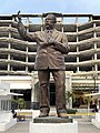
- Nomination: Statue of Lázaro Cárdenas (Puerto Vallarta) --Another Believer 05:28, 9 January 2024 (UTC)
- Review needed
-

- Nomination: Space Needle, Seattle --Another Believer 05:28, 9 January 2024 (UTC)
- Review needed
-
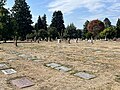
- Nomination: Calvary Cemetery (Seattle) --Another Believer 05:28, 9 January 2024 (UTC)
- Review needed
-

- Nomination: Cibali (tram station), Istanbul --Another Believer 05:28, 9 January 2024 (UTC)
- Review needed
-
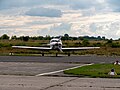
- Nomination: Lancair 360 at Mainz Finten Airfield --MB-one 06:15, 8 January 2024 (UTC)
- Review
 Comment Please remove a dustspot in the lower sky at left. Otherwise good.
Can you please makr the dustspot? I cant seem to find it. Or are you referring to the bird flying in the background? --MB-one 13:16, 9 January 2024 (UTC)
-

-

-

- Nomination Replica of Adormirea Maicii Domnului (Dormition of the Mother of God), after Dimitrie Paciurea, on the Grave of Atanasie Stolojan in the Bellu Cemetery in Bucharest, Romania --Neoclassicism Enthusiast 16:26, 7 January 2024 (UTC)
- Promotion Support Good quality. --C messier 20:49, 15 January 2024 (UTC) Support Good quality. --C messier 20:51, 15 January 2024 (UTC)
-

-

- Nomination Paris - Décoration XVIIe BnF Richelieu (mur de Cotte) (by Remi Mathis) --Sebring12Hrs 14:09, 7 January 2024 (UTC)
- Promotion Good quality. --Kadellar 15:49, 15 January 2024 (UTC)
-

-

-

-
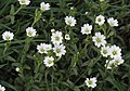
- Nomination Field mouse-ear (Cerastium arvense) --Robert Flogaus-Faust 10:32, 7 January 2024 (UTC)
- Promotion Support The central flower is outside of the focus a bit, but otherwise it's nice. --Draceane 12:26, 15 January 2024 (UTC)
-

-

-

-

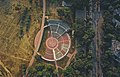
- Nomination Double Ring Pond at the Mill Creek Canyon Earthworks, a public park in Kent, Washington. --Roc0ast3r 09:45, 7 January 2024 (UTC)
- Promotion Good quality. --Kritzolina 07:49, 15 January 2024 (UTC)
-

- Nomination Museum of Guadalajara, Guadalajara, Spain --Poco a poco 09:42, 7 January 2024 (UTC)
- Promotion Support Good quality. --C messier 20:49, 15 January 2024 (UTC)
-
-
- Nomination ArtScience Museum, Marina Bay Sands, at night --Bijay Chaurasia 08:28, 7 January 2024 (UTC)
- Promotion Good quality. --Kritzolina 07:51, 15 January 2024 (UTC) Support Good quality. --Kurmanbek 18:46, 15 January 2024 (UTC)
-

- Nomination What ticket? Ticket machines at Bremen main station --JoachimKohler-HB 05:55, 7 January 2024 (UTC)
- Promotion Good quality. --Kadellar 15:43, 15 January 2024 (UTC)
-


-L1004302.jpg)


.jpg)

.jpg)


_1X7A1813.jpg)
_male_Kakadu.jpg)
_female_spreading_wings_Kakadu.jpg)
_male_with_northern_saratoga_(Scleropages_jardinii)_Kakadu_2.jpg)
_male_with_northern_saratoga_(Scleropages_jardinii)_Kakadu_5.jpg)
_male_with_northern_saratoga_(Scleropages_jardinii)_Kakadu_9.jpg)


.jpg)
.jpg)
.jpg)


.jpg)


.jpg)


_05.jpg)
_04.jpg)
_10.jpg)
.jpg)
.jpg)
.jpg)
.jpg)


.jpg)
.jpg)
.jpg)
.jpg)


_02.jpg)

.jpg)


.jpg)


.jpg)


_-_744.jpg)
.jpg)

,_after_Dimitrie_Paciurea,_on_the_Grave_of_Atanasie_Stolojan_in_the_Bellu_Cemetery_in_Bucharest,_Romania_(01).jpg)

.jpg)
.jpg)


.jpg)


.jpg)

Consensual review[edit]
File:Volgograd_Sudoverf_Railway_Station_2023-07-16_6467.jpg[edit]

- Nomination Sudoverf railway station --Mike1979 Russia 07:25, 4 January 2024 (UTC)
- Promotion
- Oppose sky looks off --Bijay Chaurasia 17:19, 9 January 2024 (UTC)
- What problem with the sky? --Mike1979 Russia 06:38, 10 January 2024 (UTC)
The sky is purple. Probably fixable though --MB-one 13:48, 11 January 2024 (UTC)
- Comment Reset to "/Decline" because of the opposing vote. --Robert Flogaus-Faust 22:23, 11 January 2024 (UTC)
- Tryed to fix the color of the sky. --Mike1979 Russia 08:02, 12 January 2024 (UTC)
- Comment Sending this to CR to end the reversions to "/Nomination" and because the author edited the image. --Robert Flogaus-Faust 11:53, 12 January 2024 (UTC)
- Support Good now. --Plozessor 05:54, 13 January 2024 (UTC)
- Support -- Spurzem 10:04, 13 January 2024 (UTC)
- Support good now --MB-one 18:38, 13 January 2024 (UTC)
- Support Good to go. --Aristeas 09:29, 15 January 2024 (UTC)
Total: 4 support (excluding the nominator), 1 oppose →  Promoted --C messier 22:24, 17 January 2024 (UTC)
File:Centro_de_interpretación_románico,_Luesia,_Zaragoza,_España,_2023-01-04,_DD_63.jpg[edit]

- Nomination Reredos of St Fabian and Sebastian, Romanesque interpretation centre, Luesia, Zaragoza, Spain --Poco a poco 07:56, 9 January 2024 (UTC)
- Promotion
- Support Good quality. --Plozessor 17:52, 9 January 2024 (UTC)
- Oppose I think the crucifixion scene at the top and the top panel on the right are too bright and the colors are therefore unnatural. I know from experience how difficult it is sometimes to photograph such painting, but in my opinion difficulties are not a criterion for a quality image. Please discuss. -- Spurzem 18:14, 9 January 2024 (UTC)
- New version --Poco a poco 20:47, 10 January 2024 (UTC)
- Support O.K. for me.--Ermell 22:42, 10 January 2024 (UTC)
- Support good rework. --Smial 15:03, 11 January 2024 (UTC)
- Comment I can't imagine that the colors of the middle panel above and the top panel on the right are anywhere close to reality. But maybe it's because of my eyes that I can't share the general enthusiasm for the photo. -- Spurzem 18:33, 11 January 2024 (UTC)
- Comment @Poco a poco: @Spurzem: Indeed this seems to have a bit more yellow in reality; there's a professional picture here. --Plozessor 13:37, 12 January 2024 (UTC)
- Comment @Poco a poco: @Spurzem: @Plozessor: In your example, the tablecloth on the altar has a visible yellow tint. Normally they are pure white. With mixed lighting, you often have to decide in favour of one variant. In the professional picture, the decision was apparently made to reduce the blue cast in the areas with daylight. This makes everything else slightly yellowish. Poco has decided to achieve a colour balance that is as neutral as possible. This is definitely not a quality defect. --Smial 08:41, 15 January 2024 (UTC)
- Support Good now. Thanks to Smial for his comment on the white balance and the comparison of the photos! --Aristeas 10:57, 15 January 2024 (UTC)
- @Smial: I do not think like you. The lower part of the retable shows colors similar to those that can be seen in reality under artificial light. The upper part, especially the crucifixion scene, has an unsightly blue cast. -- Spurzem 13:14, 15 January 2024 (UTC)
- Comment I think we don't have clear guidelines for "correct" colors under non-white light. Had one picture of a wayside shrine that looks yellow in reality because it's in a dark niche and most of the light that reaches it is reflected by the yellow walls, but that was not accepted as a QI. Only when I changed the white balance, so that the picture showed the object as it would appear under white light, it was accepted. We might have a similar case here - should the picture resemble the yellowish light in the church, or should it show the object as it would look under white light? --Plozessor 13:44, 15 January 2024 (UTC)
- Comment The pictures in the virtual tour linked by Plozessor have exactly the same problems in several different views, only, as already mentioned, the professional photographers there have opted for a more yellowish colour balance, which is just "wrong" in a different way. There, too, parts that receive light from the windows are slightly bluish in colour compared to the rest. That's just the way it is with mixed light. --Smial 17:11, 15 January 2024 (UTC)
- I think we all know how difficult it can be to photograph paintings and to reproduce the colors evenly. But can I say a picture is good or even excellent if this consistent reproduction is not achieved? -- Spurzem 19:26, 15 January 2024 (UTC)
- Who exactly forbade you from doing that? --Smial 20:13, 15 January 2024 (UTC)
- I think we all know how difficult it can be to photograph paintings and to reproduce the colors evenly. But can I say a picture is good or even excellent if this consistent reproduction is not achieved? -- Spurzem 19:26, 15 January 2024 (UTC)
- @Smial: I do not think like you. The lower part of the retable shows colors similar to those that can be seen in reality under artificial light. The upper part, especially the crucifixion scene, has an unsightly blue cast. -- Spurzem 13:14, 15 January 2024 (UTC)
Total: 4 support (excluding the nominator), 1 oppose → Promoted --C messier 22:24, 17 January 2024 (UTC)--Aristeas (talk) 10:57, 15 January 2024 (UTC)