Commons:Quality images candidates/Archives June 11 2017
Jump to navigation
Jump to search

-

-

-

-

- Nomination Parish church Holy Cross and the former hospice (Kloesterle) in Innerteuchen, Arriach, Carinthia, Austria --Johann Jaritz 01:52, 9 June 2017 (UTC)
- Promotion Good quality. --Uoaei1 04:00, 9 June 2017 (UTC)
-

- Nomination Plaque at the drinking fountain in Arriach, Arriach, Carinthia, Austria --Johann Jaritz 01:52, 9 June 2017 (UTC)
- Promotion
 Support Good quality.--Agnes Monkelbaan 04:30, 9 June 2017 (UTC)
-

- Nomination Drinking fountain (created by Andres Klimbacher) in Arriach, Arriach, Carinthia, Austria --Johann Jaritz 01:52, 9 June 2017 (UTC)
- Promotion Good quality. --Uoaei1 04:00, 9 June 2017 (UTC)
-

- Nomination Four wet wooden barrels. --W.carter 22:02, 8 June 2017 (UTC)
- Promotion Very nice! PumpkinSky 22:14, 8 June 2017 (UTC)
-

- Nomination Four barrels by the sea. --W.carter 22:02, 8 June 2017 (UTC)
- Promotion Good quality. Tournasol7 22:21, 8 June 2017 (UTC)
-

- Nomination Stacked EUR-pallets in Grötö industrial area --W.carter 22:02, 8 June 2017 (UTC)
- Promotion Good quality. -- Johann Jaritz 04:26, 9 June 2017 (UTC)
-
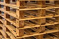
- Nomination Stacked EUR-pallets in Grötö industrial area. --W.carter 22:02, 8 June 2017 (UTC)
- Promotion Good quality. -- Johann Jaritz 04:26, 9 June 2017 (UTC)
-

- Nomination Very rusty chain in rain. --W.carter 22:02, 8 June 2017 (UTC)
- Promotion Very good focus and texture. PumpkinSky 22:16, 8 June 2017 (UTC)
-

- Nomination Garden water jug --PumpkinSky 21:32, 8 June 2017 (UTC)
- Promotion Good quality. Tournasol7 22:19, 8 June 2017 (UTC)
-

- Nomination Ein Foto aus dem Biosphärenreservat "Schleswig-Holsteinisches Wattenmeer". --Nightflyer 21:29, 8 June 2017 (UTC)
- Promotion Good quality. -- Johann Jaritz 04:25, 9 June 2017 (UTC)
-

- Nomination Ein Foto aus dem Biosphärenreservat "Schleswig-Holsteinisches Wattenmeer". --Nightflyer 21:29, 8 June 2017 (UTC)Good quality. -- Johann Jaritz 04:25, 9 June 2017 (UTC)
- Promotion {{{2}}}
-

- Nomination Lupines field in Ukraine (1) -- George Chernilevsky 20:16, 8 June 2017 (UTC)
- Promotion Good quality. --Basotxerri 20:25, 8 June 2017 (UTC)
-

- Nomination Lupines field in Ukraine (2) -- George Chernilevsky 20:16, 8 June 2017 (UTC)
- Promotion Good quality. --W.carter 22:04, 8 June 2017 (UTC)
-
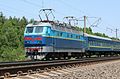
- Nomination Locomotive Skoda ChS4-111 -- George Chernilevsky 20:16, 8 June 2017 (UTC)
- Promotion Good quality. --Basotxerri 20:19, 8 June 2017 (UTC)
-

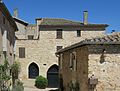
- Nomination Sainte-Austremoine Church in Salles-la-Source, Aveyron, France. --Tournasol7 19:42, 8 June 2017 (UTC)
- Promotion Good quality. --Jacek Halicki 22:37, 8 June 2017 (UTC)
-

- Nomination Sainte-Austremoine Church in Salles-la-Source, Aveyron, France. --Tournasol7 19:42, 8 June 2017 (UTC)
- Promotion Good quality. --Jacek Halicki 22:37, 8 June 2017 (UTC)
-
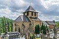
- Nomination Sainte-Austremoine Church in Salles-la-Source, Aveyron, France. --Tournasol7 19:42, 8 June 2017 (UTC)
- Promotion Good quality. --Basotxerri 20:21, 8 June 2017 (UTC)
-

- Nomination Sainte-Austremoine Church in Salles-la-Source, Aveyron, France. --Tournasol7 19:42, 8 June 2017 (UTC)
- Promotion Good quality. --Jacek Halicki 22:37, 8 June 2017 (UTC)
-
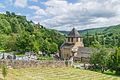
- Nomination Sainte-Austremoine Church in Salles-la-Source, Aveyron, France. --Tournasol7 19:42, 8 June 2017 (UTC)
- Promotion Good quality. PumpkinSky 21:32, 8 June 2017 (UTC)
-

- Nomination The Schlern Mountain seen from Seiseralm in South Tyrol. --Moroder 19:38, 8 June 2017 (UTC)
- Promotion Good quality. --Basotxerri 20:17, 8 June 2017 (UTC)
-

- Nomination Front facade of St. Peter's in Rome, Vatican City --Rabax63 18:22, 8 June 2017 (UTC)
- Decline
 Oppose Insufficient quality. Sorry. It isn't sharp. I check all the the statues. f/11 is good. I don't know why. May you didn't focused the building. May be your lens isn't OK. --XRay 18:55, 8 June 2017 (UTC)
 Comment It´s ok, i think it´s my mistake and not a technical problem --Rabax63
-

- Nomination Mausoleum Ossario Garibaldino in Rome Trastevere, seen from the west side --Rabax63 18:22, 8 June 2017 (UTC)
- Decline Oppose Insufficient quality. Sorry. Please have a look to the middle of your photograph and to the steps. The steps are sharper, the middle isn't sharp. The focus is in front of the building. --XRay 18:57, 8 June 2017 (UTC)
-

-

- Nomination Flower bud of one Cirsium vulgare.
--Famberhorst 17:48, 8 June 2017 (UTC) - Promotion Support Good quality. --XRay 18:58, 8 June 2017 (UTC)
- Nomination Flower bud of one Cirsium vulgare.
-

- Nomination Walk across the Hulshorsterzand/ Hulshorsterheide. 2 Pinus sylvestris in zandverstuiving.
--Famberhorst 17:48, 8 June 2017 (UTC) - Promotion Support Good quality. --XRay 18:59, 8 June 2017 (UTC)
- Nomination Walk across the Hulshorsterzand/ Hulshorsterheide. 2 Pinus sylvestris in zandverstuiving.
-
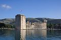
- Nomination Kamerlengo castle in Trogir, Croatia ----Imehling 17:47, 8 June 2017 (UTC)
- Decline The castle IMO is too unsharp for a QI, sorry. --Basotxerri 20:24, 8 June 2017 (UTC)
-

- Nomination Eastern watchtower of the city walls of Echternach, (Luxembourg). --Palauenc05 17:40, 8 June 2017 (UTC)
- Promotion QI for me.--Zoppo59 19:41, 8 June 2017 (UTC)
-

- Nomination Relief of Sant Angel Raphael with Tobias on the Angelo San Raffaele church in Venice. --Moroder 17:26, 8 June 2017 (UTC)
- Promotion Support Good quality.--Famberhorst 17:36, 8 June 2017 (UTC)
-

- Nomination Far de Formentor, Majorca --Llez 15:59, 8 June 2017 (UTC)
- Promotion Support Good quality.--Famberhorst 17:35, 8 June 2017 (UTC)
-

-

- Nomination Church of Salinas de Añana. Álava, Basque Country, Spain --Basotxerri 15:54, 8 June 2017 (UTC)
- Promotion Good quality. --Moroder 17:30, 8 June 2017 (UTC)
-

- Nomination Valle Salado ("Salty Valley") at Salinas de Añana; channel transporting salty water. Álava, Basque Country, Spain --Basotxerri 15:54, 8 June 2017 (UTC)
- Decline Most of the pic is not sharp and with CA. Sorry --Moroder 17:29, 8 June 2017 (UTC)
No problem, I knew it when nominating. --Basotxerri 20:38, 8 June 2017 (UTC)
-

- Nomination Landscape of the Espierba mountain range, in the background the Perdido mountain range. Sobrarbe, Huesca, Aragon, Spain --Basotxerri 15:54, 8 June 2017 (UTC)
- Promotion Support Good quality.--Famberhorst 17:33, 8 June 2017 (UTC)
-

- Nomination Landscape on the trail to Portillo de Tella en el Valle de Pineta. Sobrarbe, Huesca, Aragon, Spain --Basotxerri 15:54, 8 June 2017 (UTC)
- Promotion Support Good quality--Lmbuga 18:13, 8 June 2017 (UTC)
-

-

- Nomination Altar of Saint George at the parish- and pilgrimage church of the Assumption of Mary at Maria Saal, Carinthia, Austria --Uoaei1 15:17, 8 June 2017 (UTC)
- Promotion Good quality. -- Johann Jaritz 04:23, 9 June 2017 (UTC)
-

-

- Nomination Painted vault in the nave of the subsidiary and pilgrimage church Saint Wolfgang in Grades, Carinthia, Austria --Uoaei1 15:17, 8 June 2017 (UTC)
- Promotion Support Good quality.--Famberhorst 15:24, 8 June 2017 (UTC)
-

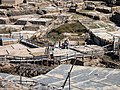
- Nomination Salineras (salt evaporation ponds) in Maras, Peru --Poco a poco 11:34, 8 June 2017 (UTC)
- Promotion Good quality. --Ermell 12:32, 8 June 2017 (UTC)
-

- Nomination Salt flat of Uyuni, Bolivia --Poco a poco 11:34, 8 June 2017 (UTC)
- Promotion Good quality.Impressing. --Ermell 12:31, 8 June 2017 (UTC)
-

- Nomination Tate Modern, London, England --Poco a poco 11:34, 8 June 2017 (UTC)
- Promotion Good quality. --Ermell 12:37, 8 June 2017 (UTC)
-

- Nomination Saguaro (Carnegiea gigantea), Botanic Conservatory, Fort Wayne, USA --Poco a poco 11:34, 8 June 2017 (UTC)
- Promotion Good quality. --Ermell 12:34, 8 June 2017 (UTC)
-

- Nomination National Theatre, Skopje, Republic of Macedonia --Poco a poco 11:34, 8 June 2017 (UTC)
- Promotion Good quality. --Ermell 12:36, 8 June 2017 (UTC)
-

- Nomination Arch of Constantine at Night (Rome) --Livioandronico2013 10:37, 8 June 2017 (UTC)
- Promotion Good quality. --Uoaei1 15:20, 8 June 2017 (UTC) Comment Great, for the recording you got up early
 --Rabax63 18:32, 8 June 2017 (UTC)
-

-

- Nomination Silesian Beskids - hiking trial to Barania Góra peak --Pudelek 09:02, 8 June 2017 (UTC)
- Promotion Good quality. --Livioandronico2013 10:51, 8 June 2017 (UTC)
-

- Nomination Silesian Beskids - hiking trial to Barania Góra peak --Pudelek 09:02, 8 June 2017 (UTC)
- Promotion Good quality. --Livioandronico2013 10:51, 8 June 2017 (UTC)
-

- Nomination MGR memorial at Marina beach in Chennai, India. --Dey.sandip 09:01, 8 June 2017 (UTC)
- Promotion Good quality and composition. -- Ikan Kekek 12:56, 8 June 2017 (UTC)
-

- Nomination Germany, Schloss Weilerbach, Garten mit Pavillion --Berthold Werner 07:22, 8 June 2017 (UTC)
- Promotion Good quality. --Ermell 12:38, 8 June 2017 (UTC)
-

- Nomination Kitesurfing at De Haan, Begium. --Cayambe 07:16, 8 June 2017 (UTC)
- Promotion GQ --Palauenc05 07:49, 8 June 2017 (UTC)
-
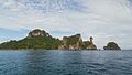
- Nomination Ko Po Da Nok. Hat Noppharat Thara–Mu Ko Phi Phi National Park. Mueang Krabi District, Krabi Province, Thailand. --Halavar 06:49, 8 June 2017 (UTC)
- Promotion The outline of the mountains against the sky might have been a little sharper, but good for me.--Famberhorst 15:21, 8 June 2017 (UTC)
-

- Nomination Ton Sai Beach. Hat Noppharat Thara–Mu Ko Phi Phi National Park. Ko Phi Phi Don, Mueang Krabi District, Krabi Province, Thailand. --Halavar 06:49, 8 June 2017 (UTC)
- Promotion I enjoy the lively composition and the quality is good enough. -- Ikan Kekek 08:49, 8 June 2017 (UTC)
-

- Nomination Long-tail boat. Loh Moo Dee Beach. Hat Noppharat Thara–Mu Ko Phi Phi National Park. Ko Phi Phi Don, Mueang Krabi District, Krabi Province, Thailand. --Halavar 06:49, 8 June 2017 (UTC)
- Promotion GQ --Palauenc05 07:50, 8 June 2017 (UTC)
-

- Nomination Thai wedded couple. Loh Moo Dee Beach. Hat Noppharat Thara–Mu Ko Phi Phi National Park. Ko Phi Phi Don, Mueang Krabi District, Krabi Province, Thailand. --Halavar 06:49, 8 June 2017 (UTC)
- Promotion Nice picture! I hope they have a copy of the file. :-) -- Ikan Kekek 08:50, 8 June 2017 (UTC)
-

-

-

- Nomination View of Schönbrunn in the Steigerwald from the north --Ermell 06:48, 8 June 2017 (UTC)
- Promotion GQ --Palauenc05 07:54, 8 June 2017 (UTC)
-

-

- Nomination Altar in the Catholic Church of St. Barbara in Unterhaid --Ermell 06:48, 8 June 2017 (UTC)
- Promotion GQ --Palauenc05 07:52, 8 June 2017 (UTC)
-

- Nomination Coat of arms (1664) of Abbot Martin Feiden (MFA) at the Quirinus Chapel in Trier, Germany. --Palauenc05 06:28, 8 June 2017 (UTC)
- Promotion Good quality. --Cayambe 09:41, 8 June 2017 (UTC)
-
- Nomination House number 26 in Zabłocie --Jacek Halicki 06:17, 8 June 2017 (UTC)
- Promotion Good quality. --Cayambe 09:40, 8 June 2017 (UTC)
-

- Nomination Chapel in Zabłocie 1 --Jacek Halicki 06:17, 8 June 2017 (UTC)
- Promotion Good quality. --Ermell 06:49, 8 June 2017 (UTC)
-
- Nomination Chapel in Zabłocie 2 --Jacek Halicki 06:17, 8 June 2017 (UTC)
- Promotion Good quality. -- Johann Jaritz 15:00, 8 June 2017 (UTC)
-

- Nomination Railway line 322 in Zabłocie --Jacek Halicki 06:17, 8 June 2017 (UTC)
- Promotion Good quality --Halavar 06:49, 8 June 2017 (UTC)
-
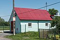
- Nomination Fire station in Zabłocie --Jacek Halicki 06:17, 8 June 2017 (UTC)
- Promotion Good quality. -- Johann Jaritz 15:00, 8 June 2017 (UTC)
-

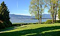
- Nomination Starnberger See in good weather with a view of the Zugspitze. (by Netty3979) --Ikan Kekek 05:48, 8 June 2017 (UTC)
- Promotion The pier takes the observer to the centre of the image. Good quality. -- Johann Jaritz 05:55, 8 June 2017 (UTC)
Thanks for the review. I'm glad you also enjoyed the composition. -- Ikan Kekek 08:57, 8 June 2017 (UTC)
-

- Nomination Napolean wrasse from the Lakshadweep atolls. By User:PoojaRathod --PJeganathan 05:43, 8 June 2017 (UTC)
- Decline sorry, not sharp enough --Biplab Anand 12:34, 8 June 2017 (UTC)
-

- Nomination Sand dunes from the Thar Desert, India. By User:Pawar Pooja --PJeganathan 05:43, 8 June 2017 (UTC)
- Decline sorry, not sharp enough --Biplab Anand 12:34, 8 June 2017 (UTC)
-

- Nomination Day flying moth from Namdapha Tiger Reserve, Arunachal Pradesh, India. By User:Rohitjahnavi --PJeganathan 05:43, 8 June 2017 (UTC)
- Promotion Certainly of QI quality, but I don't think it can pass QIC without the species being identified. -- Ikan Kekek 05:57, 8 June 2017 (UTC)
 Info It is actually a Milionia basalis. I have added the category and changed the description. --Shishir 6:21, 8 June 2017 (UTC)
Thank you. -- Ikan Kekek 08:58, 8 June 2017 (UTC)
Thanks for the id and promptly putting it up on wikipedia as well!--PJeganathan 10:12, 8 June 2017 (UTC)
-

- Nomination Downtown Vancouver and Kitsilano Beach --Xicotencatl 05:23, 8 June 2017 (UTC)
- Promotion Good quality. --Jacek Halicki 06:20, 8 June 2017 (UTC)
-
- Nomination Point Grey Park Site at Stephens Street, Vancouver, BC --Xicotencatl 05:23, 8 June 2017 (UTC)
- Promotion Support Good quality.--Famberhorst 15:17, 8 June 2017 (UTC)
-

- Nomination Panorama of Kitsilano Beach and Downtown Vancouver --Xicotencatl 05:23, 8 June 2017 (UTC)
- Promotion Good quality. --Jacek Halicki 06:20, 8 June 2017 (UTC)
-

- Nomination Ships navigating in front of the North Shore Mountains, Vancouver, BC --Xicotencatl 05:23, 8 June 2017 (UTC)
- Promotion Good quality. --Jacek Halicki 06:20, 8 June 2017 (UTC)
-

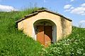
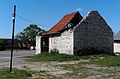
- Nomination Objekt in der Kellergasse in Starrein. --Manfred Kuzel 04:36, 8 June 2017 (UTC)
- Promotion QI for me. --Zoppo59 19:51, 8 June 2017 (UTC)
-
- Nomination Objekt in der Kellergasse in Starrein. --Manfred Kuzel 04:36, 8 June 2017 (UTC)
- Promotion Good quality. --Zoppo59 19:51, 8 June 2017 (UTC)
-

- Nomination Kellergasse in Starrein. --Manfred Kuzel 04:36, 8 June 2017 (UTC)
- Promotion Shadows can be a problem, but the quality is good.--Famberhorst 15:13, 8 June 2017 (UTC)
-
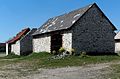
- Nomination Objekt in der Kellergasse in Untermixnitz. --Manfred Kuzel 04:36, 8 June 2017 (UTC)
- Promotion Good quality --Zoppo59 19:44, 8 June 2017 (UTC)
-

- Nomination Detail eines Objektes in der Kellergasse in Untermixnitz. --Manfred Kuzel 04:36, 8 June 2017 (UTC)
- Promotion Good quality.--Agnes Monkelbaan 05:26, 8 June 2017 (UTC)
-

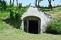
- Nomination The erratic stone block Cionstoan on the Seiser Alm, South Tyrol. --Moroder 04:35, 8 June 2017 (UTC)
- Withdrawn Sorry, not sharp enough --Michielverbeek 05:09, 8 June 2017 (UTC)
 I withdraw my nomination --Moroder 19:34, 8 June 2017 (UTC)
-
-
- Nomination Old barns in Żarki --Jakubhal 20:15, 7 June 2017 (UTC)
- Promotion Support Good quality.--Manfred Kuzel 05:08, 8 June 2017 (UTC)
-

- Nomination Image de la plaque de la stèle situé au Col du Moulin à Vent (592 m) au lieu-dit "Le Moulin à Vent", hameau de Lyas, Ardèche, France. Cette stèle commémore la création du secteur C de l'Armée Secrète (AS) le 6 juin 1944. --Benoît Prieur 19:56, 7 June 2017 (UTC)
- Promotion Ça parait de bonne qualité pour moi. -- Ikan Kekek 09:01, 8 June 2017 (UTC)
-

- Nomination The Vatican Obelisk on the Petersplatz from the southwest --Rabax63 19:05, 7 June 2017 (UTC)
- Decline Not sharp enough for Q1 --Michielverbeek 05:24, 8 June 2017 (UTC)
-

-
- Nomination Mathematical object for illustrating Chladni plates on display at Matemateca IME-USP, by Rodrigo Tetsuo Argenton) --Leandroxavier 13:37, 7 June 2017 (UTC)
- Promotion Good quality. --W.carter 22:14, 8 June 2017 (UTC)
-
- Nomination Mathematical object for illustrating Assembling of 7₁ knot on display at Matemateca IME-USP, by Rodrigo Tetsuo Argenton) --Leandroxavier 13:37, 7 June 2017 (UTC)
- Decline Insufficient quality.Same problem with sharpness and too bright light as in the other declined films in this series. --W.carter 22:14, 8 June 2017 (UTC)
-
- Nomination Mathematical object for illustrating Assembling of 6₃ knot on display at Matemateca IME-USP, by Rodrigo Tetsuo Argenton --Leandroxavier 13:37, 7 June 2017 (UTC)
- Decline Insufficient quality.Same problem with sharpness and too bright light as in the other declined films in this series. --W.carter 22:14, 8 June 2017 (UTC)
-

- Nomination Mathematical object for illustrating tautochrone curve on display at Matemateca IME-USP, by Rodrigo Tetsuo Argenton) --Leandroxavier 13:37, 7 June 2017 (UTC)
- Promotion Good quality. --W.carter 22:10, 8 June 2017 (UTC)
-

- Nomination Ruta de las Caras, Cuenca, Spain --Poco a poco 07:11, 7 June 2017 (UTC)
- Promotion Support Good quality for me.--Manfred Kuzel 05:19, 8 June 2017 (UTC)
-

- Nomination Vestmannaeyjar harbour, Heimaey, Westman Islands, Suðurland, Iceland --Poco a poco 07:11, 7 June 2017 (UTC)
- Promotion Comment Pink CA on the right side (see the note) --Halavar 10:32, 7 June 2017 (UTC)
Support Good quality--Lmbuga 18:20, 8 June 2017 (UTC)
-

- Nomination Prinzipalmarkt, Münster, North Rhine-Westphalia, Germany --XRay 03:35, 7 June 2017 (UTC)
- Withdrawn Comment Hm, XRay, meinst Du nicht, dass der Himmel hier etwas arg ausgebrannt ist? --Code 05:31, 7 June 2017 (UTC)
Das finde ich immer schwierig. Der Himmel ist bedeckt, es ist aber vergleichsweise hell. Oft lese ich, der Himmel sei ausgebrannt. Das sieht immer komisch aus, aber ausgebrannt ist das meiner Meinung nach nicht. Bei tollen Wolken oder blauem Himmel ist es immer einfacher. Ich sehe ein, zum Beurteilen eine ebenso schwierige Situation. Ich denke, ich ziehe die Nominierung zurück. Dann muss sich niemand entscheiden und es ist für alle einfacher. --XRay 13:12, 7 June 2017 (UTC) I withdraw my nomination Sorry, not good enough. --XRay 05:30, 8 June 2017 (UTC)
-

- Nomination Historical City Hall, Münster, North Rhine-Westphalia, Germany --XRay 03:35, 7 June 2017 (UTC)
- Withdrawn Comment Hm, XRay, meinst Du nicht, dass der Himmel hier etwas arg ausgebrannt ist? --Code 05:31, 7 June 2017 (UTC) I withdraw my nomination Sorry, not good enough. --XRay 05:30, 8 June 2017 (UTC)
-

- Nomination Cooking of Guinean pig (Cavia porcellus), Quito, Ecuador --Poco a poco 21:18, 6 June 2017 (UTC)
- Promotion Good quality. After reviewing this, nothing will surprise me... --W.carter 19:13, 8 June 2017 (UTC)
-
- Nomination Valle Salado ("Salty Valley") at Salinas de Añana; former and reconstructed salt evaporation ponds. Álava, Basque Country, Spain --Basotxerri 15:03, 6 June 2017 (UTC)
- Promotion There are not exactly overexposed parts in the photo, but with so many very light areas I think it would be better to reduce the highlights just a bit more. It looks a bit harsh right now. --W.carter 10:15, 8 June 2017 (UTC)
 Done Should be better now, I think. Thanks for the review. --Basotxerri 16:08, 8 June 2017 (UTC)
Easier on the eye. Good quality. --W.carter 19:09, 8 June 2017 (UTC)
-

- Nomination Église Notre-Dame-des-Champs de Mostuéjouls, Aveyron, France. --Tournasol7 14:31, 6 June 2017 (UTC)
- Promotion Good quality. --Dirtsc 13:31, 8 June 2017 (UTC)
-

- Nomination Roland le Preux Street in Rocamadour, Lot, France. --Tournasol7 14:31, 6 June 2017 (UTC)
- Promotion Good quality. --Dirtsc 13:31, 8 June 2017 (UTC)
-

- Nomination View over Valle Salado ("Salty Valley") at Salinas de Añana; former and reconstructed salt evaporation ponds. Álava, Basque Country, Spain --Basotxerri 15:01, 5 June 2017 (UTC)
- Promotion It is a wow-scene but with so many details in the photo it looks a little too much like a painting. I think it would be better if you eased up on the NR and added a bit of midtone contrast instead. --W.carter 10:10, 8 June 2017 (UTC) Done In this case, I'm not so sure if I understand you. I've tried to improve, please check. If you still aren't convinced, could you put some notes on the picture so that I can understand you better where you see the problems? --Basotxerri 16:17, 8 June 2017 (UTC)
Nevermind if you understood me, this is the result I was looking for. :) In some versions of Photoshop there is a function that is ideal for dealing with a lot of small areas with approximately the same tone ( color adjustment → adjust color curves → mid-tone contrast ) --W.carter 19:21, 8 June 2017 (UTC)
-

- Nomination Wild growing hoop petticoat daffodils (Narcissus bulbocodium subsp. citrinus) in the Olárizu park in Vitoria-Gasteiz, Álava, Basque Country, Spain --Basotxerri 07:14, 4 June 2017 (UTC)
- Promotion Dof a bit short but it is where it should be. Could you please bring out some detail on the stamen and pistils though? --W.carter 10:20, 8 June 2017 (UTC) Done Please check this one, too. I don't think that I could get it better... Thanks for the review! --Basotxerri 16:29, 8 June 2017 (UTC)
Improved! Good quality. --W.carter 19:23, 8 June 2017 (UTC)
-

- Nomination Bahnhof Schwerin-Mitte --Ralf Roletschek 06:56, 3 June 2017 (UTC)
- Decline Oppose I guess the file size is too small for QI, in addition there is a very strong reflection near the center. Sorry, no QI for me. --Zoppo59 20:04, 8 June 2017 (UTC)
-

- Nomination: Christopher Street Day 2017 in Düsseldorf --Freddy2001 20:01, 2 June 2017 (UTC)
- Review needed
-

- Nomination: Ente am Teich in Wegberg --Freddy2001 19:56, 2 June 2017 (UTC)
Species is needed for QI. "Ducks" as category is definitely not enough. I'd also apply a crop on the right Poco a poco 20:30, 2 June 2017 (UTC) - Review needed
- Nomination: Ente am Teich in Wegberg --Freddy2001 19:56, 2 June 2017 (UTC)
-

- Nomination: Bus in Fort-de-France (Martinique) --Billy69150 18:15, 2 June 2017 (UTC)
- Review needed
-

- Nomination: Holly Virgin Church in Bitola --PetarM 17:06, 2 June 2017 (UTC)
Both sides are leaning out Poco a poco 20:26, 2 June 2017 (UTC) - Review needed
- Nomination: Holly Virgin Church in Bitola --PetarM 17:06, 2 June 2017 (UTC)
-

- Nomination: A vectorgraphic of a japanese wave pattern. By User:Shisma --Alorin 16:37, 2 June 2017 (UTC)
- Review needed
-

- Nomination A variation of the standard periodic table, as of 1975, by James Franklin Hyde. An organosilicon chemist, Hyde gave carbon and silicon center stage. Reproduced by Jeremy Sachs with permission from George and Sylvia Schuster. By User:Rezmason --Shisma 16:36, 2 June 2017 (UTC)
- Promotion Good job done... Good quality. --Basotxerri 16:33, 8 June 2017 (UTC)
-

- Nomination Mountain hut in the Larrun area, Basque Country, France --Basotxerri 15:10, 2 June 2017 (UTC)
- Promotion Not the best choice for B&W since it makes the house hard to find. Can't complain about the quality though. :) QI. --W.carter 10:25, 8 June 2017 (UTC)
-

- Nomination: Flughafen Bratislava --Ralf Roletschek 11:34, 2 June 2017 (UTC)
- Review needed
-

- Nomination: Inflorescence of Polemonium caeruleum. --Bff 10:52, 1 June 2017 (UTC)
- Review I have the impression that the picture is a bit too dark. Can you correct it? Tournasol7 19:32, 1 June 2017 (UTC) Done --Bff 11:52, 2 June 2017 (UTC)
-
- Nomination Castelnau de Montmirail. House on Place Publique (circa 1630). --LeZibou 18:04, 31 May 2017 (UTC)
- Promotion Needs a bit of perspective correction, vertical lines are tilting a bit. Think you can fix that? --W.carter 08:07, 1 June 2017 (UTC). @W.carter: : thanks for your comment; I tried the best I could to straighten it. --LeZibou 18:22, 4 June 2017 (UTC)
Sorry but that is not enough. You can read about perspective correction here. I can't see what post processing program you use. --W.carter 20:17, 4 June 2017 (UTC). @W.carter: Hello, I first used XnView to straighten up the image. This time I used Gimp+EZ Perspective to correct the distortion (I'm quite new to the program, if you know any worthwhile tutorial, I'm interested). --~~~~
Nice now. I'll leave a note on your talk page.Good quality. --W.carter 10:01, 8 June 2017 (UTC)


_05062017_5170.jpg)


_03.jpg)


,_Conservatorio_bot%C3%A1nico,_Fort_Wayne,_Indiana,_Estados_Unidos,_2012-11-12,_DD_01.jpg)

.jpg)


.jpg)
.jpg)
.jpg)
.jpg)


_Plaque_de_la_formation_de_l%27Arm%C3%A9e_secr%C3%A8te_en_1944.jpg)


,_Quito,_Ecuador,_2015-07-22,_DD_21.JPG)


_(freddy2001).jpg)
_(freddy2001).jpg)
.jpg)


Consensual review
[edit]File:Giudecca_Rio_di_Sant_Eufemia_piccioni_Venezia.jpg
[edit]
- Nomination pigeons (Columba livia) on streetlight over Rio di Sant'Eufemia canal on the Giudecca island in Venice --Moroder 16:46, 31 May 2017 (UTC)
- Decline
- Support Happy landings! What a charming snap-shot. Good quality. -- Johann Jaritz 03:00, 1 June 2017 (UTC)
- Oppose None of the birds sharp. Flying one is blurred. Charlesjsharp 08:00, 1 June 2017 (UTC)
- Support Good quality for me. It's quite normal that a flying bird before landing is blurred.--Manfred Kuzel 09:18, 1 June 2017 (UTC)
- Oppose You can't see any detail at all in any of the birds. They all look like a dark gray mass. We have other photos of birds on this page right now that are 1000% better than this and are being opposed just because the head is a tiny bit out of focus. PumpkinSky 11:11, 1 June 2017 (UTC)
- Support - I don't consider this a photo of pigeons, but a pretty street lamp and side of a building with pigeons as part of the view. As such, it is a good picture. -- Ikan Kekek 06:13, 2 June 2017 (UTC)
- Oppose The description says that the pigeons are the subject and I don't think they are really sharp or crisp enough for a QI.--Peulle 07:16, 2 June 2017 (UTC)
- Comment - Regardless of the title, my eyes tell me what the subject is. Are you suggesting that if the title of the photo were changed, you might change your vote? -- Ikan Kekek 09:21, 2 June 2017 (UTC)
- Not really, no, since the description has already revealed that the photographer intended them to be the subject.--Peulle 22:31, 2 June 2017 (UTC)
- Then if the title and description were changed...I judge things differently, but my advice to Moroder would be to change the title of the picture to File:Giudecca_Rio_di_Sant_Eufemia_con_piccioni and edit the description accordingly. And then everyone could consider this as a cityscape with pigeons, instead of a portrait of pigeons. -- Ikan Kekek 07:06, 3 June 2017 (UTC)
- My point is that since he has already revealed his intention was to photograph the birds. Changing the text now doesn't change that.--Peulle 13:08, 3 June 2017 (UTC)
- I judge an artwork based on its results as I perceive them, much more than on the intention of the artist. -- Ikan Kekek 18:25, 3 June 2017 (UTC)
- My point is that since he has already revealed his intention was to photograph the birds. Changing the text now doesn't change that.--Peulle 13:08, 3 June 2017 (UTC)
- Then if the title and description were changed...I judge things differently, but my advice to Moroder would be to change the title of the picture to File:Giudecca_Rio_di_Sant_Eufemia_con_piccioni and edit the description accordingly. And then everyone could consider this as a cityscape with pigeons, instead of a portrait of pigeons. -- Ikan Kekek 07:06, 3 June 2017 (UTC)
- Not really, no, since the description has already revealed that the photographer intended them to be the subject.--Peulle 22:31, 2 June 2017 (UTC)
- Oppose Maybe I could live with the motion blur of the landing pidgeon but the right one IMO is blurred in an unacceptable manner. Maybe cropping could be a solution, I'm not sure. --Basotxerri 07:42, 3 June 2017 (UTC)
- Support I strongly disagree with Charles and despair we are judging "sharpness" of a 36MP image at 100%. The stationary birds are sharp, and some modest downsizing makes absolutely crisp sharpness at 100% should one care. The flying birds have motion blur and that is a perfectly reasonable artistic choice. If the bird at the top right was captured frozen sharpness, it would look like someone had stuck it on the wall. The overall composition with the lamp, the wires and the wall are good artistically. Peulle, we have no current policy of file naming on Commons, only a desire that it not be completely meaningless or ambiguous or incorrect. We certainly don't have any guideline for FP/QI that the filename or file description must convey the artists intentions. For reference, File:Birds on the wire - crop.jpg is an FP and this photo where nearly every bird is blurred won Landscape Photographer of the Year 2016. -- Colin 11:55, 5 June 2017 (UTC)
- Support Fine for me --Livioandronico2013 22:17, 5 June 2017 (UTC)
- Comment The two images Colin mentions have artistic merit. This one, in my opinion, doesn't. Charlesjsharp 21:56, 5 June 2017 (UTC)
- Comment @Charlesjsharp: Just out of curiosity. Could you please be a bit more specific about "artistic merit" or artistic value (?).--Moroder 08:51, 6 June 2017 (UTC)
- The other two images speak for themselves. This one (since you ask and I risk being offensive) is poorly composed, poorly executed (shutter speed far too low) and taken in poor lighting. The out-of-focus birds aren't posed in any sort of interesting way. I am staggered that anyone would consider this meets QI standards. Charlesjsharp 22:01, 6 June 2017 (UTC)
- Oppose Ugly and surprising poor quality IMO: Dust spots (I have only indicated three), motion blur, strong sharpness, all the birds and heads of the birds have poor detail. Sorry, what is quality here? Ugly composition IMO. Poor idea IMO (why this composition? Random picture?)--Lmbuga 20:40, 6 June 2017 (UTC)
- Comment This review is at it's best offensive. I cleaned those tiny, tiny spots the size of a few pixels (dust spots is something else) which probably are blurred birds in the sky. The rest has already been commented --Moroder 21:50, 6 June 2017 (UTC)
- I am not your enemy Moroder. Habitually, I like your pictures. Unfortunately, I do not like this. Please allow me to disagree with you. Sorry--Lmbuga 17:52, 8 June 2017 (UTC)
- I just went to see the dust spots again. They were dust spots, dirt stains! They are circular, round. No birds. I do not intend to sink you.--Lmbuga 18:08, 8 June 2017 (UTC)
- Oppose per Sharp. --A.Savin 16:49, 7 June 2017 (UTC)
- Oppose per Lmbuga. And Charlesjsharp. And A.Savin. And PumpkinSky. --Smial 12:42, 8 June 2017 (UTC)
- Support I cant see your problems with this image. It's technically good, the motion blur is unavoidable. The lighting conditions are a little bit unfavorable and so the image looks overall a little bit dull. But that reflects the reality. So OK for QI imho --Dirtsc 13:10, 8 June 2017 (UTC)
- Already "no composition" would suffice for decline. More issues are present. --Smial 13:46, 8 June 2017 (UTC)
- So wich part of the "composition guideline" seems to be a problem here? If I examine the guideline part by part, I cant find a reason for a decline:
1. The arrangement of the subject within the image should contribute to the image. Neutral streetlamp, wall, wires and birds are part of the image; maybe the image would look better, if the wall is cropped
2. Foreground and background objects should not be distracting. OK, because not present
3. Lighting and focus also contribute to the overall result; the subject should be sharp, uncluttered, and well-exposed. OK everything sharp, light conditions well handled
Greetings --Dirtsc 07:04, 9 June 2017 (UTC)
- CommentDon't really understand what means "no composition)". I have several takes of this scene and I selected this with the two birds with motion blur which imo gives movement to the image --Moroder 14:28, 8 June 2017 (UTC)
Total: 6 support (excluding the nominator), 7 oppose →  Declined Thoroughly discussed, voting now closed.--Peulle 22:51, 10 June 2017 (UTC)