Commons:Featured picture candidates/File:Wrocław - Jahrhunderthalle1.jpg
Jump to navigation
Jump to search

File:Wrocław - Jahrhunderthalle1.jpg, featured[edit]
Voting period is over. Please don't add any new votes.Voting period ends on 19 May 2014 at 19:21:44 (UTC)
Visit the nomination page to add or modify image notes.

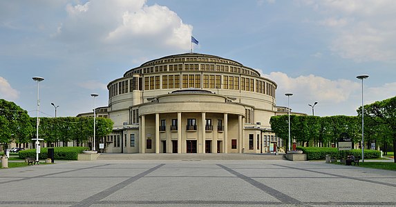
 Info all by Wladyslaw. Centennial Hall in Wrocław, Poland was built 1911 to 1913 and is a major milestone of reinforced concrete structures. The dome (masked by the exterior facade) was the largest cantilever of the world. In the Centennial Hall there is place for three times the St. Peter's Basilica of Rome. -- Wladyslaw (talk) 19:21, 10 May 2014 (UTC)
 Support -- Wladyslaw (talk) 19:21, 10 May 2014 (UTC)
- Support Is it possible to clone out those 2 guys? Poco2 17:53, 11 May 2014 (UTC)
- yes, but are they so disturbing? --Wladyslaw (talk) 18:23, 11 May 2014 (UTC)
 Comment I would clone out the guys that are walking. The other two guys that are sitting on a bench are not disturbing to me. Barcex (talk) 11:06, 12 May 2014 (UTC)
- Comment +1. And I'd crop the foreground until the next grey line.--Jebulon (talk) 11:31, 12 May 2014 (UTC)
- Sorry, but especially the two persons walking in front are good for having an idea of the dimensions of this structure. --Wladyslaw (talk) 13:32, 12 May 2014 (UTC)
- Jebulon: I tried your proposition, to cut of the front grey line. It sounds good because the image would be "open" in front. But the attempt to do so didn`t convince me. The grey line gives the picture a kind of framing, gives an idea of depth of space and appears more harmonic in my eyes than without. --Wladyslaw (talk) 04:18, 13 May 2014 (UTC)
- Thanks for the try. You are probably right. Anyway, I understand your arguments. Sometimes, an empty foreground is useless, but in this case, due to the overall composition of the photograph, the foreground (which is not "empty" btw: see the lines) is useful here, for the depth impression. Strange result: I agree with you ;).--Jebulon (talk) 08:52, 13 May 2014 (UTC)
- Support incl. the guys and other peoples. --Alchemist-hp (talk) 21:12, 12 May 2014 (UTC)
- Support --JLPC (talk) 13:14, 13 May 2014 (UTC)
- Comment Per Barcex, the couple that are walking need to go. There are plenty other clues to scale (bins, benches, the couple on the bench). Sorry, but the guy in the bright t-shirt is the first thing that the eye catches. They absolutely spoil the picture. -- Colin (talk) 20:13, 13 May 2014 (UTC)
- Barcex, Jebulon and Colin: I'm convinced now and have tried it out without the pedestrians. The impression gets better now. So I have retouched them. --Wladyslaw (talk) 19:19, 14 May 2014 (UTC)
- Close to support. But there's a stitching error in the leftmost lamp-post near the top. There are three ways I've fixed such issues. Firstly is to use Smartblend rather than the built-in blending tool. Diliff should know how to set that up for PTGui as he uses it too. It is more intelligent about where to place the seams and copes better with parallax errors. Second is to export the warped frames that the blend tool uses and import as layers to Photoshop (Gimp?) - again I only know how to do this in Hugin but Diliff does this with PTGui. You can then uses these to manually adjust the faulty stitch seams and also to clone people out where there is overlap and people have moved. Thirdly is to just patch up the image by moving the top of the lamp post so that it lines up with the rest -- not always easy to do convincingly so this is a last resort. -- Colin (talk) 20:23, 14 May 2014 (UTC)
- fixed now --Wladyslaw (talk) 04:23, 15 May 2014 (UTC)
- Close to support. But there's a stitching error in the leftmost lamp-post near the top. There are three ways I've fixed such issues. Firstly is to use Smartblend rather than the built-in blending tool. Diliff should know how to set that up for PTGui as he uses it too. It is more intelligent about where to place the seams and copes better with parallax errors. Second is to export the warped frames that the blend tool uses and import as layers to Photoshop (Gimp?) - again I only know how to do this in Hugin but Diliff does this with PTGui. You can then uses these to manually adjust the faulty stitch seams and also to clone people out where there is overlap and people have moved. Thirdly is to just patch up the image by moving the top of the lamp post so that it lines up with the rest -- not always easy to do convincingly so this is a last resort. -- Colin (talk) 20:23, 14 May 2014 (UTC)
- Support thanks -- Colin (talk) 19:53, 16 May 2014 (UTC)
- Support I must say I am surprised how much better this looks without the walkers. I usually like a scale reference, but in this case they distracted from the nice lines of the composition. I am glad the front grey line stayed. That was the right decision too. @Taxi, please fix the stitching errors. Saffron Blaze (talk) 22:57, 14 May 2014 (UTC)
- I guess this time the distraction was because the top of the man was so conspicuous in matter (strap) and color (turquoise). --Wladyslaw (talk) 04:23, 15 May 2014 (UTC)
- Support --Christian Ferrer (talk) 04:42, 15 May 2014 (UTC)
- Support ...and seven. A "retouched" template in the file description page should be fair.--Jebulon (talk) 11:37, 15 May 2014 (UTC)
- Support Yann (talk) 13:19, 16 May 2014 (UTC)
- Support --P e z i (talk) 18:34, 17 May 2014 (UTC)
Confirmed results:
Result: 10 support, 0 oppose, 0 neutral → featured. /A.Savin 09:08, 18 May 2014 (UTC)
This image will be added to the FP gallery: Places/Architecture