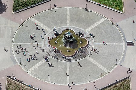
Commons:Featured picture candidates/File:Neptunbrunnen (Berlin-Mitte).Blick vom Fernsehturm.2.09011281.ajb.jpg
Jump to navigation
Jump to search
Voting period is over. Please don't add any new votes.Voting period ends on 8 Nov 2015 at 19:58:09 (UTC)
Visit the nomination page to add or modify image notes.
- Category: Commons:Featured pictures/Places/Architecture
 Info created & uploaded by Ajepbah - nominated by Tomer T -- Tomer T (talk) 19:58, 30 October 2015 (UTC)
 Support -- Tomer T (talk) 19:58, 30 October 2015 (UTC)
 Support -- Johann Jaritz (talk) Johann Jaritz 04:47, 31 October 2015 (UTC)
 Support --XRay talk 16:13, 31 October 2015 (UTC)
 Support I would perhaps have liked stronger color, but there's enough wow in the symmetry to not complain. Daniel Case (talk) 18:17, 31 October 2015 (UTC)
 Support 😄 ArionEstar 😜 (talk) 22:55, 31 October 2015 (UTC)
 Neutral Nice composition, unfavorable angle. --Laitche (talk) 10:51, 2 November 2015 (UTC)
 Comment can you do anything to increase the color saturation? --Pine✉ 06:52, 3 November 2015 (UTC)
 Support --Tremonist (talk) 14:29, 3 November 2015 (UTC)
 Comment @Pine: I'm afraid, but IMO the saturation is quite realistic (have a look at the people's clothes). The pavement is unfortunately not very colorful. --Ajepbah (talk) 20:42, 3 November 2015 (UTC)
- After some thought,
 weak support. This seems to fit the Commons FP criteria. However, I think this would be better suited to FP on English Wikipedia and perhaps other language Wikipedias, where the relatively plain aesthetics are less important that the good informative value that this photo has. --Pine✉ 20:53, 3 November 2015 (UTC)
- After some thought,
 Support --Alchemist-hp (talk) 05:19, 4 November 2015 (UTC)
 Oppose, sorry. The symmetry is nice and so is the quality, but the slight backlight makes the colours look dull. The relatively large flat area around the subject isn't helping in that regard. — Julian H.✈ 21:13, 4 November 2015 (UTC)
 Oppose per Julian H., Kruusamägi (talk) 16:04, 5 November 2015 (UTC)
 Comment For me, the colours of pavement are shown as the are: light grey and light red/pink ;-) --Ajepbah (talk) 18:53, 5 November 2015 (UTC)
- Yes, absolutely, that's not the issue. The issue is that the scene has a high contrast with many areas being dark due to being backlit, others being quite bright. As a result, most of the picture has to be at either end of the histogram, while only the central part of the histogram can really show strong colours (which mirrors our perception - very bright and dark areas can't really show a lot of colour). The pavement is not backlit, so that's the least problematic. All the colours are correct I assume. But they get lost in the picture, in my opinion. — Julian H.✈ 11:22, 6 November 2015 (UTC)
Confirmed results:
This image will be added to the FP gallery: Places/Architecture
