Commons:Graphic Lab/Illustration workshop
| Illustration Workshop | Map Workshop | Photography Workshop | Video and Sound Workshop |
 Illustration workshop
This workshop is part of the Graphics Lab, a project aimed at picture retouching to improve the graphical content of the Wikimedia projects. More information about the lab can be found on its main page and requests pages (Illustrations ; Photographs ; Maps ; Video and Sound). To ask questions or make a suggestions, see the talk page of the graphic lab page.
This specific page is the requests page for the Illustration Workshop. Anyone can make a request for an illustration to be created or improved. The standard format for making a request is shown below, along with general advice, and should be followed.
Make a request
Use the following template when making a new request, replacing the examples with your image(s) and request(s):
<gallery>
 IMAGENAME.EXT|Description of image
 IMAGE#TWO.EXT|2nd image (If there is one)
 ETCETCETC.EXT|Don't request too many at once, though
</gallery>

;Request:
: Details of your request go here… --~~~~
;Graphist opinion(s):
See also
| SpBot archives all sections tagged with {{Section resolved|1=~~~~}} after 7 days and sections whose most recent comment is older than 60 days. For the archive overview, see /Archive. The latest archive is located at /Archive/2024. | |
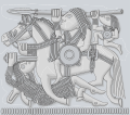
Sutton Hoo helmet design 2
Article(s): en:Sutton Hoo helmet
- Request
- Could somebody please create a version of design 2 from the Sutton Hoo helmet? An example can be seen here, but I can email a high quality version from which to trace. Ideally this should result in something similar to this version of design 1, which Goran tek-en kindly created last year. --Usernameunique (talk) 06:02, 4 May 2020 (UTC)
- Graphist opinion(s)
![]() Request taken by Goran tek-en (talk) 13:07, 4 May 2020 (UTC) Usernameunique Will get back to you soon but you can send me the high resolution meanwhile. --Goran tek-en (talk) 13:07, 4 May 2020 (UTC)
Request taken by Goran tek-en (talk) 13:07, 4 May 2020 (UTC) Usernameunique Will get back to you soon but you can send me the high resolution meanwhile. --Goran tek-en (talk) 13:07, 4 May 2020 (UTC)
- Sent, thanks! --Usernameunique (talk) 06:07, 5 May 2020 (UTC)
- Usernameunique This is not so clear to what is known or not as the other one. I'm working on it but it will take a bit of time, other parts of life also need it's time, I will be back. --Goran tek-en (talk) 17:06, 12 May 2020 (UTC)
- Usernameunique Now I need your help to check so I got all the known parts in this draft. Please check so I got all the known parts, it's quit difficult in some areas. After your feedback I will continue to work but be aware that this might take some time, hope you understand, thanks. --Goran tek-en (talk) 18:18, 14 May 2020 (UTC)
- Thanks, Goran tek-en. I'll take a look and follow up shortly. There's no rush at all as far as I'm concerned—this is the most complicated design on the helmet (by far), and I really appreciate your volunteering to help with it. --Usernameunique (talk) 22:50, 15 May 2020 (UTC)
- Goran tek-en, this looks great. As you said, this is a very difficult design, but I only have a few nits:
- 1) The "known" part of the horse's head is a little smaller. It should be brought in a tad, with the outlines shown as "reconstructed".
- 2) The triangular portion that is highlighted below the horse's head (i.e., in the space between its head/neck and the strap that the figure with the sword is grasping) is mostly empty space—its primary significance is that makes the outline of the horse's neck "known".
- 3) A few parts of the horse should be marked as "known":
- a) The chest of the horse (the small portion right where the sword enters)
- b) The shaded section a little to the right of this (next to the vertical "hair" which is next to the shield)
- c) The shaded sections beneath the shield
- d) The small shaded sections to the right of the back-strap (above the horse's hind legs)
- e) The egg-shaved ovals in the strap (and to its right) --Usernameunique (talk) 03:36, 20 May 2020 (UTC)
- Goran tek-en, this looks great. As you said, this is a very difficult design, but I only have a few nits:
- Thanks, Goran tek-en. I'll take a look and follow up shortly. There's no rush at all as far as I'm concerned—this is the most complicated design on the helmet (by far), and I really appreciate your volunteering to help with it. --Usernameunique (talk) 22:50, 15 May 2020 (UTC)
- Usernameunique Now I need your help to check so I got all the known parts in this draft. Please check so I got all the known parts, it's quit difficult in some areas. After your feedback I will continue to work but be aware that this might take some time, hope you understand, thanks. --Goran tek-en (talk) 18:18, 14 May 2020 (UTC)
- Usernameunique This is not so clear to what is known or not as the other one. I'm working on it but it will take a bit of time, other parts of life also need it's time, I will be back. --Goran tek-en (talk) 17:06, 12 May 2020 (UTC)
Usernameunique As all the lines between known and unknown doesn't follow the shaded parts it's hard to know exactly where. To me they have shown the unknown parts/things/objects with dashed lines and not the whole unknown area and it's not shaded. So I have guessed in some parts.
1) I don't understand the word "tad" and how do you mean by smaller? Is it possible for you draw lines on my draft and send me.
2) Yes, to me that is a part of the horses throat and it will be mainly shaded to show the shape. It will be more clear later on.
3)
- a) Yes
- b) Yes
- c) Yes
- d) Yes
- e) Yes, thanks for this. --Goran tek-en (talk) 15:16, 20 May 2020 (UTC)
- Thanks, Goran tek-en. I just emailed you with an image of the horse's head; let me know if that is clear, or if you have any questions about it. By the way, "a tad" is just a colloquial term for "a little" or "slightly." --Usernameunique (talk) 15:33, 20 May 2020 (UTC)
- Usernameunique This design has a background also which the previous didn't have.
- Do you know what it is sticking out down to the left, I don't understand?
- Draft with known parts and transparent unknown parts.
- Draft with known parts and unknown parts as green. Fwwdback thanks and I will work on the unknown parts meanwhile. --Goran tek-en (talk) 15:21, 10 June 2020 (UTC)
- Usernameunique Just wanted to check if you have seen the info above. --Goran tek-en (talk) 15:32, 18 June 2020 (UTC)
- Sorry for the delay, Goran tek-en. Just one very minor comment: the vertical line that forms part of the rider's arm and that is directly next to where the reconstructed sword hilt is reconstructed, not known. I'll send you an email highlighting the area, to be clear. By the way, I see the drafts are pngs; will it be possible to render the final versions as svgs?
- The thing that is sticking out down to the left is a scabbard. From a book on the subject: "The scabbard, though in a somewhat abnormal position in relation to the wearer's body, neatly fills the empty space that would otherwise exist under the fallen warrior's back in this corner of the panel. ... The position of the scabbard may have relevance to the method by which the sword was suspended. It is explicable if the sword was carried on a baldric or shoulder strap, but not if attached at or below the waist." --Usernameunique (talk) 17:53, 21 June 2020 (UTC)
- Usernameunique Thanks for info. I forgot to tell you that of course I work in svg and the files to be uploaded will be svg. The server where I show my drafts doesn't render svg's the same way as wikimedia does, so that is why I show my drafts as png. --Goran tek-en (talk) 17:28, 22 June 2020 (UTC)
- Usernameunique Just wanted to check if you have seen the info above. --Goran tek-en (talk) 15:32, 18 June 2020 (UTC)
- Usernameunique This design has a background also which the previous didn't have.
- Thanks, Goran tek-en. I just emailed you with an image of the horse's head; let me know if that is clear, or if you have any questions about it. By the way, "a tad" is just a colloquial term for "a little" or "slightly." --Usernameunique (talk) 15:33, 20 May 2020 (UTC)
Usernameunique I had an incident in the family so it might be a few weeks before I continue, it's hard to say right now. --Goran tek-en (talk) 09:12, 1 July 2020 (UTC)
- No problem, Goran tek-en, take your time. Hope your family's doing okay. —Usernameunique (talk) 19:05, 1 July 2020 (UTC)
- Usernameunique Now there is a draft for you to check.
- Here you can see some red lines. It shows two areas at which you have to decide what to do.
- To the left, to my understanding, it is like a harness that goes around the front of the horse. Do you think I should add that?
- To the right I think the behind legs should be moved backwards to meet with the known line. DO you think I should adjust it? Give me feedback, thanks. --Goran tek-en (talk) 16:17, 26 July 2020 (UTC)
- Usernameunique Did you see my posting above. --Goran tek-en (talk) 18:25, 15 August 2020 (UTC)
- Goran tek-en, thanks again for your work on this, and my apologies for taking so long to respond. On #1, I don't think we should add the harness. There might have been one (there appears to be one on the Pliezhausen brooch, which has a similar design), but it's speculative on the Sutton One design. On #2, that's an interesting observation, but I think it makes sense to leave it as is. Zooming in on the design I emailed you, it looks like the end of the known line is the beginning of the horse's tail (there appears to be a small line separating the tail from the horse's rump) so it is probably okay to leave it as is. I've emailed you a close-up image showing this separation. --Usernameunique (talk) 06:33, 13 September 2020 (UTC)
- Usernameunique So should I do the different versions as we did with the other one (I will look at the tail)? --Goran tek-en (talk) 16:25, 14 September 2020 (UTC)
- Goran tek-en, yes please. As we did before, the versions are 1) full, 2) known, 3) reconstructed-known, and 4) reconstructed. --Usernameunique (talk) 02:45, 15 September 2020 (UTC)
- Usernameunique I have made som changes to the tail part, to me it's better?
- Goran tek-en, yes please. As we did before, the versions are 1) full, 2) known, 3) reconstructed-known, and 4) reconstructed. --Usernameunique (talk) 02:45, 15 September 2020 (UTC)
- Usernameunique So should I do the different versions as we did with the other one (I will look at the tail)? --Goran tek-en (talk) 16:25, 14 September 2020 (UTC)
- Goran tek-en, thanks again for your work on this, and my apologies for taking so long to respond. On #1, I don't think we should add the harness. There might have been one (there appears to be one on the Pliezhausen brooch, which has a similar design), but it's speculative on the Sutton One design. On #2, that's an interesting observation, but I think it makes sense to leave it as is. Zooming in on the design I emailed you, it looks like the end of the known line is the beginning of the horse's tail (there appears to be a small line separating the tail from the horse's rump) so it is probably okay to leave it as is. I've emailed you a close-up image showing this separation. --Usernameunique (talk) 06:33, 13 September 2020 (UTC)
- Usernameunique Now there is a draft for you to check.
Usernameunique I haven't heard from you in a while so I have uploaded the illustrations now. If anything needs to be changed in them just contact me, thanks.
-
Sutton Hoo helmet design 2-reconstructed-known
-
Sutton Hoo helmet design 2-known
-
Sutton Hoo helmet design 2-reconstructed
-
Sutton Hoo helmet design 2-full
If you are happy with this please put the code {{section resolved|1=~~~~}} on this request so it can be archived. ![]() Done --Goran tek-en (talk) 11:20, 27 October 2020 (UTC)
Done --Goran tek-en (talk) 11:20, 27 October 2020 (UTC)
Tortoise speed
en:Zeno's paradoxes#Achilles and the tortoise fr:Paradoxe d'Achille et de la tortue#Résolution du paradoxe
- Request
The image supposes that a tortoise can run 5 m/s. No source supports this speed. The world record is 0.28 m/s. The French Wikipedia allows that 5 m/s is "unlikely" but says that the 5 m/s speed "makes the graph more readable". I submit that the graph would be quite readable if it reflected a plausible speed of 0.2 m/s for the tortoise, and I have modified the English text accordingly. Please bring the figure into the realm of possibility, perhaps redrafting it as an SVG. Thanks.
--Peter M. Brown (talk) 00:35, 10 August 2020 (UTC)
- Graphist opinion(s)
@Peter M. Brown: hi, here you have the diagram as svg - in my opinion its not recommendable to use the real speed of the toiroise in the diagramm - it would mean a almost horizontal line
is there any discussion about this topic in english? --Mrmw (talk) 17:33, 10 August 2020 (UTC)
- @Mrmw: No, there hasn't been and there should be. You're right, we can't use the real speed of the tortoise. The options seem to be:
- No change.
- Delete the graph from the articles, counting on the text to make the relevant points.
- Modify the legend — it represents the course of the race if a tortoise could run at 5 m/s or if Achilles were racing a squirrel.
- I will initiate a discussion of the matter and get back to you. I note that I have 60 days to do this.
- If we keep using a graph, it would be nice to replace it with your SVG version. You would have to label the Achilles and tortoise (squirrel?) lines and label the axes "distance" and "time".
- Thanks for your efforts.
- Peter M. Brown (talk) 22:13, 10 August 2020 (UTC)
- If nothing else, a graph should be prepared for French readers with labels "temps" and "tortue".
- Peter M. Brown (talk) 22:32, 10 August 2020 (UTC)
- @Peter M. Brown: i would like to keep the svg international - you could use fr:Modèle:Légende,
- see: de:Achilles und die Schildkröte#Mathematische Lösung
- --Mrmw (talk) 05:41, 11 August 2020 (UTC)
- @Peter M. Brown: i would like to keep the svg international - you could use fr:Modèle:Légende,
- @Mrmw: I have deleted the figure from the English Wikipedia, a measure proposed in :en:Talk:Zeno's paradoxes § Remove the distance vs. time graph in § Achilles and the Tortoise?. I note that you have already installed an svg in the German version, with the lines for Achilles and the tortoise color-coded and identified in the legend. I do not understand the German legend text (what is the Strahlensatz?), but I recommend that this approach be applied to the French version which, as I have noted, does not share the difficulties of the English. Do you want to do this, or shall I?
- @Peter M. Brown: you could use this svg for any wiki you want with any legend you like - feel free --Mrmw (talk) 21:37, 28 September 2020 (UTC)
Extract the mountain from the flag of Sabah
-
Flag of Sabah
-
The leaf extracted from the Canadian flag
Article(s): Use as Sabah symbol.
- Request
- Can you extract the mountain from the flag? Thanks. --Tofeiku (talk) 13:30, 10 September 2020 (UTC)
- Graphist opinion(s)
![]() Done by Mrmw -- Blue Sonic (talk) 14:00, 10 September 2020 (UTC)
Done by Mrmw -- Blue Sonic (talk) 14:00, 10 September 2020 (UTC)
- Thank you very much! --Tofeiku (talk) 06:17, 11 September 2020 (UTC)
- Tofeiku If you are happy with this please put the code
{{section resolved|1=~~~~}}on this request so it can be archived, thanks. --Goran tek-en (talk) 18:36, 31 October 2020 (UTC)
- Tofeiku If you are happy with this please put the code
Update plane
Article(s): Many
- Request
- Update South plane
- Flight 175 aircraft was in a banking left turn before reaching the south tower, this should be updated. --BevinKacon (talk) 18:08, 15 September 2020 (UTC)
- Graphist opinion(s)
-
- The focus is on the impact location. So there is no need to twist the air craft silhouette as it would not add any information value. Even if you would replace the plane by a simple arrow the message would be the same and would have no impact on the quality. -- MaxxL - talk 07:20, 16 September 2020 (UTC)
- If the focus is on the impact location, they should replaced with arrows then. It gives the false impression that both aircraft were level.--BevinKacon (talk) 11:40, 21 September 2020 (UTC)
- As this file is not in use, there is no need to edit it. It is just an offer to illustrate which was not chosen yet. MaxxL - talk 12:07, 21 September 2020 (UTC)
- If the focus is on the impact location, they should replaced with arrows then. It gives the false impression that both aircraft were level.--BevinKacon (talk) 11:40, 21 September 2020 (UTC)
- The focus is on the impact location. So there is no need to twist the air craft silhouette as it would not add any information value. Even if you would replace the plane by a simple arrow the message would be the same and would have no impact on the quality. -- MaxxL - talk 07:20, 16 September 2020 (UTC)
Translate maps into Malay
-
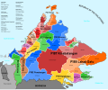
Sabah federal constituencies
-
New seats
Article(s): ms:Pilihan raya negeri Sabah 2020
- Request
- Help translate these 2 constituency maps. Republic of the Philippines=Republik Filipina, Celebes Sea=Laut Sulawesi, Sulu Sea=Laut Sulu, South China Sea=Laut China Selatan, Brunei Bay=Teluk Brunei, Darvel Bay=Teluk Darvel. All the S with numbers change to N (eg. S13=N13). 2020 New Seats=Kerusi Baru 2020. Thank you! --Tofeiku (talk) 08:11, 21 September 2020 (UTC)
- Graphist opinion(s)
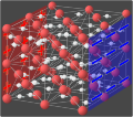
Animation for proton conduction in superionic ice
-
First frame of the animation
-
Fourth frame
-
Example of a simple animation with only a few frames
Article(s): en:Superionic water, en:Ionic conductivity (solid state), en:Fast ion conductor
- Request
Goran tek-en as we discussed, it could be helpful to take the images you already have for superionic ice and to make an animation that would show the process by which it becomes conductive in an electric field (which is the most remarkable feature of superionic ice). Here's a proposal for what the frames could be:
- H+ ions are randomly ordered and randomly oriented
- Charged plates appear, indicating that an electric field is applied
- H+ ions rotate in place to orient with this field
- H+ ions start moving from + to -
- More frames of them moving
I think this animation is great: in the beginning you can see them bouncing randomly around the lattice, and as soon as the switch is flipped, they all start moving in one direction, still bouncing off the lattice atoms as they encounter them.
Those are just a few thoughts to start off with, but let's brainstorm some more.
--Rob Hurt (talk) 01:49, 22 September 2020 (UTC)
- Graphist opinion(s)
![]() Request taken by Goran tek-en (talk) 13:44, 22 September 2020 (UTC)
Request taken by Goran tek-en (talk) 13:44, 22 September 2020 (UTC)
| Extended content |
|---|
|
I don't know how much you know about different file formats and especially svg - gif. For svg and animation that includes coding at a level I don't have, and with so many objects we will have it would be complicated, compared to the one you linked to.
Rob Hurt As we don't show all sides around the O atoms (not outside the lattice) we should not have O*2 for the H. We have two 'corridors' left-right but have three 'walls' of O. We show all the H in the 'corridors' but we only show the H which are on the inside of the 'corridors'. This is the the same for front-back.
|
- Goran tek-en yes I think it's safe to assume that the scattering is mostly off the atoms, not the bonds. For the transparency, I think something in the middle would be good, maybe 30%. Did transparency for the atoms work too? Rob Hurt (talk) 00:32, 30 October 2020 (UTC)
- Rob Hurt Here are two drafts with and without transparency on the atoms. To me it gets really confusing when there is transparency on the atoms also.
- no transparency
- 50% transparency
- Here is a draft with the random part as animation. I removed the looping for this so you have to reload it to view it again. I don't really know what I think of this. there is a lot going on but I don't understand what I see although I know what it is. Should the collisions be more visible, will it be better when the next two stages are added or what? I really need your thinking on this.--Goran tek-en (talk) 17:56, 30 October 2020 (UTC)
- Goran tek-en I actually think the animation looks good. I agree that it's hard to track each H+ because there are so many, but the important part is that it shows random motion. The most important point is that when the plates appear the motion switches from random to directional, and I'm hoping that when you add in that part, it will be clear. Is it possible to add some more frames for the random motion before making the plates appear? It just goes pretty quickly when watching it. -Rob Hurt (talk) 21:07, 31 October 2020 (UTC)
- Rob Hurt So good to hear because I'm so deep in to the motion of each H+ it's hard for me to see the bigger over all picture.
- This has 10 frames and each is 250 ms. Shorter time on each gives a smoother appearance but of course shorter total length. Yeas I can add more frames, it's all a matter of how much work I put in to it and the final animation gets heavier. This draft is about 1.8 Mb and if we add more frames in the random part and then we have the other two stages so the total might be up to 7-8 Mb. It's not really a problem in it self but for some people on slow connections it might be, but that is always a judgement one has to make. I will add five more frames and we can look at that.
- I'm thinking on making the collisions more visible by making the splash symbols I use bigger. They are almost not visible as they pass by so fast. --Goran tek-en (talk) 11:27, 1 November 2020 (UTC)
- Rob Hurt So good to hear because I'm so deep in to the motion of each H+ it's hard for me to see the bigger over all picture.
- Rob Hurt Here are two drafts with and without transparency on the atoms. To me it gets really confusing when there is transparency on the atoms also.
- Goran tek-en yes I think it's safe to assume that the scattering is mostly off the atoms, not the bonds. For the transparency, I think something in the middle would be good, maybe 30%. Did transparency for the atoms work too? Rob Hurt (talk) 00:32, 30 October 2020 (UTC)
Adapt superionic water image for electrical conduction
Article(s): en:Electrical resistance and conductance, en:Electrical conductor, en:Electrical resistivity and conductivity, en:Electric current,
- Request
Goran tek-en, could we make a version of this that we can use to demonstrate the concept of the flow of electrons through a wire in electrical conduction? This would involve:
- Changing the colors so it's clear that the new image is different from the current one (I would make the lattice atoms shiny and copper-colored, the electrons blue, and the - plate black)
- Switching the + and - plates (or reversing the directions of all the arrows)
- Optionally, adding a "zoomed out" image of the wire the electrons are flowing through like this, to connect the microscopic and macroscopic
Thanks, and let me know what you think. --Rob Hurt (talk) 01:22, 23 September 2020 (UTC)
- Graphist opinion(s)
![]() Request taken by Goran tek-en (talk) 13:56, 23 September 2020 (UTC)
Request taken by Goran tek-en (talk) 13:56, 23 September 2020 (UTC)
@Rob Hurt: Can do but I have some other stuff also going on, shall we do animation or this first?
I can't find any information of copyright on that site so it's best just to use it as information. --Goran tek-en (talk) 13:56, 23 September 2020 (UTC)
@Goran tek-en: sure, all sounds good to me. —Rob Hurt (talk) 04:50, 24 September 2020 (UTC)
standard of ottoman
Article(s): File:Caliphate_standard_of_Abdulmejid_II_(1922–1924).svg, File:Naval standard of the Ottoman Sultan.svg
- Request
- Hello. I am not an English speaker. Please excuse me. But while I was walking around Wikimedia, I noticed a distorted flag, 2. "The Caliphate Ensemble of the Yacht Söttlü" and The Ensign of the Battlecruiser Hamidiye in "Naval Museum" and I think it's the exact flag that remains. Is there anyone who can make it? --고려 (talk) 13:03, 26 September 2020 (UTC)
- Graphist opinion(s)
- @고려: Updated according to your source, I updated the existing SVG but now i have the doubt they are actually the same flags that I replaced. If not, i can re-upload them as new images.
- I've chekced, and actually it is another flag. the correct Imperial standard is more similar to the previous version (see here: [1] and [2]). I'll fix everything asap. Sette-quattro (talk) 07:20, 16 October 2020 (UTC)
- @Sette-quattro: It's not true. I didn't distort it. The flags drawn can be distorted. But I brought a real flag from the museum. I've brought a real "standard" from a Turkish museum. There's also evidence that I'm not lying.--고려 (talk) 11:56, 16 October 2020 (UTC)
- @고려: I'm not accusing you of anything :) I'm just a graphic designer, not expert on the topic. If you think this is the correct one, let's keep it. What about then the other flag? This one [3]? Should i draw also that one? Finally, from which book is taken the page you showed in the previous post (this [4])? we should add it as additional reference in the page. Sette-quattro (talk) 13:25, 16 October 2020 (UTC)
- @Sette-quattro: It's not true. I didn't distort it. The flags drawn can be distorted. But I brought a real flag from the museum. I've brought a real "standard" from a Turkish museum. There's also evidence that I'm not lying.--고려 (talk) 11:56, 16 October 2020 (UTC)
- I've chekced, and actually it is another flag. the correct Imperial standard is more similar to the previous version (see here: [1] and [2]). I'll fix everything asap. Sette-quattro (talk) 07:20, 16 October 2020 (UTC)
Flag of Kafr El-Sheikh Governorate
-
(1) Correct original flag
-
(2) Unoriginal design
-
(3) redarwn version, based on (1)
Article(s): more than +300 articl at Arabic Wikipedia like محافظة كفر الشيخ
- Request
- I request replace this original flag No. (1) to be SVG version; instead of No. (2) unoriginal flag, Thank you… --Faris El-Gwely (talk) 21:09, 26 September 2020 (UTC)
- Graphist opinion(s)
- @Faris knight: Are you sure that this is the official one? I looked online but without finding any other version of the file. Do you have it in an higher resolution? Sette-quattro (talk) 19:28, 7 October 2020 (UTC)
- Done, but I had to guess some shapes due to the poor quality. Sette-quattro (talk) 20:27, 7 October 2020 (UTC)
perspective distortion of magazine cover
Article(s): en:Paul Martin (illustrator). The image is not in this WP article, but is reachable via its Ref. #64.
- Request
- Hello. I uploaded this cover image of a bearded man fixing a clock, to Commons in July 2018. I uploaded the picture off a CD. No other image if it exists (likely anywhere). The problem is the camera's original awkward position, which made the lettering (not image) come out curved. Hence, the perspective distortion. Notice how the wording along the top is curved. I don't know how to straighten that out some, because the curvy pattern touches the top of the man's head. (Maybe, a GIMP program or similar, has the ability to draw an outline around the upper head, before straightening that section out.) The bottom part wording (including the long black bar) also curves. It should be even. It would help having the top and bottom parts straighten out some.
- This image is on the lower end of importance. However, it would have been lost to history if not uploaded to Commons. It basically just backs up some part of the text in the WP article: Paul Martin (illustrator). A section states he drew covers for four different trade magazines, including this one. It would be impossible to back up this credit w/o the upload. Thanks. JimPercy (talk) 02:30, 1 October 2020 (UTC)
- Graphist opinion(s)
JimPercy This request should really be in the section of Photography. I have two drafts for you stright of and one sharpen image. It could be sharpened even more but then it affects the image much more. Feedback, thanks. --Goran tek-en (talk) 18:30, 31 October 2020 (UTC)
- Thanks. That helped. I decided to go with the first. I already uploaded it to Commons. The sharpened one just doesn't look natural enough. But, others would see it differently. I'll try to remember about the Photography Workshop for similar request. I thought the lab was going to bypass on this one for whatever reason. JimPercy (talk) 19:23, 31 October 2020 (UTC)
JimPercy Although commons is an open place it doesn't mean that you can upload an image which I have edited, you do not have that right. I who has done the edit has that right, no one else, and you don't know under which license I wanted to release it. We do have a lot of different licenses here and it's only the creator who can decide that. In fact you have wrongly stated that this version is your own work which it is not.
I specifically wrote 'drafts' as that is what I show the requester, very often I have to work more on the file before I say it's ready to be uploaded.
My intention was to upload this as a png image and not as a jpg. Jpg is a destructive format (it deletes image information) and to use that on an image that already is blurry is really bad, png is a none destructive format and therefore better.
Also the work flow here at the graphic lab is as follows: The requester makes a request, a graphic worker takes on this request. When the graphic worker is happy with its work he puts the code {{done}} here and if the requester accepts this work he puts the code {{section resolved|1=~~~~}} here so it can be archived. ![]() Done --Goran tek-en (talk) 22:58, 1 November 2020 (UTC)
Done --Goran tek-en (talk) 22:58, 1 November 2020 (UTC)
- I just don't know anything about png. I wasn't familiar with it. I was thrown off since the lab experts in past, have always made the change right at the image's page on Commons. I guess in hindsight, I should have just stated my preference of the two options. Please convert to png or do whatever is proper or deemed necessary. Thanks. JimPercy (talk) 23:24, 1 November 2020 (UTC) PS. I put that tag in there, because of my reading of the last line in the one above with heading "Extract the mountain from the flag of Sabah." I just goofed, by not picking up on the exact order of how it's done.
- JimPercy New image uploaded, GoodHardware straightened. If you upload a new version on the image page or you upload a totally new image depends on which work that has been done, how much it's changed, and who uploads it. This is not something exact, it depends on the uploader and if it is of interest to keep the original image. So it's always a balance, more info. Everything is always kept here at commons (in the back) so it can be traced. --Goran tek-en (talk) 11:48, 2 November 2020 (UTC)
Google China
-
PNG
-
SVG
Article(s): en:Google China
- Request
- SVG version needed to fix because of bad trace --John123521 (talk) 12:45, 2 October 2020 (UTC)
- Graphist opinion(s)
- @John123521: are these the correct symbols? 谷歌 If yes i can upload the vector version Sette-quattro (talk) 21:06, 5 October 2020 (UTC)
 Done – when the request is done.
- I'm okay with this--John123521 (talk) 12:22, 3 November 2020 (UTC)
Friedrich Wilhelm Joseph Schelling's signature
Article(s): w:Friedrich Wilhelm Joseph Schelling
- Request
- Please extract the signature of the German philosopher. The existing version is incomplete. Thanks. --Ratte (talk) 13:34, 2 October 2020 (UTC)
- Graphist opinion(s)
- @Ratte: are you sure that's Schelling signature? it's very different from the uploaded one. Anyway I'll upload it asap. Sette-quattro (talk) 20:57, 5 October 2020 (UTC)
- @Sette-quattro: yes, I am sure, because it is taken from Shelling's book. And the uploaded one doesn't have any reliable source. Ratte (talk) 10:08, 6 October 2020 (UTC)
- @Ratte: Uploaded the SVG version. I think the commons description page could be improved. Sette-quattro (talk) 11:12, 6 October 2020 (UTC)
 Done
Done
- @Sette-quattro: Great job, thank you very much! But could you please add some white space at the top? See, for example, File:Hegel Unterschrift.svg. Ratte (talk) 18:17, 6 October 2020 (UTC)
- It is possible, but why should we add border to the signature? the background is transparent. If you need margin it hink it's more appropriate to add it via template, anyway I don't know which are the best practices on commons/wikipedia about margins Sette-quattro (talk) 19:34, 7 October 2020 (UTC)
- @Ratte: hi I have found this other File:Friedrich Wilhelm signature.svg (2) signature form an handwritten letter. It is more close to the previous one and different from the one you identified, please check which version is better. Sette-quattro (talk) 09:13, 16 October 2020 (UTC)
- It is possible, but why should we add border to the signature? the background is transparent. If you need margin it hink it's more appropriate to add it via template, anyway I don't know which are the best practices on commons/wikipedia about margins Sette-quattro (talk) 19:34, 7 October 2020 (UTC)
- @Sette-quattro: Great job, thank you very much! But could you please add some white space at the top? See, for example, File:Hegel Unterschrift.svg. Ratte (talk) 18:17, 6 October 2020 (UTC)
- @Ratte: Uploaded the SVG version. I think the commons description page could be improved. Sette-quattro (talk) 11:12, 6 October 2020 (UTC)
- @Sette-quattro: yes, I am sure, because it is taken from Shelling's book. And the uploaded one doesn't have any reliable source. Ratte (talk) 10:08, 6 October 2020 (UTC)
Indonesian legislative
-
DPR-RI (1st photo)
-
DPD-RI (2nd photo)
-
MPR-RI (3rd photo)
Article(s): en:People's Representative Council en:Regional Representative Council en:People's Consultative Assembly
- Request
- (1) Change the font used in 3rd photo to the font that is used in 1st and 2nd photo.
(2) Change the red color in the shield to RGB 255-0-0 because the red color is based on the flag and the law and is used in File:Flag of Indonesia.svg & File:National emblem of Indonesia Garuda Pancasila.svg --Hddty (talk) 04:56, 10 October 2020 (UTC) - Graphist opinion(s)
Translate this to Malay
-
Seat plan
Article(s): ms:Kelas perjalanan
- Request
- First Class=Kelas Pertama, Business Class=Kelas Perniagaan, Economy Class=Kelas Ekonomi. Thank you --Tofeiku (talk) 08:37, 16 October 2020 (UTC)
- Graphist opinion(s)
- @Tofeiku: you can do it on your own using the SVG translate tool: https://svgtranslate.toolforge.org/File:Asiana_Boeing_747-400_Seat_Plan.svg Sette-quattro (talk) 09:03, 16 October 2020 (UTC)
- @Sette-quattro: Thank you for telling me about this great tool! How do I put labels on picture with words? Some files I tried states that it does not have any labels to translate. --Tofeiku (talk) 09:16, 16 October 2020 (UTC)
- @Tofeiku: Maybe they are traced (so not real text, but shapes). Can you provide an example? Sette-quattro (talk) 13:28, 16 October 2020 (UTC)
- @Sette-quattro: This for example File:Stock-indices-2020crash.svg. --Tofeiku (talk) 08:18, 18 October 2020 (UTC)
- @Tofeiku: Maybe they are traced (so not real text, but shapes). Can you provide an example? Sette-quattro (talk) 13:28, 16 October 2020 (UTC)
- @Sette-quattro: Thank you for telling me about this great tool! How do I put labels on picture with words? Some files I tried states that it does not have any labels to translate. --Tofeiku (talk) 09:16, 16 October 2020 (UTC)
Convert image to SVG
-
This screenshot demonstrates the use of a convolutional neural network node to execute a machine learning task with PolyAnalyst.
Article(s): en:Draft:PolyAnalyst
- Request
- Could you convert this image to SVG for me? Sam at Megaputer (talk) 20:14, 16 October 2020 (UTC)
- Graphist opinion(s)
Sam at Megaputer Checking the different links it feels a bit like promotion of that company. You are very open with your connection so that is no problem but it still feels a bit strange, but maybe I misunderstood it. Is there some kind of public free knowledge in this, as that is what commons (wikimedia) is all about for me. --Goran tek-en (talk) 17:50, 31 October 2020 (UTC)
- I asked some questions about image uploading at the help desk, and they said they would prefer if I converted it the SVG. I tried to do it myself, but the free converters I used didn't work properly. Sam at Megaputer (talk) 19:33, 31 October 2020 (UTC)
- Sam at Megaputer That was not at all what I asked about. Is there a public interest in this more than for that company?
- Please always ping me, thanks. --Goran tek-en (talk) 11:30, 1 November 2020 (UTC)
- @Goran tek-en: By "this", do you mean converting the image? I assume so, otherwise they wouldn't have asked me to do it at the help desk. They said it would "improve the quality of the upload". Sam at Megaputer (talk) 13:05, 1 November 2020 (UTC)
- Sam at Megaputer I'm sorry to be unclear. What I ask is this;
- Has this illustration a public interest outside from that company?
- Has that article a public interest outside from that company? --Goran tek-en (talk) 14:24, 1 November 2020 (UTC)
- @Goran tek-en: Honestly, the image will probably not be used outside of the article on PolyAnalyst. I don't know if the article will have a public interest outside of the company. It is my opinion that it is in the public interest to have good coverage of the maximum number of subjects, including companies, but I understand that there are some people here who disagree. Sam at Megaputer (talk) 15:58, 1 November 2020 (UTC)
- Sam at Megaputer I'm sorry to be unclear. What I ask is this;
- @Goran tek-en: By "this", do you mean converting the image? I assume so, otherwise they wouldn't have asked me to do it at the help desk. They said it would "improve the quality of the upload". Sam at Megaputer (talk) 13:05, 1 November 2020 (UTC)
- Sam at Megaputer That was not at all what I asked about. Is there a public interest in this more than for that company?
Sam at Megaputer I don't have any knowledge of this subject but it seems to be a kind of analytical method and if so that is something that can be used in many places and circumstances.
![]() Request taken by Goran tek-en (talk) 17:40, 1 November 2020 (UTC) But during the process I will need your feedback and knowledge as the illustration we have is not that great in detail.
Request taken by Goran tek-en (talk) 17:40, 1 November 2020 (UTC) But during the process I will need your feedback and knowledge as the illustration we have is not that great in detail.
- Are you looking for an 'exact' copy or the symbols can be altered? --Goran tek-en (talk) 17:40, 1 November 2020 (UTC)
- @Goran tek-en: Thanks. I'll be glad to supply any information you need. I would like to converted image to be as close to the original as possible. Sam at Megaputer (talk) 20:05, 1 November 2020 (UTC)
- Sam at Megaputer I would need some explanation on the symbols.
- CSV is a database
- Derive, is that some kind of pluming, to find what you want in a larger amount?
- Partition, cutting up an excel (or similar) to the pieces you need?
- 10 000 or 20 000 rows, a symbol for any amount of rows
- Convolutional Neural Network, like this kind of machine learning?
- Model testing, a magnifying glas, key and what? --Goran tek-en (talk) 15:24, 2 November 2020 (UTC)
- @Goran tek-en: Your assessments are pretty accurate. This software imports data (in this case with a CVS node), and stores it is a form that is pretty similar to a spreadsheet. Then nodes are linked into a flowchart (aka en:directed acyclic graph) to perform an analysis. The text below each node is the node's name, which has been given by the user.
- Sam at Megaputer I would need some explanation on the symbols.
- @Goran tek-en: Thanks. I'll be glad to supply any information you need. I would like to converted image to be as close to the original as possible. Sam at Megaputer (talk) 20:05, 1 November 2020 (UTC)
- CSV is a database.
- The derive node takes two columns of data as input and creates a new column as output by applying a function specifies by the user.
- The partition node prepared the dataset to be split into pieces.
- The following nodes are "filter row" nodes. Basically, they are just applying the partition that has already been specified. Based on the nodes names, I can infer that the top node has 20,000 rows, and the bottom node has 10,000.
- The Convolutional Neural Network is like this, as you suspected.
- The icon for the model testing node is composed of a magnifying glass over a key and a pie chart. If you were to take away the magnifying glass, you would be left with PolyAnalyst's logo.
- Is this what you needed? Sam at Megaputer (talk) 17:38, 2 November 2020 (UTC)
- Sam at Megaputer That is great thanks, it's also interesting for me overall. The derive node illustration, is that like plumbing? That doesn't fit with what you explained for me. --Goran tek-en (talk) 12:17, 3 November 2020 (UTC)
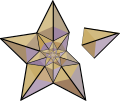
Good article and featured article topicon redesign for English Wikipedia
-
Current good article icon
-
Current featured content icon
- Article(s)
- 5,859 featured articles
- 3,696 featured lists
- 32,507 good articles
- Assorted additional talk, help, and process pages
- Request
- Yes, this one is a big one.
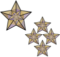
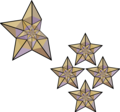
- Background: The current symbols for good articles and featured content have been used since those systems were introduced way back in Wikipedia's early days. They have significant problems. The featured article icon is too skeuomorphic, giving it an outdated look, and its excessive detail causes it to render poorly at small scale. The good article icon, meanwhile, has been adopted throughout the rest of Wikimedia (and in some places on Wikipedia) as the "support vote" icon, leading to conflicting usage. Far worse than the issues with them individually, however, is the fact that there is no shared visual language between them (the GA icon uses the norro style, and the FA icon does not use any style). When compounded by their overall lack of prominence (a separate issue that we're trying to address), this has led to the unfortunate situation where many (perhaps most) non-editing readers could not tell you whether a star or a green badge is a higher distinction. Given how much effort we put into the GA/FA systems, there's more than a bit of tragic irony to that.
- Process: This is the first stage in the process of redesigning the icons (after informal discussions in various places). Ideally, several proposals will be put forth that can be compared against the status quo in a more formal and widely-advertised round of !voting (similar to the process for the MediaWiki logo redesign), with the winner adopted.
- Design details: The redesigned icons could end up being anything from checkmarks (a la the Twitter verification badge) to a silver star for GAs to a multi-star system that begins with one star for stubs and increases thereafter; feel free to get creative.
- Also, since the whole idea here is to unify the symbology, the redesign will need to include the associated symbols in addition to the main icons. You don't have to design them all now, but candidates with at least an articulated vision of what they should look like may be more likely to win support once we reach the formal !voting stage. Here are the current icons still in use that I could find (there may be a few more fringe ones):
| Related icons |
|---|
|
- In truth, the potential scope of this project could be a lot bigger, trying to unify all of the icons used anywhere on Wikipedia. However, recent attempts to do so have failed, and their utility is questionable, given that most icons do not appear in reader-facing areas and thus have a vastly more limited reach. Redesigning these two icons is a more feasible task with clear and significant benefits for readers across tens of thousands of pages.
- Cheers, Sdkb (talk) 21:47, 17 October 2020 (UTC)
- Discussion
Please direct discussion to the cross-posting at English Wikipedia to keep everything in one place. Thanks, Sdkb (talk) 21:47, 17 October 2020 (UTC)
Add elements to SVG flag of Columbus
-
SVG flag
-
JPG flag, with all elements present
Article(s): Flag of Columbus, Ohio
- Request
- Hello! I'd like to use the SVG version of the flag within the article, however, it is missing a key element and is inferior to the JPG. I need eight white five-pointed stars on both sides of the blue part of the shield. I would also like the black borders removed of the design within the circle. Thank you so much! --Jordano53 (talk) 14:38, 19 October 2020 (UTC)
- Graphist opinion(s)
- @Jordano53: Hello! Do you have any offical source that we can use? Sette-quattro (talk) 14:47, 21 October 2020 (UTC)
- @Sette-quattro: Yes. This is the Columbus municipal code, sections 105.02 and 105.021 are relevant here. Jordano53 (talk) 22:44, 23 October 2020 (UTC)
Sudan/Chad/CAR locator maps
I made a request at Commons:Graphic_Lab/Map_workshop#Sudan/Chad/CAR_locator_maps that does not require any mapping expertise (just basic SVG editing). Cross-posting here because the map workshop looks pretty dead. Thanks! Calliopejen1 (talk) 18:33, 19 October 2020 (UTC)
-
Description of first image
-
Description of second image (if needed)
-
Description of third image (if needed; don't request too many at once, though)
Article(s): [[]]
- Request
- Details of your request go here… --2409:4061:94:E633:0:0:11E7:A8AC 20:28, 19 October 2020 (UTC)
- Graphist opinion(s)
Flag of the Japanese Resident General of Korea
Article(s): File:Flag of the Japanese Resident General of Korea (1905–1910).svg
- Request
- If you look at page 5 of the "The Script Signed by the Emperors, 1906, Imperative Order No.21, Defines the Flag of the Resident General" document found in the "Japan Center for Asian Historical Record," there is a Flag of the Resident General. I would appreciate it if you could modify it accordingly.--고려 (talk) 15:16, 21 October 2020 (UTC)
Jpeg to svg project
-
jpeg
-
jpeg
-
jpeg
Article(s): A field book of the stars and A Field Book of the Stars
- Request
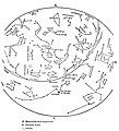
- a whole book jpeg to svg
- It is a book of star maps, simple. A lot of boring arcs, arrows, and names of mythical beings that get mis-spelled.
- Graphist opinion(s)
To even consider this request there has to be a requester, no one has signed this request. There will be questions, drafts to be checked, etc so someone has to be able to provide this. It's a major request so to have this backup is very important. --Goran tek-en (talk) 17:31, 31 October 2020 (UTC)
Angstrom unicode explanation - correction
-
the description in this pictur has an error.
Article(s): en:Angstrom, de:Ångström (Einheit), eo:Anstromo, es:Unicode and others
- Request
- correction of text in this graphics
- it is a useful graphics describing three methods (the third one deprecated) to encode the angström sign in unicode. The second method is combining the ordinary letter "A" with the ring symbol. Unfortunately, the current text ("U+212B + U+030A (line break) LATIN CAPITAL LETTER + COMBINING RING ABOVE") is wrong: "U+212B" must be replaced by "U+0041" and "LATIN CAPITAL LETTER" must be replaced by "LATIN CAPITAL LETTER A"
- Graphist opinion(s)
- @the-guy-who-posted-the-request: I changed it. Hope, I did it well. If not, let me know. --Puck04 (talk) 17:04, 27 October 2020 (UTC)
SVG: Darstellung von Mustern/Musterfeldern in der PNG-Vorschau
-
Das angelegte Muster auf dem Felsen (unten) wird nicht angezeigt.
- Request
- Ich habe ein Wappen gescannt (Pixelgrafik) und mit Adobe Illustrator verktorisiert. Der Felsen, auf dem der Hirsch steht, ist im Original mit einem Punktraster gefüllt, für das ich in AI ein entsprechendes Musterfeld angelegt habe. Der mit diesem Muster gefüllten Pfad wird in der PNG-Vorschau nicht gerendert (geparced?), sichtbar ist die Ebene darunter (schwarz). Kann man da unkompliziert etwas im Text (SVG-Code) machen, ohne dass die Dateigröße unnötig aufgeblasen wird?
- I scanned a coat of arms (pixel graphics) and vectorized it with Adobe Illustrator. The rock on which the deer is standing is originally filled with a point grid, for which I created a corresponding pattern field in AI. The path filled with this pattern is not rendered (parced?) in the PNG preview, the layer below is visible (black). Can you easily do something in the text (SVG code) without unnecessarily inflating the file size? --Puck04 (talk) 23:01, 26 October 2020 (UTC)
- Graphist opinion(s)


