Commons:Graphic Lab/Illustration workshop
| Illustration Workshop | Map Workshop | Photography Workshop | Video and Sound Workshop |
 Illustration workshop
This workshop is part of the Graphics Lab, a project aimed at picture retouching to improve the graphical content of the Wikimedia projects. More information about the lab can be found on its main page and requests pages (Illustrations ; Photographs ; Maps ; Video and Sound). To ask questions or make a suggestions, see the talk page of the graphic lab page.
This specific page is the requests page for the Illustration Workshop. Anyone can make a request for an illustration to be created or improved. The standard format for making a request is shown below, along with general advice, and should be followed.
Make a request
Use the following template when making a new request, replacing the examples with your image(s) and request(s):
<gallery>
 IMAGENAME.EXT|Description of image
 IMAGE#TWO.EXT|2nd image (If there is one)
 ETCETCETC.EXT|Don't request too many at once, though
</gallery>

;Request:
: Details of your request go here… --~~~~
;Graphist opinion(s):
See also
| SpBot archives all sections tagged with {{Section resolved|1=~~~~}} after 7 days and sections whose most recent comment is older than 60 days. For the archive overview, see /Archive. The latest archive is located at /Archive/2024. | |
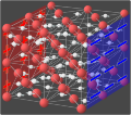
Animation for proton conduction in superionic ice
-
 First frame of the animation
 -
 Fourth frame
 -
 Example of a simple animation with only a few frames


Article(s): en:Superionic water, en:Ionic conductivity (solid state), en:Fast ion conductor
- Request
Goran tek-en as we discussed, it could be helpful to take the images you already have for superionic ice and to make an animation that would show the process by which it becomes conductive in an electric field (which is the most remarkable feature of superionic ice). Here's a proposal for what the frames could be:
- H+ ions are randomly ordered and randomly oriented
- Charged plates appear, indicating that an electric field is applied
- H+ ions rotate in place to orient with this field
- H+ ions start moving from + to -
- More frames of them moving
I think this animation is great: in the beginning you can see them bouncing randomly around the lattice, and as soon as the switch is flipped, they all start moving in one direction, still bouncing off the lattice atoms as they encounter them.
Those are just a few thoughts to start off with, but let's brainstorm some more.
--Rob Hurt (talk) 01:49, 22 September 2020 (UTC)
- Graphist opinion(s)
![]() Request taken by Goran tek-en (talk) 13:44, 22 September 2020 (UTC)
Request taken by Goran tek-en (talk) 13:44, 22 September 2020 (UTC)
| Extended content |
|---|
|
I don't know how much you know about different file formats and especially svg - gif. For svg and animation that includes coding at a level I don't have, and with so many objects we will have it would be complicated, compared to the one you linked to.
Rob Hurt As we don't show all sides around the O atoms (not outside the lattice) we should not have O*2 for the H. We have two 'corridors' left-right but have three 'walls' of O. We show all the H in the 'corridors' but we only show the H which are on the inside of the 'corridors'. This is the the same for front-back.
Rob Hurt Draft random 2. 15 frames each 300 ms. --Goran tek-en (talk) 18:01, 8 November 2020 (UTC)
|
Rob Hurt So we are now at list number 2 and 3.
- I understand charged plates appear.
- What do you mean by H+ ions rotate in place to orient with this field. Rotate how?
- List number 4. I must continue from where the H+ left of in its random face. So if a H+ was travelling from right to left and the electric field appears. Do this H+ make a soft turn slowly change its direction towards left to right (like a curved movement trowing a ball up)? Or is it a sudden break and then moving left to right? --Goran tek-en (talk) 21:36, 15 November 2020 (UTC)
- Goran tek-en I think we should model it after this, and you can pay particular attention to when the light get turned on, which is equivalent to when the plates appear. The rate at which they change direction will be proportional to the rate at which the plates appear. So if they appear gradually the H+ ions will change direction gradually, and if they appear suddenly, the H+ ions will change direction quickly. --Rob Hurt (talk) 01:32, 26 November 2020 (UTC)
Add elements to SVG flag of Columbus
-
 SVG flag
 -
 JPG flag, with all elements present


Article(s): Flag of Columbus, Ohio
- Request
- Hello! I'd like to use the SVG version of the flag within the article, however, it is missing a key element and is inferior to the JPG. I need eight white five-pointed stars on both sides of the blue part of the shield. I would also like the black borders removed of the design within the circle. Thank you so much! --Jordano53 (talk) 14:38, 19 October 2020 (UTC)
- Graphist opinion(s)
- @Jordano53: Hello! Do you have any offical source that we can use? Sette-quattro (talk) 14:47, 21 October 2020 (UTC)
- @Sette-quattro: Yes. This is the Columbus municipal code, sections 105.02 and 105.021 are relevant here. Jordano53 (talk) 22:44, 23 October 2020 (UTC)
- @Jordano53: Hello! Concerning the "key element eight five-pointed stars" they do not exist on Coat of arms of the United States or on the chief (upper band) of the national shield of the USA. The American Heraldry Society quotes the Department of State blazon as “The ARMS. Paleways of thirteen pieces argent and gules; a chief, azure.” No stars. Why do you want the stars? -- MaxxL - talk 13:23, 16 December 2020 (UTC)
- @MaxxL: I wonder if that is a mess up on the part of the city. This image clearly shows stars and this engraved seal at the city hall also shows the stars. It's a great observation, and now I have to go down the rabbit hole again and see if I can find why these stars were added. Jordano53 (talk) 14:46, 16 December 2020 (UTC)
- @Jordano53: Hello! In heraldry the only relevant, factual information is the blazon - the written description of the shield. All pictures you will find are just an artist interpretation of the blazon which may vary widely. Every flag manufacturer or communication agency has its own preferred artist and layout. The longer or intensively you search the more versions you will find. -- MaxxL - talk 14:55, 16 December 2020 (UTC)
- @MaxxL: The 13 stars in this National Shield seem to originate from the 1912 flag decided by city council. The American Heraldry Society blazons the 13 stars within the CREST above the ARMS, not in the azure field of the SHIELD. Couldn't find dictation to explain when the changes were decided, but I'd reason it was a stylistic choice. 17 stars representing admission into the union, and 13 stars for the colonies becomes too cluttered when the usage is in a small format (think letterheads, print documents etc.) Looks great on that wood carving though! --Suzy K Wells (talk) 04:33, 17 December 2020 (UTC)
Sudan/Chad/CAR locator maps
- Request
I made a request at Commons:Graphic_Lab/Map_workshop#Sudan/Chad/CAR_locator_maps that does not require any mapping expertise (just basic SVG editing). Cross-posting here because the map workshop looks pretty dead. Thanks! Calliopejen1 (talk) 18:33, 19 October 2020 (UTC)
- Details of your request go here… --2409:4061:94:E633:0:0:11E7:A8AC 20:28, 19 October 2020 (UTC)
- Graphist opinion(s)
Calliopejen1, looks like this was done. Confirming you have what you need and this can now be archived. --Usernameunique (talk) 16:51, 17 December 2020 (UTC)
Flag of the Japanese Resident General of Korea
.svg)
Article(s): File:Flag of the Japanese Resident General of Korea (1905–1910).svg
- Request
- If you look at page 5 of the "The Script Signed by the Emperors, 1906, Imperative Order No.21, Defines the Flag of the Resident General" document found in the "Japan Center for Asian Historical Record," there is a Flag of the Resident General. I would appreciate it if you could modify it accordingly.--고려 (talk) 15:16, 21 October 2020 (UTC)
- Graphist opinion(s)
고려 For us graphic workers without any knowledge of this subject it's impossible to understand what you want changed, really. You would have to be more explicit for us to understand and then consider to take this request. Please always think that we have zero knowledge of the subject which probably is your specialty. --Goran tek-en (talk) 12:32, 8 November 2020 (UTC)
- There's a design on page 5, so you can draw it as it is. I don't understand what kind of explanation I need.--고려 (talk) 12:41, 8 November 2020 (UTC)
- 고려 There is an outline flag (just black lines on brown) on that page so it doesn't tell me anything about color or else. So to me I don't understand what you want changed. But if you don't understand let someone else work on this, otherwise always ping me, thanks. --Goran tek-en (talk) 20:24, 10 November 2020 (UTC)
- 고려, are you asking for changes to be made to the above image? If so, what changes? --Usernameunique (talk) 07:30, 27 December 2020 (UTC)
- 고려 There is an outline flag (just black lines on brown) on that page so it doesn't tell me anything about color or else. So to me I don't understand what you want changed. But if you don't understand let someone else work on this, otherwise always ping me, thanks. --Goran tek-en (talk) 20:24, 10 November 2020 (UTC)
- There's a design on page 5, so you can draw it as it is. I don't understand what kind of explanation I need.--고려 (talk) 12:41, 8 November 2020 (UTC)
Jpeg to svg project
-
 jpeg
jpeg -
 jpeg
jpeg -
 jpeg
jpeg


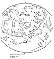
Article(s): A field book of the stars and A Field Book of the Stars
- Request
- a whole book jpeg to svg
- It is a book of star maps, simple. A lot of boring arcs, arrows, and names of mythical beings that get mis-spelled. --RaboKarbakian (talk) 18:01, 11 November 2020 (UTC)
- Graphist opinion(s)
| Extended content |
|---|
|
To even consider this request there has to be a requester, no one has signed this request. There will be questions, drafts to be checked, etc so someone has to be able to provide this. It's a major request so to have this backup is very important. --Goran tek-en (talk) 17:31, 31 October 2020 (UTC)
licensing: gutenberg vs commons (posted here at artists request) I mentioned a book whose images I uploaded here that were deleted. I was doing the images for a gutenberg project. As gutenberg is managed by people from the United States, all of the books there qualify under the US Public Domain rules. But this book was published in the United Kingdom and the illustrator was alive well into the 1900s and as such is not in the public domain in the United Kingdom. The book was published there, but the images were deleted here. Ye Sundial Book at gutenberg and here, you can see mention of the deletion log Category:Ye Sundial Booke and here, on my talk page where my work was deleted due to the United Kingdom public domain rules (which involve the death of the illustrator who died in 1985). Commons is far more rigorous for licensing than any other site I know, uploads are 'trolled' by software and people, as they are managing a whole world of content. Also, if you learn what old stuff can be here and why, you will learn the most. At least, that has been my experience. |


-
spring (a jpeg)
Further, I am responsible for the jpegs in that category because I was making them for the gutenberg post-processor, image size, and the limited ROM of my e-reader; while others are responsible for the png because they were making them for here, where the guidelines are to make diagrams as png due to file type clarity (or lack of lossiness). SVG will be the best, however!-- RaboKarbakian (talk) 18:03, 16 November 2020 (UTC)
![]() Request taken by Goran tek-en (talk) 17:52, 14 November 2020 (UTC)
Request taken by Goran tek-en (talk) 17:52, 14 November 2020 (UTC)
- RaboKarbakian As it is always a problem between the illustration in 100% and the thumbnail I will ask you if you know how big thumbnails you will use in the articles?
- An illustration can work well in 100% (eg 800 px wide) and that is really the only thing I can control but then, very often, the requester use a thumbnail of eg 150 px wide and then 'complain' that the illustration is not visible. So that is what I'm trying to avoid by asking you this, always ping me, thanks. --Goran tek-en (talk) 18:57, 16 November 2020 (UTC)
- Goran tek-en I used a simple formula for determining the size displayed at wikisource, making the image as close to the printed size as possible: width/300px * 72 (all based on ppi, pixels per inch, then perhaps, tweaked further for conditions at wikisource). The larger they are, the more uses they have, but if SVG is not so good at scaling down, then not so useful. Perhaps if you could make them fit more modern screens, using width/300px * 98? So, File:April 01-40N-2100-Fieldbook of Stars-025.jpg would be (2272px/300ppi) * 98ppi = 742px wide and 814px wide? Then the SVG would be scaled to 530px wide at wikisource. You know better than me if this is reasonable both in my expectations and the scalability of the file.--RaboKarbakian (talk) 18:15, 17 November 2020 (UTC)
- RaboKarbakian Thanks for that. Svg files are different from bitmapp images as they are xml based and it's all about code. It is always sharp in any size but then of course if you show a svg file at 10%, of course it will be difficult to see. The thumbnails used in wikimedia is a png image created from the svg file in the size needed. So what I only need is the width in px of the thumbnail you think you will use. Or you can link me to a place where I can see one which you think is relevant, thanks.
- The Inkscape I use works with screen resolution of 98 ppi and when you talk about bitmapps transferred (eg printed) to a physical material (eg paper, plastic...) you have to consider how many dpi (dots per inch) is needed to obtain a sharp image. --Goran tek-en (talk) 09:42, 18 November 2020 (UTC)
- Goran tek-en Perhaps it is easier then for you to make the SVG the same size as the original jpeg or png? That would not involve math or 'good judgement' (making a thumbnail size for a request like this is probably not the best judgment). You know how to click on the thumbnail to get to the file page and then from there to find the original size? I apologize, as I am used to a certain eh, culture here (with the pixel and photograph people) where the best and the largest is always encouraged.--RaboKarbakian (talk) 18:04, 18 November 2020 (UTC)
- RaboKarbakian Now I have done parst of the Spring image and you have to check and think after what will work for you.
- Draft (not complete) and the colors are chosen so they work well for most people with color vision issues.
- This is an image 250 px wide to try to show you what a thumbnail in that size will look like. You have to check your thumbnail size because I want to know that it will work for redoing later on is not something I will do. If it's hard for you to try we might be forced to upload an image so you can try a real file.
- Many of the names are rotated which makes them hard to read but I understand they try to mimic the sky in some way. But I think it would be better to try to keep the names horizontally.
- Check this and give me feedback, thanks. --Goran tek-en (talk) 19:22, 21 November 2020 (UTC)
- Goran tek-en "1.png" is simply beautiful, better than I imagined! The 250px thumbnail is, however, too small for me to read the details of. The "thumbnails" in use at wikisource are more like 450px. A sincere thank you for the preview of 1.png.... --RaboKarbakian (talk) 17:38, 25 November 2020 (UTC)
- RaboKarbakian Now I have done parst of the Spring image and you have to check and think after what will work for you.
- Goran tek-en Perhaps it is easier then for you to make the SVG the same size as the original jpeg or png? That would not involve math or 'good judgement' (making a thumbnail size for a request like this is probably not the best judgment). You know how to click on the thumbnail to get to the file page and then from there to find the original size? I apologize, as I am used to a certain eh, culture here (with the pixel and photograph people) where the best and the largest is always encouraged.--RaboKarbakian (talk) 18:04, 18 November 2020 (UTC)
- RaboKarbakian Thanks for that. Svg files are different from bitmapp images as they are xml based and it's all about code. It is always sharp in any size but then of course if you show a svg file at 10%, of course it will be difficult to see. The thumbnails used in wikimedia is a png image created from the svg file in the size needed. So what I only need is the width in px of the thumbnail you think you will use. Or you can link me to a place where I can see one which you think is relevant, thanks.
- Goran tek-en I used a simple formula for determining the size displayed at wikisource, making the image as close to the printed size as possible: width/300px * 72 (all based on ppi, pixels per inch, then perhaps, tweaked further for conditions at wikisource). The larger they are, the more uses they have, but if SVG is not so good at scaling down, then not so useful. Perhaps if you could make them fit more modern screens, using width/300px * 98? So, File:April 01-40N-2100-Fieldbook of Stars-025.jpg would be (2272px/300ppi) * 98ppi = 742px wide and 814px wide? Then the SVG would be scaled to 530px wide at wikisource. You know better than me if this is reasonable both in my expectations and the scalability of the file.--RaboKarbakian (talk) 18:15, 17 November 2020 (UTC)
Sport record icons
-
Sports record icon for National U20 Record
-
 Sports record icon for World U20 Record
 -
Sports record icon for European U20 Record (also version for Africa (AF), North America (NA), South America (SA), Asia (AS) and Oceania (O))
-
Sports record icon for World U18 Best Performances
-
Sports record icon for European U18 Best Performance
-
Sports record icon for National U18 Best Performance
-
Sports record icon for European U23 Record
-
 Sports record icon for Diamond League Record (in Diamond color) - Version 1
 -
 Sports record icon for Diamond League Record (in Diamond color) - Version 2
Article(s): en:Diamond League; de:Diamond League
- Request
- Please create these icons which would improve athletics record lists and also athletes' bios and club pages. Example how they should look like:
 in this category https://commons.wikimedia.org/wiki/Category:Sport_records_icons --194.8.192.162 09:52, 6 November 2020 (UTC)
 - Graphist opinion(s)
- I created two of the requested icons but need more information for the rest. For the Diamond League icon, I wasn't sure what you would prefer so I created two versions using the logo gradient and the darker blue in the logo. Use the one you prefer and we can delete the unused one. For the following requested icons it looks like there is an existing version already:
* National record under 20- 
* European record under 20 - 
* European record under 23 - 
* North American record under 20 -. Likewise for Africa
, South America
, Asia
, and Oceania
.
For the World, European, and National under 18 Best Performance, what should be in the text? WB18, EB18, NB18 or something else? Let me know so I can create anything else you need.
Nancystodd (talk) 23:12, 21 December 2020 (UTC)
Location map for whole Sabah
-
 With Kota Kinabalu highlighted
 -
 Example from other Malaysian state, Johor
 -
 Sabah map with lines


Article(s): en:Sabah
- Request
- There is a location map for the capital city of Sabah but there's no location map for Sabah however. I want to use it for Location map module in Wikipedia. --Tofeiku (talk) 14:34, 15 November 2020 (UTC)
- Graphist opinion(s)
Representation of the gluon field in the nucleons


Article(s): en:Antiproton, en:Antineutron (depending on outcome of discussion)
- Request
- There is an ongoing dispute over which representation of the gluon field should be used in the relevant English Wikipedia articles. A version of the first image (with the gluon flux tubes) is requested for the antiproton and antineutron. –LaundryPizza03 (dc̄) 02:33, 16 November 2020 (UTC)
- Graphist opinion(s)
- @LaundryPizza03:
 Done --Mrmw (talk) 11:48, 16 November 2020 (UTC)
 - there are problems with local version in en-wiki for
- i think you should delete this files in en-wiki to avoid conflicts and to make sure to dispaly commons-version in en-wiki --Mrmw (talk) 12:50, 16 November 2020 (UTC)
Vectorize design
Article(s):
- Request
- Could somebody please create a vectorized version of this image? I can email the full-resolution image to whomever takes the request. Thanks, --Usernameunique (talk) 22:07, 18 November 2020 (UTC)
- Graphist opinion(s)
Image scaling request...
-
 UK Traffic Sign 511 (1981)
 -
 UK Traffic Sign 534.1 (1981)
 -
 UK Traffic Sign 519.1 (1981)
 -
 UK Traffic Sign 814 (1981)
.svg)
.svg)
.svg)
Article(s): s:Index:UKSI19810859.pdf as images in Page: content.
- Request
- Please scale these more appropriately (can SVG do that internally?) with respect to other traffic signs images in the relevant Commons Category and those used in the linked article. Asking here as it's simple task that an experienced user can do rapidly...
- --ShakespeareFan00 (talk) 18:53, 21 November 2020 (UTC)
- Graphist opinion(s)
- @ShakespeareFan00, can you be more specific about what’s wrong with the size or proportions? Is it just the nominal pixel dimensions? Yes, with SVGs scaling is usually very easy—it says so right on the tin! But one needs to know what one’s trying to achieve.—Odysseus1479 (talk) 04:41, 22 December 2020 (UTC)
- It is indeed the nominal pixel dimensions, I had drawn these at actual size, whereas the ones from the Traffic Signs Database are based on how they were sized for print reproduction, which are considerably smaller. I was wanting someone to scale these to be more suited to display on screen and print compared to the existing traffic sign images Commons holds.ShakespeareFan00 (talk) 09:33, 22 December 2020 (UTC)
Vectorize image
-
 Sutton Hoo helmet winged dragon motif

Article(s):
- Request
- Could somebody please create a svg version of this image? Four comments:
- 1) I will email a high-resolution image to whomever takes the request
- 2) In the linked image, both wings have 21 garnets (the black boxes under the wings). Please modify the right wing to have 22 garnets. But please keep the length of the wings the same.
- 3) Please remove the curved line at the very bottom
- 4) If it helps to have some context, this is the simplified design from the front of the Sutton Hoo helmet (image).
- Thanks, --Usernameunique (talk) 05:42, 23 November 2020 (UTC)
- Graphist opinion(s)
- @Usernameunique: Doable, but I don't know if it would be allowed. The original image is under copyright, and uplaoded downscaled following the 'fair use' approach. If we vectorialize it? who is the rights owner? I'm not expert of that so i would suggest you to check this before. Sette-quattro (talk) 14:41, 30 November 2020 (UTC)
- Thanks, Sette-quattro. Although the image linked to is from a 1972 article, the underlying design is from the sixth or seventh century, and thus well out of copyright. The 1972 image is extremely faithful to the original—including minor differences in the number of silver wires in the wings (43 vs. 46), and a right wing that is millimeters shorter than the left—so I don’t think it has much claim to copyright protection of its own. Let me know if you think anything else is needed. Thanks, —Usernameunique (talk) 15:13, 30 November 2020 (UTC)
- @Usernameunique: , I think the descriptiona and the categories should be refined. Sette-quattro (talk) 16:33, 30 November 2020 (UTC)
- That looks really great, thanks Sette-quattro. Would you mind also making the two slight alterations listed above (#2 and #3)? —Usernameunique (talk) 17:17, 30 November 2020 (UTC)
- Done @Usernameunique: edited the line and the number of squares. If you think is resolved, please mark the section for automatic archiving Sette-quattro (talk) 14:05, 3 December 2020 (UTC)
- Thanks, Sette-quattro. The left side should have 21 squares, however; only the right side should have 22. (For reasons not relevant here, the eyebrows on the Sutton Hoo helmet were slightly different. It's discussed in the last paragraph of Sutton Hoo helmet § Construction, and the second paragraph of Sutton Hoo helmet § Dragon motifs.) And if you have time and feel like it, there are two other very minor edits that could me made. First, there is a stray dot on the far left (in the lip of the left boar's head). Second, there could be slightly less white space separating each of the black squares; there is more space separating the boxes to the right of eyebrow than there is separating the boxes to the left of each eyebrow. The spacing on the left sides is perfect.
- In any event, these are minor comments. Thanks again for your work on this. --Usernameunique (talk) 02:22, 4 December 2020 (UTC)
- Sette-quattro, just following up to see if you might be able to make the tweaks described above. Thanks, --Usernameunique (talk) 16:54, 17 December 2020 (UTC)
- That looks really great, thanks Sette-quattro. Would you mind also making the two slight alterations listed above (#2 and #3)? —Usernameunique (talk) 17:17, 30 November 2020 (UTC)
- @Usernameunique: , I think the descriptiona and the categories should be refined. Sette-quattro (talk) 16:33, 30 November 2020 (UTC)
- Thanks, Sette-quattro. Although the image linked to is from a 1972 article, the underlying design is from the sixth or seventh century, and thus well out of copyright. The 1972 image is extremely faithful to the original—including minor differences in the number of silver wires in the wings (43 vs. 46), and a right wing that is millimeters shorter than the left—so I don’t think it has much claim to copyright protection of its own. Let me know if you think anything else is needed. Thanks, —Usernameunique (talk) 15:13, 30 November 2020 (UTC)
Non-free frame

Article(s): [[]]
- Request
- Please remove the frame. Hanooz 21:36, 2 December 2020 (UTC)
- Graphist opinion(s)
KNIL heraldy
-
 The army's emblem
 -
 The air force division's coat of arms

Article(s): Royal Netherlands East Indies Army and Royal Netherlands East Indies Army Air Force
- Request
- Would someone improve both heraldy to SVG? For the references take a look at this site (army, air force) and also this site. Astronommica (talk) 01:26, 5 December 2020 (UTC)
- Graphist opinion(s)
Logo for Saraiki Wikipedia
Hi, would there be someone who could upload this svg logo
to https://meta.wikimedia.org/wiki/File:Wikipedia-logo-v2-skr.svg
Kindly help for Logo for Wikipedia. See also
https://commons.wikimedia.org/wiki/User_talk:Odder#Saraiki_Wikipedia
I am waiting for you help. Sraiki (talk) 03:36, 4 December 2020 (UTC)
- From talk page. --Minoraxtalk 02:10, 6 December 2020 (UTC)
- @Sraiki: Kindly wait for a volunteer to process your request. Thanks. --Minoraxtalk 02:10, 6 December 2020 (UTC)
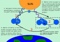
Ozone cycle
-
 The file (SVG)
 -
 New version without text


Article(s): en:Ozone layer
- Request
- This file is in svg but does not has <text/> and cannot use in svgtranslate. anyway it would be grate if this can translate easier. — 𝙋𝙖𝙩𝙨𝙖𝙜𝙤𝙧𝙣 𝙔.ᴛᴀʟᴋ 07:38, 6 December 2020 (UTC)
- Graphist opinion(s)
- @Patsagorn Y.: I made a new version of the graphic, without text, which can be used adding the description as normal text. If you want i can add etibalt texts to it. Sette-quattro (talk) 20:39, 9 December 2020 (UTC)
Red Kingspenny blossom
Article(s): Certain articles relating to The Wheel of Time series.
- Request
- Could someone please create an SVG heraldic template of the Red Kingspenny blossom, which is a fictional flower within the TWOT universe. One such impression of the flower can be seen as part of this image here. Thanks. Snow Lion Fenian (talk) 13:11, 13 December 2020 (UTC)
- Graphist opinion(s)
Broe helmet image
-
Reconstruction of the Broe helmet
Article(s): en:Broe helmet
- Request
- Could somebody please create a replacement free version of this file? It should look largely the same, if possible, but the vertical animal head on the crest should be removed. Please email me for the high-resolution image. Thanks, --Usernameunique (talk) 23:39, 14 December 2020 (UTC)
- Graphist opinion(s)
Magnum PI (reboot) logo
-
 Current logo of Magnum PI (2018–2020)
 -
 B/W Version
Article(s): en:Magnum P.I. (2018 TV series)
- Request
- Black-colored version of the Magnum PI (reboot) logo would be nice. Thanks. --George Ho (talk) 07:23, 15 December 2020 (UTC)
- Graphist opinion(s)
![]() Done -- MaxxL - talk 10:29, 16 December 2020 (UTC)
Done -- MaxxL - talk 10:29, 16 December 2020 (UTC)
- Thanks. Can you change the background from opaque to transparent? I would appreciate it. George Ho (talk) 10:34, 16 December 2020 (UTC)
- Done -- MaxxL - talk 10:47, 16 December 2020 (UTC)
Lutetium phthalocyanine
-
 The only currently available file representing this compound

Article(s): en:Lutetium phthalocyanine
- Request
- Need a chem diagram that shows this molecule's coordination, as it is a sandwich compound. Also request a 3D model; see Bidermane et al. for details. --–LaundryPizza03 (dc̄) 07:50, 16 December 2020 (UTC)
- Graphist opinion(s)
Kotatsu.svg rendering issue
-
 Kotatsu diagram

- Request
- The label in the upper-right corner is supposed to say "Blanket". The thumbnail view on Wikipedia and the file page incorrectly show a black box, but directly viewing the file in Chrome looks correct. The thumbnails of the previous versions of this file look correct. --Chris857 (talk) 00:06, 21 December 2020 (UTC)
- Graphist opinion(s)
![]() Done – Nancystodd (talk) 15:02, 22 December 2020 (UTC)
Done – Nancystodd (talk) 15:02, 22 December 2020 (UTC)
Convert Almohad emblem to SVG
-
Original Emblem (Silk and gilded parchmant)
-
 Flag, just for reference
.svg)
Article(s): en:Almohad Caliphate
- Request
- I know this isn't an easy one. If it's any consolation, they didn't imagine you would be working on this back in 1212 AD.
 —Please note this is the emblem not the flag. --Flaspec (talk) 22:39, 21 December 2020 (UTC)
 - Graphist opinion(s)
Mandate acquired to redesign English Wikipedia GA/FA topicons
You are invited to join the discussion and submit proposals at en:WP:GL/I#Good article and featured article topicon redesign. Regards, {{u|Sdkb}} talk 22:12, 24 December 2020 (UTC)
Please Review - Wrong Colour Palette
Article(s): File:Thai-Airlines-Logo 2008.svg
- Request
(Taken from File talk:Thai-Airlines-Logo 2008.svg)
- According to the internal document on page 16, the yellow text on a white background is incorrect due to "Wrong use of colour on wordmark". The correct use of Thai Airways' text colour is
- If the background is "transparent", "white", and according to the document on page 15, "Light colour backgrounds" and depends on the "Image backgrounds", the text colour shall be purple.
- If the background is, "purple", and according to the document on page 15, "Corporate colour and corporate colour gradient backgrounds", "Dark colour backgrounds" and depends on the "Image backgrounds", the text colour shall be yellow.
- the description above do not include single colour brand signatures, but explanation available on the document. --Bebiezaza (talk) 15:25, 26 December 2020 (UTC)
- Graphist opinion(s)
Clean up/vectorize signature
-
 Will P. Brady signature
 -
 Will P. Brady signature
Article(s): en:Will P. Brady
- Request
- Would somebody please 1) clean up the current png, making the background white and removing the text? Please upload over the existing file. Then, would you please 2) create an svg version of the signature? Thanks, --Usernameunique (talk) 21:04, 26 December 2020 (UTC)
- Graphist opinion(s)
![]() Request taken by Sushant savla (talk) 09:20, 27 December 2020 (UTC)
Request taken by Sushant savla (talk) 09:20, 27 December 2020 (UTC)
![]() Done--Sushant savla (talk) 10:02, 27 December 2020 (UTC)
Done--Sushant savla (talk) 10:02, 27 December 2020 (UTC)
- Thanks, Sushant savla! One small nit: could you please remove the bump on the top right of the "B" in "Brady"? I believe that is part of the text (specifically, the bottom arm of the "E" in "ARE"), not signature. --Usernameunique (talk) 19:24, 27 December 2020 (UTC)
Change the color of the SVG format logo from the Ministry of Education and Culture of the Republic of Indonesia Wikicommons version.
-
 Logo of Ministry of Education and Culture of Republic of Indonesia

Article(s): Kemdikbud
- Request
- English: Hello, who read. Before starting my request, I told him that I wasn't very good at using English. I translate, using Google translation. So I apologize if the translation is wrong :). Continue to the heart of the request. I opened the kemdikbud.go.id site just for fun. Then I went to the About Logo section. Then I noticed that the color version in Commons was different from the law at the Ministry of Education and Culture. So, just change the blue and yellow colors according to the site. ~ THX ~
- Details of your request go here… --Fahriahmad306 (talk) 04:53, 28 December 2020 (UTC)
- Graphist opinion(s)