Commons:Graphic Lab School/Images to improve/Archive/Resolved
SVG Cleanup[edit]
-
 Shield of Washington & Jefferson College

Article(s): Washington & Jefferson
Request: Certain portions of this .svg are not symmetrical, like the black and white lines in the bottom segment. I tried my best, but I can't get:
- the white lines evenly spaced
- the black lines to have a uniform width
- the rhombus evenly situated among the black and white intersecting lines.
Maybe someone can clean this image up? Thanks! -- Jwilkinsen (talk) 06:20, 2 March 2009 (UTC)
Graphist opinion:![]() Done
Nevermind, I think I nailed it this time.--Jwilkinsen (talk) 21:30, 3 March 2009 (UTC)
Done
Nevermind, I think I nailed it this time.--Jwilkinsen (talk) 21:30, 3 March 2009 (UTC)
SVG (inkscape) problems with upload to commons[edit]
-
 Diagram (svg)

Article(s): Does not exist.
Request: I made this SVG diagram with inkscape. After uploading the file to commons, some boxes with black color appears. I made about 10 attempts with different settings, but it did not work! Sometimes I had more black boxes, sometimes less, but never without any black colored box. What is my mistake? -- 112BKS (talk) 10:48, 15 February 2009 (UTC)
Graphist opinion:
- You're using flowed text. Mediawiki can't handle it, and Inkscape doesn't support it fully yet. When making a text box, just click once and type - don't drag out a box. If you can possibly avoid it, don't convert text to paths, as this makes the filesize huge and makes further editing harder. I've uploaded a new version, and taken the liberty of making it more international by using symbols, not words. Also, graphs don't generally need titles, as this restricts use to one (or two) languages, and can be easily done in Wiki markup. − Inductiveload (talk) 17:07, 15 February 2009 (UTC)
- Thank you very much! I am not very familiar with inkscape, but I think, for a "regular" user it is nearly impossible to create a proper SVG-File, which makes no problems in Wiki-Commons. I agree with the new language free diagram. But there is one mistake. The “P” schould be changed to Pe. This means “effective” pressure. (The opposite is the ”indicated” pressure Pi.) Can you change the P to Pe?--112BKS (talk) 17:34, 15 February 2009 (UTC)
- Done. I agree, it takes some time to get used to it. Text is the major problem, everything else is mostly well-supported. As long as you steer well clear of flowed text, and make sure you only use fonts Mediawiki supports (Deja Vu is the best IMO, and it's freely licenced - Google it to download) you shouldn't have too many problems. Also, take care to align stuff to the pixel grid - if it isn't it will be blurry. Remember that a 1px line snapped right on the grid will also be blurry, as the edges are 0.5px from the grid. However, a 2px line will be crisp. That problem isn't confined to Mediawiki, you can see it in Inkscape too.
- If you can, try to make the images a sensible number of pixels across (eg 600px rather than 610.12). This makes it easier to size the images well in the articles.
- If you ever need any help or need something doing, don't hesistate to drop by my talk page. − Inductiveload (talk) 18:15, 15 February 2009 (UTC)
- Thanks again! As soon as I have the next problem with svg-files, I will drop into your talk page (please excuse my terrible Bavarian English)--112BKS (talk) 20:00, 15 February 2009 (UTC)
- Thank you very much! I am not very familiar with inkscape, but I think, for a "regular" user it is nearly impossible to create a proper SVG-File, which makes no problems in Wiki-Commons. I agree with the new language free diagram. But there is one mistake. The “P” schould be changed to Pe. This means “effective” pressure. (The opposite is the ”indicated” pressure Pi.) Can you change the P to Pe?--112BKS (talk) 17:34, 15 February 2009 (UTC)
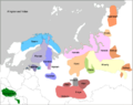
Improved SVG map of Uralic[edit]
Articles: en:Uralic languages, several articles referring to the specific languages or subgroups and all translations.
Request: File:Fenno-Ugrian people.png has been flagged as a "Map images that should use vector graphics". I am interested in assisting with this but it would seem to make sense to improve the quality of the map at the same time.
- I have now uploaded an SVG version that I created myself. Unfortunately it doesn't render correctly. Can someone assist? For correct rendering see PNG version temporarily uploaded and the newly uploaded commons version below. Laurens (talk) 16:01, 21 February 2009 (UTC)
-
 Old PNG Version
 -
 New PNG Version
 -
 New SVG version


- Better? Basically replaced all "patterns" by a clipped path where the clipping path was striped. /Lokal_Profil 22:51, 5 March 2009 (UTC)
- Yes - a lot - thanks. 09:08, 7 March 2009 (UTC)
Stitch these images together[edit]
Images:
-

-

-

-

-

-

-
 400+MP stich

Request: If anyone has a image editor large enough to stitch these six sections of a panorama together, please do so. Even if this might turn out to be the largest image uploaded onto Commons in Commons History, it's still worth it.
If no one can handle these gargantuan proportions, feel free to resize the images.
CommonMaster (talk) 23:06, 6 December 2008 (UTC)
Collaboration: I should have enough computer horse-power to do it. I'll need to wait untill I get home tonight however. This image will end up being about 424.8 megapixles. --J.smith (talk) 00:00, 7 December 2008 (UTC)
- WTF... Image:Georgetown PowerPlant interior pano 1 - Mercator A01.jpg has a severed head in it... J.smith (talk) 00:00, 7 December 2008 (UTC)
- ROFL! That's a really nice stitching artifact. Right in the middle, too. Heh... maybe it could be captioned "This is what happens if you're not careful around heavy machinery"? —Ilmari Karonen (talk) 00:17, 7 December 2008 (UTC)
- There's another one in A04: a kid with no legs. Or maybe it's the same kid's upper body twice; it's hard to tell. —Ilmari Karonen (talk) 00:20, 7 December 2008 (UTC)
- A practical tip for fixing such blending errors is to stitch two versions of the panorama: one blended and one with each image in a separate layer. Load them both into one layered image in an image editor (GIMP, Photoshop, etc.) and use layer masks (or simply the eraser tool) to override enblend's choice in the places where it doesn't look right. —Ilmari Karonen (talk) 00:29, 7 December 2008 (UTC)
- Could someone please remove these artefacts? CommonMaster (talk) 19:11, 10 December 2008 (UTC)
- A practical tip for fixing such blending errors is to stitch two versions of the panorama: one blended and one with each image in a separate layer. Load them both into one layered image in an image editor (GIMP, Photoshop, etc.) and use layer masks (or simply the eraser tool) to override enblend's choice in the places where it doesn't look right. —Ilmari Karonen (talk) 00:29, 7 December 2008 (UTC)
Was this really the optimal size hugin suggested? Because it looks to me like the images have been upscaled quite a bit, and could probably be scaled down by at least a factor of 2 or 3 without losing any actual detail. —Ilmari Karonen (talk) 00:10, 7 December 2008 (UTC)
- I noticed that too... but I think it's actually a victim of very high compression. The images are 89mp each but only take up 6 megs of space. --J.smith (talk) 01:23, 7 December 2008 (UTC)
- That's probably more of a symptom than the cause. If it was just excessive compression, you'd expect to see typical JPEG compression artifacts like blocking. Instead, it seems more likely that the image has been scaled up during the stitching process, leading to a lack of high-frequency components and therefore high compressibility. —Ilmari Karonen (talk) 03:48, 7 December 2008 (UTC)
- Hmmm ok. He did say it was stitched up with 56 images, but I that seems plausible. Haha.. I just discovered a bug in Google chrome. It won't open these images. :~) J.smith (talk) 04:17, 7 December 2008 (UTC)
- Ok, it's up at Image:Georgetown PowerPlant interior pano.jpg. I tried to save it as a PSD, but the file ended up passing the 2gig limit that CS3 apparently has. There is some kind of weird blue fringe on a few of the images - I just left it since I don't have any overlap to play with. --J.smith (talk) 05:29, 7 December 2008 (UTC)
- BTW, you can't open the full size image in Chrome, IE or Firefox. Wikimedia seems to deal with it ok. Picasa can view it, but it can error out if you zoom in/out. You can view it scaled to 2500px in the long demention in my sandbox: User:J.smith/sandbox --J.smith (talk) 05:42, 7 December 2008 (UTC)
- ADDENDUM: Opening this file in IE7 will result in a window with an X in it. Opening it with Firefox says that the image contains errors. CommonMaster (talk) 15:20, 8 December 2008 (UTC)
- Hmmm... there seems to be a stitching line in the middle of the image. Can someone fix that? CommonMaster (talk) 04:26, 8 December 2008 (UTC)
- BTW, you can't open the full size image in Chrome, IE or Firefox. Wikimedia seems to deal with it ok. Picasa can view it, but it can error out if you zoom in/out. You can view it scaled to 2500px in the long demention in my sandbox: User:J.smith/sandbox --J.smith (talk) 05:42, 7 December 2008 (UTC)
- Ok, it's up at Image:Georgetown PowerPlant interior pano.jpg. I tried to save it as a PSD, but the file ended up passing the 2gig limit that CS3 apparently has. There is some kind of weird blue fringe on a few of the images - I just left it since I don't have any overlap to play with. --J.smith (talk) 05:29, 7 December 2008 (UTC)
- Hmmm ok. He did say it was stitched up with 56 images, but I that seems plausible. Haha.. I just discovered a bug in Google chrome. It won't open these images. :~) J.smith (talk) 04:17, 7 December 2008 (UTC)
- That's probably more of a symptom than the cause. If it was just excessive compression, you'd expect to see typical JPEG compression artifacts like blocking. Instead, it seems more likely that the image has been scaled up during the stitching process, leading to a lack of high-frequency components and therefore high compressibility. —Ilmari Karonen (talk) 03:48, 7 December 2008 (UTC)
- It's not a stitching line, it's a boarder the original images have. The images are very hard to work with, so I didn't try to remove them. It actualy washes out some of the detail, so I'm not sure how to remove it. --J.smith (talk) 05:27, 8 December 2008 (UTC)
- Is this the largest image ever uploaded to Commons? CommonMaster (talk) 15:25, 9 December 2008 (UTC)
- As far as I know it's the highest in pixel count. J.smith (talk) 18:14, 9 December 2008 (UTC)
- It is indeed. You've beaten Image:Orion Nebula - Hubble 2006 mosaic 18000.jpg by 138 Mpix. —Ilmari Karonen (talk) 21:19, 9 December 2008 (UTC)
- Amazing! Perhaps this could even set a record for "Largest image ever uploaded to the internet (by pixel count)". CommonMaster (talk) 15:24, 10 December 2008 (UTC)
- Not even close. paris-20-gigapixels.com Also, you can download a 1+ GB image of the surface of mars. I tried to find it, but it eludedes me. :( --J.smith (talk) 19:01, 10 December 2008 (UTC)
- Amazing! Perhaps this could even set a record for "Largest image ever uploaded to the internet (by pixel count)". CommonMaster (talk) 15:24, 10 December 2008 (UTC)
- It is indeed. You've beaten Image:Orion Nebula - Hubble 2006 mosaic 18000.jpg by 138 Mpix. —Ilmari Karonen (talk) 21:19, 9 December 2008 (UTC)
- As far as I know it's the highest in pixel count. J.smith (talk) 18:14, 9 December 2008 (UTC)
We need to upload a smaller version of this file. It is way too large for some browsers to handle. CommonMaster (talk) 19:13, 10 December 2008 (UTC)
- Done.
Just look for it.It is at File:Georgetown PowerPlant interior pano-resized.jpg CommonMaster (talk) 17:29, 17 December 2008 (UTC)
ADDENDUM: I haven't found any browser capable of opening the file. 00:42, 12 December 2008 (UTC)
- Camino browser can save the file. Just click on the full res link and download link target. CommonMaster (talk) 15:29, 12 December 2008 (UTC)
Panorama request[edit]
-

-

-

-

-
 Tilted horizon, minimal cropping
 -
 Straight horizon, more cropping


Please assemble these into a panorama. Follow these guidelines-
- Make the ground lighter and add some blur to the sky if that is good
- Upload the file:
- Licensed under Public Domain
- Name Image:Mount rainier trail panorama.jpg
CommonMaster (talk) 04:49, 27 November 2008 (UTC)
- Ok, hows this? --J.smith (talk) 05:30, 27 November 2008 (UTC)
- Awesome. However, it seems to be missing Image:Mount rainier trail panorama1.jpg. CommonMaster (talk) 19:52, 27 November 2008 (UTC)
- There is no overlap between 1 & 2. Not much I can do without some overlap. At least 10%, but 20% is more ideal. The other pictures in the set are kind of pushing it... but they were lined up straight so it worked out ok and I didn't need to crop much. --J.smith (talk) 07:31, 28 November 2008 (UTC)
- Try this:
- CommonMaster (talk) 02:29, 29 November 2008 (UTC)
- I'm sorry, the program I use won't accept that image as part of the set without some overlap and I don't have the skill to blend them by hand. :( --J.smith (talk) 02:49, 29 November 2008 (UTC)
- Actually, it turns out there is a few pixels of overlap between images 1 and 2. It's not much, but should be enough for stitching. Unfortunately, it seems I'll have to recompile hugin if I want the latest exposure correction features, which this panorama seems to call for. Just give me a few minutes... (Alternatively, I can send you the pre-aligned .pto file if you'd like to take a crack at finishing it.) —Ilmari Karonen (talk) 14:29, 29 November 2008 (UTC)
- Are you sure? O.o Maybe it's just me, but things just don't seem to line up. I am using CS3, so I don't think I can do much with the .pto file. Good luck! It would be cool to see something better. Feel free to upload over my version. J.smith (talk) 16:59, 29 November 2008 (UTC)
- Here you go. One issue I'm not sure of is whether it's a problem that the horizon is tilted. I can fix that easily enough, but only at the cost of losing a significant slice off the lower right. —Ilmari Karonen (talk) 19:40, 29 November 2008 (UTC)
- I went and uploaded a version with a straight horizon (or at least approximately so — I mostly used the cloud bases as guidelines, with a few trees as vertical guides) too. Feel free to decide which one you like more. —Ilmari Karonen (talk) 19:51, 30 November 2008 (UTC)
- I was comparing both versions side by side and by flashing them against each other. I'm leaning towards the original version. It seems that the horizon-aligned image has distortion in the center. Furthermore, much of the bottom-right corner is chopped, giving it imbalance. Also, the trail on the left side seems vertical in the new version. If there was a way to straighten the horizon without those side effects, I will take a look. CommonMaster (talk) 02:26, 1 December 2008 (UTC)
- ADDENDUM: However, the slope of the mountains starting from the left and continuing to the far right seems to be more natural 02:31, 1 December 2008 (UTC). It seems bulgy in the middle because this is a wide-field panorama, and some of the previous versions make the slope look better. 15:31, 4 December 2008 (UTC)
- I went and uploaded a version with a straight horizon (or at least approximately so — I mostly used the cloud bases as guidelines, with a few trees as vertical guides) too. Feel free to decide which one you like more. —Ilmari Karonen (talk) 19:51, 30 November 2008 (UTC)
- Here you go. One issue I'm not sure of is whether it's a problem that the horizon is tilted. I can fix that easily enough, but only at the cost of losing a significant slice off the lower right. —Ilmari Karonen (talk) 19:40, 29 November 2008 (UTC)
- Are you sure? O.o Maybe it's just me, but things just don't seem to line up. I am using CS3, so I don't think I can do much with the .pto file. Good luck! It would be cool to see something better. Feel free to upload over my version. J.smith (talk) 16:59, 29 November 2008 (UTC)
Lighthouse on Klein Curaçao[edit]
-
 The lighthouse on the uninhabited island Klein Curaçao, Netherlands Antilles
 -
 Retouched

.jpg)
Article(s): Klein Curaçao (en, es, nl)
Request: was a quality image candidate, but was declined with the reason "Incorrect perspective". Would someone correct the perspective of this image? – Ilse@ 18:22, 16 December 2008 (UTC)
Graphist opinion: Hows this? J.smith (talk) 19:26, 16 December 2008 (UTC)
- Good job! Could you describe how it was done? CommonMaster (talk) 19:21, 17 December 2008 (UTC)
- CS3 has a perspective correction tool. I just used it until it looked right. --J.smith (talk) 21:19, 17 December 2008 (UTC)
- Thank you for your help. I prefer the original image, because the proportions (height:width) seem distorted in the corrected image. – Ilse@ 13:43, 18 December 2008 (UTC)
- I've uploaded a new version (over J.smith's earlier one, I hope they won't mind). Do you think it's any better? I suspect mine may in fact be a bit overcorrected — perhaps I should try again without any control points on the tower itself. —Ilmari Karonen (talk) 10:40, 23 December 2008 (UTC)
The Population of the World in a Pail[edit]
Article(s):
Request: I'm working on a Project and I could use some impressive graphics http://commons.wikimedia.org/wiki/User:United_Countries_of_the_World I thought I would start with this one:
Lesson 4 to learn
Learn to use your thinking cap ... imagine in your minds eye (1) white pail but this time it is in the shape of an upside down funnel.
Once again the (1) pail is 100% full. Now imagine down the center of the pail is a small tube divided into 4. The 4 pieces represent: 1) food 2) shelter 3) clothing 4) health care
Now surrounding the center tube is a bigger tube divided into 4. Those 4 pieces represent: 1) reading 2) writing 3) arithmetic 4) public speaking to be heard
Surrounding the first 2 center tubes (or the core of mankind) are several more ... we will define them later.
Now imagine several flat almost see through discs laid flat on the bottom of the pail. Each disc represents 1 person on earth so there should be 6.2 billion discs in the pail. The discs should be arranged as follows: oldest in age on the bottom, youngest in age at the top (new born's), dividing the each persons disc into pie shaped pieces; 1 pie piece of each persons disc will be labeled the country they live in, 1 pie piece will be labeled the province/state/region, 1 pie piece will be labeled their closest village/town/city they live in, 1 pie piece will be labeled their first name, etc., 1 pie piece will be labeled their occupation, 1 pie piece will be labeled assets, 1 pie piece will be labeled liabilities, 1 pie piece will be labeled equity (net worth), 1 pie piece will be labeled acquired skills, 1 pie piece will be labeled acquired education beyond the basics, 1 pie piece will be labeled talents and core life interests, 1 pie piece will be labeled religious affiliation and understanding of other religions, 1 pie piece will be labeled past criminal behavior and understanding what a crime is and what it isn't, 1 pie piece will be labeled your disabilities and your abilities, 1 pie piece will be labeled your dreams and your nightmares, 1 pie piece will be labeled goals and ambitions along with your failures and lessons learned in life, 1 pie piece will be labeled your ideas to improve the world, 1 pie piece will be labeled your ideas on whats hurting the world, 1 pie piece will be labeled things that you HATE in the world and things that you LOVE in the world, 1 pie piece will be labeled things that you want in life and things you don't want out of your life, 1 pie piece will be labeled where you would like to travel too and where you have already traveled, 1 pie piece will be labeled your friends and your enemies.
I'm still working on the text but one should get the idea of what I need in a graphic from what I have so far. Any help is greatly appreciated. Your Canadian friend Randy Colbert.
Graphist opinion: Could you please upload the file? 206.188.48.165 23:00, 6 December 2008 (UTC)
Merging images into an icon for b:First Aid[edit]


Article(s): It will be used as an icon for b:First Aid once it (hopefully) becomes a Featured Book.
Request: I'd like the Globe as the back ground with the star of life over top, and offset (ie opposite of the combo shown). As well, if anyone feels up to re-doing the star of life icon with shiny Nuvola-like flair, feel free to do so, and use that instead (and remake the combo at the right). I'm definitely up for learning how to do this sort of thing myself, so if you get this done, can you let me know what software you used so I can try to mimic your work? Thanks a bunch! – Mike.lifeguard | @en.wb 09:16, 22 November 2007 (UTC)
Graphist opinion:


- I created the image at the right, I'm not sure if it's what you were looking for. To "Nuvola-flair" the star of life icon I merely added a gradient shape to the top and a shadow behind - it isn't perfect but hopefully it's close enough ;) If someone else comes up with something better feel free to upload over top of my version.
To Mike.lifeguard - I use the free program Inkscape to do my vector work, though you can use programs like Adobe Illustrator and such to export vector graphics. Feel free to drop me a note on my talk page if you want any more info :) -- Editor at Large • talk 23:25, 22 November 2007 (UTC)
- I thought the idea was that of Image:Globe-Star of life.svg? Haven't put a glare in mine though/Lokal_Profil 23:30, 22 November 2007 (UTC)
- *cough*, you're right of course... I fixed my version. I guess I didn't read the description properly :P -- Editor at Large • talk 23:45, 22 November 2007 (UTC)
- At the same time as I updated my image to use you're flair =). I'll mark mine as a dupe. /Lokal_Profil 23:47, 22 November 2007 (UTC)
- Heh, great minds think alike I suppose! Well it was a great team effort, hopefully Mike.Lifegard likes it -- Editor at Large • talk 23:50, 22 November 2007 (UTC)
- At the same time as I updated my image to use you're flair =). I'll mark mine as a dupe. /Lokal_Profil 23:47, 22 November 2007 (UTC)
- *cough*, you're right of course... I fixed my version. I guess I didn't read the description properly :P -- Editor at Large • talk 23:45, 22 November 2007 (UTC)
- Actually, I liked the version with the star of life big and the globe over top, so I switched Lokal Profil's version to that... or something. Forgive me for uploading over top, but it would have been deleted anyway. – Mike.lifeguard | @en.wb 18:38, 23 November 2007 (UTC)
Worm anatomy[edit]
-
 Oligochaeta anatomy
 -
 Polychaeta anatomy


Article(s): Earthworm
Request: Conversion to SVG could make this into a highly effective, crisp diagram. Some help might be necessary from a knowledgeable Wikipedian (such as User:TheAlphaWolf, User:Quercusrobur and User:WormRunner) Circeus 18:52, 8 February 2007 (UTC)
Graphist opinion:
- This looks like a straight-forward but fun project. If nobody has started it by this weekend I'll probably take a stab at it. Are there colouration preferences for the various parts of the anatomy? ChaosNil 23:58, 9 February 2007 (UTC)
- Eh nevermind, maybe somebody else will do it. ChaosNil 18:20, 14 February 2007 (UTC)
- That one is for me. Give me some time. Two related images already exist btw... Lycaon 22:23, 20 February 2007 (UTC)
- Eh nevermind, maybe somebody else will do it. ChaosNil 18:20, 14 February 2007 (UTC)
 Done StaphyllinusCaesareus[edit]
-
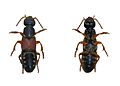 Background top clean up.

Article(s): unknow
Request: This picture may be better with a white background. --Yug (talk) 10:39, 29 April 2007 (UTC)
Graphist opinion: Okay I did this. Not too sure if it looks good or not though.. There was pretty bad jpeg compression so the edges were ambiguous. If you don't like it, feel free to revert. Bitplane 14:38, 11 May 2007 (UTC)
- No, it's good. I knew the former image what not really good. But your work is good. I try to launch this Graphic lab, and we will need good photographers and good graphists. We canno't have every think we need in the first month, but the situation is improving ;]
- thank you ! --Yug (talk) 11:44, 13 May 2007 (UTC)
Mercedes-Benz 220 -- Needs colour/etc adjustment[edit]
.jpg)
Article(s): w:en:Mercedes-Benz W114, w:nl:Europese auto in 1967, w:es:Mercedes-Benz Clase E
Request: The colour balance in this image is all wrong. This was scanned from a photo I took forever ago, and the photo has gotten damaged since then. I had some success by adding a translucent green-colourised layer over the top of it (it balanced out the excessive red), but I couldn't get the contrast right after that, so I left it as it is (but I uploaded a really high-res version of it, in case anyone takes up this offer). Don't worry about touching up the smaller scratches on the photo; that's tedious clone-brush work which I'm willing to do myself. So! I'd be grateful if anyone could do the colour/contrast/etc adjustment for me. Thanks a whole lot. :) Lewis Collard! (natter) 18:28, 23 July 2007 (UTC)
Graphist opinion: I tried to fix it up, hopefully it's a bit better now... unfortunately I couldn't fix entirely the section in the middle that was quite different from the rest, and of course the right half which is out of focus a bit was not fixable, but I sharpened it up a tad and tried my best to make that hedge all the same colour ;) Someone else might be able to do a better job, but perhaps this gives you something to work with now. -- Editor at Large • talk 13:20, 31 July 2007 (UTC)
- I darkened the pavement on the bottom a little and reduced the level of red to make the color seem more realistic. I tried fixing some of the worst blurry spots (the headlamp on the left) but they seem to be beyond repair. Mr.Z-man 02:30, 13 November 2007 (UTC)
- Bummer. :\ Thanks for trying anyway. Lewis Collard! (talk, contribs, en.wp) 12:01, 16 November 2007 (UTC)
- Well... This film scan was a hell!! After almost one and half year I think we can now consider this request as “resolved”!
- So... Starting all from the beginning again, here's a new post-processed version with a red car (and not purple) as it seem to have been, neutral shadows, almost no dust spots, scratches and finger-prints, a more natural contrast and the numerous specific colour balances in the different parts of the photograph in order to make it (I hope and guess) as close to reality as possible. Unfortunately, I think there's nothing much to do for the sharpness I improved a bit without making appear the grain of the film to an unacceptable level. I'd like to say that the best viewing imo will be at a size not bigger than 33% of the original size.
- I hope you like it. A good exercise for someone who has the time to play with it ;) Sting (talk) 00:12, 25 April 2009 (UTC)
- Bummer. :\ Thanks for trying anyway. Lewis Collard! (talk, contribs, en.wp) 12:01, 16 November 2007 (UTC)
- I darkened the pavement on the bottom a little and reduced the level of red to make the color seem more realistic. I tried fixing some of the worst blurry spots (the headlamp on the left) but they seem to be beyond repair. Mr.Z-man 02:30, 13 November 2007 (UTC)
WW2 in Yugoslavia[edit]
.
Article(s): articles about w:Independent State of Croatia, and generally, about WW2 in Yugoslavia. Here are other versions: [1], [2]
Request: There are many versions of this map on various wikipedias. Please, can You make new free .svg image that can be easily translated ? -- BokicaK (talk) 14:32, 27 October 2008 (UTC)
- And if You colour Banat (area east by Tisa river and north by Danube river, look here) in different shade, because Banat was part of Nedic's Serbia, but under direct German control. --BokicaK (talk) 14:53, 27 October 2008 (UTC)
- And funny, Belgrade, capital of Yugoslavia, isn't showed on the map. --BokicaK (talk) 14:55, 27 October 2008 (UTC)
- As well as Novi Sad and Kragujevac, sites of big war crimes conducted by fascist, and Sarajevo, the biggest city in Bosnia. --BokicaK (talk) 15:00, 27 October 2008 (UTC)
Graphist opinion: Looks like this has already been done. Take a look here: [3] That should probably be moved to Commons, no? — ʞɔıu 08:35, 27 November 2008 (UTC)
Hm, yes, something like that. But this image in not accurate. Compare borders of Croatia around Belgrade on the first image. --BokicaK (talk) 10:13, 15 February 2009 (UTC)
Heraldic crowns of France[edit]
-
 Baron
Baron -
 Vidame
 -
 Vicomte
 -
 Comte
Comte -
 Marquis
 -
 Duc
Duc -
 Prince du Sang
 -
 Prince de Sang Royal


-
 Baron SVG
 -
 Vidame SVG
 -
Possible SVG redraw?
-
Possible SVG redraw?
-
 SVG Marquis
 -
 Duc SVG
 -
 Prince du Sang SVG


Proposal by requester - style 1[edit]


Proposal by requester - style 2[edit]


Article(s): Commons:Valued image candidates/French Crown
Request: Hi. We would like a whole harmonized set of SVG pictures corresponding to the heraldic French crowns. The context of the request is the improvement of a Valued Image Set candidate, the image could then be used whithin heraldry projects. There are jpg or png versions for most of them (provided here), requiring small improvements. Two of them (Roi and Dauphin) will have to be created. There already are SVG versions of the comte and vicomte crowns: these can be either taken as a basis for the others, or improved (which should be possible, I guess...). We would like to have all the crowns seen from a front view (no perspective), with the same arrangement of blue and red jewels when possible, like on the existing SVG pictures for instance (and also a harmonized appearance of leaves, fleur-de-lis and pearls). Also, the pearls of the vidame crown should be removed.
- The king's crown: the basis is the same as the Prince du Sang crown (three fleur-de-lis with two leaves), but the crown is shut by five "arches" with pearls, with a velvet hat and a fleur-de-lis at the top (not an orb). A very little illustration can be found here (first crown), but with five fleur-de-lis (we want only three of them). The general shape is the one of St Edward's crown, but with different ornaments (and five arches, not three).
- The Dolphin's crown is depicted on the same page (second crown). Same general shape as the royal crown. The basis is the one of the Prince de Sang Royal (five fleur-de-lis) and the closure is made by three dolphins (this is the hard part, I guess [:Category:Dolphins in heraldry]).
There are example of leaves and fleur-de-lis here if you need inspiration. Many others on Commons. We thank you in advance, should you consider our request interesting enough to justify your attention. Don't hesitate to ask questions if I've not been clear enough. -- Eusebius (talk) 17:20, 5 November 2008 (UTC)
Graphist opinion: I'll see what I can do. It's a start. Pbroks13 (talk) 09:05, 6 November 2008 (UTC)
- Thanks. --Eusebius (talk) 10:16, 6 November 2008 (UTC)
- There are two crowns that are already in SVG format, Image:Heraldique couronne vicomte français.svg and Image:Heraldique couronne comte français.svg. Do you want them to be redone? Pbroks13 (talk) 04:30, 7 November 2008 (UTC)
- It is up to you. The set is interesting for us as soon as it is homogeneous, so you can either make all the crowns look like the existing count and viscount crowns, or make all the crowns on a different basis that you prefer. If I can make a comment, I think that the black lines used on the png/jpg files to represent shadows are useless in SVG, since it is possible to make a nicer shadow layer. Besides, could you please remove the decorative pearls on the vidame crown? Thanks for your work, anyway. --Eusebius (talk) 09:31, 7 November 2008 (UTC)
- The leaves on the marquis, duc and prince du sang (and king) crowns should be of the same shape. --Eusebius (talk) 21:21, 7 November 2008 (UTC)
- I've used your work to build more "harmonized" series of crowns. Do you plan to work on the "difficult" ones, the king and the Dauphin? --Eusebius (talk) 15:27, 17 November 2008 (UTC)
- The leaves on the marquis, duc and prince du sang (and king) crowns should be of the same shape. --Eusebius (talk) 21:21, 7 November 2008 (UTC)
- It is up to you. The set is interesting for us as soon as it is homogeneous, so you can either make all the crowns look like the existing count and viscount crowns, or make all the crowns on a different basis that you prefer. If I can make a comment, I think that the black lines used on the png/jpg files to represent shadows are useless in SVG, since it is possible to make a nicer shadow layer. Besides, could you please remove the decorative pearls on the vidame crown? Thanks for your work, anyway. --Eusebius (talk) 09:31, 7 November 2008 (UTC)
- There are two crowns that are already in SVG format, Image:Heraldique couronne vicomte français.svg and Image:Heraldique couronne comte français.svg. Do you want them to be redone? Pbroks13 (talk) 04:30, 7 November 2008 (UTC)
(Outdented) I personally like the second style. Before I go any farther, are those the right jewels that are supposed to be on the King's crown? Pbroks13 (talk) 02:49, 18 November 2008 (UTC)
- The king's crown is nice (except that a fleur-de-lis, not a fleuron, should be at the top, but I'll be able to correct it myself later). The jewels are ok, we decided to make it all the same, anyway the exact jewel design has changed over time, the key element is the disposition of the fleur-de-lis and fleurons. Should you need some "heraldic" dolphin designs, you have a few here. Thanks again for your work. --Eusebius (talk) 07:33, 18 November 2008 (UTC)
- Are you still working on it, or do we consider this request closed? --Eusebius (talk) 15:53, 5 December 2008 (UTC)
- Hey, sorry. This whole thing totally slipped my mind. I'll get on it as soon as I can. Sorry for that long wait. Pbroks13 (talk) 09:32, 9 December 2008 (UTC)
- No worries, we don't demand that you do it, it's just nice if you can! --Eusebius (talk) 09:50, 9 December 2008 (UTC)
- Hey, so I have been working on finding a picture of a dolphin that could be used in the crown for a while, but no luck. I've been trying to find a good raster image to work off of, but the only one I can find is the one you found. If we can find a higher resolution image, I could make a Dolphin that could match the crown. Pbroks13 (talk) 18:00, 12 December 2008 (UTC)
- OK... If I find one I'll let you know! Thanks again for your work. --Eusebius (talk) 18:31, 12 December 2008 (UTC)
- Hey, so I have been working on finding a picture of a dolphin that could be used in the crown for a while, but no luck. I've been trying to find a good raster image to work off of, but the only one I can find is the one you found. If we can find a higher resolution image, I could make a Dolphin that could match the crown. Pbroks13 (talk) 18:00, 12 December 2008 (UTC)
- No worries, we don't demand that you do it, it's just nice if you can! --Eusebius (talk) 09:50, 9 December 2008 (UTC)
- Hey, sorry. This whole thing totally slipped my mind. I'll get on it as soon as I can. Sorry for that long wait. Pbroks13 (talk) 09:32, 9 December 2008 (UTC)
- Are you still working on it, or do we consider this request closed? --Eusebius (talk) 15:53, 5 December 2008 (UTC)
(indent reset) I've found this picture of the crown, still small though. About dolphins alone, you have a SVG here on Commons, plus these ones on the net (none of them is of very good quality, none of them has his tail in the position wanted on the crown): [4] [5] [6] [7]. --Eusebius (talk) 14:48, 19 December 2008 (UTC)
- I've done my best, improve it if you feel like it! Thanks again. --Eusebius (talk) 15:24, 24 January 2009 (UTC)
Mount Rainier panorama[edit]
![]() Done
Done


Article(s): en:Mount Rainier, de:Mount Rainier
Request: I would like someone, if possible, to remove the car and the motorcycle.
Thegeo (talk) 18:58, 12 November 2008 (UTC)
Graphist opinion: I could crop them out... is that what your looking for? I don't think I could really do a convincing job of cloning them out of the picture. --J.smith (talk) 19:43, 12 November 2008 (UTC)
Google does something like that with Street View (they make the car used to take the picture vanish). However, I think they are cropping and then replacing the cropped area with overhead imagery. Will (Talk - contribs) 21:22, 12 November 2008 (UTC)
- I might be able to resynthesize away the motorcycle, but I don't think there's any way to remove the car (and the couple) — they're just too prominent. Anyway, I'd recommend just accepting them as authentic — if transient — parts of the scenery. —Ilmari Karonen (talk) 23:10, 12 November 2008 (UTC)
- Main problem is the stone fence, it is almost impossible to restore it, but what I can do is crop the bottom of car and just clone and resample the top of car, I uploaded a sample but I think the original panorama is better and it have more value. ■ MMXXtalk 08:42, 13 November 2008 (UTC)
- I don't care about the stone fence anymore. If you could chop out enough of the car and couple so it could be edited out, that would be great. Deathgleaner (talk) 19:02, 14 November 2008 (UTC)
- That looks awesome! I can't hardly tell it was retouched. J.smith (talk) 07:52, 14 November 2008 (UTC)
- Which one? :) It seems Deathgleaner, the original uploader decided to crop out the original panorama, but I personally preferred the version with car and road. ■ MMXXtalk 12:09, 14 November 2008 (UTC)
- The one you made, on the right. The retouching went well. J.smith (talk) 16:45, 14 November 2008 (UTC)
- I would have to agree that I can't even noticed it was cropped and retouched. Could you, then, remove the "WRONG WAY" sign? It would also be helpful if someone could balance out the sky so it's not dark in one place and light in another. If someone wants to do that, use a darker portion of the sky as a reference. Deathgleaner (talk) 18:57, 14 November 2008 (UTC)
- Yeah, me too. Somehow the car balances the composition. Without it, the image looks kind of skewed to me. Maybe it's the projection. IMO the car, bike and sign also give it more of a sense of immediacy: it's what one would see if one was actually there. Without them, it's just another postcard picture of some trees and a mountain. De gustibus, of course. —Ilmari Karonen (talk) 20:50, 14 November 2008 (UTC)
- Fact: This image is running for Featured Pictures, and from what I've heard on the nominations, many people don't like the car and the motorcycle there. Deathgleaner (talk) 03:19, 15 November 2008 (UTC)ﺸ
- PS: Could someone move Image:Mount Rainier panorama 2.jpg to Image:Mount Rainier panorama.jpg?
- Here it is, I also removed the 'Wrong Way sign' as your request and uploaded the new image in original file, but I don't think I could do a satisfying job for the sky. ■ MMXXtalk 07:57, 15 November 2008 (UTC)
- I did yet another edit and tried to remove the car. And I fixed the sky. Amada44 (talk) 09:29, 27 January 2009 (UTC)
OH MY! Please fix![edit]
Image:Alberg pano.jpg looks all weird. The image doesn't show either.
This was not taken by me.
CommonMaster (talk) 04:52, 5 December 2008 (UTC)
- Can't re-do a pano without the source images. If I did have the souce images I think i could stich a much cleaner image. But... maybe the uploader was looking for a paticular effect?
- The image shows for me. What are you talking about the image dosn't show? --J.smith (talk) 08:04, 5 December 2008 (UTC)
- Yes, I did intend the effect. But someone is welcome to make a smoother pano as well, just please don't replace mine.
- I've now uploaded the component images and linked them from Image:Alberg pano.jpg. - Jmabel ! talk 04:05, 6 December 2008 (UTC)
- Ok, thanks! I've done a new stitch here. --J.smith (talk) 05:31, 6 December 2008 (UTC)
- Now that is what I call nice! Never mind my comment about "the image doesn't show", it must have been my browser. Anyway, a few comments...
- The chimney is a little bit distracting. See what happens if you remove it.
- The wispy clouds in the sky are also a little bit distracting. Try blurring them or something to make it less so.
- CommonMaster (talk) 22:57, 6 December 2008 (UTC)
- PS: I tried stitching the panorama myself with Hugin, but obviously, I'm not a tech wizard.
- If I altered the scenery then it would no longer be encyclopedic. --J.smith (talk) 05:56, 7 December 2008 (UTC)
- Now that is what I call nice! Never mind my comment about "the image doesn't show", it must have been my browser. Anyway, a few comments...
- Ok, thanks! I've done a new stitch here. --J.smith (talk) 05:31, 6 December 2008 (UTC)
Please change text back to original version[edit]
-
 current version
Article(s): w:Speciation#Artificial speciation
Request: In File:Drosophila speciation experiment.svg, the text in the lower right, "mating preference," should be much stronger. It's not a preference, but a complete inability to produce any offspring with the other group, which is why this diagram shows speciation. I see the earlier versions of that file used to say "separate species" instead there. Would someone please change that text back? I don't have any (successful) experience with editing SVGs. Thank you! -- 69.228.197.162 13:31, 5 January 2009 (UTC)
Graphist opinion: Reverted unsourced text change http://commons.wikimedia.org/w/index.php?title=File:Drosophila_speciation_experiment.svg&diff=prev&oldid=10622363 HowDoIUseUnifiedLogin? (talk) 00:05, 6 January 2009 (UTC)
- Ummm... did either of you happen to read the original article (or the summary of it which the image was based on)? What Dodd observed in her experiment was a statistically significant, but definitely not complete, preference for mating with flies from the same group: see in particular the table on the second page. I've reverted your revert. —Ilmari Karonen (talk) 04:31, 6 January 2009 (UTC)
Badge of the Supreme Court of the United Kingdom[edit]
![]() Done
Done
-
 Crown and floral elements can be taken from here.
Article(s):w:en:Supreme Court of the United Kingdom
Request: -Could someone please create an SVG version of the above badge for the Supreme Court of the UK. I have tried myself, however i'm not very good at circles. Thanks!- AlexD (talk) 21:40, 17 January 2009 (UTC)
Graphist opinion:
- How's this? Inductiveload (talk) 08:10, 4 February 2009 (UTC)
- Thanks Inductiveload that's great! AlexD (talk) 21:04, 5 March 2009 (UTC)
Snoqualmie Falls plaque[edit]

right now, this pic looks like one of those old tv screens that bulge out. this needs to be fixed so the edges are straight. Also, there are some specks of dust on the plaque that can be removed. The image then should be retouched. Finally, detour the plaque. Thanks.
Deathgleaner (talk) 22:42, 17 January 2009 (UTC)
- Done. Reuploaded over the original. —Ilmari Karonen (talk) 21:40, 18 January 2009 (UTC)
- Thank you. Please remember removal of the specks of branches and grass, as well as detouring the image (for corners, use a transparent background). Deathgleaner (talk) 05:09, 25 January 2009 (UTC)
- "Detouring"? Do you perhaps mean you'd like the background removed? —Ilmari Karonen (talk) 14:32, 25 January 2009 (UTC)
- yes, that. I thought they were the same thing. Deathgleaner (talk) 15:27, 26 January 2009 (UTC)
HA-300 concept[edit]
Article(s): Helwan HA-300
Request: Please make of this concept drawing an SVG image. -- Diaa abdelmoneim (talk) 20:33, 19 January 2009 (UTC)
Graphist opinion:
- I found an alternate source (higher res) and used that instead. It doesn't have those odd black leading edges, which I think helps make it clearer. It also isn't the "concept" version, but its the actual version, I think, so it's probably more useful for articles about the actual plane. Inductiveload (talk) 02:42, 4 February 2009 (UTC)
- Thank you so much. I just saw the change.--Diaa abdelmoneim (talk) 15:55, 20 March 2009 (UTC)
Virginia Tech massacre vigil[edit]
-
 Candlelight vigil at Virginia Tech, following the 2007 massacre.

Article(s): en:Virginia Tech massacre
Request: I listed this image as a featured picture candidate, as it is an unreproducible image of an important event, and as far as I could tell it is a quality image. Unfortunately it was quickly tagged as having too much noise (live and learn...) so I'd like to know if there's anyone who could reduce the noise and clean up this image. It may never be a candidate for featuring, but I think it's the best of the several images on Commons covering the same event. -- Gump Stump (talk) 22:01, 19 January 2009 (UTC)
Graphist opinion: I reduced the noise, but because of that, the image lost detail and i resized it acordingly. You can revert the image if you don't like the result. If you don't know how, ask me Richardprins (talk) 16:41, 6 February 2009 (UTC)
- That looks good--thank you! - Gump Stump (talk) 18:37, 12 February 2009 (UTC)
US Women's Suffrage Map[edit]
-
 Map of Women's Suffrage laws in various states of the US immediately before passage of the Nineteenth Amendment.
 -
 Need something like this instead.
 -
 Pick your colours =)


Article(s): w:History of women's suffrage in the United States
Request: This map contains a lot of good information, but it's hard to read in it's current state. It should be converted to a color SVG map like we use in other articles, with the key moved out of the image. BTW, Alaska and Hawaii should not be included in the map since they were not yet states. -- Kaldari (talk) 16:53, 21 January 2009 (UTC)
Here are how the states should be colored:
- Full suffrage (15 states): Washington, Oregon, California, Nevada, Idaho, Utah, Arizona, Montana, Wyoming, Colorado, South Dakota, Kansas, Oklahoma, New York, Michigan
- Presidential suffrage (13 states): Illinois, Indiana, Nebraska, North Dakota, Rhode Island, Ohio, Iowa, Maine, Minnesota, Missouri, Tennessee, Wisconsin, Kentucky
- Primary suffrage: Texas, Arkansas
- Municipal suffrage (5 states): North Dakota, Nebraska, Illinois, Tennessee, Vermont
- School, bond, or tax suffrage (8 states): New Mexico, Louisiana, Mississippi, Delaware, New Jersey, New Hampshire, Massachusetts, Connecticut
- Municipal suffrage in some cities: Florida, Ohio
- Primary suffrage in some cities: Georgia
- No suffrage (7 states): Alabama, South Carolina, North Carolina, Virginia, West Virginia, Maryland, Pennsylvania
All the info above has been verified in reliable sources. The following states have more than 1 color: Ohio, North Dakota, Nebraska, Illinois, Tennessee. Note that Ohio and Vermont will be slightly different than presented in the original map due to the original map limiting itself to 7 key choices. Kaldari (talk) 18:24, 21 January 2009 (UTC)
Graphist opinion:
- On it. Any special preference with regard to colours? /Lokal_Profil 21:01, 21 January 2009 (UTC)
- Done. Now it's just colours left. /Lokal_Profil 22:00, 21 January 2009 (UTC)
- How about green for full suffrage and dark red for no suffrage, with shades of yellow, orange, blue, etc. for the others. Kaldari (talk) 21:43, 22 January 2009 (UTC)
- I usually prefer more muted colors, like the ones from the example, BTW, rather than harsh primary colors, so feel free to use your best judgement. Kaldari (talk) 21:44, 22 January 2009 (UTC)
- Also, the colors for "Municipal suffrage in some cities" and "Primary suffrage in some cities" should probably be close to the color for "No suffrage", since they represent almost no suffrage. Kaldari (talk) 21:47, 22 January 2009 (UTC)
- I usually prefer more muted colors, like the ones from the example, BTW, rather than harsh primary colors, so feel free to use your best judgement. Kaldari (talk) 21:44, 22 January 2009 (UTC)
- How about green for full suffrage and dark red for no suffrage, with shades of yellow, orange, blue, etc. for the others. Kaldari (talk) 21:43, 22 January 2009 (UTC)
- Done. Now it's just colours left. /Lokal_Profil 22:00, 21 January 2009 (UTC)
- I took a shot at it myself. How's it look? Kaldari (talk) 00:52, 23 January 2009 (UTC)
- Like the final result a lot. Sufficiently distinct colours whilst still being similar enough for links to be drawn between them. =) /Lokal_Profil 01:03, 23 January 2009 (UTC)
- The colors for Ohio could perhaps be improved, though — combined with the shocking pink used for "municipal suffrage in some cities", it's kind of hard (for me at least) to tell at a glance whether the other color is supposed to be orange for "presidential suffrage" or salmon pink for "primary suffrage in some cities". I suspect changing either (or both) of the "in some cities" colors would fix it. —Ilmari Karonen (talk) 01:26, 23 January 2009 (UTC)
- What do you think of it now? Kaldari (talk) 20:37, 23 January 2009 (UTC)
- Much better, thank you. —Ilmari Karonen (talk) 13:22, 24 January 2009 (UTC)
- What do you think of it now? Kaldari (talk) 20:37, 23 January 2009 (UTC)
- The colors for Ohio could perhaps be improved, though — combined with the shocking pink used for "municipal suffrage in some cities", it's kind of hard (for me at least) to tell at a glance whether the other color is supposed to be orange for "presidential suffrage" or salmon pink for "primary suffrage in some cities". I suspect changing either (or both) of the "in some cities" colors would fix it. —Ilmari Karonen (talk) 01:26, 23 January 2009 (UTC)
- Like the final result a lot. Sufficiently distinct colours whilst still being similar enough for links to be drawn between them. =) /Lokal_Profil 01:03, 23 January 2009 (UTC)
Armenian barn.png[edit]
-
 Armenian barnsater

Article(s): Userpages throughout various wikipedias.
Request: Remove the extra white space around it please. -- VartanM (talk) 23:02, 4 February 2009 (UTC)
Graphist opinion: Done Richardprins (talk) 21:42, 5 February 2009 (UTC)
Thanks. VartanM (talk) 02:29, 9 February 2009 (UTC)
Federal Police Patch.svg border[edit]
Dudes, I made this image

using this image as inspiration. As you can see, the coat of arms with the eagle has an extra white border in the external picture (from the German ministry of internal affairs). I'd like it if one of you could make the border for me, because i don't know how to do it myself and because i have homework to do xD. Thanks in advance Richardprins (talk) 21:37, 5 February 2009 (UTC)
- There you go. Hope the homework wasn't too hard! Inductiveload (talk) 00:37, 6 February 2009 (UTC)
- Thanks!
Copyright?[edit]
Hi, I'm looking for clarification about copyright laws and if I should post a picture on the commons. On corbis.com There is a better version of a reproduction (photograph) of a monastic work. However, the website claims copyright over the image, even though it's hundreds of years old! (BTW there's no watermark on the image). Is a comany allowed to do that? I read that in a legal case, the judge decided that if it's a total reproduction of a work in the public domain, the reproduction itself is in the public domain to. (Bridgeman Art Library v Corel Corp if you're interested). So is this true? and more importantly, can I upload images like the one above on the commons? Thanks, Richardprins (talk) 18:43, 11 February 2009 (UTC)
- Yes, we have {{PD-Art}} which covers this case. As the template itself states: "The official position taken by the Wikimedia Foundation is that "faithful reproductions of two-dimensional public domain works of art are public domain, and that claims to the contrary represent an assault on the very concept of a public domain"." However, we already have a copy of this image on Commons: File:Pope Gregory I.jpg. I've gone ahead and uploaded the higher quality copy of that image over the lower-quality one that was already here. -- Huntster T • @ • C 03:37, 12 February 2009 (UTC)
 Resolved Panorama Request[edit]


As usual, please stitch these together and name the panorama File:WA-OR Border panorama.jpg. Deathgleaner (talk) 03:29, 28 February 2009 (UTC)
- Seems User:Marku1988 did the job. Just amazing how landscape panorama looks the same no matter who did the stich. Esby (talk) 12:35, 28 February 2009 (UTC)
- Just like what I saw when I got there. Wow. Deathgleaner (talk) 22:40, 28 February 2009 (UTC)
ResolvedAstoria seaside[edit]


As usual, please stitch these together then drop the "partX" from the name (Image:Astoria-seaside-panorama.jpg). Copy description from one of the originals.
Deathgleaner (talk) 00:02, 1 March 2009 (UTC)
- Done. Esby (talk) 13:03, 2 March 2009 (UTC)
- Good job. Deathgleaner (talk) 15:25, 2 March 2009 (UTC)
Map does not display[edit]
-
 old map

Article(s): w:Jesuit Missions of the Chiquitos, w:La Santisima Trinidad de Paraná, w:Jesuit Reductions and others
Request: Please fix the image, so that it displays in thumb view. You might want to use the original which can be found here. -- bamse (talk) 06:41, 24 April 2009 (UTC)
Graphist opinion:
- PNG files will not display if the size is over 12 megapixels. I am scaling it down right now and it will display after that. --Yarnalgo (talk) 07:03, 24 April 2009 (UTC)
- Thanks a lot! bamse (talk) 07:35, 24 April 2009 (UTC)
- I think you should have converted it into a jpeg instead of scaling it down. Please keep the source and convert to jpeg. I would do it myself but I have a very slow connection an it would take ages till it gets uploaded.--Diaa abdelmoneim (talk) 16:32, 26 April 2009 (UTC)
- Thanks a lot! bamse (talk) 07:35, 24 April 2009 (UTC)
Mariano Moreno[edit]
-
 Portrait of Mariano Moreno, founding father of Argentina.
 -
Same portrait, from a different angle
-
Same portrait, from a different angle

Article(s): es:Mariano Moreno
Request: The image, taken from a good angle, suffers those awful strong lights over it (it's the museum fault, not a flash). I have took aditional photos from other angles, where those sections can be seen undisturbed. Can those be used to enhance the main image and remove the light effect from it? -- Belgrano (talk) 20:14, 30 May 2009 (UTC)
Graphist opinion:
- I could perhaps try something with hugin (I've had some luck in making it do things it wasn't really designed for), but I'd probably need full-resolution versions of the other two images. —Ilmari Karonen (talk) 18:48, 3 June 2009 (UTC)
- What if you split the main image in 2 halfs, each one with the 2 light reflects, fix each one with the corresponding photo that shows the section from an angle without light, and then fix the main image with the 2 fixed partial images? Belgrano (talk) 13:43, 5 June 2009 (UTC)
- What I meant is that you've only uploaded the tilted images at a low resolution (480 x 640 pixels), while the main image is 1036 x 1120 pixels. Please upload them all at the original resolution from your camera and I might be able to do something with them. —Ilmari Karonen (talk) 16:39, 5 June 2009 (UTC)
- I guess I should archive this request for now. The first time I have been in the museum I configured my camera for high size of images, and I thought such configuration was supposed to last. But checking my photos of the day, they are all of this small size. Dammed machine Belgrano (talk) 18:50, 5 June 2009 (UTC)
File:2000cardistribution.svg[edit]
-
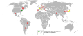 This shows the global distribution of passenger cars in use in 2000 as a percentage of the top market (USA - 212,706,400).

Article(s): This svg could replace the png version on [wikipedia.org/wiki/Automobile|Automobile].
Request: Something is wrong with my version of Inkscape, and I was wondering if someone else could save this with Illustrator or Inkscape to try and fix this problem. -- Nevetsjc (talk) 09:00, 19 June 2009 (UTC)
Graphist opinion:
- Fixed it, don't forget to transform your text in path, via the object menu. Esby (talk) 11:39, 21 June 2009 (UTC)
Dynamic range tricks[edit]
I recently took these two shots of the University of Washington's Clark Hall:
-
 Building looks good, but sky is washed out.
 -
 Sky looks great, but everything else is dark.
 -
 Best I could do with enfuse.
 -
 So I shot another photo.


My intent was to do the usual trick of getting the full dynamic range by layering one over the other (it was handheld, but they match pretty well with a tiny offset, easily handled by moving a layer a few pixels) and then applying something in the range of a 40-60% transparency to one of the photos. However, there was enough of a breeze that when I tried that I didn't like what happened to the tree. Anyone who is more of a whiz than I think this is salvageable? Open to any and all suggestions. - Jmabel ! talk 04:44, 8 July 2009 (UTC)
- I tried, but you're right, the tree doesn't look to good up close. I don't think it's so much the wind as the large difference in exposure and the bleeding of the sky over the tree in the more exposed image: there are parts of the tree that are pure white in the more exposed version and almost pure black in the less exposed one. No software is going to get good detail out of those parts. At least it looks OK if you don't look too closely. —Ilmari Karonen (talk) 01:36, 9 July 2009 (UTC)
Yeah, I'm afraid that's the story. I came back with a better camera & took another picture. Didn't have a copy of this one with me, so it turned out to be from a different spot, but still captures the building well. Sky's not perfect, but at least it isn't a washout. Guess we can mark this one "stale". - Jmabel ! talk 02:55, 9 July 2009 (UTC)
- I see you came up with yet another version. I actually think I liked your second version best — the composition seems nicer and focuses more on the building than on the grass and the sky. It could use tilt correction, though — let me see what I can do. —Ilmari Karonen (talk) 19:56, 9 July 2009 (UTC)
- Oh, never mind, I see that was another building. Couldn't have told them apart if you hadn't said so, though. :) —Ilmari Karonen (talk) 19:58, 9 July 2009 (UTC)
Piatt Castles[edit]
-
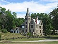 Mac-O-Chee Castle
 -
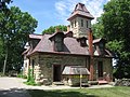 Mac-A-Cheek Castle
 -
 Montage


Article(s): Piatt Castles at en:wp
Request: -- Merge the two photos into a small montage with one photo on top of the other, in a format similar to that of File:Blood Run Site montage.jpg. Order doesn't matter. Nyttend (talk) 21:43, 9 July 2009 (UTC)
Graphist opinion:
- Done like that? --Yarnalgo (talk) 22:56, 9 July 2009 (UTC)
- Just what I wanted; thanks! Nyttend (talk) 13:17, 10 July 2009 (UTC)
-
 111th US Senate

Article(s): 111th United States Congress
Request: Illinois needs to be changed to the lighter blue, because of Obama's resignation from the US Senate.-- Ctjf83 (talk) 03:10, 24 November 2008 (UTC)
Graphist opinion:
- FYI - image is on wikipedia: [8] --J.smith (talk) 03:35, 24 November 2008 (UTC)
- He was replaced by another democrat, Roland Burris. Beao (talk) 21:27, 24 September 2009 (UTC)
Coat of arms of Pelagićevo[edit]

Article(s): w:Pelagićevo, w:sr:Пелагићево
Request: Can someone create .svg version of this coat of arms. Design can be found here. --BokicaK (talk) 03:39, 24 May 2009 (UTC)
Graphist opinion: Can you find a better image of the coat of arms? —Preceding unsigned comment added by Richardprins (talk • contribs) 13:25, May 28, 2009 (UTC)
This is the best image which I could find. --BokicaK (talk) 15:16, 30 May 2009 (UTC)
- Hi, I made the image, see the thumbnail. Is it correct? is there anything you'd like to change? please tell me. Richardprins (talk) 17:05, 3 June 2009 (UTC)
I'm delighted! :) But can You little center name ПЕЛАГИЋЕВО? --BokicaK (talk) 03:30, 4 June 2009 (UTC)
Improve images[edit]
-
 lighten main subject and white balance (?)
 -
 white balance


![[1]](https://sr.wikipedia.org/wiki/Image:Podela_jugoslavije_1941.png)
![[2]](https://sr.wikipedia.org/wiki/Image:Independent_State_of_Croatia_Map.jpg)
![[3]](https://en.wikipedia.org/wiki/Image:Western_Balkans_1942.2008.svg)
![[4]](http://www.heraldique-europeenne.org/Armoriaux/Gelre/Blasons/0300/0309_Dauphin.gif)
![[5]](http://quaranta1.chez-alice.fr/ecussons/provence_alpes_cote_d_azur/arvieux-blason.gif)
![[6]](http://cadeaux.tf1.fr/v2/genealogie_blasons/dauphin.gif)
![[7]](http://www.newgaso.fr/img/dauphin.gif)
Article(s): Jesuit Missions of the Chiquitos
Request: Can these low quality images be improved? Please see Category:San Javier, Ñuflo de Chávez for proper colors of the church. -- bamse (talk) 02:10, 10 June 2009 (UTC)
Graphist opinion:
- Done. --Jackl (talk) 10:14, 4 July 2009 (UTC)
==[edit]
Request: In Commons:Deletion requests/, User:Sdee said that the SVG version is totally different from the original one. However, I couldn't find that and he rejected to point out where was the differences at once. Therefore, I need helps on comparing these two images for any major differences. If there are differences, I wish there is someone else to help me on fixing it. Thank you! --CDIP No.150 repair meter 20:13, 28 June 2009 (UTC)
Graphist opinion:
- I commented on the DR. --Yarnalgo (talk) 20:36, 28 June 2009 (UTC)
Don't know why, but there is a black box at the centre of the svg. Please help me remove it. Thanks. --Jackl (talk) 05:02, 3 July 2009 (UTC)
- Done --Yarnalgo (talk) 17:16, 4 July 2009 (UTC)
Macedonian Wikipedia Logo[edit]
-
 The logo used by mk.wikipedia.org
Article(s): On the whole project, in the upper left corner, so basically — in every article.
Request: Hi. I need an expert who can cast an eye on this .png image and literally polish the logo around the edges a little bit. Check out the mk donation landing page that uses the logo — it has white lines surrounding the edges of the text and the puzzle ball. Can someone check upon it for errors/optimize it/upload a better version? Thank you in advance --Brainmachine (talk) 11:02, 23 July 2009 (UTC)
Graphist opinion:
Fixed. ¦ Reisio (talk) 23:58, 27 July 2009 (UTC)
Pat Nixon Signature SVG[edit]
-
 Raster
 -
 Vector
Please improve the vector to look more alike the raster. Connormah (talk) 22:34, 5 August 2009 (UTC)
- Please see
Wikipedia:Wikipedia:Graphic Lab/Image workshop#Request for improvement: Pat Nixon Signature.svg. Certes (talk) 01:23, 17 August 2009 (UTC)- Request now resolved and archived at WP:GL/I. Details at w:Wikipedia:Graphic Lab/Image workshop/Archive/Sep 2009#Request for improvement: Pat Nixon Signature.svg. Certes (talk) 13:06, 10 September 2009 (UTC)
Fix please[edit]
-
 It suppose to look like the second version of the file. I am a SVG novice coder, and I do not know what's wrong. Thanks.
Request: -- Jackl (talk) 11:09, 27 August 2009 (UTC)
Graphist opinion: