Commons:Graphic Lab/Illustration workshop: Difference between revisions
| Line 785: | Line 785: | ||
:::::: {{Ping|Glrx}} as initial [[:file:Chronologie_constitutions_françaises.png]] is (PD), I was on the way to release my contributions as (CC-0). [[User:En rouge|En rouge]] ([[User talk:En rouge|<span class="signature-talk">{{int:Talkpagelinktext}}</span>]]) 21:24, 15 August 2022 (UTC) |
:::::: {{Ping|Glrx}} as initial [[:file:Chronologie_constitutions_françaises.png]] is (PD), I was on the way to release my contributions as (CC-0). [[User:En rouge|En rouge]] ([[User talk:En rouge|<span class="signature-talk">{{int:Talkpagelinktext}}</span>]]) 21:24, 15 August 2022 (UTC) |
||
::::::: {{Ping|En rouge}} so may I release the SVG as CC-0? [[User:Glrx|Glrx]] ([[User talk:Glrx|<span class="signature-talk">{{int:Talkpagelinktext}}</span>]]) 22:31, 15 August 2022 (UTC) |
::::::: {{Ping|En rouge}} so may I release the SVG as CC-0? [[User:Glrx|Glrx]] ([[User talk:Glrx|<span class="signature-talk">{{int:Talkpagelinktext}}</span>]]) 22:31, 15 August 2022 (UTC) |
||
:::::::: {{Ping|Glrx}} it's up to you, either CC-0 (my initial will), CC-4 (Commons's default), or CC-3 as it is already. [[User:En rouge|En rouge]] ([[User talk:En rouge|<span class="signature-talk">{{int:Talkpagelinktext}}</span>]]) 00:08, 16 August 2022 (UTC) |
|||
::: {{Ping|Mathglot|Glrx}} as written above, my last proposal is draft [https://upload.wikimedia.org/wikipedia/commons/archive/b/bd/20220815131206%21Test.svg 2022-08-15]: |
::: {{Ping|Mathglot|Glrx}} as written above, my last proposal is draft [https://upload.wikimedia.org/wikipedia/commons/archive/b/bd/20220815131206%21Test.svg 2022-08-15]: |
||
:::* slanted text @20°, more readable than text @45° |
:::* slanted text @20°, more readable than text @45° |
||
Revision as of 00:08, 16 August 2022
| Illustration Workshop | Map Workshop | Photography Workshop | Video and Sound Workshop |
 Illustration workshop
This workshop is part of the Graphics Lab, a project aimed at picture retouching to improve the graphical content of the Wikimedia projects. More information about the lab can be found on its main page and requests pages (Illustrations ; Photographs ; Maps ; Video and Sound). To ask questions or make a suggestions, see the talk page of the graphic lab page.
This specific page is the requests page for the Illustration Workshop. Anyone can make a request for an illustration to be created or improved. The standard format for making a request is shown below, along with general advice, and should be followed.
Make a request
Use the following template when making a new request, replacing the examples with your image(s) and request(s):
<gallery>
 IMAGENAME.EXT|Description of image
 IMAGE#TWO.EXT|2nd image (If there is one)
 ETCETCETC.EXT|Don't request too many at once, though
</gallery>

;Request:
: Details of your request go here… --~~~~
;Graphist opinion(s):
See also
| SpBot archives all sections tagged with {{Section resolved|1=~~~~}} after 7 days and sections whose most recent comment is older than 60 days. For the archive overview, see /Archive. The latest archive is located at /Archive/2024. | |
Vector diagrams for linear patterns of the skin
-
 Langer's lines
 -
 Dermatomes


Article(s): en:Langer's lines, en:Blaschko's lines, en:Dermatome (anatomy)
- Request
- I think it would be nice to have standardized vector images for the three common linear patterns of the skin (i.e., Langer's lines, Blaschko's lines, and dermatomes). This article has diagrams of all three of them, but you may want to look at several images for each because there's some variability between different representations.
- As far as the styles of the illustrations, the format of side-by-side anterior and posterior views is the most common.
- From a scientific standpoint, one important consideration to remember is that Langer's lines represent a vector field of skin tension, while Blaschko's lines and dermatomes are used to demarcate particular segments of skin. In other words, for Langer's lines, the lines themselves are what's important, while for Blaschko's lines and dermatomes, it's the segments of skin between the lines that are important. This should influence the choice of coloring style. I think it's going to be too complicated to accurately color Langer's lines and I haven't found any images attempting it, so those don't need to be colored. For the other two, the segments should be colored (we don't even technically need lines between them if the contrast between the colors is enough to see the boundaries between the segments, but I'll defer to your judgement on that). The unique thing about Blaschko's lines is that they have a directionality to them, from back to front (i.e., wrapping around from spine to navel), from medial to lateral (shoulders to fingers) and from top to bottom (hips to toes). The image here may show the directionality a bit better for the legs. I'm not sure what the best way to show the directionality of the segments will be, but perhaps shading them so the beginning is more saturated than the end. Dermatomes should be filled with color according to the level of the nerves innervating them, as shown here.
- Thanks, and happy to discuss further. --Rob Hurt (talk) 00:10, 26 October 2021 (UTC)
- Graphist opinion(s)
![]() Request taken by --please ping me-- Goran tek-en (talk) 15:10, 26 October 2021 (UTC)
Request taken by --please ping me-- Goran tek-en (talk) 15:10, 26 October 2021 (UTC)
@Rob Hurt: I will really need your help all the way here. So you want three different images each representing different lines; Langer's lines, Blaschko's lines, and dermatomes. So first we will have to find a body illustration that can be used for them all. After that I will check more into each and will for sure have questions. --please ping me-- Goran tek-en (talk) 15:10, 26 October 2021 (UTC)
Base bodies
| Extended content |
|---|
@Rob Hurt: Now I finally have the drafts for the bodies, sorry it took so long.
We now (if those are fine with you) have to decide how you want the bodies:
|
Langer's lines
| Extended content |
|---|
|
Rob Hurt, Could you link me to a few of the best images you know of regarding Langer's lines, thanks. --please ping me-- Goran tek-en (talk) 11:51, 15 November 2021 (UTC)
|
@Rob Hurt Now you can find them here; Langer's lines 3D shaded true SVG. If you don't see any problems there this part should be ![]() Done
Done
- For the "gender-neutral version" I'm struggling. If you search for "Androgynous human body illustration" there is not much difference to them and what we have, the genital parts are toned down in the ones we have here already. I do understand your point but to me the people censoring stuff like this is living in a world which I don't want to be a part of. And it will be so hard to decide how to look e.g. would male breasts be fine but not female breasts etc. Can we leave it for now and return later on.
Blaschko's lines
| Extended content |
|---|
|
Can you give me a short explanation and link to images which you say is representative for what you want. --please ping me-- Goran tek-en (talk) 19:02, 8 December 2021 (UTC)
Rob Hurt Here you have to check if those lines a good for Blaschko. Don't think about lines sticking out, will fix that later. Those drafts are PNG versions of the original SVG file I'm working in and will upload to commons. Draft-1 100%
|
Rob Hurt I haven't heard from you in a while so now I have uploaded the Blaschko files and you can find them here: Blaschko's lines, patterns 3D shaded true SVG
- I had to guess some for description and so. It would be great if you could check and let me know if there is anything that needs to be changed.
- So if this is done what is the third type of illustrations you want? --please ping me-- Goran tek-en (talk) 19:11, 17 March 2022 (UTC)
- @Goran tek-en sorry for the delay, but yes those look good and I'll probably make a few minor edits to the metadata.
Dermatomes
| Extended content |
|---|
|
The last type of illustration would be dermatomes, which do have a very specific and consistent structure to how they are arranged, and are separated into C, T, L, and S subsets. There are some vector images here already, but they're cartoonish and not very accurate. Can you use this and this image as your guides to overlay onto the base bodies you have? Rob Hurt (talk) 01:04, 23 March 2022 (UTC)
|
- @Goran tek-en Four general points to start: first, the diagrams aren't exact down to the centimeter, and there's variability among individuals in terms of which nerves innervate which patches of skin, and sometimes multiple nerve fibers can innervate the same patch; second, some diagrams show the developmental innervation and some show the clinical innervation, and the maps were also determined in different ways throughout medical research history, so that's why there can be differences; third, even though all the nerves exit from the spinal cord, they can surface anywhere, so the patches of skin don't have to be connected in any particular way. Nerves can also branch, and depending on where that happens, it can lead to areas that are innervated by the same nerve that aren't next to each other; fourth, we don't always expect patches to wrap from front to back--each patch has a line separating it from its neighbors, and sometimes those lines can occur on the sides of the body and aren't shown in the diagrams. This should help with the hands, and you can look at A and B of this to refine the legs, but you'll see that some of the boundaries are on the side of the leg. Let me know if you have more questions. Rob Hurt (talk) 02:08, 23 May 2022 (UTC)
- @Rob Hurt I haven't understood that the areas originated from nerves, that explains a lot. I believed that it was areas on the surface of the skin, so now I understand more your points, thanks.
- New drafts and the codes I don't have is marked X1 etc. draft front back. --please ping me-- Goran tek-en (talk) 19:42, 26 May 2022 (UTC)
- @Goran tek-en Good, I'm glad that clarified things.
- Those nerves originate from several nerve roots, and branch in the arm to innervate different patches of skin. But if you want a code for them, it would be:
- X1: C8, T1
- X2: C6-8
- X3: C6-8
- Rob Hurt (talk) 23:41, 27 May 2022 (UTC)
- @Rob Hurt It's not what I want, it's your request so you say if you want codes or not. If you want you can have two versions, with and with out codes.
- Draft for your feedback, check everything, thanks. --please ping me-- Goran tek-en (talk) 10:57, 31 May 2022 (UTC)
- @Goran tek-en Ok I think this looks great. Rob Hurt (talk) 01:04, 6 June 2022 (UTC)
- @Rob Hurt Should the male illustration be the same or any changes? --please ping me-- Goran tek-en (talk) 16:51, 8 June 2022 (UTC)
- @Goran tek-en Nope I think they should be the same. Rob Hurt (talk) 19:18, 8 June 2022 (UTC)
- @Rob Hurt Sorry for the delay but my family is having a bad time, will be back in due time. --please ping me-- Goran tek-en (talk) 16:49, 18 June 2022 (UTC)
- @Goran tek-en No problem, that's much more important, and I hope everything works out ok. Rob Hurt (talk) 22:12, 20 June 2022 (UTC)
- @Rob Hurt So now I'm finally back.
- Here you have two drafts and check everything, thanks.
- without text
- with text --please ping me-- Goran tek-en (talk) 11:47, 15 August 2022 (UTC)
- @Goran tek-en No problem, that's much more important, and I hope everything works out ok. Rob Hurt (talk) 22:12, 20 June 2022 (UTC)
- @Rob Hurt Sorry for the delay but my family is having a bad time, will be back in due time. --please ping me-- Goran tek-en (talk) 16:49, 18 June 2022 (UTC)
- @Goran tek-en Nope I think they should be the same. Rob Hurt (talk) 19:18, 8 June 2022 (UTC)
- @Rob Hurt Should the male illustration be the same or any changes? --please ping me-- Goran tek-en (talk) 16:51, 8 June 2022 (UTC)
- @Goran tek-en Ok I think this looks great. Rob Hurt (talk) 01:04, 6 June 2022 (UTC)
- @Goran tek-en Four general points to start: first, the diagrams aren't exact down to the centimeter, and there's variability among individuals in terms of which nerves innervate which patches of skin, and sometimes multiple nerve fibers can innervate the same patch; second, some diagrams show the developmental innervation and some show the clinical innervation, and the maps were also determined in different ways throughout medical research history, so that's why there can be differences; third, even though all the nerves exit from the spinal cord, they can surface anywhere, so the patches of skin don't have to be connected in any particular way. Nerves can also branch, and depending on where that happens, it can lead to areas that are innervated by the same nerve that aren't next to each other; fourth, we don't always expect patches to wrap from front to back--each patch has a line separating it from its neighbors, and sometimes those lines can occur on the sides of the body and aren't shown in the diagrams. This should help with the hands, and you can look at A and B of this to refine the legs, but you'll see that some of the boundaries are on the side of the leg. Let me know if you have more questions. Rob Hurt (talk) 02:08, 23 May 2022 (UTC)
Seal of the General Secretary of the Workers' Party of Korea
-
 Base image

Article(s): w:General Secretary of the Workers' Party of Korea
- Request
- An user posted a tweet to my talk page show a document seal of the General Secretary of the Workers' Party of Korea, it would be nice to make it vectorised. --Great Brightstar (talk) 14:43, 20 June 2022 (UTC)
- Graphist opinion(s)
- Is there any evidence that indicates this seal design is in the public domain (author life + 50y), per the North Korean law? Guessing from the dates in that tweet collage, it looks like WPK Chairman emblem.svg is the older version of the seal, and they designed a new seal in Jan 2021? 痛 (talk) 17:32, 20 June 2022 (UTC)
- I believe that the seal design is in public domain due to it being used for state management without commercial purpose. Migs005 (talk) 05:00, 21 June 2022 (UTC)
- Sorry for the delay. It looks like the image is too blurred for me to nail down the details. Is it possible to find some high-resolution images of the seal? I Googled around in English but to no avail. --痛 (talk) 01:06, 16 July 2022 (UTC)
Fictional province of Empolese-Valdelsa
-
 Drawn with Inskcape but poor detail

Article(s): it:Utente:Carnby, it:Unione dei comuni Circondario dell'Empolese Valdelsa
- Request
- Could you please improve a bit the prancing donkey details?--Carnby (talk) 04:19, 21 June 2022 (UTC)
- Graphist opinion(s)
Atlas of the Munsell Color System
-
 Scanned copy of work
Article(s): s:Index:Atlas of the Munsell color system.djvu
- Color realignment of scans
- The colors in this are yellowed/faded. However, I've found that at some point certain tones in Munsell's system were formally defined, so it should in the theory be possible to use the information in this work, coupled with some formally defined 'renotation' data, to determine a color correction that can be applied to these (and other scans).
- I appreciate that this is a long-term request, and may need a semi-expert to figure out the relevant correction factor(s) to be applied.
- (In some other fields there is the concept of a 'crib'. I am wondering if this can be approrpiately corrected, Commons would have a 'color crib' which could be used to help color shift other images, requested for retouching.
- Additional Notes:
- I'm not sure if a simple one stage correction can be applied.
- Differing pigments may have different degrees of shift.
- At some point the Munsell system was rescaled?
--ShakespeareFan00 (talk) 10:27, 22 June 2022 (UTC)
- Graphist opinion(s)
- @ShakespeareFan00: Hi,
- I don't know if it's really a good idea to adjust colors of this atlas.
- In my opinion, it seems that keeping this book as is, as it was published, as it has aged, as it has been scanned is worth it.
- I think it's better to build brand new plates (in svg format for instance – as done in [1]–), referring to this album, to explain and illustrate Munsell system.
- En rouge (talk) 20:40, 29 June 2022 (UTC)
- Moreover, the atlases at [2], [3] and [4] (I don't know if they are the same, or same as your previous link, but I mention them as reminders) can be of any help.
- En rouge (talk) 21:19, 29 June 2022 (UTC)
- @En rouge: It would still be nice to have version of the Plates of this as SVG though. The other point about having a corrected version for references was that by having a non-faded version of this, it would be possible to have some kind of benchmark that could be used to assist other color correction efforts on Commons.
ShakespeareFan00 (talk) 22:48, 29 June 2022 (UTC)
- As a temporary measure, having JPG's for the Plates would still of course be useful :) ShakespeareFan00 (talk) 22:48, 29 June 2022 (UTC)
- I will make first the SVG of the Plates. About to restore the scan, I'm thinking to first correct the yellowish colour of the pages caused by the time, and then correct the color charts to match the SVG, because we can't know how the original pigment was. What do you think? Núria Florensa Adell (talk) 15:08, 21 July 2022 (UTC)
- That was exactly the kind of approach I was suggesting :). If it's possible by taking that approach, to also note how specific pigments are affected by fading and yellowing, then that is also critical information that could help improve color corrections performed on other images. Here there are 'defined' colors to some extent, and it should be possible to determine more quantatively what color shifts affect older works ( and scans) with color reproductions in them. I would strongly suggest, if you hadn't considered doing so, documenting the process you undertaken somehow (Wikiversity would be a good place for something like that.)ShakespeareFan00 (talk) 15:19, 21 July 2022 (UTC)
- Sobre determinar com cada pigment és afectat per l'engroguiment (yellowing) i el descoloriment, no tinc els coneixements per fer-ho i aplicar-ho a correccions. Requeriria matemàtiques complexes i penso que no val la pena. No crec ni que sigui plausible:
- - El descoloriment depèn del temps d'exposició a la llum, la intensitat i la freqüència de la llum, l'estructura química del pigment en qüestió... Circumstàncies que o desconeixes o, coneixent-les, quantificar-les per utilitzar un algoritme corrector seria impracticable
- - L'engroguiment depèn de l'acidesa del paper, la composició del paper, l'ambient on a estat exposat...
- - Has de conèixer exactament quin pigment es va utilitzar
- Que consti que jo no sóc experta en la matèria, quins coneixements tens tu sobre el tema?
- Mètode per restaurar obra impresa amb el GIMP
- Avís: és el que faig servir jo, pot haver-n'hi de millors, no n'he fet recerca
- Engroguiment (yellowing)
- Amb el comptagotes, prendre una mostra ponderada (com més gran millor) d'una zona que hauria de ser blanca (assumim que era blanc pur)
- Crear una nova capa "yellowing" del color del primer pla que acabem d'agafar-ne mostra
- Configurar el mode de la capa "yellowing" com a "divideix" (Divide)
- Això seria equivalent a fer un balanç de blanc, però té l'avantatge, que si és un llibre i totes les pàgines tenen la mateixa afectació, no cal fer-lo cada vegada i no hi ha variacions, totes es corregeixen uniformement.
- Descoloriment (fading)
- Veure si hi ha una zona no (tant) descolorida, per exemple, dels llibres s'acostuma a descolorir el llom però no pas les cobertes. Si a la zona no afectada hi ha colors que estan afectats en una altra zona, es poder fer servir de referència
- To be continued
- Faré recerca, ho perfeccionaré i en faré un tutorial a Wikiversity Núria Florensa Adell (talk) 21:55, 21 July 2022 (UTC)
- Do you understand Catalan, or Spanish? I understand English, but to explain complex and technical things it's difficult to me. Núria Florensa Adell (talk) 18:10, 21 July 2022 (UTC)
- I don't speak Spanish or Catalan sorry. Is there process for finding translators on Commons? ShakespeareFan00 (talk) 19:01, 21 July 2022 (UTC)
- I don't know, but i'm writing my response in english and I am achieving it, but I take so long Núria Florensa Adell (talk) 19:04, 21 July 2022 (UTC)
- If you feel more comfortable in catlan, My response (using the Translator in Duck Duck Go)(I have no control over any translation errors):-
- Aquest era exactament el tipus d'enfocament que estava suggerint :). Si és possible prenent aquest enfocament, per observar també com els pigments específics es veuen afectats per l'esvaïment i el color groguenc, llavors això també és informació crítica que podria ajudar a millorar les correccions de color realitzades en altres imatges. Aquí hi ha colors "definits" fins a cert punt, i hauria de ser possible determinar de manera més quantativa quins canvis de color afecten les obres més antigues (i les exploracions) amb reproduccions de color en elles. Us suggeriria encaridament, si no us haguéssiu plantejat fer-ho, documentar el procés que heu emprès d'alguna manera (Wikiversity seria un bon lloc per a una cosa així).)
- ShakespeareFan00 (talk) 19:17, 21 July 2022 (UTC)
- La correcció és correcta. Jo puc entendre't bé en anglès, sense traductor, però al escriure trigo molt. Núria Florensa Adell (talk) 20:15, 21 July 2022 (UTC)
- I don't know, but i'm writing my response in english and I am achieving it, but I take so long Núria Florensa Adell (talk) 19:04, 21 July 2022 (UTC)
- I don't speak Spanish or Catalan sorry. Is there process for finding translators on Commons? ShakespeareFan00 (talk) 19:01, 21 July 2022 (UTC)
- That was exactly the kind of approach I was suggesting :). If it's possible by taking that approach, to also note how specific pigments are affected by fading and yellowing, then that is also critical information that could help improve color corrections performed on other images. Here there are 'defined' colors to some extent, and it should be possible to determine more quantatively what color shifts affect older works ( and scans) with color reproductions in them. I would strongly suggest, if you hadn't considered doing so, documenting the process you undertaken somehow (Wikiversity would be a good place for something like that.)ShakespeareFan00 (talk) 15:19, 21 July 2022 (UTC)
- He fet recerca (és un tema que desconeixia totalment) i me'n adono que és molt més complex perquè són escales perceptuals. Veig que hi ha fonts amb els paràmetres de cada color (varien segons l'edició de l'atles)(veure discussió), però no es poden aplicar directament de forma digital, s'ha de fer una conversió complexa. Si @Jacobolus em pogués ajudar a obtenir els valors RGB, jo podria llavors editar l'atles per a que els colors fossin els originals. Ell segurament podrà respondre't sobre les part tècniques sobre el factor de conversió que proposes Núria Florensa Adell (talk) 22:21, 21 July 2022 (UTC)
- I will make first the SVG of the Plates. About to restore the scan, I'm thinking to first correct the yellowish colour of the pages caused by the time, and then correct the color charts to match the SVG, because we can't know how the original pigment was. What do you think? Núria Florensa Adell (talk) 15:08, 21 July 2022 (UTC)
- As a temporary measure, having JPG's for the Plates would still of course be useful :) ShakespeareFan00 (talk) 22:48, 29 June 2022 (UTC)
- I would recommend against trying to re-color this. There is no way the colors of the physical artifact are precisely as they were in 1915, and there were various changes made to the Munsell Book of Color over time. The Optical Society of America measured the colors in a version of the Munsell Book from about 1930 (if I recall correctly), and then developed the “Munsell renotations” in 1943, which were used subsequently to define the Munsell system. But none of these will precisely match the colors from 1915. Moreover, I would expect some of the colors to not be reproducible on computer displays. I think you should leave this scan as-is. Edit to add: this Atlas is not the full Munsell Book of Color (not sure when the first version of that was published), but only a small subset of color chips used for explaining the system. The color chips in the scan here actually look reasonably good to my eye (the paper yellowed a lot more than the paint chips). I think this scan already does a pretty good job of demonstrating the Munsell color system, and giving useful historical perspective. For any more precise technical purpose this is not the source to look at. –Jacobolus (talk) 23:39, 21 July 2022 (UTC)
- That is a reasoning I can understand. Do you have a suitable wording I could add to any scan images uploaded, to say the color reproduction should not be trusted for professional work etc?
- My other question would be, is there material supporting the formal definition of the Munsell system (you mention the renotation) that is copyright free? (I highly doubt there is but would welcome more information). ?
- ShakespeareFan00 (talk) 05:55, 22 July 2022 (UTC)
- I will correct the yellowing (above I had explain the method I use). Pigments, not being exposed to light being inside the book, will not have been faded significantly.
- This data about the 1929 edition (the edition of the scan) is not correct? They are measurements taken years after the edition or are the values used to create that edition?
- Thanks! Núria Florensa Adell (talk) 10:43, 22 July 2022 (UTC)
- Sorry, I see that it's the 1915 edition, i don't know how I looked to it Núria Florensa Adell (talk) 10:51, 22 July 2022 (UTC)
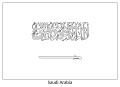
SVG flags of Saudi Arabia with incorect calligraphy
-
 Correct flag
 -
 Flag with incorrect calligraphy
 -
 Comparison of the two versions

.svg)
List of images
-
 Vertically hung flag
 -
 90 degrees rotated
 -
 Coloring page
 -
 Obverse civil ensign
 -
 Naval ensign
 -
 Naval flag
 -
 Royal standard of the crown prince
 -
 Air force ensign
 -
 Flag of the Air Defense Forces
 -
 Flag of the Royal Saudi Air Force
.svg)
.svg)
.svg)
.svg)


.svg)
Article(s): various
- Request
- Several versions of the Saudi flag have a different calligraphy for the Shahada than in the official description (see p. 10). I haven't checked the raster flags, since those will be harder to update. --–LaundryPizza03 (dc̄) 15:04, 26 June 2022 (UTC)
- Graphist opinion(s)
If File:Flag of Saudi Arabia.svg remains stable for a period of time, then I will update the construction sheet and the colouring page. I am not rushing ahead because I am not convinced that the edit war is over. There have been 22 reverts to File:Flag of Saudi Arabia.svg in the last 9 days and the file remains unlocked. MapGrid (talk) 01:42, 28 June 2022 (UTC)
Vectorization of coat of arms and flag of Albanian Republican Guard
-
 Coat of arms (jpg format)
 -

-
 Flag (jpg format) The black eagle is surrounded by a thin yellow thread.
 -


-

-

-
 If the helmet is not good, remove it from here
 -
 This file is considered invalid revision and the twigs are not drawn well but could use as a basis.


Article(s): en:Republican Guard (Albania)
- Request
- Convert to SVG
- If someone could convert this coa and flag to SVG would be nice. Thank you in advance. --AT44 (talk) 10:44, 28 June 2022 (UTC)
- Graphist opinion(s)
- @AT44: I am unable to fulfill the request, but I found ready-made items that can help. Swiãtopôłk (talk) 08:15, 1 july 2022 (UTC)
- @AT44:
 Half done. The patterns on the goat crown are too hard to see; the twig structure is too time consuming to reproduce exactly the way it looks. I will leave those to anybody else interested in improving them. 痛 (talk) 02:42, 16 July 2022 (UTC)
John Vaughan's proposed flag for North Queensland
-
 Blank blue ensign

Article(s): State of North Queensland
- Request
- Will someone please create an SVG file of John Vaughan's flag proposal for the hypothetical Australian state of North Queensland, as seen in this photo here. Thanks. Snow Lion Fenian (talk) 14:42, 29 June 2022 (UTC)
- Graphist opinion(s)
Hmm... Snow Lion Fenian, do you have a better image than this to show the full graphical details of that flag, ideally from a more reliable source? 痛 (talk) 10:22, 20 July 2022 (UTC)
- @痛: Sorry for the delay in responding. Well, the only other source on this I can find so far is this particular passage from the FOTW website, which describes (but unfortunately doesn't show) John Vaughan's design proposal. But I can keep looking, and I'll be sure to show you any pictures I find. Snow Lion Fenian (talk) 15:22, 30 July 2022 (UTC)
- Thanks. And what would be the copyright status for this flag? I just noticed that Australia has a low threshold of originality. 痛 (talk) 23:14, 6 August 2022 (UTC)
Coopérative de Transport Maritime et Aérien

- Request
- Please add vectorized versions of these flags. This time I gave the names
- @Swiãtopôłk: Please for Coopérative de Transport Maritime et Aérien (CTMA) and the copyright issue, let us know En rouge (talk) 20:38, 7 July 2022 (UTC)
- @En rouge: You can make it, it should not meet the threshold of originality in Canada. By the way, I had not noticed before that the flag has a different version of the logo than the one provided in the article [5]. Swiãtopôłk (talk) 21:57, 7 July 2022 (UTC)
- @Swiãtopôłk: OK, but the proposed flag sample is not sufficient to get the appropriate design, as this will lead to a new, created design.
- Uncertainties are:
- star appearance – two options exist, aligned branches vs. circumflex branches –
- outer outline – two options again, equal left/right height vs. left height less than right height –
- And I can't find another photo...
- Moreover, I found an alternative flag design (you can zoom into the picture).
- En rouge (talk) 21:24, 9 July 2022 (UTC)
- @En rouge: I am also not able to find much reliable information, but I am sure that the outline resembling the chimney of the ship is higher on the "a" side. The photo clearly shows an equal star that does not touch the circle, so stick with it. The proportions of the flag resemble Canada, which makes sense as flags with similar proportions look nice side by side. An alternate flag shows this logo, part of it is non-free graphics with complicated shading. I hope I have answered all your questions. Swiãtopôłk (talk) 22:57, 9 July 2022 (UTC)
- @En rouge: You can make it, it should not meet the threshold of originality in Canada. By the way, I had not noticed before that the flag has a different version of the logo than the one provided in the article [5]. Swiãtopôłk (talk) 21:57, 7 July 2022 (UTC)
- @Swiãtopôłk: as written above, about an alternative flag design,
- this becomes a reality...!
- Using maps.google.com, to look for Coopérative de Transport Maritime et Aérien settlements, I browsed associated private photos. And this alternative flag design appears to be the flag in use.
- The proposed photo of the flag, from Commons: Drapeau du groupe CTMA.JPG:
 , is dated 2011-08-22 (uploaded 2013-06-07).
 - Found photos (from maps.google.com) are dated 2016-08 to 2021-08: [6], [7], [8], [9] and [10]
- The only old flag (Drapeau du groupe CTMA.JPG) was found in a photo (dated 2019-08): [11].
- What are your thinkings? Yours, En rouge (talk) 21:57, 10 July 2022 (UTC)
- @En rouge: I'd rather just leave a description ,,The flag fell into disuse in the second half of the 2010s and has been informally replaced by a copyrighted projector,,. The big problem with this topic is that the company doesn't really care about its flags and doesn't leave too much information. Swiãtopôłk (talk) 19:28, 11 july 2022 (UTC)
- @Swiãtopôłk: I think it's better to pause about House flag of the Coopérative de Transport Maritime et Aérien (CTMA).svg (#6), without any more information!
- Please, have a request at a later time. Yours, En rouge (talk) 01:11, 13 July 2022 (UTC)
Colorize
-
 This is my draw
 -

.jpg)
.png)
Article(s): en:Ah-ai Grotto, zh:阿艾石窟
- Request
- My drawing cannot be colored due to technical reasons, reference is here. --Thyj (talk) 06:58, 18 July 2022 (UTC)
- Graphist opinion(s)
@Thyj: Here you go. This is as far as I can progress before I ran out of patience on this one. 痛 (talk) 00:57, 7 August 2022 (UTC)
- The coloring is wrong. Thyj (talk) 04:42, 7 August 2022 (UTC)
- Sorry. But now you would want to find someone else on this page to do the color correction for you. The original restoration contains a lot of details, and I know mine did not cover all of them, but my hand hurt badly after yesterday's effort. 痛 (talk) 14:53, 7 August 2022 (UTC)
GIF creation request


Article(s): Venezia on italian Wikivoyage
- Request
- I wish that the left circles column go from up to down and right circles column go from down to up, perhaps starting out of image and going out of image and in loop. Many thanks in advance!!! --Gatto bianco (talk) 15:48, 26 July 2022 (UTC)
- Graphist opinion(s)
- @Gatto bianco: Please specify which Wikipedia article this GIF would be used in. —RCraig09 (talk) 16:07, 26 July 2022 (UTC)
- @RCraig09: Actually not for a Wikipedia article, it is more required on Wikivoyage for explain how people should walk in Venice. --Gatto bianco (talk) 16:15, 26 July 2022 (UTC)
@Gatto bianco: While I can produce exactly what you proposed, I made these arrow GIFs instead for the following three reasons:
- they print better
- they scale better to a smaller size
- they are more generic and can be reused for general traffics that includes driving, cycling and walking.
-- 痛 (talk) 01:21, 7 August 2022 (UTC)
- Graphist annoyance
- Hi @Gatto bianco: you made the same request, here and in c:GL/V GIF creation request, on the same date.
- Moreover, no indication, no links between the requests.
- Please avoid this!
- Luckily, the two graphists : @Tfbybyhf and 痛: have different solutions to your need. This improves the amount of animated GIFs available.
- I duplicate – me too – this comment for the given annoyance, in the other page. Yours, En rouge (talk) 14:20, 9 August 2022 (UTC)
Reconstruction of the coast of arms and emblems of the main medieval Albanian noble families
Article(s): Muzaka, Dukagjini, Thopia, and many more.
- Recently most, if not all, the coat of arms of Albanian noble families were removed on Wikipedia because they were copyright infringements. My request is to make reconstructions of those emblems. In other words, I am not asking for the emblems to be identical to the ones that will be depicted in the sources, but to be inspired from them and to be drawn in a style in accordance with other emblems on Wikipedia. For this request I need a graphist who has experience with medieval European heraldry. The coat of arms that need a reconstruction are listed hereunder:
- Muzaka: The coat of arms of the Muzaka family is said to be a two-headed eagle.[12] A fresco of the coat of arms exists in Italy on a propriety of the family:vatrarberesh.it p=48.
- Dukagjini:The emblem of the Dukagjini is a one-headed white eagle.[13][14]
- Thopia: The coat of arms of this family is a lion holding a sword with lilies [from the book of the author Genc Myftiu, titled "Albania, a patrimony of European values: a short encyclopedia of Albanian history and cultural heritage", quote: The emblem of his principality was a lion with Angevin lilies.]
- Engjelli family:The emblem of the family is a red cross on a white background with an angel holding some kind of leaf.[15]
- Skuraj family: The symbol of this family is a wolf with a lily and a banner with three stars, the stone fresco of this emblem can be found in the following source:[16]. The emblem of the capital of Albania, Tirana is based on this symbol.
- Spani: The emblem of the Spani was an arm holding a sword with three roses. The source for this symbol is the same as the one for the Engjelli.
On internet I found examples [17][18][19][20] of how I imagine the reconstructions could look like, if the end result is similar to those examples that would be ideal! Many thanks to whoever is wanting to make the emblems! Ahmet Q. (talk) 08:09, 1 August 2022 (UTC)
- Graphist opinion(s)
Replacement of text in translation of existing image File:Chronologie_constitutions_françaises.png
-
 PNG timeline

I only just learned of this page; my request is already posted at en-wiki's Graphics lab, here, but I think it's not as active as it once was, because it was posted on 3 July, and this and several other requests have gone without response.
Please let me know whether it's better just to leave this pointer in case someone would be able to work on it there, or whether I should close that one, and reopen it here.
![]() Courtesy link: en:WP:GL/I#Request translation of existing image c:File:Chronologie_constitutions_françaises.png
Courtesy link: en:WP:GL/I#Request translation of existing image c:File:Chronologie_constitutions_françaises.png
Thanks, (ping, please) Mathglot (talk) 01:36, 4 August 2022 (UTC)
@Mathglot: I can fully recreate this PNG in the SVG format to make any translation work easier. But given that France has a long history and that English is written left-to-right not top-to-bottom, this image shows in Wikipedia thumbnails better if oriented vertically instead. How would you feel about that? 痛 (talk) 01:35, 7 August 2022 (UTC)
- @痛: Thanks for responding. An svg sounds great! I'm actually not planning to use a thumbnail in the article, but a page-wide image; see en:Draft:List of political systems in France for how that looks. This is a somewhat unusual usage of an image, but I think it works well in this case. I consider the diagram an integral part of the page content, and not just a teaser to click on and blow up to see more detail. (I've checked the draft in the mobile view gadget as well as from a smart phone; it generates a horizontal scrollbar, of course, but it looks fine.)
- That said, I can see an argument for having a vertical rendering of it which might work flush right, but I'd use it at a size similar to the full-width example, so it might span the entire length of the article, depending how long it is. If a thumbnail works better on a vertical than a horizontal image, and we need to have a thumbnail version for technical reasons, is there a way of just showing part of the image, maybe via annotated image or similar? I don't want to double the work involved, but how hard would it be to have both versions, horizontal and vertical? It seems to me the horizontal image works well at the Draft (plus most timelines are horizontal, aren't they?) and after the Draft is released, I was planning to add the timeline to all the other articles in en:Category:Constitutions of France (and a few others), but perhaps other editors might prefer the vertical one in some cases?
- By the way, the Draft is just that—a draft, so if you decide to take this on and want to play around with trials of different image versions in context, go ahead and edit the Draft to place any kind of image you want there, vertical or horizontal, finished or not, several at once to compare—it's all good. Thanks again, Mathglot (talk) 03:03, 7 August 2022 (UTC)
- Work in progress
-
 Chronologie constitutions françaises.svg (fr) SVG in French, as PNG above
For draft version, please see Test.svg (depending on the activity, eventually see file history) -
Chronologie constitutions françaises.svg (en) SVG in English, from French SVG sibling, with requirements and translation given in (en) WP
For draft version, please see Test.svg (depending of the activity, eventually see file history) -
 Chronology of French Constitutions.svg EN, vertical, work-in-progress


@Mathglot and 痛: Hi, I already have a french SVG version (linear, horizontal, as is source PNG above), hope to have an english one soon. En rouge (talk) 02:38, 9 August 2022 (UTC)
- @En rouge: For a second I thought we are stepping on each other's work 🤪.
It looks like your file name listed above may be incorrect?--痛 (talk) 03:04, 9 August 2022 (UTC) - Nevermind, I just noticed your uploads in test.svg. They look pretty good to me. Maybe you can replace the current one in en:Draft:List of political systems in France with yours? 痛 (talk) 03:18, 9 August 2022 (UTC)
- @痛: Sorry, I didn't want to scratch your work (mine is not a problem, it was for test at first). It's why I haven't uploaded the drawing with their appropriate names (but uploaded to Test.svg, to be able to check rendering). And why I put the notice above. En rouge (talk) 13:43, 9 August 2022 (UTC)
- Oh, cool; nice to see this underway! Would the word 'First' fit in the caption which currently says '1st Rep.' (red; near the top) so it would be 'First Rep.'? If not, leaving it as is is fine. Thanks so much; excited to watch this take shape, it will be very useful on a whole raft of French constitutional and historical articles. Pinging Elinruby, because he'll enjoy this, I think. Mathglot (talk) 09:02, 9 August 2022 (UTC)
- Just noticed that that '1st Rep.' cell is kind of tall, so if vertical text works there, go for it. Come to think of it, I wonder if some of the really long cells would benefit from vertical text (in the vertical image) or increased horizontal spacing (in the horizontal image) so it can "own" the cell a bit better? Whatever looks right and good for the reader, is good. Mathglot (talk) 09:31, 9 August 2022 (UTC)
- @Mathglot: I don't understand your wish/requirement, can you describe with specific cell(s), text value and text layout: actual vs. required. En rouge (talk) 13:43, 9 August 2022 (UTC)
- Not really a requirement, was just thinking out loud while looking at the vertical image. Probably best just to leave it as is in the vertical layout above. Mathglot (talk) 07:17, 10 August 2022 (UTC)
- @Mathglot: I don't understand your wish/requirement, can you describe with specific cell(s), text value and text layout: actual vs. required. En rouge (talk) 13:43, 9 August 2022 (UTC)
I like what is being done, but here are some thoughts.
- Multiline text is difficult to translate. For the horizontal layout, it might be simpler to put the text at an angle. For the general idea, see File:SARS-CoV-2 Delta variant.svg. It looks like most strings could then be one line, and they would not have the complicated stacking at the left edge. Some leaders may have to make some jogs to accommodate the font height.
- The dots at the end of leader lines are confusing. They do not represent instants in time. Some of them line up will with dates (such as Charter of 1824), but others do not. The Constitution of 1804 lines up with 1809. The Constitution of 1870 dot hits at 1863 and the period ends at 1870 (w:1870 French constitutional referendum). I would get rid of the dots, and I would have the leaders touch nearer to their effective time. For example, Charter of 1830 leader at 1830 to start the w:July Monarchy.
- When files are related, they usually share a base name. That keeps the files together in category listings and is a basis for renaming files. Consequently,
- File:Chronologie_constitutions_françaises.png original PNG
- File:Chronologie_constitutions_françaises.svg French SVG
- File:Chronologie_constitutions_françaises en.svg English SVG (but keeping French base name)
- Instead of making a separate English SVG file, consider using SVG Translate. Yes, SVG Translate has problems, but it can do a reasonable job with single-line labels that have a lot of room. SVG Translate could add other languages, too. The original PNG is used on en, ga, and uk Wikis. Monarchie de Juillet (Q58202) July Monarchy (Q58202) Monarcacht Iúil (Q58202) Липнева монархія (Q58202)
Glrx (talk) 19:04, 9 August 2022 (UTC)
- Thanks for your comments, Glrx. Before I get to replying to your comments, just a point of philosophy first on collaboration on these images: basically, I don't want to lay down any strict "rules" about the design because I consider you guys the experts, and I trust you to come up with something pleasing and effective for the target audience. That said, maybe it's easier to do the technical part of image creation rather than also getting "stuck" with designing it as well, so I'm good with working with whatever method is easiest for you. I.e., if you want me to "specify", I will, but otherwise I'm good with you doing whatever you think works best. Try out different designs if you want; stack 'em all up one on top of the other in the Draft all at once if you want so we can compare them all. So, by the numbers:
- I assume you're talking about the callouts (outside the image border). Not sure what you mean "difficult to translate" as the translations are all given already at the courtesy link. I agree that for horiz. layout, diagonals might be better. If the callouts that are now multiline become single line, would they increase the image height in horiz. mode? If the text is too long (e.g., the 1815 one is pretty long) we can probably shorten it with abbreviation or rewording; lmk if you need suggested shorter text for any callouts.
- Agreed, dump the dots.
- I'm fine with sharing the base name; I'm sure I can create a redirect in English and just use that in the Draft instead; or if that's a bad idea for some reason, then just stick with the French name with the en suffix.
- I'm afraid I don't know anything about SVG translate so can't respond. (It sounds like this comment, maybe all of them, was directed more at the graphics folks.) Anyway, as long as we can define what we want the English text to be, any tool that gets the job done and makes it easier for you and/or follows general conventions or best practices here is fine with me.
- Thanks for your suggestions (and keep them coming)! Mathglot (talk) 07:11, 10 August 2022 (UTC)
- The artists here are wonderful volunteers. They are helping out, and they do a great job.
- The long callout to me is "Constitution of 1852 (modified) Constitution of 1870". It does not sound like one event, so perhaps it should be 2 or more callouts.
- The difficult to translate comment concerns many languages -- not just French or English. The diagram could be useful for many wikis. When looking at several languages, it is unlikely the line breaks will coincide. Glrx (talk) 14:13, 10 August 2022 (UTC)
- Glrx, Thanks; I will think about rewording & shortening "Constitution of 1852 (modified) Constitution of 1870"; I agree that's rather unwieldy. I understand about the line breaks not coinciding, because translation is not word-by-word replacement. Mathglot (talk) 23:14, 10 August 2022 (UTC)
I have a question for you: when you look at the diagram, does the '1780' date at the beginning imply to you that the Ancien Régime began in 1780? Because actually, the Ancien Régime began in 1589 (according to most historians; who date it to the accession to the throne of Henri IV). So, that '1780' tick mark is actually the last decade of a 200-year era. If you found that confusing or misleading, do you think it would be better if we changed the label inside the cell from "Ancien Régime" to "Ancien Régime (1589–1789)", to make it clearer that the '1780' tick is towards the very end of it? Maybe if we copied the fade-out idea after the 2022 tick mark and added a fade-in just before the '1780' tick, would that help? Mathglot (talk) 07:55, 10 August 2022 (UTC)
- In the PNG version, it does suggest a start at 1780, but the SVG version has wonderful fuzzy edges at the start and finish. I also took the name "Ancien Régime" to go back further than 1780. Glrx (talk) 14:13, 10 August 2022 (UTC)
- @Mathglot, Glrx, and 痛:
- Writing "Ancien Régime (1589–1789)" first appears a good solution to me, but it is not in accordance with all texts inside the ribbon (no date) – but, as it is not directly related to other texts (it is in a grey cell), this text can also be considered.
- My proposal is to put a text outside the ribbon, as "Constitution ..." texts, but with grey line (instead of yellow) and text as "Royalty (1589–1789)". I do a try...
- En rouge (talk) 15:37, 10 August 2022 (UTC)
- @Mathglot, Glrx, and 痛:
- Please, have a look at my proposal hereabove at Test.svg (the former version is given for comparison) ; any comments are welcome (I know: there is a bug for "Premier Empire", and a lighter one on 1790 as a not wanted stroke above).
- This version also embed a new representation: a stroke to assign a constitution applicable to a political regime duration.
- Sorry, I edited the french version first...
- En rouge (talk) 19:13, 10 August 2022 (UTC)
- Hi, En rouge, when I look at Test.svg I see a color test pattern in a square box with the word 'test' in huge font. Mathglot (talk) 19:40, 10 August 2022 (UTC)
- Sorry @Mathglot: I must give some information. In this same page, Test.svg, you must go down to the file history. En rouge (talk) 20:05, 10 August 2022 (UTC)
- @Mathglot and En rouge: I added some quick slanted text to En rouge's Test.svg design. Glrx (talk) 22:18, 10 August 2022 (UTC)
- Glrx, that's an improvement, I think. At least for some of the narrower boxes, like "Constitution de 1791", I think we need tiny connector lines from the slanted labels to the diagram border, otherwise it's not quite clear which diagram item it applies to. For example, does "Constitution de 1791" apply to the item where the extension of the centerline of the slanted text label would intersect the top of the diagram, or does it apply to the item that the first letter of the text label (the "C" of "Constitution") is sitting vertically above? Thanks, Mathglot (talk) 23:27, 10 August 2022 (UTC)
- @Mathglot and En rouge: quickly added leaders. Glrx (talk) 01:05, 11 August 2022 (UTC)
- Glrx, yes, a small fix, but a big improvement in clarity; the previous uncertainty is gone. Ah, "leaders", I knew there had to be a name for those lines. (I'm a jargon-o-holic; see here for some of my favorite words.) Mathglot (talk) 01:51, 11 August 2022 (UTC)
- @Mathglot and En rouge: quickly added leaders. Glrx (talk) 01:05, 11 August 2022 (UTC)
- Glrx, that's an improvement, I think. At least for some of the narrower boxes, like "Constitution de 1791", I think we need tiny connector lines from the slanted labels to the diagram border, otherwise it's not quite clear which diagram item it applies to. For example, does "Constitution de 1791" apply to the item where the extension of the centerline of the slanted text label would intersect the top of the diagram, or does it apply to the item that the first letter of the text label (the "C" of "Constitution") is sitting vertically above? Thanks, Mathglot (talk) 23:27, 10 August 2022 (UTC)
- @Mathglot and En rouge: I added some quick slanted text to En rouge's Test.svg design. Glrx (talk) 22:18, 10 August 2022 (UTC)
- @En rouge: I looked at your 18:44, 10 Aug. variant (legend for "Ancien Régime" + stroke), and it looks good. At first, I questioned whether it should be royauté or monarchie, but after reading up on it (e.g., here), I think you picked exactly the right word. What do you mean by: "a stroke to assign a constitution applicable to a political regime duration"? Mathglot (talk) 23:52, 10 August 2022 (UTC)
- Please continue at § horizontal layout (French) below. Mathglot (talk) 01:30, 13 August 2022 (UTC)
- Sorry @Mathglot: I must give some information. In this same page, Test.svg, you must go down to the file history. En rouge (talk) 20:05, 10 August 2022 (UTC)
- Hi, En rouge, when I look at Test.svg I see a color test pattern in a square box with the word 'test' in huge font. Mathglot (talk) 19:40, 10 August 2022 (UTC)
- @Mathglot, Glrx, and 痛:
- @Mathglot, Glrx, and 痛:
vertical layout (English/Chinese)
![]() Courtesy link: flat multi-line text + all callouts – 20:25, 12 August by 痛
Courtesy link: flat multi-line text + all callouts – 20:25, 12 August by 痛
![]() Test bed: Draft:Charter of 1814 (uses File:Chronology of French Constitutions.svg)
Test bed: Draft:Charter of 1814 (uses File:Chronology of French Constitutions.svg)
I just noticed that the vertical layout does not work very well on mobile devices 🥲 I can finish the vertical layout, but I think you guys shall use En rouge's work in the actual article. --痛 (talk) 12:34, 10 August 2022 (UTC)
- I think the vertical layout is worth keeping. Maybe it doesn't work well at en:Draft:List of political systems in France because there is a very wide table there and there's no room for it on mobile (and not really even in desktop view) but could still work on other articles. I'll try and create a test draft to try it out with. Mathglot (talk) 19:36, 10 August 2022 (UTC)
- @痛: Please enhance the vertical layout as I saw it's even more appropriate in a page/article as (Draft) Charter of 1814. En rouge (talk) 19:45, 10 August 2022 (UTC)
- @痛, Glrx, and Mathglot: Moreover, it can be the design to comply Glrx's suggestions/requirements: one line for labels. En rouge (talk) 19:53, 10 August 2022 (UTC)
| copied this comment to § vertical layout in mobile view |
|---|
|
- I have just uploaded a new version for the vertical layout (directly from my local Wikimania site!) that (1) flattened the multi-line text into one line and (2) included all the callout texts. 痛 (talk) 20:26, 12 August 2022 (UTC)
- RL issues; will check late or tomorrow; thx! Mathglot (talk) 21:06, 12 August 2022 (UTC)
- "Courtesy link" added above; this is your new version, right? Mathglot (talk) 01:49, 13 August 2022 (UTC)
- You are correct, Mathglot. --痛 (talk) 14:56, 13 August 2022 (UTC)
- This image looks good. It makes the image wider with the callouts on the right, but that still seems acceptable in desktop view, using updated test draft rev 1104308279 of en:Draft:Charter of 1814 to expanded from 225 to 250px. Mathglot (talk) 04:36, 14 August 2022 (UTC)
- I have just uploaded a new version for the vertical layout (directly from my local Wikimania site!) that (1) flattened the multi-line text into one line and (2) included all the callout texts. 痛 (talk) 20:26, 12 August 2022 (UTC)
vertical layout in mobile view
Comment of 23:09, 10 Aug below originally appeared above.
Just so you know, the en:Draft:Charter of 1814 was created so that I could play around with the vertical image, and see if I could get a pleasing result by altering the image width to 110px for mobile view only, using something like [[File:Chronology of French Constitutions.svg|right|{{if mobile|110|220}}px]] but it did not work as intended. I've tried four or five alternatives using {{if mobile}}, but it seems to want to interpret the image before it interprets the more embedded "if" template, which is counter to my understanding of how template expansion works, so none of my approaches so far work. I'll come back to this, but need to get some other stuff done. Meanwhile, for my next attempts with this "if mobile" thing, I'm going to need (ideally) a one-pixel white or transparent image (i.e., basically a "no-image" case) so if you know of one, please lmk. Thanks, and really appreciating all the images and brainstorming on this. Mathglot (talk) 23:09, 10 August 2022 (UTC)
So far I've been unable to get {{if mobile}} to work. Instead, I embedded the vertical image in a div tag with class nomobile which suppresses it in mobile view, and this is working, so solves the problem. This can be seen by using mobile view while rendering Draft:Charter of 1814. Mathglot (talk) 04:36, 14 August 2022 (UTC)
horizontal layout (French)
![]() Courtesy link: Current live – 11 Sept. 2020 by BotMultichill
Courtesy link: Current live – 11 Sept. 2020 by BotMultichill
![]() Courtesy link: slanted text + leaders – 22:14, 10 August 2022 by Glrx
Courtesy link: slanted text + leaders – 22:14, 10 August 2022 by Glrx
There are three very narrow items where the font of the description collides with the yellow separators or borders on the cells. Can we try widening the cells a tiny bit to avoid collisions, even if it means stealing a pixel or two from adjacent cells which are fatter and can afford to give up some space? There are three of them: Première Restauration, Cent-Jours, and Republique decennale. Thanks, Mathglot (talk) 04:08, 14 August 2022 (UTC)
I thought the idea of having a full-width horizontal image across the page was my original idea above, but it turns out that over at fr-wiki they've already thought of that. You can see it live in this French article. Mathglot (talk) 06:07, 14 August 2022 (UTC)
horizontal layout (English)
t.b.d. Mathglot (talk) 02:02, 13 August 2022 (UTC)
Global (horz/vert) - (french/english)
![]() Courtesy link: multilingual SVG – 6:10, 15 Aug by Glrx ('may have bugs')
Courtesy link: multilingual SVG – 6:10, 15 Aug by Glrx ('may have bugs')
- @痛, Glrx, and Mathglot: the timeline is about french constitutions,
- but font-width are larger for regimes than for constitutions, this appears to be weird!
- => my perceptions:
- - horz: as original png file (as constitutions must be directly read, rather than slanted text), reducing regimes's font-width to be lower than contitutions's ones;
- - vert: same as horz above, but columns ordered as constitutions – regimes – dates (instead of dates – regimes – constitutions)
- yours, En rouge (talk) 00:37, 15 August 2022 (UTC)
- See also test.svg with slanted text @20°, and regimes's font size < constitutions's font size; this can even be improved... En rouge (talk) 01:35, 15 August 2022 (UTC)
(Edit conflict)(@Mathglot: suppressed by En rouge (talk) 21:24, 15 August 2022 (UTC); it's not a conflict: it's an exchange of arguments to provide the most adequate file, considering everybody advice and suggestion En rouge (talk) 21:24, 15 August 2022 (UTC))- En rouge, the term edit conflict is a technical computing term, not an editorial one, and doesn't imply any disagreement with anyone. Please see your talk page for an explanation. Thanks, Mathglot (talk) 22:30, 15 August 2022 (UTC)
- En rouge, this is tricky. You're not wrong that the diagram is about constitutions, and it's also true that the constitutions were instrumental in defining the changes of one regime to another. So, in that sense, you are right, and logically, since the constitutions are both the topic, and the driving factor they could be more central, larger font, and so on. I am tempted by your ideas, and would like to see where it leads us, at some point.
- Nevertheless, I think trying to move the diagram in that direction right now is not the right approach, and I'd like to explain why:
- Timelines – are almost always are organized by date (otherwise, they are not really "timelines", but something else. Exceptions exist; maybe this is even one of them; that would need some discussion.
- Focus – this would be a major change in the central focus of the diagram, and I feel queasy about doing so—especially on the French diagram—without some significant buy-in by stakeholders (i.e., other editors interested in French history).
- Timeliness – While I think it's an idea well worth pursuing, if we go down that road now, it might mean additional delay in getting an English translation of the horizontal timeline that could be used in the Draft, which was my original reason for coming here, and remains my top priority.
- The original idea of only translating the cells and callouts is relatively simple in conception and implementation, and I feel remains a worthwhile initial goal. I'd like to get to that point first (consider it our "Everest Base camp") and then once we have that done, we can use that as a jumping-off point for other ideas, as further enhancements or evolution of the diagrams (which will also need the translated content). How does this sound to you? Mathglot (talk) 02:04, 15 August 2022 (UTC)
- See also test.svg with slanted text @20°, and regimes's font size < constitutions's font size; this can even be improved... En rouge (talk) 01:35, 15 August 2022 (UTC)
- I've uploaded a multilingual SVG at File:Chronologie_constitutions_françaises.svg.
- It apparently has some issues with the
librsvgrendering engine. Some text is the wrong size, other text is the wrong color and not centered. Clicking through to view the SVG directly will display OK. I will try to find the bugs tomorrow. Commons:Commons SVG Checker. - I did not merge parts of the English timeline as requested at en.WP. It does not fit into the translation model, and I want the file to be translated into other languages that may distinguish the separate periods.
- I do not know which license En rouge wants to use.
- I also want to fix the left and right edges.
- Glrx (talk) 06:32, 15 August 2022 (UTC)
- @Glrx: , this is *very close* to what is needed at en-wiki, and could be okay just as is. You said you wanted to adjust or fix a few things, so I'll wait, but this is really close, now. Much of your comment goes over my head but I assume is meant for your GL colleagues. you called it a "multilingual SVG, it has a French name, and when I look at it, I see only English labels (which is what we need). The other stuff about librsvg, and other things and bugs, is beyond me, but I'll wait for your next version. Thanks for this one! (P.S. I added a 'courtesy link' top; can you verify this it the one you are talking about?) Mathglot (talk) 10:20, 15 August 2022 (UTC) update: grayed-out text moved to technical Q&A subsection Mathglot (talk) 20:36, 15 August 2022 (UTC)
- I understand the part about not merging the cells as indicated at en-wiki; that can be dropped if it introduced problems with the global version; thank you for explaining that. Mathglot (talk) 20:39, 15 August 2022 (UTC)
- @Glrx: as initial file:Chronologie_constitutions_françaises.png is (PD), I was on the way to release my contributions as (CC-0). En rouge (talk) 21:24, 15 August 2022 (UTC)
- @En rouge: so may I release the SVG as CC-0? Glrx (talk) 22:31, 15 August 2022 (UTC)
- @Glrx: it's up to you, either CC-0 (my initial will), CC-4 (Commons's default), or CC-3 as it is already. En rouge (talk) 00:08, 16 August 2022 (UTC)
- @En rouge: so may I release the SVG as CC-0? Glrx (talk) 22:31, 15 August 2022 (UTC)
- @Glrx: as initial file:Chronologie_constitutions_françaises.png is (PD), I was on the way to release my contributions as (CC-0). En rouge (talk) 21:24, 15 August 2022 (UTC)
- @Mathglot and Glrx: as written above, my last proposal is draft 2022-08-15:
- slanted text @20°, more readable than text @45°
- all texts on one line (constitutions, as well as regimes)
- regimes in a font width lower than others fonts.
- This give a .svg as suggested by Glrx En rouge (talk) 22:04, 15 August 2022 (UTC)
- I always done proposals (in Test.svg) rather than uploading a reference file.
- I was glad to exchange before doing such uploads, as this can lead to (Edit conflict). En rouge (talk) 22:09, 15 August 2022 (UTC)
- I did the 45° so the text could start at a fixed y-coordinate; IIRC, I only had to bend one leader line. With the 20° slant, the lefthand text needs to start high to avoid overlapping the next line.
- Although single line text is preferred, I'd like to use a larger font. That makes some parts readable at a small scale. I do like the notion of using fewer font sizes for the regimes (Directory seems much too large in the PNG). Although a smaller font does give the Constitutions more prominence, the size of some regimes (e.g., third Republic) seems to beg for a larger font.
- Glrx (talk) 22:44, 15 August 2022 (UTC)
- I have to agree with Glrx, here. I find both the font size changes and the positioning of words not an improvement. The 45° headers were very easy to read and understand, and the diagram fonts were legible at full screen width in the horizontal, as they are currently in the Draft. Flipping the font makes the regime captions completely unreadable (for my eyes) at full page width, and I can't tell what angled constitution callout applies to what cell. In addition, their vertical positioning above seems haphazard. I really don't think this is the direction we want to be going, at least, not without significant buy-in from French Wikipedia users interested in the topic; but as mentioned previously, that would be a significant effort. (In addition, please see your talk page for an explanation of the technical computing term edit conflict.) Thanks, Mathglot (talk) 23:18, 15 August 2022 (UTC)
technical Q&A about Commons, imaging, etc.
Explanations about certain technical issues not directly related to the workshop request
[Above], you called it a "multilingual SVG, it has a French name, and when I look at it, I see only English labels (which is what we need). The other stuff about librsvg, and other things and bugs, is beyond me, but I'll wait for your next version. Thanks for this one! (P.S. I added a 'courtesy link' top; can you verify this it the one you are talking about?) Mathglot (talk) 10:20, 15 August 2022 (UTC)
- @Mathglot:
- The SVG is multilingual. If you open the SVG in your browser, then it will display the language that best matches your preference (in this case, English). A typical French user would see French text. When MediaWiki displays an SVG image, it localizes it to the desired language and renders a PNG for the wiki page.
- You can go to File:Chronologie constitutions françaises.svg. There will be a "Render this image in (language dropdown box)". You can select a language and click "GO" to see that language version. You see a larger version by clicking on a PNG size. Here are some direct links to the PNG thumbnails:
- For several years, we have wanted WMF to upgrade the software that does the SVG to PNG conversion. Later versions of the software have fixed many bugs, and there is also an alternative renderer that may be better. Right now, the current SVG file has rendering problems. I want to identify the problems, and I will need to work around them.
- BTW, a permalink captures the state of the text at an instant, but it does not capture the state of the images at that instant. The transclusions (images, templates, file histories) will be the current rather than the historical values.
- Glrx (talk) 18:45, 15 August 2022 (UTC)
- Glrx, (I've refactored this side-discussion on technical points of imaging and commons to this new subsection from the previous one) Thanks for that explanation. I've added 'courtesy links' in an attempt to keep organized, and understand what we are talking about, when someone says, 'I just uploaded XYZ, you can see it here...', but if those courtesy links are not helpful (whether because they always transclude current versions, or for whatever reason) then they should not be there. I see from your bulleted links that there is a better way to create links for specific language versions; I'll try to update the courtesy links according to your model. Thanks, Mathglot (talk) 20:45, 15 August 2022 (UTC)
- @Glrx: is there any file naming convention to tell it's a multiligual / international file (i.e. avoiding someone create a xxx-(de) or a xxx-(zh) file)? En rouge (talk) 23:57, 15 August 2022 (UTC)
- Glrx, (I've refactored this side-discussion on technical points of imaging and commons to this new subsection from the previous one) Thanks for that explanation. I've added 'courtesy links' in an attempt to keep organized, and understand what we are talking about, when someone says, 'I just uploaded XYZ, you can see it here...', but if those courtesy links are not helpful (whether because they always transclude current versions, or for whatever reason) then they should not be there. I see from your bulleted links that there is a better way to create links for specific language versions; I'll try to update the courtesy links according to your model. Thanks, Mathglot (talk) 20:45, 15 August 2022 (UTC)
Ceremonial flags of the Commonwealth Games
Article(s): Commonwealth Games, Flag of the Commonwealth of Nations.
- Request
- Would someone please create SVG files of the following ceremonial flags that have been used by the Commonwealth Games over the years:
- 1) Ceremonial flag of the British Empire Games (1930–1950), as seen here.
- 2) Ceremonial flag of the British Empire and Commonwealth Games (1954–1966), as seen here.
- 3) Ceremonial flag of the British Commonwealth Games (1970–1974), as seen here.
- 4) Ceremonial flag of the Commonwealth Games (1978–1998), as seen here.
- 5) Ceremonial flag of the Commonwealth Games (2002–2018), as seen here.
- Thanks. Snow Lion Fenian (talk) 14:48, 5 August 2022 (UTC)
- Graphist opinion(s)
@Snow Lion Fenian: what would be the copyright status for these flags? 痛 (talk) 15:19, 13 August 2022 (UTC)
File:PopMatters logo.webp
- Request
- Do make an SVG of this file. Thanks in advance. ----Minorax«¦talk¦» 05:52, 6 August 2022 (UTC)
- Graphist opinion(s)
![]() Done--Carnby (talk) 16:20, 6 August 2022 (UTC)
Done--Carnby (talk) 16:20, 6 August 2022 (UTC)
Magazine logos
- Request
- Do make the respective SVGs of the files. Thanks in advance ----Minorax«¦talk¦» 05:57, 6 August 2022 (UTC)
- Graphist opinion(s)
Partially ![]() Done - Gabuxae (talk) 13:16, 6 August 2022 (UTC).
Done - Gabuxae (talk) 13:16, 6 August 2022 (UTC).
- @Minorax: here you go. --痛 (talk) 03:28, 9 August 2022 (UTC)
House Flags 6/6
-

-

-

-

-

-

-
 7 British and African Steam Navigation Company


Article(s): [[]]
- Request
- Please add vectorized versions of these flags.
1
2 [21] The elongated diamond appears in the photos, and the square in the graphics.
3 Only the triangle has a black frame
4
5
6 Blue from the flag of Great Britain.
7 Blue from the flag of Great Britain.
Swiãtopôłk (talk) 15:18, 7 August 2022 (UTC)
-
 flag #1
 -
 flag #2
 Done
Done -
 flag #3 Done
 -
 flag #4 Done
 -
 flag #5 Done
 -
 flag #6
 -
 flag #7 Done


- @Swiãtopôłk: do you agree with these names? En rouge (talk) 22:52, 10 August 2022 (UTC)
- @En rouge: Yes, the names are good. Swiãtopôłk (talk) 05:32, 11 August 2022 (UTC)
- Graphist opinion(s)
- #2
- @Swiãtopôłk: I take the colors from picture at your given link. For red, I suppose it's OK, but for blue... En rouge (talk) 13:28, 11 August 2022 (UTC)
- @En rouge: It's OK for blue too. Swiãtopôłk (talk) 13:52, 11 August 2022 (UTC)
- #3
- @Swiãtopôłk: Aspect ratio from pdf document, page 3 of 16. Green color approximated from [22] (can be better...) En rouge (talk) 18:15, 11 August 2022 (UTC)
- #5
- @Swiãtopôłk: Layout from House Flag of the Swedish American Line, blue color from flag of Sweden. En rouge (talk) 21:09, 11 August 2022 (UTC)
- @En rouge: Warning: SVG invalid. I removed aria-label, which is unsupported. I uploaded a valid version.--Carnby (talk) 05:21, 12 August 2022 (UTC)
- @Carnby and En rouge: Invalid SVG is not necessarily a bad thing. An
aria-labelis not "invalid" in the sense that it breaks SVG or that it is unwanted. Please do not remove them. Thearia-*accessiblity labels are common in both HTML and SVG. The attributes are reasonable in SVG 1.1 documents, and they are a part of the SVG 2.0 draft specifications. See https://svgwg.org/svg2-draft/struct.html#WAIARIAAttributes . Inkscape adds the attribute when it converts text to curves. A screen reader can then describe the curves as text. I like the idea of validating SVG files. It has helped me find mistakes such as misspelled, missing, or duplicated attributes. However, validation is not the last word; validation may complain about reasonable extensions such as ARIA labels, Inkscape layers,data-*attributes, or translation markup. Glrx (talk) 17:56, 12 August 2022 (UTC)- @Glrx: However the W3C Validator doesnt say it's invalid to use aria-label; it doesn't accept aria-label in that position. Is there a way to save aria-label and make SVG valid?--Carnby (talk) 07:36, 13 August 2022 (UTC)
- @Carnby:
- If I run the validator on the old file
- then the validator complains about
aria-labelongelements. - Although the validator ignores RDF metadata and Inkscape extensions, it does not ignore ARIA extensions. It is OK to add
aria-labelto agelement. See g element] at Mozilla. - Also notice that the nu-validator is checking against SVG 1.1 rather than SVG 2.0. WMF is using SVG 1.1, so doing SVG 2.0 validation does not make sense. Some uses of
refXandrefYshould be flagged as errors. - I do not know if there is a simple way to turn off the ARIA errors. In theory, one could add extension schemas to a validator, but I do not believe that is common in practice. In some sense, the SVG 2.0 spec should not mention ARIA because it is outside the scope of SVG. The SVG WG should not be interpreting what ARIA means. Similarly, HTML and SVG should be silent about the
translateattribute, too. It makes more sense for thearia-*anddata-*attributes to be in their own namespaces, but they are inherited from HTML, and HTML is not really namespace aware. - For me, the simplest course is to look at the validation errors and ignore the errors that are too strict. It's easy if there are only a few spurious errors, but it gets ugly when there are hundreds of
i:knockoutattributes. - Glrx (talk) 20:30, 13 August 2022 (UTC)
- @Glrx: I have reverted the two files in which I deleted aria-label.
- @Glrx: However the W3C Validator doesnt say it's invalid to use aria-label; it doesn't accept aria-label in that position. Is there a way to save aria-label and make SVG valid?--Carnby (talk) 07:36, 13 August 2022 (UTC)
- @Carnby and En rouge: Invalid SVG is not necessarily a bad thing. An
- @En rouge: Warning: SVG invalid. I removed aria-label, which is unsupported. I uploaded a valid version.--Carnby (talk) 05:21, 12 August 2022 (UTC)
.svg)
- The error is the same:
Attribute aria-label not allowed on SVG element g at this point.<g↩ aria-label="M"↩ id="text9720-0"↩ style="font-size:26.6667px;line-height:125%;font-family:'DejaVu Sans';-inkscape-font-specificat…l';letter-spacing:0px;word-spacing:0px;display:inline;fill:none;stroke:#000000;stroke-width:0.25px">.
- The error is the same:
- --Carnby (talk) 08:30, 14 August 2022 (UTC)
I've sent an e-mail to the validator website--Carnby (talk) 08:14, 15 August 2022 (UTC)
- @Swiãtopôłk and En rouge: I created the remaining two house flags. --痛 (talk) 20:13, 13 August 2022 (UTC)
- @痛 and Swiãtopôłk: Thank you, they look great, I will not archive it yet, as there is a discussion about technical details. Swiãtopôłk (talk) 10:16, 17 August 2022 (UTC)
- @痛: thx En rouge (talk) 00:12, 15 August 2022 (UTC)
- But...@痛 and Swiãtopôłk: I've a doubt about #1 Norfolk & Washington Steamboat Company; Searching and searching the web, I've not found any flag! Even "Lloyd’s Book of House Flags and Funnels", 1912, nomenclature does not mention the company. Some flags are visible on ship images, far far away at the horizon, but nothing as the given shape (only long, sharp triangles).
- The given bitmap image above is from the cover of a match box; I don't know if it can be considered as a valid source... En rouge (talk) 00:12, 15 August 2022 (UTC)
- @En rouge: Sorry to write back today, but I forgot to save the links and had to look for them again. Unfortunately, in the case of companies from 100 years ago, it is impossible to avoid speculation. This type of flag is more a tool than a symbol, and is often enough to make them similar to each other. I have not found confirmation for this, but it seems to me that the long and sharp ones contain the names of the cities to which the ship is sailing. [23] [24] [25] [26] : Swiãtopôłk (talk) 09:22, 15 August 2022 (UTC)
- OK @Swiãtopôłk: it was to think if it's a new design, or an existing one.
- Your link [27] can be used to validate the initial bitmap image: file:Norfolk & Washington Steamboat Company Logo.png (at some aspect ratio layout and colors fidelity extent).
- @En rouge: Sorry to write back today, but I forgot to save the links and had to look for them again. Unfortunately, in the case of companies from 100 years ago, it is impossible to avoid speculation. This type of flag is more a tool than a symbol, and is often enough to make them similar to each other. I have not found confirmation for this, but it seems to me that the long and sharp ones contain the names of the cities to which the ship is sailing. [23] [24] [25] [26] : Swiãtopôłk (talk) 09:22, 15 August 2022 (UTC)
Flag of the China Social Democratic Party

Article(s): en:List of Chinese flags zh:中国社会民主党
- Request
- Please make a few corrections to the file. Delete the blank field. Trim the yellow field so that all stripes are of the same size. Widen the red bar a little. [28]
Swiãtopôłk (talk) 22:23, 7 August 2022 (UTC)
- Graphist opinion(s)
@Swiãtopôłk: ![]() Done. HapHaxion (talk / contribs) 15:46, 8 August 2022 (UTC)
Done. HapHaxion (talk / contribs) 15:46, 8 August 2022 (UTC)
- Thank you
Flags and coats of arms of the Portuguese Empire (update)
Angola
-
Flag
(1965 proposal) -
 Coat of arms
(1935–1951) -
 Coat of arms
(1951–1975) -
 Coat of arms
(lesser)
.svg)
.svg)
.svg)
Cape Verde
-
Flag
(1965 proposal) -
 Coat of arms
(1935–1951) -
 Coat of arms
(1951–1975) -
 Coat of arms
(lesser)
.svg)
.svg)
.svg)
Macau
-
Flag
(1965 proposal) -
 Coat of arms
(1935–1951) -
 Coat of arms
(1951–1976) -
 Coat of arms
(1976–1999) -
 Coat of arms
(lesser)
.svg)
.svg)
.svg)
.svg)
Mozambique
-
Flag
(1965 proposal) -
 Coat of arms
(1935–1951) -
 Coat of arms
(1951–1975) -
 Coat of arms
(lesser)
.svg)
.svg)
.svg)
Portuguese Guinea
-
 Flag
Flag
(1965 proposal) -
 Coat of arms
(1935–1951) -
 Coat of arms
(1951–1974) -
 Coat of arms
(lesser)
.svg)
.svg)
.svg)
.svg)
Portuguese India
-
 Flag
Flag
(1965 proposal) -
 Coat of arms
(1935–1951) -
 Coat of arms
(1951–1974) -
Coat of arms
(lesser)
.svg)
.svg)
.svg)
Portuguese Timor
-
 Flag
Flag
(1965 proposal) -
 Coat of arms
(1935–1951) -
 Coat of arms
(1951–1975) -
 Coat of arms
(lesser)
.svg)
.svg)
.svg)
.svg)
São Tomé and Príncipe
-
Flag
(1965 proposal) -
 Coat of arms
(1935–1951) -
 Coat of arms
(1951–1975) -
 Coat of arms
(lesser)
.svg)
.svg)
.svg)
Article(s): [[]]
- Request
- Could you please update the shield sizes of all the flags and coats of arms of Portuguese colonies. Some of the shield sizes are very odd. ColorfulSmoke (talk) 01:26, 9 August 2022 (UTC)
- Some of the shields are big and small. Please update all of them and make sure the shield sizes are even? ColorfulSmoke (talk) 12:54, 11 August 2022 (UTC)
- Graphist opinion(s)
Free City of Danzig

.svg)

.svg)
.svg)

.svg)

.svg)
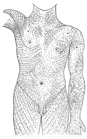
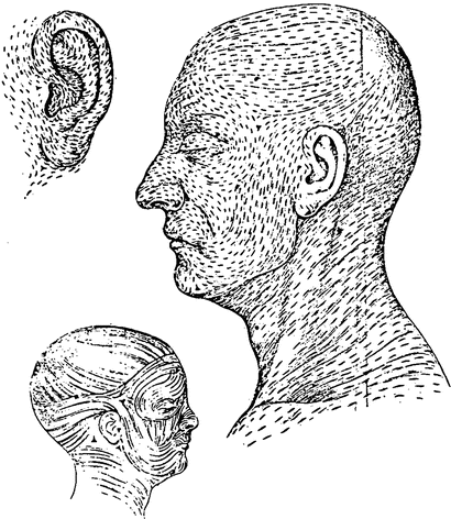
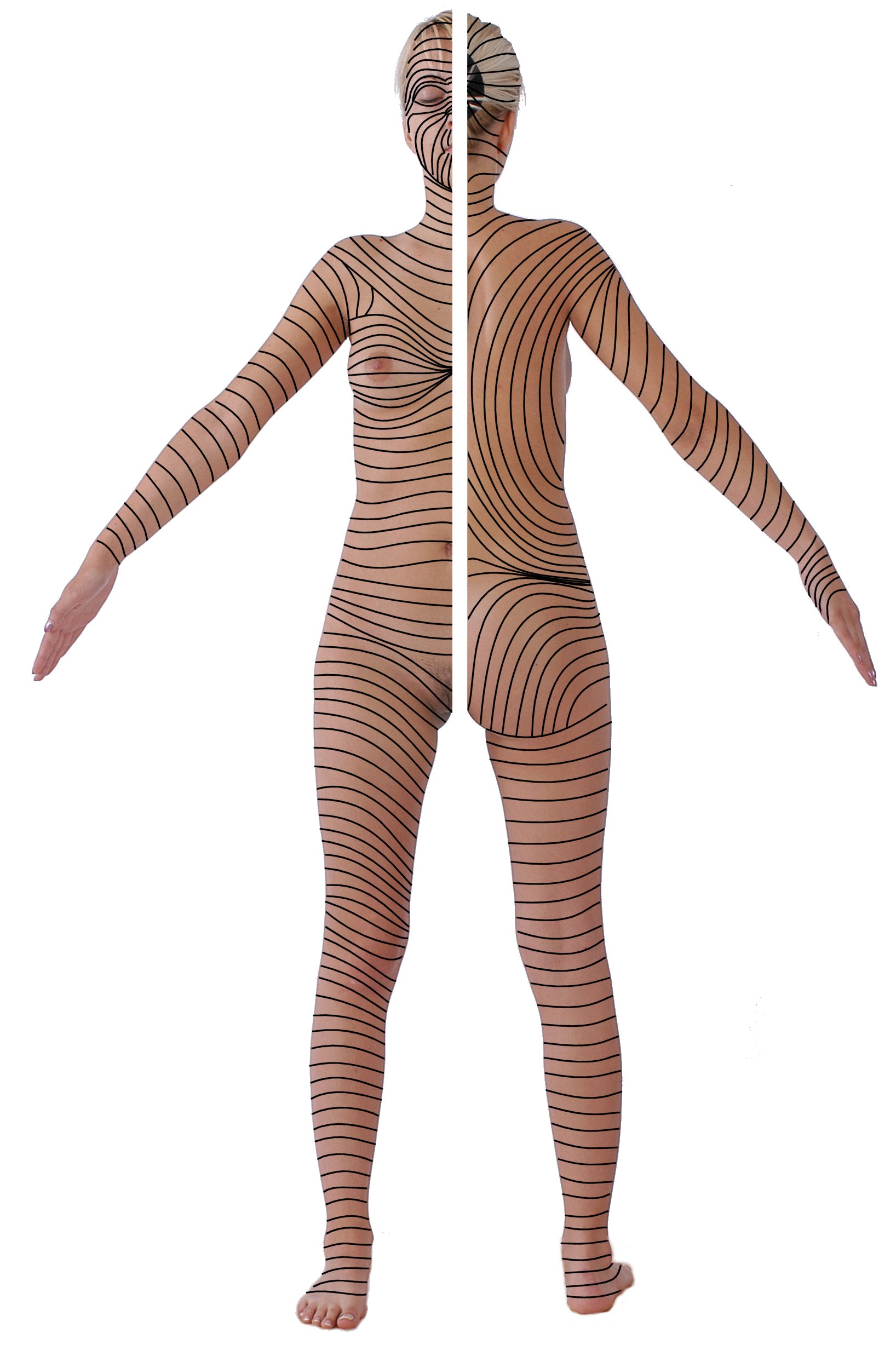
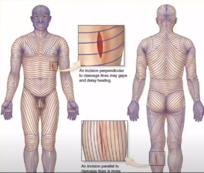
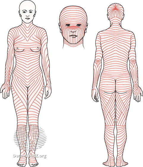
.svg)
![[5]](https://ctma.ca/images/services.png)
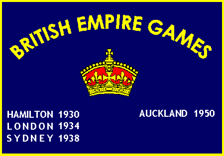
![[22]](https://www.baltrum-linie.de/wp-content/uploads/2019/04/bl-Impressionen-277-1024x768.jpg)
![[23]](https://i.etsystatic.com/11346147/r/il/6ff8c4/2272901645/il_794xN.2272901645_djuj.jpg)
![[25]](https://i.ebayimg.com/images/g/wdkAAOSwrwhgTQZt/s-l400.jpg)
![[26]](https://storage.googleapis.com/hippostcard/p/a32028a596aaec2e7d5bffeb58bca0ff.jpg)
![[28]](https://lh3.googleusercontent.com/yongable/RpIh7sR3vdI/AAAAAAAAAQ0/xW141qFp_iI/DSC00547.JPG?imgmax=720)
.svg)
.svg)
.svg)
.svg)
.svg)
.svg)
Article(s): en:Flag of Gdańsk
- Request
- Please add vectorized versions of these flags. Keep it visually consistent with an already existing flag.
![[30]](https://pbs.twimg.com/media/D-qLuxkWsAEylcD.png)
- Swiãtopôłk (talk) 10:16, 14 August 2022 (UTC)
- Graphist opinion(s)