Commons:Graphic Lab/Illustration workshop
| Illustration Workshop | Map Workshop | Photography Workshop | Video and Sound Workshop |
 Illustration workshop
This workshop is part of the Graphics Lab, a project aimed at picture retouching to improve the graphical content of the Wikimedia projects. More information about the lab can be found on its main page and requests pages (Illustrations ; Photographs ; Maps ; Video and Sound). To ask questions or make a suggestions, see the talk page of the graphic lab page.
This specific page is the requests page for the Illustration Workshop. Anyone can make a request for an illustration to be created or improved. The standard format for making a request is shown below, along with general advice, and should be followed.
Make a request
Use the following template when making a new request, replacing the examples with your image(s) and request(s):
<gallery>
 IMAGENAME.EXT|Description of image
 IMAGE#TWO.EXT|2nd image (If there is one)
 ETCETCETC.EXT|Don't request too many at once, though
</gallery>

;Request:
: Details of your request go here… --~~~~
;Graphist opinion(s):
See also
| SpBot archives all sections tagged with {{Section resolved|1=~~~~}} after 7 days and sections whose most recent comment is older than 60 days. For the archive overview, see /Archive. The latest archive is located at /Archive/2024. | |
Modify the flag

Article(s): zh:野比大雄
- Request
- Reference: [1]. This is the flag that appears in the comic book, it has only a simple pattern. --Thyj (talk) 16:14, 26 July 2019 (UTC)
- Graphist opinion(s)
i do not understand the request?-LadyofHats (talk) 12:55, 14 September 2019 (UTC)
- @LadyofHats: I believe that he wants an SVG version of the file and the link is provided as a reference. 大诺史 (Talk/留言/토론/Discussion) 16:45, 24 September 2019 (UTC)
- but the file in the gallery is already an svg.-LadyofHats (talk) 00:27, 26 September 2019 (UTC)
- @Thyj: Could you please clarify what modification you are requesting? --Usernameunique (talk) 11:54, 6 October 2019 (UTC)
- but the file in the gallery is already an svg.-LadyofHats (talk) 00:27, 26 September 2019 (UTC)
- @LadyofHats: I believe that he wants an SVG version of the file and the link is provided as a reference. 大诺史 (Talk/留言/토론/Discussion) 16:45, 24 September 2019 (UTC)
-
Image similar to the image here: https://www.igi-global.com/chapter/the-diffusion-absorption-refrigerator-operation-and-performance/136746 (not usable, copyvio)
-
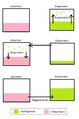 current image to be replaced
 -
svg

Article(s): en:Absorption refrigerator and internat.
- Request
Hi. I think the article (and all international version of the same article) would greatly benefit from some to replace the currently used images, that I don't find great (except the water spray, this one is fine to me). Something colored (the model is black and white), and internationally usable Gem fr (talk) 19:40, 2 August 2019 (UTC)
- Graphist opinion(s)
- @Gem fr: As the two images are so different I just want to make sure I understand what you want, something like this? Please ping me, thanks. --Goran tek-en (talk) 17:45, 4 August 2019 (UTC)
- Wow. This is so PERFECT. Just the needed thing @Goran tek-en: . Gem fr (talk) 09:26, 5 August 2019 (UTC)
- @Gem fr: This is not free either, I can do one for you as an svg but not until the first half of September, if you can wait. Otherwise I will leave this to someone else, it's up to you. --Goran tek-en (talk) 17:45, 5 August 2019 (UTC)
- It sure can wait, no problem. Thanks for taking my request into consideration Gem fr (talk) 08:10, 6 August 2019 (UTC)
- @Gem fr: This is not free either, I can do one for you as an svg but not until the first half of September, if you can wait. Otherwise I will leave this to someone else, it's up to you. --Goran tek-en (talk) 17:45, 5 August 2019 (UTC)
- Wow. This is so PERFECT. Just the needed thing @Goran tek-en: . Gem fr (talk) 09:26, 5 August 2019 (UTC)
![]() Request taken by Goran tek-en (talk) 18:13, 18 September 2019 (UTC)
Request taken by Goran tek-en (talk) 18:13, 18 September 2019 (UTC)
- @Gem fr: Is this video correct for what you want? --Goran tek-en (talk) 15:30, 20 September 2019 (UTC)
- @Goran tek-en: Yes it is Gem fr (talk) 22:12, 20 September 2019 (UTC)
- @Gem fr: Is this video correct for what you want? --Goran tek-en (talk) 15:30, 20 September 2019 (UTC)
@Gem fr: This is a draft just to get the overall picture and for me to get more information.
I need you to answer the questions and inform me if the statements below are correct, if not please inform me.
- Is the overall pipes, containers correct, can the pipes be drawn in those angels and so on?
- 1 is the boiler and are all four components present there?
- 2 is were the ammonia gas is separated from the water and goes upwards.
- 3 is the water returning and it is liquid here.
- 4 is the evaporator and this is were the ammonia gas is transformed to liquid. It's cooled down here so it has to give away heat.
- Is sodium chromate and hydrogen gas also present in the flow between 2 and 4? --Goran tek-en (talk) 18:02, 5 October 2019 (UTC)
- I dare say I like it, even as a draft, this is promising.
- The piping is really good. The pipe between 1 and 2 works like a kind of pump: the boiling liquid generates bubbles that push the liquid upward from the chamber 1 to the chamber 2. So it should go down inside chamber 1 toward the heating element, and be filled with a bicolore zebra.
- forget the sodium chromate, it is used only in a different kind of absorption refrigerator (large systems for building climatisation)
- hydrogen is there only in the part of the drawing on the left side, the part with no color in the piping. Its role is only to balance pressure
- so, to explicitly answer your question: chamber 1 contains only the water+ammonia liquid. Your draft is correct about 2, 3 and 4
- great work @Goran tek-en: , keep going ! Gem fr (talk) 18:27, 6 October 2019 (UTC)
- @Gem fr: Draft 2.
- Thanks for your information, I like the way you gave it, short explanation and then specific answers to my questions.
- 1-4. I have made some changes so please check.
- 5. Is it liquid ammonia here rinning down?
- 6. I don't understand it here. Does ammonia liquid and hydrogen gas here, which direction, what form?
- 7. Evaporator that gives of cold?
- 8. Hyhydrogen gas rising?
- 9. Container, how does hydrogen gas return to it? --Goran tek-en (talk) 10:45, 8 October 2019 (UTC)
- I am delighted, @Goran tek-en: , it is so nice!
- 1-4 is perfect, no need to change anything. I like the radiating rays and snowflakes
- 5: no, liquid ammonia goes down 6, pulled down by gravity. This the place where hydrogen gas balance pressure between chamber 4 and 9. No movement here
- 6: liquid ammonia turn to gas here, this suck up latent heat of evaporation and generates the cold
- 8: ammonia, gas again is sucked down into 9
- 9: this the place where water suck up the gas ammonia.
- (I am in a hurry, I come back in a few hours)Gem fr (talk) 11:29, 8 October 2019 (UTC)
- @Gem fr: Draft 3.
- What happens 5-9? --Goran tek-en (talk) 16:46, 9 October 2019 (UTC)
- in 9, important thing: there, the water (coming from pipe 3) absorbs the ammonia (gas coming from pipe 8); water loves ammonia, so ... sllllurp ! This allow the ammonia to complete the cycle, when the ammonia enriched water will go back to chamber 1. It also help evaporation of ammonia in 7 (lower partial pressure ->easier evaporation). the higher part of the chmaber is filled with gas (hydrogen and ammonia), the lower part by a liquid (water+ammonia) that will go back to chamber 1 (an arrow is required)
- in 5, pretty much nothing, but it is needed to balance pressure. Since the ammonia gas is at higher temperature in chamber 2 and pipe going from 2 to 4 (increasing gas pressure), and since in chamber 9 water absorb the ammonia gas (lowering pressure), the pressure would be greater in the right part of the machine than in the left part, and trouble would ensue. The hydrogen is just a filler to balance things. You will find hydrogen pipe 5 (the whole of it) and chamber 9 (only the top, gassy, part), these are the place you will put the green color.
- 6 is just a pipe for liquid ammonia going down to chamber 7, by gravity
- 7 is where liquid ammonia turns to gas, absorbing heat
- 8 is the pipe for gas ammonia generated in chamber 7 to go in chamber 9
- so it is almost finished, @Goran tek-en: , great job. Gem fr (talk) 17:19, 9 October 2019 (UTC)
- @Gem fr: This draft is just to show you how it will look if you put it on a colored background.
- For all the pipes where there is liquid I haven't filled them to indicate this. I'm not sure if you have seen, just so you think it's OK.
- Should there be any gas direction symbols in 5, if so which direction or both?
- I have put a legend there but you will have to tell me what you want there.
- The numbers is just for us at the moment so do you want numbers if so where?
- We can do one numbered and one not numbered version if you like. Some editors wants the explanation for numbers in the info, some in the illustration. It's up to you. --Goran tek-en (talk) 15:11, 10 October 2019 (UTC)
- @Goran tek-en: Would it be better to change ammonia liquid -> liquid ammonia? + water liquid should just be water. 大诺史 (Talk/留言/토론/Discussion) 15:18, 10 October 2019 (UTC)
- very nice, @Goran tek-en: , I could use it right now but I am sort of perfectionist so I will ask for a few minute things if you dont mind.
- I think it would be better with some sort of wavy water line; these would in chamber 2 and 9, in each case just above the pipe 3 level
- OTOH, I am nor sure this would be required for ammonia; the fact that you used slightly lighter color and wavy arrow for ammonia gas, and darker/straight arrow for liquid ammonia is enough for me. But the opinion of someone else would help, if they think it required
- No arrow required in 5, IMHO.
- We definitively need numbers, they are just fine as is. I have rather the number not in the info, I think it will allow for better internationalization
- A small change in chamber 1 would be better: the heating device is sometime electric, sometimes a gas burner, and in both case it is rather vertical, wrapped around the pipe that will be go to chamber 2 (so this pipe enter inside chamber 1, and it also enter a few cm into chamber 2
- I will be off a few days, in between if someone else could have a look it would be perfect. Thanks for the great job anyway. Gem fr (talk) 08:11, 12 October 2019 (UTC)
- @Gem fr: Draft 5.
- Once we are done I will need the following;
- Name of the file
- Description (/language)
- Captions/s (/language)
- Category/ies at commons
- to be able to upload it at commons. If you don'y know about Captions read here.--Goran tek-en (talk) 17:08, 12 October 2019 (UTC)
- @Gem fr: Draft 5.
- @Gem fr: This draft is just to show you how it will look if you put it on a colored background.
- @Gem fr: Draft 3.
- @Gem fr: Draft 2.
Wikipedia Asian Month medals in Czech and English
-
 Gold medal in de
 -
 Silver medal in de
 -
 Bronze medal in de


-
Gold medal in cs (requested file)
-
Silver medal in cs (requested file)
-
Bronze medal in cs (requested file)
-
Gold medal in en (requested file)
-
Silver medal in en (requested file)
-
Bronze medal in en (requested file)
- Hello @Furfur and Viztor: and other wikigraphics! I want translate Germany medals into Czech and English.
- Please change "ASIATISCHER MONAT" to Czech "ASIJSKÝ MĚSÍC WIKIPEDIE". "NOVEMBER 2018" change to "LISTOPAD 2019". "GOLDMEDAILLE" change to "ZLATÁ MEDAILE", "SILBERMEDAILLE" to "STŘÍBRNÁ MEDAILE" and "BRONZEMEDAILLE" to "BRONZOVÁ MEDAILE".
- For English version please change "ASIATISCHER MONAT" to"ASIAN MONTH". "NOVEMBER 2018" change to "NOVEMBER 2019". "GOLDMEDAILLE" change to "GOLD MEDAL", "SILBERMEDAILLE" to "SILVER MEDAL" and "BRONZEMEDAILLE" to "BRONZE MEDAL".
- I requested 6 files, 3 for Czech, 3 for English. Thank you! --Patriccck (talk) 11:25, 7 August 2019 (UTC)
- Graphist opinion(s)
Why do you want to have an English version – I understand the Czech request, but the English one? --Furfur ⁂ Diskussion 12:00, 7 August 2019 (UTC)
- @Furfur: I changed the request. Do you understand now? I want Czech and English versions of medal (for Czech and English version of WAM). --Patriccck (talk) 13:34, 7 August 2019 (UTC)
- @Patriccck: I understood that. But WHY do you want the medals? You are apparently working in the Czech Wikipedia, so I understand that you probably want to use them there, but does anyone want to use them in en.WP? I takes some time and effort to create these files, so it should be clear if they are really needed. --Furfur ⁂ Diskussion 14:27, 7 August 2019 (UTC)
- @Furfur: Yes, I want to use medals on Czech Wikipedia and also on English Wikipedia. I will use medals for both Wikipedias. I know, that you will take some time and effort a I appreciate it. --Patriccck (talk) 16:35, 7 August 2019 (UTC)
@Furfur: Can you please create these files? --Patriccck (talk) 20:22, 11 August 2019 (UTC)
- I think that I will not create the English medals because I do not see a real demand for them in the English wikipedia. With the Czech medals there ist the problem that the fonts used for the creation of the text do not support letters like Ě (E with Háček) and others, so the medals would definitively look significantly different, because a different font has to be used. --Furfur ⁂ Diskussion 20:48, 11 August 2019 (UTC)
- @Furfur: I will use medals on English Wikipedia (like this), because I am the organizer on enwiki. Can you please send me an example of the font, which supports Czech alphabet?--Patriccck (talk) 14:23, 22 August 2019 (UTC)
I just wondering why you want to have an English version without asking the coordinator and designer of Wikipedia Asian Month. As this year's main coordinator,I think it's very offensive. Li-Yun Lin (talk) 03:05, 13 August 2019 (UTC)
- @Li-Yun Lin: I am sorry. I did not know, that Wikipedia Asian Month has got designer. I want English version of medals, because I will use them (as organizer in English Wikipedia for this year). --Patriccck (talk) 09:35, 13 August 2019 (UTC)
- @Li-Yun Lin: If you are the coordinator of this years en:WP Asian Month, consider adding that information somewhere on the page, as I am sure it would be useful for other users to have a way to easily find you. Pbrks (talk) 18:08, 13 August 2019 (UTC)
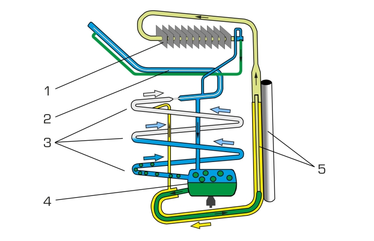
Sutton Hoo helmet designs 1 & 5
Article(s): Sutton Hoo helmet
- Request
- Could somebody please create versions of designs 1 and 5 from the Sutton Hoo helmet? Examples can be seen here (page 8 of the pdf), but I can email a high quality version from which to trace. Ideally these should result in something similar to File:Sutton Hoo helmet fig4.svg, which LadyofHats kindly did earlier. --Usernameunique (talk) 18:29, 24 August 2019 (UTC)
- Graphist opinion(s)
![]() Request taken by Goran tek-en (talk) 18:06, 18 September 2019 (UTC)
Request taken by Goran tek-en (talk) 18:06, 18 September 2019 (UTC)
@Usernameunique: But I will need feedback and info from you or it will not work for me. I would like the high quality versions also, thanks. --Goran tek-en (talk) 18:06, 18 September 2019 (UTC)
- Thanks, Goran tek-en, I look forward to it. Just sent you an email, using the email address in the link from your userpage. I'm more than happy to provide feedback and information. Why don't you take a look at the images, and then let me know what you think? I suspect that it will probably be easier to start with Design 5, but let me know if you think otherwise. --Usernameunique (talk) 18:32, 18 September 2019 (UTC)
- @Usernameunique: For d5, do you want it like File:Sutton Hoo helmet fig4.svg so that I use the same colors etc?
- For d1 I really need to know more exactly which part of that illustration you want, if you can mark on a screen print or similar it would be great, and then same question as above. --Goran tek-en (talk) 17:52, 19 September 2019 (UTC)
- Goran tek-en, please make both design 1 and design 5 like File:Sutton Hoo helmet fig4.svg, with the same colors, etc. For design 1, please make the entire image that you see on page 186; I just sent you a cropped version, for clarity. The one thing to keep in mind is the distinction between the "known" design and the "reconstructed" design. In the book, the distinction is shown by outlining the reconstructed parts in dotted lines, and making them a lighter gray. That's basically fine. (If erring on the side of a more obvious distinction or a less obvious distinction, I would err on the side of a more obvious distinction.) Thanks, --Usernameunique (talk) 20:59, 20 September 2019 (UTC)
- @Usernameunique: Draft for D5, feedback thanks. --Goran tek-en (talk) 16:40, 24 September 2019 (UTC)
- That looks fantastic, thanks Goran tek-en! I don't see anything to improve upon. --Usernameunique (talk) 21:53, 24 September 2019 (UTC)
- @Usernameunique: I forgot one thing I intended to do. If you look at the source the snakes bodies has shadows on them so they were kind of rounded. I forgot to add that but check the to drafts here and tell me which you want before I make it on all the snakes.
- I think we should add shadows on the snakes bodies, tell which you want. --Goran tek-en (talk) 16:43, 25 September 2019 (UTC)
- Agreed, Goran tek-en, let’s add the shadows. I had actually thought about that and decided it didn’t matter, but looking at it agree that the shadows look better. —Usernameunique (talk) 17:45, 25 September 2019 (UTC)
- @Usernameunique: Draft with snake shadows.
- If this is OK I will need the following;
- Name of the file
- Description (/language)
- Captions/s (/language)
- Category/ies at commons
- to be able to upload it at commons. If you don'y know about Captions read here.--Goran tek-en (talk) 10:29, 27 September 2019 (UTC)
- Looks great, Goran tek-en. Thanks again. File name: File:Sutton Hoo helmet fig5.svg. English description: Design 5 from the Sutton Hoo helmet, retraced and vectorized from p. 202 of The Sutton Hoo Ship-Burial, vol. 2 (1978). Caption: Pattern from design 5 on the Sutton Hoo helmet. Category: Sutton Hoo helmet. --Usernameunique (talk) 16:41, 27 September 2019 (UTC)
- That looks fantastic, thanks Goran tek-en! I don't see anything to improve upon. --Usernameunique (talk) 21:53, 24 September 2019 (UTC)
- @Usernameunique: Draft for D5, feedback thanks. --Goran tek-en (talk) 16:40, 24 September 2019 (UTC)
- Goran tek-en, please make both design 1 and design 5 like File:Sutton Hoo helmet fig4.svg, with the same colors, etc. For design 1, please make the entire image that you see on page 186; I just sent you a cropped version, for clarity. The one thing to keep in mind is the distinction between the "known" design and the "reconstructed" design. In the book, the distinction is shown by outlining the reconstructed parts in dotted lines, and making them a lighter gray. That's basically fine. (If erring on the side of a more obvious distinction or a less obvious distinction, I would err on the side of a more obvious distinction.) Thanks, --Usernameunique (talk) 20:59, 20 September 2019 (UTC)
- @Usernameunique: For d5, do you want it like File:Sutton Hoo helmet fig4.svg so that I use the same colors etc?
By the way, Goran tek-en, if you haven't started working on design 1 yet, how would you feel about a slightly different method? I've been thinking it might make more sense to show the full design without any differentiation between the "known" design and the "reconstructed" design. Then, a second file could remove all the "reconstructed" portions, leaving only the "known" parts (somewhat similar to this file, where just the known parts are shown), and the reader could toggle between the two (like with these two designs). --Usernameunique (talk) 23:11, 29 September 2019 (UTC)
- First @Usernameunique: now you can find design5 here file:Sutton Hoo helmet fig5.svg.
- I will make the different known and unknown separately and then we can decide on how to upload them as we can test and see.
- For design 1: in the two previous ones there is a very light background grey and to me that represent the helmet and will do so also in this. If this is correct I will have to introduce another "color". My question is should we stick to different shades of grey or add a soft color? --Goran tek-en (talk) 09:33, 30 September 2019 (UTC)
- I don't know if you did see this as I added it with out a new signing, For design 1: in the two previous ones there is a very light background grey and to me that represent the helmet and will do so also in this. If this is correct I will have to introduce another "color". My question is should we stick to different shades of grey or add a soft color? --Goran tek-en (talk) 19:01, 30 September 2019 (UTC)
- Goran tek-en, that sounds correct to me. Would something silvery work? For reference, this is what the design was intended to look like. --Usernameunique (talk) 19:09, 30 September 2019 (UTC)
- @Usernameunique: That is so impressive, the original was made all by hand by very skilled craftsmen. I also do sculpted jewelry in silver and slate so I understand what it takes to produce something like that, woooh, thanks for showing that image to me it helps me. --Goran tek-en (talk) 13:11, 1 October 2019 (UTC)
- Very cool, Goran tek-en, I'd love to see some of your jewelry if you have pictures. The designs on the Sutton Hoo helmet were made with a form of die stamping known as pressblech, where individual dies (like this one) were crafted by hand, and then used to stamp sheets of tinned bronze. If you're interested, there's a discussion of the technique here (pp. 109–114). --Usernameunique (talk) 15:40, 1 October 2019 (UTC)
- @Usernameunique: Draft for D1_1. This is a draft before I continue to check so this is all right with you. Right figure known parts, feed back, thanks. --Goran tek-en (talk) 16:45, 4 October 2019 (UTC)
- Thanks, Goran tek-en. That looks really good. Stylistically, I think it's perfect. Two minor nits on the details: first, part of the forearm is actually crossed over by the left figure, so shouldn't be visible. Second, the nose and mouth are actually visible in the fragment (see p. 188, figure 142c in the chapter I emailed you), though I agree the drawing in the book does not make this clear. --Usernameunique (talk) 22:56, 4 October 2019 (UTC)
- @Usernameunique: For the arm, as I haven't made the left figure yet I don't know exactly where it crosses over so that will come.
- In this figure the nose and mouth are dashed, not established, so which should we trust? --Goran tek-en (talk) 15:46, 5 October 2019 (UTC)
- Makes sense, Goran tek-en. I would include the nose and mouth. I just emailed you a few more pictures—photographs and drawings of the fragments (i.e., the "known" portions of the design)—which both show the nose and mouth. I'm not sure why in the first illustration they are only dashed. --Usernameunique (talk) 21:59, 5 October 2019 (UTC)
- @Usernameunique: For the arm, as I haven't made the left figure yet I don't know exactly where it crosses over so that will come.
- Thanks, Goran tek-en. That looks really good. Stylistically, I think it's perfect. Two minor nits on the details: first, part of the forearm is actually crossed over by the left figure, so shouldn't be visible. Second, the nose and mouth are actually visible in the fragment (see p. 188, figure 142c in the chapter I emailed you), though I agree the drawing in the book does not make this clear. --Usernameunique (talk) 22:56, 4 October 2019 (UTC)
- @Usernameunique: Draft for D1_1. This is a draft before I continue to check so this is all right with you. Right figure known parts, feed back, thanks. --Goran tek-en (talk) 16:45, 4 October 2019 (UTC)
- Very cool, Goran tek-en, I'd love to see some of your jewelry if you have pictures. The designs on the Sutton Hoo helmet were made with a form of die stamping known as pressblech, where individual dies (like this one) were crafted by hand, and then used to stamp sheets of tinned bronze. If you're interested, there's a discussion of the technique here (pp. 109–114). --Usernameunique (talk) 15:40, 1 October 2019 (UTC)
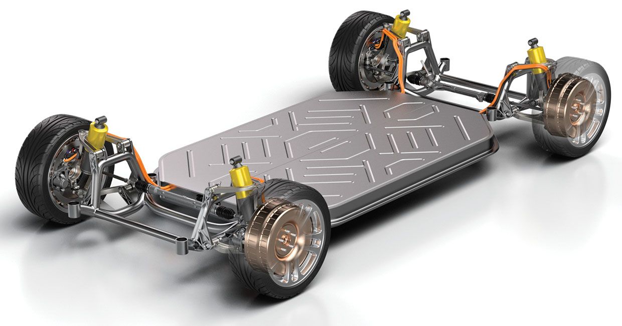
Simple schematic of car using motors in wheel hubs
-
 Please modify a copy of this diagram of a standard electric car

Articles: simple:Car and perhaps en:Wheel hub motor
- Request
- The reasons I am resubmitting this request are:
1) Since I first requested it there have been new developments some of which I have added to the en:Wheel hub motor article. 2) I did not explain properly why this subject is so important. Because transport is a major cause of global warming even small improvements in efficiency can prevent a lot of CO2 emissions. So it is important that children who will be the engineers of the future understand electric motors in vehicles.
So it would be great if someone could copy the excellent diagram above, which will remain in the article, of a dual-motor all-electric car to make a diagram of a car using wheel hub motors.
Details:
Remove existing motors and their labels and the axles
Connect wheels to battery structurally
Only need one line from word "battery" to the battery
Draw a simple motor in each wheel (maybe the red circles already there would do but change color)
One text "motors" (of course editable for different languages as per other text) with lines to each motor
Connect motors to battery electrically using cable same color as charging cable (maybe they should both be red for electricity but if so please change on dual motor image too)
So it ends up as a very simple version of the car shown here.
Note: I have no financial interest in this or conflict of interest.
--Chidgk1 (talk) 08:05, 31 August 2019 (UTC)
- Graphist opinion(s)
![]() Request taken by Goran tek-en (talk) 18:19, 18 September 2019 (UTC)
Request taken by Goran tek-en (talk) 18:19, 18 September 2019 (UTC)
@Chidgk1: But it may take a couple of weeks before I can work on it, if that time span is not fine with you please say so and I will revert my take, thanks. please ping me. --Goran tek-en (talk) 18:19, 18 September 2019 (UTC)
- @Chidgk1: I have started to look at this but there are parts of this file (drawing) that I can't edit and I don't understand how or way it was made in such a special way. I see now that you are the original up loader so why don't you do this your self?
- If you still want me to do it I will have to redo quit a bit so it will not look the same. So please get back to me on how you want this, please ping me, thanks. --Goran tek-en (talk) 17:54, 9 October 2019 (UTC)
- @Goran tek-en: Thanks. No rush. See slideshow at end of this What do I need to explain better? Chidgk1 (talk) 05:42, 12 October 2019 (UTC)
- @Chidgk1: I you are not the creator (but you stand as the creator on it's page), do you have the permission to upload it here with that license?
- If you don't have that or proof of it and that it was handled in the correct way I will not work on this any more. You have to prove to me that you have the permission and that it's handle according to the links below.
- So get back to me when you can show that, before that I will not be working on this. I do hope you understand, commons is a free place but we respect peoples work. --Goran tek-en (talk) 13:25, 12 October 2019 (UTC)
- @Chidgk1: I you are not the creator (but you stand as the creator on it's page), do you have the permission to upload it here with that license?
- @Goran tek-en: Thanks. No rush. See slideshow at end of this What do I need to explain better? Chidgk1 (talk) 05:42, 12 October 2019 (UTC)
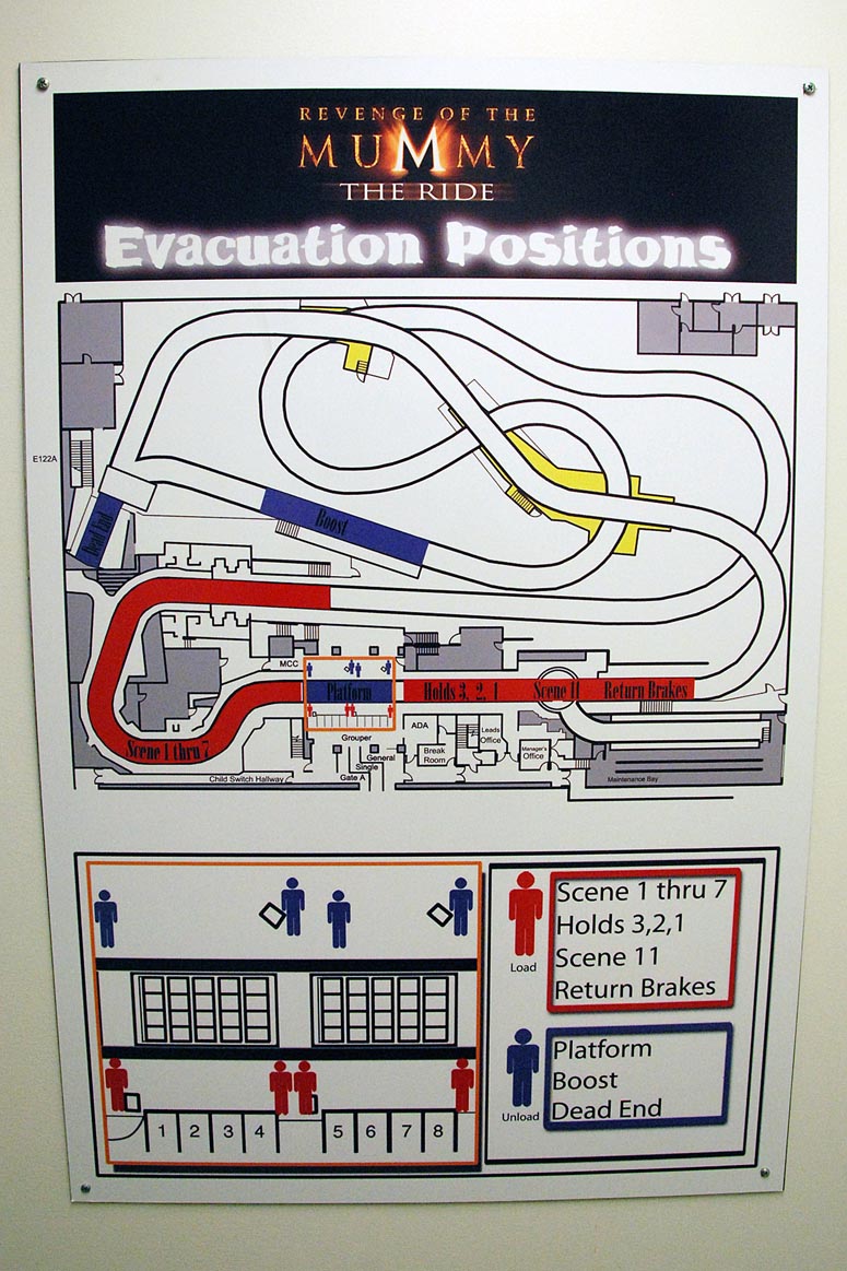
Map of Revenge of the Mummy ride (Hollywood)
Article(s): en:Revenge of the Mummy
- Request
- Freer version of the map seen in this link (image) can be created, especially without non-free elements seen in the original map. --George Ho (talk) 00:44, 4 September 2019 (UTC)
- Graphist opinion(s)
Lambeosaurus species comparison
-
 Lambeosaurus species comparison

Article(s): fi:Lambeosaurus
- Request
- It would be nice to have the colour and pattern of the illustration on the left changed, to make it clear that it's separate from the species next to it. Doesn't matter how it gets done, as long as it stays realistic for a dinosaur. --Paranaja (talk) 14:41, 8 September 2019 (UTC)
- Graphist opinion(s)
- altered the colours (but then, stupidly, uploaded to the same file as an update. Paranaja does this look ok? Otherwise will revert and try different colours tonight. Ian Furst (talk) 17:58, 8 September 2019 (UTC)
- It's not bad, but what I was thinking of was a complete overhaul, like actually changing out the colours and contrasts to different ones. If that's possible, it would be really nice. --Paranaja (talk) 22:06, 8 September 2019 (UTC)
- OK, I've reverted the image, and am playing with it but because of the amount of blur it's not easy (for me). If someone else can do it, would appreciate it otherwise I'll keep playing. Ian Furst (talk) 01:22, 9 September 2019 (UTC)
- Ian Furst would it be easier to do the colouring based on this draft version of the drawing? --Paranaja (talk) 09:41, 14 September 2019 (UTC)
- I'm going to have to admit defeat on this one. Short of attempting to redraw all the sketch, I can't recolour without it looking horrible. The problem (for me) is I can't remove enough of the jpeg artifact to take away the white background. If I could do that, I could colour on the layer deep to the sketch. Otherwise, I have to overlay a colour redraw which I don't have the talent for. Sorry. Ian Furst (talk) 14:58, 15 September 2019 (UTC)
- Ok, thank you for trying. --Paranaja (talk) 14:06, 18 September 2019 (UTC)
- I'm going to have to admit defeat on this one. Short of attempting to redraw all the sketch, I can't recolour without it looking horrible. The problem (for me) is I can't remove enough of the jpeg artifact to take away the white background. If I could do that, I could colour on the layer deep to the sketch. Otherwise, I have to overlay a colour redraw which I don't have the talent for. Sorry. Ian Furst (talk) 14:58, 15 September 2019 (UTC)
- Ian Furst would it be easier to do the colouring based on this draft version of the drawing? --Paranaja (talk) 09:41, 14 September 2019 (UTC)
- OK, I've reverted the image, and am playing with it but because of the amount of blur it's not easy (for me). If someone else can do it, would appreciate it otherwise I'll keep playing. Ian Furst (talk) 01:22, 9 September 2019 (UTC)
- It's not bad, but what I was thinking of was a complete overhaul, like actually changing out the colours and contrasts to different ones. If that's possible, it would be really nice. --Paranaja (talk) 22:06, 8 September 2019 (UTC)
@Paranaja: I changed the two to the left, I'm not sure if it only should be the bottom one so tell me. Draft to check, do you mean something like this. Feedback thanks, please ping me. --Goran tek-en (talk) 17:54, 18 September 2019 (UTC)
- @Goran tek-en: It's only the bottom one. If I understand correctly what you are doing, seems like a good start. What I mean is that the colours should be done from scratch and with patterns different from the illustrations to the right. --Paranaja (talk) 18:15, 18 September 2019 (UTC)
- @Paranaja: If one changes both colors and patterns the image will change so much that it may not be possible to really see what it should be. I have three different drafts here.
- Feedback thanks. --Goran tek-en (talk) 16:54, 19 September 2019 (UTC)
- @Paranaja: If one changes both colors and patterns the image will change so much that it may not be possible to really see what it should be. I have three different drafts here.
- @Goran tek-en: What I mean with patterns is not that the illustration should be covered in texture, but that different areas of the illustration should have different colours. In your previous sketch, you had removed the colours. What you could do now is to colour the image, similar to what the original author did based on a pencil illustration, but with different colours in different places. --Paranaja (talk) 17:22, 19 September 2019 (UTC)
- Look at the illustration to the right, it looks completely different from the middle one. The one on the left should also look completely different from the two others. --Paranaja (talk) 17:24, 19 September 2019 (UTC)
- @Paranaja: Please ping me, thanks. Images are really hard to discuss with text, just you know what image you have in your head. New draft. --Goran tek-en (talk) 18:11, 19 September 2019 (UTC)
- Look at the illustration to the right, it looks completely different from the middle one. The one on the left should also look completely different from the two others. --Paranaja (talk) 17:24, 19 September 2019 (UTC)
- @Goran tek-en: Ok, it should be something like this but more professionally coloured. --Paranaja (talk) 20:55, 19 September 2019 (UTC)
- @Paranaja: To me what you show here this is the same as the other heads, especially the one down to the right. To my understanding it doesn't correlate to what you have described before, I think that's why both Ian Furst and I did something totally different. New draft 5. --Goran tek-en (talk) 10:45, 20 September 2019 (UTC)
- @Goran tek-en: Ok, it should be something like this but more professionally coloured. --Paranaja (talk) 20:55, 19 September 2019 (UTC)
- @Goran tek-en: I apologise for not uploading a clarifying image right in the beginning. Your new draft is looking pretty good, feel free to upload it when you are happy with it. The contrast could be reduced a little bit and the leopard patterning could be made less obvious. --Paranaja (talk) 13:54, 20 September 2019 (UTC)
![]() Request taken by Goran tek-en (talk) 15:07, 20 September 2019 (UTC)
Request taken by Goran tek-en (talk) 15:07, 20 September 2019 (UTC)
- @Paranaja: New draft 6, feedbackthanks. --Goran tek-en (talk) 15:07, 20 September 2019 (UTC)
- @Goran tek-en: Lighter green would be better and the border between the red crest and the green head could be less obvious. --Paranaja (talk) 10:04, 22 September 2019 (UTC)
- @Paranaja: New draft 7, feedbackthanks. --Goran tek-en (talk) 17:24, 22 September 2019 (UTC)
- @Goran tek-en: Lighter green would be better and the border between the red crest and the green head could be less obvious. --Paranaja (talk) 10:04, 22 September 2019 (UTC)
- @Paranaja: New draft 6, feedbackthanks. --Goran tek-en (talk) 15:07, 20 September 2019 (UTC)
Illustrations by Yuen-Ji
-
Maitreya (original image)
-
Maitreya (colored image)
-
Bhaisajyaraja
-
Machig Labdron
Article(s): [[]]
- Request
- First and second image is blurred, for technical reasons. Please try to refer to the style of the original.--Thyj (talk) 03:16, 11 September 2019 (UTC)
- Graphist opinion(s)
Bicycle and car together
Article(s): (multiple articles)
- Request
- To illustrate the use of the instrumental case in the Serbian language, I need an SVG illustration showing a person riding a bicycle, and next to it, the same person riding a car with the same bicycle affixed to the roof. I would have done it myself, but I can't find a person riding a bicycle in Category:SVG bicycles drawn in the same style as Category:SVG profile drawings of automobiles. --Nikola (talk) 08:07, 14 September 2019 (UTC)
- Can you specify which car you would (ideally) like this done with? Will it have any labels? I'm not sure what you mean by "...the instrumental case..." Ian Furst (talk) 15:01, 15 September 2019 (UTC)
- Any that is large enough to fit a bicycle on the roof, for example File:VW Golf 2 profile drawing.svg. For an example of how the fitting looks like, see [2]. The car needs no labels, I will add the text to the image myself. For the case, see w:Instrumental case. Nikola (talk) 12:00, 20 September 2019 (UTC)
- Can you specify which car you would (ideally) like this done with? Will it have any labels? I'm not sure what you mean by "...the instrumental case..." Ian Furst (talk) 15:01, 15 September 2019 (UTC)
- Graphist opinion(s)
Vectorization of coat of arms of Institution Notre-Dame
-
 Coat of arms of Institution Notre-Dame

Article(s): fr:Institution Notre-Dame (Valenciennes), de:Institution Notre-Dame
- Request
- Please vectorize this French academic coat of arms and create an SVG file. Please remove the black edges on the bottom left/right side of the coat of arms. --37.58.201.72 11:59, 25 September 2019 (UTC)
- Graphist opinion(s)
Vectorize signature
-
 Robert Kaske signature.jpg Robert Kaske signature
 -
 Robert Kaske signature.svg SVG-version
 -
 Robert Kaske signature section.png discussion
 -
 Victoria Justice Signature discussion.png discussion also


Article(s): Robert Kaske
- Request
- Please vectorize the signature, creating a new file. Thanks, --Usernameunique (talk) 19:00, 26 September 2019 (UTC)
- Graphist opinion(s)
- @Usernameunique:
 --Mrmw (talk) 08:08, 27 September 2019 (UTC)
- Thanks Mrmw! Looks perfect. --Usernameunique (talk) 22:38, 27 September 2019 (UTC)
- The second "k" has problems. The loop is OK, but the top of the next stoke should be a discontinuity; the SVG has rounded it. Then there should be a smooth descent to the next discontinuity that finishes the bulge. The SVG has a straight run during the bulge with a continuous finish. Glrx (talk) 06:15, 28 September 2019 (UTC)
- Thanks Mrmw! Looks perfect. --Usernameunique (talk) 22:38, 27 September 2019 (UTC)
- @Glrx: use c:template:ping please
- not sure what you mean - made two minor modifications
- --Mrmw (talk) 17:56, 28 September 2019 (UTC)
- @Mrmw: That made it worse; you flattened the exit from the second "k". The pen dynamics for the character are off. Think about how strokes are made and compare to the original. Glrx (talk) 02:55, 29 September 2019 (UTC)
- @Glrx: i really try hard to follow your thoughts - phrases like 'think about it' arent very constructiv - i compare each stroke with orginal, because i trace it - please check the result now - thx
- --Mrmw (talk) 07:15, 29 September 2019 (UTC)
- @Mrmw: That's worse. You've put a kink in the middle of the upstroke after the "k"'s loop. There should be one smooth stroke upward; instead you have the stroke go up half way, jog to the right a little bit, and then draw the rest of the stroke. Physically, that makes no sense. The signer is executing the upstroke at speed, so the jog would take enormous accelerations to produce the jog. Glrx (talk) 14:20, 29 September 2019 (UTC)
- @Glrx: i uploaded a file for discussion
- i only put a kink in G5-6 because i thougt it is the part you have problems with - i dont know wich part you would like to improve - please use coordinates
- perhabs @Usernameunique: will join the discussion --Mrmw (talk) 15:25, 29 September 2019 (UTC)
- Mrmw, I must admit I'm also a bit unclear about what the problems are that Glrx is identifying. Glrx, I don't think it's a big issue—the file that is intended to serve a minor role in an infobox—but perhaps it would be easier for you to take a crack at modifying the letter in question? Thanks, --Usernameunique (talk) 17:51, 29 September 2019 (UTC)
- @Mrmw:
- The bulge on the second "k" was improved from version 1, but the upstroke got worse.
- Several knots are misplaced; they should be in the center of the corrected ink and should stop a radius away from the edge.
- For example, the knot for the "a" at (-F,5) is too low and the knot at (-D,6) is too high. The knot for the "s" at (-B,3) is at the top edge of the ink. If the knot is not centered, then the stroke cannot be on the center line of the ink.
- The bottom knot at {E,2) should not be smooth; the current stroke descends below the knot; a curve through such a knot is difficult to control. Version 1 had two smooth knots here. There should be one discontinuous knot positioned lower; the pen stops moving at the bottom of the stroke and then heads in a new direction.
- There should not be 3 knots between the knot at (E,2) and the knot at (I,9). That curve should be smooth and relatively straight one radius away from the right edge.
- The stroke fitting is weak. For example, the first "K" at (-D,12). The slope from (J,9) to (K,8) is steeper than the ink. The slope from (K,3) to (N,5) is too shallow.
- There's an unneeded double knot around (N,15).
- Version 3 has 8 subpaths (one starting "m 0 0") for 6 curves.
- Glrx (talk) 19:05, 30 September 2019 (UTC)
- Mrmw, I must admit I'm also a bit unclear about what the problems are that Glrx is identifying. Glrx, I don't think it's a big issue—the file that is intended to serve a minor role in an infobox—but perhaps it would be easier for you to take a crack at modifying the letter in question? Thanks, --Usernameunique (talk) 17:51, 29 September 2019 (UTC)
- @Glrx: hello, first of all - sorry for my english, i will do my best - for graphics i do my best as well
- i am really happy to get feedback from you - everybody should try to improve his work - i tried too
- but perhaps I am not able to satisfy your claims - but perhaps its not necessary in this case at all - as usernameunique mentioned - this signature is not part of studies about calligraphy
- we talk here in this discussion about my work - the signature of robert kakse - and its not my intention to mix different matters - but i have some questions regarding your work - the signature of victoria justice
- therefore i uploaded again a file to look at the details
- i know your master was the png-file, not the jpg ([3])
- but in my opinion you should have used the jpg as master because its the master for the png
- in the review for my work you are dealing with pixels
- therefore you should be accurate just as you claim - and you sould use the original master (jpg)
- its important to clarify - you work is really nice - good work for a complex signature - but now lets go to detail
- either the edges at 3 and 4 are too low or the edge for 5 is too high
- the loop of 1 nearly miss the orginal at all
- the bow of 2 is too bent, 6 as well
- the path of 8 to 12 schould be perfect smooth, at 8, 9, 10, 11 and 12 are discontinuities, i could list more of this
- to clearify this point as well: I feel stupid to claim this topics about your work - in german we call it a 'fliegenschiss', a fly-shit?
- what do you think in summary?
- perhaps other users would like to express their opinion about this topic?
- --Mrmw (talk) 21:07, 1 October 2019 (UTC)
Convert Former Canadian Flags into SVG files.
-
 Canadian Red Ensign 1870 (Convert to SVG)
 -
 Canadian Red Ensign 1870 (result)
 -
 Canadian Red Ensign 1873 (Convert to SVG)
 -
 Canadian Red Ensign 1873 (result)
 -
 Canadian Red Ensign 1896 (Convert to SVG)
 -
 Canadian Red Ensign 1896 (result)
 -
 Hypothetical flag of British Columbia 1906-1960 (Convert to SVG)
 -
 Hypothetical flag of British Columbia 1906-1960 (result)

.svg)

.svg)

.svg)


Article(s): Various
- Request
- Convert to SVG files
- Please can these former Canadian flags be converted to SVG files please as they are only currently in PNG form and for some reason have never been converted with the British Columbia flag in particularly in poor condition despite it being officially listed as just a hypothetical flag. … --2A02:C7F:5622:2000:1450:8D79:73EB:E94A 14:10, 29 September 2019 (UTC)
- Graphist opinion(s)
 Request taken by Tcfc2349 (talk) 13:54, 4 October 2019 (UTC); First, I converted the British Columbia flag to SVG. --Tcfc2349 (talk) 13:54, 4 October 2019 (UTC)
- Request taken by Tcfc2349 (talk) 23:31, 4 October 2019 (UTC); The 1873 and 1896 versions were also make from files in Commons. --Tcfc2349 (talk) 23:31, 4 October 2019 (UTC)
- Done I also completed the last file. --Tcfc2349 (talk) 13:27, 6 October 2019 (UTC)
Convert Hong Kong Protest Flags to SVG
-
 Black Bauhinia Flag
 -
 Lennon Wall Flag
 -
 Lennon-SVG
 -
 Black SVG
.png)


.svg)
Article(s): en:Tactics and methods surrounding the 2019 Hong Kong protests
- Request
- Please convert these flags used during the 2019 Hong Kong protests to SVG. TextClick (talk) 17:06, 5 October 2019 (UTC)
- Graphist opinion(s)
- @TextClick: One done. Pbrks (talk) 22:37, 5 October 2019 (UTC)
![]() Request taken by Mrmw (talk) 07:10, 7 October 2019 (UTC)
Request taken by Mrmw (talk) 07:10, 7 October 2019 (UTC)
Ceremonial Canadian Red Ensigns (Please create)
-
 Please recreate separate flag and add Crown of Saint Edward (Heraldry) to the top of coat of arms.
 -
 Please recreate separate flag and add Crown of Saint Edward (Heraldry) to the top of coat of arms.
 -
 Please recreate separate flag and add Crown of Saint Edward (Heraldry) to the top of coat of arms.
 -
 Please recreate separate flag and add Crown of Saint Edward (Heraldry) to the top of coat of arms.
 -
 This is a example of the request
.svg)


Article(s): Various
- Request
- Please recreate these flags and add the Crown of Saint Edward (Heraldry) to the top of coat of arms so we have the ceremonial Canadian red ensign flags.
- Please add the Crown of Saint Edward (Heraldry) to the top of coat of arms in each of the flags and title the new svg files as ceremonial Canadian Red ensign flags. (2A02:C7F:5622:2000:216C:3818:D727:B709 15:39, 7 October 2019 (UTC))
- Graphist opinion(s)
Make SVGs valid
-
 Logo of Arken Zoo, company that sells pets, pet food and toys in Sweden
 -
 Logo of Elgiganten, company that sells electronics in Sweden
Article(s): sv:Arken Zoo and sv:Elgiganten
- Request
- I would like to make them valid. Source for Arken Zoo logo is https://get.musti.media/shops/mse/resources/ftp/framework/logotypem.svg which I put into Notepad++ and removed the mask-part which I think made the black border around "zoo" invisible and opened in Inkscape where I also removed some nodes. Source for the Elgiganten logo is elgiganten.se where I just right clicked on the logo, pressed inspect elements and copied the SVG tag and pasted into Notepad++, then I opened in Inkscape and saved as SVG.--Jonteemil (talk) 00:09, 8 October 2019 (UTC)
- Graphist opinion(s)
- Done. -- Begoon 00:34, 8 October 2019 (UTC)
 Comment @Begoon and Jonteemil: Logos might be above COM:TOO Sweden, especially the zoo logo. "A simple general rule is that if it is unlikely that two persons would create, for example, a text identically or similarly, the text is probably sufficiently original to qualify as a protected work. (..) Often, the requirements for copyright protection are considered to be relatively low." 大诺史 (Talk/留言/토론/Discussion) 02:30, 8 October 2019 (UTC)
- 大诺史, that's a fair point - I was forgetting that Jonteemil generally deals with Swedish content, which is clumsy of me, because this has come up before. I think sv.wiki doesn't host non-free/fair use files (or any files at all? I could be wrong?) and if so there'd only be a possibility for use on projects that do, unfortunately. I'm pretty sure your assessment is correct, but I guess it could be confirmed at COM:VPC if necessary. -- Begoon 02:46, 8 October 2019 (UTC)
- @Begoon: My bad, didn't see your comment. I've already created a DR @ Commons:Deletion requests/Files uploaded by Jonteemil. 大诺史 (Talk/留言/토론/Discussion) 02:51, 8 October 2019 (UTC)
- That doesn't seem like a problem. It will serve the same purpose as the discussion I suggested. -- Begoon 02:53, 8 October 2019 (UTC)
- @Begoon: So you’re here too :)? Thanks for the fix! Might be in vain if they’re deleted but yeah...Jonteemil (talk) 15:46, 8 October 2019 (UTC)
- Heh. Yeah, you never know where you'll find me
 ... You're welcome. You should probably keep copies of the files in case they are deleted and you want to make use of them on any projects as non-free/fair use. Cheers. -- Begoon 21:47, 8 October 2019 (UTC)
- Heh. Yeah, you never know where you'll find me
- @Begoon: So you’re here too :)? Thanks for the fix! Might be in vain if they’re deleted but yeah...Jonteemil (talk) 15:46, 8 October 2019 (UTC)
- That doesn't seem like a problem. It will serve the same purpose as the discussion I suggested. -- Begoon 02:53, 8 October 2019 (UTC)
- @Begoon: My bad, didn't see your comment. I've already created a DR @ Commons:Deletion requests/Files uploaded by Jonteemil. 大诺史 (Talk/留言/토론/Discussion) 02:51, 8 October 2019 (UTC)
Fix the proposed flags of Malaya (1949)
-
 Original flag 1
 -
 Re-illustrated flag 1


-
 Original flag 2
 -
 Re-illustrated flag 2


-
 Original flag 3
 -
 Re-illustrated flag 3


Article(s): wikipedia:Flag of Malaysia
- Request
- Please fix the proposed flags of Malaya.
- The current flags in Wikimedia Commons isn't as what the designs looked like as shown in the newspaper cutting from The Malay Mail and Utusan Melayu dated 15th November 1949 and 16th November 1949 respectively, as seen in page 15 of this document [4]. --EmpAhmadK (talk) 05:45, 8 October 2019 (UTC)
- Graphist opinion(s)
- Kindly elaborate what changes are sought? the images in right hand column is same as that in news paper referenced. --06:34, 8 October 2019 (UTC)
- Apologies, I just realised that I'm at the wrong place. I was suggesting that the image be changed to the new one I made, but I just realised that this is to request for an illustration and not what I thought it was at first.
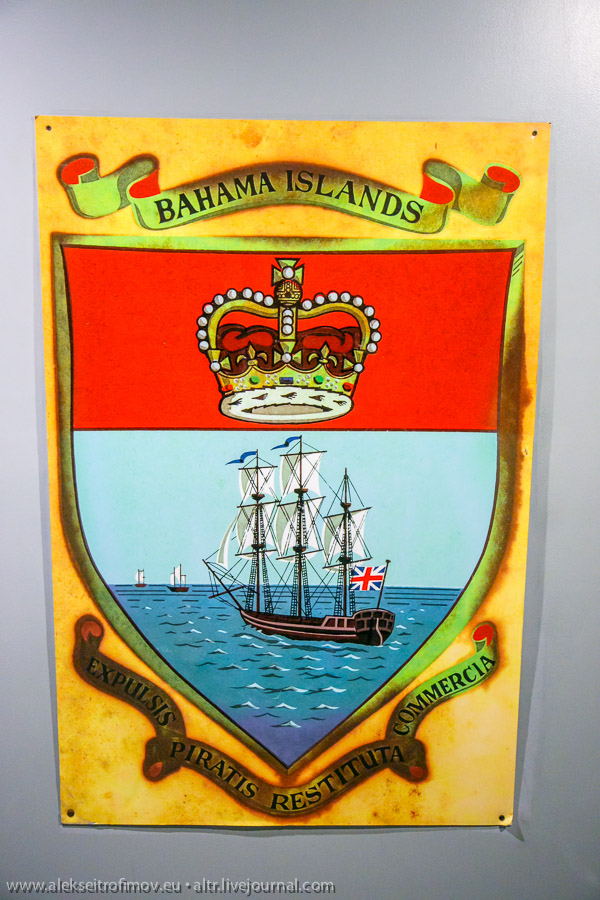
Old flag and coat of arms of the Bahamas
-
 arms
arms -
 flag
flag -
 governor's flag
.svg)
.svg)
.svg)
Article(s): various
- Request
- This emblem was used by the Bahamas from 1964 to 1973, I urgently created this file by referencing another file. So I would be grateful if you could remake this emblem in more detail. --Tcfc2349 (talk) 08:11, 8 October 2019 (UTC)
- And please refer to this file and this photo when remaking. There are also additional new files found. Thank you. --Tcfc2349 (talk) 08:11, 8 October 2019 (UTC)
- Graphist opinion(s)
- I want to keep the crown intact. Please correct the other part. Thank you. --Tcfc2349 (talk) 08:35, 8 October 2019 (UTC)
- I also found a photo of a detailed enlargement of the inner part of the emblem a while ago. Please refer to it. --Tcfc2349 (talk) 08:51, 8 October 2019 (UTC)
Fake SVG signatures to be vectorised
-
 Cleo C Hogan
 -
 Cordell Hull (1)
 -
 Cordell Hull (2)
 -
 Dale A Urban
 -
 Edward J Pettit
 -
 Robert Howard
 -
 Sumner Welles
 -
 Tex Gray
 -
 William F Aronow
 -
 William W Erbach
 -
 Miloš Zeman
 -
 Robert E Thompson


- Request
- Looking through the {{Fake SVG}} backlog, I came across these signatures. Hopefully someone who likes doing these can overwrite the files with true vector versions. --NikNaks talk - gallery - wikipedia 10:34, 11 October 2019 (UTC)
- Graphist opinion(s)
- @NikNaks: Mrmw (talk) 21:16, 11 October 2019 (UTC)
Fix Bad SVG
-
 Current logo of Umbro
Article(s): en:Umbro
- Request
- I uploaded a file that I thought was 100% SVG but apparently not. Can someone fix it? -- Jonteemil (talk) 08:14, 12 October 2019 (UTC)
- Graphist opinion(s)
- @Jonteemil: there were actually two logos in this file - umbro and en:File:Sjalaveds IK logo.svg
- @Mrmw: I suspected that was the case. They were both from the same PDF so I just resized the page to the selected logos respectively. But I guess I have to delete the other logo if I just want one logo in the SVG.Jonteemil (talk) 08:58, 12 October 2019 (UTC)
- Mrmw (talk) 08:26, 12 October 2019 (UTC)
Make SVG Valid
-
 File has 2 errors

Article(s): en:Ontario Highway 407
- Request
- Please fix the errors in this SVG file to make it valid. --TextClick (talk) 05:43, 13 October 2019 (UTC)
- Graphist opinion(s)
Convert presidential standards of Kenya to SVG
-
 Presidential Standard of Jomo Kenyatta (convert to SVG)
 -
 Presidential Standard of Mwai Kibaki (convert to SVG)
 -
 Presidential Standard of Uhuru Kenyatta (convert to SVG)


_sid_103).jpg)
.png)
.png)
![[2]](https://i.ebayimg.com/00/s/NzUyWDEwMjQ=/z/DkEAAOSwjMBcgW-R/$_86.JPG)
![[3]](http://4.bp.blogspot.com/-aw73T_dBRf0/Tmj-WUgckiI/AAAAAAAAAuM/FLpWQDiBvtw/s1600/DSCF9710.jpg)
.svg)
1964.gif)
Article(s): various
- Request
- These flags are Kenya's presidential standards, so thank you for converting them to SVG. --Tcfc2349 (talk) 06:37, 13 October 2019 (UTC)
- Graphist opinion(s)
- I think Jomo Kenyatta's flag is a good idea to use some of the elements in Daniel Arabmoi's flag already converted to SVG. For Mwai Kibaki's flag, the olive branch should be the one on the UN's emblem. --Tcfc2349 (talk) 06:55, 13 October 2019 (UTC)