Commons:Graphic Lab/Illustration workshop
| Illustration Workshop | Map Workshop | Photography Workshop | Video and Sound Workshop |
 Illustration workshop
This workshop is part of the Graphics Lab, a project aimed at picture retouching to improve the graphical content of the Wikimedia projects. More information about the lab can be found on its main page and requests pages (Illustrations ; Photographs ; Maps ; Video and Sound). To ask questions or make a suggestions, see the talk page of the graphic lab page.
This specific page is the requests page for the Illustration Workshop. Anyone can make a request for an illustration to be created or improved. The standard format for making a request is shown below, along with general advice, and should be followed.
Make a request
Use the following template when making a new request, replacing the examples with your image(s) and request(s):
<gallery>
 IMAGENAME.EXT|Description of image
 IMAGE#TWO.EXT|2nd image (If there is one)
 ETCETCETC.EXT|Don't request too many at once, though
</gallery>

;Request:
: Details of your request go here… --~~~~
;Graphist opinion(s):
See also
| SpBot archives all sections tagged with {{Section resolved|1=~~~~}} after 7 days and sections whose most recent comment is older than 60 days. For the archive overview, see /Archive. The latest archive is located at /Archive/2024. | |
slight error, made by a 3rd party, to "paint in" the resulting winning party of a local-election results-map (Hyndburn 2016) ...
-
 Election map from 2016 with error
 -
 Election map from 2018 with wrong colour (PNG)
 -
 Election map from 2012
 -
 Election map from 2019 (PNG)


Article(s): w:2016 Hyndburn Borough Council election
- Request
In the 2016 Hyndburn Borough Council election, ONLY two ward-seats were won by Conservatives / the two neighbouring Barnfield & Baxenden wards (bottom-RIGHT corner of map) , the erroneous [St Oswalds ward, bottom LEFT corner - looks like "Florida"] was won by Labour and should be paint-filled in as RED, not as BLUE.
- for reference - a local council map of each named-ward (*16) can be found at - https://www.geopunk.co.uk/council/Hyndburn-District-(B) -
I am currently working on a draft-copy of the next 2020-Hyndburn Borough Council-elections results page, which references the previous 4yr old results. Over the past decade, I've relied upon other 3rd-party contributors to "edit/tweak" the results-maps, as I myself an NOT any kind of a "paintshop-expert".
. EG, in 2014 "they" picked a much darked BLUE than previously/subsequently used ... and 'again' in 2018, another 'darker blue' was used ...
pls refer to - w:2012 Hyndburn Borough Council election w:2014 Hyndburn Borough Council election w:2018 Hyndburn Borough Council election w:2019 Hyndburn Borough Council election
Warrenlm (talk) 13:43, 26 February 2020 (UTC)
- Graphist opinion(s)
- I have modified the 2016 map. Please referesh and check if that map is correct now. – b_jonas 15:37, 12 March 2020 (UTC)
Please help with Unsafe CSS removal
Hi ,
As EugeneZelenko was suggesting I created a logo on SVG but when I try to upload it on commons it says that there are unsafe CSS in the style element of uploaded SVG file. Is there anyone who can please help me to fix this issue ? Many thanks--Neverstopthat (talk) 15:38, 15 March 2020 (UTC)
- Neverstopthat I don't know which issues it complains about but at this link you can test a svg file before uploading. For your file it complains about "Font type Open Sans Condensed is not available in Wikimedia software.". Not all fonts work here and there is a link for you to check which fonts that work. At this place you can also check your file. Very often it's very good to save it as "optimized svg", then check it at those places and see what is wrong, if any. If it passes this last check place you can also put out "Valid W3C code" on the file, it's good to do so. --Goran tek-en (talk) 16:42, 9 April 2020 (UTC)
- @Neverstopthat: The current file has CSS with a
@font-facerule that loads a font from aurl(data:...). Such a URL is probably unsafe because fonts are programs. The URL could also be unsafe because an arbitrary font may not have a free license. The SVG file should not define a font; it should just use available/generic fonts. Glrx (talk) 20:07, 9 April 2020 (UTC)
- @Neverstopthat: The current file has CSS with a
Covid-19-curves-graphic-social-v3.gif in Malay
-
 The gif

Article(s):
- Request
- Please translate this to Malay (ms).
- Flatten the curve=Ratakan lengkung
- y-axis=Bilangan kes, x-axis=Masa sejak kes pertama
- Healthcare system capacity=Muatan sistem penjagaan kesihatan, Full=Penuh
- The 3 points=Basuh tangan. Jangan sentuh muka. Duduk di rumah apabila sakit.
- Dialogue=:Apa-apa sajalah, ini seperti selesema atau demam. Usah cemas namun berwaspadalah.
- Adapted from=Diolah dari, And the CDC=Dan CDC --Tofeiku (talk) 13:25, 17 March 2020 (UTC)
- Graphist opinion(s)
"International versions" are devoid of text, for use by non-English Wikipedias. —RCraig09 (talk) 20:52, 10 April 2020 (UTC)]] and 21 April 2020
-
 21:01, 6 April 2020 — "Flatten the curve" international version (no text)
 -
 03:19, 11 April 2020 — Flatten the curve AND raise the line GIF international version
 -
 04:17, 10 April 2020 — Pandemic resurgence - effect of inadequate mitigation - International version


Commander’s Award for Public Service
-
Commander’s Award for Public Service Award Ribbon
Article(s): en:Public Service Commendation Medal
- Request
- This image was uploaded in a raster graphics format. However, it contains information that could be stored more efficiently and/or accurately in the SVG format, as a vector graphic. If possible, could someone please upload an SVG version of this image. Thanks a lot! --2600:1700:ADB0:5ED0:993A:6F1:BDD5:AA9 04:25, 18 March 2020 (UTC)
Oops...just realized that this is on the English Wikipedia and not Commons!--2600:1700:ADB0:5ED0:68FE:50FB:53DC:9E1E 13:32, 18 March 2020 (UTC)
- Graphist opinion(s)
ČT3
-
 Logo of ČT3
 -
Logo of ČT3 without background
-
Description of third image (if needed; don't request too many at once, though)
Article(s):
- Request
- Please delete background of the file. Thank you! --Patriccck (talk) 14:23, 19 March 2020 (UTC)
- Graphist opinion(s)
Replacing cartoonish social distancing graphics with better ones

Article(s): en:Social distancing, en:Coronavirus disease 2019, en:2019–20 coronavirus pandemic
- Request
- This request was also made a the en.wp Graphics Lab: [1]. —RCraig09 (talk) 20:31, 9 April 2020 (UTC)
- We request a remake of these graphics to adopt a more suitably encyclopedic aesthetic. See w:Talk:Social distancing#Cartoonishness of graphics for context. Given the prominence of these articles, any redesigns you create are likely to be seen by tens of millions of readers in the coming weeks. --Sdkb (talk) 21:42, 24 March 2020 (UTC)
- Who is this "we" being referred to? Many of I think these images are fine. Doc James (talk · contribs · email) 19:36, 4 April 2020 (UTC)
- The "we" is the consensus editors at w:Talk:Social distancing#Cartoonishness of graphics. —RCraig09 (talk) 20:43, 5 April 2020 (UTC)
- Who is this "we" being referred to? Many of I think these images are fine. Doc James (talk · contribs · email) 19:36, 4 April 2020 (UTC)
- Graphist opinion(s)


.gif)
The effectiveness of social distancing
-
Description of first image
-
Description of second image (if needed)
-
Description of third image (if needed; don't request too many at once, though)
Article(s): en:Social distancing
- Request
- Please reproduce these graphs in a manner suitable for Wikimedia
- There are various graphs on the National Geographic article about the effects of social distancing during the en:Spanish flu pandemic. I request that someone use the data to reproduce similar graphs for inclusion in Wikipedia projects. --~ R.T.G 15:57, 30 March 2020 (UTC)
- Graphist opinion(s)
- The indicated original source for those graphs is doi:10.1001/jama.298.6.644, which contains a few graphs and a table with limited data. I was unable to find the source data at the resolution used to make those graphs. I was able to find graphs in the supplement. Reproducing them appears to require extracting the raw data from the graphs, which is less than ideal. --AntiCompositeNumber (talk) 16:29, 15 April 2020 (UTC)
Mislabelled axes on svg

Article(s): b:Geometry for Elementary School/Rectangular coordinate system
- Request
- Can someone upload a new version of this file with the x & y axes correctly labelled i.e. x is the horizontal axis and y is the vertical axis Nthep (talk) 18:06, 2 April 2020 (UTC)
- Graphist opinion(s)
- @Nthep:
 Done --Mrmw (talk) 12:26, 7 April 2020 (UTC)
UK Government Coat of Arms
en:File:Coat of Arms of the British Government.jpg
Article(s): Various
- Request
- Please can this version of the coat of arms of the UK Government be converted into a SVG file please. (2A02:C7F:5622:2000:5011:FEB7:7720:1995 14:51, 7 April 2020 (UTC))
- Graphist opinion(s)
Text OK in original SVG, but not one rendered into PNG by Wikimedia Commons
-
 Description of first image

Article(s): en:Golden Gate Cloning
- Request
- Hello,
I've been making several illustrations and uploading them to Wikimedia Commons, and to preserve resolution, I want to upload them as vector images. I had originally been using the PDF format, but I see that these images are downsampled for display on pages. I then tried using SVG, but when the images get rendered by Wikimedia Commons into PNGs for display, I've often found that text isn't rendered properly. I'm attaching one image as an example, but this has happened with many images. You'll see that the text is fine in the original SVG, but not in the rendered PNG. I intentionally switched to Wikipedia-compatible fonts (liberation, deja vu), but this did not solve the issue. Do you have any suggestions for how to fix this going forward? Rob Hurt (talk) 18:15, 9 April 2020 (UTC)
- Graphist opinion(s)
- Hi, Rob. As an SVG newbie I discovered the same problem. The problem is the way Wikipedia renders fonts, and as far as I can tell there is no easy "solution" in the true sense of the word. A request to solve the problem technically has been submitted, but it's an old problem so salvation is not at hand. You can "work around" the problem, however: see the purple section of this link “”[2]. Good luck to you, sir! —RCraig09 (talk) 23:50, 9 April 2020 (UTC)
- Thanks! Converting text to paths solved the issue this time. Rob Hurt (talk) 22:57, 10 April 2020 (UTC)
- The fonts in the image are too small. Although MediaWiki does have problems rendering small fonts, that does not seem to be the problem. When MW renders fonts below about 15px, the letter spacing becomes erratic. That's not the problem for the given file. The fonts are just too small for the height of the image.
- The image is 3000px high, but the fonts are (on quick inspection) in the range of 28 to 56px; that is 0.9% to 1.9%. Although those fonts are readable when printed out on a letter-size page, the images on WP are usually displayed much smaller. If the displayed image height is a 2 inches (51 mm), then the 56px font will be 0.037333333333333 inches (0.95 mm) tall. One would not expect such a font to be easily readable.
- Make the font sizes much larger.
- Glrx (talk) 22:01, 10 April 2020 (UTC)
- Thank you for the suggestion. Interestingly, it's actually the larger fonts in the image that I'm having problems with--the smaller ones are fine. I converted the fonts to curves, which worked in this case. Rob Hurt (talk) 22:57, 10 April 2020 (UTC)
- Rob Hurt I just want to give you some reflections regarding size. I downloaded your file but when I opened it in Inkscape and looked at the page size the unit (px, mm, ...) is not set correctly. When I draw a box to check the size it's about 8000 px (pixels) high. That is not good (to my understanding) to draw something that big if it's intended to be used as an illustration within wikimedia. "Most" screen resolutions are about 1080 px high or slightly more. This is what I assume that the viewer of my graphic work probably will have. Then there is always frames and stuff both at top and bottom so the actually view area is even less. So in my graphic work I try to use that height and then I think about the size of text. I will never know at which size an illustration/map will be viewed at. So if I can't get a specific size from the requester I try to stick to max 1000 px in height and then I make it work in 100%. Then I can view in Inkscape or whatever program one uses that the illustration/map is legible at 100% regarding text, illustrations, lines etc. So for the illustration you link to it's very hard to know how it will be viewed when the page size is not set correctly. I write all of this just as my experience and I mean all well with it. --Goran tek-en (talk) 18:06, 17 April 2020 (UTC)
- Thank you for the suggestion. Interestingly, it's actually the larger fonts in the image that I'm having problems with--the smaller ones are fine. I converted the fonts to curves, which worked in this case. Rob Hurt (talk) 22:57, 10 April 2020 (UTC)
PNG to SVG
-
 Coco logo in PNG version
Article(s): es:Coco (película)
- Request
- Hi. I just need to convert the PNG logo in a SVG file, if possible. Thanks in advance. --5truenos (talk) 01:37, 10 April 2020 (UTC)
- Graphist opinion(s)
The quality, size and resolution of the PNG image is sufficient for any use imaginable here. Therefore it would be a waste of time to vectorize it beside the fact that the complexity of the many dents and holes makes the task extremely time consuming. Stay with the PNG whose quality is far beyond of thousands of traced and vectorized files here. - MaxxL - talk 16:49, 15 April 2020 (UTC)
Public Service Commendation Medal
-
 Ribbon for the Public Service Commendation Medal of the United States Army
 -
 SVG Version of Ribbon for the Public Service Commendation Medal of the United States Army
Article(s): en:Public_Service_Commendation_Medal
- Request
- Could someone please create an SVG version of this ribbon? --Boven (talk) 02:46, 10 April 2020 (UTC)
- Graphist opinion(s)
- @Boven: Done MacMoreno (talk) 16:28, 12 April 2020 (UTC)
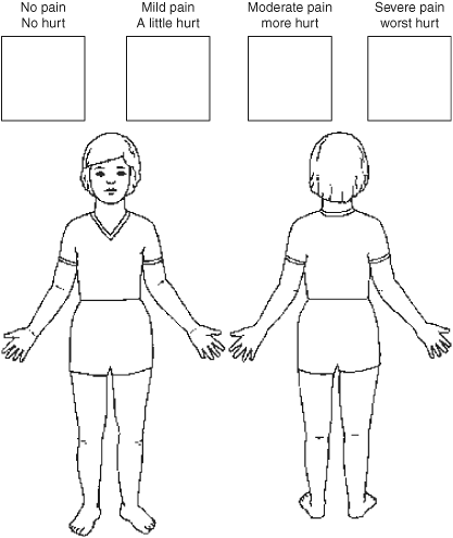
Drawing of child front and back


Source Article(s): Hebrew Pain scale
- Request
- I need a line drawing of one color clothed child front and back like the source I`ve attached. I need a similar drawing of the child only (I`ll add the Hebrew squares). Have been searching commons for hours but all I have found is those two pictures in the top.
- Graphist opinion(s)
- Is the source image free media? I've traced it but now realise that it's from the ~1970s (?) and probably can't be traced due to copyright reasons. If you can find the licence I'll upload my traced SVG Carlinmack (talk) 16:49, 13 April 2020 (UTC)
- As I wrote, it is`nt. I need a line draw similar to the right picture of a young kid. I need a black fading gradient on left shoulder or another pain area. Tal (רונאלדיניו המלך, talk) 22:54, 16 April 2020 (UTC)
Arms of Lord Mayor Russell
- Request
An image of Lord Mayor Russell's coat of arms for his term of office (2019–21) which impales his corporate arms with those of his family, viz:
-
 City of London arms
 -
 Russell arms


Please advise - many thanks.
Yours, 194.50.30.10 00:28, 11 April 2020 (UTC)
- Graphist opinion(s)
Exactly what work do you want done? Please be specific. —RCraig09 (talk) 02:53, 23 April 2020 (UTC)
- User:Robin S. Taylor, by any chance do you know what is being requested here? I see you uploaded File:Russell_of_Killowen_Escutcheon.png; could it just be a request to convert to SVG? Oddly, File:Blason_ville_uk_Londres.svg is already SVG. —RCraig09 (talk) 21:07, 3 May 2020 (UTC)
- I'm a little confused, but I would guess that the request is for an impaled shield with the arms of the Lord Mayor of London in the dexter and William Russell's personal arms in the sinister. Robin S. Taylor (talk) 21:21, 3 May 2020 (UTC)
- ~ scratches head ~ It sounds like a bit of artistic license is called for. It looks like the component elements are in SVG already, but as a heraldic newbie I'd only be guessing at what to do. If no more specific instructions are given, someone else will have to handle. —RCraig09 (talk) 00:47, 4 May 2020 (UTC)
- I'm a little confused, but I would guess that the request is for an impaled shield with the arms of the Lord Mayor of London in the dexter and William Russell's personal arms in the sinister. Robin S. Taylor (talk) 21:21, 3 May 2020 (UTC)
Brighter colour of photographs
-
 Michel Felisi 2018 - 1.PNG
 -
 Michel Felisi 2018 - 2.PNG
 -
 Michel Felisi 2018 - 3.PNG


Article(s): nl:Michel Felisi
- Request
- These photographs are quite dark. Is it possible to brighten them up so one can see the person on the photo better?
- Ymnes (talk) 15:17, 12 April 2020 (UTC)
- Graphist opinion(s)
- @Ymnes: Done MacMoreno (talk) 15:59, 12 April 2020 (UTC).
- @MacMoreno: Very nice, thank you very much! Ymnes (talk) 16:00, 12 April 2020 (UTC)
- Apparently resolved by User:MacMoreno's newly uploaded versions.
- @MacMoreno: Very nice, thank you very much! Ymnes (talk) 16:00, 12 April 2020 (UTC)
Image corruption detected in File:... created by JPEGcrop application

Drawings of two coins
Article(s): [[]]
- Request
- To enable categorizing and using these two coin drawings independently, I wanted to split the original image and drop the embedded captions, but recalled I could not use Commons:CropTool as this would replace the original image by the (one and only one) cropped version.
- Instead, as per Help:Removing_watermarks I used the lossless JPEGcrop application, twice. The resulting two JPG files looked OK in IrfanView, so I uploaded them to File:2-3_Thaler_1721_Georg_Ludwig.jpg and File:2-3_Thaler_1754_Georg_II.jpg, respectively.
- However, both attempts were flagged with error messages e.g.: "Image corruption detected in File:2-3 Thaler 1721... Hello HReuter, it appears that the version of File:2-3 Thaler 1721 Georg Ludwig.jpg which you uploaded 2020-04-10T12:25:38Z is broken... " and the uploads could not be viewed -- no idea why.
- As a workaround, I did similar crops using an old version of Photoshop I had and could now upload the resulting single images without any problem, but lossy (at least in principle) and with larger filesizes.
- While I could leave it this way, I am still interested to learn what went wrong, or how to do better, even more so since a similar situation may arise anytime.
- Thanks in advance, HReuter (talk) 16:09, 13 April 2020 (UTC)
- Graphist opinion(s)
- @HReuter: You can upload to a new file using toolforge:croptool, it's an option that appears after previewing the crop. In many cases, it will in fact be the default option. I can confirm that firefox refuses to open the image, but ImageMagick (the software that Wikimedia uses to make thumbnails) and jpegtran (the software that CropTool and Jpegcrop use) are entirely fine with it. There are three typical types of corruption that I see: Missing end marker (some of the image data got left behind), two images in one file, and improper encoding. This file appears to have all the data, doesn't have anything tacked on to the end as far as I can see, and has the correct w:JFIF encoding. @TheSandDoctor: do you have any ideas? --AntiCompositeNumber (talk) 17:33, 15 April 2020 (UTC)
Coat of arms of Armstrong, Santa Fe
Please, based on File:Escudo_de_Armstrong_(Santa_Fe).jpg complete File:Armstrong.svg the right down part, it's very difficult for me vectorize it, regards!! Ezarateesteban 16:23, 23 April 2020 (UTC)
Graphist response:
- I will generate a new SVG. —RCraig09 (talk) 17:53, 10 May 2020 (UTC)
![]() Request taken by RCraig09 (talk) 17:53, 10 May 2020 (UTC)
Request taken by RCraig09 (talk) 17:53, 10 May 2020 (UTC)
-
JPG mentioned above, started April 2018
-
PNG version, started October 2019
-
File:Armstrong.svg (created 10 May 2020)
I've completed and uploaded Version 4 of File:Armstrong.svg, based on the government website here.
I see that the rings aren't centered above the shield, which seemed wrong. However, I stayed true to the government website. I can change if necessary. Tell me if you have suggestions. —RCraig09 (talk) 22:54, 10 May 2020 (UTC)
- Why you now place this file in many local wikis instead of simple replacing old file on Wikidata? In ru-wiki, for example, during long time we use automatic import from wikidata without unnecessary boilerplate code. Slb nsk (talk) 00:23, 11 May 2020 (UTC)
- Slb nsk,
I don't understand how Wikidata relates to Commons images.I thought that replacing JPG images with SVG images was normal policy.I don't know how to "replace an old file on Wikidata".00:56, 11 May 2020 (UTC) I just figured out how to make an image display through Wikidata. —RCraig09 (talk) 04:32, 11 May 2020 (UTC)
- Slb nsk,
- Why you now place this file in many local wikis instead of simple replacing old file on Wikidata? In ru-wiki, for example, during long time we use automatic import from wikidata without unnecessary boilerplate code. Slb nsk (talk) 00:23, 11 May 2020 (UTC)
thanks a lot!!! Ezarateesteban 12:49, 11 May 2020 (UTC)
Coat of arms of Jakarta
-
 Vectorize. File name: Coat of Arms of Jakarta (1951-1963)
 -
 Vectorized SVG

.svg)
Article(s): en:Coat of arms of Jakarta
- Graphist opinion(s)
Done —User:MacMoreno
- Apparently resolved by User:MacMoreno's SVG uploaded 7 May 2020.
England only 2019 GE Election Map
-
 UK 2019 Election Map (Please can a new map be created which is similar to this that excludes Scotland Wales and Northern Ireland to make it a England only map.
 -
 England 2017 Election Map (Please can a new map like this be created which shows results from the 2019 election).


Article(s): Various
- Request
- Please can a map similar to this be recreated but exclude result from Wales Scotland and Northern Ireland to make it a England only map. (MOTORAL1987 (talk) 15:11, 26 April 2020 (UTC))
- Graphist opinion(s)
- I will give this a try and report back within a day or two. —RCraig09 (talk) 17:19, 26 April 2020 (UTC)
- Thank you. If you need any help this link might help you as it’s from the 2017 election and the broundries used were exectly the same For the 2019 election. (MOTORAL1987 (talk) 17:54, 26 April 2020 (UTC))
- @MOTORAL1987: Regrettably, the internal complexity of the SVG file make this change beyond my skill level in Inkscape (it's not just a matter of deleting colored areas, as it turns out). I can email anyone the SVG as far as I've taken it, but someone else will have to either continue it or start from scratch. Sorry to disappoint. —RCraig09 (talk) 18:33, 26 April 2020 (UTC)
- Thank you. If you need any help this link might help you as it’s from the 2017 election and the broundries used were exectly the same For the 2019 election. (MOTORAL1987 (talk) 17:54, 26 April 2020 (UTC))
To emphasize: this request is still open for others to handle. Sorry I can't. —RCraig09 (talk) 18:55, 1 May 2020 (UTC)
- I have added a map from the 2017 election that could be used as a template for the 2019 results map. Please can someone take this up. (MOTORAL1987 (talk) 14:37, 7 May 2020 (UTC))
Map for 2019–20 locust infestation
Hi, can anyone make a map showing the spread of locusts for this article en:2019–20 locust infestation? There's an example of a good map in this FAO briefing but unfortunately it's not free. Thank you! -- Phoebe (talk) 13:15, 28 April 2020 (UTC)
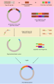
PDF to SVG: license plates
-
 PDF source
 -
 SVG equivalent, as improved by User:NikNaks
Article(s): all pages linked to d:Q22706
- Request
- Could be this PDF diagram redone as SVG? The PDF preview is really strange, otherwise it is very useful graphic. — Draceane talkcontrib. 12:27, 29 April 2020 (UTC)
- Graphist opinion(s)
- Is File:License plate sizes.svg (2014) an acceptable substitute? —RCraig09 (talk) 14:48, 29 April 2020 (UTC)
- @RCraig09: I think that it's OK, but the SVG should be fixed, because the text doesn't appear in thumbnails and preview... — Draceane talkcontrib. 08:11, 30 April 2020 (UTC)
Section is apparently resolved. —RCraig09 (talk) 22:05, 8 May 2020 (UTC)
Vectorize signature
-
 John Richard Clark Hall signature
 -
 File:1911 England Census - John Richard Clark Hall signature.svg
Article(s): en:John Richard Clark Hall
- Request
- Would somebody please vectorize the above signature? Thanks, --Usernameunique (talk) 05:51, 4 May 2020 (UTC)
- Graphist opinion(s)
![]() Request taken by —RCraig09 (talk) 18:37, 8 May 2020 (UTC)
Request taken by —RCraig09 (talk) 18:37, 8 May 2020 (UTC)
![]() Done
Done
- Thanks, RCraig09, that looks great. It does a particularly nice job of capturing the boldness of the signature. —Usernameunique (talk) 22:16, 8 May 2020 (UTC)
Sutton Hoo helmet design 2
Article(s): en:Sutton Hoo helmet
- Request
- Could somebody please create a version of design 2 from the Sutton Hoo helmet? An example can be seen here, but I can email a high quality version from which to trace. Ideally this should result in something similar to this version of design 1, which Goran tek-en kindly created last year. --Usernameunique (talk) 06:02, 4 May 2020 (UTC)
- Graphist opinion(s)
![]() Request taken by Goran tek-en (talk) 13:07, 4 May 2020 (UTC) Usernameunique Will get back to you soon but you can send me the high resolution meanwhile. --Goran tek-en (talk) 13:07, 4 May 2020 (UTC)
Request taken by Goran tek-en (talk) 13:07, 4 May 2020 (UTC) Usernameunique Will get back to you soon but you can send me the high resolution meanwhile. --Goran tek-en (talk) 13:07, 4 May 2020 (UTC)
- Sent, thanks! --Usernameunique (talk) 06:07, 5 May 2020 (UTC)
Chart of New Zealand Political System
-
 Chart of New Zealand political system
 -
 Model chart


Article(s):
- Request
- Please create an svg version of this chart. --Hazhk (talk) 15:12, 2 May 2020 (UTC)
- Graphist opinion(s)
- Before vectorization to SVG: should this chart be refined in substance before being used? Compare to Constitution Act 1986. —RCraig09 (talk) 16:08, 2 May 2020 (UTC)
- It's not a comprehensive chart but it gives a brief summary of the New Zealand political system. If one were to make a more detailed version of the chart then perhaps a modified version of this comparable chart of the UK political system – with the lower house named "House of Representatives" and minus the upper house (the Lords), with the addition of the governor-general — would be more suitable. I don't know how easy it would be to modify the UK chart, but perhaps that would be more informative. Thanks for the suggestion. --Hazhk (talk) 16:38, 2 May 2020 (UTC)
- —I would feel much more comfortable if you could first modify your own diagram, with the interconnecting lines being explained, and element names being more formally correct (since the diagram is for an encyclopedia). For example, the names "government departments" and "statutory bodies" are vague, or so broad as to cover entities not directly under the executive.
- —See Category:Political organization charts. The particular example File:Political System of the United States.svg is more detailed than you need to be, but I think it's a good, longstanding, widely used diagram to use as a model.
- —As a yank, I won't tackle New Zealand government structure myself, but in any event I think today's version of the chart is not ready for use in an encyclopedia. —RCraig09 (talk) 17:46, 2 May 2020 (UTC)
- Yes, you're right that the chart is oversimplified compared to the other political organizational charts you linked to. I admit that I wasn't familiar with those images. I tried to keep it simple in part because I don't know how to create a complex chart. It's asking a lot of you to create an entirely new chart. For that reason, I'll withdraw this request and try and find a more suitable image first. Thanks for the recommendations. --Hazhk (talk) 08:19, 3 May 2020 (UTC)
- I think you User:Hazhk will find a number of people here who will want to do the graphics work, once a mature diagram is developed. Best wishes. —RCraig09 (talk) 14:39, 3 May 2020 (UTC)
- Yes, you're right that the chart is oversimplified compared to the other political organizational charts you linked to. I admit that I wasn't familiar with those images. I tried to keep it simple in part because I don't know how to create a complex chart. It's asking a lot of you to create an entirely new chart. For that reason, I'll withdraw this request and try and find a more suitable image first. Thanks for the recommendations. --Hazhk (talk) 08:19, 3 May 2020 (UTC)
- It's not a comprehensive chart but it gives a brief summary of the New Zealand political system. If one were to make a more detailed version of the chart then perhaps a modified version of this comparable chart of the UK political system – with the lower house named "House of Representatives" and minus the upper house (the Lords), with the addition of the governor-general — would be more suitable. I don't know how easy it would be to modify the UK chart, but perhaps that would be more informative. Thanks for the suggestion. --Hazhk (talk) 16:38, 2 May 2020 (UTC)
![]() Not done
Not done
(second attempt)
-
Organisational chart of New Zealand political system (prior PNG)
-
 File:20200508 New Zealand government structure.svg

Article(s): en:Politics of New Zealand
- Request
- I've gone back to the drawing board and created this more detailed chart of the New Zealand political system. I have uploaded a new version of the file; you may need to purge the cache to see the changes. (It depicts the political system as set out in the Constitution Act 1986 as well as conventional practices.) Please would a graphic designer create a more polished version of this chart in .svg format. Thanks in advance! --Hazhk (talk) 20:18, 4 May 2020 (UTC)
- Graphist opinion(s)
- a) It's a step in the right direction. However, it's standard for organizational charts to have the "highest" (supervisory, most powerful) entities at the top, with subordinate entities beneath. Examples: Are all three courts directly connected (allow direct appeals) to the Supreme Court? Is the Prime Minister really "within" the Executive Council? etc.
- b) The ~13 different colors are confusing; if different colors are used, the entities should be color-coded to distinguish meaning and distinction or similarities of the various blocks. Don't just decorate.
- c) I see the listing of "Government departments, Crown entities, statutory bodies" remains. This listing seems to be vague and overly broad and, to an outsider's view at least, apparently incorrect and not illuminating.
- d) I again suggest you take a serious look at File:Political System of the United States.svg and refine your existing chart. —RCraig09 (talk) 20:43, 4 May 2020 (UTC)
- Thanks for the recommendations. I did look at the U.S. chart and others and while they are helpful I think it would be inaccurate to model the New Zealand chart off an explanation of the U.S. presidential system. In parliamentary systems such as NZ there is no strict separation of powers; yes, the prime minister is an ordinary member of the Executive Council and Cabinet as well as Parliament.
The connections between the courts was a silly error on my part and one that I corrected. I revisit the colour coding. As is very evident, I have no experience in graphics design or creating charts and diagrams, and my request is that someone who does have expertise in designing charts will be able to create one. --Hazhk (talk) 22:00, 4 May 2020 (UTC)- 1) I was definitely not attempting to liken the U.S. government structure to the N.Z. government structure. I was referring to the approach of the U.S. chart versus your chart.
- 2) Specifically, the U.S. diagram has legends explaining a small number of consistently applied color codes, legends explaining colored arrows, elements clearly contained in other elements versus separate from other elements, etc. In contrast, beyond the number of colors in your chart, the meaning of the Governor-General spanning the edge of your Parliament block is unclear, etc.
- 3) A graphics guy could simply convert your chart to an SVG format, but that would not serve readers well. The choke point here is clarifying what you want the graphics guy to actually create. Maybe you could find a suitable NZ government chart(s) and post link(s) here; you can't be the first one in history to have thought of the idea! —RCraig09 (talk) 06:33, 5 May 2020 (UTC)
- I have made further changes to the chart and I believe it is now adequate. That is, the essential information is present. This is meant to be an illustration of the more-detailed explanatory text within the en:Politics of New Zealand article. I would appreciate it if a graphics editor could take the information from this file and apply it to an svg template; the new chart does not need to be perfectly replicate my attempt, it merely needs to convey the same diagram/layout. I hope that this is OK. --Hazhk (talk) 15:35, 5 May 2020 (UTC)
- I think that this version is workable. I'll be busy on an unrelated project for at least a day or two, so another illustrator can take up the project if I don't get to it. I will post the {{I take ___ }} template if no one else accepts. —RCraig09 (talk) 16:11, 5 May 2020 (UTC)
- Thanks for your recommendations. I await to see who will work on this. --Hazhk (talk) 18:18, 5 May 2020 (UTC)
- I think that this version is workable. I'll be busy on an unrelated project for at least a day or two, so another illustrator can take up the project if I don't get to it. I will post the {{I take ___ }} template if no one else accepts. —RCraig09 (talk) 16:11, 5 May 2020 (UTC)
- I have made further changes to the chart and I believe it is now adequate. That is, the essential information is present. This is meant to be an illustration of the more-detailed explanatory text within the en:Politics of New Zealand article. I would appreciate it if a graphics editor could take the information from this file and apply it to an svg template; the new chart does not need to be perfectly replicate my attempt, it merely needs to convey the same diagram/layout. I hope that this is OK. --Hazhk (talk) 15:35, 5 May 2020 (UTC)
- Thanks for the recommendations. I did look at the U.S. chart and others and while they are helpful I think it would be inaccurate to model the New Zealand chart off an explanation of the U.S. presidential system. In parliamentary systems such as NZ there is no strict separation of powers; yes, the prime minister is an ordinary member of the Executive Council and Cabinet as well as Parliament.
It may take a while since it will take a bit of background research, but... ![]() Request taken by —RCraig09 (talk) 20:00, 7 May 2020 (UTC)
Request taken by —RCraig09 (talk) 20:00, 7 May 2020 (UTC)
- I found good textual description sourcing (listed in the file description page). Let me know if anything is "off" (especially in the relationship between the Ministers and Parliament). I can revise if needed. —RCraig09 (talk) 06:45, 8 May 2020 (UTC)
- I think it looks superb. The "support … opposition" text is not the usual terminology but that's not a problem. The only element that I feel could be confusing is the arrangement of ministers in the 'Executive' box. Ministers of the Crown and the Executive Council are one and the same; all ministers are members of the Executive Council but only the senior ministers are members of the Cabinet. In my crude mock-up I tried to show Cabinet as a subset of the Executive Council with a discrete group of ministers outside Cabinet. Do you think there is an easy way to convey this? At least removing 'Ministers of the Crown', leaving only "Prime minister, Cabinet ministers, ministers outside Cabinet" would be better. Apart from that, I am very grateful for your work. --Hazhk (talk) 09:44, 8 May 2020 (UTC)
- I've made the suggested changes. Thanks for all your input; I think the project has turned out well. I'm surprised such a chart hadn't been made for NZ already! —RCraig09 (talk) 17:41, 8 May 2020 (UTC)
- Thanks. --Hazhk (talk) 18:34, 8 May 2020 (UTC)
- I've made the suggested changes. Thanks for all your input; I think the project has turned out well. I'm surprised such a chart hadn't been made for NZ already! —RCraig09 (talk) 17:41, 8 May 2020 (UTC)
- I think it looks superb. The "support … opposition" text is not the usual terminology but that's not a problem. The only element that I feel could be confusing is the arrangement of ministers in the 'Executive' box. Ministers of the Crown and the Executive Council are one and the same; all ministers are members of the Executive Council but only the senior ministers are members of the Cabinet. In my crude mock-up I tried to show Cabinet as a subset of the Executive Council with a discrete group of ministers outside Cabinet. Do you think there is an easy way to convey this? At least removing 'Ministers of the Crown', leaving only "Prime minister, Cabinet ministers, ministers outside Cabinet" would be better. Apart from that, I am very grateful for your work. --Hazhk (talk) 09:44, 8 May 2020 (UTC)
- @RCraig09:
- This file has trivial shapes (rectangles and Manhattan arrows) and two dozen text strings, but the original upload was more than 400 kB. I want WMF to serve most SVG files directly rather than going through a (flawed) rasterization step, but that's not going to happen if the typical SVG is a large file.
- This illustration should use straight text. It should not convert its text elements to curves. Making the text hidden does not help with translation but rather confounds it. https://tools.wmflabs.org/svgtranslate/File:20200508_New_Zealand_government_structure.svg is unusable — adding transparent translations to a file serves no purpose. The tool sees some text, offers to translate, but never changes the image because the translations are also transparent. Even if it did display the translations, the tool would not know how to remove the text converted to curves. By the way, the text is not "transparent"; the text has
display="none"; such text cannot be selected and then pasted elsewhere. - The illustration has become very complicated to work around a problem that is simple to fix.
- It is far less work to just make generic fonts work. Then translations to other languages are then easy. The text layer already uses
text-anchor="middle", so minor font differences should have little impact. In ordinary circumstances, a generic CSS font would work fine. - The illustration does tickle a
librsvgrendering bug because the fonts are 5.6, 7, 8.5, and 10 pixels high. That's because the image uses a smallviewBox="0 0 317.5 238.125". If the image used a largerviewBox(say 900×700 pixels) and scaled the fonts to fit that box, then the fonts would look fine. (librsvgdoes a reasonable job painting 15, 21, 24, and 30px fonts) - If you upload the illustration without the text-to-curves but keeping its current
viewBox, JoKalliauer can use one of his black magic scripts and scale the image. - In the future, if you make your illustrations on a larger canvas and use bigger fonts, then
librsvgshould look OK. - Glrx (talk) 22:48, 10 May 2020 (UTC)
- — Wow. I had ongoing problems with text rendering (especially of thumbnails), even when using
Liberation Sans, Arial, Helvetica, sans-serifas suggested on SVG help on en.wikipedia. In this particular text-intensive image I used 20-28pt fonts on a 1200x900px "page". This file is not "unusable"; it's just that Inkscape or equivalent would have to be used to translate. - — I am familiar with Inkscape, but (like probably most editors) not with XML intricacies. I have no clue what
viewBoxis, or involves. User:JoKalliauer has already made a newer, smaller version with an edit summary that's beyond my skill level. - — A few months ago, a more graphically experienced editor User_talk:Efbrazil also encountered text rendering issues, ending up submitting a formal request to fix this longstanding font rendering issue (sorry I don't remember where or how, exactly). He can explain better than I.
- — If you know an easy way to "make generic fonts work" without having to become an XML coder, please explain. —RCraig09 (talk) 01:30, 11 May 2020 (UTC)
- — Wow. I had ongoing problems with text rendering (especially of thumbnails), even when using
- @RCraig09:
- You are using the correct text anchors, so the actual choice of the font does not matter. You do not need to specify the four fonts, and it is probably best if you just specify
sans-serif. The font substitution list is important when the artist has anchored the text in the wrong manner but uses the font length to make it appear correct. Imagine centering text by adjusting the starting point of the text. If somebody else uses a different font with different metrics, then the text may not look centered anymore. The four-font substitution list is trying to use fonts with similar metrics, so if the artist did rely on the font metrics for positioning, the result will still be close. The New Zealand image does not have that problem but rather the small font problem. The New Zealand image is not using 20px fonts but rather 5.6px fonts. Also "20pt" (20 points) is not "20px" (20 pixels). - The
viewBoxis the natural size of the image, which in this case is 317.5 wide × 238.125 pixels tall. That means the SVG coordinates in the file will use those values. A font that is 7px high would be about 7⁄238 or about 1⁄30 of the rendered height. You may think your diagram is 1200 × 900 pixels, but its not. The SVG file says<svg … width="1200" height="900" … viewBox="0 0 317.5 238.125" xmlns="http://www.w3.org/2000/svg" …>
- The
viewBoxdescribes the rectangle of the SVG coordinate system to view. Thewidthandheighttell the browser to scale that viewing area into a 1200 × 900 area on the screen. It also turns out that MW will ignorewidthandheightand use the width and height requested by the wiki page. The important point is thelibrsvgbug is based on the pixel size commanded in the SVG code, and in the New Zealand case, that size is 5.6px. I do not know Inkscape, but Inkscape may be reporting the apparent font size of (1200⁄317)×5.6 ≅ 21. The font sizes in the SVG file must be bigger to avoid thelibrsvgbug.
- The bug is long standing, but it is not a MW bug. MW uses the free software
librsvg, and that software has many outstanding issues that will probably not be fixed anytime soon. That's one of the reasons to have small SVG files: it may be that WMF will start to serve small SVG files beforelibrsvgfixes this rendering bug. - You make the generic fonts work by starting with a larger native (not scaled) image size (1200 pixels wide rather than 317) and use font sizes appropriate to that larger native area. JoKalliauer would know the appropriate incantations to Inkscape. (Just taking a 317px wide image and scaling it by a factor of 4 does not avoid the bug.)
- You are using the correct text anchors, so the actual choice of the font does not matter. You do not need to specify the four fonts, and it is probably best if you just specify
- Glrx (talk) 03:44, 11 May 2020 (UTC)
- Thanks for the explanations, Glrx. It's a mystery to me why the file recites
viewBox="0 0 317.49999 238.125"in the first place. It seems like specifying a larger viewBox at the outset, might avoid problems. I'll await further word from JoKalliauer. —RCraig09 (talk) 04:37, 11 May 2020 (UTC)- @RCraig09: Afaik I wrote the suggestion of the fallback-fonts, knowingly it can be seen differently. (I care about the font-metrics so I don't care about sans-serif and would remove it, and Glrx cares about the generic font families (Serif or not) so he would remove all fallback-font except sans-serif, so the compromise was to add both. More infos see: Help:SVG#fallback)
- Also I generally agree with User:Glrx, however I have a different flavour/liking: I not even changed the font in the file (only some differences of the renderer), and File:20200508_New_Zealand_government_structure.svg has (imho serious) alignment problems: "Elected MPs" and "judicial review" touch/cross paths (they imho should be changed to
text-anchor="end"), those problems dissapear as soon as you open the svg in your favourite browser (assuming you have "Liberation Sans" or "Arial" or both installed). If you would allow different font-families with different metrics, the Problems can be much more serious. - @RCraig09: I optimized you file much more agressively, If you don't like it revert it or tell me what to change.
- — Johannes Kalliauer - Talk | Contributions 08:10, 11 May 2020 (UTC)
- Thanks for the explanations, Glrx. It's a mystery to me why the file recites
- @RCraig09:
- I appreciate the time you have spent, explaining things. Thank you & vielen Dank.
- — To summarize: The details are complicated and technical, but the two choices are:
- Smaller file size, easier to translate "automatically" — good for tech-savvy XML editors
- Exact font-path rendering, consistent font-path rendering across platforms, reasonably easy to translate in user-friendly programs (Inkscape) — good for the viewer, good for most WP editors.
- — Here, the thumbnails of this file new version do not render "Interpretation; judicial review" consistently across three articles Government of New Zealand, Politics of New Zealand, Constitution of New Zealand on my desktop, or iPhone Safari. I think that if you (Johannes) want to adjust this text object, and "Elected MPs", that would be good.
- — Bottomline: the fact the we are having this long conversation, linking to help: pages etc., shows there is a huge problem, with no clean solution in sight. I'm impressed the file has gone from 421KB to 8KB; however I don't have the technical knowledge to understand or perform extreme optimization. —RCraig09 (talk) 16:38, 11 May 2020 (UTC)
ABS-CBN horizontal logo
-

-
 Match with the logo
.svg)
Article(s): en:ABS-CBN
- Request
- Please replace the dash with the iconic symbol. --49.146.15.107 05:44, 11 May 2020 (UTC)
- Graphist opinion(s)
Insignia of the Pasundan Police Department
-
 Please replace the mock up vector with a real vector. Thanks.

Coat of arms of Wiranatakusumah V
-
 Please replace the mock up vector with a real vector. Thanks.

Flags of East Indonesia
-
 Ratio 3:2
 -
 Ratio 3:1
 -
 Ratio 3:2
 -


.jpg&action=edit&redlink=1)
.jpg)
.png)
Article(s): en:State of East Indonesia
- Request
- Please replace the mock up vector with a real vector. Thanks. --Jeromi Mikhael (talk) 07:39, 11 May 2020 (UTC)
- Graphist opinion(s)