Commons:Graphic Lab/Illustration workshop
| Illustration Workshop | Map Workshop | Photography Workshop | Video and Sound Workshop |
 Illustration workshop
This workshop is part of the Graphics Lab, a project aimed at picture retouching to improve the graphical content of the Wikimedia projects. More information about the lab can be found on its main page and requests pages (Illustrations ; Photographs ; Maps ; Video and Sound). To ask questions or make a suggestions, see the talk page of the graphic lab page.
This specific page is the requests page for the Illustration Workshop. Anyone can make a request for an illustration to be created or improved. The standard format for making a request is shown below, along with general advice, and should be followed.
Make a request
Use the following template when making a new request, replacing the examples with your image(s) and request(s):
<gallery>
 IMAGENAME.EXT|Description of image
 IMAGE#TWO.EXT|2nd image (If there is one)
 ETCETCETC.EXT|Don't request too many at once, though
</gallery>

;Request:
: Details of your request go here… --~~~~
;Graphist opinion(s):
See also
| SpBot archives all sections tagged with {{Section resolved|1=~~~~}} after 7 days and sections whose most recent comment is older than 60 days. For the archive overview, see /Archive. The latest archive is located at /Archive/2024. | |
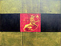
Proposed flags of Norway (1821)
-
 Proposal 1
 -
 Proposal 2
 -
 Proposal 6
 -
 Proposal 7
 -
 Proposal 8
 -
 Proposal 10
 -
 Proposal 11 (version 1)
 -
 Proposal 11 (version 2)
 -
 Proposal 11 (version 3)
 -
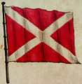 Proposal 13
 -
 Proposal 14
 -
 Proposal 15
 -
 Proposal 16


- Article(s)
- Flag of Norway
- Request
- Could someone please create SVG files of the above proposals for the flag of Norway from 1821. More information on them can be seen on this page here. Thanks. Snow Lion Fenian (talk) 17:57, 2 May 2021 (UTC)
- Graphist opinions
- @Snow Lion Fenian:
- Other source images can be found at Forslag til flagg, for year 1821. Those are same images, but with layout paper for color expectation. En rouge (talk) 19:33, 28 May 2021 (UTC)
- I think that the second (2nd) proposal can simply be made by taking the flag of the Dominican Republic (or "Santo Domingo") and removing the coat of arms. --Donald Trung 『徵國單』 (No Fake News 💬) (WikiProject Numismatics 💴) (Articles 📚) 06:39, 24 July 2021 (UTC)
![]() Request taken by En rouge (talk) 22:17, 8 September 2021 (UTC)
Request taken by En rouge (talk) 22:17, 8 September 2021 (UTC)
- to be progressively completed...
-
 Norway flag 1821 proposal 1.svg
to be completed -
 Norway flag 1821 proposal 2.svg
to be completed -
 Norway flag 1821 proposal 6.svg
to be completed -
 Norway flag 1821 proposal 7.svg
to be completed -
 Norway flag 1821 proposal 8.svg
to be completed -
 Norway flag 1821 proposal 10.svg
to be completed -
 Norway flag 1821 proposal 11-A.svg
to be completed -
 Norway flag 1821 proposal 11-B.svg
to be completed -
 Norway flag 1821 proposal 11-C.svg
to be completed -
 Norway flag 1821 proposal 13.svg
to be completed -
 Norway flag 1821 proposal 14.svg
to be completed -
 Norway flag 1821 proposal 15.svg
to be completed -
 Norway flag 1821 proposal 16.svg
to be completed


- @Snow Lion Fenian:
- before completing ornaments on flags, please tell me if you have some comments/requirements, essentially about aspect ratio, line width, colors, or...
- yours, En rouge (talk) 02:17, 9 September 2021 (UTC)
- @En rouge: Those all seem nicely in order, thank you for doing this. I'd say it's okay to go ahead and add the extra symbols on each one. Snow Lion Fenian (talk) 15:43, 9 September 2021 (UTC)
213.192.68.53, 10 September 2021
- two comments
- - 10 doesn't use this strange color, but only yellowed material.
- - 14 does not present Scandinavian cross, only a very thick Saint George's Cross
— 213.192.68.53 — end
— En rouge edit, moved from above:
- — Moved gallery posted by @213.192.68.53: :
-
 right lion to most flags, but on some he shouldn't have a crown and the golden ax
 -
 Lion for 7, the ax should be larger and the tail is different
 -
 crown for 8 and 16, jewels must be gilded
 -
 the lion most similar to the 15, also the wrong tail
.svg)


_2.svg)
- — 213.192.68.53 — end
— end of En rouge edit
- @213.192.68.53: , please, can you give references for your arguments :
- but in (ref.1), we can see differences between mast color (yellow-ish) and flag color (olive-ish)... what are your sources?
- but I can agree with you, as for #10, I think viewed-black is blue instead, but I have no source...
- I think it's the same (blue instead of black) for 6 & 7 (painted source images give me this feeling), as well as 10 perhaps ;
- 14 seems really be black (but I've got no other source than the given paper painted flags copy)
- for 14: do you mean the cross is centered ? do you have a source ?
- and/or other sources ?
-
- for lion's tail, what's the problem ?
- the main issue can be inward or outward... whatever the painting/display/rendering...
- no?
- all pictures are lion-ward (i.e. outward), rather than leopard-ward (inward)
- so, what do you mean ?
thanks En rouge (talk) 00:17, 11 September 2021 (UTC)
- @En rouge: Given the lack of sources (or indeed responses) from the other User, I think it may be best to proceed with adding the extra symbols to the flags in the best way you see fit yourself. If you're still up for it of course? Snow Lion Fenian (talk) 18:00, 27 September 2021 (UTC)
- Snow Lion Fenian (talk) 05:40, 25 November 2021 (UTC)
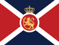
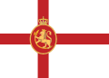
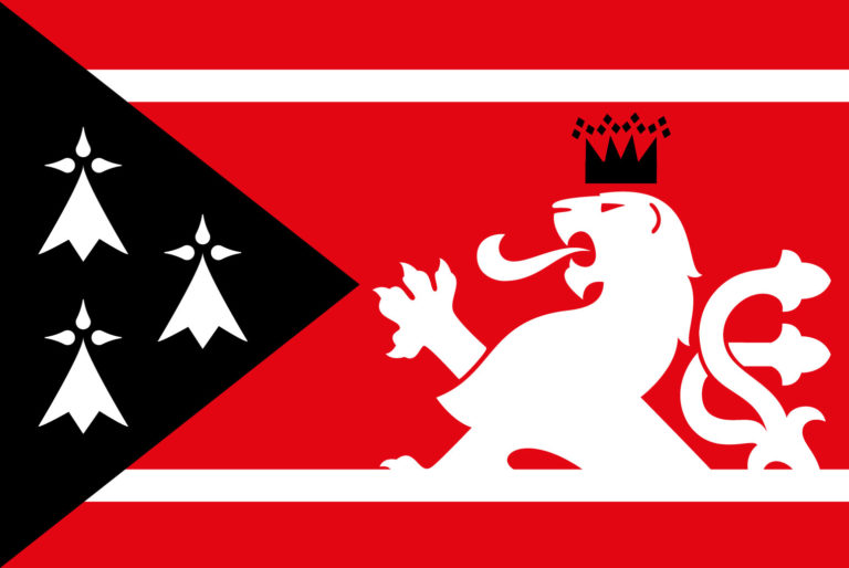
Hunza
-
 correct flag
 -
 correct coat of arms


Article(s): en:Hunza (princely state)
- request(s)
1 request is a restore of the old version of incorrect flag [7] sources:[8] [9] [10] ![]() Done
Done
2 request is the addition of the Mir standard [11], which also requires an emblem.
I have not found a reliable source with the correct image of the coat of arms, but it was certainly a lion holding flag, with a ribbon on the mast with the word Hunza state and inscription above the flag [12] [13], most likely no formal draft exists.
standard name ,,Flag of Mir of Hunza`` coat of arms name ,,Emblem of Hunza (Kanjut)``
213.192.68.53 12.7.2021
- Graphist opinion(s)
Emblem of Bombay State, Vindhya Pradesh and Goa, Daman and Diu
-
 Emblem of Vindhya Pradesh
 -
 Emblem of Bombay State
 -
 Emblem of Goa, Daman and Diu
 -
 Emblem of India.svg


Article(s): w:Vindhya Pradesh w:Bombay State w:Goa, Daman and Diu
- Request
- please vectorize emblem of Bombay State, Vindhya Pradesh and Goa, Daman and Diu.
213.192.68.53 1.8.2021
- Graphist opinion(s)
New version of File:Nuvola Nordic flags.svg
-
 Replace the flag of the Faroe Islands in this image with the flag of Finland
 -
 The flag of Finland
 -
 new SVG
 Done
Done


Article(s): en:Template:User Nordic cinema task force and en:Template:WikiProject Film
- Request
- Make a new edited version of File:Nuvola Nordic flags.svg
 by replacing its flag of the Faroe Islands
  with the flag of Finland
  , so then it has all five flags of the five Nordic countries.
The new image would replace the Nordic cinema task force's image in the templates User Nordic cinema task force and WikiProject Film. --85.23.79.231 14:10, 25 August 2021 (UTC) - Graphist opinion(s)
Not a graphist. Is this not done one purpose to exclude Finland which is culturally different from the other countries? I feel such a request should be to make a new image and not to overwrite the previous one. Veverve (talk) 01:24, 27 August 2021 (UTC)
- Yes, that's what I meant with the "new edited version", sorry if the request wasn't clear enough. It can be named something like File:Nuvola Nordic flags v2.svg or File:Nuvola Nordic countries flags.svg. 85.23.79.231 11:13, 27 August 2021 (UTC)
Bump. Is this too hard? If it is, it's a bummer, because only images of the five Nordic flags in one picture are photos that don't work that well as logos in reduced sizes. Well, I found this File:Vlajky severskych zemi.png ![]() but I'm afraid that it's too wide. --85.23.79.231 14:43, 29 October 2021 (UTC)
but I'm afraid that it's too wide. --85.23.79.231 14:43, 29 October 2021 (UTC)
- Done --Mrmw (talk) 14:10, 9 December 2021 (UTC)

Article(s): ru:Солнечное затмение 11 августа 1999 года
- Request
- The map has very old borders, i.e. with two Germanies. 217.117.125.83 11:31, 12 September 2021 (UTC)
- Graphist opinion(s)
- erm.. isnt that normal? i mean for the time the image was made?-LadyofHats (talk) 02:03, 4 November 2021 (UTC)
- The graphic is dated 2004, but I guess the plotting software was using an old base map. IMO the political borders are scarcely relevant to the purpose of the image. (And I bet we have dozens to hundreds more charts in the series that show eclipses either earlier or later than the period during which the map was correct.)—Odysseus1479 (talk) 02:25, 4 November 2021 (UTC)
Vectorize Chinese emblem
-
 Chinese emblem from China's State Council Gazette
Article(s): 中华人民共和国国务院公报 on Wikisource
- Request
- Please vectorize the Chinese emblem from the State Council Gazette included above. The emblem should have a single red color. --Kanwenjian (talk) 02:35, 23 September 2021 (UTC)
- Graphist opinion(s)
.svg)
@Kanwenjian: This looks like it's just the normal Emblem of the PRC which is already on commons... are you looking for something different? Wegates (talk) 19:05, 5 November 2021 (UTC)
- @Wegates: , Wikisource tries to as faithfully reproduce documents as possible, in this case it's that emblem but only in red and white. It's like comparing "File:Coat of arms of the Republic of Vietnam (1967-75) (Variant 1).svg" to "File:Coat of arms of the Republic of Vietnam (1963–1975) (Red).svg", the latter would be usable in Wikisource documents where the coat of arms only appears in red like the above. --Donald Trung 『徵國單』 (No Fake News 💬) (WikiProject Numismatics 💴) (Articles 📚) 21:13, 5 November 2021 (UTC)
- @Wegates: , yes please I would like the emblem but only in red and white (or transparent for the white parts). Kanwenjian (talk) 07:35, 16 November 2021 (UTC)
Flag of Jaipur
-
[1] first flag (c.1630 - c.1699, 1818 - 1877), the exact shade can probably not be determined, most likely no one paid special attention to it and individual versions differed from each other, today's colors can be used
-
![Flag of Jaipur (c. 1699-1818) Done: above are modified colors on 2021-11-04, as assumed in [2]](https://upload.wikimedia.org/wikipedia/commons/thumb/6/60/Flag_of_Jaipur_%28c._1699-1818%29.svg/120px-Flag_of_Jaipur_%28c._1699-1818%29.svg.png)
-
![flag 1877-1922 [3]](https://upload.wikimedia.org/wikipedia/commons/thumb/8/8d/Drapeau_Jaipur.png/120px-Drapeau_Jaipur.png) flag 1877-1922 [3]
flag 1877-1922 [3] -
![Flag of Jaipur (1922-1946) Half done: above are modified colors on 2021-11-04, as assumed in [4], sequence was good (green stripe in the middle), if possible, change the name to ,,Flag of Jaipur (1922-1946),,](https://upload.wikimedia.org/wikipedia/commons/thumb/5/5e/Flag_of_Jaipur.svg/120px-Flag_of_Jaipur.svg.png) Flag of Jaipur (1922-1946)
Flag of Jaipur (1922-1946) Half done: above are modified colors on 2021-11-04, as assumed in [4], sequence was good (green stripe in the middle), if possible, change the name to ,,Flag of Jaipur (1922-1946),,
 -
[5] - flag adopted in the second half of the 1940s
-
[6] today's flag used informally by the Maharaja family, consists of two pieces of fabric
-

![Flag of Jaipur (c. 1699-1818) Done: above are modified colors on 2021-11-04, as assumed in [2]](/wiki/File:Flag_of_Jaipur_(c._1699-1818).svg)
![flag 1877-1922 [3]](/wiki/File:Drapeau_Jaipur.png)
![Flag of Jaipur (1922-1946) Half done: above are modified colors on 2021-11-04, as assumed in [4], sequence was good (green stripe in the middle), if possible, change the name to ,,Flag of Jaipur (1922-1946),,](/wiki/File:Flag_of_Jaipur.svg)

Article: w:Jaipur State
- Request
- Please correct the colors for darker ones, obtaining such intense colors was impossible in that era and it's darker today too.
- Today's flag looks like this [14] (today Maharaja's family uses a different color arrangement), the appearance of the flag in British times is difficult to determine, but such saturated colors are unbelievable, because they cannot be obtained with natural dyes. There were actually more flags, here in the best quality I have found (flag 1922 - 1946 is wrong, green should be in the middle, others are good).
-213.192.68.53 15:21, 10 10 2021
- Graphist opinion(s)
Please provide a relevant source for what the colors should look like. Auguel (talk) 21:47, 19 October 2021 (UTC)
![]() Request taken by En rouge (talk), 2021-11-04
Request taken by En rouge (talk), 2021-11-04
- @213.192.68.53: colors modified at your request and your provided "flickr" link. Your link to "worldstatesmen.org" cannot be considered as images expose full range RGB values, invalid for dyes. yours, En rouge (talk) 22:13, 4 November 2021 (UTC)
- Half done as @213.192.68.53: must confirms that colors from "flickr" link are OK for both antic flags (to validate these colors).
- yours, En rouge (talk) 22:13, 4 November 2021 (UTC)
- PS: @213.192.68.53: , please create an account, to be able to notify you of any solve, of any problem, thanks, En rouge (talk) 22:13, 4 November 2021 (UTC)
- I think we didn't understand each other, do as it is in the links, shades of colors, sorry. -213.192.68.53, 11 11 2021
Add curved text to circular SVG
-
 Add text to this SVG...
 -
 ...using this as a reference.
 -
 1961
1961 -
 1972
1972


.png)
.png)
Article(s): Oakland, California
- Request
- Add text to SVG.
- Please add text to the SVG using the PNG as a reference (clearer image here). If you want to, feel free to make any other fixes as you see fit. --– Illegitimate Barrister (talk • contribs), 20:53, 13 October 2021 (UTC)
- Graphist opinion(s)
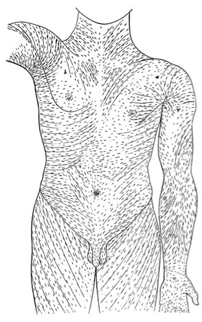
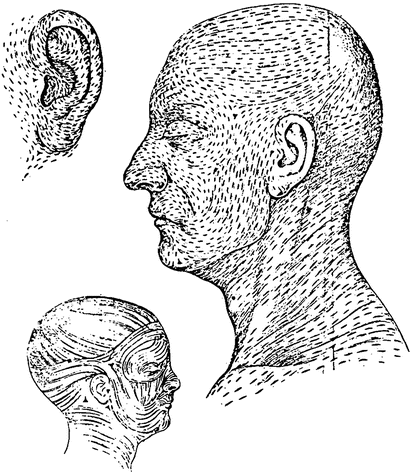
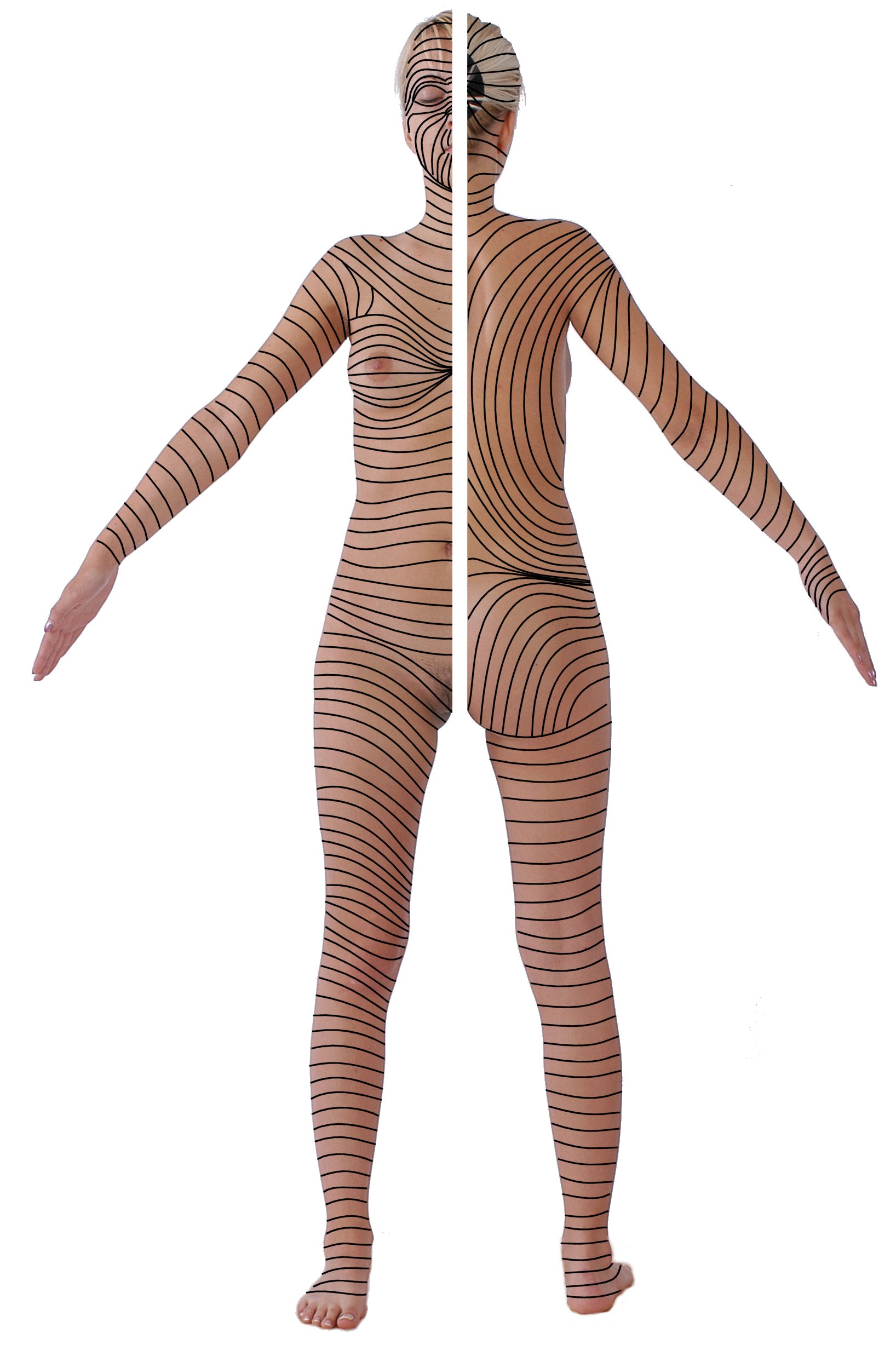
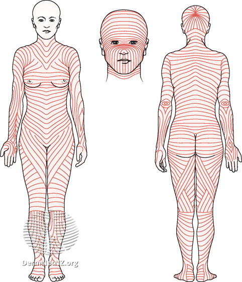
Vector diagrams for linear patterns of the skin
-
 Langer's lines
 -
 Dermatomes


Article(s): en:Langer's lines, en:Blaschko's lines, en:Dermatome (anatomy)
- Request
- I think it would be nice to have standardized vector images for the three common linear patterns of the skin (i.e., Langer's lines, Blaschko's lines, and dermatomes). This article has diagrams of all three of them, but you may want to look at several images for each because there's some variability between different representations.
- As far as the styles of the illustrations, the format of side-by-side anterior and posterior views is the most common.
- From a scientific standpoint, one important consideration to remember is that Langer's lines represent a vector field of skin tension, while Blaschko's lines and dermatomes are used to demarcate particular segments of skin. In other words, for Langer's lines, the lines themselves are what's important, while for Blaschko's lines and dermatomes, it's the segments of skin between the lines that are important. This should influence the choice of coloring style. I think it's going to be too complicated to accurately color Langer's lines and I haven't found any images attempting it, so those don't need to be colored. For the other two, the segments should be colored (we don't even technically need lines between them if the contrast between the colors is enough to see the boundaries between the segments, but I'll defer to your judgement on that). The unique thing about Blaschko's lines is that they have a directionality to them, from back to front (i.e., wrapping around from spine to navel), from medial to lateral (shoulders to fingers) and from top to bottom (hips to toes). The image here may show the directionality a bit better for the legs. I'm not sure what the best way to show the directionality of the segments will be, but perhaps shading them so the beginning is more saturated than the end. Dermatomes should be filled with color according to the level of the nerves innervating them, as shown here.
- Thanks, and happy to discuss further. --Rob Hurt (talk) 00:10, 26 October 2021 (UTC)
- Graphist opinion(s)
![]() Request taken by --please ping me-- Goran tek-en (talk) 15:10, 26 October 2021 (UTC)
Request taken by --please ping me-- Goran tek-en (talk) 15:10, 26 October 2021 (UTC)
@Rob Hurt: I will really need your help all the way here. So you want three different images each representing different lines; Langer's lines, Blaschko's lines, and dermatomes. So first we will have to find a body illustration that can be used for them all. After that I will check more into each and will for sure have questions. --please ping me-- Goran tek-en (talk) 15:10, 26 October 2021 (UTC)
Base bodies
| Extended content |
|---|
@Rob Hurt: Now I finally have the drafts for the bodies, sorry it took so long.
We now (if those are fine with you) have to decide how you want the bodies:
|
Langer's lines
| Extended content |
|---|
|
Rob Hurt, Could you link me to a few of the best images you know of regarding Langer's lines, thanks. --please ping me-- Goran tek-en (talk) 11:51, 15 November 2021 (UTC)
|
@Rob Hurt Now you can find them here; Langer's lines 3D shaded true SVG. If you don't see any problems there this part should be ![]() Done
Done
- For the "gender-neutral version" I'm struggling. If you search for "Androgynous human body illustration" there is not much difference to them and what we have, the genital parts are toned down in the ones we have here already. I do understand your point but to me the people censoring stuff like this is living in a world which I don't want to be a part of. And it will be so hard to decide how to look e.g. would male breasts be fine but not female breasts etc. Can we leave it for now and return later on.
Blaschko's lines
Can you give me a short explanation and link to images which you say is representative for what you want. --please ping me-- Goran tek-en (talk) 19:02, 8 December 2021 (UTC)
- @Goran tek-en Unlike Langer's lines, Blaschko's lines and dermatomes aren't real lines, but instead the regions of skin between the lines are derived from the same embryonic cell (Blaschko's) or are innervated by the same sensory neurons (dermatomes). This means that there is a correct density of lines for both, unlike for Langer's lines. I think this and this are the best images, but here is another. For dermatomes we definitely will want to shade the skin in between lines like here, and technically the same would be appropriate for Blaschko's lines, but we can decide if that will be too visually overwhelming or not. Rob Hurt (talk) 18:34, 9 December 2021 (UTC)
- @Rob Hurt Thanks, why are the lines/areas different left and right side of the belly part in the front view? Should they not be more similar? --please ping me-- Goran tek-en (talk) 14:48, 10 December 2021 (UTC)
- @Goran tek-en That's to demonstrate that the lines are slightly different for each person because of stochasticity during embryonic development--it's actually the same phenomenon that causes stripes on zebras, spots on cats, etc. which aren't identical from one individual to the next and aren't perfectly symmetrical within an individual. In general they should follow the same pattern on both sides, but there is some randomness. Rob Hurt (talk) 23:10, 10 December 2021 (UTC)
- @Rob Hurt Thanks, why are the lines/areas different left and right side of the belly part in the front view? Should they not be more similar? --please ping me-- Goran tek-en (talk) 14:48, 10 December 2021 (UTC)
Corrections to erroneous map files
-
 Map of operations in the en:Trans-Mississippi Theater of the American Civil War
 -
 Non-English version
 -
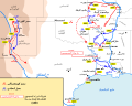 Another non-English version


Article(s): Roughly 20 articles across quite a few language editions of wikipedia
- Request
- Corrections to erroneous map files
- See Commons:Deletion requests/Files in Category:Maps of the Trans-Mississippi Theater of the American Civil War for an enumeration of the most major error. A good example image for the Price's Raid corrections is File:Price's Raid.png. Ping me for any questions - I'm not super active on Commons, but if I get pinged then enwiki will send me a notification. Hog Farm (talk) 05:35, 26 October 2021 (UTC)
- Graphist opinion(s)
 Request taken by BusterD (talk) 20:20, 28 October 2021 (UTC)
Proposed flag of Cyprus (1959)
.svg)
Article(s): Flag of Cyprus
- Request
- Will someone please create an SVG file of the proposed national flag for Cyprus from 1959, which is described (but not shown) on this page here as consisting of "a white field with a large, rust-brown K, the first letter in the name 'Cyprus' both in Turkish and Greek." Thanks. Snow Lion Fenian (talk) 10:42, 30 October 2021 (UTC)
- Graphist opinion(s)
- @Snow Lion Fenian: Done --Mrmw (talk) 14:34, 8 December 2021 (UTC)
- @Mrmw: Terrific work, and thanks as always for your help. Snow Lion Fenian (talk) 15:02, 8 December 2021 (UTC)
Customs flags - Taiwan
-
 Please revert to 2010 version
 -
 I need this yellow-green one


Article(s): en:List of Chinese flags
- Request
- Please revert to 2010 version, there is another file with this image, but with the correct name (File:Ensign of the Chinese Maritime Customs Service.svg). I need this yellow-green one.
213.192.68.53 31.10.2021
- Graphist opinion(s)
 For context, the complicated elements can be found at "File:Flag of Director General of Customs of ROC.svg".Note that flags based on photographs can be nominated for deletion as "user-generated fantasies" as many people here only want files sourced from external places as the "Wikimedia Commons is not a source of educational content" according to some, so any flag based on that photograph may be liable for deletion in the future, at least based on similar deletion requests of Vietnamese political flags based on photographs at political events. --Donald Trung 『徵國單』 (No Fake News 💬) (WikiProject Numismatics 💴) (Articles 📚) 10:08, 14 November 2021 (UTC)
- Picture shows unused today Ensign of the Chinese Maritime Customs Service already existing under the correct name here. The file used to show the correct flag, as indicated by its description. 213.192.68.53 23.11.2021
Union flag folding GIF
-
 American flag folding GIF
 -
 Union flag (long 1:2 ratio)
 -
Union flag (normal 3:5 ratio)

.svg)
Article(s): e.g. en:Flag of the United Kingdom etc.
- Request
- GIF for folding the British flag (Sorry if this isn't the right board for animations – please advise)
- Make a GIF of the Royal Navy procedure for folding the Union flag, as explained: here for a coffin pall-type long version (1:2), as exemplified by the existing American example. If possible, also make a GIF for the folding of a more typical 3:5 flag. GPinkerton (talk) 10:44, 10 November 2021 (UTC)
- Graphist opinion(s)
Signature

Article(s): Tejashri Pradhan
- Request
- Please vectorize this signature. Also make its resolution similar to other signatures in English Wikipedia. Eevee01 (talk) 14:22, 18 November 2021 (UTC)
- Graphist opinion(s)
![]() Done - Gabuxae (talk) 19:04, 30 November 2021 (UTC)
Done - Gabuxae (talk) 19:04, 30 November 2021 (UTC)
The seal of Lê Thánh Tông
-
 Original seal
 -


Article(s): Lê dynasty
- Request
Why don't ya vectorize the seal? --Baokhang48812002 (talk) 23:52, 19 November 2021 (UTC)
- Graphist opinion(s)
- This appears to be a photography of the physical object, and it is used as such in the only article linked to it. what exactly are you looking for? Wegates (talk) 18:49, 1 December 2021 (UTC)
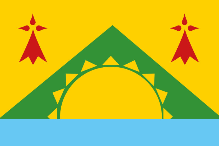
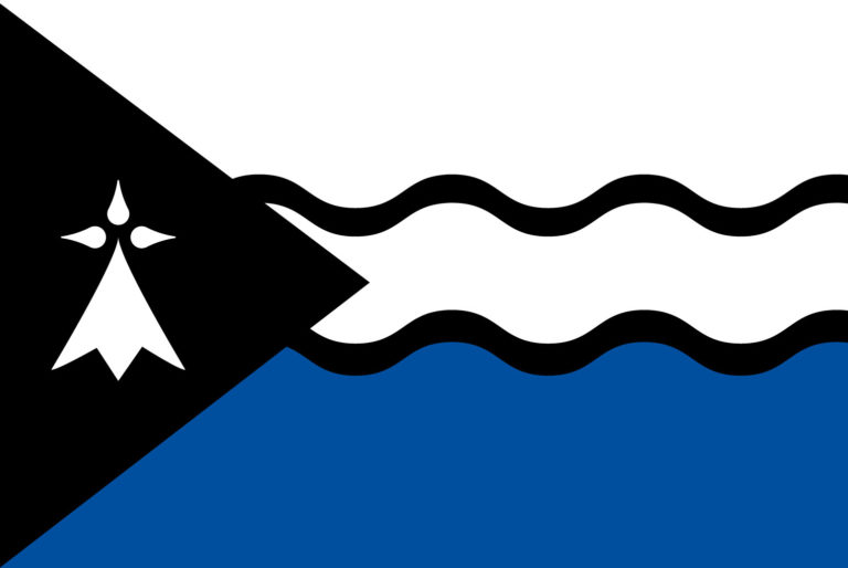
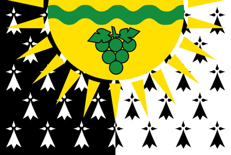
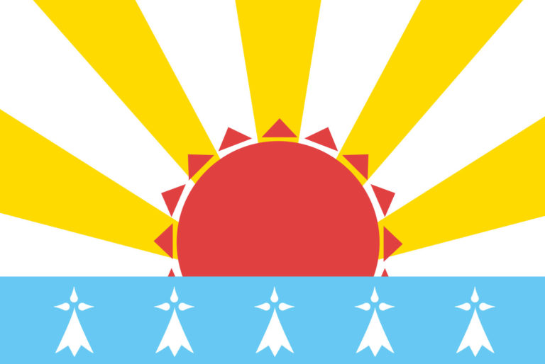
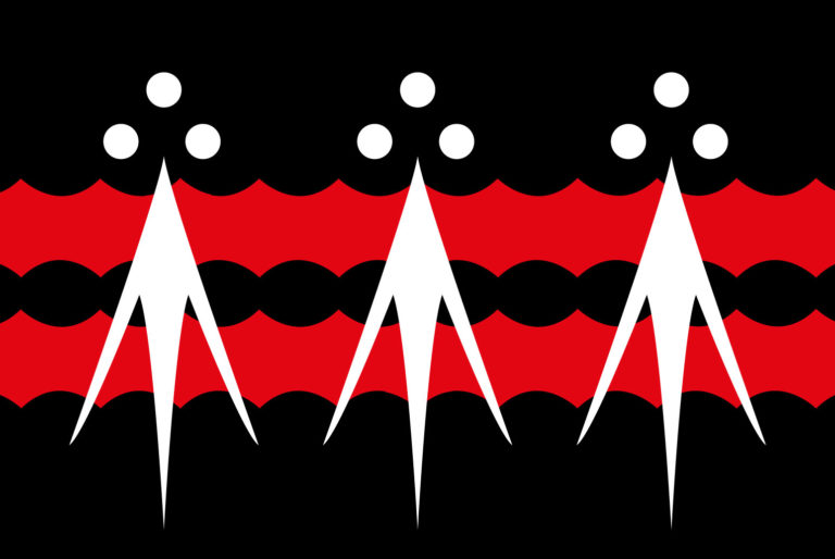
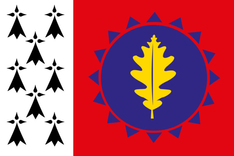
Breton district flags
-
 Pays de Baud
 -
 Bidar
Bidar -
 Chtou
Chtou -
 Coglais
 -
 Presqu'île de Crozon
 -
 Fisel
Fisel -
 Pays de Loudéac
 -
 Pays Mitaud
 -
 Plougastel
 -
 Porhoët


Article(s): List of Breton flags
- Request
- Can someone please create SVG files of the flags of the following traditional districts of Brittany:
- Pays de Baud
- Bidar
- Chtou
- Coglais
- Presqu'île de Crozon
- Fisel
- Pays de Loudéac
- Pays Mitaud
- Plougastel
- Porhoët
Thanks. Snow Lion Fenian (talk) 19:05, 24 November 2021 (UTC)
- Graphist opinion(s)
- @Snow Lion Fenian: Done --Mrmw (talk) 20:40, 5 December 2021 (UTC)
- @Mrmw: That's perfect, and thanks so much for all your hard work on all these files. I do appreciate it greatly. Snow Lion Fenian (talk) 20:09, 6 December 2021 (UTC)
Flag of Bulgaria (1948, 3-2)
-
 Flag of Bulgaria (3-2)
 -
 Coat of arms of Bulgaria (1948)
 -
 Flag of Bulgaria with Coat of Arms (1948)
.svg)
.svg)
.svg)
Article(s): Flag of Bulgaria
- Request
- Please create File:Flag of Bulgaria (1948, 3-2).svg, it should be File:Flag of Bulgaria (3-2).svg with File:Coat of arms of Bulgaria (1948).svg placed on the top-left on the white band like this one. ColorfulSmoke (talk) 13:03, 1 December 2021 (UTC)
- Graphist opinion(s)
- Done Please let me know if you would like further edits. 00sier (talk) 20:24, 1 December 2021 (UTC)
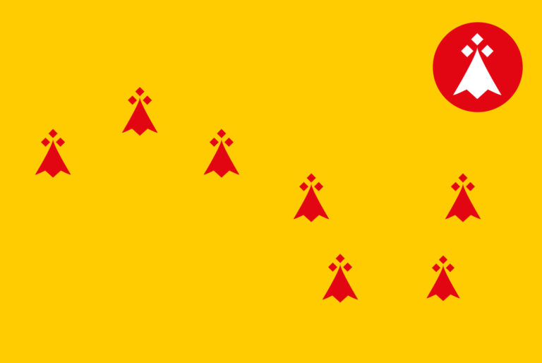
Another set of Breton district flags
Article(s): List of Breton flags
- Request
- Alright, similar to my last request, could someone please create SVG files of the following flags, which also represent traditional districts within Brittany:
- Clos Poulet
- Vignoble Nantais
- Vendelais
- Vannetais Oriental
- Pays Pourlet
- Poudouvre
- Plinn
- Penthièvre
- Penn Sardin
- Pays Rouzig
- Pays de Lorient
- Pays de la Mée
Thanks. Snow Lion Fenian (talk) 19:50, 9 December 2021 (UTC)
- Graphist opinion(s)
Flags of Bulgaria
-
 1946–1948
 -
 1948
1948 -
 1948–1967
 -
 1967–1971
 -
 1971–1990
.svg)
.svg)
.svg)
.svg)
.svg)
-
 1946–1948, 3-2
 -
1948, 3-2
-
 1948–1967, 3-2
 -
 1967–1971, 3-2
 -
 1971–1990, 3-2
.svg)
.svg)
.svg)
.svg)
-
 1946–1948
 -
1948
-
 1948–1967
 -
 1967–1971
 -
 1971–1990
.svg)
.svg)
.svg)
.svg)
![[7]](https://commons.wikimedia.org/wiki/File:Flag_of_Hunza.svg)
.svg)
_(Variant_1).svg)
_(Red).svg)
![[1]](https://www.worldstatesmen.org/jaipur1.gif)
![[3]](https://www.worldstatesmen.org/jaipur3.gif)
![[5]](https://www.worldstatesmen.org/jaipur5.gif)
Article(s): Flag of Bulgaria
- Request
- Please update the Bulgarian flags with the current version of the Coats of arms. ColorfulSmoke (talk) 13:25, 11 December 2021 (UTC)
- Graphist opinion(s)